Skip to main content
June 09, 2026
videos
SIGN UP/IN
Latest
Sections
Speedy Tuesday
All Articles
Buyer's Guides
Hands-On
People
TBT
Video
Watch Review
Watches of 2026
You Asked Us
Brands
Audemars Piguet
Rolex
Cartier
Hermès
Omega
Grand Seiko
Tudor
Patek Philippe
Seiko
IWC
Breitling
4N
A-13
A. Lange & Söhne
A.F.0210.
Abinger
Accurist
Accutron
Ace
ADPT
Advisor
Aera
Aevig
Aîon Group
Airain
Airin
Akrivia
Alain Silberstein
Albishorn
Alcadus
Alpina
Alsta
Alterum
Amida
Andersen Genève
Anemoic
Angelus
Anicorn
Anoma
Anonimo
anOrdain
Antoine Preziuso
Apiar
Apple
Aquadive
Aquastar
Aramar
Arcanaut
Archimede
Ardra Labs
Argon
Arion
Arken
Armin Strom
Arnold & Son
Arroway Modular Bracelets
Art of Horology
Artem
Artisans de Genève
ArtyA
Asketica
Astor+Banks
Astromatic
ASU
Atelier de Chronometrie
Atelier de Monaco
Atelier Holgur
Atelier Romane
Atelier Wen
Atlantic
Atmoss
Atom
Audemars Piguet
Audi
Audric
Autodromo
AVI-8
Avia
Awake
Axia Time
Axios
Azimuth
BA111OD
Ball
Balmont
Baltic
Bamford
Bangalore Watch Company
Barrelhand
Basis
Batavi
Baume & Mercier
Bausele
Baylor
Beaubleu
Beaucroft
Beaufort
Beda'a
Bedat
Behrens
Belchengruppe
Belhamel
Bell & Ross
Benjamin Chee Haute Horlogerie
Bennett Winch
Benrus
Benzinger
Bergeon
Berneron
Bespoke Watch Projects
Bianchet
Biatec
Biotic
Biver
Black Badger
Blancier
Blancpain
BND
Bohematic
Bohen
Boldr
Borealis
Bosphorus Leather
Boston and Stewill
Boucheron
Boundary Layer Studio
Bovet
Branch
Bravo Watchware
Bravur
Breguet
Breitling
Brellum
Bremont
Breva
Brew
Briston
BRM
Brüggler
Bucherer
Buci
Buler
Bulova
Bunter
Buren
Bvlgari
Byrne
Cabestan
Calgari
Campanola
Carl F. Bucherer
Carl Suchy & Söhne
Cartier
Casio
Cauny
Cedric Bellon
Celadon HH
Celegin
Certina
Chanel
Charles Girardier
Charles Simon
Charlie Paris
Chopard
Chopin
Christiaan van der Klaauw
Christian Etienne
Christophe Claret
Christopher Ward
Chromachron
Chronofixe
Chronographe Suisse
Chronoswiss
Chronotechna
CIGA Design
Cimier
Circula
Citizen
Claude Meylan
Claudex
Clebar
Cleguer
Clemence
Clerc
COD
Code41
Collective
Cornavin
Corniche
Corum
Crafter Blue
Credor
Crepas
Croton
CT Scuderia
Cuervo y Sobrinos
Cvstos
CWC
Cyberpunk
Cyma
Cyrus
Czapek
DAEM
Daizoh Makihara Watchcraft Japan
Daniel Roth
Datumatic
David Candaux
Davosa
DB Milau
De Bethune
De Rijke & Co.
Dekla
Delaloye
Delft Watch Works
Delma
Delugs
Dennison
Depancel
Derby
Desder
Destino
Detomaso
DeWitt
Diatom
Dietrich
Dingemans
Dior
DiW
Dodane
Dominique Renaud
Dornblüth & Sohn
Douglas
Doxa
Draken
Dryden
Dubey & Schaldenbrand
DuBois et Fils
Dulux
Dumoreau
Dunselman
Duward
Dwiss
Earthen Co.
Eatsleeplay
Ebel
Eberhard
Echo/Neutra
Edox
Edward Christopher
Egotempo
Elgé
Elgin
Elka
Elves
Emile Chouriet
Emmanuel Bouchet
Endatto
Enicar
Eone
Eqvis
Ergon
Erika's Originals
Ernest Borel
Eterna
Excelsior Park
Eza
F.P.Journe
Fam al Hut
Farer
Favre Leuba
Fears
Felca
Ferdinand Berthoud
Fiona Krüger
Fleming
Fleux
Flik Flak
Florijn
Fluco
Formex
Forstner
Fortis
Franc Vila
Franck Dubarry
Franck Muller
Fratello
Frederique Constant
Frenca
Fromanteel
Fugue
Furlan Marri
G-Shock
Gagà Laboratorio
Gallet
Gane
Ganster
Garrick
Gavox
Geckota
Genteel Handmade
Genus
George Daniels
Gerald Charles
Gérald Genta
German Polosin
Gigandet
Girard-Perregaux
Giuliano Mazzuoli
Glashütte Original
GLC
Glycine
Godana
Golden Concept
Gorilla
GoS Watches
Graham
Grana
Grand Seiko
Greubel Forsey
Grieb & Benzinger
Grönefeld
Gruen
Gruppo Gamma
Gucci
Guebly
Gyre
H. Moser & Cie.
Habring²
Hajime Asaoka
Halda
Halios
Hamilton
Hamtun
Hanhart
Harry Winston
Harvel
Harwood
HasNoBounds
Hasselblad
Hautlence
Haven
Havid Nagan
Hazemann & Monnin
Hegid
Heinrich
Helicon
Helm
Herbelin
Hermès
HERO-ERA
Héron
Hesili
Heuer
HoD
Holthinrichs
Horage
Horizon
Horon
HP Hercules
HSNY
HTD
Hublot
Hysek
HYT
Hz Watches
Ianos
ID Genève
IFL Watches
Ikepod
Illinois
Independent Atelier
Ineichen
Islander
ISOfrane
Isotope
IWC
J.N. Shapiro
J&Berg
Jack Mason
Jacob & Co.
Jacques Bianchi
Jaeger-LeCoultre
James Lamb
Jaquet Droz
Jardur
Jean Dunand
Jenny
John Robert
John Roberts Wristwatches
Joseph Bonnie
JS Watch Co
Junghans
Juvenia
Kari Voutilainen
Kasper
Kelbert
Ketelaars
Kienzle
Kikuchi Nakagawa
Kiwame Tokyo
Klokers
Kollokium
Konstantin Chaykin
Krayon
Kross Studio
Kubernet
Kudoke
Kuoe
Kurono Tokyo
L'Epée
Label Noir
Laco
Lanco
Lang & Heyne
Lange & Berkeley
Laurent Ferrier
Laventure
Le Gant
Le Rhöne
Lebois & Co
Lebond
Lederer
Leica
Leinfelder
LeJour
Lemania
Leonidas
Lesablier
LIC
Ligure
Lima
Limes
Linde Werdelin
LIP
Löbner
Longines
Lonville
Lorca
Lorier
Louis Erard
Louis Moinet
Louis Vuitton
LOV
Lowinger
Ludovic Ballouard
Lüm-Tec
Luminox
Lytt Labs
M.A.D.Editions
Maen
Maghnam
Magrette
Makina
Manufacture Royale
Marathon
March LA.B
Marin Instruments
Marloe
Marloe Watch Company
Marnaut
Marvin
masahiro kikuno
Massena LAB
Mathey-Tissot
Maurice de Mauriac
Maurice Lacroix
Mauron Musy
MB&F
McGonigle
MCT
Meccaniche Orologi Milano
Mecchaniche Veloci
Medana
MeisterSinger
Melbourne
Méraud
Mercer
Merci Instruments
Meridian
Meylan
Micromilspec
Mido
Milléchron
Milus
Mimo
Minase
Minerva
Ming
Minilip
Minim
Mirvain
Mitch Mason
Miyota
Mk II
Möels & Co
Moeris
Mona
Monbrey
Mondaine
Mondia
Monta
Montblanc
Montilier
Montjuïc
Moritz Grossmann
Movado
Mozen
Mr Jones Watches
MSBespoke
Mu:n
Mühle Glashütte
Mulco
Namica
Naoya Hida
Naoya Hida & Co.
NDC Straps
Nectere
Neotype
Nero Biglia
Nezumi
Nicolet
Niton
Nivada Grenchen
Nodus
Nomadic
Nomos
Nordgreen
Nordic Marine Instruments
Norqain
North Street Straps
Oak & Oscar
Oceanix
ochs und junior
Ollech & Wajs
Olma
Omega
OraOrea
Orator
Ordiam
Orfina
Orient
Orient Star
Orion
Oriosa
Oris
Orodeus
Otsuka Lotec
Out of Order
Panerai
Papar
Par Weber
Parmigiani Fleurier
Parrera
Patek Philippe
Paulin
Pebro
Pedrozo & Piriz
Pelican
Penarosa
Pequignet
Peren
Perfecta
Perpetual Straps
Perrelet
Perseo
Peter Roberts
Peter Speake-Marin
Petermann Bédat
Philippe Dufour
Piaget
Pierce
Pierre DeRoche
Pinion
Poljot
Pontiac
Porsche
Porsche Design
Praesidus
Pragma
Prevail
Prim
Prokop&Broz
Prometheus
Purnell
Qian GuoBiao
QlockTwo
Quiet Club
Rado
Raidillon
Raketa
Ralph Lauren
Raúl Pagès
Raven
Raymond Weil
RC Tritec
Rebellion
REC
Record
Redwood
Reise
Remy Cools
Renaud Tixier
Reservoir
Ressence
Retter
Revolo
Rexhep Rexhepi
RGM
Richard Mille
Rimowa
Rios1931
RJ
Roamer
Roarcraft
Robert & Fils 1630
Robot
Rodania
Roger Dubuis
Roger Smith
Roland Oostwegel
Rolex
Romain Gauthier
Rossling
Roue
RSM Straps
Rubber B
RubberB
RZE
RzR Watches
S.U.F. Helsinki
Sada
Sandoz
Sarpaneva
Sartory Billard
Schaefer & Companions
Schofield
Schwarz Etienne
Scottish Watches
Scurfa
Seaboard Yacht
Seagull
Seaholm
Seals Watch Company
Second Hour
seconde/seconde/
Securiton
Seiko
Selectron
Selten
Semicolon
Serica
Sero
SevenFriday
Sherpa
Sicura
Siduna
Singer Reimagined
Sinn
Sjöö Sandström
Solix
Spaceman
SpaceOne
Speake-Marin
Sperina
Sphaera
Sphinx
Spinnaker
Squale
St. Blaise
Staib
Staudt
Stellaris
Sternglas
Stewart Dawson
Stoic
Stowa
Strapatelier
Straton
Straum
Struthers Watchmakers
Studio Underd0g
Sturmanskie
Suissemecanica
Swatch
Swiss Time Watches
SYE
Sylvain Pinaud
Synchron
Système Formel
TAG Heuer
Tavannes
Technos
Tellus
Tempest
Temporal Works
Tempore Lux
Terrycrafted
The Electricianz
Thomas Prescher
Tiffany & Co.
Timenest
Timex
Timor
Tissot
Titoni
TNT
To The Hour
Tockr
Toledano & Chan
Tool Watch Co.
Tornek-Rayville
Tourist
Traska
Treiber
Trilobe
Triton
Trivoly
Triwa
Tudor
Tulloch
Turtle
Tusenö
Tutima
TUUL
TWCO
Typsim
U-Boat
Ubiq
Ultramarine
Ulysse Nardin
Undive
Undone
Unimatic
Union
Universal Genève
Urban Jürgensen
Urwerk
UTS Munchen
Vacheron Constantin
Vaer
Van Cleef & Arpels
Van der Gang
Van Ree
Vandaag
Vapaus
Vario
Varix
Varon Chiri
Vaucanson
Vault
Veblenist
Velle Alexander
Venezianico
ventura
Venus
Verax
Vero
Vertex
Vianney Halter
Vicenterra
Victorinox
Vieren
Viqueria
Visitor Watch Co.
Volan
Von Doren
Von Vogel
Vortic
Vostok
Vostra
Voutilainen
VPC
Vulcain
Wakmann
Waltham
WatchStrapHeaven
WatchTime
Weiss
Welsbro
Wempe
WH&T
William Wood
William Wood Watches
Wilmington
Wittnauer
Wolbrook
Wolf 1834
Wolf Creek
Wren
WRK Timepieces
Wyler
Xetum
yellowdogwatchstraps
Yema
Yonger Bresson
York & Front
Zannetti
Zealandic
Zeitwinkel
Zelos
Zenith
Zeno
Zero West
Zodiac
ZRC 1904
Zulu Alpha Straps
view all brands
Podcast
About
About Fratello
Careers
Newsletter
Contact
Create Fratello Account
Free Downloads
Transparency
Advertising
Videos
Search for:
Search for:
Latest
Sections
Speedy Tuesday
All Articles
Buyer's Guides
Hands-On
People
TBT
Video
Watch Review
Watches of 2026
You Asked Us
Brands
Audemars Piguet
Rolex
Cartier
Hermès
Omega
Grand Seiko
Tudor
Patek Philippe
Seiko
IWC
Breitling
4N
A-13
A. Lange & Söhne
A.F.0210.
Abinger
Accurist
Accutron
Ace
ADPT
Advisor
Aera
Aevig
Aîon Group
Airain
Airin
Akrivia
Alain Silberstein
Albishorn
Alcadus
Alpina
Alsta
Alterum
Amida
Andersen Genève
Anemoic
Angelus
Anicorn
Anoma
Anonimo
anOrdain
Antoine Preziuso
Apiar
Apple
Aquadive
Aquastar
Aramar
Arcanaut
Archimede
Ardra Labs
Argon
Arion
Arken
Armin Strom
Arnold & Son
Arroway Modular Bracelets
Art of Horology
Artem
Artisans de Genève
ArtyA
Asketica
Astor+Banks
Astromatic
ASU
Atelier de Chronometrie
Atelier de Monaco
Atelier Holgur
Atelier Romane
Atelier Wen
Atlantic
Atmoss
Atom
Audemars Piguet
Audi
Audric
Autodromo
AVI-8
Avia
Awake
Axia Time
Axios
Azimuth
BA111OD
Ball
Balmont
Baltic
Bamford
Bangalore Watch Company
Barrelhand
Basis
Batavi
Baume & Mercier
Bausele
Baylor
Beaubleu
Beaucroft
Beaufort
Beda'a
Bedat
Behrens
Belchengruppe
Belhamel
Bell & Ross
Benjamin Chee Haute Horlogerie
Bennett Winch
Benrus
Benzinger
Bergeon
Berneron
Bespoke Watch Projects
Bianchet
Biatec
Biotic
Biver
Black Badger
Blancier
Blancpain
BND
Bohematic
Bohen
Boldr
Borealis
Bosphorus Leather
Boston and Stewill
Boucheron
Boundary Layer Studio
Bovet
Branch
Bravo Watchware
Bravur
Breguet
Breitling
Brellum
Bremont
Breva
Brew
Briston
BRM
Brüggler
Bucherer
Buci
Buler
Bulova
Bunter
Buren
Bvlgari
Byrne
Cabestan
Calgari
Campanola
Carl F. Bucherer
Carl Suchy & Söhne
Cartier
Casio
Cauny
Cedric Bellon
Celadon HH
Celegin
Certina
Chanel
Charles Girardier
Charles Simon
Charlie Paris
Chopard
Chopin
Christiaan van der Klaauw
Christian Etienne
Christophe Claret
Christopher Ward
Chromachron
Chronofixe
Chronographe Suisse
Chronoswiss
Chronotechna
CIGA Design
Cimier
Circula
Citizen
Claude Meylan
Claudex
Clebar
Cleguer
Clemence
Clerc
COD
Code41
Collective
Cornavin
Corniche
Corum
Crafter Blue
Credor
Crepas
Croton
CT Scuderia
Cuervo y Sobrinos
Cvstos
CWC
Cyberpunk
Cyma
Cyrus
Czapek
DAEM
Daizoh Makihara Watchcraft Japan
Daniel Roth
Datumatic
David Candaux
Davosa
DB Milau
De Bethune
De Rijke & Co.
Dekla
Delaloye
Delft Watch Works
Delma
Delugs
Dennison
Depancel
Derby
Desder
Destino
Detomaso
DeWitt
Diatom
Dietrich
Dingemans
Dior
DiW
Dodane
Dominique Renaud
Dornblüth & Sohn
Douglas
Doxa
Draken
Dryden
Dubey & Schaldenbrand
DuBois et Fils
Dulux
Dumoreau
Dunselman
Duward
Dwiss
Earthen Co.
Eatsleeplay
Ebel
Eberhard
Echo/Neutra
Edox
Edward Christopher
Egotempo
Elgé
Elgin
Elka
Elves
Emile Chouriet
Emmanuel Bouchet
Endatto
Enicar
Eone
Eqvis
Ergon
Erika's Originals
Ernest Borel
Eterna
Excelsior Park
Eza
F.P.Journe
Fam al Hut
Farer
Favre Leuba
Fears
Felca
Ferdinand Berthoud
Fiona Krüger
Fleming
Fleux
Flik Flak
Florijn
Fluco
Formex
Forstner
Fortis
Franc Vila
Franck Dubarry
Franck Muller
Fratello
Frederique Constant
Frenca
Fromanteel
Fugue
Furlan Marri
G-Shock
Gagà Laboratorio
Gallet
Gane
Ganster
Garrick
Gavox
Geckota
Genteel Handmade
Genus
George Daniels
Gerald Charles
Gérald Genta
German Polosin
Gigandet
Girard-Perregaux
Giuliano Mazzuoli
Glashütte Original
GLC
Glycine
Godana
Golden Concept
Gorilla
GoS Watches
Graham
Grana
Grand Seiko
Greubel Forsey
Grieb & Benzinger
Grönefeld
Gruen
Gruppo Gamma
Gucci
Guebly
Gyre
H. Moser & Cie.
Habring²
Hajime Asaoka
Halda
Halios
Hamilton
Hamtun
Hanhart
Harry Winston
Harvel
Harwood
HasNoBounds
Hasselblad
Hautlence
Haven
Havid Nagan
Hazemann & Monnin
Hegid
Heinrich
Helicon
Helm
Herbelin
Hermès
HERO-ERA
Héron
Hesili
Heuer
HoD
Holthinrichs
Horage
Horizon
Horon
HP Hercules
HSNY
HTD
Hublot
Hysek
HYT
Hz Watches
Ianos
ID Genève
IFL Watches
Ikepod
Illinois
Independent Atelier
Ineichen
Islander
ISOfrane
Isotope
IWC
J.N. Shapiro
J&Berg
Jack Mason
Jacob & Co.
Jacques Bianchi
Jaeger-LeCoultre
James Lamb
Jaquet Droz
Jardur
Jean Dunand
Jenny
John Robert
John Roberts Wristwatches
Joseph Bonnie
JS Watch Co
Junghans
Juvenia
Kari Voutilainen
Kasper
Kelbert
Ketelaars
Kienzle
Kikuchi Nakagawa
Kiwame Tokyo
Klokers
Kollokium
Konstantin Chaykin
Krayon
Kross Studio
Kubernet
Kudoke
Kuoe
Kurono Tokyo
L'Epée
Label Noir
Laco
Lanco
Lang & Heyne
Lange & Berkeley
Laurent Ferrier
Laventure
Le Gant
Le Rhöne
Lebois & Co
Lebond
Lederer
Leica
Leinfelder
LeJour
Lemania
Leonidas
Lesablier
LIC
Ligure
Lima
Limes
Linde Werdelin
LIP
Löbner
Longines
Lonville
Lorca
Lorier
Louis Erard
Louis Moinet
Louis Vuitton
LOV
Lowinger
Ludovic Ballouard
Lüm-Tec
Luminox
Lytt Labs
M.A.D.Editions
Maen
Maghnam
Magrette
Makina
Manufacture Royale
Marathon
March LA.B
Marin Instruments
Marloe
Marloe Watch Company
Marnaut
Marvin
masahiro kikuno
Massena LAB
Mathey-Tissot
Maurice de Mauriac
Maurice Lacroix
Mauron Musy
MB&F
McGonigle
MCT
Meccaniche Orologi Milano
Mecchaniche Veloci
Medana
MeisterSinger
Melbourne
Méraud
Mercer
Merci Instruments
Meridian
Meylan
Micromilspec
Mido
Milléchron
Milus
Mimo
Minase
Minerva
Ming
Minilip
Minim
Mirvain
Mitch Mason
Miyota
Mk II
Möels & Co
Moeris
Mona
Monbrey
Mondaine
Mondia
Monta
Montblanc
Montilier
Montjuïc
Moritz Grossmann
Movado
Mozen
Mr Jones Watches
MSBespoke
Mu:n
Mühle Glashütte
Mulco
Namica
Naoya Hida
Naoya Hida & Co.
NDC Straps
Nectere
Neotype
Nero Biglia
Nezumi
Nicolet
Niton
Nivada Grenchen
Nodus
Nomadic
Nomos
Nordgreen
Nordic Marine Instruments
Norqain
North Street Straps
Oak & Oscar
Oceanix
ochs und junior
Ollech & Wajs
Olma
Omega
OraOrea
Orator
Ordiam
Orfina
Orient
Orient Star
Orion
Oriosa
Oris
Orodeus
Otsuka Lotec
Out of Order
Panerai
Papar
Par Weber
Parmigiani Fleurier
Parrera
Patek Philippe
Paulin
Pebro
Pedrozo & Piriz
Pelican
Penarosa
Pequignet
Peren
Perfecta
Perpetual Straps
Perrelet
Perseo
Peter Roberts
Peter Speake-Marin
Petermann Bédat
Philippe Dufour
Piaget
Pierce
Pierre DeRoche
Pinion
Poljot
Pontiac
Porsche
Porsche Design
Praesidus
Pragma
Prevail
Prim
Prokop&Broz
Prometheus
Purnell
Qian GuoBiao
QlockTwo
Quiet Club
Rado
Raidillon
Raketa
Ralph Lauren
Raúl Pagès
Raven
Raymond Weil
RC Tritec
Rebellion
REC
Record
Redwood
Reise
Remy Cools
Renaud Tixier
Reservoir
Ressence
Retter
Revolo
Rexhep Rexhepi
RGM
Richard Mille
Rimowa
Rios1931
RJ
Roamer
Roarcraft
Robert & Fils 1630
Robot
Rodania
Roger Dubuis
Roger Smith
Roland Oostwegel
Rolex
Romain Gauthier
Rossling
Roue
RSM Straps
Rubber B
RubberB
RZE
RzR Watches
S.U.F. Helsinki
Sada
Sandoz
Sarpaneva
Sartory Billard
Schaefer & Companions
Schofield
Schwarz Etienne
Scottish Watches
Scurfa
Seaboard Yacht
Seagull
Seaholm
Seals Watch Company
Second Hour
seconde/seconde/
Securiton
Seiko
Selectron
Selten
Semicolon
Serica
Sero
SevenFriday
Sherpa
Sicura
Siduna
Singer Reimagined
Sinn
Sjöö Sandström
Solix
Spaceman
SpaceOne
Speake-Marin
Sperina
Sphaera
Sphinx
Spinnaker
Squale
St. Blaise
Staib
Staudt
Stellaris
Sternglas
Stewart Dawson
Stoic
Stowa
Strapatelier
Straton
Straum
Struthers Watchmakers
Studio Underd0g
Sturmanskie
Suissemecanica
Swatch
Swiss Time Watches
SYE
Sylvain Pinaud
Synchron
Système Formel
TAG Heuer
Tavannes
Technos
Tellus
Tempest
Temporal Works
Tempore Lux
Terrycrafted
The Electricianz
Thomas Prescher
Tiffany & Co.
Timenest
Timex
Timor
Tissot
Titoni
TNT
To The Hour
Tockr
Toledano & Chan
Tool Watch Co.
Tornek-Rayville
Tourist
Traska
Treiber
Trilobe
Triton
Trivoly
Triwa
Tudor
Tulloch
Turtle
Tusenö
Tutima
TUUL
TWCO
Typsim
U-Boat
Ubiq
Ultramarine
Ulysse Nardin
Undive
Undone
Unimatic
Union
Universal Genève
Urban Jürgensen
Urwerk
UTS Munchen
Vacheron Constantin
Vaer
Van Cleef & Arpels
Van der Gang
Van Ree
Vandaag
Vapaus
Vario
Varix
Varon Chiri
Vaucanson
Vault
Veblenist
Velle Alexander
Venezianico
ventura
Venus
Verax
Vero
Vertex
Vianney Halter
Vicenterra
Victorinox
Vieren
Viqueria
Visitor Watch Co.
Volan
Von Doren
Von Vogel
Vortic
Vostok
Vostra
Voutilainen
VPC
Vulcain
Wakmann
Waltham
WatchStrapHeaven
WatchTime
Weiss
Welsbro
Wempe
WH&T
William Wood
William Wood Watches
Wilmington
Wittnauer
Wolbrook
Wolf 1834
Wolf Creek
Wren
WRK Timepieces
Wyler
Xetum
yellowdogwatchstraps
Yema
Yonger Bresson
York & Front
Zannetti
Zealandic
Zeitwinkel
Zelos
Zenith
Zeno
Zero West
Zodiac
ZRC 1904
Zulu Alpha Straps
view all brands
Podcast
About
About Fratello
Careers
Newsletter
Contact
Create Fratello Account
Free Downloads
Transparency
Advertising
Videos
Home
photoessay
photoessay
Photoessay: The Maitres du Temps Chapter Three
Ming Thein
3
June 19, 2012
Photo Essay: Breguet La Tradition
Ming Thein
4
February 28, 2012
Jaeger-LeCoultre Gyrotourbillon Review
Ming Thein
9
February 13, 2012
Jaeger-LeCoultre Master Minute Repeater Review
Ming Thein
2
February 04, 2012
Photo Essay: The Jaeger-LeCoultre Compressor Navy Seals Alarm Beverly Hills Boutique Edition
Ming Thein
3
January 26, 2012
Photo Essay: The Jaeger-LeCoultre Master Tourbillons
Ming Thein
January 22, 2012
Photo Essay: Jaeger-LeCoultre Reverso Gyrotourbillon 2
Ming Thein
2
January 15, 2012
De Bethune DB26 – Photo Essay by Ming Thein
Ming Thein
5
December 29, 2011
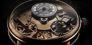
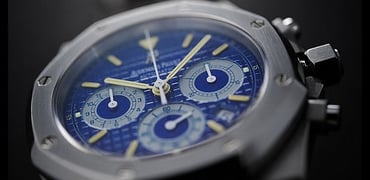
Photo Essay: Audemars Piguet Royal Oak Chronograph City of Sails
Ming Thein
1
December 23, 2011
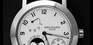
Photo Essay: The Patek Philippe 5055
Ming Thein
2
December 13, 2011
Photo Essay: The Sinn U1000
Ming Thein
5
November 21, 2011
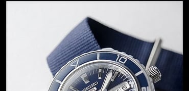
Photo Essay: The Seiko ‘Fifty Three Fathoms’
Ming Thein
5
November 16, 2011
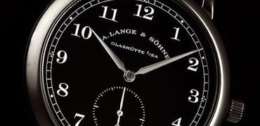
Long Term Report: A. Lange & Sohne 1815
Ming Thein
4
November 08, 2011
Photo Essay: Chopard LUC Chronometer
Ming Thein
November 05, 2011
Photo Essay: The Speake-Marin Piccadilly QP
Ming Thein
1
October 04, 2011
Long Term Review: Jaeger Le-Coultre Reverso Grande GMT
Ming Thein
13
September 11, 2011
Photo Essay: A Benzinger 6497 Skeleton
Ming Thein
1
September 01, 2011