Watches & Pencils #12 – Use of Color in Watches

Before we enter the next story about color I would like to say something about the past period of Watches & Pencils on Fratello Watches. It all started pretty small with a quick sketch and a few lines (view the very first post about the ‘Bullhead’ here). After the launch W&P quickly evolved to a feature with long intense stories accompanied by complex artwork. The ‘Sandwich’-post or the previous post about the ‘Submariner’ for example. To maintain focus, quality and give the cartoons and stories the attention they deserve, we’ve decided to split up those two ‘types’ of content. Expect one cartoon with a few lines and one longer story / review with photos from now on. That said, let’s move on to the watch stuff.
Colorful Theory
When speaking about watches there can be several reasons why a particular color is used, for example (in random order):
- To symbolize an emotion (e.g. blue stands for intelligence). This one is difficult because every color symbolizes positive and negative emotions (e.g. blue also stands for unfriendliness).
- To highlight important details and optimize legibility (e.g. bright yellow tip to highlight the end of the onyx black seconds hand).
- Because elements/logo’s forces the designer to include certain colors (e.g. the colors white, blue and red to create the RAF-logo).
- To create a distinctive identity and nice visual appearance.
Of course, these reasons can also be combined in one single element. When combining, elements usually get stronger. They become distinctively and legible for example. A nice example is the famous Doxa dial. After several underwater-tests salamander orange seemed the most legible color and it also created a very recognizable identity for Doxa.
Vibrant Yachting Timers
You could also say that some watch-groups are generally more colorful than others. Sports watches are more colorful than dress watches for example. That’s an open door. But if we sub-categorize sports watches there is an overall multi-color winner in my opinion: regatta watches. More specifically: non-digital/quartz watches with yachting functions. Especially the ones from the 1970’s. Almost always with the rich and colorful palette of blue, red, white and orange tones to highlight the countdown functions. Besides the functional reason, they add a vibrant unique topping to the dial, which I really like. To name a few examples: Heuer Regatta (134.601) and the famous Skipper (11063V), the Yema Yachtingraf Croisiere and the newer Alpina Yacht Timer (AL-880LBG4V6).
Although I believe that those yacht related watches are still the most colorful in general, recent releases at SIHH2016 weakened this thesis a bit. As we probably all know by now Audemars Piguet launched a ‘Royal’ rainbow: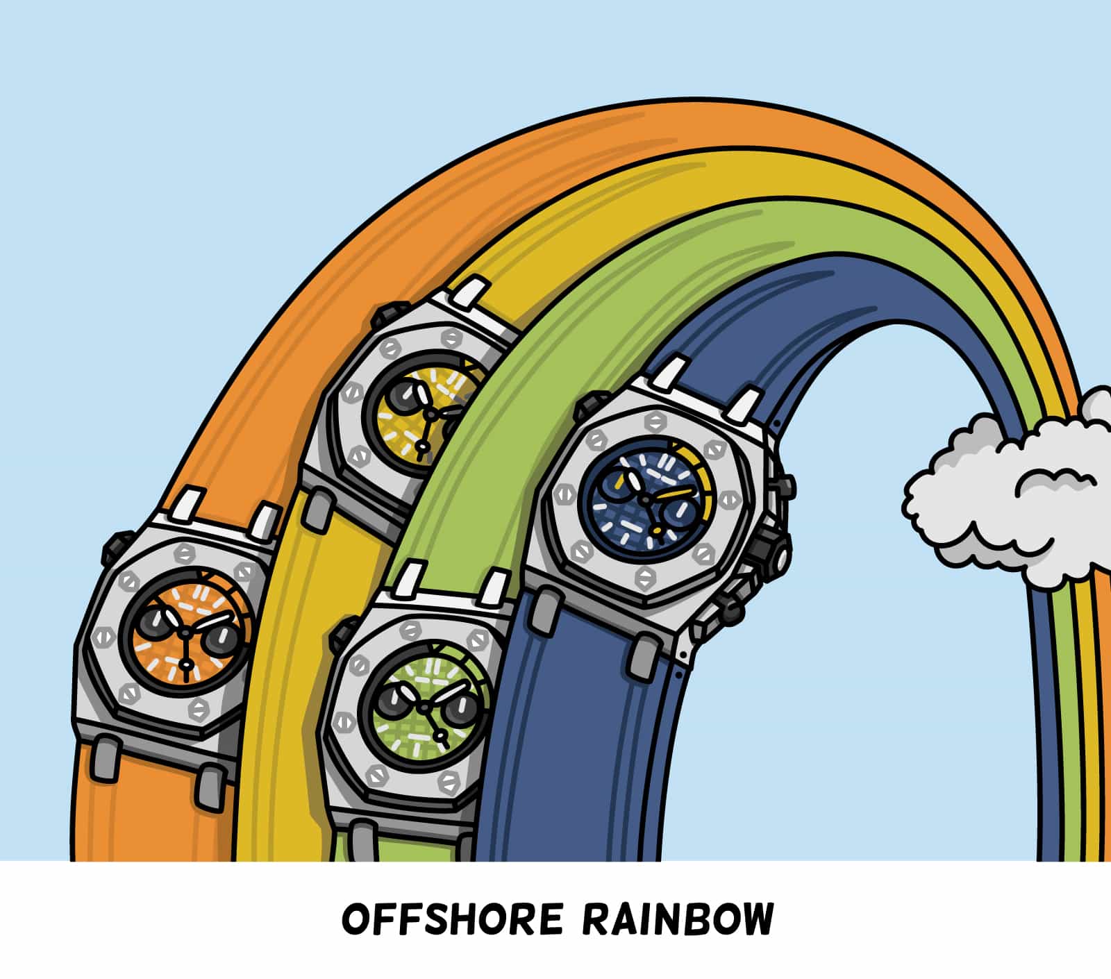
With this addition several splashy colors were added by Audemars Piguet (read the recent review by Robert-Jan). Besides the discussion if you (dis)like those colors, they are mainly applied to create character. Not to optimize contrast or legibility in general. Let me try to explain this a bit more.
Color Contrast Ratio
There are multiple ways to measure/analyze color contrast, but let’s keep things simple. (static) contrast basically is a comparison/number to define the luminosity ratio between two colors (1:100 with black and white for example). While the dark blue version of the new APROO does have a nice ratio, when I measure the yellow and orange variant I get a disappointing score in terms of contrast ratio (compared to the white/silver colored indexes). Not so practical if you want to go diving… But, who cares?
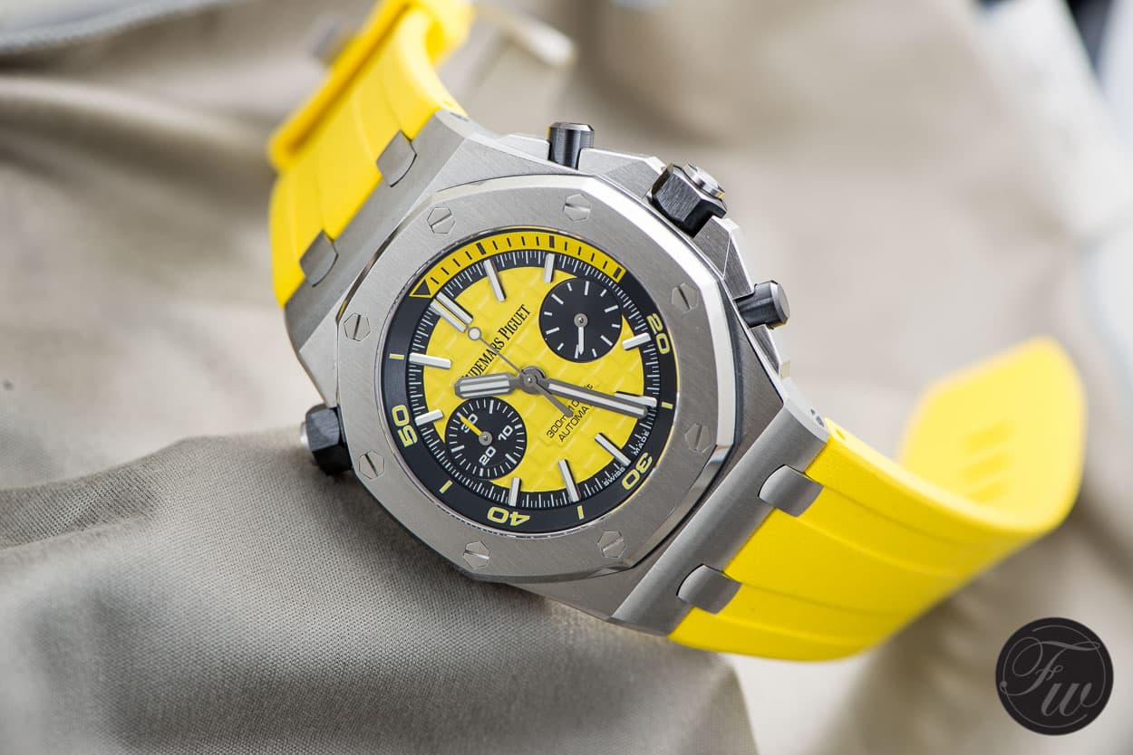
Not the most optimal contrast ratio for a dive watch (white : yellow), but it looks nice though (reference number: 26703ST.OO.A051CA.01)
Conclusion
Although I do like the new color variations, this is a nice example where the color creates a character, but at the same time weakens another reason to include a color: functional legibility. Let’s end with a few questions to think about:
- Legibility above characteristics or characteristics above legibility?
- What’s your favorite ‘rainbow’ watch?
- Is readability today an important factor on expensive dive watches while almost 100% of the buyers will never use it for diving?
Thanks for watching/reading and please don’t hesitate to leave your comment below
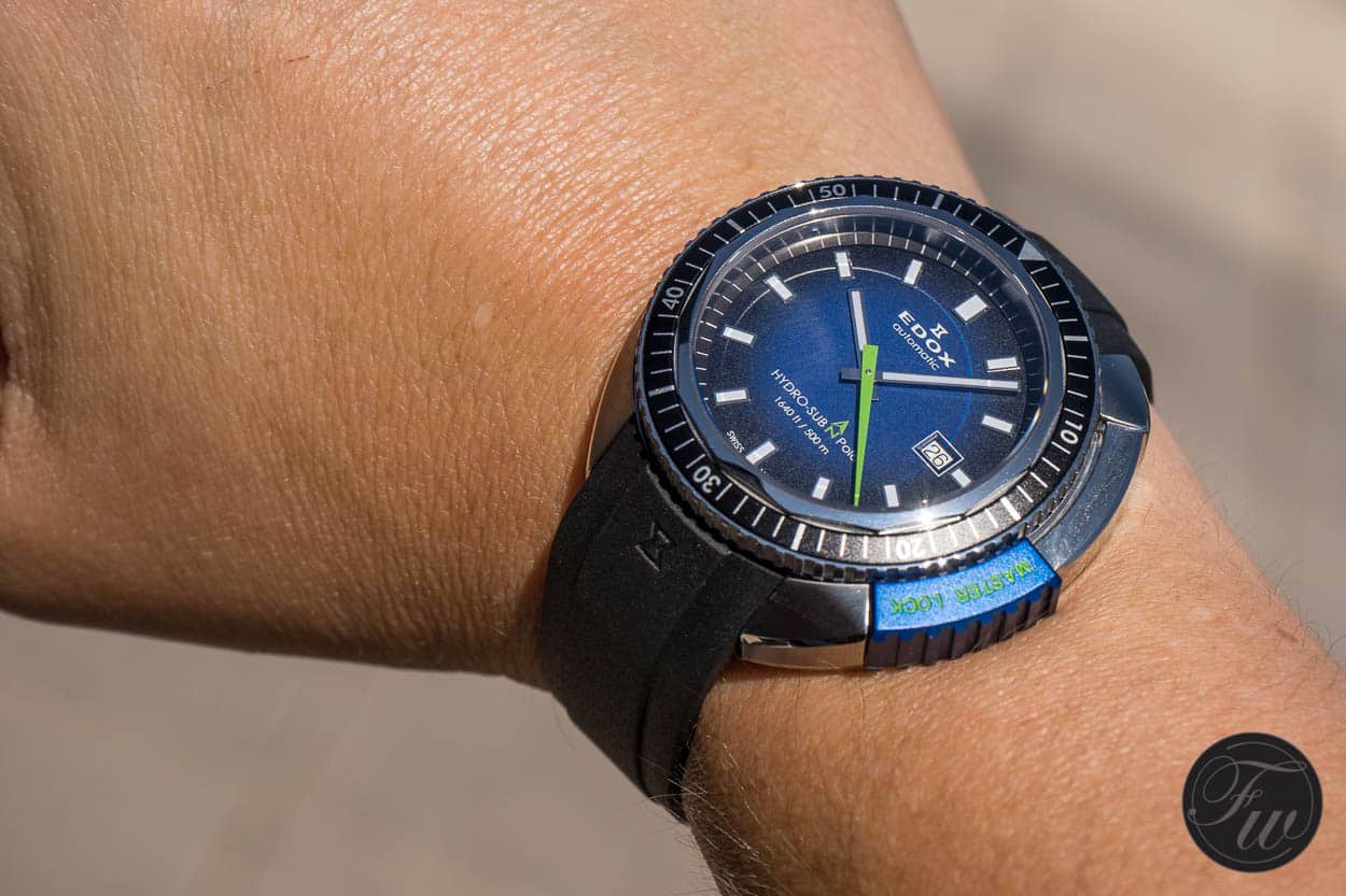
A nice example of combining two reasons to add color: character and legibility (Edox Hydro-Sub – 80301-3NBU-NBU)