Watches & Pencils #15 – Date Windows

Being fascinated by the perpetual discussion about date windows I decided to dedicate an episode of Watches & Pencils to it. Between the lines I will participate to this by giving my personal opinion, but let’s mainly focus on a tour around a few remarkable ‘windows’:

In this episode we will only focus on date windows, so don’t expect date indicators with subdials, pointer date-indicators, etcetera.
General introduction: variations and properties
Before we start our trip and look at some fresh Baselworld 2016 windows I would like to introduce a few categories and quickly summarize a few bits about date windows.
Date windows and variations
Roughly, because there are so much variations and possibilities that it is almost impossible to cover them all:
- Grande Date or Big Date: two big windows form the base for this impressive window. Underneath houses a nifty technique formed by two, sometimes overlapping, separate discs. Together they form the date. One of the most famous ones is probably the Lange & Söhne big date.
- Day-Date: in this variation the date is accompanied by the day of the week. Often two windows next to each other (DAY – NR).
- Panorama date windows: A big stretched (curved) window providing the viewer more visibility on the date disc. Thus, it exposes a date range nearby the date. The actual date is often indicated by a caret nearby the window.
- A-symmetrical date windows: date windows with more dynamic shapes. A trapezium shaped date window for example.
- Round date window. Self-explanatory.
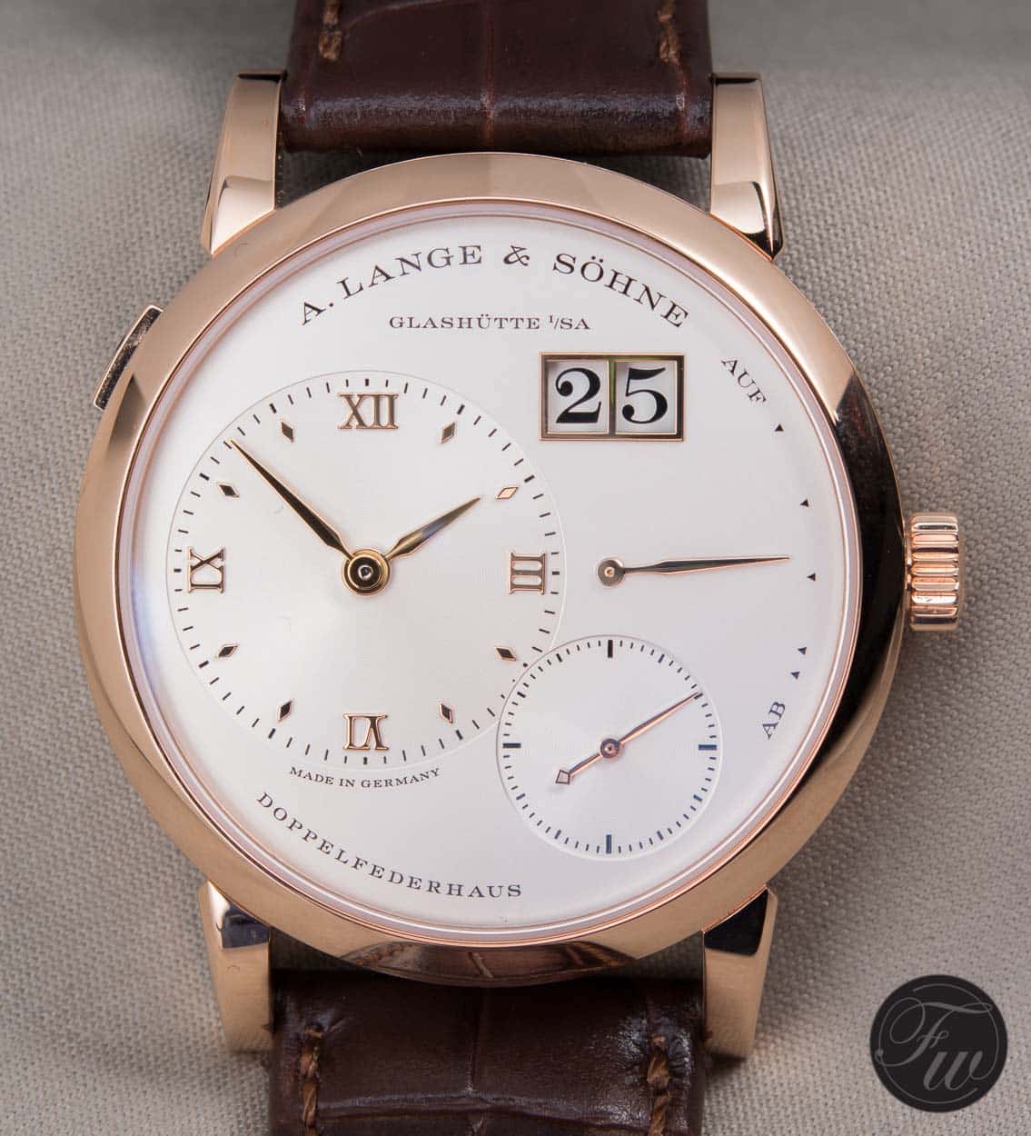
Example of a ‘Big Date’ on a Lange & Söhne 1
Character: chameleon or spotlight?
Some date windows blend in like chameleons and others like to let every dial-viewer know that they are there. What is your cup of tea? In my opinion it depends on the kind of watch/category and the way the contrast or blending is executed. One of the most heard irritations I hear is wrong color combinations and contrast. For example: a crème colored dial with a virgin white colored date window…. Often the cause are economic arguments and out-house movements.

Sinn U212 EZM 16 date window: minimalistic but legible.
Position of date windows
Besides color there are also more options for the watch brand to choose from. If they have a choice… Huh? Unfortunately, most of the low and mid-segment watch brands are limited to third party movements from ETA or Soprod for example. This is putting quite a restriction/challenge on the design of the dial, since the date disc position is static and attached to the movement. Often brands need to ‘work around’ the date window, causing oddly placed date windows and cluttered dial designs with mismatching colors and typefaces. But, a work-around is most of the time better then forgetting this element and create the infamous ‘afterthought’ looking date window. Ok, let’s admit, with outsourced movements it can be quite a challenge. But, there are often options left. The position for example. Instead of the very popular 3 o’clock position, 4 o’clock can sometimes create a more balanced and practical choice. More unorthodox positions like 11 o’clock can be very original, but aren’t that practical and accepted in general.

Position of the window at 6: design choice or restriction? (new Longines Heritage 1918)
Size
By choosing an optimal contrast you can trigger attention, but there is another parameter causing the same effect: size. We’ve already spoken about the BIG date. The “natural” way. Besides this watch brands can also increase the size by the magnifying effect of a cyclops on the glass. You hate them or love them, but it is a way to increase exposure and legibility of the date window.

Magnifying cyclops on the new Rolex Yacht-master 40 in Everose gold
Reviewing date windows
There’s no accounting for taste, but with this foundation and our personal opinion/preferences we can review and analyse and review date windows on a more solid and detailed way. Let’s sum up and look at some Baselworld novelties from last year:
- Variation and general commitment to the concept of the watch
- Color
- Position
- Size
- (Numeral) typeface
- Special additions (e.g. cyclops)
Baselworld 2016 reviews

Alpina Seastrong Diver
This date window fits the watch in my opinion. Alpina did choose for the most common 3 o’clock position in a ‘chameleon’ setup. Since there aren’t many numerals around on this dial it fit’s other typographic elements and it nicely extends the rounded hour indicator. It’s a dive watch and when not diving this watch tells you the date on a subtle way.

Clerc Hydroscaph H1 Chronometer
A panorama setup with a blue matching caret indicating the actual date. There is something special about this example. In most of the cases when talking about white colored dials, brands choose for a (matching) white colored date disc. In this case Clerc implemented the purest contrast / uncommon setup: a black disc with white numerals on a white dial. But is it, together with the panorama setup, the most legible and fitted option? If there were options during the design process: is three o’clock the best position since the characteristic numeral ‘3’ needs to be cut off quite a bit? In my opinion everything is bold on this watch, except for the date…

Eberhard Contograf
A slightly a-symmetrical date window. What I really like about this window is that Eberhard created a connection between elements by giving it the same deep red color. The date window included. At 6 o’clock it complements the overall look of the dial and balance of the dial. Every element gets enough space. Also, the date window is nicely aligned when trying to create an imaginary line between the 5 and 7 o’clock indicators. The stainless steel frame around the window fits just right and gives the window a more luxurious and refined look.

Glashütte Original Quintessenz Senator
Glashütte only produces and uses in-house movements. Designers get all the room and space to create the most ideal dial and matching date windows. Here we see a beautiful example of a big date. Although it’s a big date it lets other elements speak and blends in. Its numeral Roman typeface matches the other numerals (e.g. the numerals on the small seconds track) and every number is perfectly aligned in the window. The rounded recessed extra level around the date creates a border with a depth effect on a subtle and well-thought way. The date is formed by to discs next to each other instead of the overlapping setup where I spoke about earlier on. It exposes the technique by leaving off the ‘separator frame’ like Lange & Söhne does.
Open (or closed) end
Last 1st of April there were jokes about date window masks in the watch scene. Although I don’t like the idea of being your own chef and change “carefully” crafted designs by an extra ingredient (date window mask in this case) I am very curious about the future. Will a date window become a more offered option amongst watch brands or do we need to accept choices made by brands we love? Would you pay a bit more for a watch with two dials: one with and one without date window? If we try to create a bridge with “smart” watches it isn’t unthinkable. These watches come with tons of dials out of the box… Taste can change through time and having options is good. Or not?
I hope you’ve enjoyed this episode. Please let me know what you think about date windows. Are you the person who loves stealthy ‘chameleon’ windows or do you prefer luxury ‘spotlights’ with white gold borders on an onyx black dial?