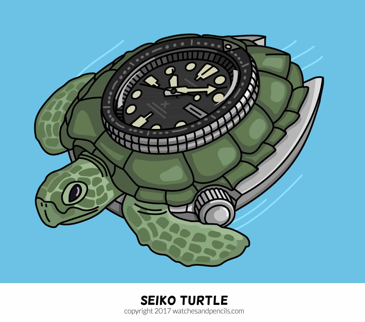
Watches & Pencils #29 – The Seiko Turtle: Legendary Dive Watch

In early 2016 Seiko re-launched their Seiko Turtle with a big wave. In a short time 4 variants splashed in: a black (SRP777), a gilt (SRP775), a blue (SRP773) and a pepsi (SRP779) version (read more here). Later on, some editions were added. For example, the PADI version and the green version. The watch scene embraced the return of the missing turtle, so I decided to dedicate an episode to it. And an illustration:
Ancestor
The big ancestor is the Seiko 6309. To be precise, reference number 6309-7040 or 6309-7049. It replaced the 6105 series in 1976. It was produced for more than 10 years (from 1976 until 1988) and had a almost identical friend (6306-7000, difference: hacking movement and Kanji wheel). The Seiko 6309 was definitely a hit back then.
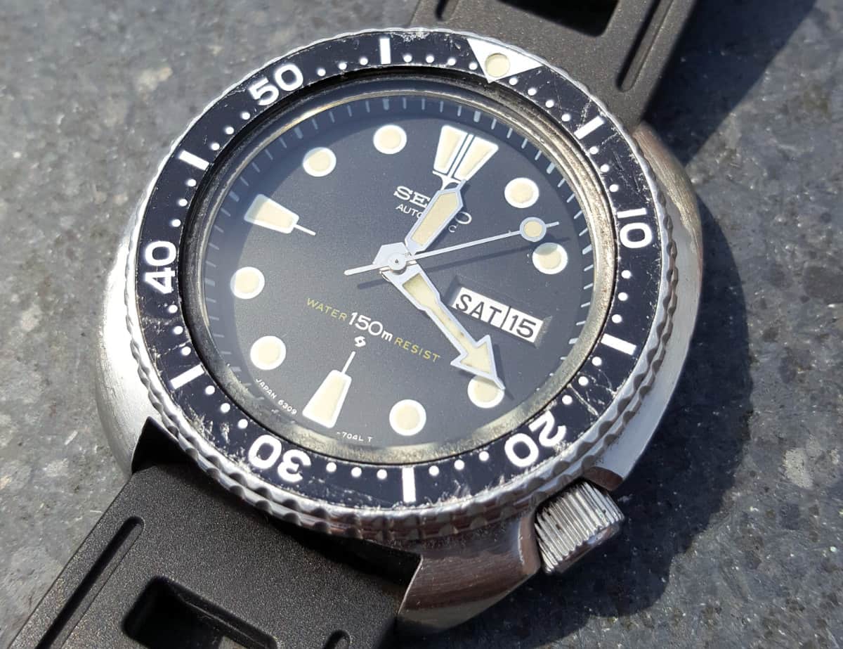
Ancestor of the newer turtle: Seiko 6309-7049 on a newer Isofrane strap
Turtle Eggs
Fast forward to 2016. Seiko decided to bring back the Turtle. A few new turtles were born out of the mother 6309 (here’s a side-by-side comparison of the 6309 and the new SRP777). There are two variants, a Suwa and a non-Suwa dial. As with other vintage Seikos it indicates whether it was produced in the Seiko Suwa factory in Japan. The Suwa-dial was used between approximately 1976 and 1980. Although the core is still the same, there were some changes involved.
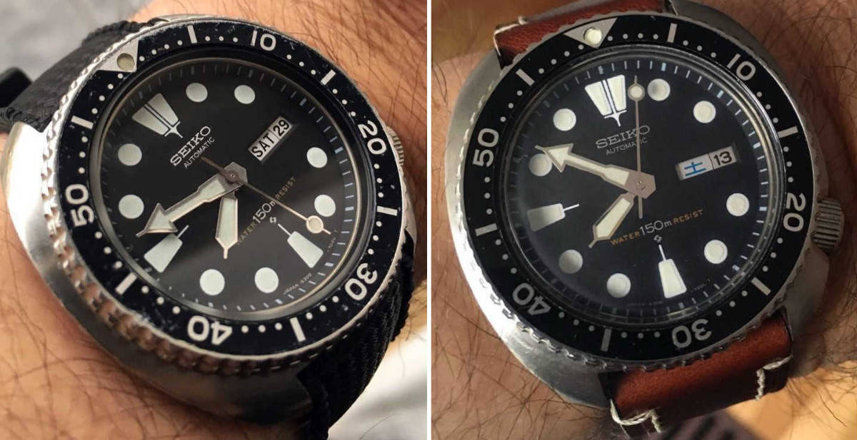
Vintage ‘Turtles’: Seiko 6309-7049 and 6306-7001
Some differences: Seiko 6309 VS Seiko SRP777
Seiko 6309 series |
Seiko SRP777 |
| 13mm thick | 14mm thick |
| Semi-hard rubber/plastic strap | Soft silicon rubber strap |
| Lollipop seconds hand with lollipop on head | Lollipop seconds hand with lollipop on tail |
| 150m water resistance | 200m water resistance (ISO 6425 compliant) |
| Normal lugs | Drilled lugs |
| Seiko 6309 movement: 17 jewel automatic workhorse. It does not hand wind or hack. | Self-winding caliber 4R36 with 24 jewels. It does hand wound and stop seconds. |
Seiko SRP777
Nickname
The name ‘Turtle’ is introduced many years later than the release of the first 6309 series. Just like with many other famous watches it is based on typical properties of the watch. In this case you could say the case of the Seiko ‘Turtle’ looks a bit like a turtle shell. It also is a dive watch. For me as a visual minded person the nickname is a nice hook to remember reference numbers a lot better. Whether you like it or not, the nickname does place an extra layer on top of everything. Personally I think this makes it an even more interesting watch.
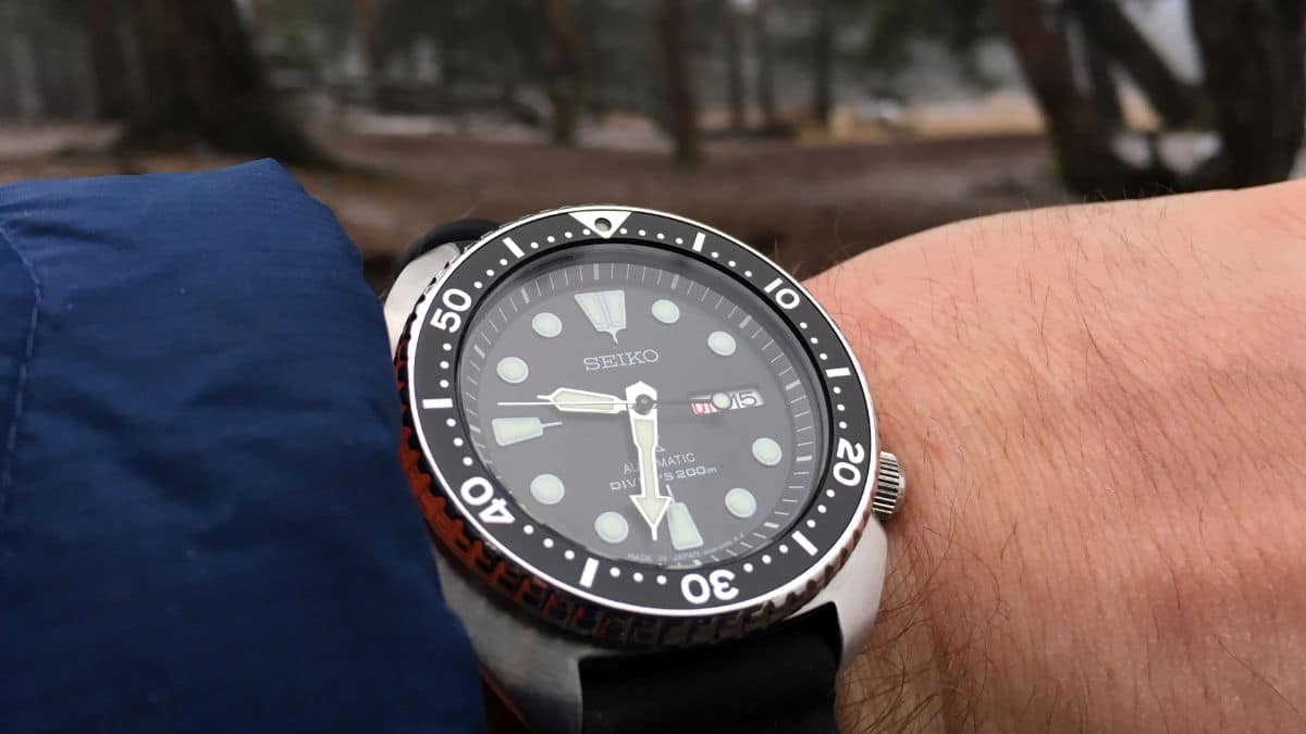
A true toolwatch (PADI edition, reference SRPA21K1 on a custom strap)
Comfortable Tool Watch
Although the turtle is quite a big watch, I’ve never heard anyone complaining about the comfort. It is a smart cushion-shaped case and cleverly designed to sit comfortable on the wrist. With 22mm lugs it is a watch with a lot of possibilities regarding straps.
The turtle is a true tool watch from the very beginning until now. Since it is so well built and affordable there are a lot of people who actually take it for a dive. In essence, the design is subsidiary on this watch, but let’s look at a few nice design elements / details.
Design breakdown
Case
Starting with one of the most remarkable parts: the case. The cushion shaped case has several types of finishing on it. Each defines a part: circular brushing on top of the case, polished sides and straight brushing on the case back. The sharp line separates the top from the side. This has a nice side-effect. It causes the watch to look less massive. The oversized screw down crown sits recessed into the case instead of using crown guards. The combination of this and the 4 o’clock position does provide maximum comfort – relatively speaking in the world of dive watches.
Bezel
Optimal operation of the bezel is guaranteed by the masculine grip. The two rows of ‘sharp teeth’ play nicely with the light and are especially interesting from diagonal viewpoints. The insert is slightly tapered towards the dial, providing better connection with the markers on the dial.
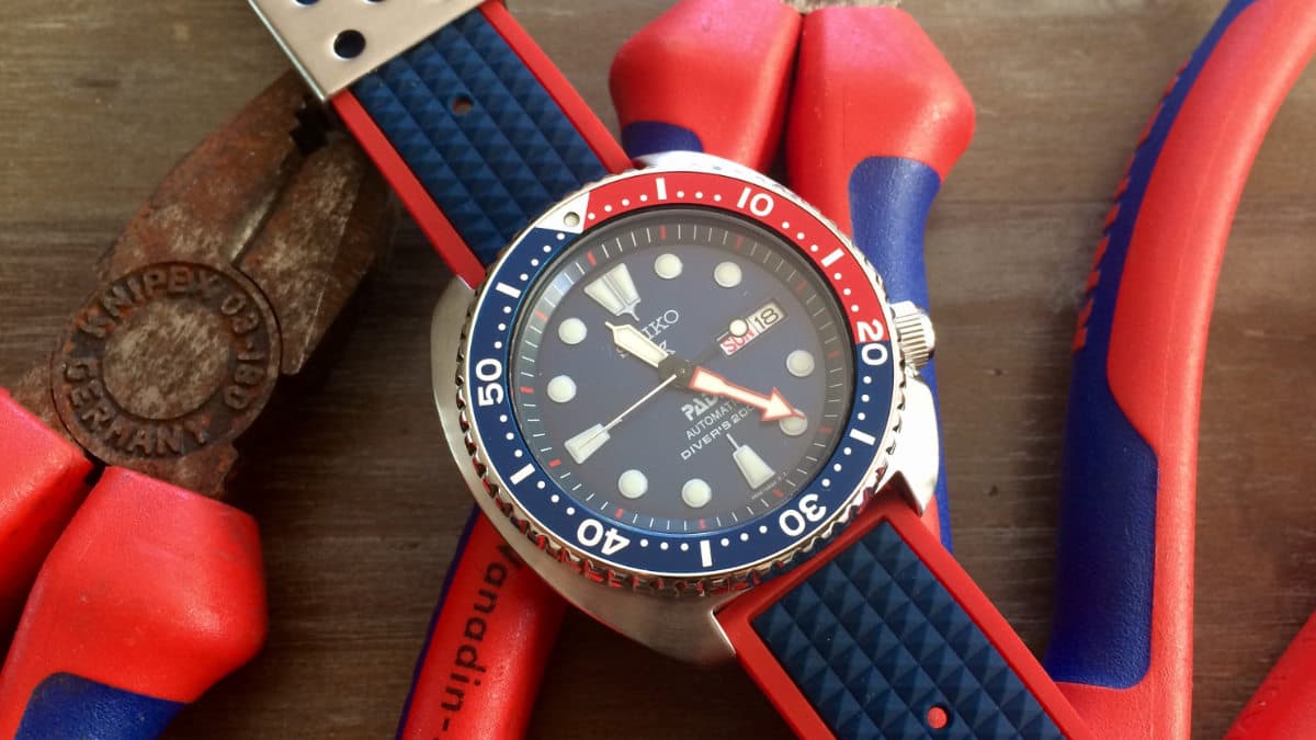
Seiko SRP775 with gilt accents
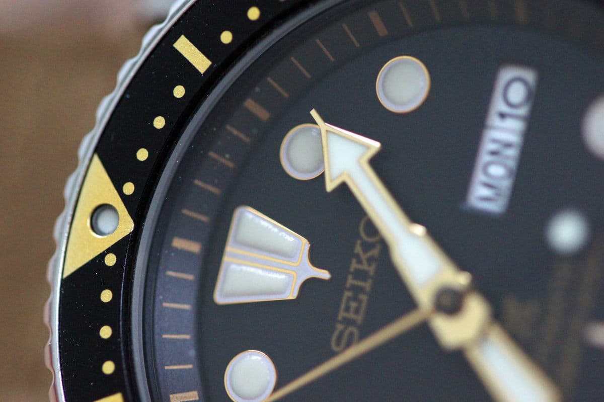
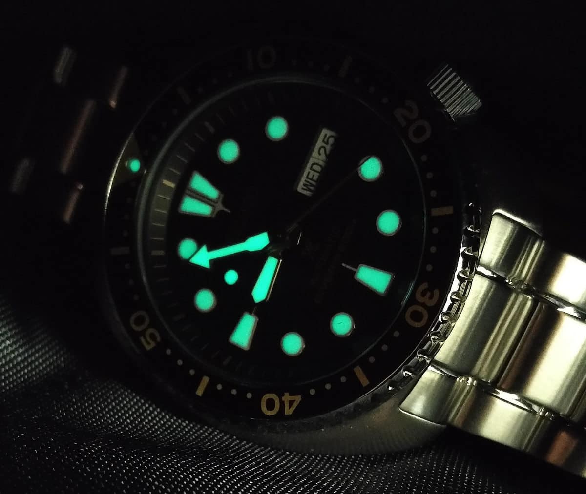
Dial
Depth is created by the outer minute track and the raised hour markers filled with lots of Lumibrite. For me the hour markers are a bit shiny and I do love this aspect on the ancestor (6309 series) a bit more as those markers are more matte. The trapezoid shaped markers at 12, 6 and 9 are a true trademark of Seiko.
Typography is set up nicely and the dial is not too stuffed with it. The day-date window does a nice job in terms of contrast and is a good counterpart too the rest of the big markers. To conclude: the hands are very distinctive, accurate and easy to read. Overall, a remarkable and legible face.
No faux patina
Nowadays almost every brand launches re-issues. Most of the time with creme colored lume, also called ‘faux patina’. This is often applied to create vintage looks. Did you notice that the newer Seiko turtle series is a re-issue without this design choice?
Seiko Turtle Photo Section
Love for the Seiko Turtle: a big fan crowd
To measure the love for this watch I decided to let the new and vintage ‘turtle’ owners send in their pictures and wrist shots. The forum-topic almost exploded within a few hours. It underlined the love for this watch. All the photos in this post are powered by them except for the illustration. A big thanks to everyone who was involved in this!
If you’re interested in the process of creating such an illustration please check out my instagram-account: @watchesandpencils. I often publish sketches and other material for the Watches and Pencils feature on Fratello Watches.