5 More Remarkable Rolex Ads From Days Gone By

Rolex has a rich history of advertising built for decades. The brand has produced some of the most remarkable ads ever created by a watch brand. In this recurring series, we take a look at the most iconic ads Rolex has created over the years.
One of the most exciting and fun things to do when diving into the history of a watch brand is to look at its advertising. Rolex has always been a brand that has created some of the most remarkable ads in the industry, not least because they are connected to outstanding achievements and famous people. Some of the advertisements are stylish, some of them are thought-provoking, and some are blessed with an excellent sense of humor.
All of them represent a certain time. And all of them have this typically self-assured Rolex tone of voice. In this installment of the series, we will dive into five truly vintage ads which the oldest referring back to the climbing of the highest mountain on earth in 1953 and the youngest dating back to 1977, my year of birth. Let’s see what strange and amazing things we could find this time.
1. Official America’s Cup watch since when…?
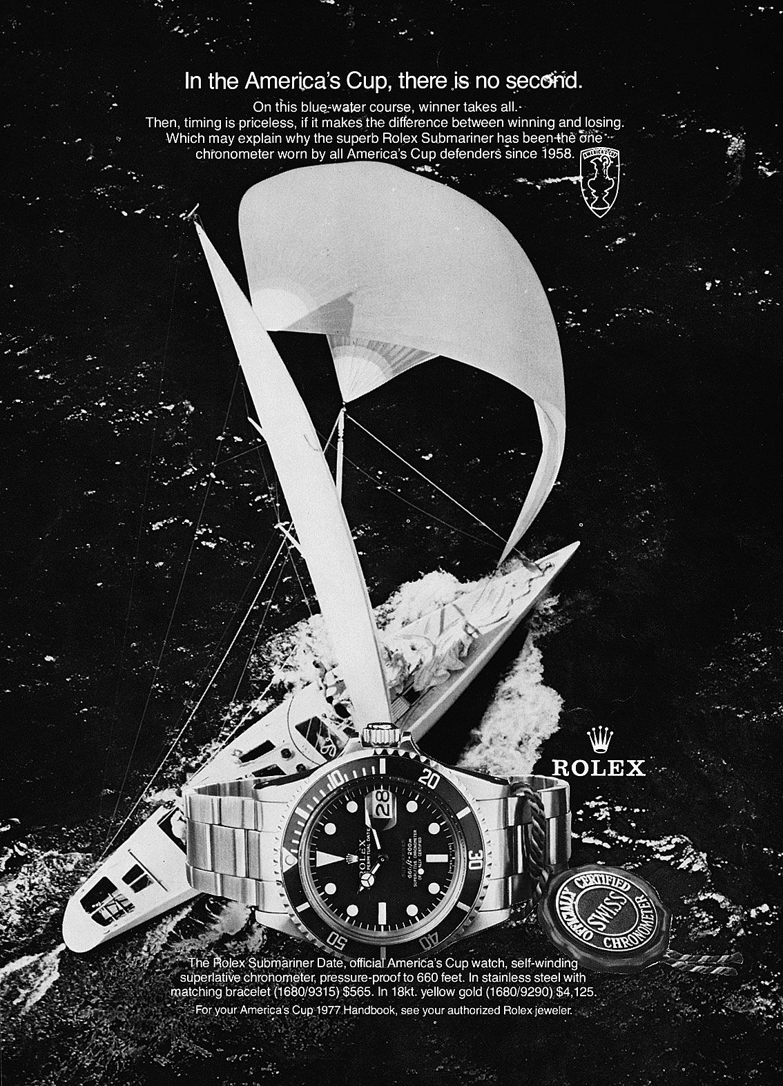
Let’s start this article off with an ad that shows how Rolex excelled during the 1960s and 1970s in creating ads with weirdly placed text and logos. The first thing that caught my eye in this 1977 ad for the Submariner, is the placement of the text. Like in many vintage Rolex ads, it is quite shaky. Starting off at the top, the text is placed ridiculously close to the sail. Worse still is the way the America’s Cup logo is crammed in there at the end of the sentence. The placement, unfortunately, affects the readability of the headline somewhat with “second” being placed on a white crest of foam.
The Rolex logo looks like it’s on its way up to meet the America’s Cup logo
The lower text is also placed weirdly because it covers the bezel of the Submariner. Why would you cover your own product with text? Besides that, it’s safe to say that the placement on top of the image of the boat is not creating the clearest image anyway. One last detail to point out is the Rolex logo. In good Rolex advertising tradition, the Rolex logo is placed in a strange position. It looks like it’s on its way up to meet the America’s Cup logo.
Twisting facts…
Now Rolex was a proud partner of the America’s Cup for years. Over the decades Rolex has created quite a few America’s Cup ads. There is a funny detail with some of these ads. This ad states that “the superb Rolex Submariner has been the one chronometer worn by all America’s Cup defenders since 1958.” If you look up the full-color version of this ad online, you will find one that states, “Rolex. Official America’s Cup watch since 1958.” It’s a slight change in message from what this ad says. And there is another Rolex America’s Cup that can be found online with a different image, but the same Rolex Submariner ref. 1680 “Red Sub”. That ad states “Rolex, the official America’s Cup watch since 1962.” It seems as if Rolex was twisting facts back in the seventies.
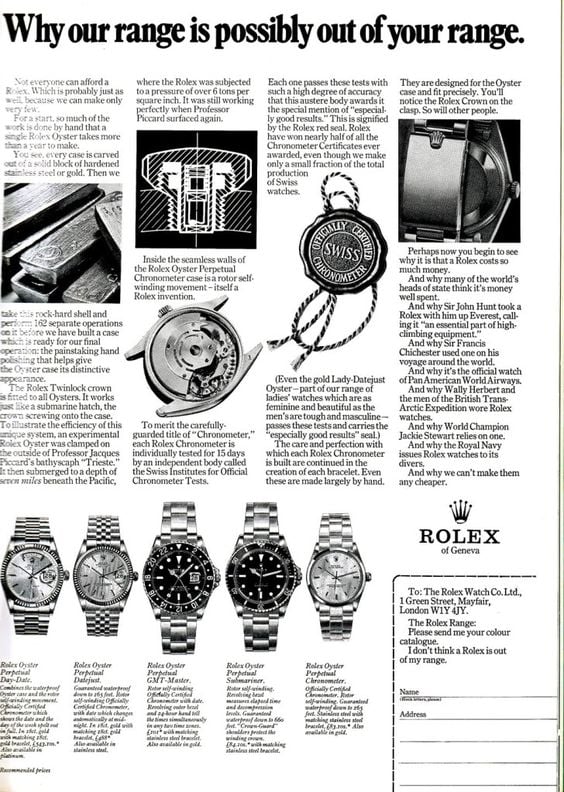
2. We can’t make them any cheaper
The second ad is a great example of the self-assured tone of voice Rolex ads are known for. You could easily say it’s on the edge of arrogant to state you are only for the happy few that can afford it. But the ad backs that claim up by summing up what makes Rolex watches so exclusive and innovative and therefore costs a lot of money. And let’s be honest, the brand has defined a lot of the industry standards as you can read in the ad. We have to give the brand credit for that.
Another nice detail about the ad is that you can see five different Rolex models in one ad.
Oddly, the bracelet is mentioned. More specifically the Rolex crown on the clasp: “You will notice the Rolex crown on the clasp. So will other people.” Although factually true, my guess is people will see the Rolex crown on the dial a lot sooner than the one on the clasp. Another nice detail about the ad is that you can see five different Rolex models in one ad. It’s something that doesn’t happen too often. And it’s more impressive to see that all five of these models are still part of the current Rolex collection and haven’t changed in appearance a great deal.
Rolex can’t make them any cheaper
Which had me checking from what year the ad could be. The easiest answer to that was not in the displayed watches but in the last piece of text. It states “World Champion Jackie Stewart” which he became for the first time in 1969. It mentions Wally Herbert and the men of the British Trans-Arctic Expedition, an expedition that took place from 1968 to 1969. And lastly, Sir Francis Chichester who circumnavigated the globe from 1966 to 1967. So my guess is the ad has to be from either 1969 or 1970. Sometimes it’s great to see not that much has changed in five decades and then you understand why Rolex can’t make them any cheaper.
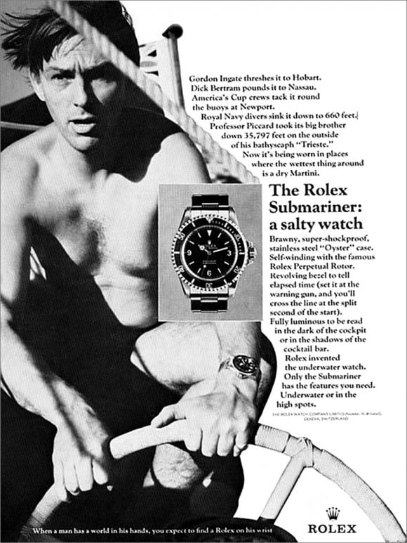
3. Gordon Ingate or Dick Bertram?
This next ad from 1966 is also part of the rich collection of quirky Rolex ads that has a lot going on. But whose face are we looking at and why is half of the image gone? A quick bit of research quickly showed that it’s not Gordon Ingate in the picture but Richard “Dick” Bertram. Dick Bertram was a famous champion sailor of powerboats and a leading boat builder from Miami. The now-famous Miami-Nassau powerboat race was the brainchild of Bertram and race car promoter Capt. Sherman “Red” Crise. Bertram won the 184-mile long Miami-Nassau Race a number of times in the early 1960s and that’s why the ad is referring to him “pounding his Rolex on the way to Nassau.”
But we see only half of the picture Bertram is part of. Obviously, for the ad, it’s sufficient because we see his Rolex Submariner in the picture but cutting off half the image? Yes, it was done to make room for the text of the ad but what’s up with how the text is placed? It’s placed following the shapes of the cut-off image and makes for a shaky read.
The Submariner with an Explorer dial
To my surprise, the Rolex Submariner with the Explorer dial (ref. 5513) is placed on top of the image instead of in the white part where it would have stood out more. But at least it’s in the middle of the ad so it does take center stage. It’s fun to see the Submariner with an Explorer dial in an ad as it was only produced from 1962-1965 and have become highly sought after by Rolex collectors.
“Now it’s being worn in places where the wettest thing around is a dry martini.”
The best part of the ad for me is the text. After stating that a number of highly respected men have tested the Submariner successfully, the ad goes on to say, “Now it’s being worn in places where the wettest thing around is a dry martini.” You gotta love that. And the next line is also a winner: “The Rolex Submariner: a salty watch.” Back in the sixties, this line referred to the toughness of the Submariner. Nowadays it could have multiple meanings with “salty” meaning more than tough. But the line at the bottom of the ad is the winner for me as it is simply a beautiful sentence for the Rolex brand. “When a man has a world in his hands, you expect to find a Rolex on his wrist.” Says it all. Horrible layout; great ad!
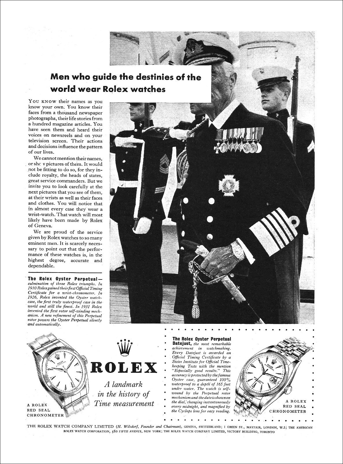
4. Rolex, masters of DIY art
This next ad is part of a series of ads that have become iconic and widely loved amongst Rolex fans. This series of “Men who guide the destinies of the world” ads and the “You’d wear A Rolex” series are in my opinion the best ads that Rolex has ever created. Both series have been created with a clear concept in mind and the execution in both images and words makes them stand out, even now, decades later.
There is something rebellious and DIY about the look of the ads
Explaining the ad would be useless really. Just read the text of the ad and you will know all there is to know. All the ads in this series feature great staged images of highly influential people that wear a Rolex and whose faces have been covered or are at least invisible. The first ads in the series were published in 1957 and this specific ad is from 1958. Rolex ran the series until 1960 and published a revamped version of the ads in 1964. Those were less iconic and badly executed if you ask me. What I like about these first ads is that they are almost punk avant la lettre. There is something rebellious and DIY about the look of the ads that I really love.
It’s messy
Does it make the ad perfectly executed? Of course not. It’s a Rolex ad. Just look at the way the Oyster Perpetual and the Oyster Perpetual Datejust and the product text are placed in the ad. The Oyster Perpetual text is close to the commercial text only separated by a black line. The Datejust and its product text are placed in a dotted rectangular shape and the logo is pretty close to the image of the Oyster Perpetual. Once again it’s messy. But I wouldn’t want it any other way. Especially because in these series everything looks quite DIY. It’s what makes them iconic.
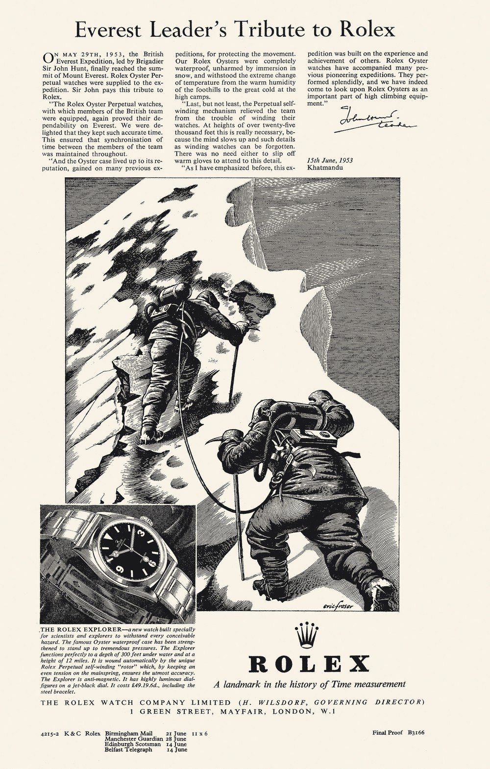
5. The ultimate Rolex ad
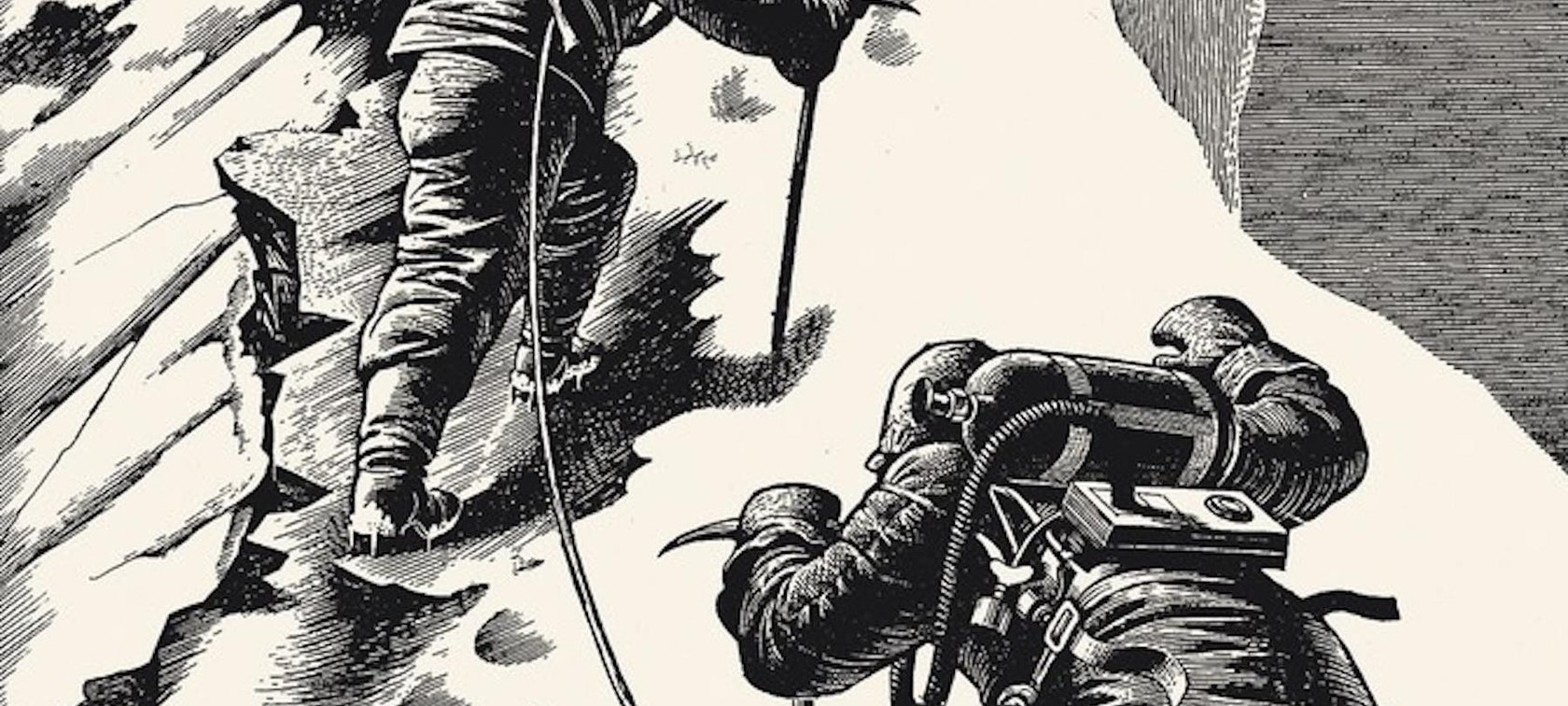
The last ad in this article is from 1953. It looks more like an advertorial than a regular ad. I have to say, this probably is one of my favorite Rolex ads ever. Why? The style, the craftsmanship, the Rolex Explorer ref. 6150, and of course the story. And with the story I mean, the story of the text and especially the image. The drawing perfectly tells the story of Hillary and Norgay pushing for the summit of Everest. They have just climbed what later became known as the Hillary Step and were conquering the last 300 vertical feet (90m) to the Summit. You can feel both men pushing as hard as they can, moments before becoming the first (confirmed) human beings to summit Mount Everest on May 29th, 1953.
The image was created by the legendary British illustrator and graphic designer Eric Fraser
The image was created by the legendary British illustrator and graphic designer Eric Fraser. Fraser was known for his perfect use of line and stipple to create something truly magical. They could have not chosen a better illustrator to bring this story to life in the newspapers. And I say papers because you can see this ad was planned to be printed in four different newspapers. We are actually looking at the final print proof before printing the ad in the Birmingham Mail, Machester Guardian, Edinburgh Scotsman, and Belfast Telegraph.
The summit of Everest
Hillary and Norgay were on the summit of Everest on the 29th of May. Amazingly, this ad was ready to be printed on the 14th of June in Edinburgh and Belfast. So a little over two weeks after both men stood on top of the world, this ad went to press. It sounds like quite an accomplishment for that time.
The testimonial Sir John Hunt wrote is the perfect ad in itself. He vividly explains what makes the modified Rolex Oyster Perpetuals they wore so special. As we know, this is not the watch in the picture. Rolex already registered the “Explorer” patent on January 26th, 1953. The conquering of Mount Everest was the perfect moment to introduce the all-new Rolex Explorer. The Explorer we see in the image is a ref. 6150 with “Rolex Oyster Perpetual” printed on the upper part and “Precision” on the lower part of the dial.
Rolex Explorer legacy
This ad is the start of the Rolex Explorer legacy, which was inspired by one of the greatest human achievements ever. The fact that it tells that great story, brought to life by the stunning artwork by Eric Fraser, makes this my favorite Rolex ad out there.
Thus concludes our fifth list of remarkable Rolex ads. Let us know if there are any unusual Rolex ads that you’d like us to look into.
More information about Rolex on their official website.
*Some ads used from these sources can be traced back to Rolex Magazine, a website dedicated to this brand. I sourced the others from Pinterest.