Hands-On With The Hamilton Intra-Matic Auto Chrono Watch

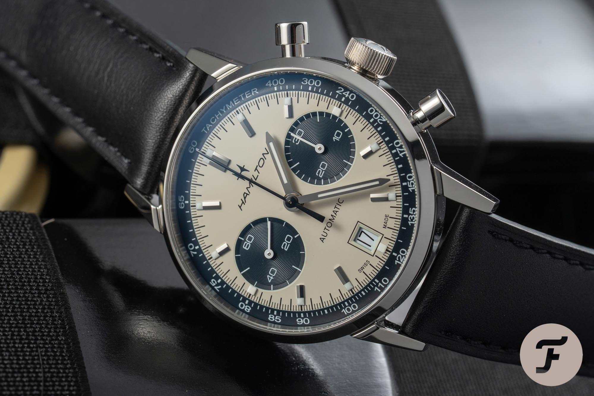
The panda dial is without question one of the most iconic dial color configurations out there. But although slapping two black sub-registers on a white dial might make it a panda dial, it doesn’t necessarily make it a great one. One of the brands that perfectly understood that is Hamilton. The Hamilton Intra-Matic Auto Chrono is the perfect example of a panda dial done very well. I got the opportunity to go hands-on with it and experience what it is that makes this model such an attractive piece.
There is something magical about the high contrast black and white dial that gives the panda dial its wide appeal. It’s a stylish statement like a mobster’s black shoes with white spats. But as with any stylish statement, there is a right and a wrong way to do it. The Hamilton Intra-Matic Auto Chrono shows us the right way of doing it. With previous coverage of the watch on Fratello focusing on specs and technical details, it’s time to look at this piece from a design perspective.
The proportions of a panda dial
The keyword for me when it comes to the dial of a chronograph is balance. If the balance of the elements is weird, it can mean rejection within a matter of seconds. And the challenging job of a watch designer doesn’t get any more comfortable with a panda dial. If anything, the chances of failure are, thanks to the unforgiving contrast in play, increased.
The stark color of white and black magnifies the impact of every element. The sympathetic layout and sizing of every element are crucial for a great panda dial. If the balance is off on those, you can try and mask the lay-out with other elements, but it won’t hide what the fundamental problem is.
I often struggle with bicompax chronographs.
The number of sub-registers on the dial also affects size and placement. I prefer three sub-registers placed at the 3, 6, and 9 o’clock position. I often struggle with bicompax chronographs. To my eye, the problem emerges in one of two major ways. Either the dial, lacking that all-important third register, looks imbalanced, or because the bottom half of the dial looks painfully bare.
A watch with a history
After wearing the Intra-Matic Auto Chrono for quite a while, I can honestly say that none of these problems ever popped up this time. And it’s all because of several smart design elements that have their roots in the late 1960s. As Balazs explained in 2018 in his introduction article on the Intra-Matic Auto Chrono “Panda”, it is based on several Hamilton chronographs from the end of the 20th century’s most-swinging decade. In 1968, Hamilton introduced the Chronograph A, followed a year later by the Caliber 11-powered Chrono-matic. Both chronographs served as the inspiration for the Intra-Matic Auto Chrono.
The Intra-Matic Auto Chrono’s dial
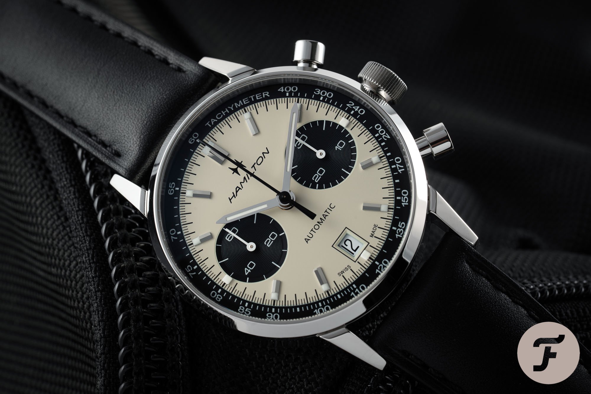
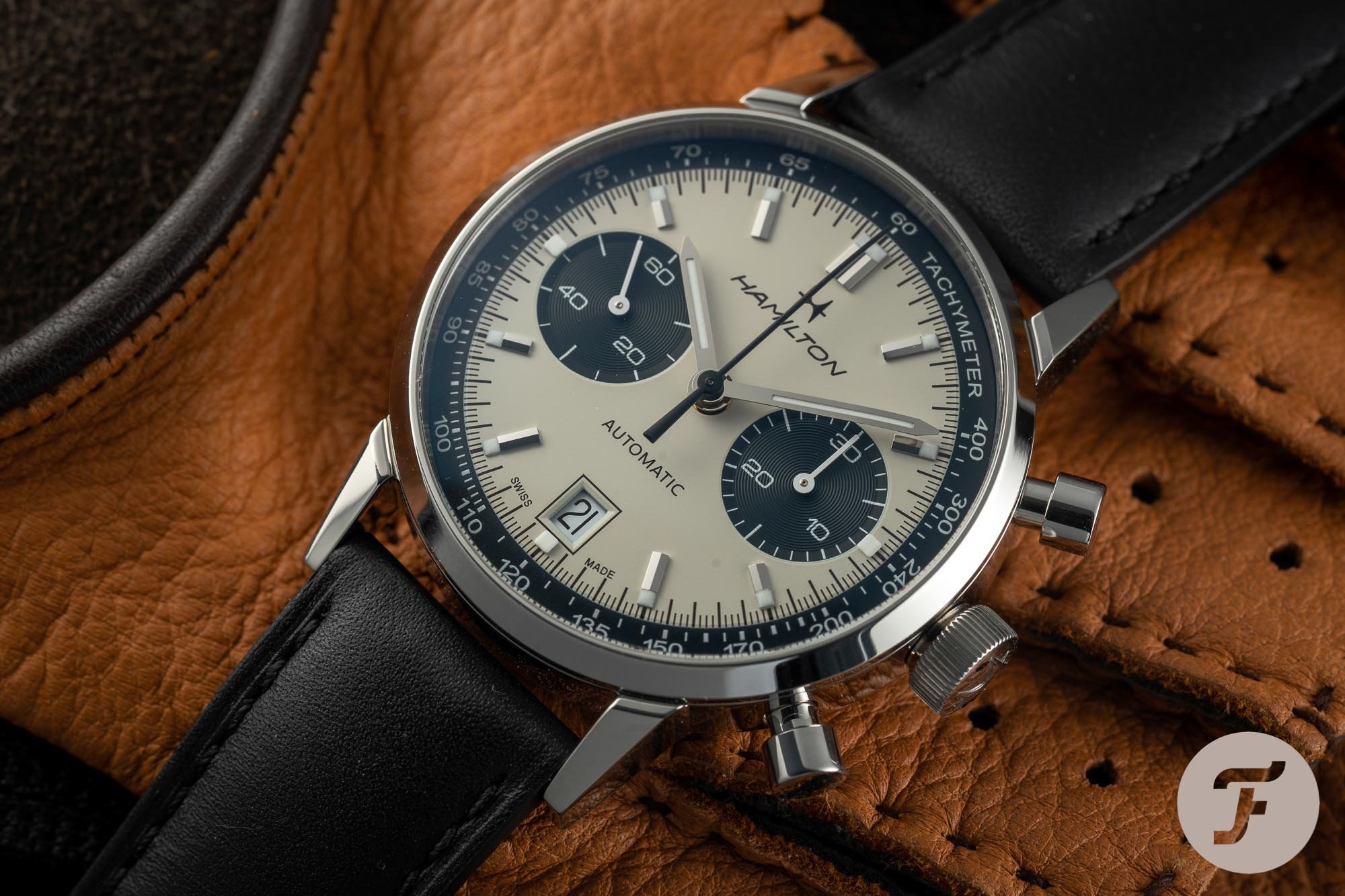
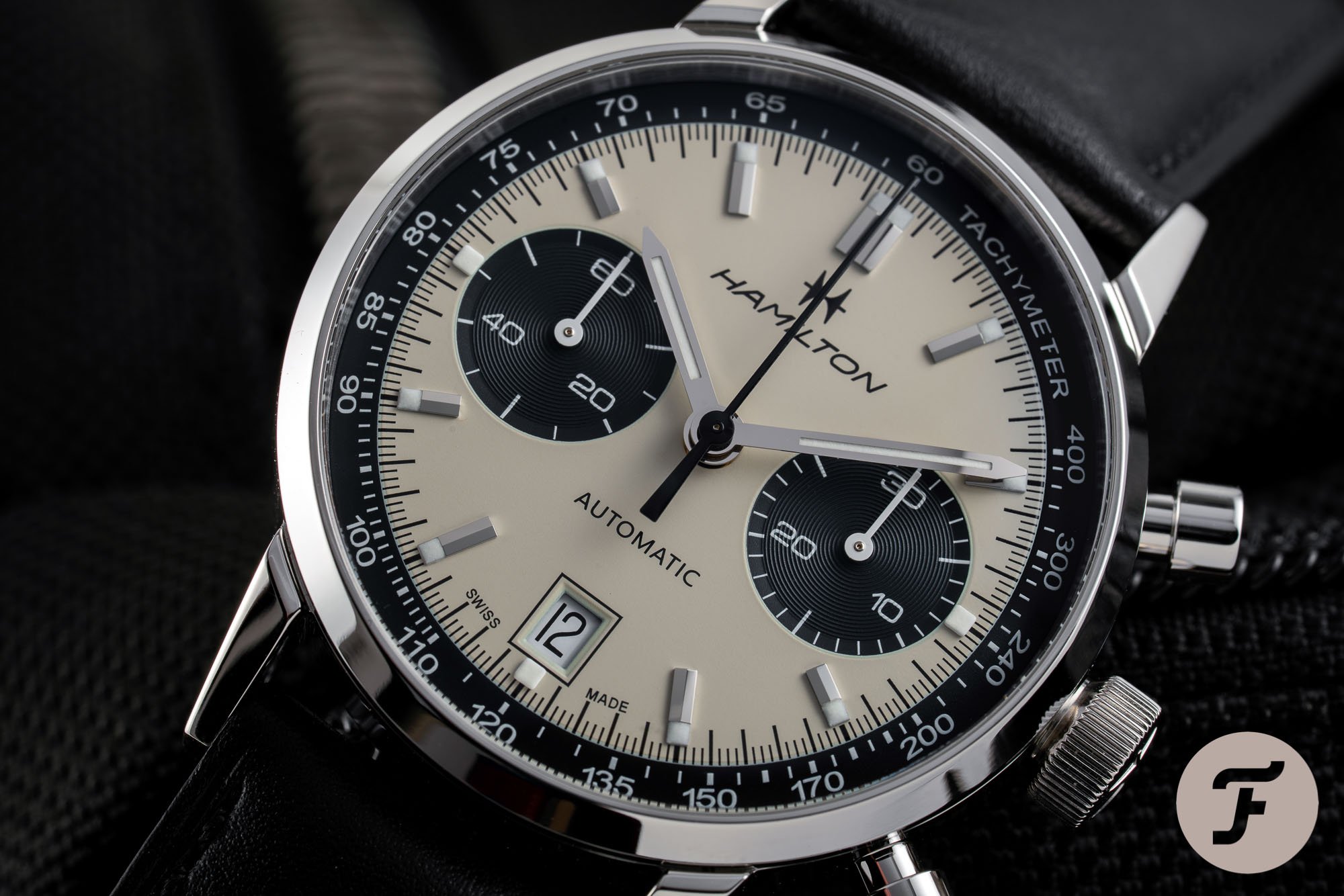
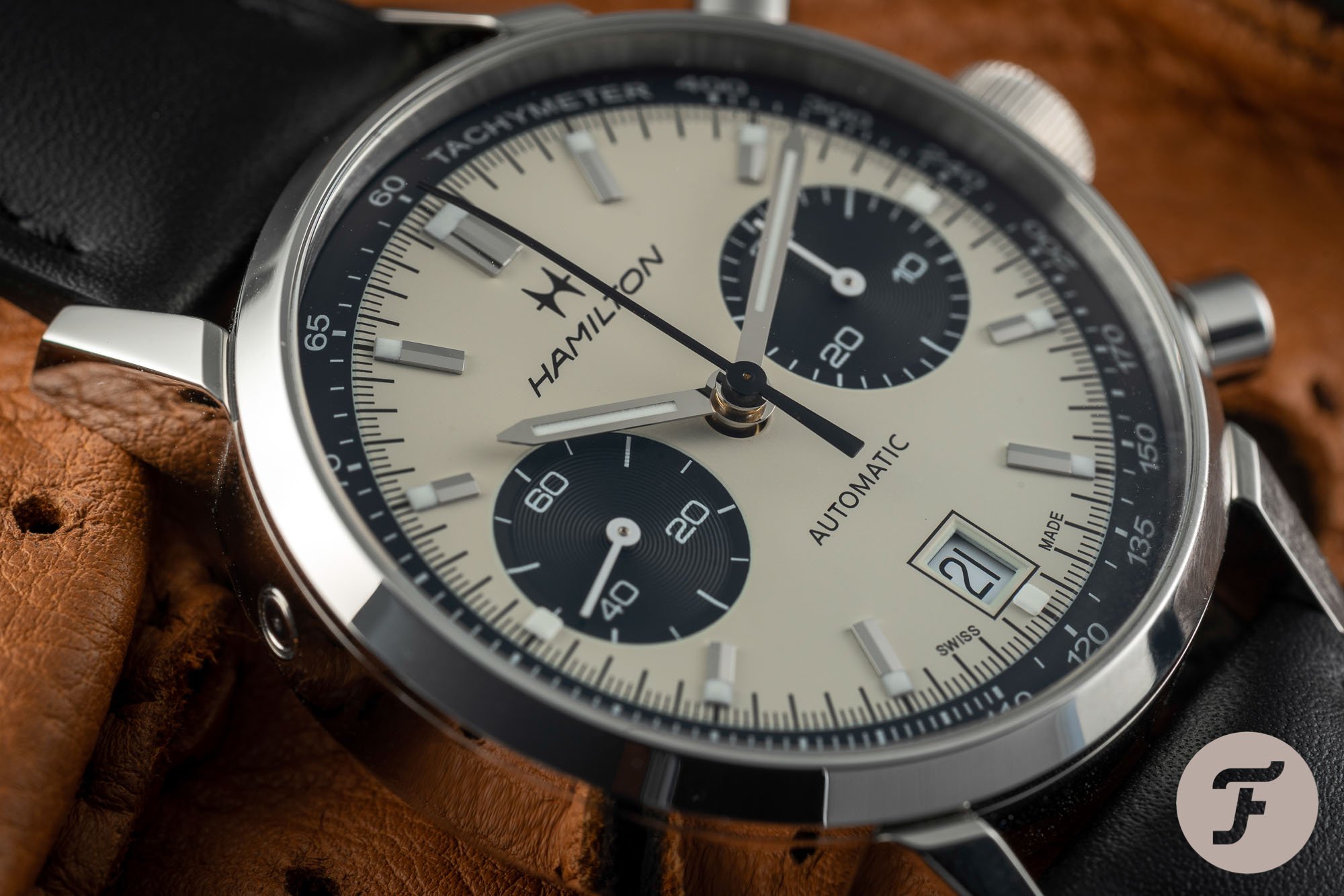
First off, the placement and size of the sub-registers are perfect. Their size fits the overall dial size, and they are neatly placed in between the 2 and 4 o’clock markers on the right and 8 and 10 o’clock markers on the left side of the dial. As a result, they do not interrupt or intersect any other dial markers. Consequently, the sub-dials look calm in their setting.
The black outer ring is the key element that makes this panda dial even more attractive.
The next smart thing is that the hour markers are made out of two parts. They are made partly of applied markers with two facets and a small lumed part. By leaving the lumed part of the 3 and 9 o’clock markers, the 12 -hour scale stays intact. The 1960s models did not have that, and I think it’s these changes that make the modern dial even better than the forerunners.
Another thing that I like on an excellent panda dial is the black outer ring framing the dial with the tachymeter scale printed on it. The outer ring — slightly sloping on the edges — is the critical element that makes this panda dial even more attractive. It adds an extra visual spark, and it helps out tying together all the elements.
The success is in the details
One final standout design element I want to discuss is the date window. On the 1969 Chrono-matic, the date disc was black with white printing. For the current Intra-Matic Auto Chrono, Hamilton chose to go for a white date disc with black printing. Some enthusiasts would have preferred the historically accurate version, and I understand that. But I prefer this current version.
The black outline around the date window is another one of those small but important design elements.
Although I don’t mind the black date disc on the Chrono-matic from 1969, for this watch, this might be one black element too many. There is enough contrast with the off-white dial. Next to that, the date window is highlighted by a black outline. This black outline — also part of the 1969 original — is another one of those small but essential elements. It prevents the lower part from becoming boring and puts just enough emphasis on the date aperture. The white sub-register hands and lume (along with the Tachymeter scale printing) ensure the white date wheel background integrates with the ecru center dial.
And there are quite a lot more elements that make this a great panda dial. From the timeless typography to the perfect size of the logo, Hamilton did a great job optimizing the dial of the Intra-Matic Auto Chrono. The result is a dial that is a stunner on your wrist with all the elements perfectly in sync.
The design does not only work for a black and white panda configuration, by the way. Robert-Jan did an in-depth review of the equally beautiful blue and white version of the Intra-Matic Auto Chrono here. If a panda dial is not your thing, don’t rule out the Intra-Matic Auto Chrono all together.
Wearing the Intra-Matic Auto Chrono
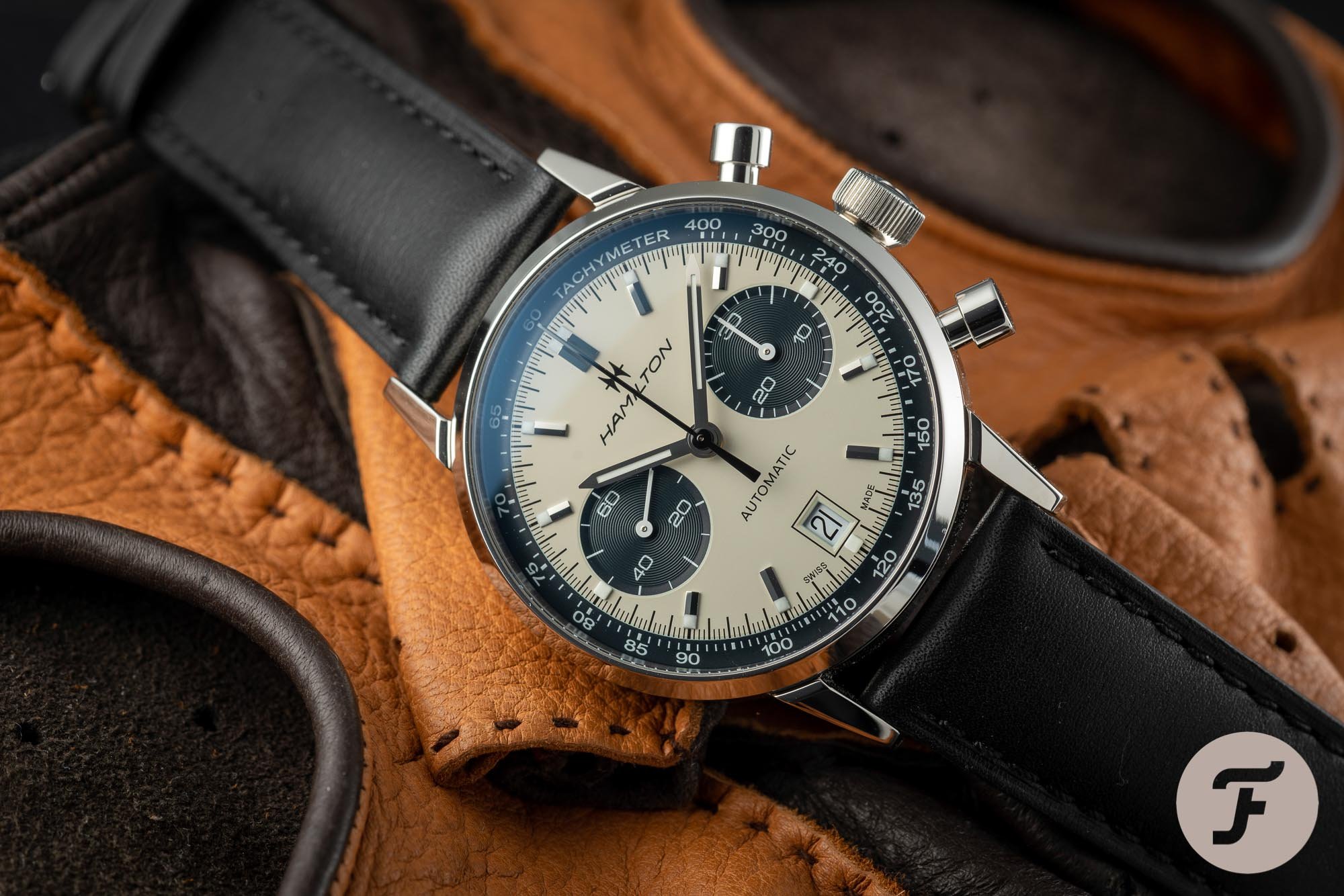
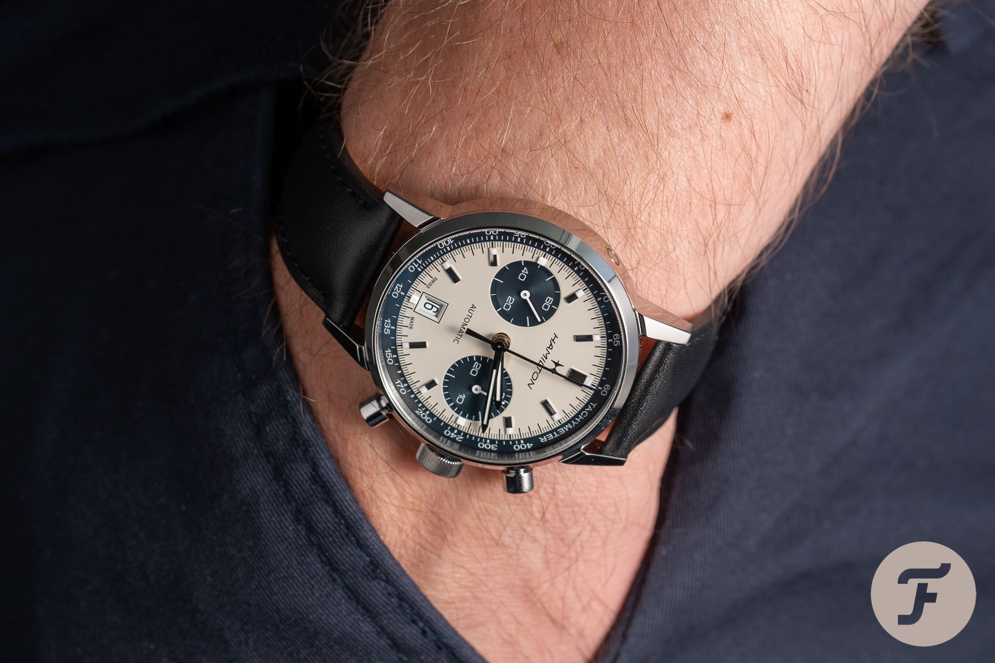
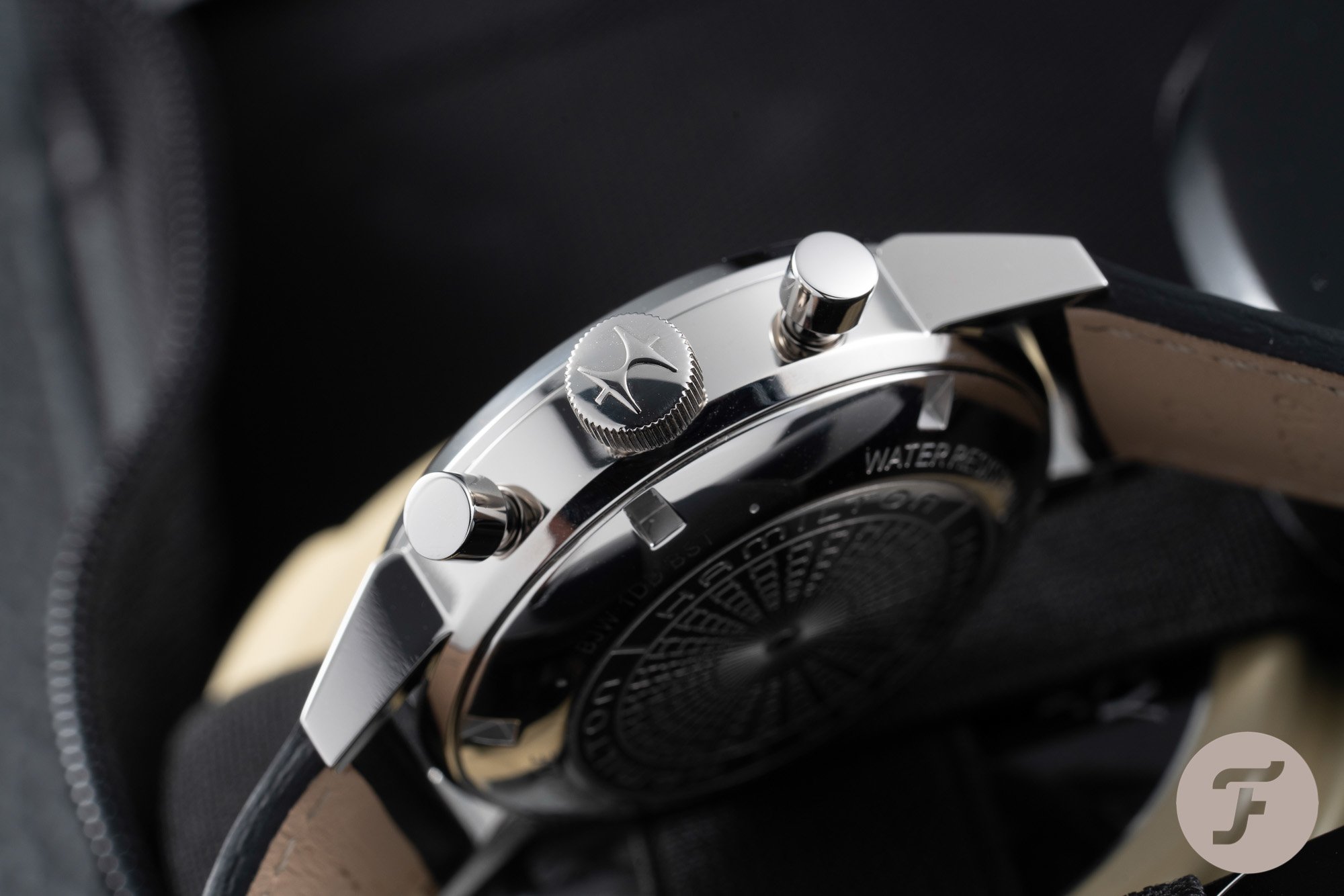
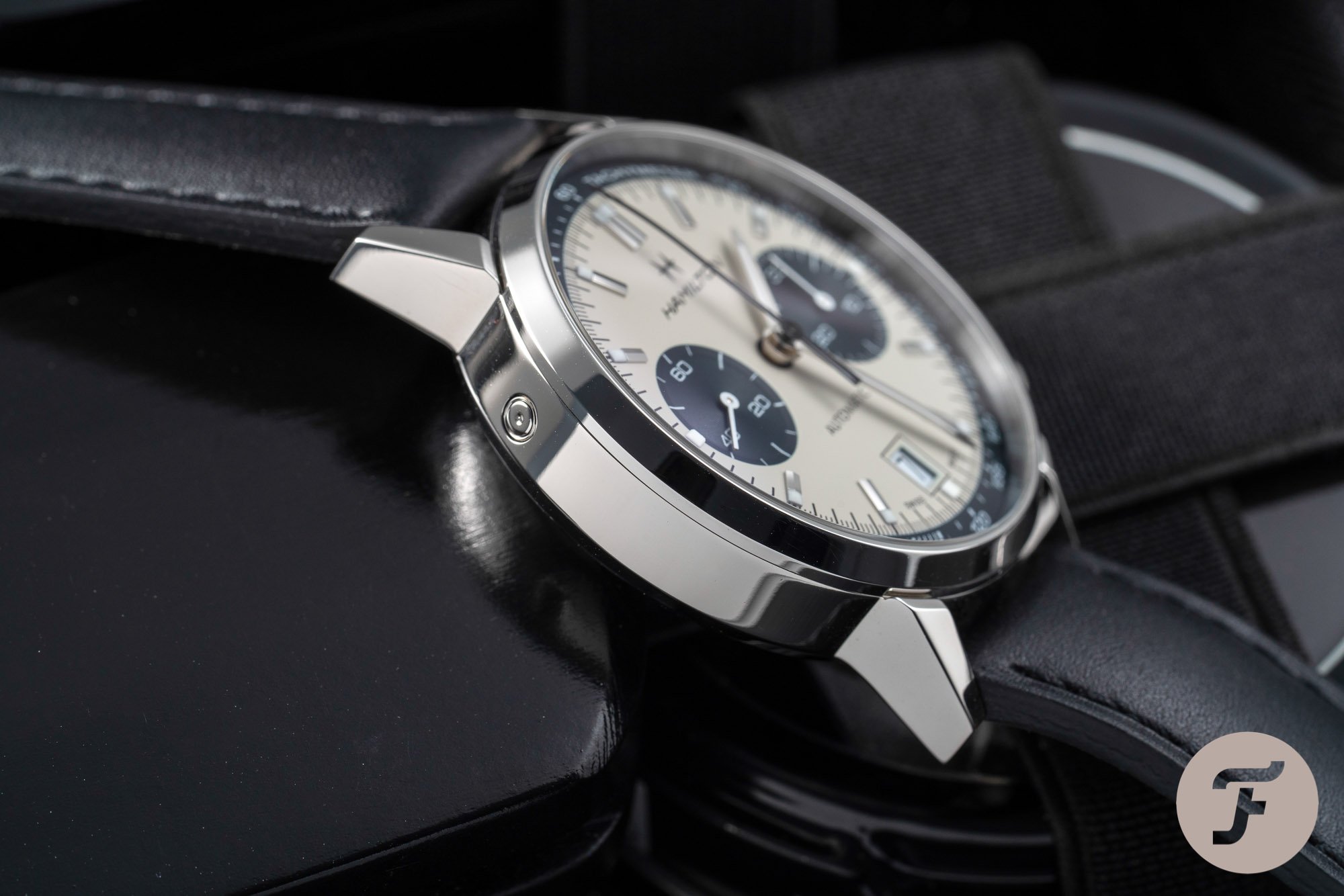
The first thing that stands out when putting the watch on your wrist is its wrist presence. And it’s not just limited to the dial. It’s a combination of the 40mm round-shaped case with the characteristic long pump pushers, the big crown, and the panda dial. The fact that the case is fully polished certainly adds to its presence.
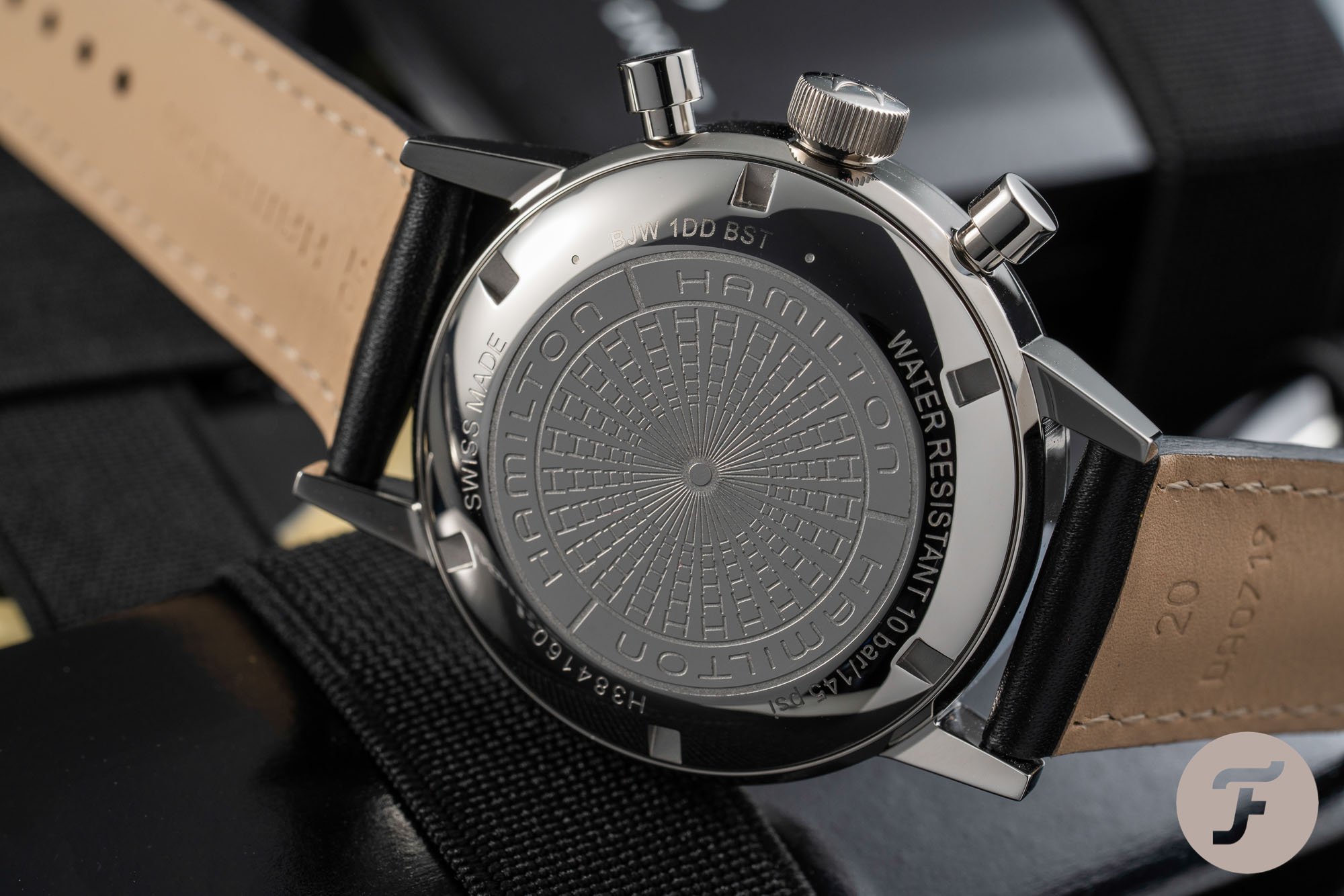
On the size of the pushers, in all honesty, I had to get used to their length. I don’t like it when pushers are too long and start to become unwanted “tentacles” that create an overall imbalance. After wearing the watch for a couple of days, the feeling slowly disappeared, and I started enjoying the watch’s aesthetic more and more.
In 2017 Hamilton introduced the 42mm Intra-Matic 68 Chrono that Michael wrote about here. Ever since its size was announced, it has been an issue for people. Especially compared to the 36mm original, many thought it was pure blasphemy to create an “oversized” rendition of the original.
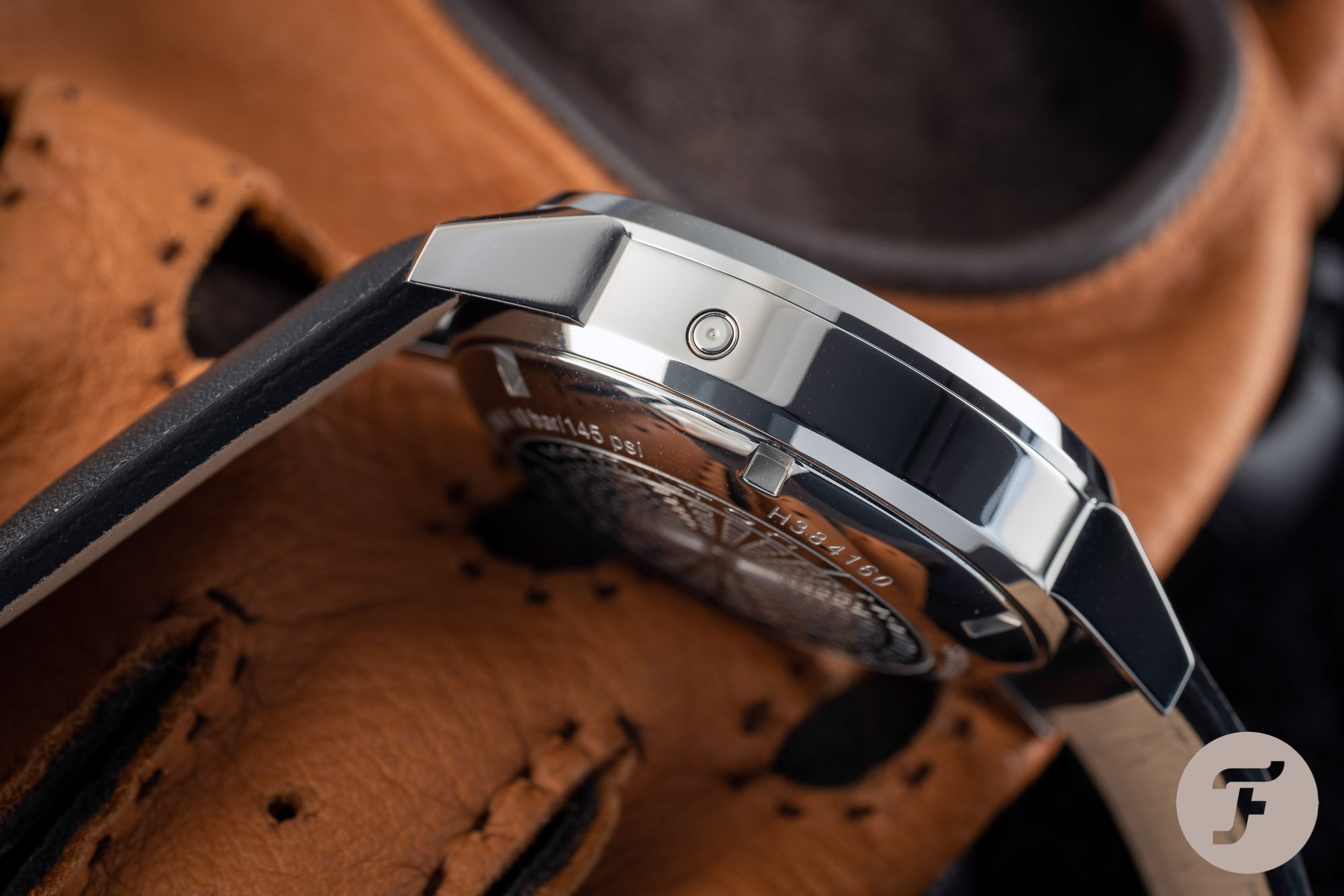
Although 42mm is not excessively large at all, I am glad Hamilton chose to go for 40mm for the current Intra-Matic Auto Chrono. Lately, I have started to like watches with a smaller case size increasingly. This watch is no exception. And the lug-to-lug size of 49mm makes sure it’s not too small to wear, making it the perfect size for my wrist.
On the comfortable black leather strap the watch never felt too heavy or out of balance.
Another thing I like is its 14.7mm thickness. While making it too bulky for some, for me it’s perfect. On the comfortable black leather strap, it comes with, it never felt too heavy or out of balance. And it adds enough mass to comfortably operate the pushers that have a pleasant and robust click upon operation.
Hamilton Calibre H-31
The watch’s thickness is caused by the Hamilton Calibre H-31, a movement that is based on the ETA 7753 chronograph movement. Hamilton increased the power reserve from 42 hours to 60 hours by using a different mainspring, modifying the entire gear train between the barrel and the escapement, and the escapement itself.
Those are all significant upgrades to the ETA 7753. They elevate a standard workhorse movement to a much better one. The only impractical feature of the movement is setting the date. It’s done with the small corrector in the case band at 10 o’clock. But you get used it quite quickly, to be honest.
If there is one thing about Valjoux 7753 movements that stands out on my wrist, it’s that famous wobbling effect. Because the movement only winds clockwise, it causes the movement to have a free spin in the other direction. I don’t mind it all, and I sometimes give it a little spin on purpose with a flick of the wrist. It’s these small interactions with a watch that make it come to life.
That dial, though
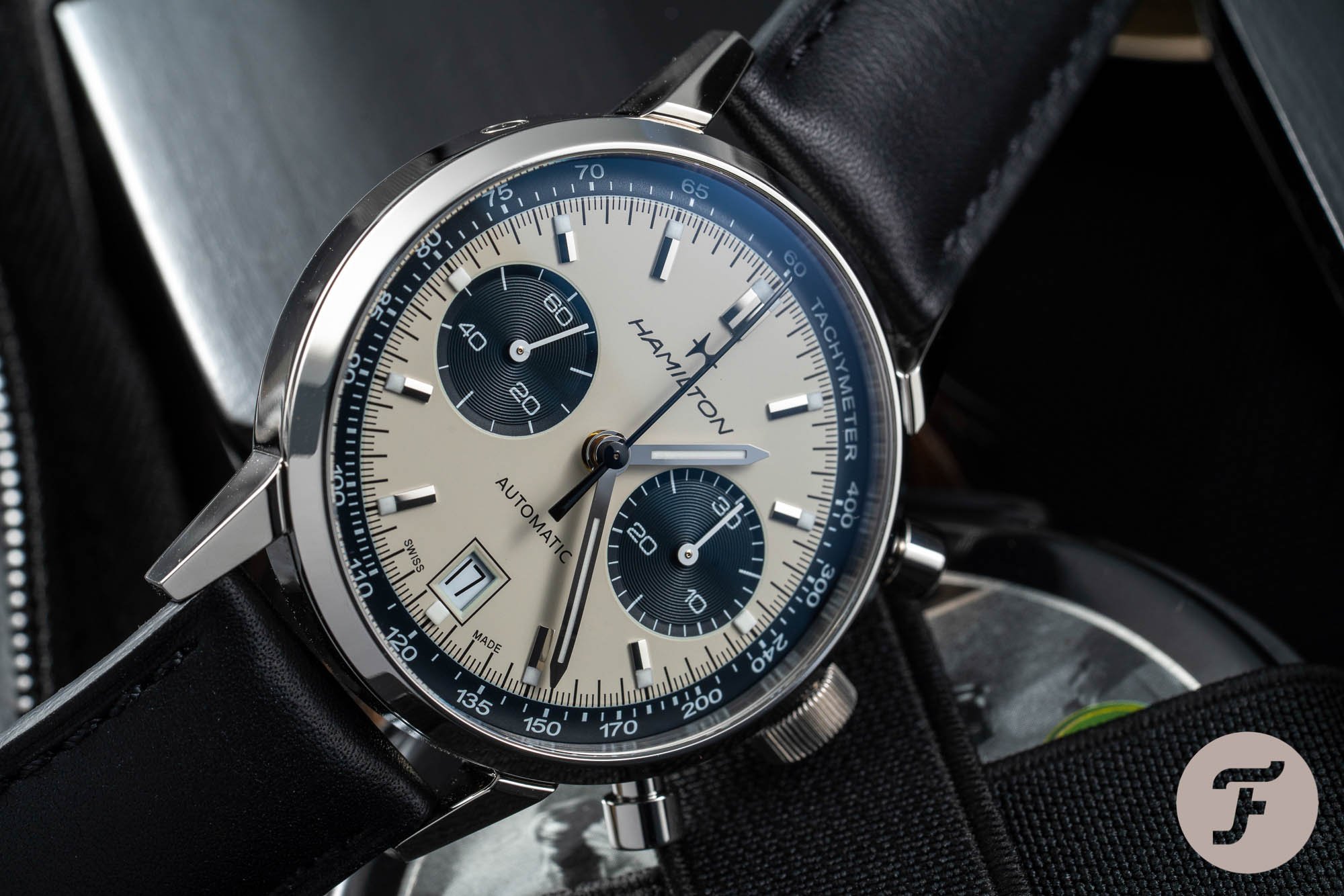
But the overall element that brings this Intra-Matic Auto Chrono to life is the face of the watch. The panda dial is not only well balanced in design, but it is also very easy-to-read. The straight nickelled hour and minute hands filled with Super-LumiNova stand out perfectly.
The sub-dial hands are coated with white lacquer for perfect readability against the black sub-dials. But my favorite is the black lacquered chronograph hand. It creates an ideal balance of contrast against the off-white background and blending in with the other black elements.
Overall, I have to say I quickly became a big fan of the Hamilton Intra-Matic Auto Chrono. At first, I had my doubts about some of the details like the fully polished case and the length of the pump pushers. But those doubts quickly disappeared after wearing the watch for a couple of days on end. After that, the beautifully designed and executed dial takes center stage.
With a list price of €1,995, the Hamilton Intra-Matic Auto Chrono is hard to beat. There aren’t that many chronographs for that kind of money that combine exceptional looks, with a good movement, and the history to make the story of the watch complete. After wearing the Intra-Matic Auto Chrono for a more extended period, I can only say that at this price, it is an incredible buy.
We have added the Hamilton Intra-Matic Auto Chrono to the Fratello Shop, click here.