Watches & Pencils #11 – Submariner: Name & Typography

Today we talk about the most famous submarine in the world: the Rolex Submariner (find our historical Sub overview here). Besides the impressive machinery and all its revolutions through time there are a lot of visual aspects to point out. In this article the focus will be on the naming, dial and typography of this ‘U-boat’.
Wilsdorf the Artist
Being obsessed by visual perfection, the open-minded Rolex founder Hans Wilsdorf is quite a hero for many watch collectors. Myself included. He understood that for optimal marketing, every detail counted. For example, when he invented the name ‘Rolex’. He said:
“I tried combining the letters of the alphabet in every possible way. This gave me some hundred names, but none of them felt quite right. One morning, while riding on the upper deck of a horse-drawn omnibus along Cheapside in the City of London, a genie whispered ‘Rolex’ in my ear.” (source: Rolex.com)
He wanted to create a name that was easy to pronounce and sounding the same in every language. When we look at the name ‘Submariner’, it also commits to Wilsdorf’s conditions. Strong, adventurous, technical and aquatic are directly bubbling up in our brains when most of us think of the name. Mainly because it is so related to ‘submarine’, of course. Together with the short but strong visual appearance, naming one of the most iconic watches ‘Submariner’ definitely is one of the cornerstones for the enormous success.
Anonymous Start
When you invest in the history of the model you will notice that around 1953 the first batch of Submariners (e.g. reference number 6205) did not have the name ‘Submariner’ on the dial. It was added a little later. Probably to highlight this fantastic name even more and expand the recognition of this name. Smart move Rolex.
Right Timing
Let me clarify why the name ‘Submariner’ is quite smart from another perspective. When the first Submariner was launched it suited its highly ‘exploring’ time period like a perfect tailor-made suit. At that time, many submarines were exploring the deepest and darkest depression points on Earth. On top of it, they were also the glory years of the famous explorer and diver Jacques-Yves Cousteau (his “Calypso-period”), which had a close relation with Rolex. A later Rolex brother (Deep Sea Special) even made it to the deepest depression point on Earth (10,916 meters – 37,800 feet). To give another, non Rolex-related example of right timing when it comes to marketing: As we all know, short after we initiated discovering and exploring the deep seas with subs, we did start to explore the galaxy. As Rolex, Omega also understood the power of right timing and created (after NASA chose them in 1965 as the official watch for EVA) a permanent link between the Omega Speedmaster Professional and moon explorations by NASA.

Rolex Submariner (reference number 1680)
Typography
Let’s zoom in. Obviously the used typeface for ‘ROLEX’ and ‘SUBMARINER’ is a capitalized or, more technically, a Roman Serif style. There have been several (on-line) discussions about the font which is being used on the dial to display the name ‘ROLEX’. Although it may look like an all-caps typeface such as Garamond, Bodoni, or Baskerville Old Face I am sure that a custom font is used. No doubt that Wilsdorf opted for this, since custom typography is king of the hill in terms of alignment, proportions, ligatures, etcetera. Because the name ‘ROLEX’ consists of 5 characters, the trademark crown icon could be perfectly horizontally centered above the name (above the letter ‘L’), which creates an even space next to both sides of the crown. As a result, everything above the center of the dial looks very balanced.
Then there are the other lines below the middle of the dial, which I often call “‘spec lines”. The name ‘Submariner’ for example. Another font is used if we compare it to the brand’s name ‘ROLEX’. For example, pay attention to the serifs of the ‘R’ in both words or compare the stroke contrast per character to notice the difference between the two words. Although they differ, both share the same characteristics: made out of wide strong bodied letters, just like the steel used on a submarine to fight against the pressure:
In general, all the letters on the spec lines are precisely and widely spaced to remain readability, even from a little distance. To create a hierarchy, bigger or smaller font sizes are used for the lines and elements. Sometimes a color is added, but more about that later on.
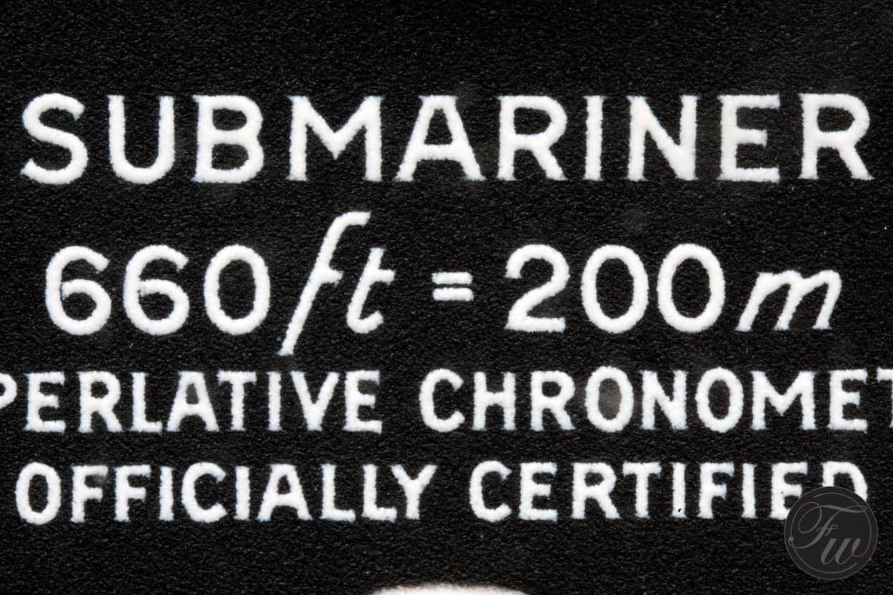
Macro of the “spec lines” on the 1680
Error on the dial?
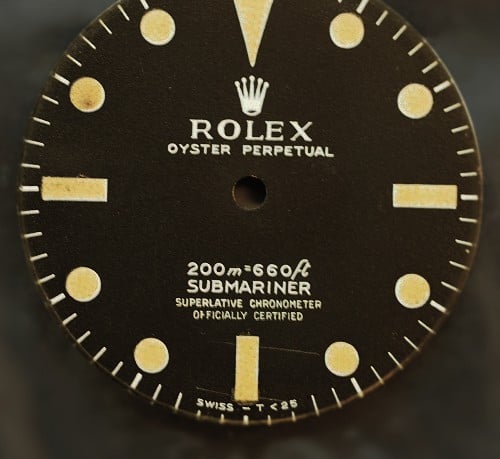
Let’s look at the WR-line. The used units (meter and feet) to indicate the water resistance are printed in an italic version of the font. Quite strange if you follow the strict rules of displaying symbols and units:
“Symbols for physical quantities are printed in italics, while symbols for units are printed in roman type.”
Most of these rules are documented by the American Institute of Physics and generally accepted. I’ve done some research in this document and can only conclude that there is a technical typographical mistake on the dial. Let me clarify that with those rules of the AIP in mind. Following the typographical rules to display units/variables ‘m’ does mean something different then the italic ‘m’ which is printed on Submariner-dials. The Roman ‘m’ stands for ‘meter’ (which is correct), but strictly seen the Italic ‘m’ on the dial stands for ‘mass’ (!?). Of course Rolex doesn’t want to display the WR in mass. By making the font italic Rolex probably just wanted to visually highlight the units when they released the sub in the 1953. Nowadays they still use this font style to keep things authentic, but in my opinion they’re technically wrong.
Since I’m not a professional chemist or physicist, please feel free to clarify, enforce or debunk this in the comment section below this article. I’d like to hear from you. For more info I would suggest the AIP style manual (see Appendix C), more info about the mass-symbol, or the difference between Roman and Italic.
Mix-up
If you look at the spec lines on the ‘Submariner’ you will notice quite a mix up of the lines and font variations through time. For example, some times the ‘Submariner’ wording is introducing the specification lines and a reference later, the water resistance indication gets the honor to open the specifications on the dial. If we zoom in on the WR-line, we can even find variations at line-level, for example:
- 660ft = 200m
- 200m = 660ft
As we can see, lots of variations. What was the motivation for this mix up of lines and words? Visual optimization or A-B testing to see which specification “cocktail” sells best? For the order variation of units on the WR-line it probably can be explained and related to the ‘leading’ unit per region.
Dial of a mid-sixties Rolex Submariner (reference number 5512)
Colorful Submariner variations
Besides this mix-up of lines Rolex also did some experimenting with font colors on the Submariner. A nice example of a color variation is the Rolex Submariner with reference number 1680 (early examples). Rolex altered the color for the ‘Submariner’ tagline to a scarlet red tone on this one. That’s why this ‘submarine’ is also known as ‘Red Submariner’ amongst collectors.
From 0 to 4+ in 50+ years
The Rolex “spec-line-car” accelerated from 0 to 4 lines in roughly 50 years, rare variations like the ‘Comex’ versions, excluded. If we do include them to our range, we could even say 5 lines. For example, a nice ‘5-liner’ is the ultra rare Rolex Submariner Sea-Dweller 2000 (reference number 1665, a.k.a. Great White or Double Red). This expansion morphed the general ‘Submariner’ face from a utilitarian, minimalistic but highly legible look with subtle luxurious details to a more crowdy and specification exposing spotlight. Later on, stainless steel or (white) gold accents and borders enforced this overall luxurious look on the dial even more. Since I belong to the followers of the ‘less is more’ principle I’m mostly attracted to the early ‘Submariner’ examples, a.k.a. ‘two liners’ (e.g. reference number 5508, 5512 or the newer 14060), but that’s just my taste. I’d like to see the name of the model on the dial, maybe a highly unique or model specific specification or two, but that’s about it. If there is an urgent need for putting more specs on the watch I’d prefer the caseback, to ensure focus on the most distinctive design elements and separate the more “common” technical description.
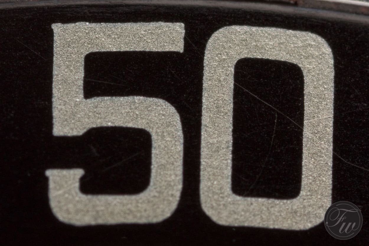
Macro of the 1680-bezel. Note the subtle serifs on the ‘5’.
Questions
To conclude, I would like to leave the stage with a few questions for you to think about. For me watch collecting isn’t only about gathering knowledge and watches but also about forming a rock-solid vision, opinion and taste. So here it goes:
- Are the spec lines a necessary design element on the dial?
- Do we still need those lines in 2016 where almost every watch in this price range is running within COSC/Chronometer specifications?
- The new METAS standards (‘Master Chronometer’) has recently been introduced. What will the effect be?
- What do you think of the actual position of the spec lines? If we look back, there are rare variations released where ‘Submariner’ even is placed just below the ‘ROLEX’ branding. Is this better? If so, why?
- What if the COSC certification could be place next to ‘Swiss made’?
- Would you buy a Rolex Submariner if it did not have ‘Officially Certified’ on the dial?
Happy thinking and have a safe dive!
p.s. I would like to thank Michael and Bert of the FW-team for providing me the fantastic pictures to beautify this post.