Hands-On With The ACE × NOMOS Glashütte Club 36 Blue Limited Edition

I was there for the first one. I watched the second fly off the shelves from afar. And now, as the third ACE × NOMOS Glashütte Club collaboration (and sixth between the retailer and brand overall) starts to make its way to the wrists of soon-to-be happy buyers, I felt obliged to get in on the action. I simply had to get one in my hands. Orange? Blue? I wouldn’t be an honorary Dutchman if I sat on my hands while that kind of watch was on offer. But does this model pick up where the previous two successes left off?
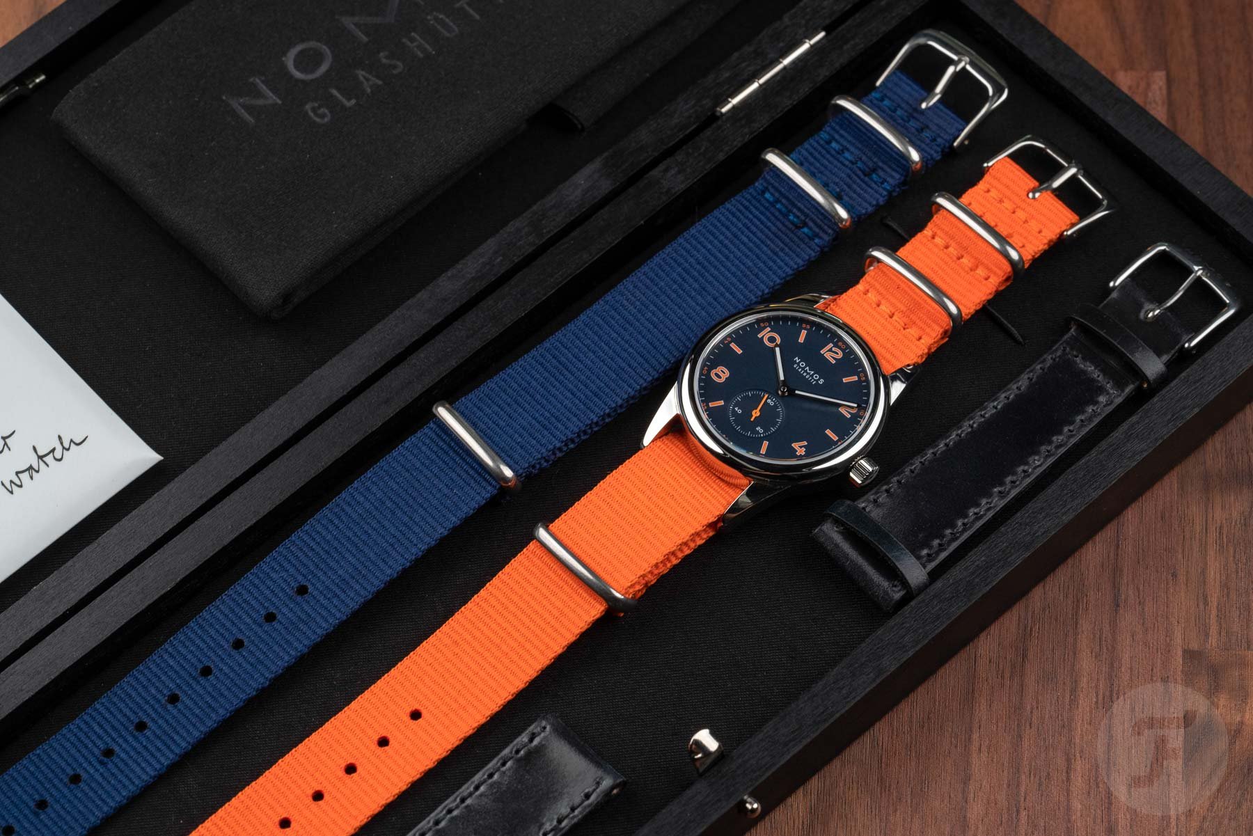
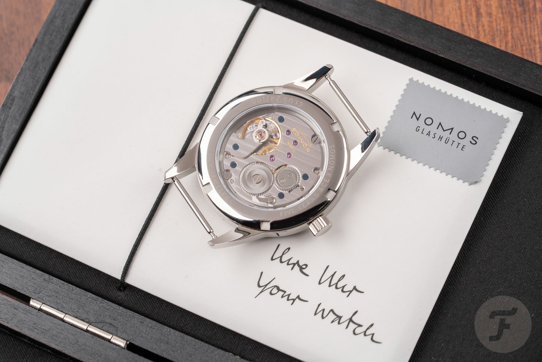
Truth be told, it doesn’t. This is something completely new. While the Amsterdam Club I worked on with Ace started a story that would be rounded out by the Ace Weltzeit and subsequent Tangente, it also seemed to be a closely related sibling of the Nomiesforlife model (replete with its baby blue accents) that had me salivating for days after it had sold out. Here, however, we have a different business model (100 pieces with display backs, 50 pieces with closed backs), and an entirely different visage.
This model is the most colorful model Ace has produced with NOMOS so far. In some ways, it is also the most ambitious. That feels a little odd to say because while NOMOS is known for its black and white sophistication (which meant the previous five models felt quite comfortable alongside the core collection) it is the Club family that has a history of color. Not only is it the most youthful NOMOS model, but it is also often the wildest. The recent CoolHunting editions with their rainbow dials proved that. This model shows Ace is willing to take the gloves off and try something different.
In my opinion, it works
A couple of weeks ago, I covered the release of this model. Now I’ve had it on my wrist and spent the necessary hours with it in all kinds of lights (artificial and natural). I was pretty excited when I started the review and now, at the end of it, I’m even more convinced this color combo works.
To be honest, given my history with NOMOS Glashütte, I wasn’t really worried about the blue at all. I know that the “Nachtblau” or “Atlantik blau” can look a bit dull, a bit gray, a bit murky in photos. I’ve seen it and heard it said a thousand times. Except the thing is, you don’t wear the watch in the photos, you wear the one on your wrist.
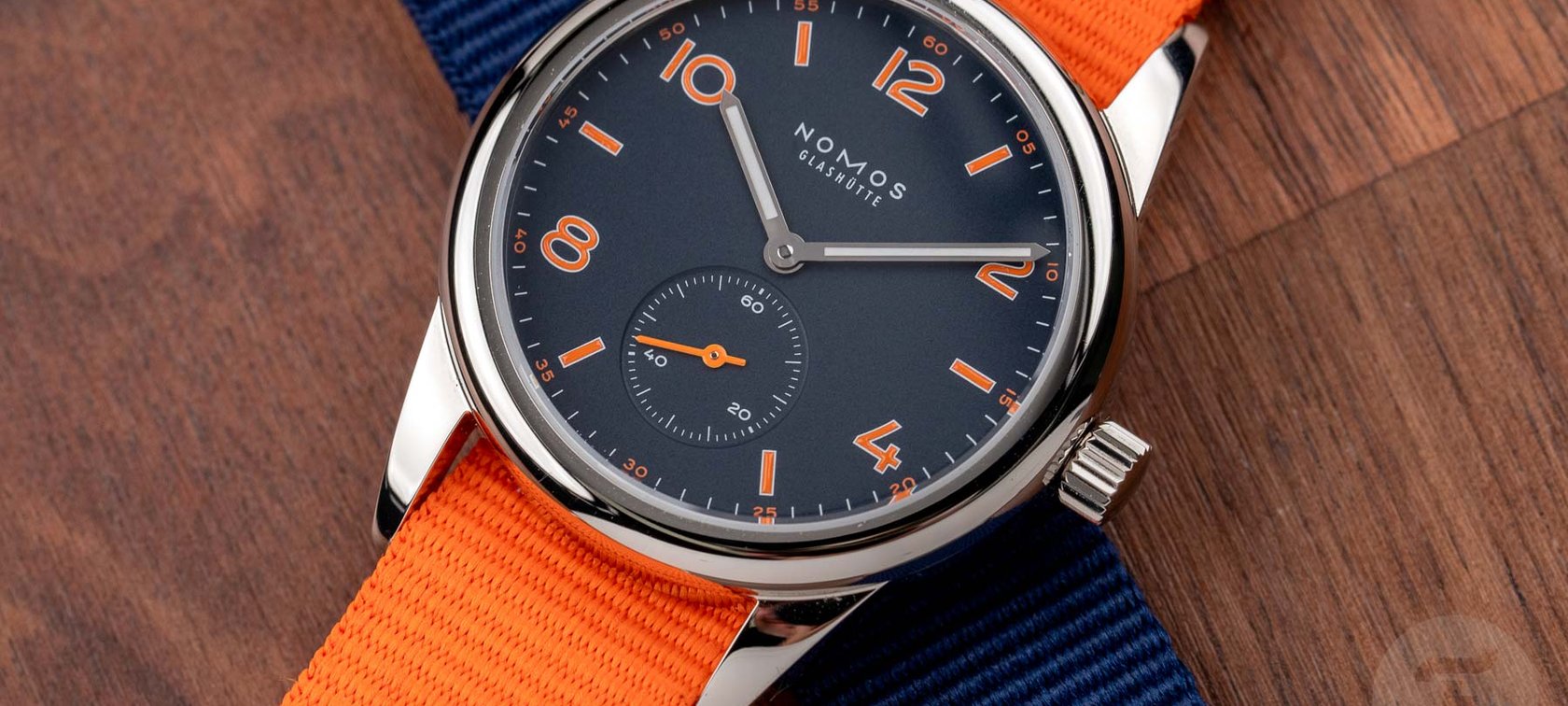
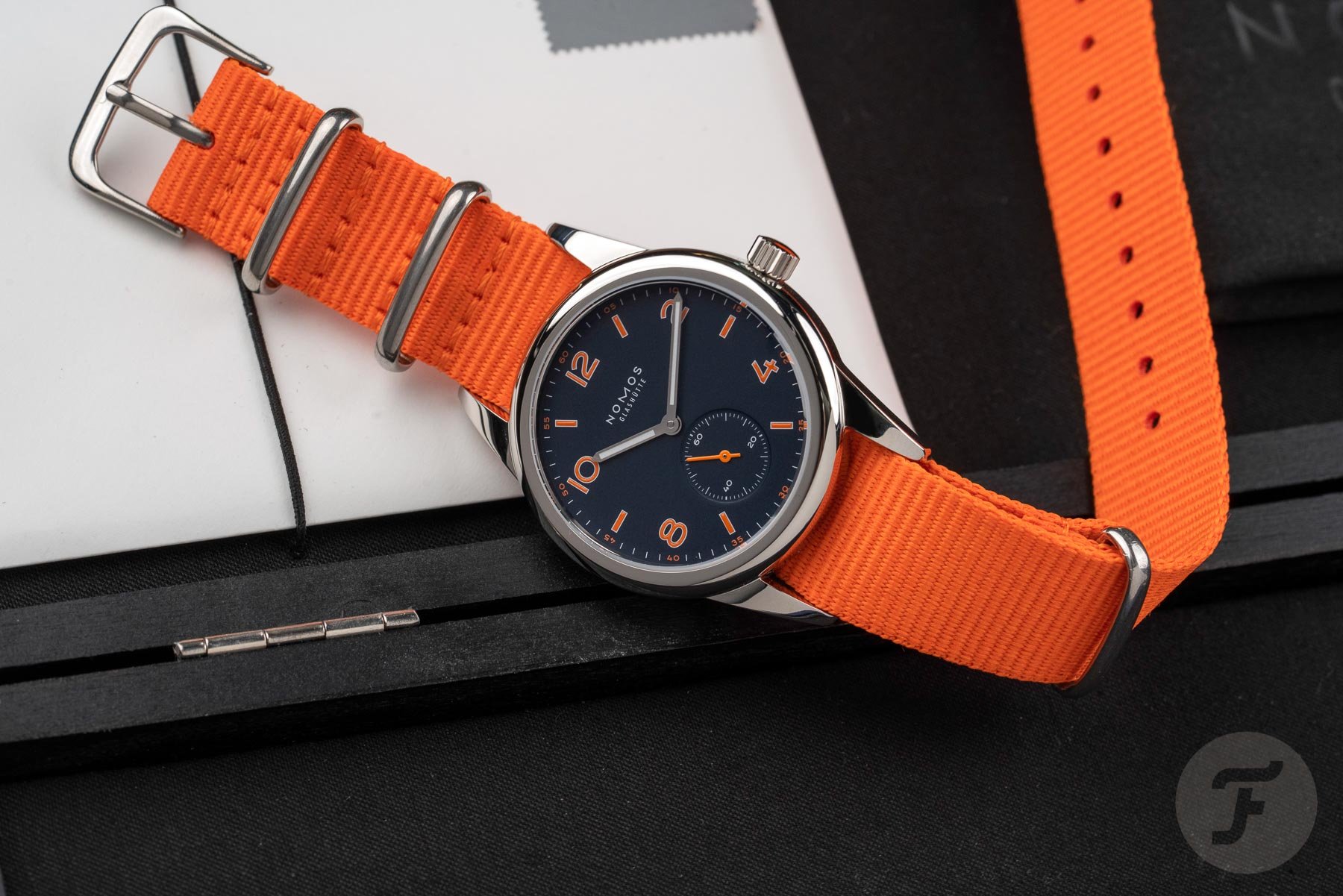
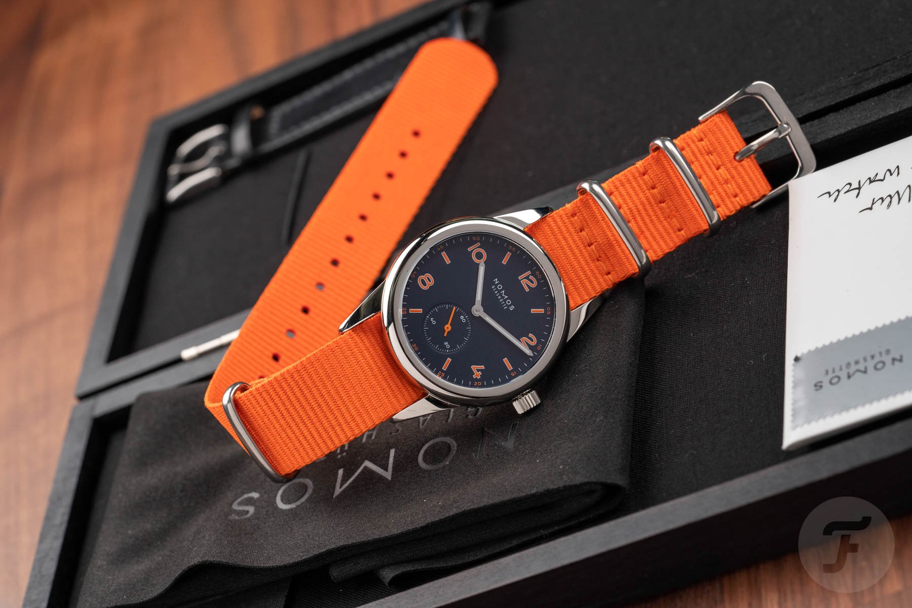
And on the wrist, that blue has always sung. When it comes to life most vivaciously, however, is when it’s paired with a striking accent color. As you know, I’m dangerously obsessed with the shade of orange (RAL 2005) we used on our own collaboration piece with NOMOS. That orange has been deployed against the Atlantik blue of 2017’s Ahoi neomatik to stunning effect. However, not everyone likes having their retinas seared every time they glance at their wrists as I do. As such, Ace made the wise decision (given the sheer volume of the orange on this dial) to go with a more digestible shade. In fact, in the world of oranges, this one is more like the peachy Pantone 1495C we used on the Czapek Antaractique.
What was I scared of?
There was one element I needed a bit of time to warm up to, however. The stark white lume of the hands, flanked by the polished rhodium that connects the center of the dial to the polished steel case, seemed a bit jarring to me at first. Against that deep blue background, did those crip and clean hands make too much of an impression? From a legibility perspective, they are hard to fault. Were they aesthetically up to snuff, however?
I’m not sure why it wasn’t immediately obvious to me, but there is plenty of white on this dial. The text is all in white, the minuterie too, and not to mention the bright white outlines of the numerals. Surely the blue and orange dial is no more striking than the red and ruthenium of the Amsterdam, right? Wrong. This dial is much more complex.
At the risk of creating my own color lexicon, this dial uses two “active” colors. They steal the show. The blue and orange colorway is everything. The white elements of the dial wilt in the face of such ferocious competition. And, I believe, it is the metallic frames of those white luminous rectangles that make them jump out to me as separate from the whole ensemble. After a week on my wrist, though, I now see the dial for what it is in its entirety. And the longer you look at it, the more the white hands make sense with the dial.
Hit the lights
The sixth collaboration piece between German brand NOMOS Glashütte and Ace Jewelers of Amsterdam is one of those watches that keeps on giving. As with more of my favorite watches, it changes throughout the day. The blue shifts through the myriad shades available to it but whatever shade it is at any given moment, you can be sure the orange will be right there by its side, harmonizing in countless different ways.
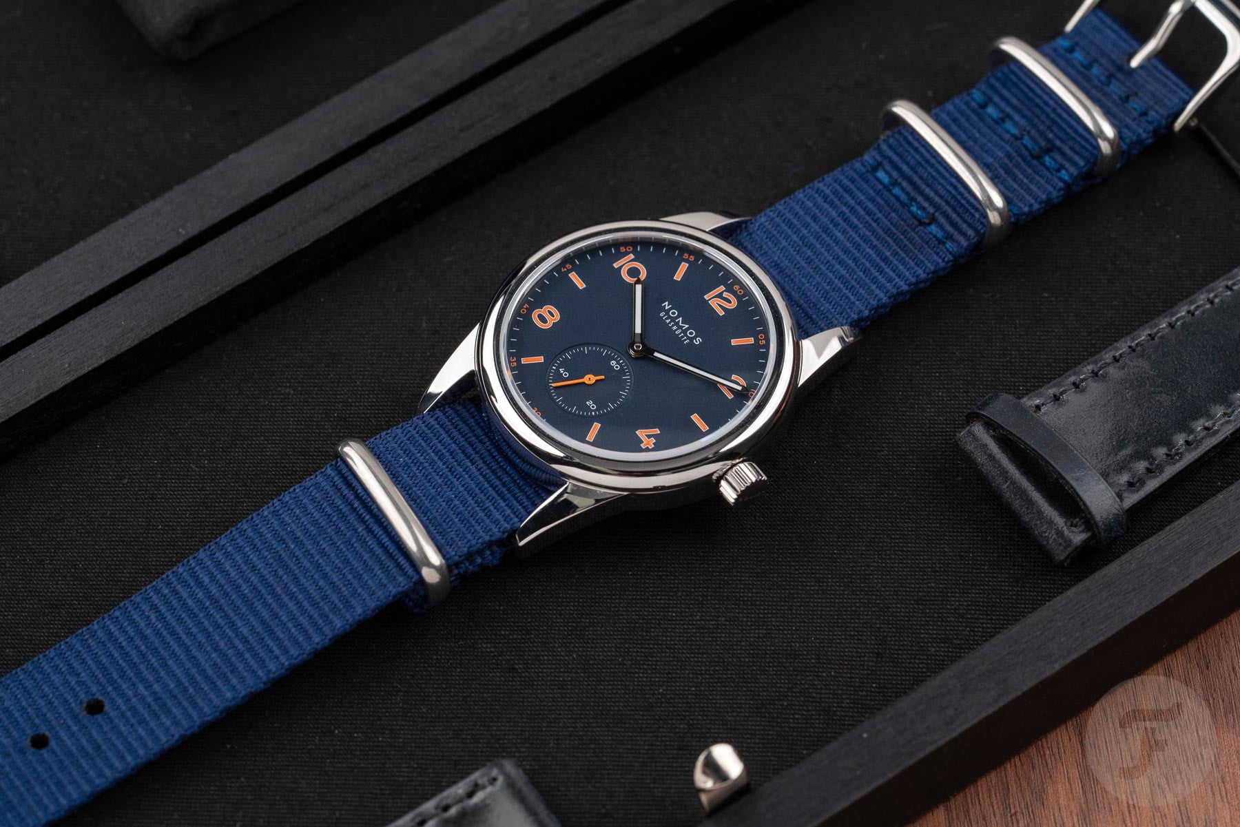
And talking of harmonizing, it is impossible to ignore the additional blue and orange fabrics straps (yes, that’s a plural) included in the box here. Not only do this vibrant NATOs double down on the colorful concept, but they also eliminate the lug gap created by the NOMOS Glashütte Club’s oft-picked-on lugs. It’s a truly wonderful combo that won me over entirely. I’d wear this one on the blue NATO or flip it onto a brown leather ZULU with polished hardware for a grittier look.
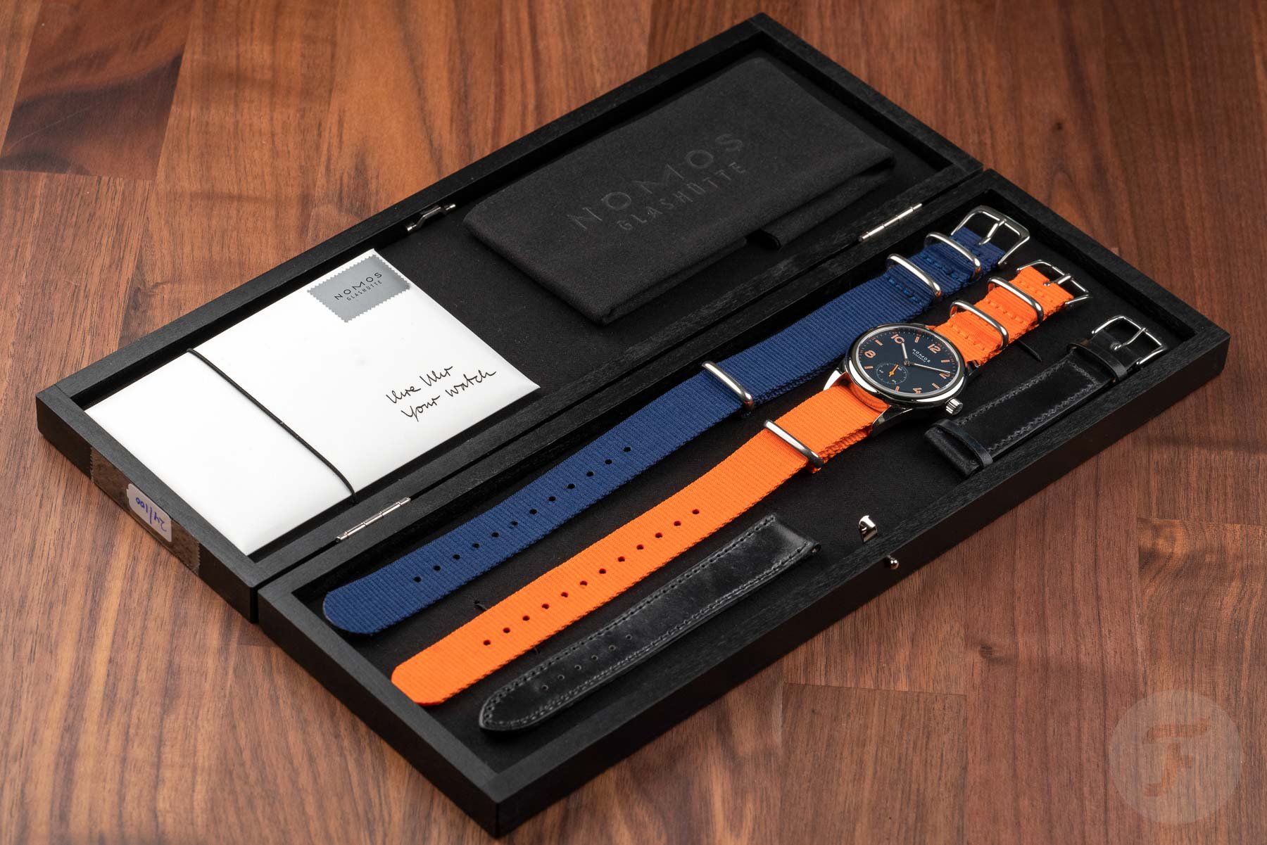
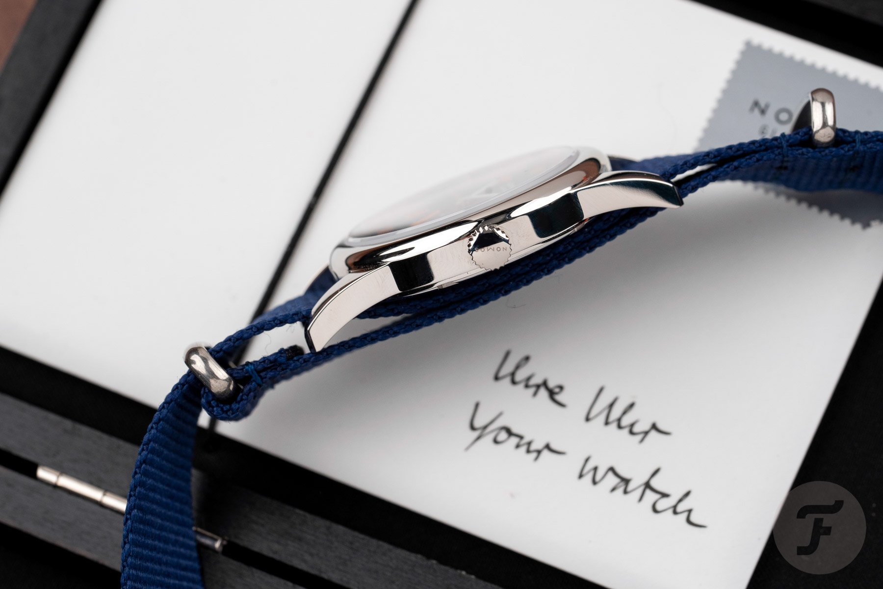
Both models measure 36mm across, stand 8.1mm tall on the wrist, and are water-resistant to 100m. That’s actually my preferred size for the Club but likely has a lot to do with why there are still a couple of these pieces available. The closed case back version (701.S3) will cost you €1,080 incl. VAT. Meanwhile, the open case back alternative will set you back €1,340 (703.S3). My choice? The 701.S3. It is the truer successor of the original Club upon which this model is based. And, on those NATO straps, this size case can be worn on a whole host of wrist sizes. Are you tempted to give it a whirl on yours? Learn more about NOMOS Glashütte here.