Hands-On With The Straum Opphav — A Stunning Start That Heralds Big Things From The Norwegian Brand

I’m thoroughly sick of all the chatter we hear from start-up brands about how they are going to turn the established order on its head. How they are going to “disrupt” the luxury industry. Or even worse, how their product deserves attention for its “uniqueness” despite being composed of off-the-shelf parts from a forgotten corner of some fly-by-night factory in the arse-end of the Chinese badlands. Thankfully, for every 1,000 chancers, one good brand emerges. Say hello to Straum and its stunning debut model, the Opphav.
Since the debut effort from Straum first popped up on my Instagram feed, I’ve grown quite close to the guys behind the project. Lasse and Øystein are earnest, passionate, sideways-thinking chaps with a vision. That vision doesn’t have a name because it doesn’t need one. It isn’t the vision to disrupt or subvert. Quite unusually, the vision is simply a vision of a product. And, I must say, it is the physical manifestation of the argument I’ve been making for years: branding and empty promises will only get new brands so far. The long-term success of a brand hinges on the quality of its ambassador on the wrist — the product itself.
The Straum Opphav — ambition in steel
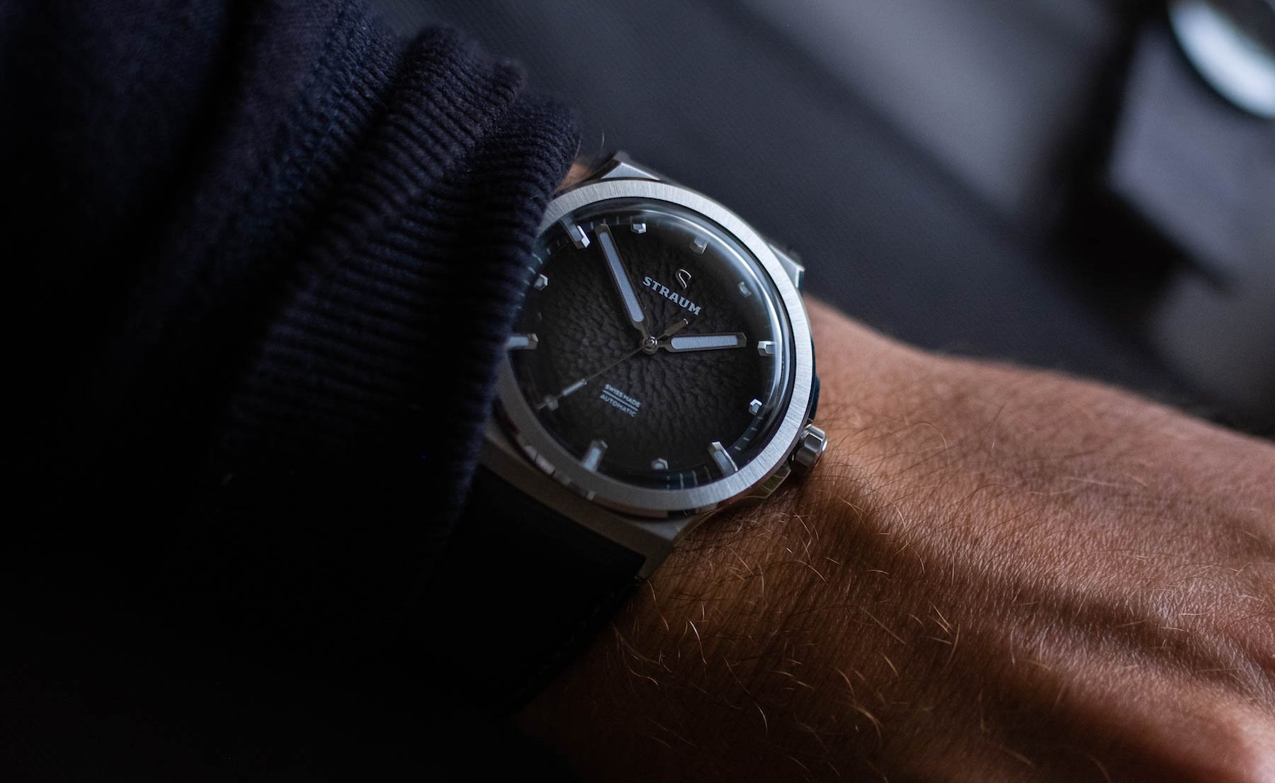
What I really like about the Opphav is how different it is. The guys behind its design have gone all-in with creating a totally new aesthetic (and that isn’t just marketing bumf; this watch is genuinely unlike anything I’ve seen before in some very obvious ways). But despite the significant differences between the Opphav and its peers, the case and wearability of the watch remain sufficiently “normal” and thus suitable for everyday wear and enjoyment. We’ve seen unbridled wildness before, and it doesn’t work. Well, it may work in the moment, but it isn’t sustainable or versatile in any way. What we have here is consciously bridled creativity in a product that surprises at every turn.
Concepts flowing thick and fast
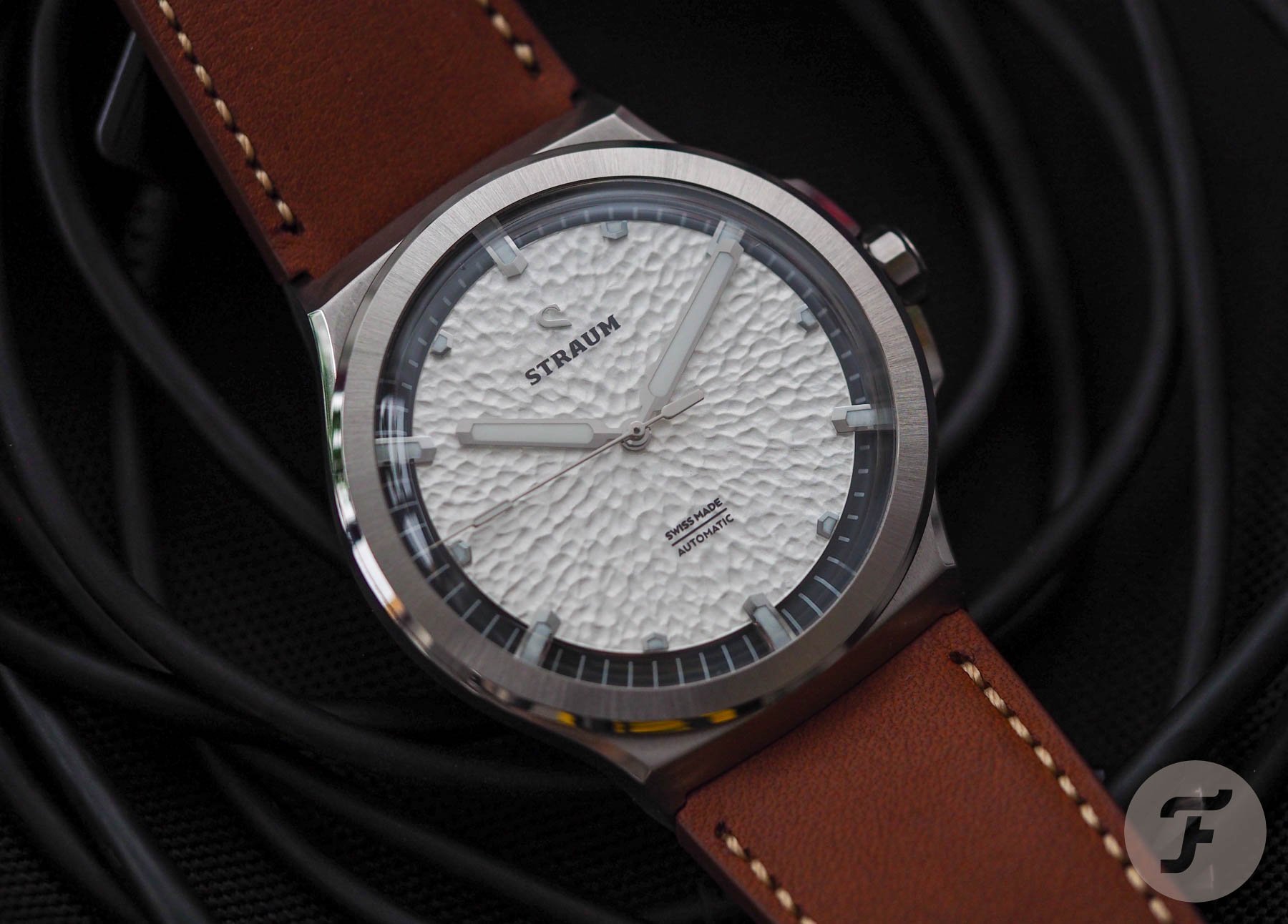
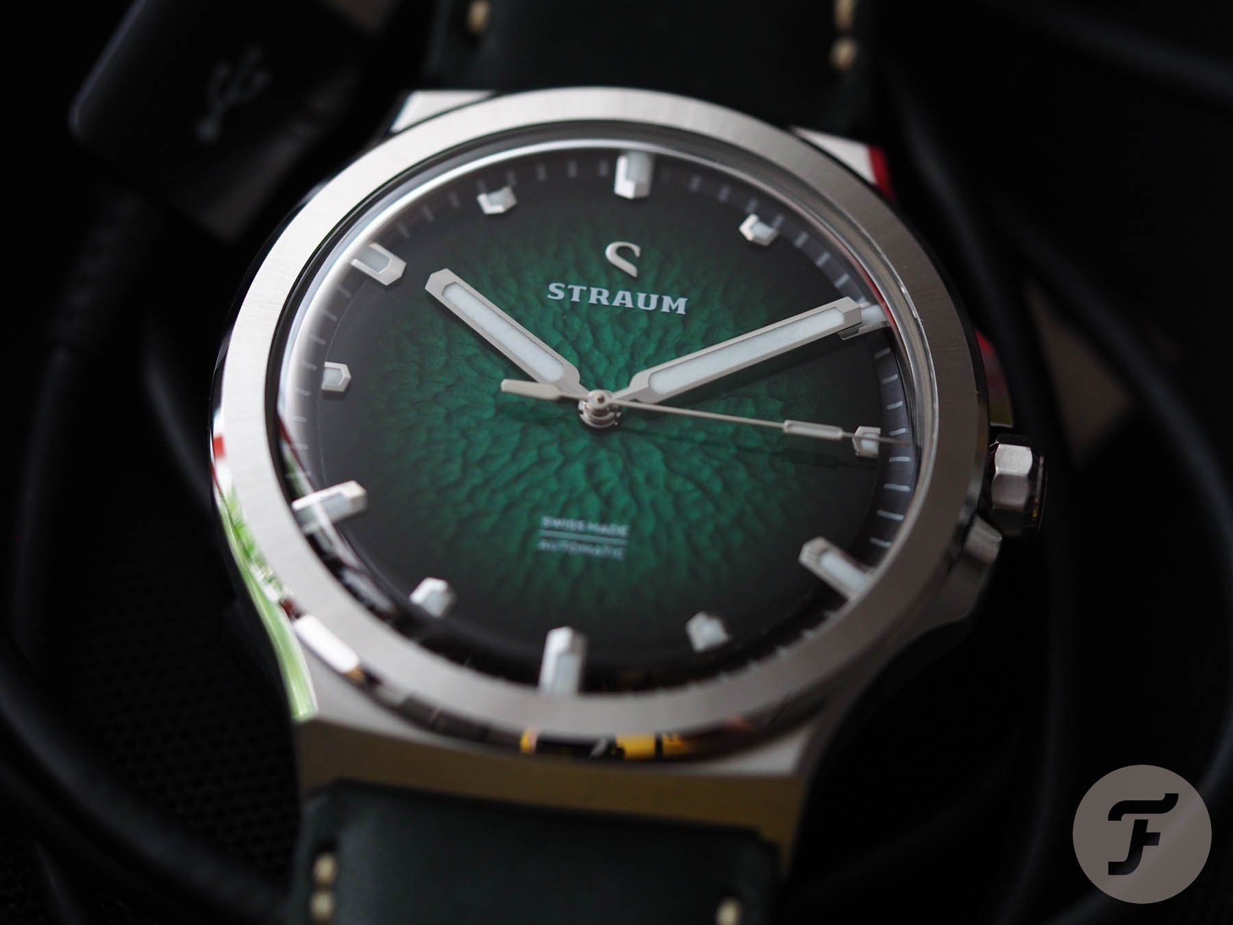
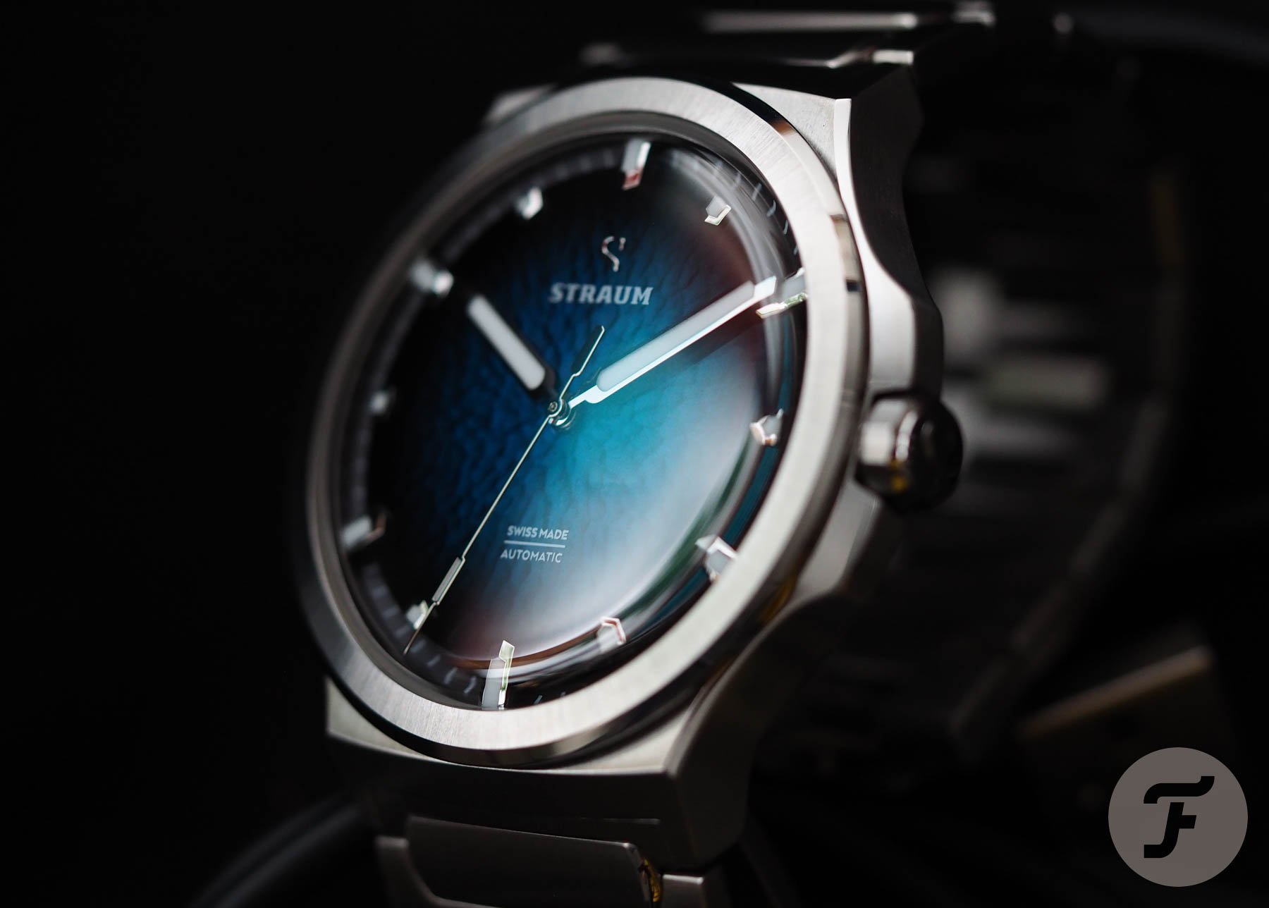
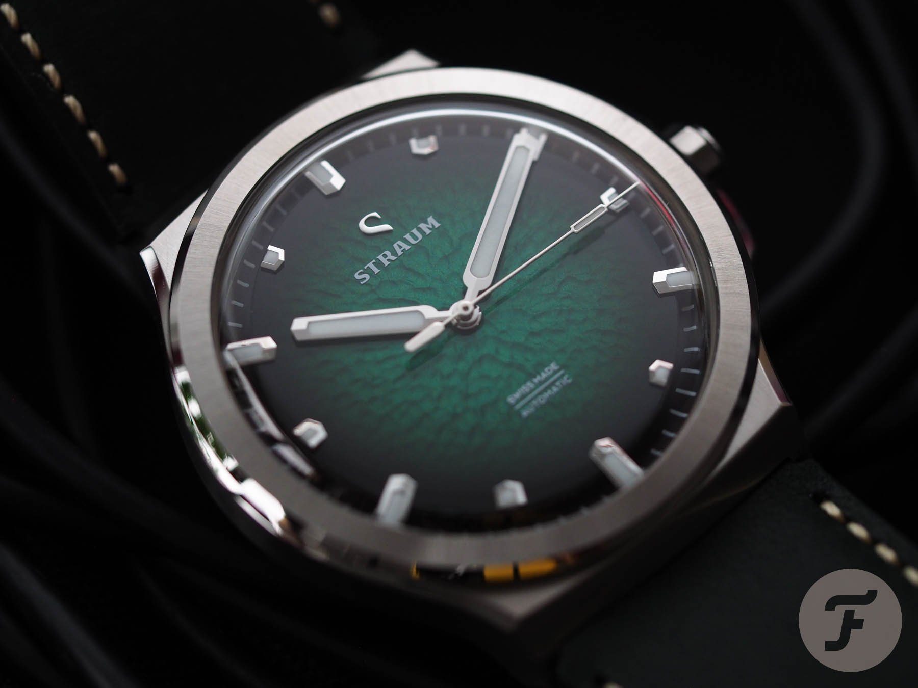
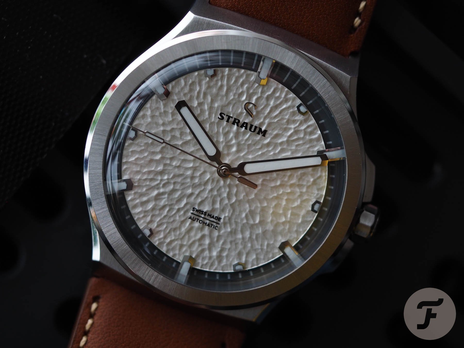
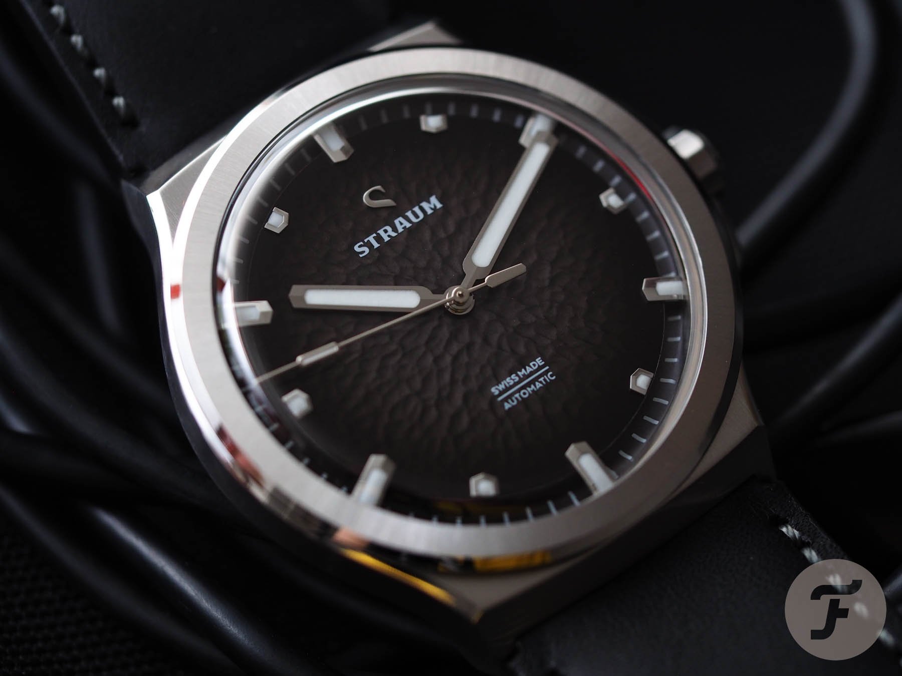
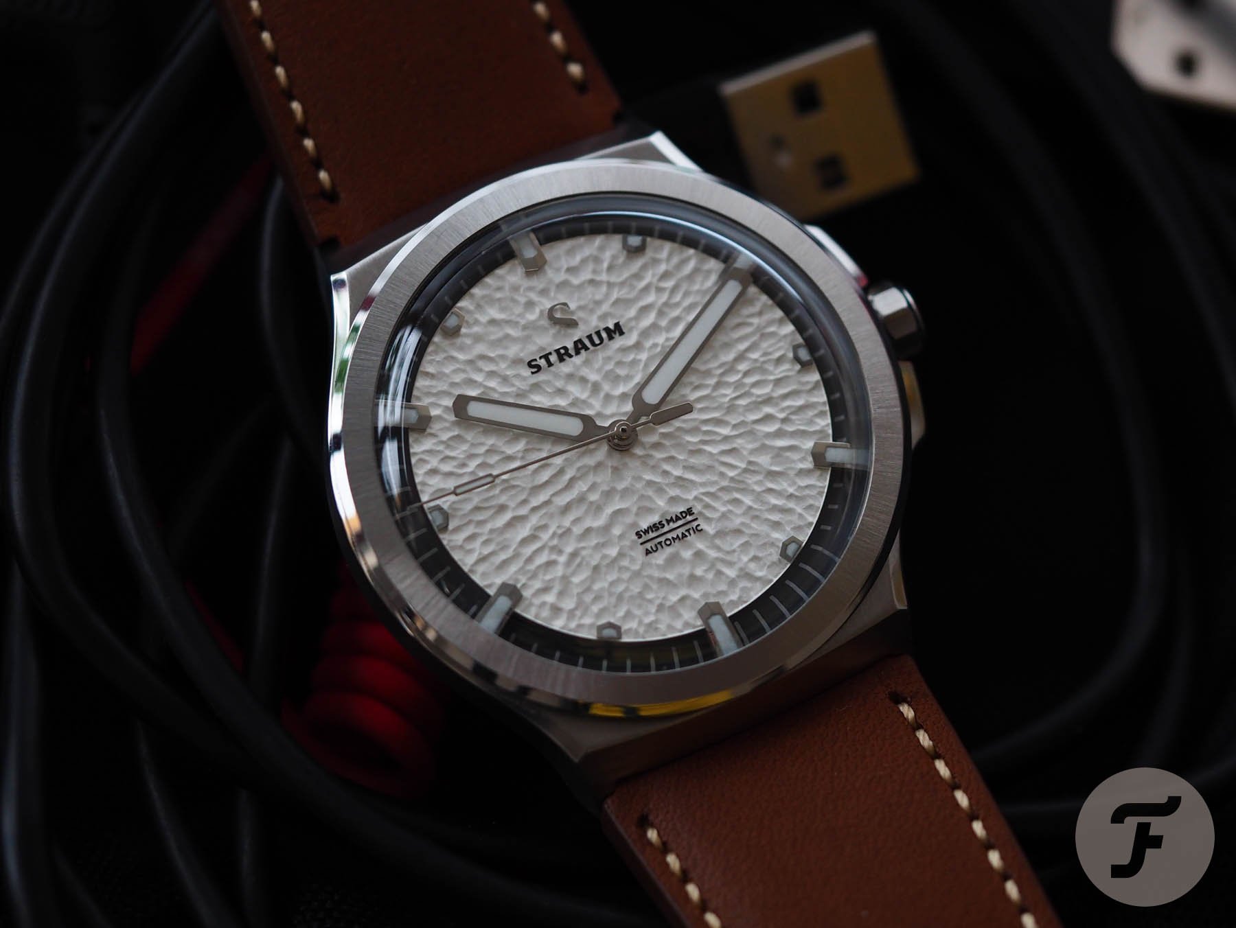
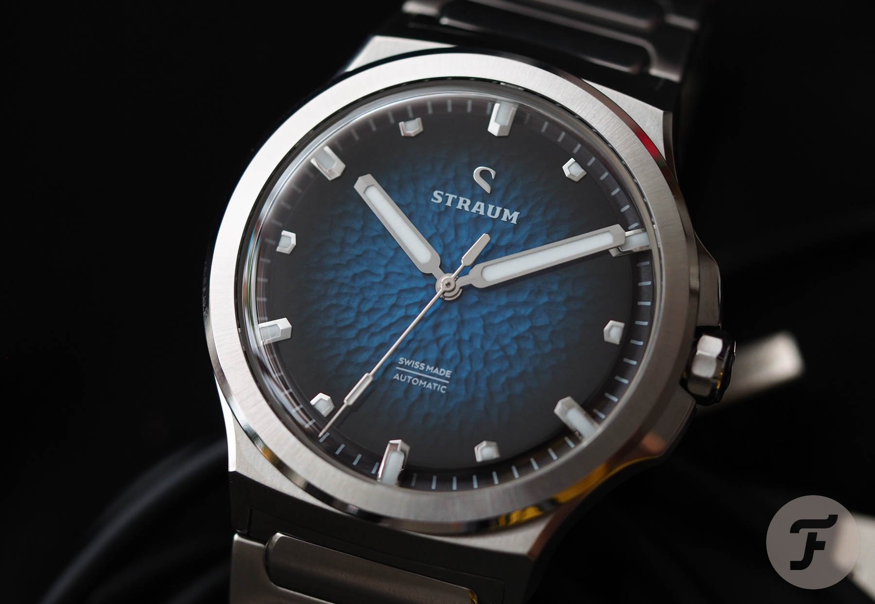
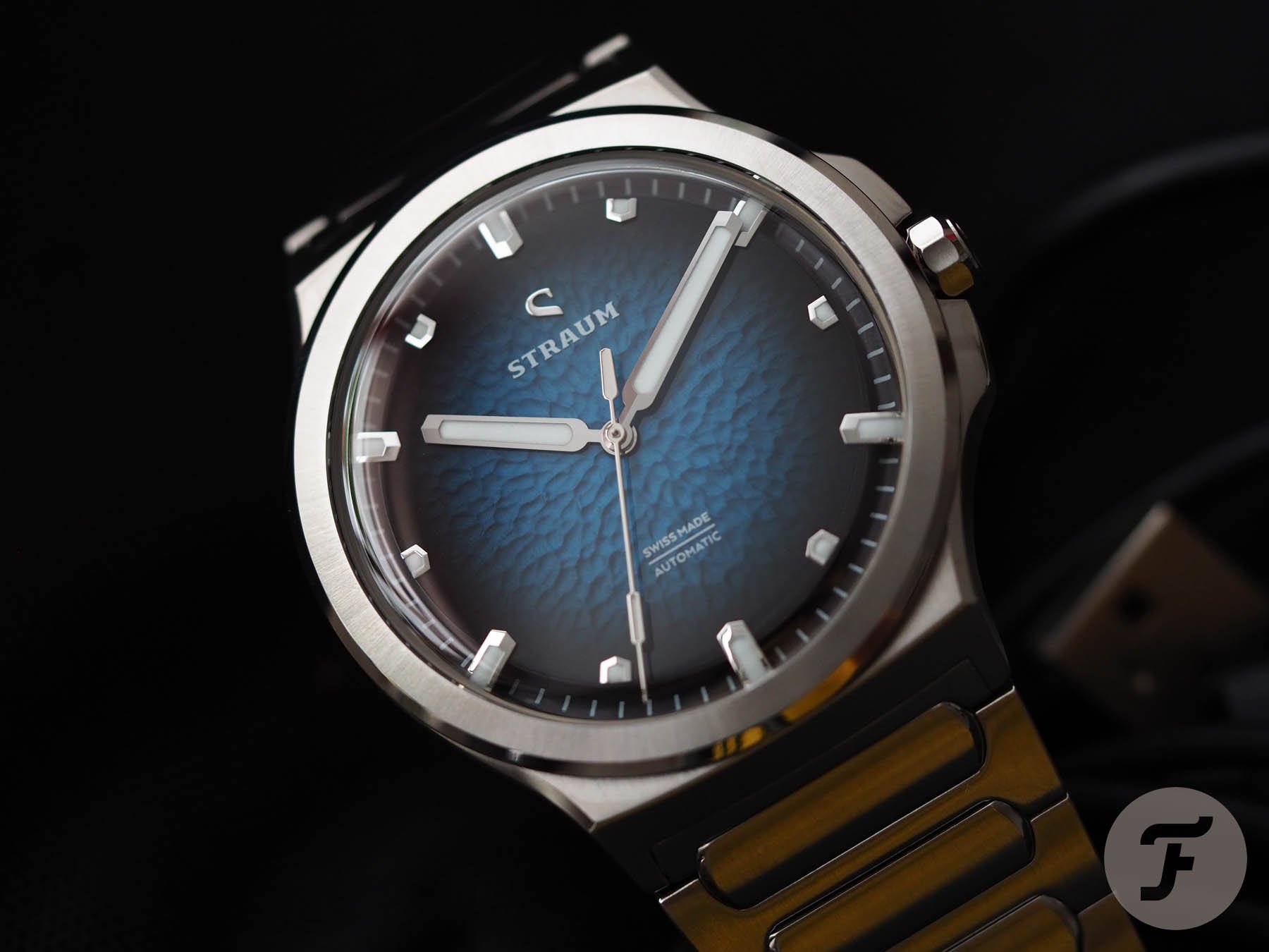
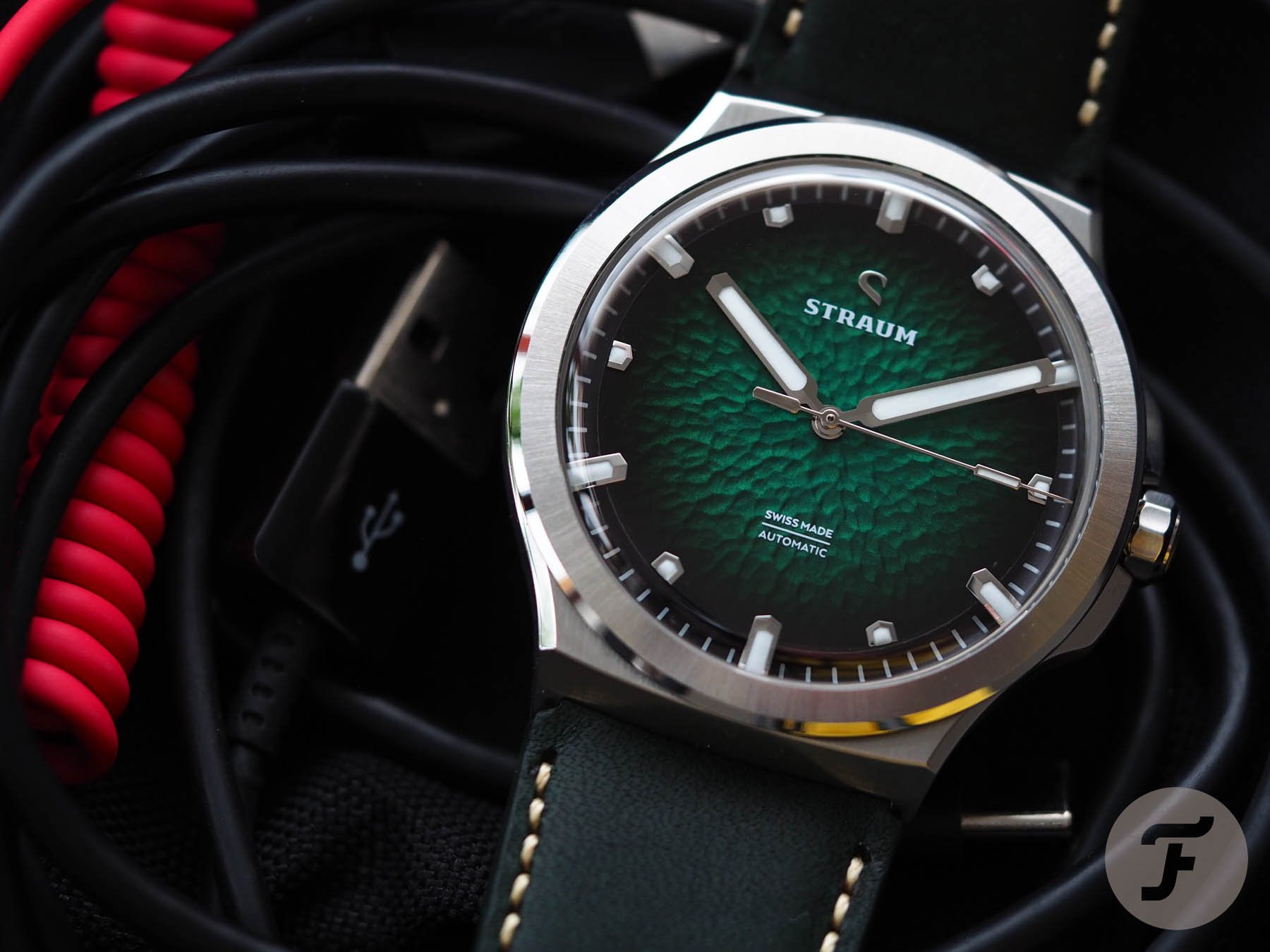
There’s a lot to dig into with the Opphav, so let’s start with the most obvious component — the dial. The patterned dial of the Opphav draws you in. Available in green, blue, charcoal, and white, Straum took pains to get the colors just right. The initial drafts of the colors were too dark and didn’t match expectations, so the guys went back again and again until they got the lacquer color just right. In my opinion, the effort paid off.
The colors reference Norwegian nature. Green hills and treetops, gray rocky outcrops, deep blue fjords, and white driven snow serve as their inspiration. The most stunning aspect of the dial, however, is nothing to do with its color. It’s the fact that it’s floating.
The main event
Now, you might not believe this, but I didn’t actually realize that the chapter ring was a concave bowl that touches the boxy crystal and then swoops down and away from the floating dial edge until I had the watch in hand. I was stunned by the visual trickery and the way that void interacts with the curvature of the crystal. Honestly, I didn’t like it at first. I even went back to Straum with some proposals of how a more “mainstream” follow-up might be a nice idea (the feedback was well-received, I might add). However, over time, I grew to not only appreciate it (the appreciation for its difference was instant) but also to find myself somewhat fascinated by it.
It was an aesthetic I hadn’t experienced in almost 20 years of working with watches. It flummoxed me for a minute. I had to really think about it, I found it so avant-garde. In the end, I decided that as a launch model from a brand pitching its first piece under €1,000 pre-taxes, it was the best I’d ever seen. It sets the stage perfectly for a more restrained follow-up that takes these daring elements and walks them back towards the pack in concept before blowing the competition out of the water with execution.
And that’s it. Execution. These ideas, wrapped in a more “timeless” package and executed as well as they can be at this price point (aided in that quest by the continued commitment to thoughtful design), could result in something that sees Straum kick in one of the deepest and most unexpected industry footholds a microbrand has ever established. I often extol the virtues of a “confuse and consolidate” release strategy. And Straum seems on the cusp of pulling this off right out of the gate. The first release has “wow” factor. If the second shows maturity and boasts the design chops to round out the brand’s definition, we could be about to see something glorious…
What I love about the Straum Opphav
The dial is breathtaking. The colors draw you in. It isn’t enamel (it’s lacquer), but the effect is close enough for it not to matter. What you’re paying for here is really more the design and the concept than it is the absolute execution. While that may sound critical, I don’t mean it to. In the context of this watch’s price, it is a show-stopping release. In comparison to other similar models at wildly different price points, it obviously has room for improvement.
Me being unfair as usual
As unfair as this is, I compared this model to both my Laventure Marine and my Czapek Antarctique. I could see similarities in the “Nautilus-esque” case designs shared by all three (especially by the Straum and the Laventure). The Laventure Marine retailed for just about 50% more than the Straum, but its real comparative value (due to the time of its release and the almost total lack of margin in the original project) means it is really representative of a watch at least twice the price. If the base Marine model came out today, its price would be closer to €3K than its initial retail of €1.5K.
Meanwhile, the Czapek Antarctique retails for €20K. It is worlds apart from either other model and an example of true Haute Horlogerie. However, I have included it in the comparison to show the possible differences in the execution of similar designs depending on the budget. While this may sound obvious, it is something newer brands often overlook, designing to ideals rather than the practicalities of financial limitations.
Laying down a marker
I used the hour markers as an example when I broke down my watch analysis with Lasse and Øystein. The hour markers on the Czapek are polished. So are the hour markers on the Straum Opphav. The markers on the Czapek, however, look sharp-edged enough to cut through the very fabric of space and time. Their surfaces are also so mirrored that they could reflect the very face of God back in them with ease.
The same “effect” is achieved by the polished hour markers on the Opphav (which are extremely well done at this price point). There is, however, an appreciable difference between the markers of a watch made and sold for sub-€1K and one worth 20 times that. Those differences aren’t always obvious until you have the two pieces in hand. To an experienced eye, however, they are quite obvious. Thus, the boys raised a logical question: “What can we do about that?”
The answer is never simple
One way to “solve” this conundrum is to always design within the limitations of one’s budget. However, that is not a solution that leaves much room for inspiration. And it’s one that likely would not occur to anyone but a crusty old watch hack like me. It is a sober and staid approach pursuant to “technical perfection” that perhaps loses some of its humanity along the way.
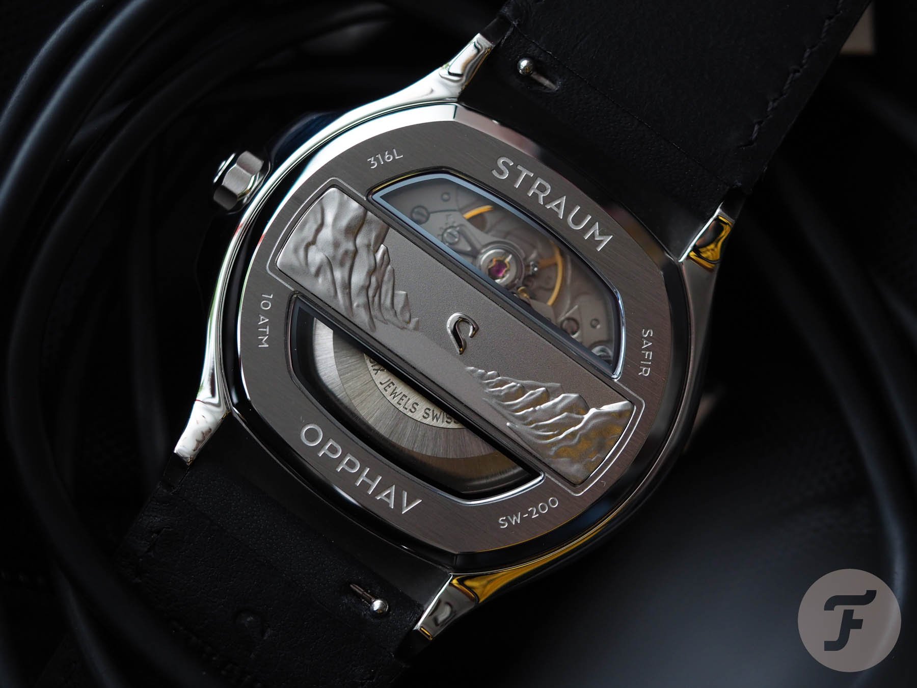
The fun continues on the back
I’ve never been a fan of shaped display crystals or plaques in any form. I told the guys they could happily ditch the cutesy nordic scene on the reverse, and I wouldn’t lose any sleep over it. Nevertheless, I know that’s just my personal opinion. Dave Sergeant (who spends most of his time talking about the color yellow, his dog Luna, and Straum) absolutely loved this element, and I must agree with him that I’d rather see it than yet another Sellita.
Despite my Sellita fatigue (something which often leads me to prefer closed and well-decorated case backs to any kind of obverse movement view), a Swiss-made movement in a watch with such a high design concept and yet a reasonable price point is very satisfying indeed.
Only the beginning
This is a compelling first chapter. I hope the book of Straum will be long and celebrated as time passes. We believe great things are yet to come from this brand that has already started promisingly. The Opphav is a fantastic first effort and a model I am glad to have in my collection. I anticipate being even gladder as time passes.
I remember when I first took a speculative punt on Laventure at the genesis of that company, filled with fear at investing what was all my spare money at the time, but somehow convinced it would turn out to be a wise decision. Nowadays, it is impossible to find a green Marine anywhere for any money. I have a sneaking suspicion we might be facing the same situation with the Opphav in years to come should the brand build on this excellent foundation and move on to something new further down the road. Stay tuned to Fratello to follow the story. To learn more about the brand’s origins, check out the official website here.