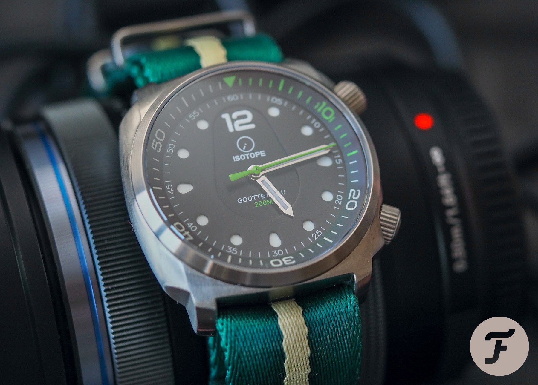
Isotope Goutte D’Eau Compressor Dive Watch In Green

Compressor-style cases (as aped by this Isotope Goutte d’Eau dive watch) somehow fell out of favor with the general watch-buying public for a couple of decades. Why? I don’t know. Maybe the industry just outgrew the technology and assumed no one enjoyed the twin-crown aesthetic without the compressible case that got more and more water-resistant the deeper it traveled beneath the surface (until, of course, it goes so far, the metal housing crumples like an Origami crane in a rainstorm).
However, when this style started to creep back into the mainstream, I was overjoyed. It’s great to see bigger brands (particularly Longines) experimenting with this style once more, but a wave of ambitious microbrands and independents (such as Alkin, Marnaut, Farer, and Christopher Ward, for example) are throwing out options left, right, and center. Isotope didn’t want to miss out on the fun. And so, to celebrate the brand’s fifth anniversary, allow me to present to you the Isotope Goutte d’Eau Compressor dive watch in green.
The immediate pros of the Isotope Goutte d’Eau dive watch
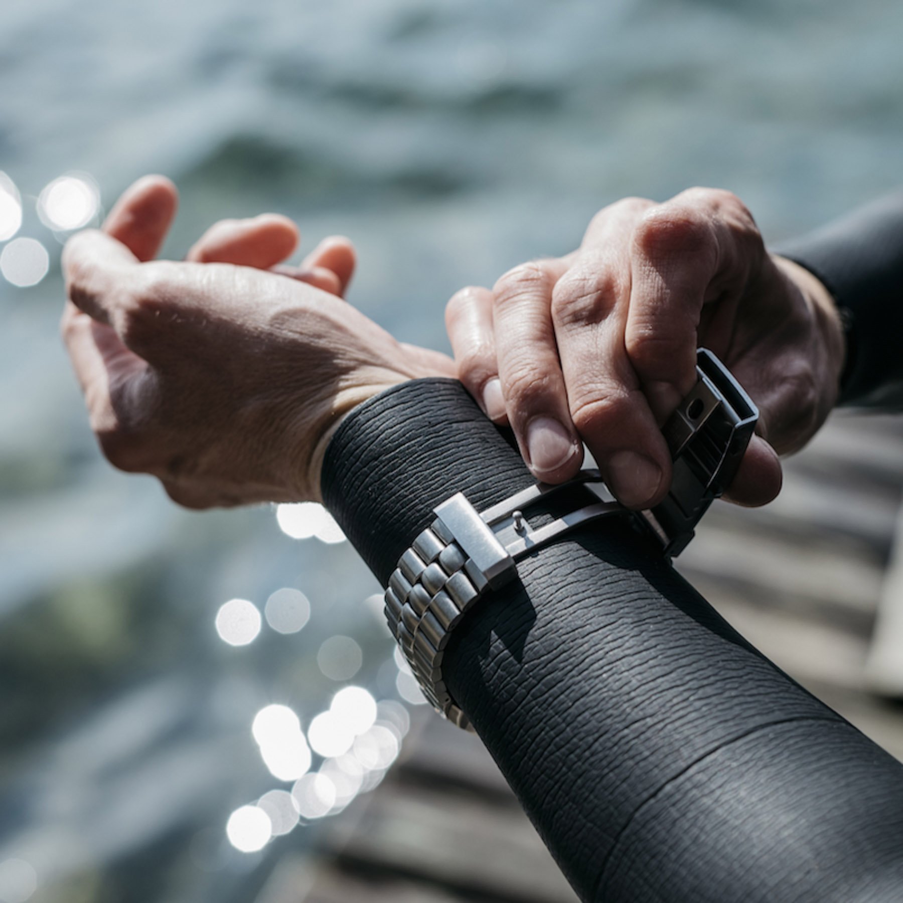
Straight out of the box (or handsome felt watch roll to be more pertinent), a few things are noticeable. Firstly, the aforementioned watch roll is a really smart addition to the proposition. I like functional packaging. Give me a decent leather (or, as I now know it to be an option, felt) roll in a simple cardboard box I can store, stack, or chuck, and I’m a happy man. Additionally, the Goutte d’Eau comes on a bracelet but is packaged with one of the lushest, thickest, most vividly colored NATO alternatives I’ve ever seen. As such, I did away with the bracelet immediately to avoid having to size it to my teeny tiny wrist and wore this watch on the comfortable fabric option instead.
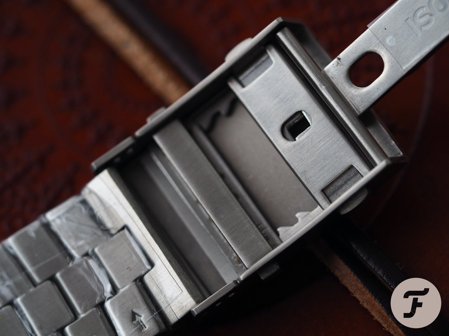
Now, having dismissed the bracelet so swiftly, you might think I thought it a poor element of the design. I did not. In fact, nothing could be further from the truth. Relatively speaking, it is possible that the bracelet is the best part of this whole package. It was well styled, stands out as proprietary, and, most important, utilizes a very nicely engineered micro-adjustment clasp.
The joys of good engineering
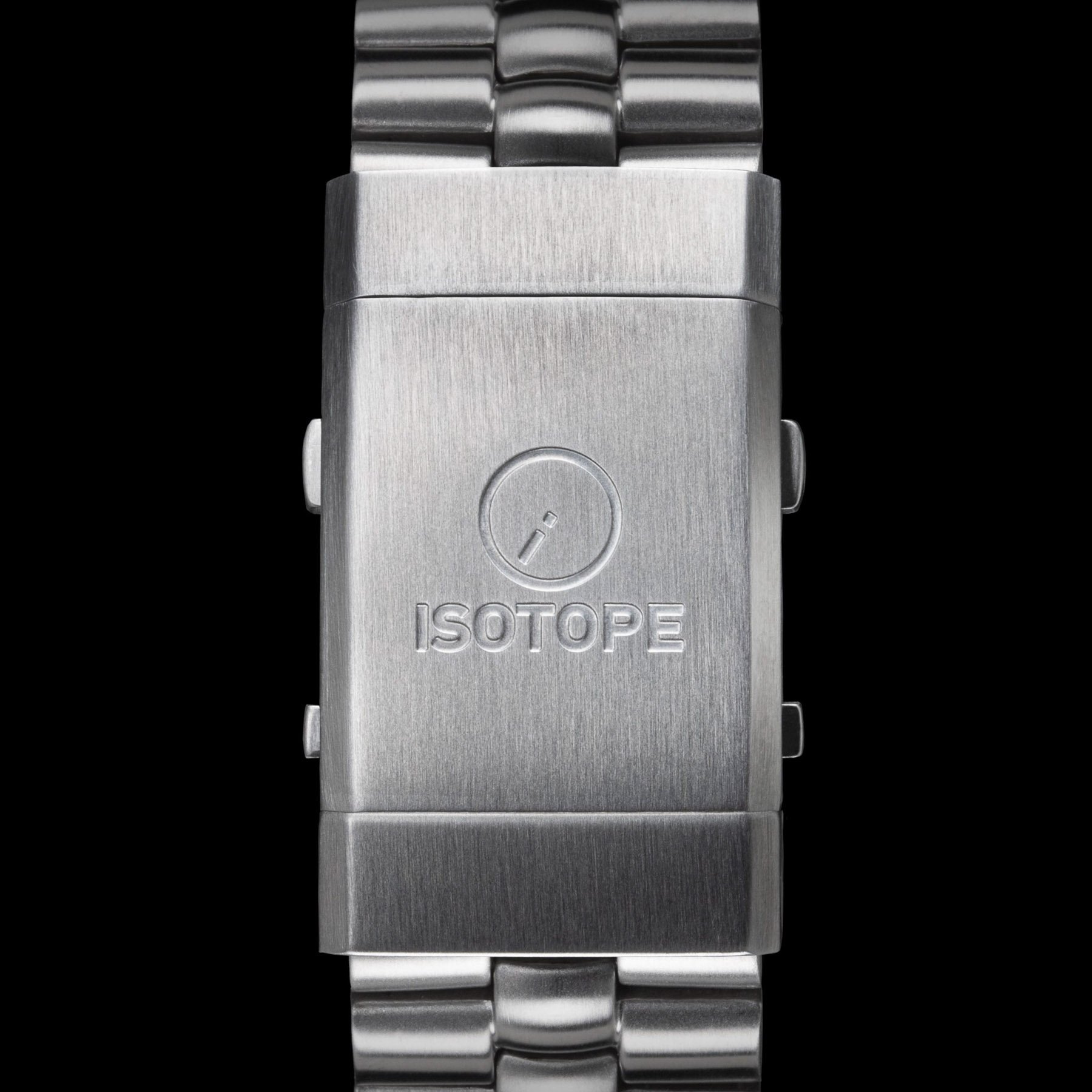
Despite my general aversion to bracelets, I am a sucker for a nicely engineered clasp. I’ve said it before and I will say it again: the clasp on the Omega Seamaster PloProf 1200M is better designed and certainly better executed than most watch heads. This one from Isotope is obviously not on that level, but it is of the same lineage. If direct inspiration wasn’t taken from the PloProf buckle, then it was taken from something close. And, pleasingly for a small microbrand, the execution here is more than passable. The shape of the spring-loaded buttons and the edges of the engraved logo are sharp and decisive. That’s nice to see.
What about the obvious cons?
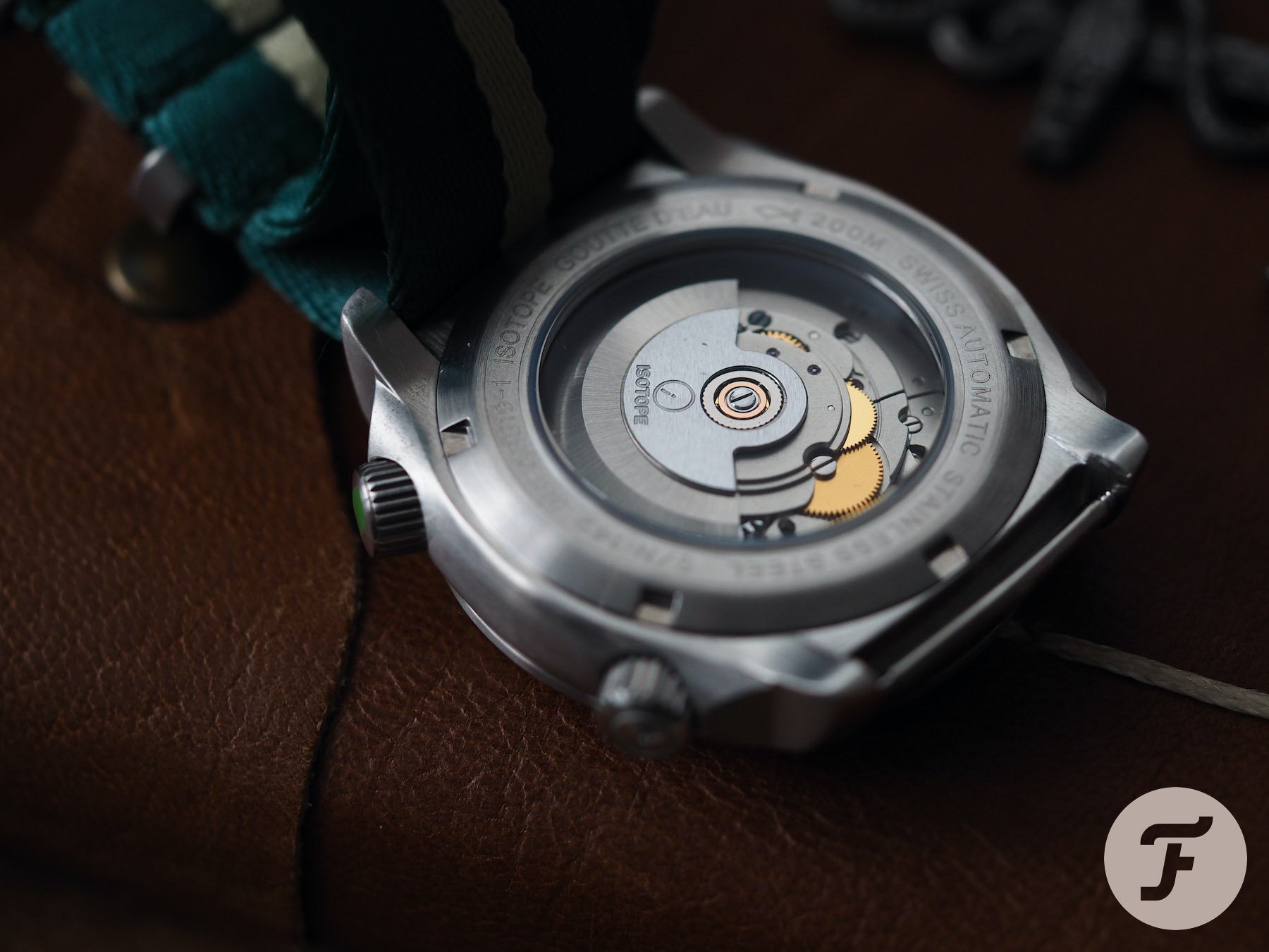
Let’s get this out of the way quickly: the Goutte d’Eau is not a genuine compressor. That shouldn’t really bother anyone, I would imagine, but it is worth mentioning in case anyone misconstrues “compressor-style” for meaning this watch actually uses the old “Flexi-back” system that saw the case back push down harder and harder on a deformable gasket as the external pressure increased. This is an aesthetic thing and one I like very much in general.
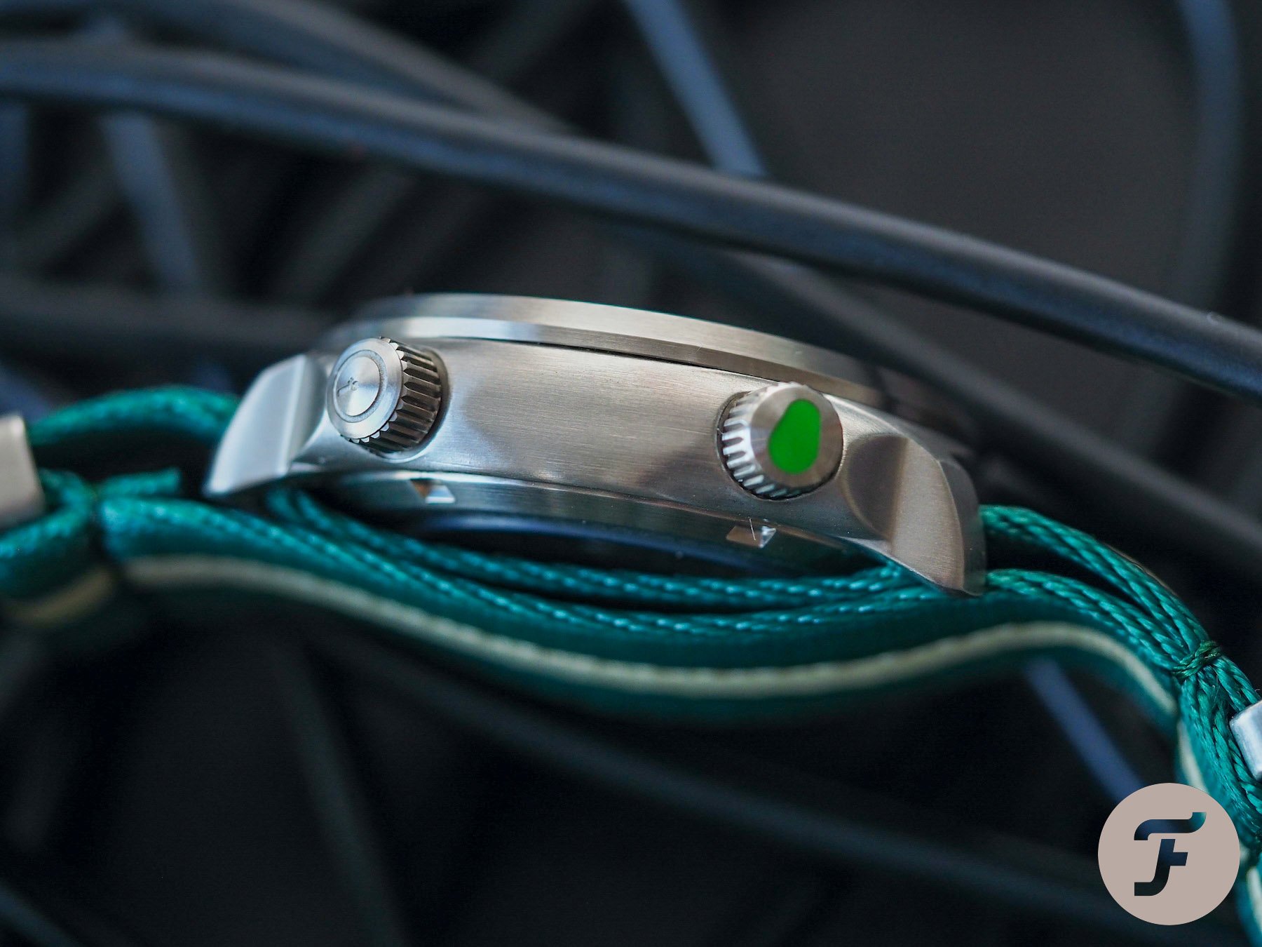
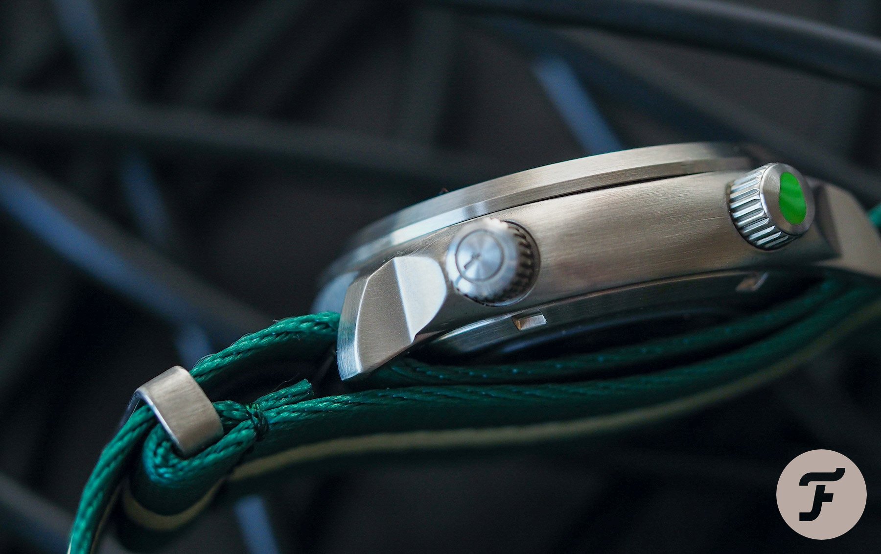
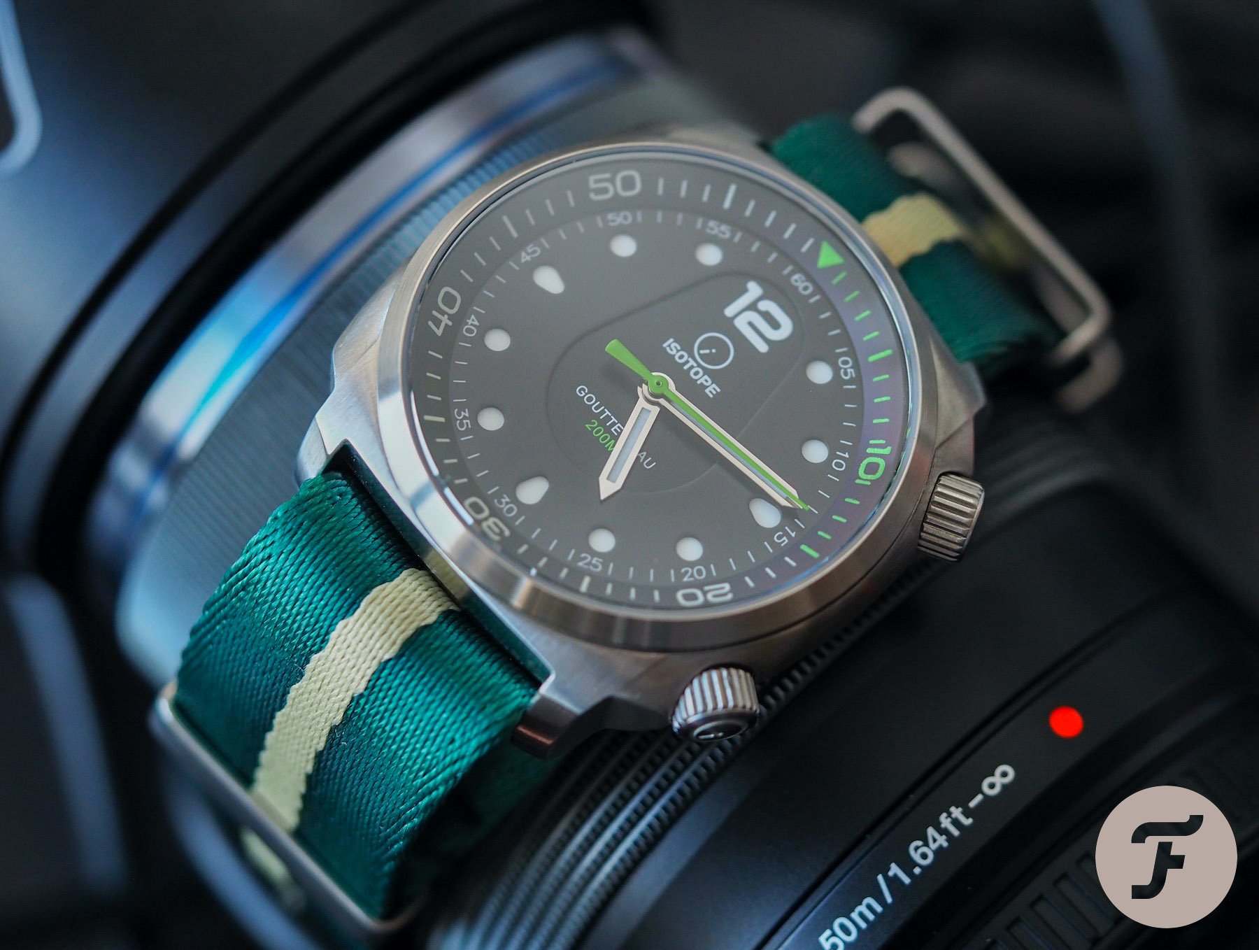
A pebble
But how does the twin-crown system work with the Goutee d’Eau’s pebble-like case shape? There is something a bit Ikepod about this case, something a bit a.b.art. I don’t dislike either brand, but I think it is undeniably fair to say this kind of styling looks like it stumbled out of 2005 and into the modern-day. The advantage of that is that a heck of a lot of people liked 2005, and now, in our post-pandemic society, the liberties and general Joie de vie of the past seem like things of which I’d like to be reminded on a daily basis.
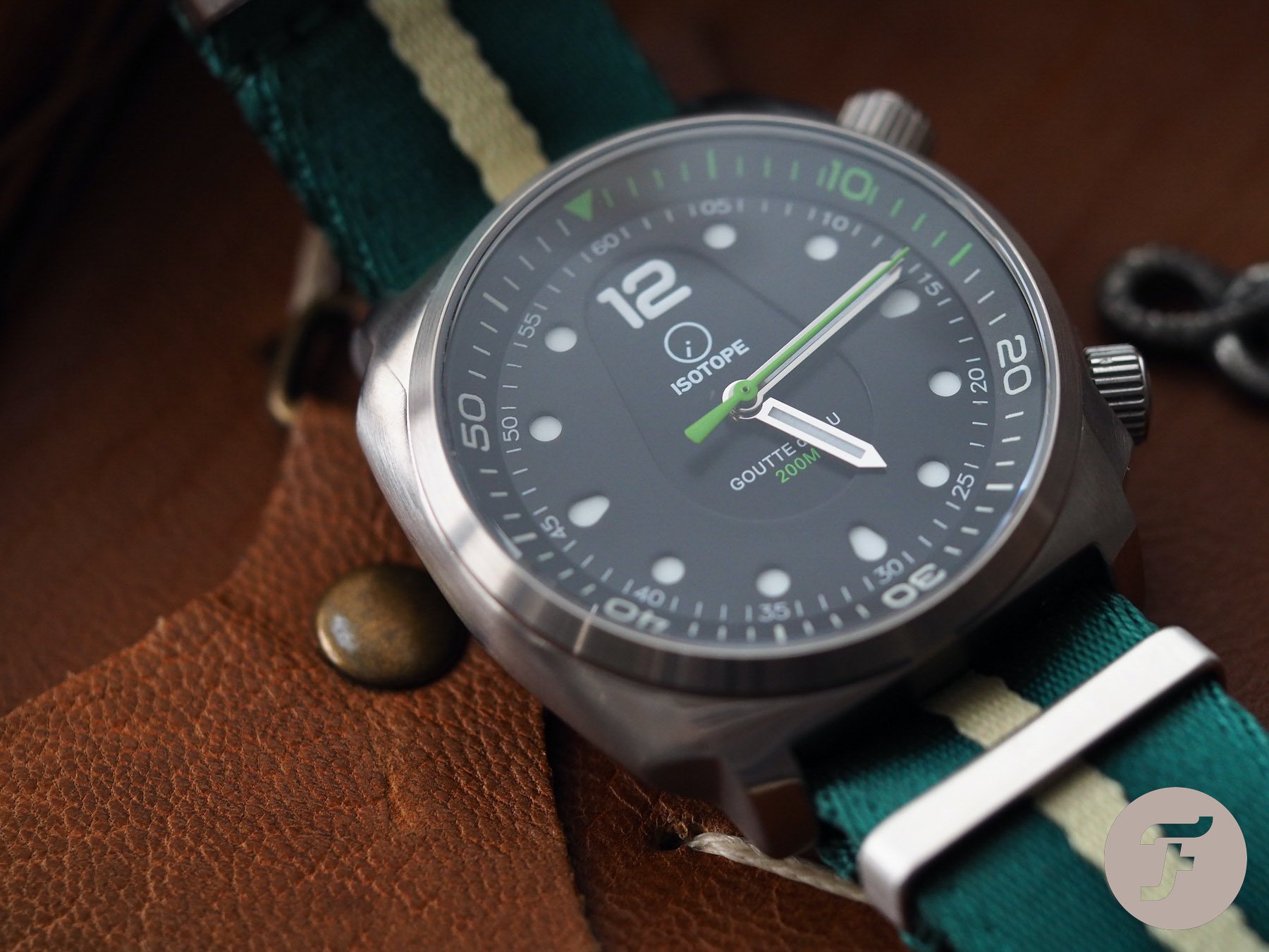
The case finish is brushed. I’m not against brushed surfaces, but for this model, I think a fine vapor blasting to make the exterior look even more like a stone might have been a good idea. Why? Angles. Pure and simple. The problem with an “overstuffed” cushion case like this is that brushing it with lines that don’t criss-cross at some point due to the angle of the brush head on the metal surface is really, really difficult. Getting it perfect is the preserve of brands like Panerai. As such, this effort is, while good, not as good as I have seen it done elsewhere. It is perhaps understandable for the price point, but the question could have been eliminated with a matte blasted finish. That, as I often speak about, is what I call a “smart design decision”.
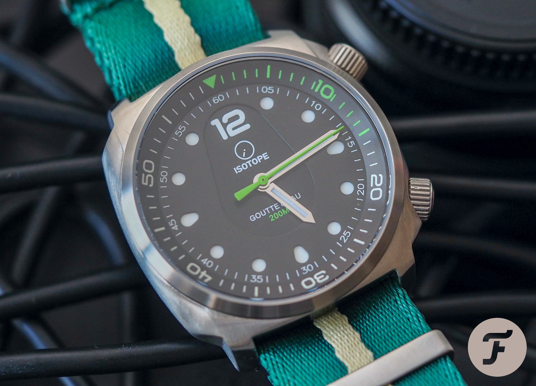
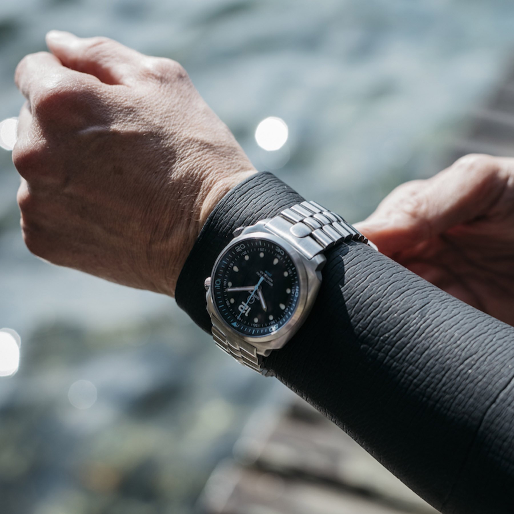
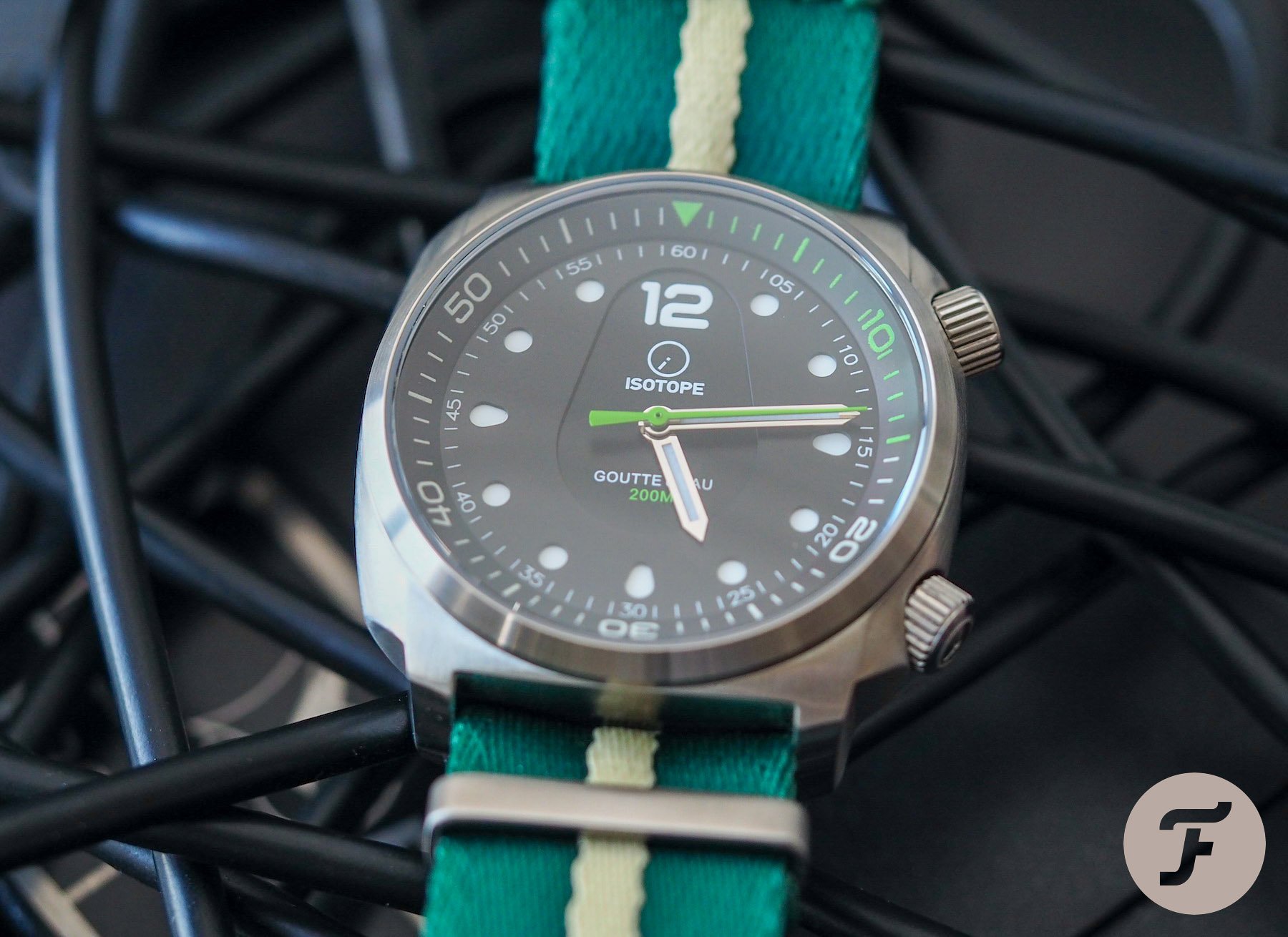
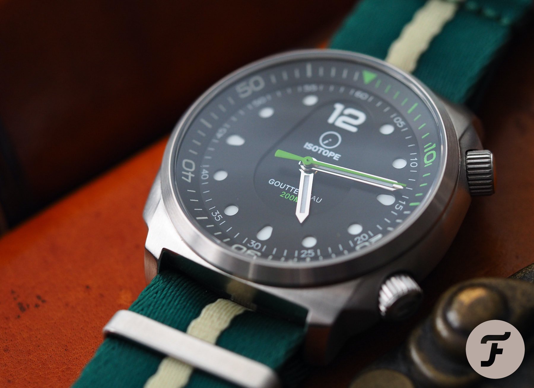
The dial is very legible
This is, first and foremost, a dive-inspired watch. The lume on the 12 o’clock triangle of the internal rotating bezel extends all the way around in two colors, shifting from green to blue when the track hits 15 minutes. Given this watch’s obvious roots, legibility is important. There are a couple of weird aesthetic quirks to the Goutte d’Eau dial that I will touch on in a moment, but the legibility (thanks to a very nicely executed sandwich dial), is great.
What are the weird bits?
The weird bits for me are the teardrop-shaped depression in the center of the dial and the shapes of the hour markers. The teardrop is quite clever in a way, as it plays with your eyes, given the sandwich construction of the dial. Although the teardrop recess is not as deep as the dial is thick, this added third level to the dial is a nice touch, in theory, I’m just not sure I love it in practice. Does it draw my eye toward the 12 o’clock marker and thus act as an orientation device? Maybe. I’d be willing to buy that as an argument but for the fact the 12 it is training my eyes upon is pad printed where the other hour markers are part of the lower sandwich level. As such, it isn’t quite as bright or crisp in the dark.
Those hour markers. I’m talking about the cardinal points. We’ve touched on the 12, but what about the 3, 6, and 9? They mirror the “teardrop” portion of the dial, which is a thoughtful touch, however, I find them too organically styled for my taste. I’m not actually criticizing the design process here. Pretty much everything Isotope has done makes sense from an artistic perspective, and there are a lot of nice links and callbacks throughout the design that make it exciting to wear this watch in the long term. It’s just that I don’t go in for that kind of aesthetic.
An unusual design deserving attention
Is this a good example of type? Yes, it is. Is it good value given its sub-€600 price tag (for the Sellita version; there is an NH38 option for about €150 less)? Yes, it is just about on point for what it is. Could it be improved in the next iteration? Aside from the case finish concern, and perhaps the external coloring on the 2 o’clock crown, which I could do without, there isn’t a huge amount to change about this watch. It’s just a question of whether you like the design.
…celebrate the brand’s fifth anniversary…
If you do, I could imagine you falling in love with it, because there really aren’t too many watches that look like this around at all. If you are interested, check out the Isotope Goutte d’Eau Compressor diver here. Oh, and to celebrate the brand’s fifth anniversary, Isotope is offering 15% off until June 2nd. Just use the code anniversary15 when you check out.