Mitch Mason Chronicle Watch Looks Likely To Soar

Crowd-funded watches are commonplace these days. That’s a really good thing for the watch community, in my opinion. With plenty to choose from at generally affordable prices, these projects provide a welcome access point to a sometimes prohibitively expensive industry. But sorting the wheat from the chaff is not always so easy. The first watch from Mitch Mason, the Chronicle watch, offers a very unusual design, buoyed by great add-ons for a very attractive price.
Homage pieces are ten a penny. Borrowed dial designs abound. Many microbrand owners seem either allergic to or terrified of doing something different. On one hand, that is totally understandable. Homage pieces are popular. Popular dial designs are popular for a reason. And, perhaps most importantly, budget restrictions for these entry-level timepieces make going too far out of the box painfully prohibitive. But here’s proof it can be done. Now, normally I’d hold back on revealing the price until the last paragraph, but I think that with this piece you really should get to know it with the early bird Kickstarter price of $379 in mind. Crazy, right? If you think there’s only so good something can be for less than four hundred bucks, read on. Let me know if your opinions changed in the comments below. I know mine did.
Let’s start with the basics
For that kind of price and this kind of design, there has to be some kind of trade-off. You can’t have everything for nothing. In my opinion, Mitch Mason made the sacrifice in the right area — the movement. There is absolutely nothing wrong with the automatic Miyota powering the brand’s debut model, the Chronicle. It won’t win any watchmaking awards, but neither are we likely to see the Sellita SW200 sweep up at the GPHG…
It is important for every collector to have their boundaries and checklists.
Some customers place such a premium on the Swiss Made label, pieces like this won’t even register. That’s cool if that’s how you define quality. It is important for every collector to have their boundaries and checklists. For me, however, this kind of creativity doesn’t require a fancy movement to be of interest. I often ask myself, how much value does a Sellita, a Soprod, an STP, an ETA, or any other base caliber really add to a watch like this? How much does it matter to me? To me personally, it doesn’t matter that much at all. I have watches powered by all of the above already. Weirdly, I just realized I don’t own a Miyota at all, so maybe a model like this has even more value from a collector’s standpoint when it comes to my own collection…
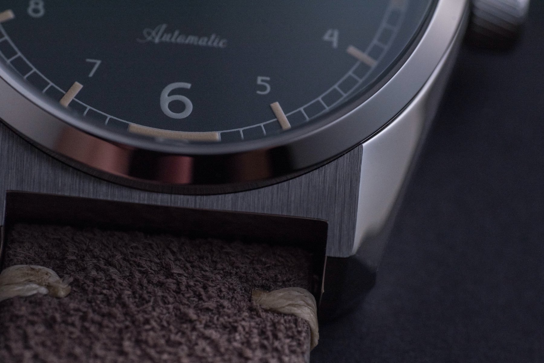
Central to this project
Design is central to this project. What is also clearly important to Mitch Mason is ensuring that the products and accessories it provides are of the best possible quality for the money. Here, I am referring to the tasty-looking watch wrap these watches come packaged in. With a bigger brand name stamped on the front of it, this kind of leather pouch would command in excess of the $379 asking price without breaking a sweat.
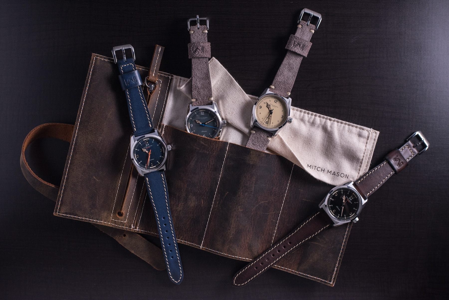
Triumphant colorways
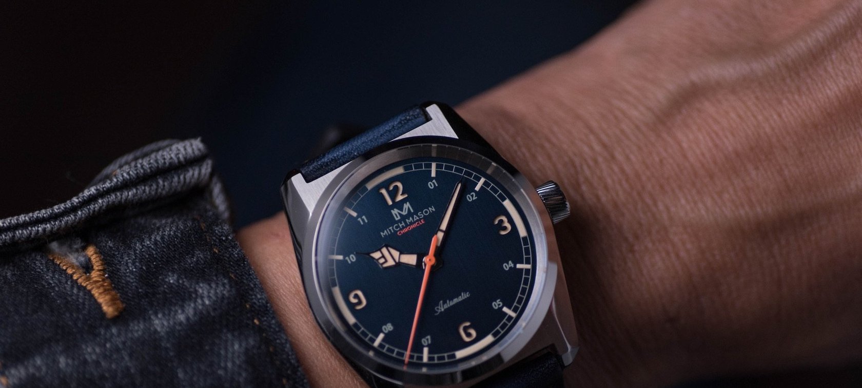
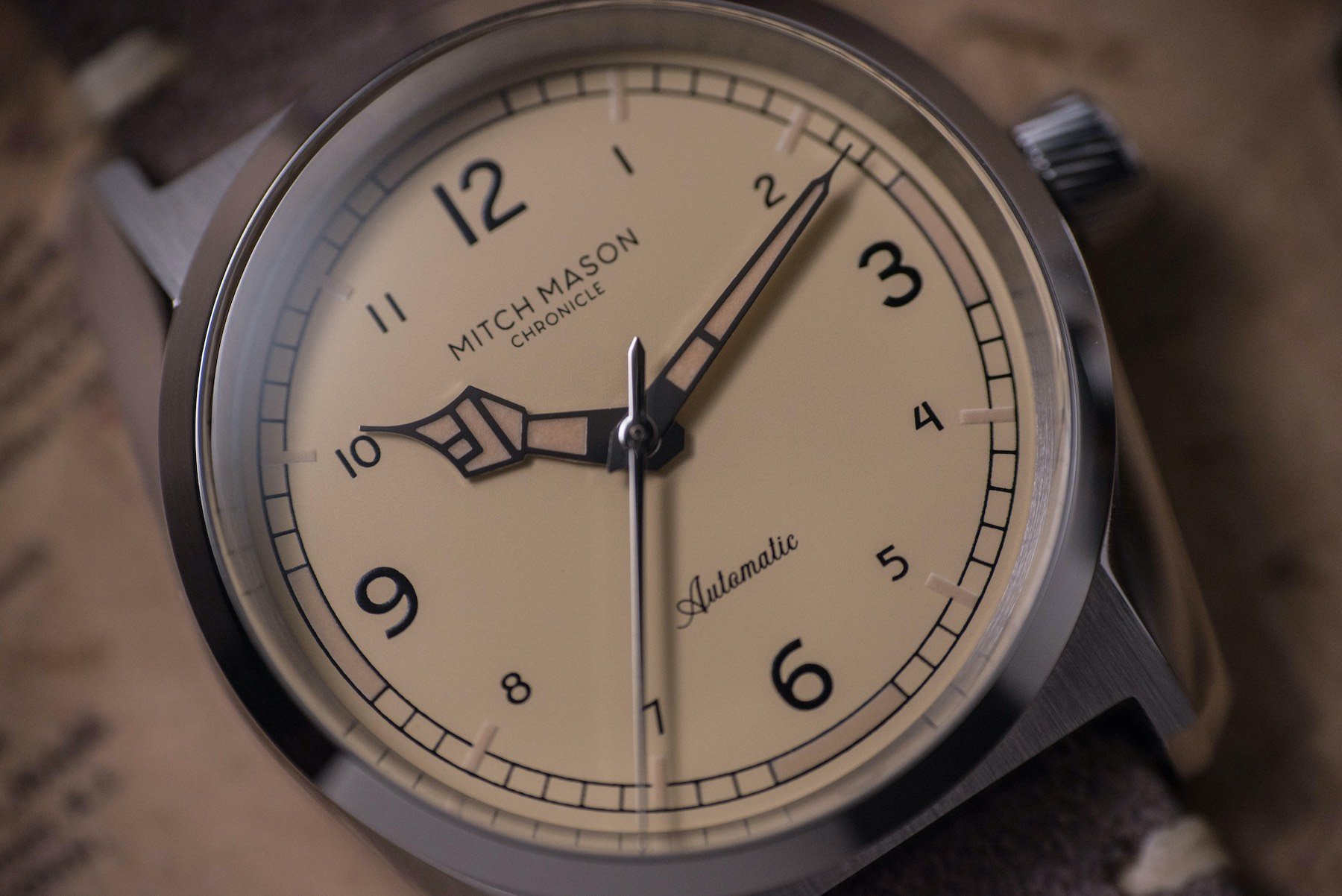
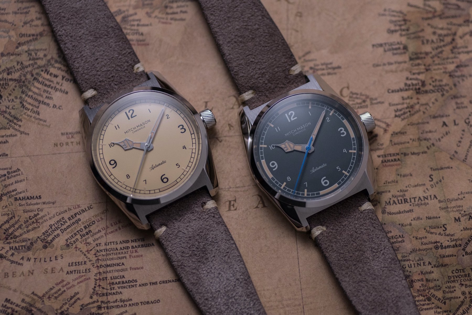
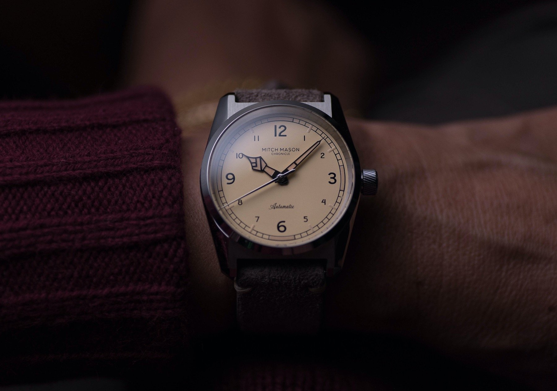
Do you know what I really like about this four-piece release? I don’t have a favorite. That’s not to say I’ve not had favorites. In fact, I’ve cycled through all four at one point or another over the past few months since I became aware of this collection. Initially, I was dead set on the cream. I’ve never been attracted to cream as a dial color. I don’t often go in for pale shades in general. Here, however, was something so unapologetically different I just couldn’t shake it from my mind. It is, in my opinion still, the cleanest of the bunch. But that serene cream was soon usurped by the brushed blue dial.
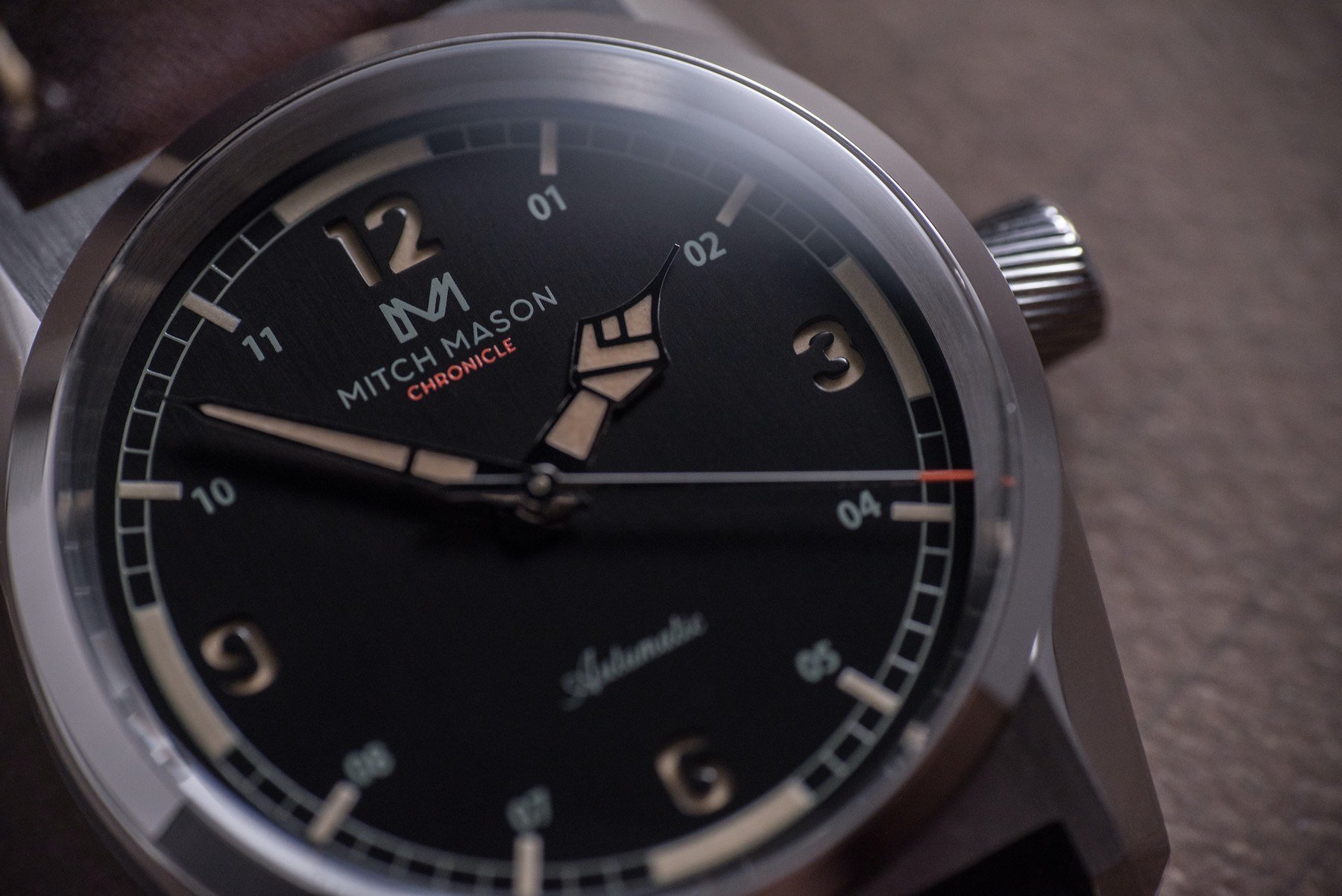
The finish of the blue dial marks it as an outlier immediately. I’m not sure if I’d go as far as to call it divisive but it is certainly the most extravagant design. The bright red/orange seconds hand adds to that vibe. The same color is used on the flat matte black dial too, but more sparingly. In fact, that realization saw my preference shift towards the black before I realized that it said something else about the brand in general that I hadn’t noticed at first.
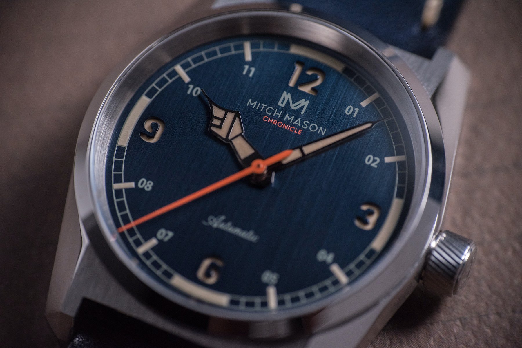
Unlike so many small brands, component sharing throughout this collection is minimal. Yes, they use the same case back design. Yes, all three dials and handset use the same lume. But each model has a unique seconds hand and upper level dial. That is pretty unusual. Especially when you could easily have made it unnecessary with a couple of minor alterations.
Individual
Of all the models, the one that wouldn’t so easily be able to get away with the red-tipped hand is the “field gray” model. This was (and I think remains) my least favorite of the bunch simply because it is the “coldest” design. That said, it did briefly jump to the top spot when I considered these colorways from a versatility perspective. Had it been fitted with the plain silver seconds hand of the cream dial it might have stayed on top…
But — and this is rather unusual for me — I am not of the opinion that I could make the collection better by swapping around existing components. I really do think that Mitch Mason has done a great job of conceiving self-contained colorways that work for each individual model. While that might not make picking a favorite an easy task, it makes deciding to get one on my wrist a lot easier.
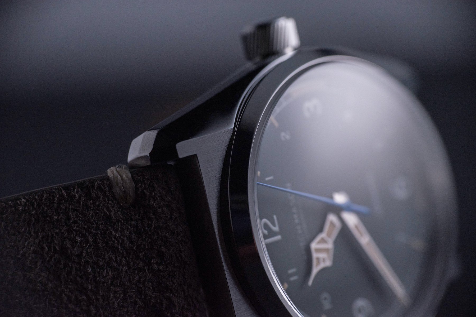
The case
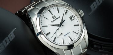
Yes, the dials are cool. The Mitch Mason hands are very, very special. But the runaway success of this project is the case shape. There is an edgy, Grand Seiko quartz vibe to this housing (it reminds me of the SBGV245 and SBGV243 case). The angles, the contrasting finishing, and its attractiveness from pretty much any angle I can imagine make this case a real triumph.
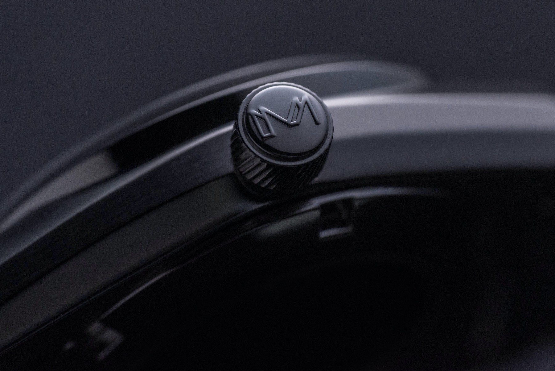
If I put my ultra-critical hat on I would like to see two changes. Firstly, I would like a deeply stamped case back (although I love the fact it is closed, to begin with, as well as the design itself). Secondly, I would do something entirely different with the crown decoration. I think I’d like to see the sharp, angular logo engraved rather than embossed. Honestly, though, in person, I cannot conceive having a problem with it as it is.
…you won’t hear too many complaints from me…
I am pretty excited about getting one of these watches (and the very nice looking leather wrap) in hand. I think it might well lever me from my cash. And at the sub-$400 mark, you won’t hear too many complaints from me on that front. To follow the brand’s developments and learn more about the upcoming Kickstarter project, check out the official site here.