Timor Heritage Field Watch Review — An Honorable Successor To The Dirty Dozen
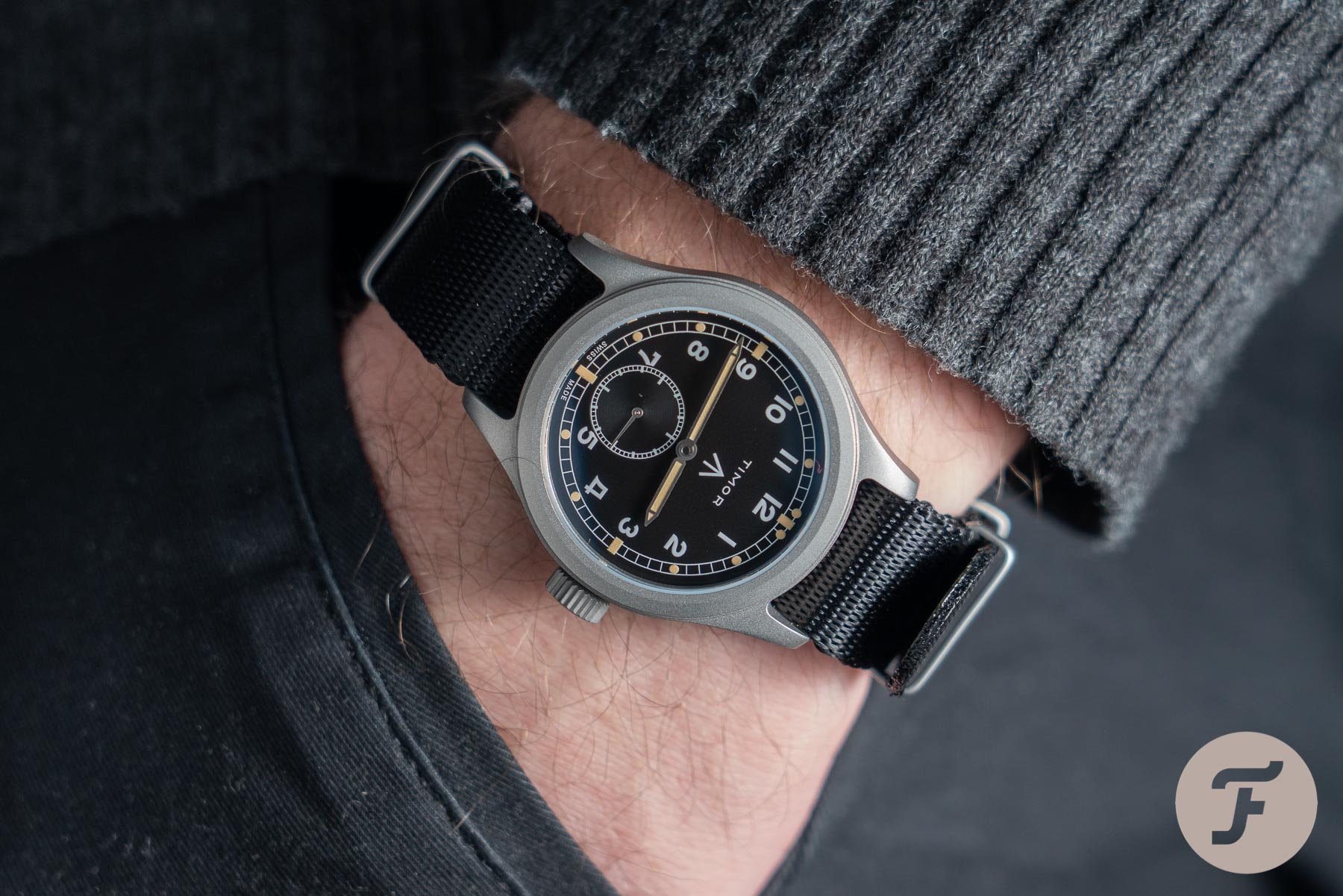
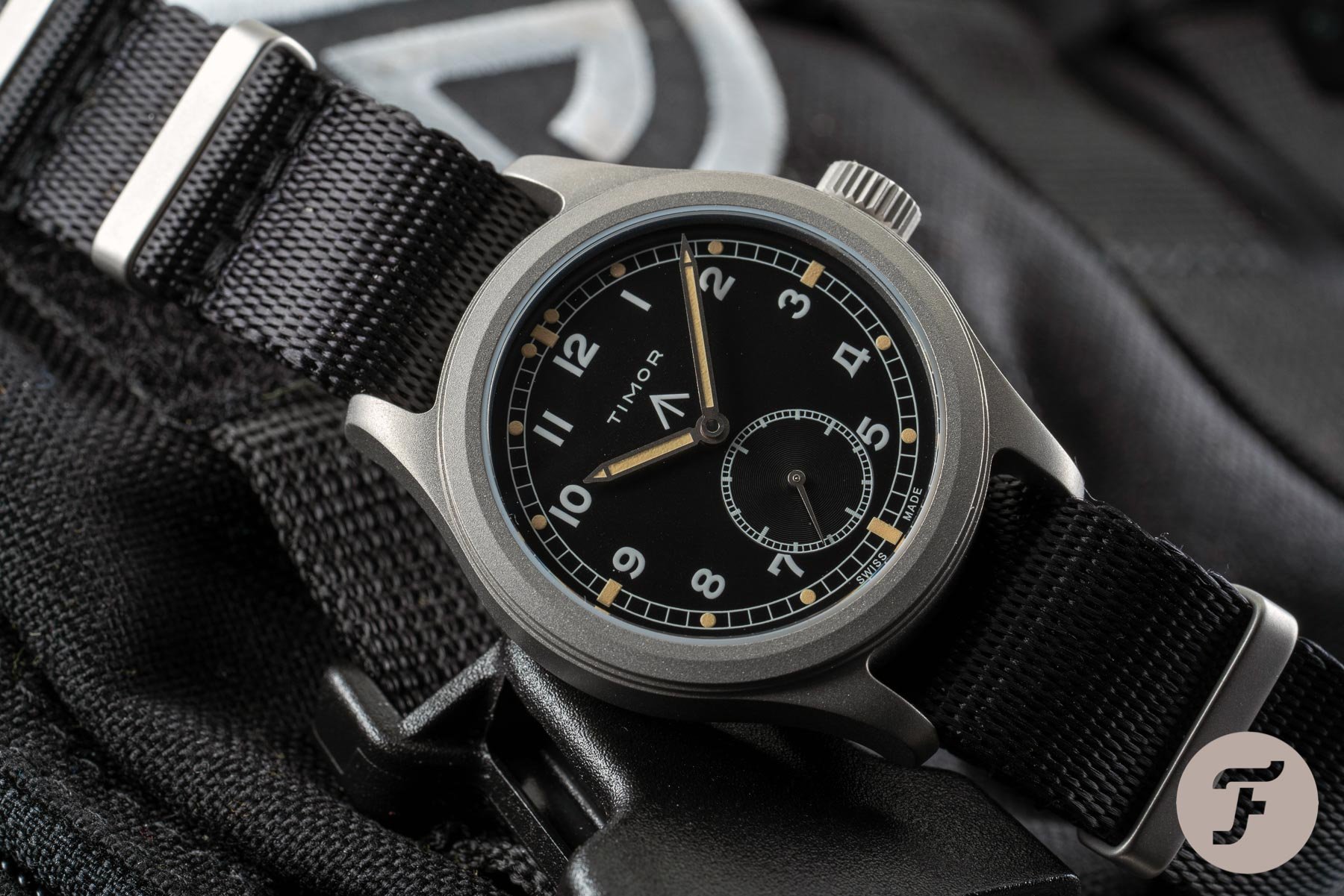
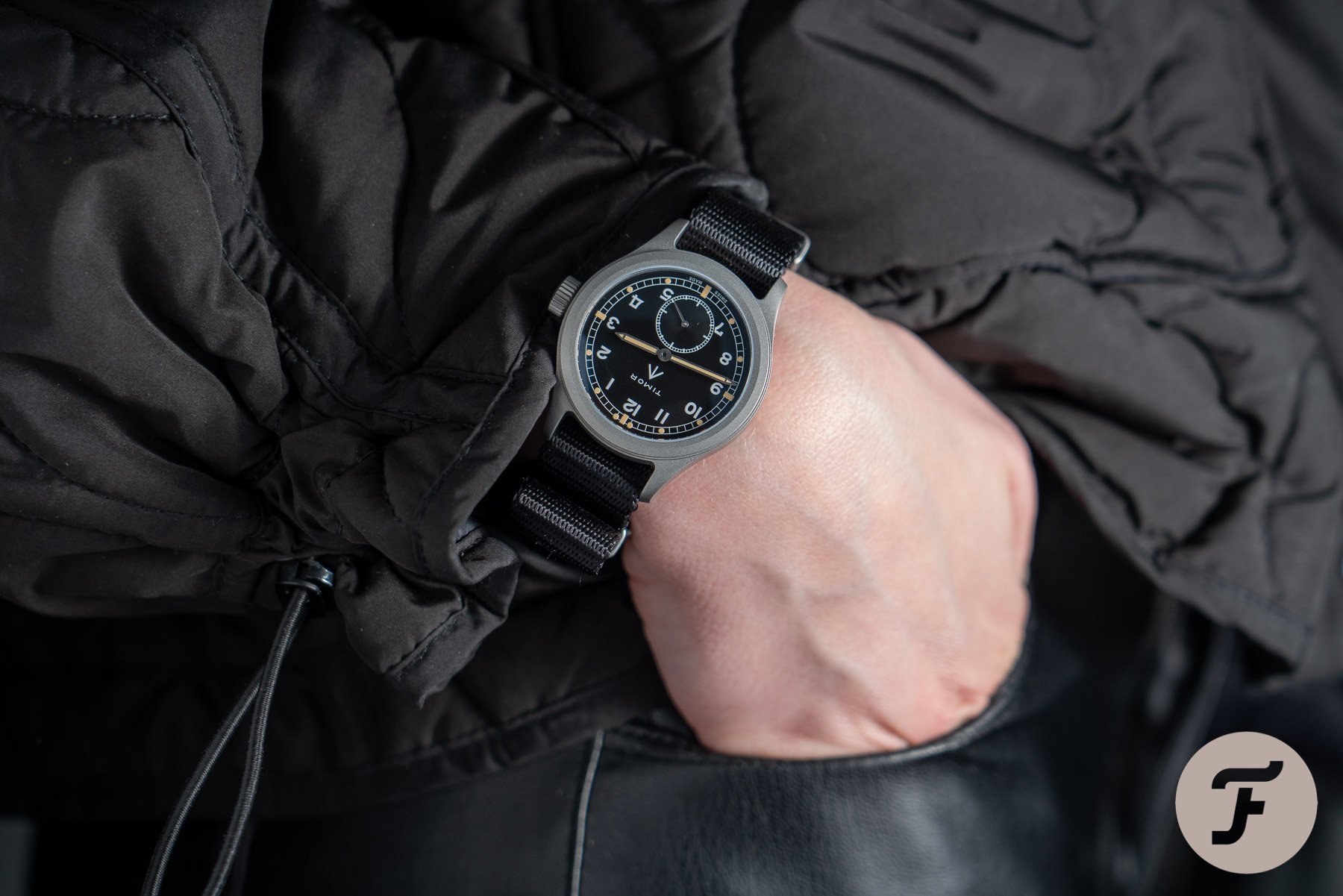
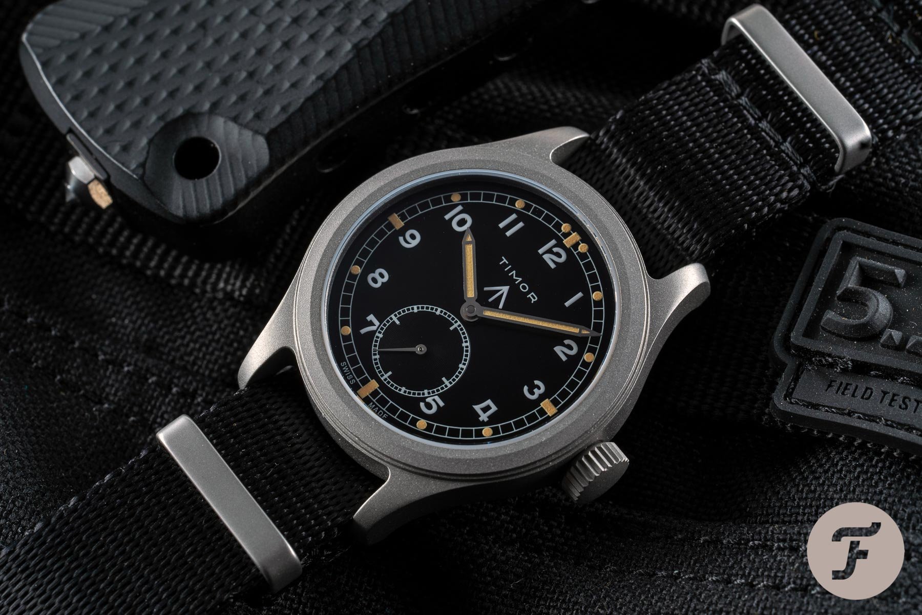
Over a year ago, in February 2020, I reported on the rebirth of the Timor watch company here on Fratello. In that article, I made it clear that if the brand drew from its heritage it would be staring down a slam dunk. This release had nailed-on success written all over it. There was no need to push the boat out. There was no desire for anything new, per se. All Timor had to do was keep its head and execute. Now we get to find out if the Timor Heritage Field delivers as we finally got the chance to go hands-on with it at our HQ in the Netherlands.
With a watch like the Timor Heritage Field, the press shots can only tell you so much. Of course, every watch model deserves to be seen in the metal, to be handled, to be worn, but some watches — especially those next-level, totally bonkers, Haute Horlogerie masterpieces we’re more likely to drool/fawn over than actually wear — are better able to communicate their class through staged soldier shots than others. When we’re talking about this price point and this kind of style, it is even more imperative to go hands-on.
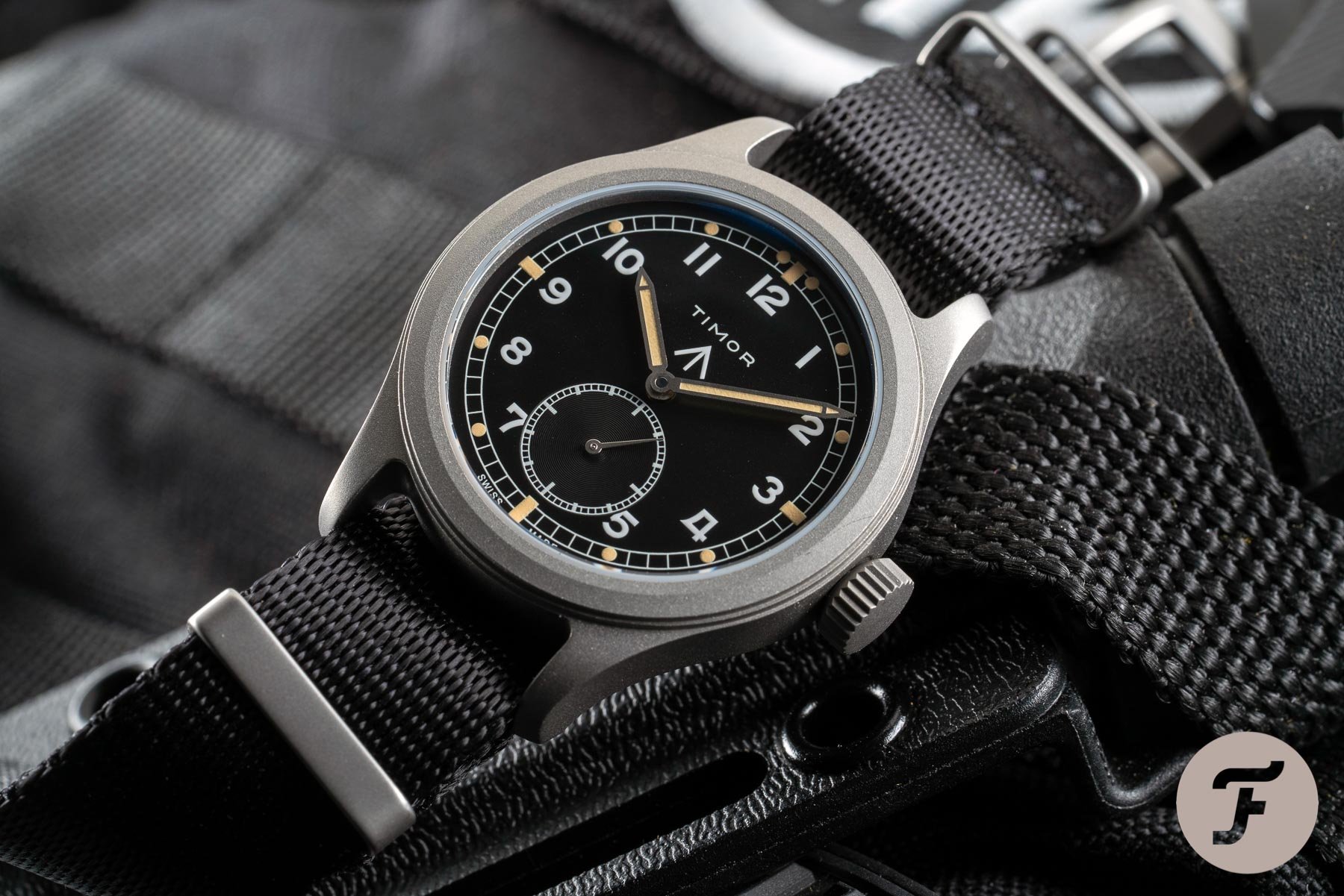
Why? Because this kind of straightforward renaissance is all about execution. The design is not new. It is barely updated from the original (that’s kind of the point). Sure, we have a blasted, more industrial surface finish and a slightly beefier case all around, but the DNA has been retained. The dial and handset are almost carbon copies of the original. And so the question becomes, how well does the new iteration of a world-renowned classic honor its forerunner’s legacy?
Aping with intent
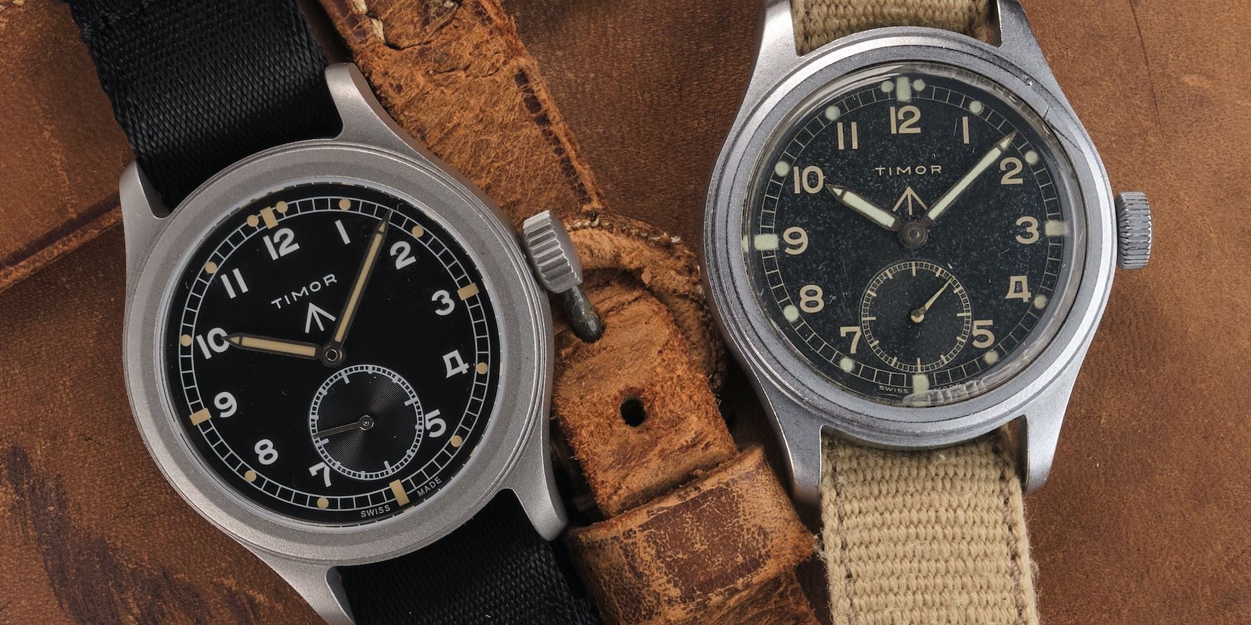
I will include one press shot in this article for the sake of comparison. Take a look at the below image supplied by the brand. In it, you can see the modern Timor Heritage Field on the left. On the right, we can see the original W.W.W. model that was a proud member of the Dirty Dozen during WWII.
The crown
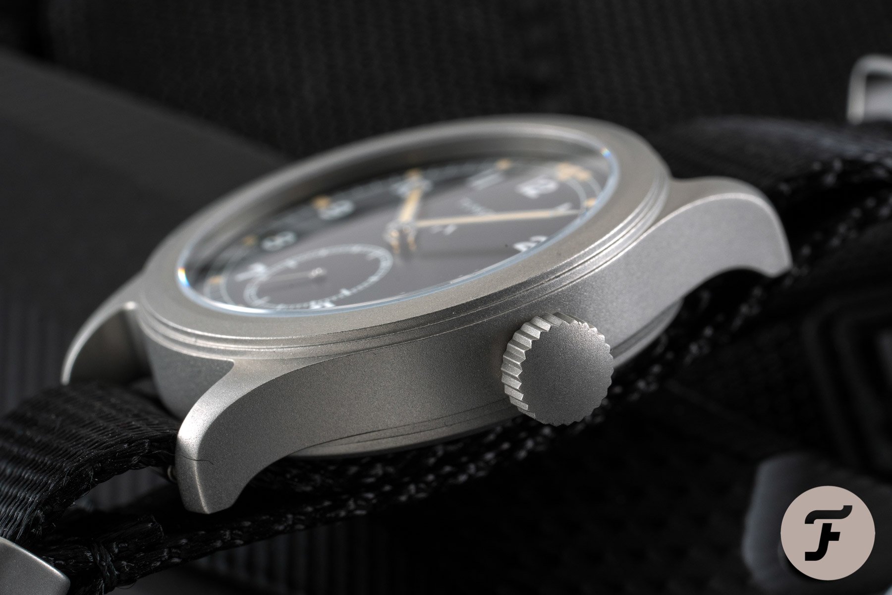
So let’s start with some of the major differences and speculate as to the thinking behind them. Firstly, military watches were well known for their oversized crowns. There is no doubt that the original crown of the Dirty Dozen Timor (which I’m just going to call the “DDT” from now on) was big for its day. It was one of the larger crowns among the Dirty Dozen but most of them were roughly the same size (the JLC and IWC were both tiddlers in comparison, interestingly).
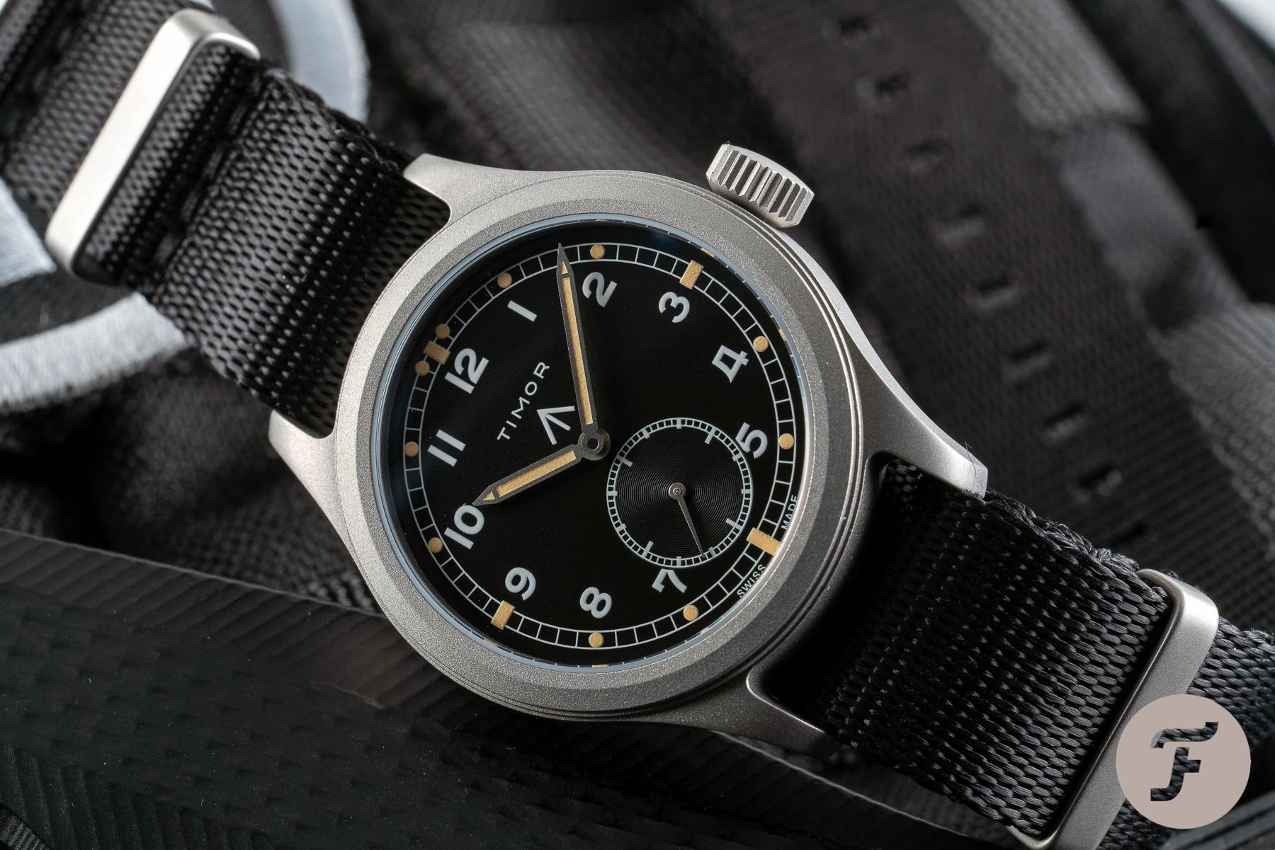
However, the modern version sees the already stocky crown expand even further! I really like this modification for two reasons. One: I like big crowns. Two: I think Timor has done this to play on our expectations of what constitutes a military watch and to feed the stereotype that a field or pilot’s watch should have a large, easy-to-grip crown. Had Timor reproduced the original crown, it would, by today’s standards, appear average. While the modern crown size is different from the original, it expresses the same point of difference that a direct imitation would not have been able to live up to.
The typeface
I believe the same idea is visible throughout this watch redesign in many areas. It is clear to me that while Timor did not want to change anything about the original design (especially not its diameter which remains 36.5mm, true to the original). However, it was clearly considered that the watch need send the same message to its modern audience as the original model did to its. As such, some subtle tweaks have come into play that, again, feed into tropes. And so, in the instance of the Timor Heritage Field watch, we find it is the tropes that have been reissued rather than the watch itself.
The typeface is clearly different. Firstly, the older font was slimmer and, in my opinion, more elegant. I think, therefore, that it has been updated so it reflects a more rugged character to the eyes and in the minds of a modern audience. In the 1940s, this font would have been seen as plain, functional, tough, even. nowadays, of course, it looks positively quaint.
Timor has done its best to conceal the modernization of this font by keeping the four (normally the first number people go to for font comparisons, weirdly) as similar as possible to the original form. But the new numbers are smaller 9and thus appear thicker) and they are more clipped. Just look at the 2 and the 12: the originals curl back on themselves while the modern versions meet with a brusque ending.
The hands and lume
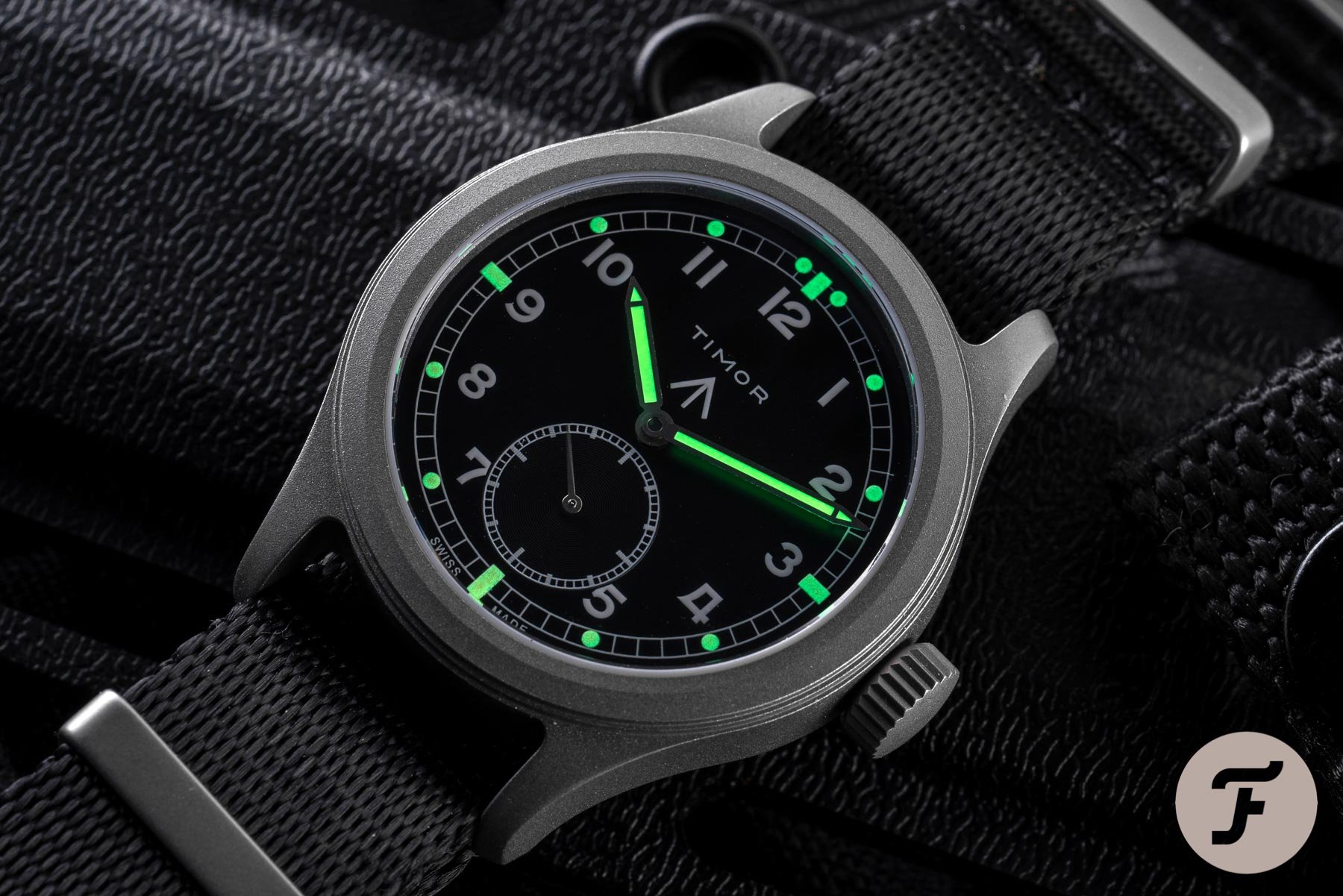
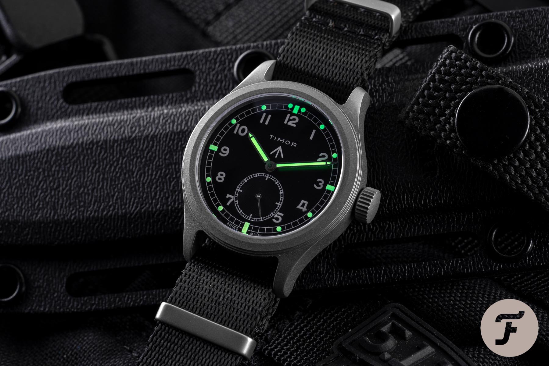
One massive improvement in the modern model is, of course, the lume. Just look at the blazing brightness in the above shot. That’s what a field watch should look like when the lights get low. The bright green glow is provided courtesy of beige Super-LumiNova 155C.
The handsets’ dimensions are also different from one another. In conjunction with the smaller numbers freeing up more dial real estate, the modern Timor Heritage Field has thinner hands. Interestingly, although the minute hand remains the same — very pleasing — length, the hour hand is a touch longer, which, give the smaller numbers’ more huddled appearance, means it intersects the hour markers far more obviously. But why do those smaller numbers appear so much closer together?
The bezel and crystal
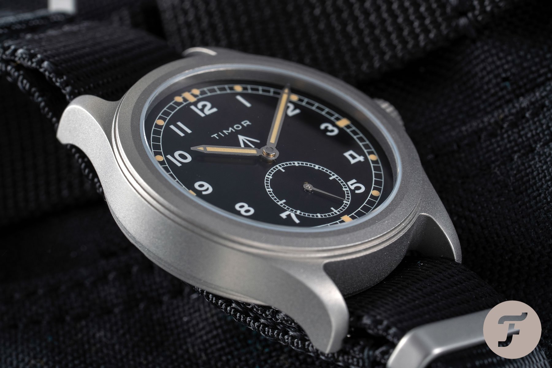
The bezel of the newer model is roughly 60% wider than the original, which reduces the dial aperture by the same amount, resulting in the more huddled feeling of the numbers.
Perhaps the biggest changes to the overall appearance of the watch are the bezel thickness and the crystal profiles. While the modern sapphire has the subtlest of domes to it, the original was effectively a bubble lens in comparison. Not only did the older crystal soften the overall mien of the watch, so too did the refraction of the dial make the whole affair feel much warmer and more inviting.
The final thought
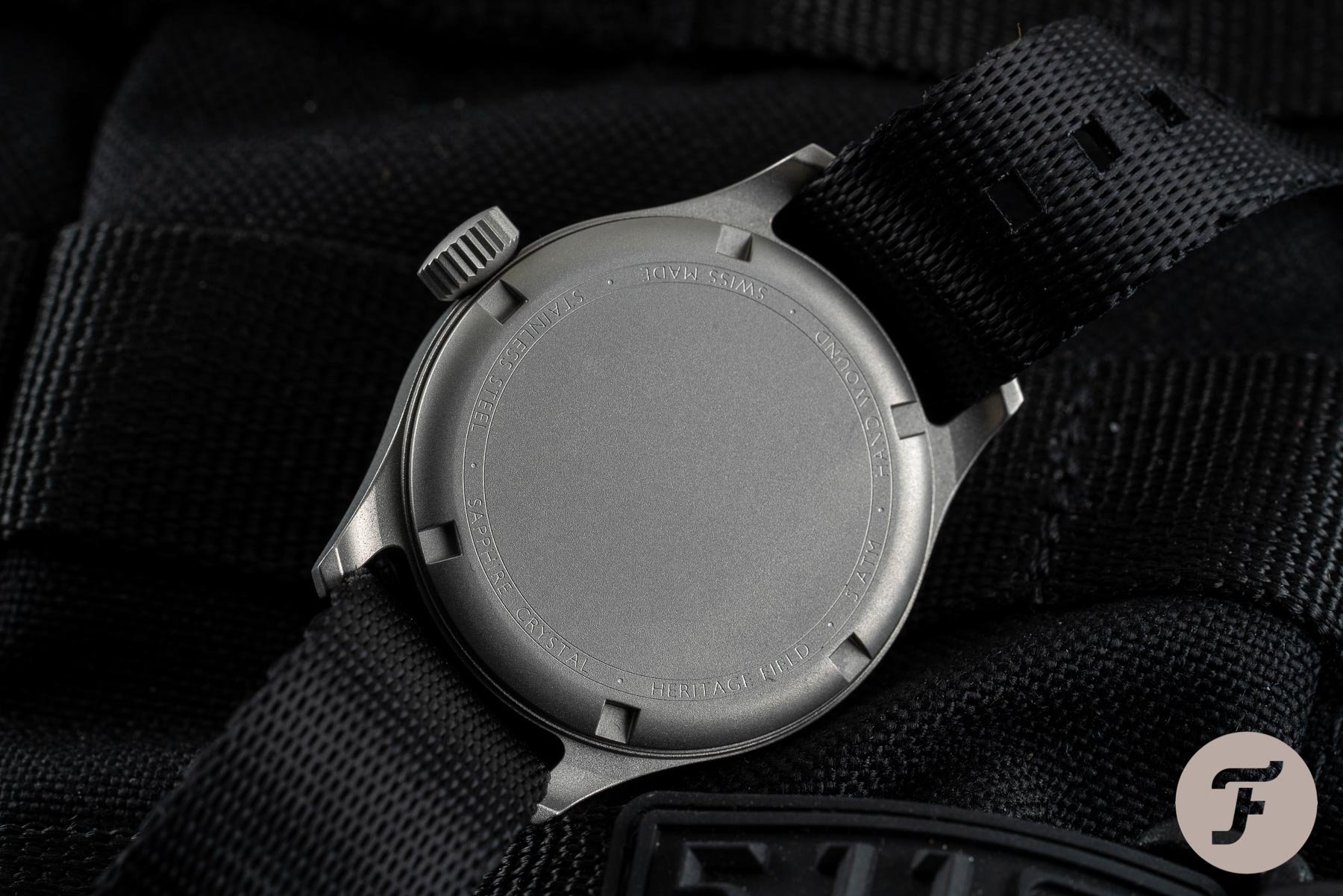
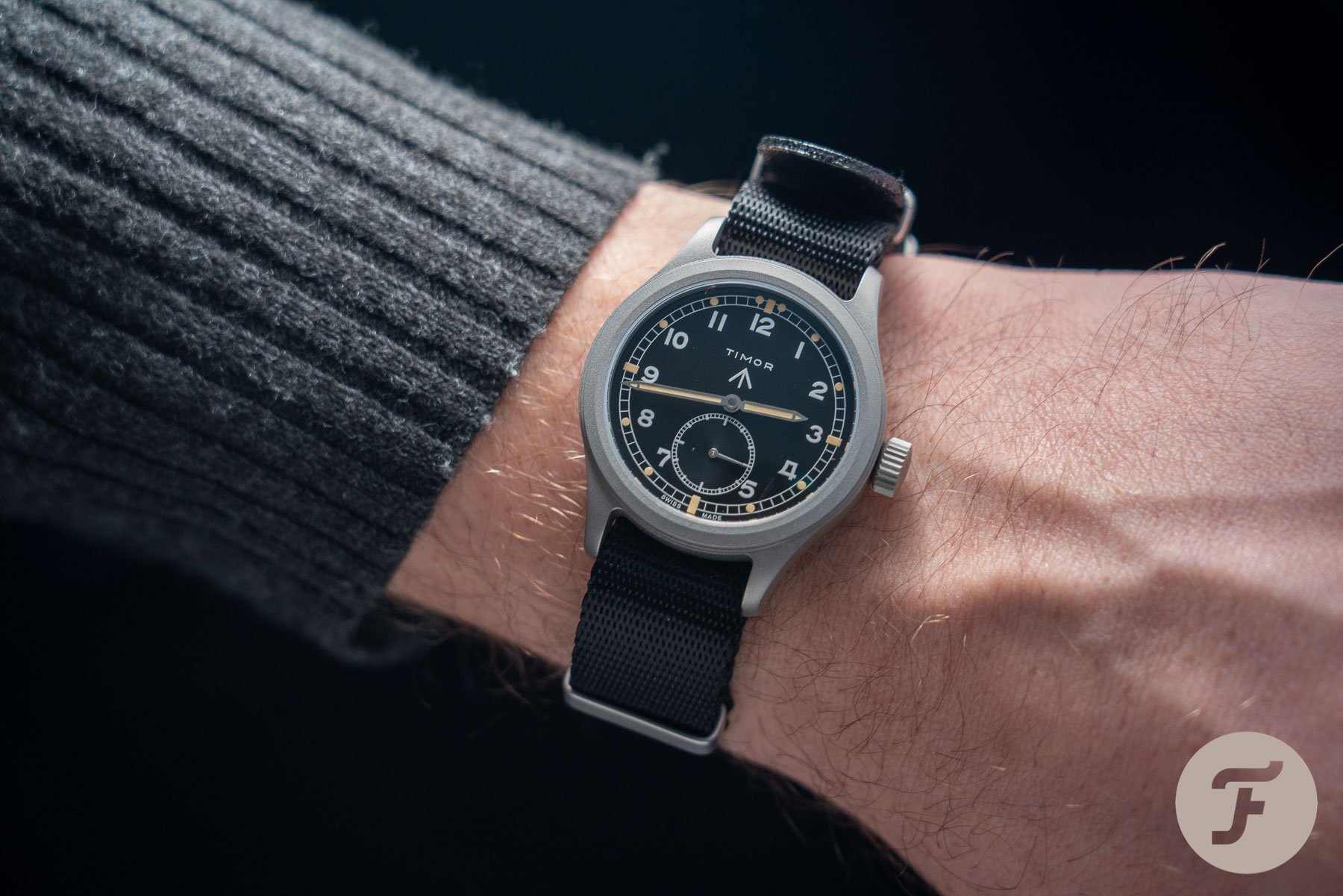
There is a lot to like about this new model. It is well made, robust, and features some improvements. I am kind of stunned it is only water-resistant to fifty meters and would have expected at least 100 meters given this case style, closed case back, and the size of the crown. Dimensionally, the 11mm thickness nets off really nicely against the 36.5mm diameter. In fact, given the diameter, the thickness is lower than one might expect. The thicker bezel and seconds sub-dial, however, counterbalances this visual effect and results in a watch that looks very close to the diameter it claims to be.
I personally prefer almost everything that was changed about the original. I’m a sucker for that original font. I love the high-dome crystal. I’d take the modern-day crown over the throwback in an instant, but that’s about it. That said, the modern-day price of £910 and the choice between manual or automatic movements is surely an improvement. Consider this: if you want a genuine Timor from back in the day, you’re looking at north of £1,500 for a half-decent one and much more for a good example.
Although I’m swayed by the delicious original, I do think Timor has done a pretty good job here. I was even more impressed with this piece on the wrist than I was from press photos. The execution is good. I think the early bird price of £650 was a really nice level for this watch but I don’t think the £910 asking price is beyond the pale, especially considering the Sellita SW260/216 movements within. Learn more about Timor here.

