Jorg’s Top Five Iconic Watch Case Designs

Ever since getting into the world of watches, I have always loved the discussions about watch design. The recurring topic is often progression. The arguments are as much about the lack thereof as they are about the ongoing quest for finding that new instant classic. Creating something genuinely new that meets with immediate acceptance seems to be the hardest thing there is. Especially when it comes to case design. But the excitement of seeing something novel is excellent.
The thing that has intrigued me most over the years is the shape of a watch case. It is often the most crucial element for an immediate “yes” or “no”. And a well-designed case can make a design become a proven classic. But the real appreciation of good design takes time and a lot of shifting opinions. That’s why it takes great courage to try and come up with something new. All too often, the answer is “seen it before,” or, “yeah it’s new, but it’s weird”.
Next to forming an opinion on new introductions, case design also triggers my design curiosity. Has every shape been tried? Are there new ways of combining already existing shapes that feel new? And when will I feel the excitement again that I felt for the five watches in this list? And it probably comes as no surprise that almost all of them are classics or future classics. But iconic design often feels uncomfortable at first. And some of the models in this list felt uncomfortable to me at first.
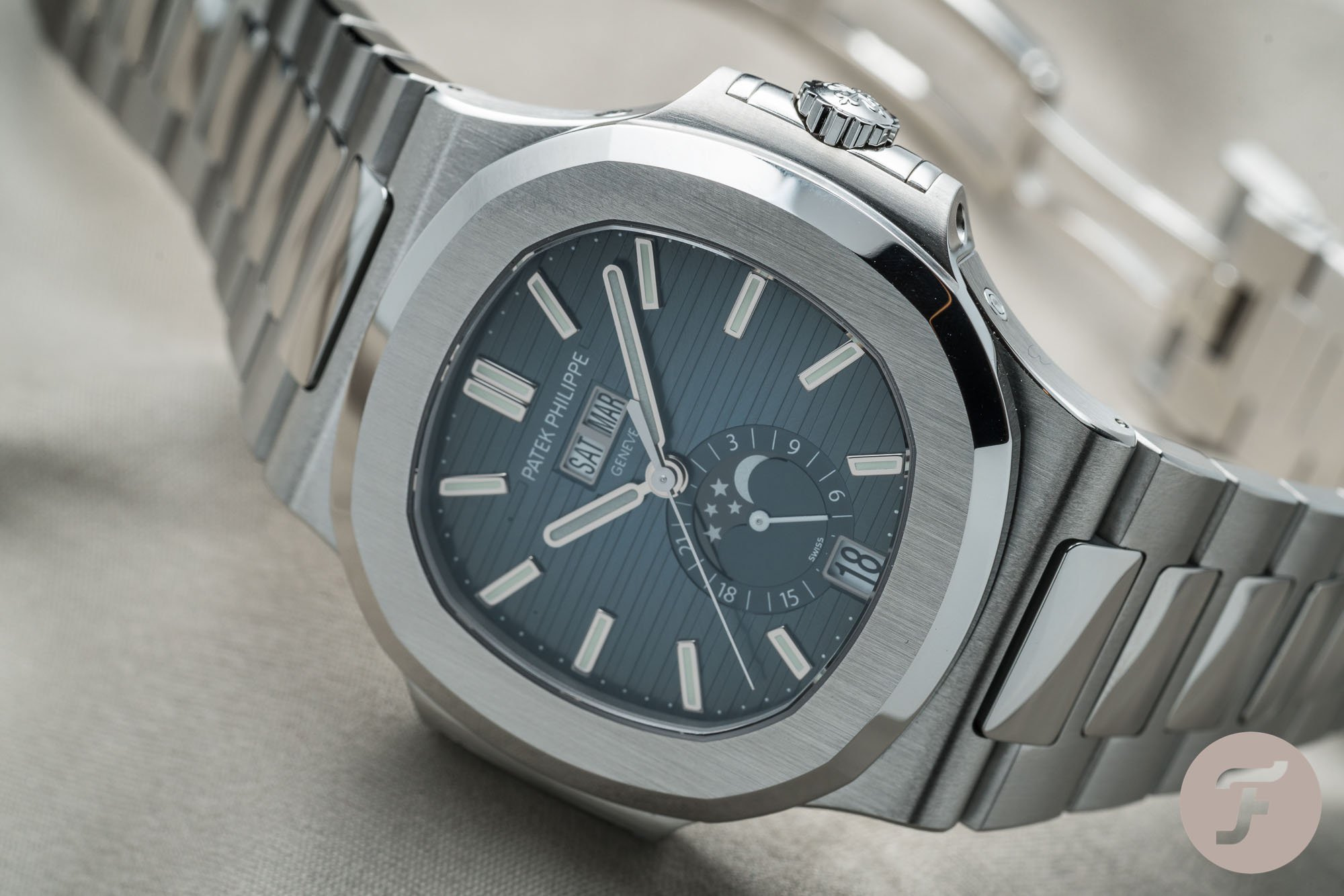
1. Patek Philippe Nautilus
The first watch on this was always going to be a design by Gérald Genta. And while you might have expected the Royal Oak here, I had to go with the Nautilus. Honestly, I am a Royal Oak guy. Overall I like it better than the Nautilus. I like the overall industrial feeling of the design better, the bracelet is more nuanced and ambitious, and I love the dial and bezel a lot more. As a reminder of all the details, you can read Robert-Jan’s article comparing both here. But as an exercise in case design, the Nautilus is more exciting. The octagonal shape of the bezel characterizes the Royal Oak. If you look at the fundamental shape of the case, however, you will find that it’s less groundbreaking.
Genta realized that he needed something extra to create a lasting and exciting shape.
The sides of the case define the Nautilus. Genta realized that he needed something extra to create a lasting and exciting shape. Had he not done that, it would have ended up a pretty “yawnful” watch. The proof? Just look at the Piaget Polo S, and you will know what I mean. For me, The Nautilus is Genta at his best when it comes to case design. The combination of curvy and straight lines and round and sharp edges make this a joy to watch and a true classic.
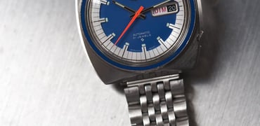
2. Seiko 7A28-7000 “Aliens”
The story of the Seiko 7A28-7000 is one from my youth. When the movie Aliens was released in 1986, I was nine years old and a bit too young, according to my parents, to see it. Three years later, my aunt, however, thought it was time to watch Aliens with my brother and two nieces. The result? A movie that had me on the edge of my seat for the entire duration — okay, it scared the crap out of me at some moments as well. Secondly, a fascination with all the futuristic-looking elements, including that weird watch on Sigourney Weaver’s wrist. But as I was young, I quickly forgot about it altogether.
Did we need Giugiaro to make this design a reality?
Fast forward a good fifteen years. That’s when the watch resurfaced in my consciousness. In an online search for Giugiaro car designs, I stumbled upon that Aliens Watch. There it was, still looking futuristic all those years later. And I still loved it. I don’t have to explain to you that its design is unconventional.
Nevertheless, combining a round shape and a rectangular shape it not weird at all in watch design. But the way it was done is remarkable to this day. The question I always had was, “Did we need Giugiaro to make this design a reality?” It seems hard to believe that if a member from the Seiko design team had shown this design in 1983, it would have been seriously considered for production. Thank god for Giugiaro and Aliens.
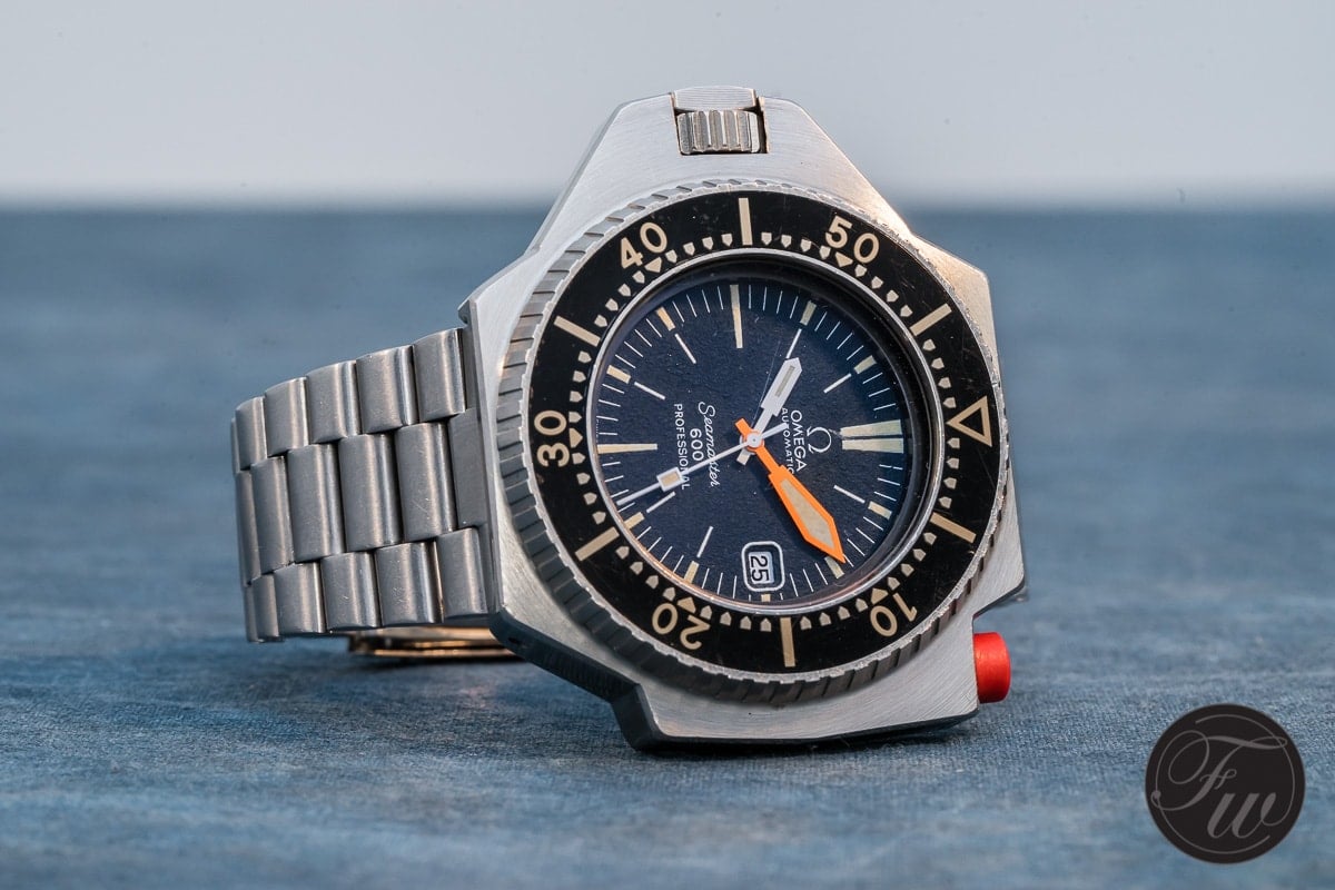
3. Omega Seamaster 600 PloProf
I wrote about my love for the modern Ploprof 1200M in an episode of 52Mondayz that you can read here. The Ploprof looks strange, weighs a ton, and is enormous. How can it be a classic? Well, Omega found a magical way to make it work. In my article, I explained why I like the modern Ploprof 1200M better than the original. And Robert-Jan explained the differences between the original 1970s 600 PloProf and the modern Ploprof 1200M here. But when it comes to the case design, we have to honor the original Seamaster 600 PloProf.
Here is a watch that is purely based on the design principle of form following function and it ends up one of Omega’s most iconic designs.
Gerard explained in his article about his original 600 Ploprof what triggered the design of the watch. It was born out of pure practicality rather than an extensive exercise in design shapes. Not only does this give the PloProf instant credibility, but it also provides the magic of the story. Here is a watch that is purely based on the design principle of form following function. Consequently, it ended up one of Omega’s most iconic designs.
I wrote in my recent article, “Although the shape of the case seems asymmetrical, if you look closer, you will find that the basis of the case is very symmetrical, but the functional elements added to the watch make it look asymmetrical and weird. But it’s weird for exactly the right reasons.” And that’s why it’s my second favorite Omega after the Speedmaster Professional.
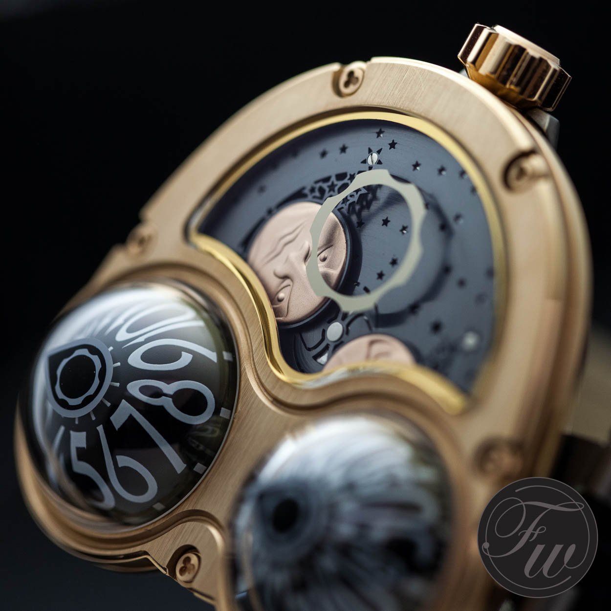
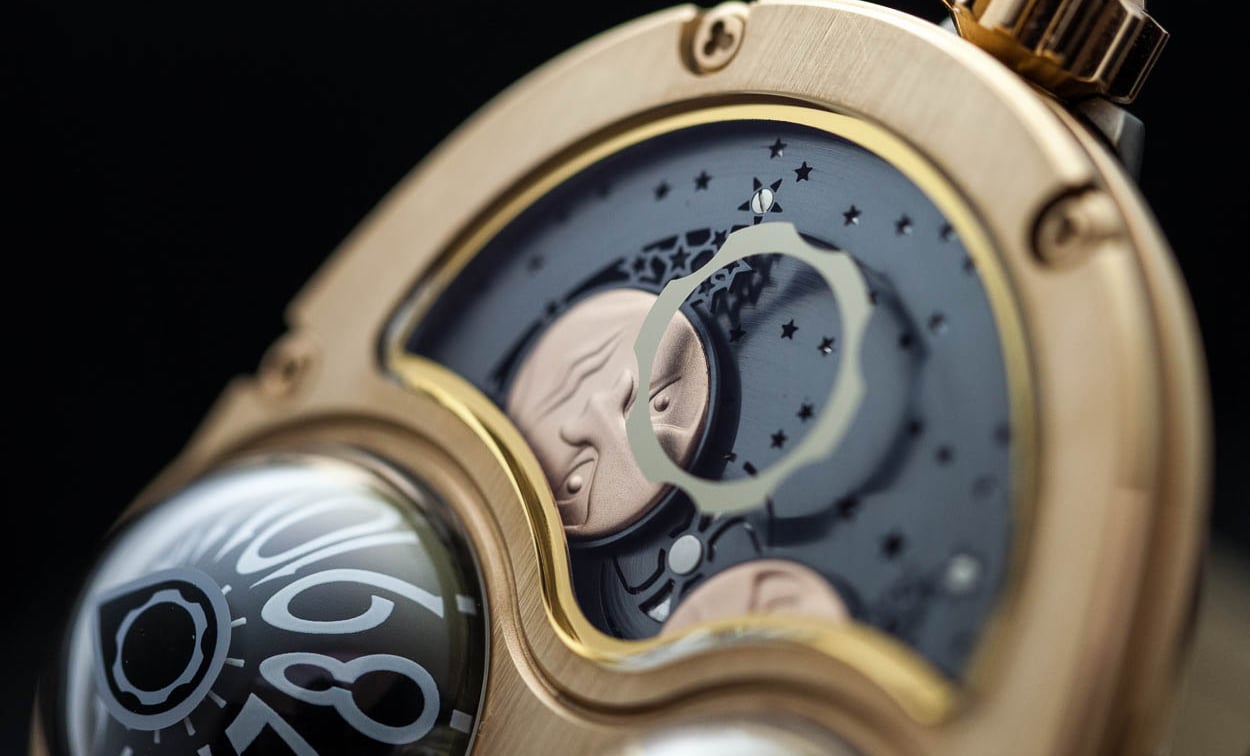
4. MB&F HM3
There are quite a few smaller independent brands that have pushed the boundaries of case design over the last two decades. Without a doubt, my favorite has always been MB&F. I do not just like the brand’s out of this world designs, but I also love Max Büsser’s ideas about what a watch brand can be and how the collaborative way of working results in the most stunning creative results. The epitome of MB&F’s quest for amazing watch designs for me thus far is the Horological Machine 3 (HM3).
I do think, however, that the HM3 Starcruiser shows that it is not lightyears removed from what could be a widely loved and wearable watch.
In all fairness, every one of the Horological Machines is an exploration in case design. Picking one is simply a personal preference. MB&F creates limited production timepieces that push the boundaries of what a watch necessarily can be. I do think, however, that the HM3 Starcruiser shows that the design is not lightyears removed from what could be a widely loved and wearable watch. The vertical symmetry in shape feels very comfortable, and its dimensions are not the most extreme. Do I prefer the regular HM3 Starcruiser or the HM3 Frog version? Ask me that again when I have the money to buy one.
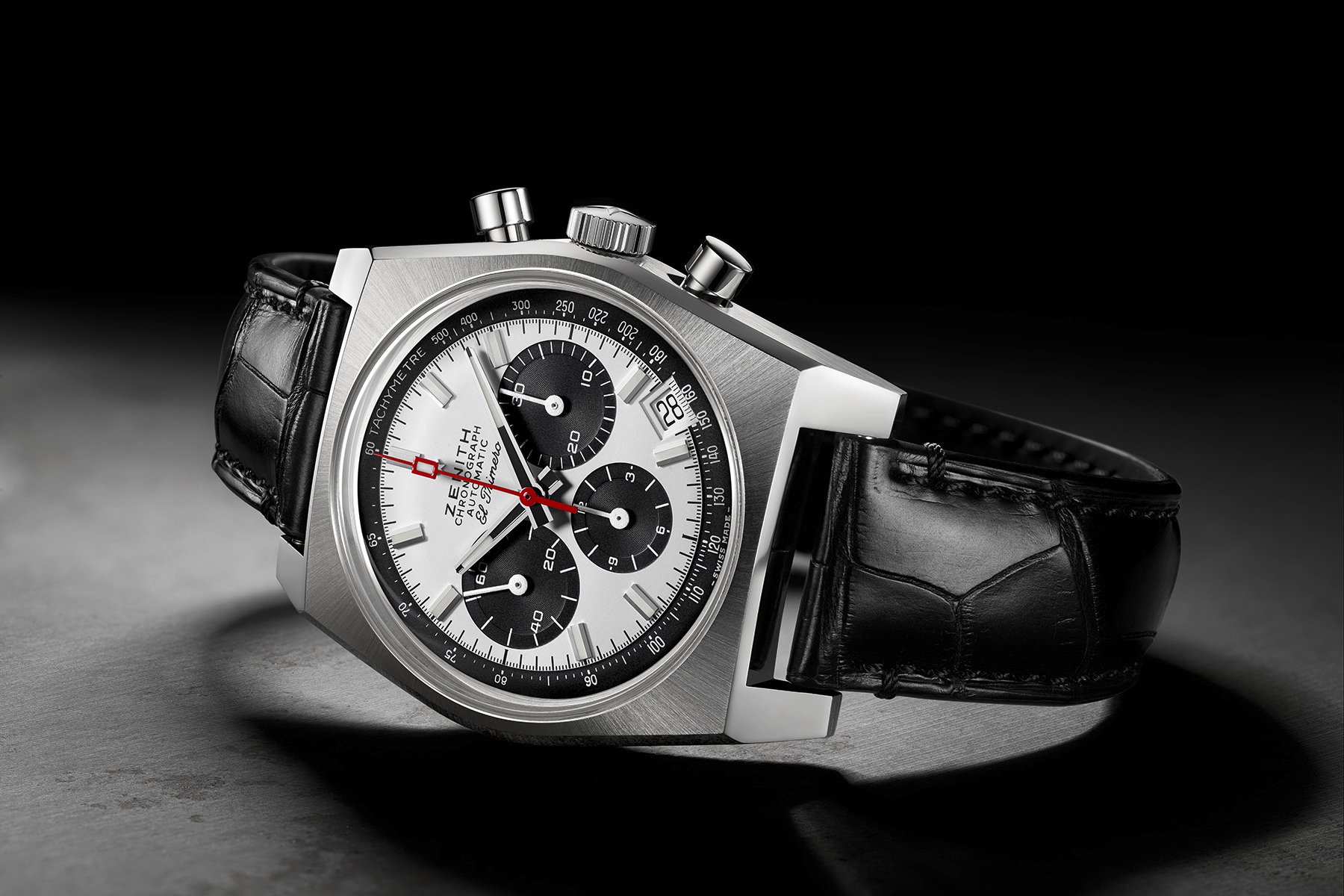
5. Zenith El Primero A384
The last watch on this list might be a bit of a surprise after all the previous entries. But sometimes the magic is in the simplicity of a shape rather than finding an extreme. The Zenith El Primero A384 is the perfect example. For quite some time, I felt the case design of the Zenith El Primero A384 was too defined by the era in which it was created. Introduced in 1969, the El Primero A384 features a blocky case design that felt a bit too simple and stuck in that realm of late ’60s and early ’70s designs.
In all honesty, the basic shape of the case is defined by rather simple lines.
The case design is also not that unique in itself. There are quite a few brands from that era that used the same blocky design for their watches. And while I love the original El Primero A384 that was produced from 1969 until 1972, the real power revealed itself after the variety of Revival editions showed how diverse and powerful such a seemingly simple design can be. Because, in all honesty, the basic shape of the case is defined by rather simple lines. But they are highly effective. Both in the fact that they define the case of El Primero A384, a profile we do not often see anymore. And because it is the perfect seemingly simple canvas for the dial and hands to shine. Ideally, that is what a case should do and why I love the El Primero A384.
There it is, Jorg’s top five iconic case designs. Do you disagree, or do you feel we left an essential design out? Let us know. We would love to hear your opinions and more about some of your favorite designs.