Tulloch T-01 Watch Review

Sometimes, all it takes is a meeting of minds. Buoyed by an unshakable passion for creating things, Shane Tulloch has poured his heart, soul, and savings into starting his own brand. And while that is an ambitious move at the best of times, in 2020 it proved even harder. Luckily for Shane, his thoroughly planned approach reaped dividends. Having spent years accruing contacts in Switzerland, he knew who to call. With a movement brought to life by Kari Voutilainen’s team, the TULLOCH T-01 has all the credibility it needs to punch above its weight.
I first discovered TULLOCH in the early part of 2020. I’m not going to pretend I was ahead of the curve or an early adopter or, even, particularly excited when I first received the press release detailing the T-01’s debut. What can I say? It was that time of year. Press releases were migrating from PR departments to my inbox like swallows to warmer winter climes. But there was something about the design of the TULLOCH (dial) that lingered in my brain. Days after receiving that press release, I revisited it. Intrigued (but still largely ignorant of what I was looking at) I reached out to Shane to arrange the Baselworld meeting that never was…
Fast-forward to now
Recently, I had the chance to speak with Shane on the phone. It was our first “meeting” and I’d imagined it to be a polite, professional chat that lasted no more than 30 minutes. The guy I found on the other end of the phone, however, was far more interesting, humble, and ambitious (in a realistic way) than I had expected. We talked freely for more than an hour as I got to grips with what makes the T-01 as good on the inside as it looks on the outside.
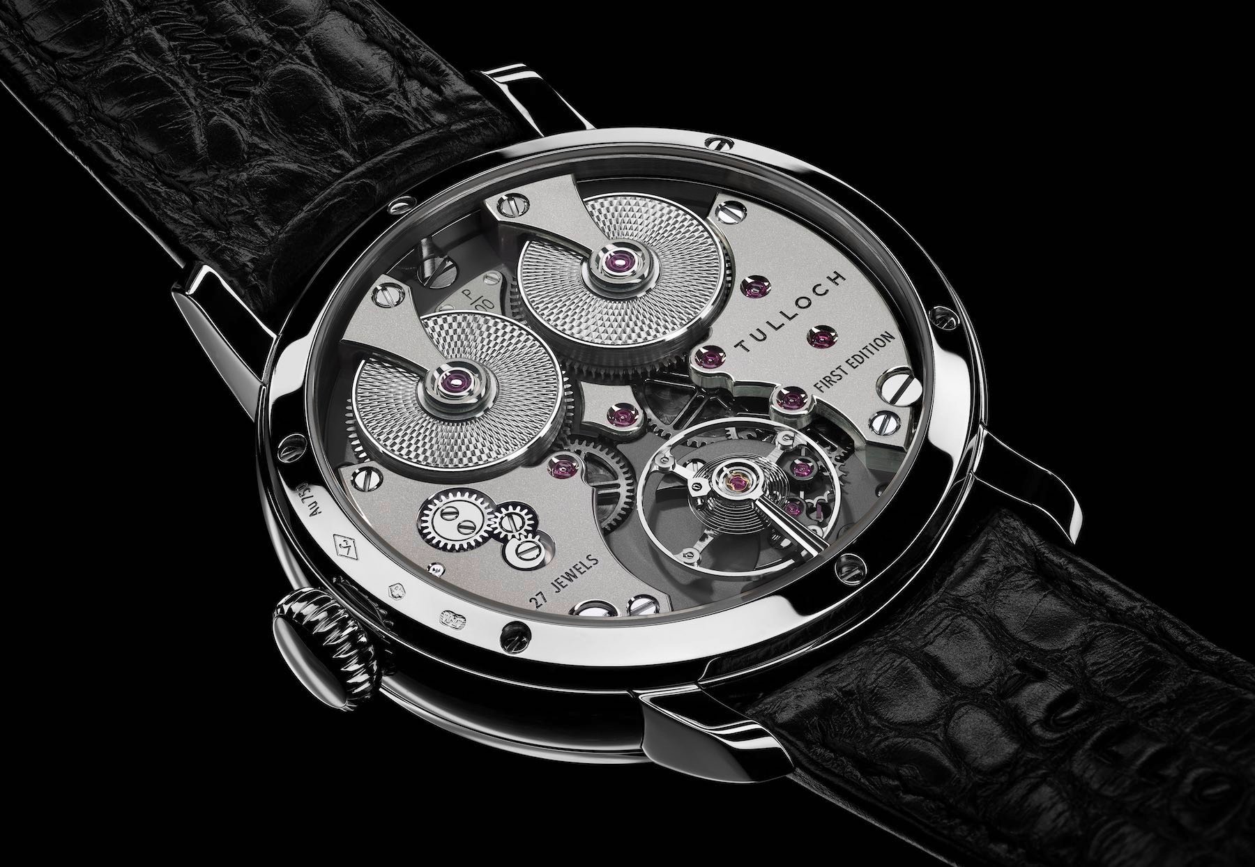
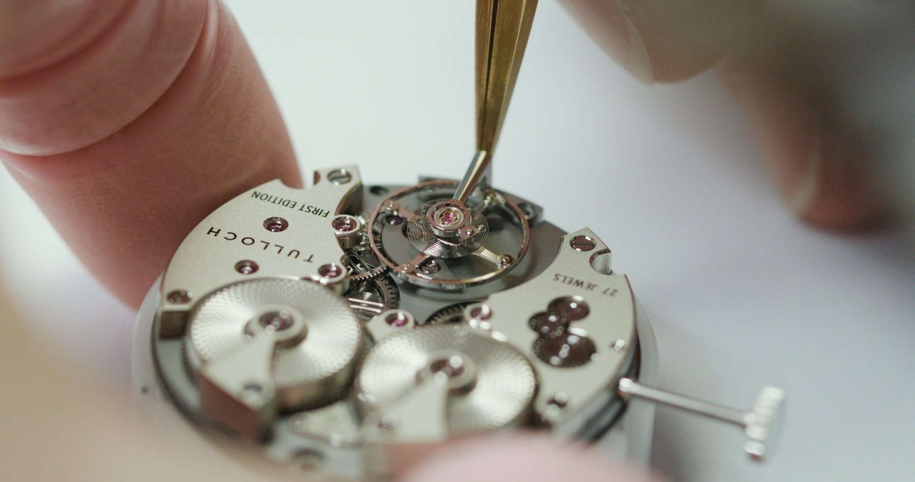
The expertise afforded this project by Finnish maestro Kari Voutlainen and the Comblémine SA team in Saint-Sulpice was invaluable. As Shane explained during our chat, it was Kari’s idea to add the patterned barrels (which can be decorated according to the customer’s preference). Small design flourishes like this along with the hard-earned skill necessary to hand-finish a movement to this standard are the mark of a master at work. For Shane to have tapped this resource on his very first foray into the watchmaking field (as an independent brand) surely suggests of finer things to come.
…brimful with ideas…
But, honestly, I struggle to consider the future (or even to imagine exactly what could follow the T-01) while this piece is still fresh in my mind. Shane seems to be brimful with ideas, but when it comes to the aesthetics, I’m struggling to imagine a cleaner, better-executed design that this regulator layout we have here.
What I like about this watch
Such is my current enthusiasm for the Tulloch design, I recently listed it as one of my favorite brands (along with, bizarrely perhaps, HYT) during a recent interview with Alon Ben Joseph of Ace Jewelers. That is strong praise for a brand that has but one watch to its name. But along with my attraction to the dial layout, the movement layout, and the undeniable effect of recency bias, I really stand by that. I should also have mentioned A. Lange & Söhne in that conversation as the gold standard of watchmaking (in my opinion) but that’s being caught in the moment for you…
…more to it than that…
What I like about this watch is the way everything seems so harmoniously balanced. I say “seems” because I haven’t actually had this one on my wrist yet. As such, I must analyze it from afar. Needless to say, I am impressed by what I see, but I’m not so green as to suggest I will feel the same after I have had the chance to wear it. I noticed one of our readers (Chia-Ming Yang) commented on the recent interview with Shane Tulloch and mentioned that the lugs felt long to him. I had a good look at them again after reading that comment (thanks for engaging!) and they do look long. But perhaps there is more to it than that…
Lug length doesn’t tell the whole story
Long lugs are pretty annoying, but what annoys people more than the length of the lugs (as I see it) is the position of the lug holes. What can really disrupt the look of a watch on the wrist are the gaps between the strap and the case band created when the lug holes are placed perilously close to the tips of the lugs. One of my favorite watches in my collection (I have two of them — one in 36 and one in 38) is the NOMOS Club (Campus, specifically). This watch is frequently criticized for its immense lug length and the large “Bermuda wrist triangles” as I call them, it leaves between the case and strap.
And with good reason. It’s indisputable. Those gaps are there. I personally think it works with that watch design, but plenty of watch lovers I know disagree with me. And that is understandable. The Club is one of the few watches upon which I accept such a design decision. For the most part, I agree with the masses.
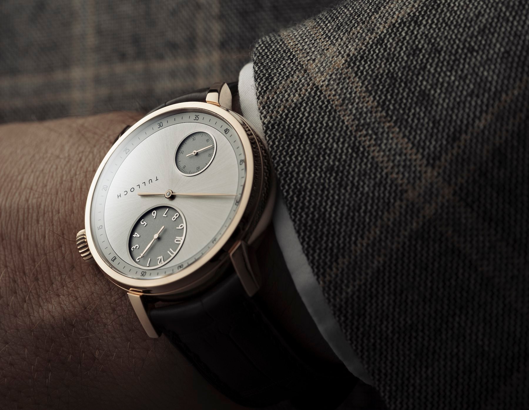
But, and this is crucial, the TULLOCH T-01 seems to have its lug hols further up the lugs. Look at the strap and where it sits. Not only does it have a curved end (a great idea to neutralize the negative wearability of long lugs) but it also sits very near to the case. The result on the wrist should, I assume, be that the strap, when strapped on properly, follows the protruding portion of the lugs’ contours as it wraps around the wrist.
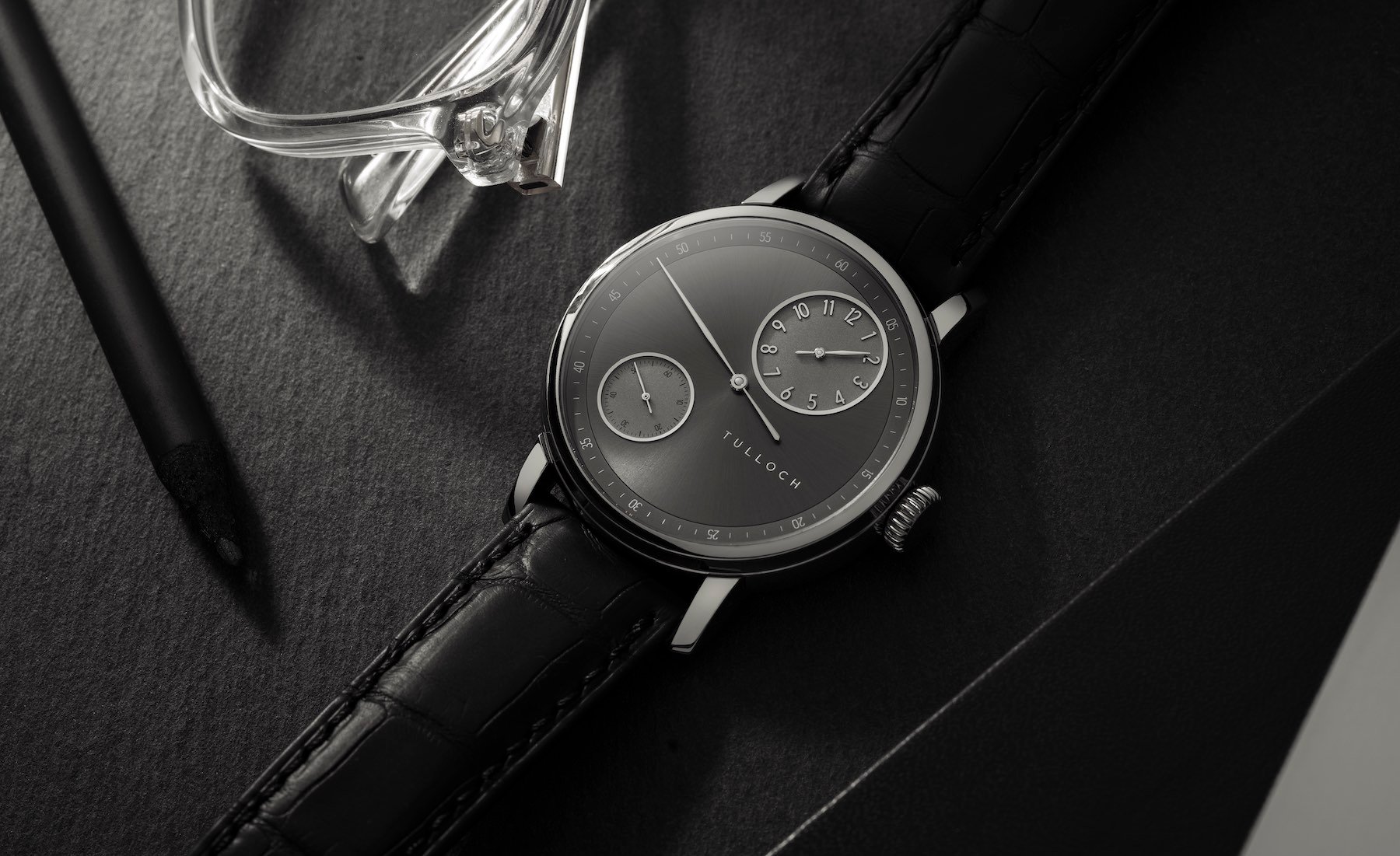
The dial
We’ll know more about the wearability of this bad boy when I finally get it in hand. That’s likely to happen as soon as travel restrictions to the States ease. Shane has been in NYC for the past few months, barely able to travel to meet with clients. That’s difficult enough for a mature business to manage. For a brand new brand, it could have existential implications, but here’s hoping the increasing attention being paid to the brand has a positive effect.
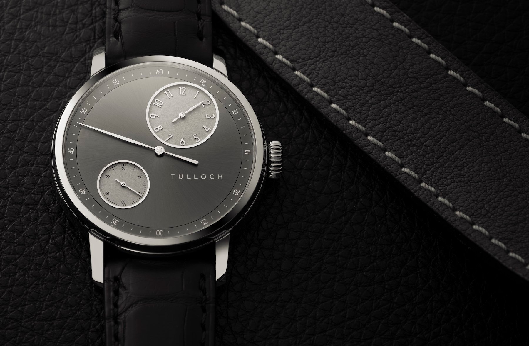
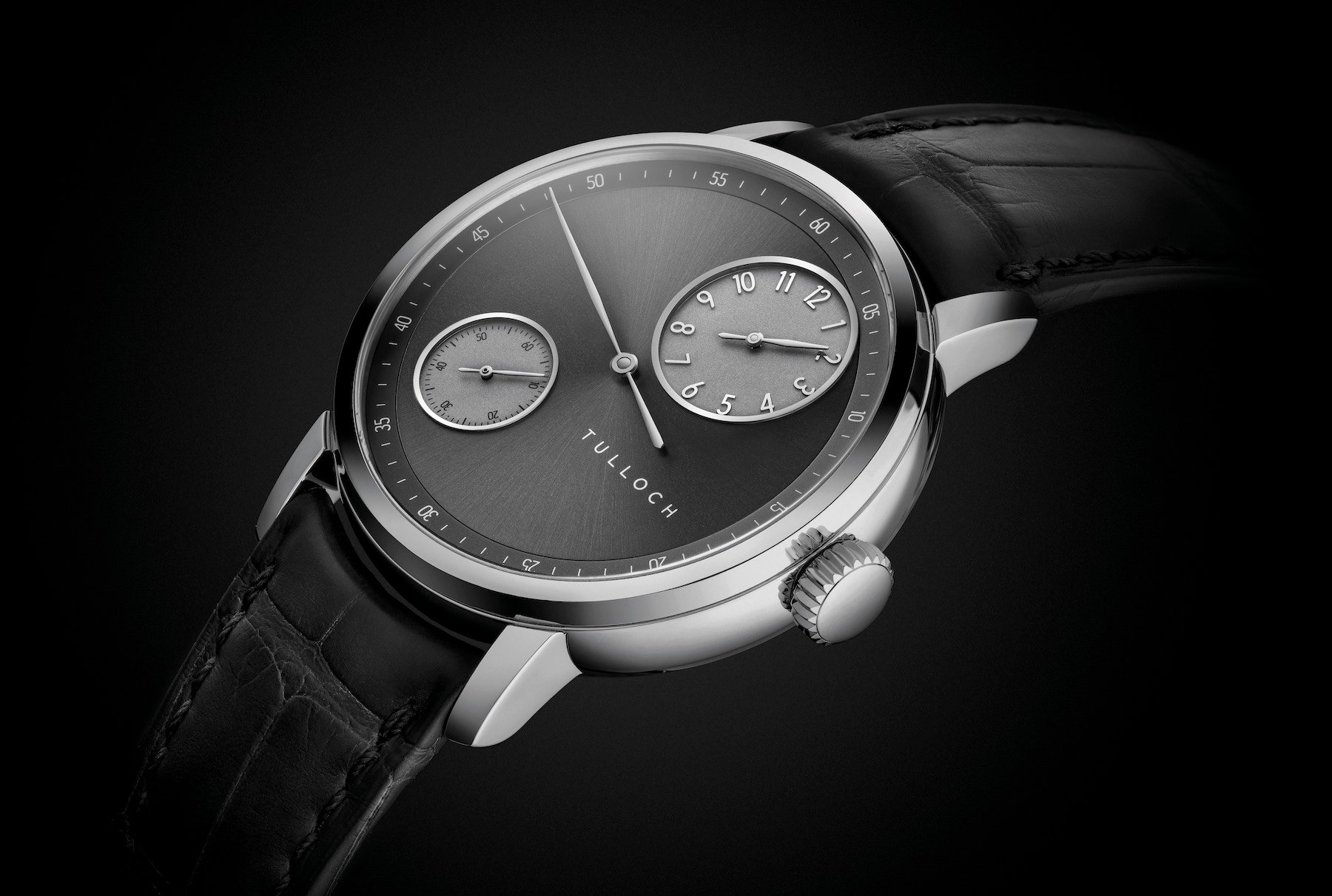
So back that harmonious balance I was talking about. The dial design is often viewed as the most important aspect of the whole package. Get it right, and you have a chance; get it wrong and it is goodnight Vienna.
The temptation to fill “dead” space on the dial is enormous…
Here, the dial is phenomenal. The regulator layout, which places the emphasis on the central minute hand, while relegating the hours to the larger of the two sub-dials, is supremely well balanced. Better still, it is restrained. The temptation to fill “dead” space on the dial (I’m looking at the upper left quadrant if you’re wondering) is enormous. It takes some serious resolve to stay away from making the dial too busy.
The execution here is top-drawer. Those recessed sub-dials both have hand-polished surrounds, while the hours are also presented in relief. The main dial surface has a light-catching brushed surface, which contrasts (especially from some angles starkly) with the encircling minuterie.
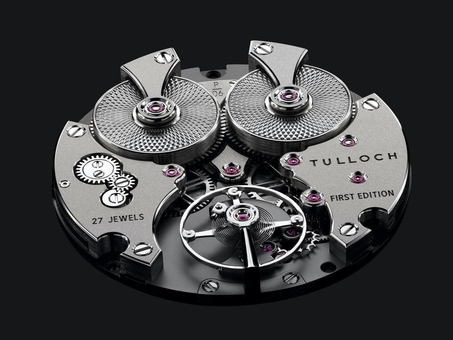
That movement
I’m not crazy. I know this aesthetic won’t be for everyone. But, and I say this in all honesty, it is for me. I love the symmetry of this design. In some ways, I wish I hadn’t suddenly seen it as a “shocked” face (with the barrels as eyes and the balance wheel as a gaping gob), because now I can’t unsee it. But I jest — it doesn’t bother me.
With such a fine design, it would surely be a shame to shelve it after one go-around.
I love the absence of gold elements here. I think that works particularly well with the white gold case. However, an argument could be made for it being even more attractive in rose gold. Yellow goes with white gold a bit better than it does with rose, so maybe the white gold case could have handled it. In the rose gold housing, however, this movement looks sublimely clean.
I’d love to see this movement architecture retained in the future. Shane mooted it was possible. With such a fine design, it would surely be a shame to shelve it after one go-around. And yet, as someone who designs from the ground-up, retaining it may not make sense. It all comes down to what style or complication TULLOCH wishes to bring us next. I am excited to take this one for a test drive. I’ll share more thoughts with you on that front when the time comes. In the meantime, let us know your thoughts below. I’d love to hear your take on the design, and what you think young brands should do to meet with success. Learn more about Tulloch here.