Watch Design — What Makes A Watch Highly Legible?

Legibility — it’s one of those terms that gets thrown around liberally in the watch world. A good watch should be easily legible. Otherwise, it fails to serve its primary purpose. In particular, tool watches are kept to a high standard here. But how is great legibility achieved in watch design, and what myths surrounding legibility deserve busting?
As much as we love intricate designs that make us gaze at our wrists for minutes on end, at its core, a watch should be instantly legible. It is a topic that seems obvious, but I think it is worth exploring nonetheless. Let’s get stuck in!
Legibility as a design objective
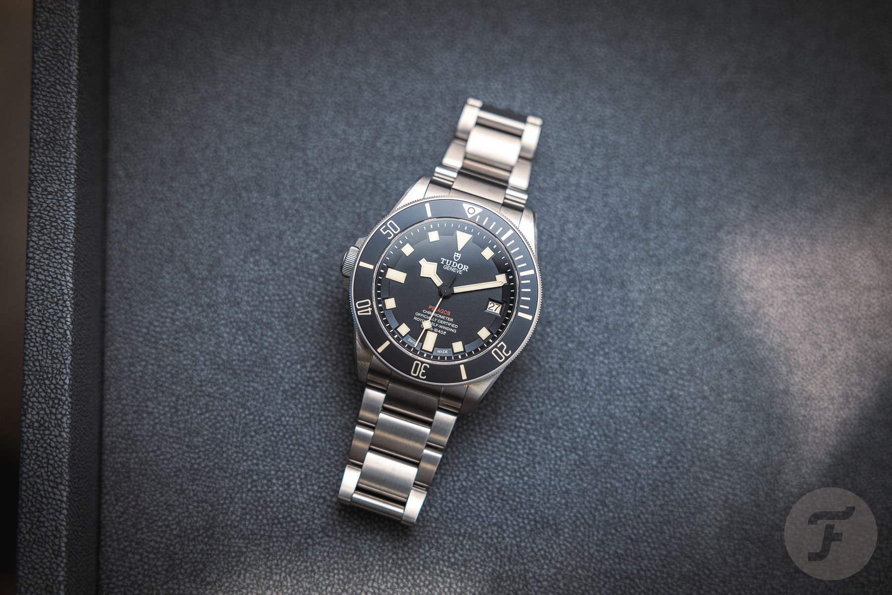
Before anything else, let’s have a look at what legibility in watches actually encompasses. A watch is highly legible if you can read the time both quickly and accurately. Just a glance should inform you about the current time unambiguously. A watch is only highly legible if it meets those criteria under the intended use circumstances. A dive watch, as an obvious example, should be legible underwater, in low light, and when viewed through a diving mask.
Great legibility can be viewed as a feature or a design trait. In that sense, it isn’t very different from other features such as accuracy and water resistance. It can be an objective for a watch designer to meet.
This probably sounds quite obvious, but it is crucial to see it as such before we proceed. Like most other features, a designer has several tools available to him/her to achieve legibility. A great overall watch design balances the many design objectives in an optimized configuration. So when chasing great legibility, the tools chosen depend on the entire set of design objectives, not on legibility alone.
Legible through scale
The above is clearly explained when we look at scale. A watch designer can use scale to achieve the desired legibility. Simply put: make a watch bigger, and it usually becomes more legible. It is just the way our vision works.
Pilot’s watches and dive watches are prime examples. Look at the WWII-era B-Uhren, for instance. These were of great functional importance, but they weren’t exactly used under optimal circumstances. They would be viewed through goggles while flying in airplanes, with all the vibrations and movement that it entails, often under highly stressful combat situations. No wonder these watches were executed in a 55mm size, with the dial occupying the vast majority of that real estate.
If we look at the different tools at the designer’s disposal, scale is a bit of a hammer. It is the crudest possible way of boosting legibility, but it is very effective nonetheless. However, it comes at a cost. Scaling up a watch design can make it cumbersome or stylistically less appropriate for the intended use. Sometimes you need other ways to achieve great legibility. I think we can safely bust the myth that watches that need great legibility have to be large by definition.
Legible through functional minimalism
If scale is a hammer, then functional minimalism is a scalpel. How much of a design can you cut away to maintain only the bare functional minimum? This is a much harder way to accomplish great legibility, but it is equally effective.
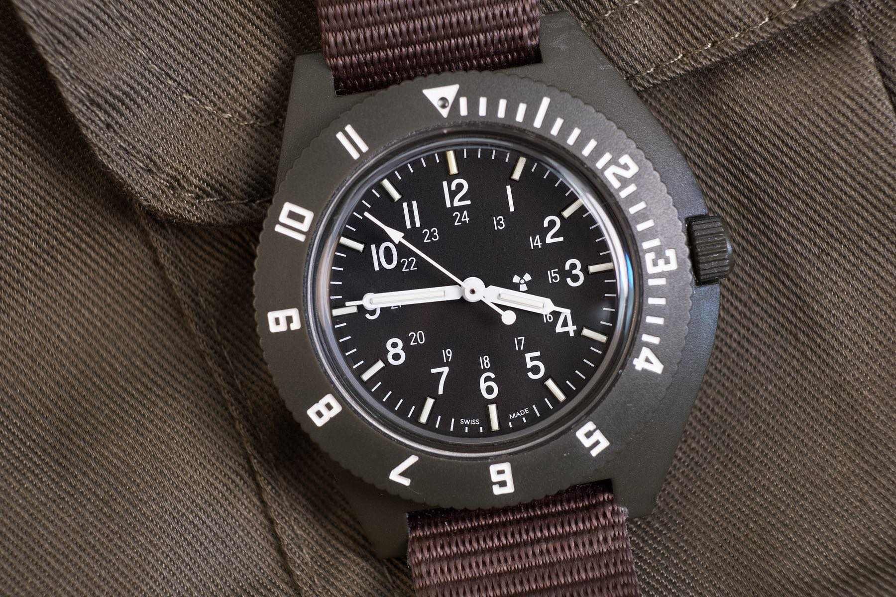
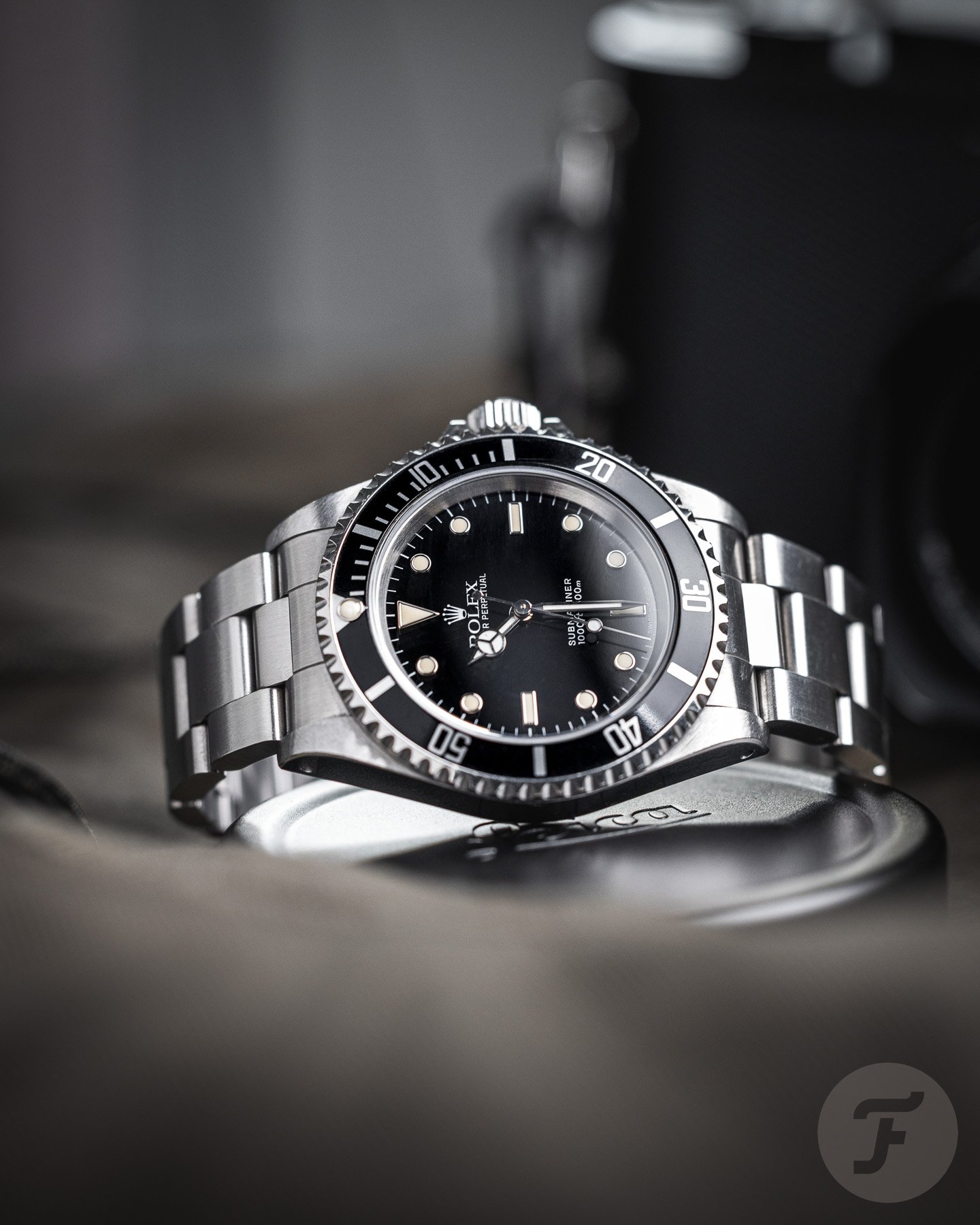
If a watch has to be optimally legible, you remove every non-essential detail. This is why military watches often don’t feature brand logos on the dial. The so-called “sterile dial” allows the wearer’s vision to register nothing but the information that matters, and that naturally boosts legibility.
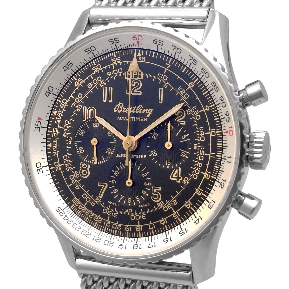
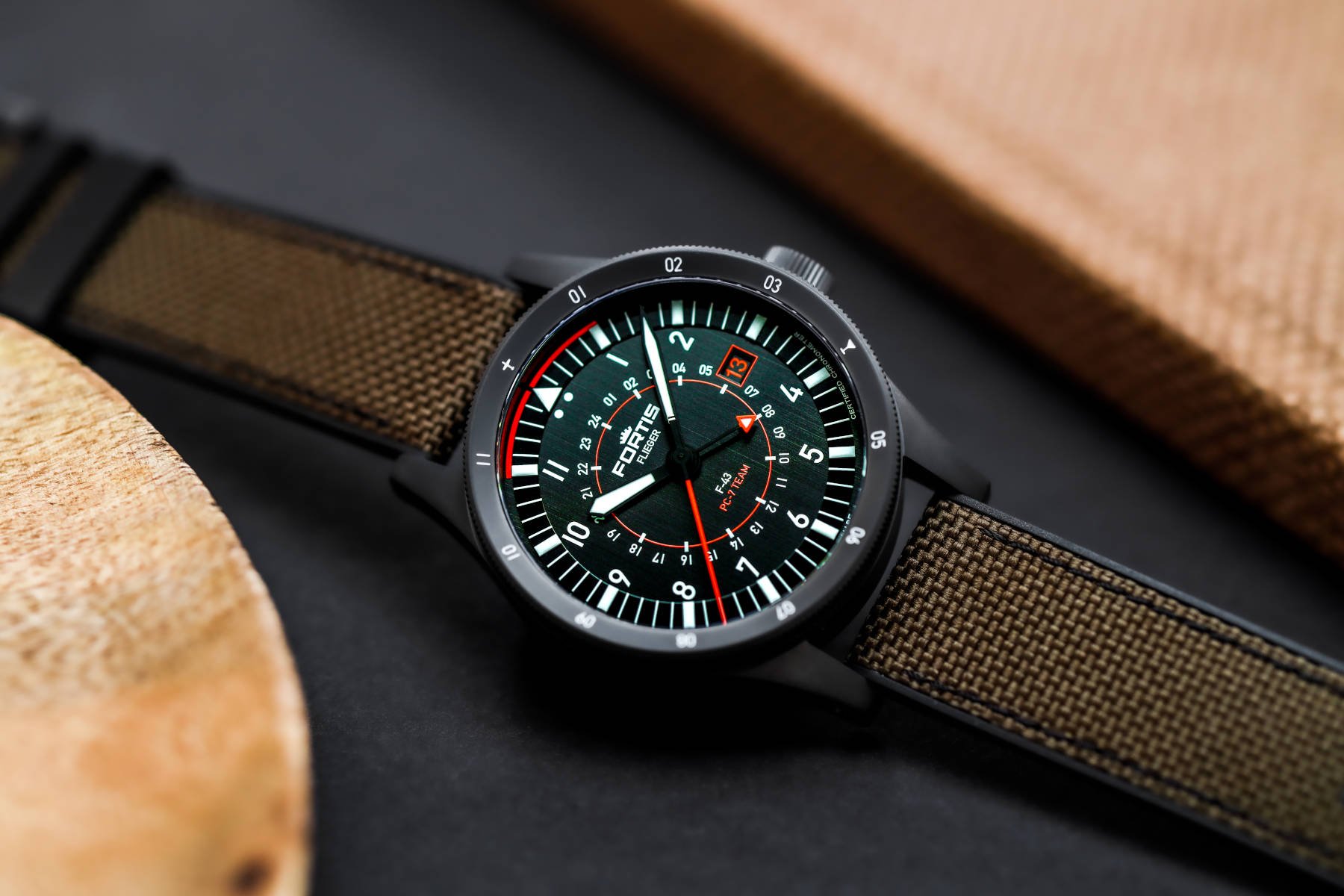
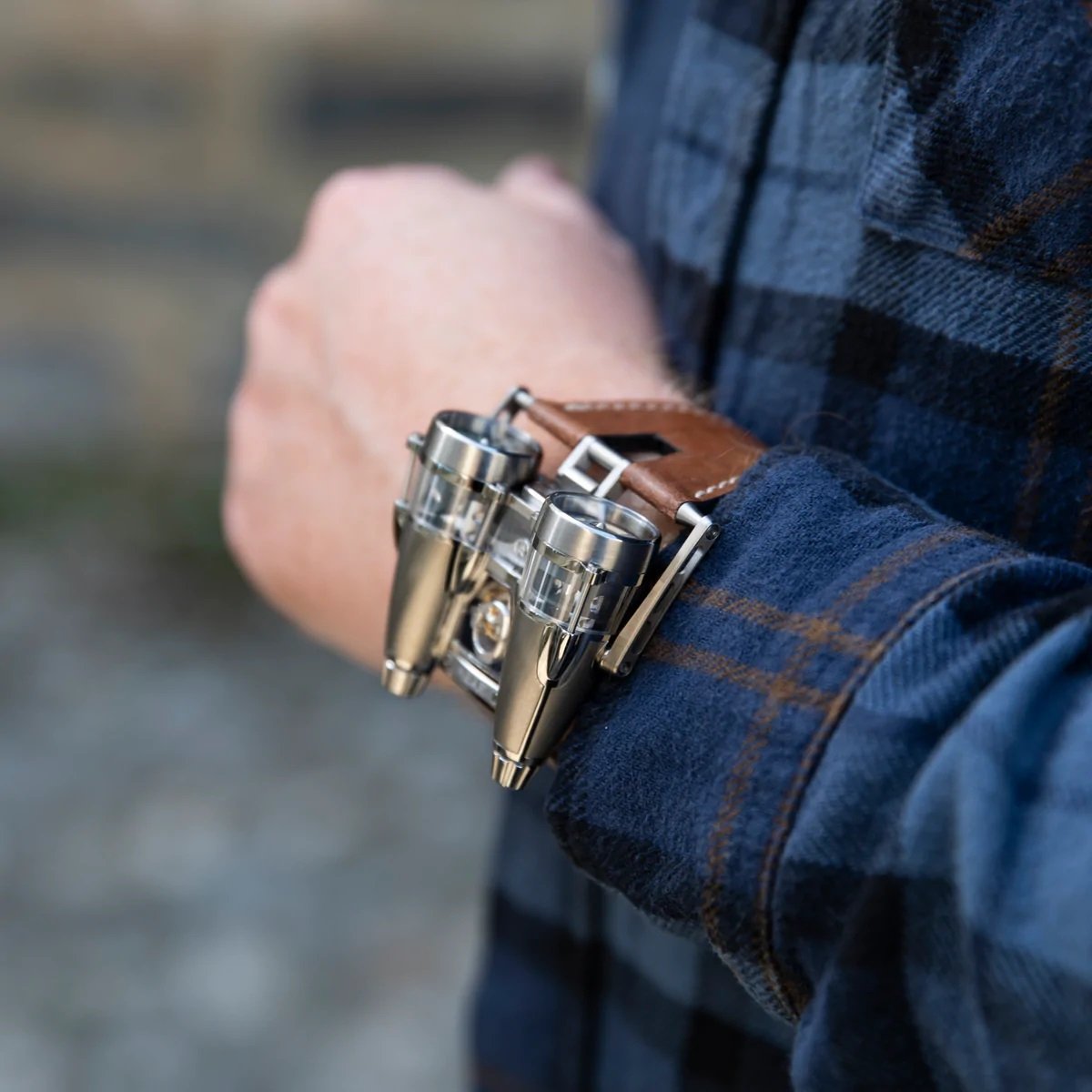
Image: Herios
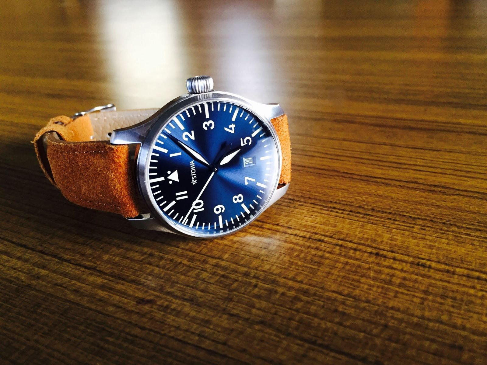
If we stick with pilot’s watches for a moment, you can see the interaction between scale and functional minimalism at work. Traditionally, the Breitling Navitimer has a very cluttered, busy dial. Thus, you need it to be bigger to remain legible. On the opposite end of the spectrum, you find the original Rolex Air King. With nothing but three hands and a bunch of indices, this watch could be much smaller while retaining perfect legibility. The first-generation Air King measured a mere 33mm across. The Navitimer measured a comparatively massive 41mm. There is no right or wrong here, just different priorities within the design objectives. Of course, the calibers inside dictate size as well, but, in this example, the manufacturers likely wouldn’t have chosen differently if the movements were the same size.
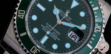
Legible through contrast
I find contrast the most exciting way of striving for great legibility. You may think of great color contrast first. Sure, white numerals on a matte black dial offer maximum contrast. As a designer’s tool, however, contrast is much more subtle than that.
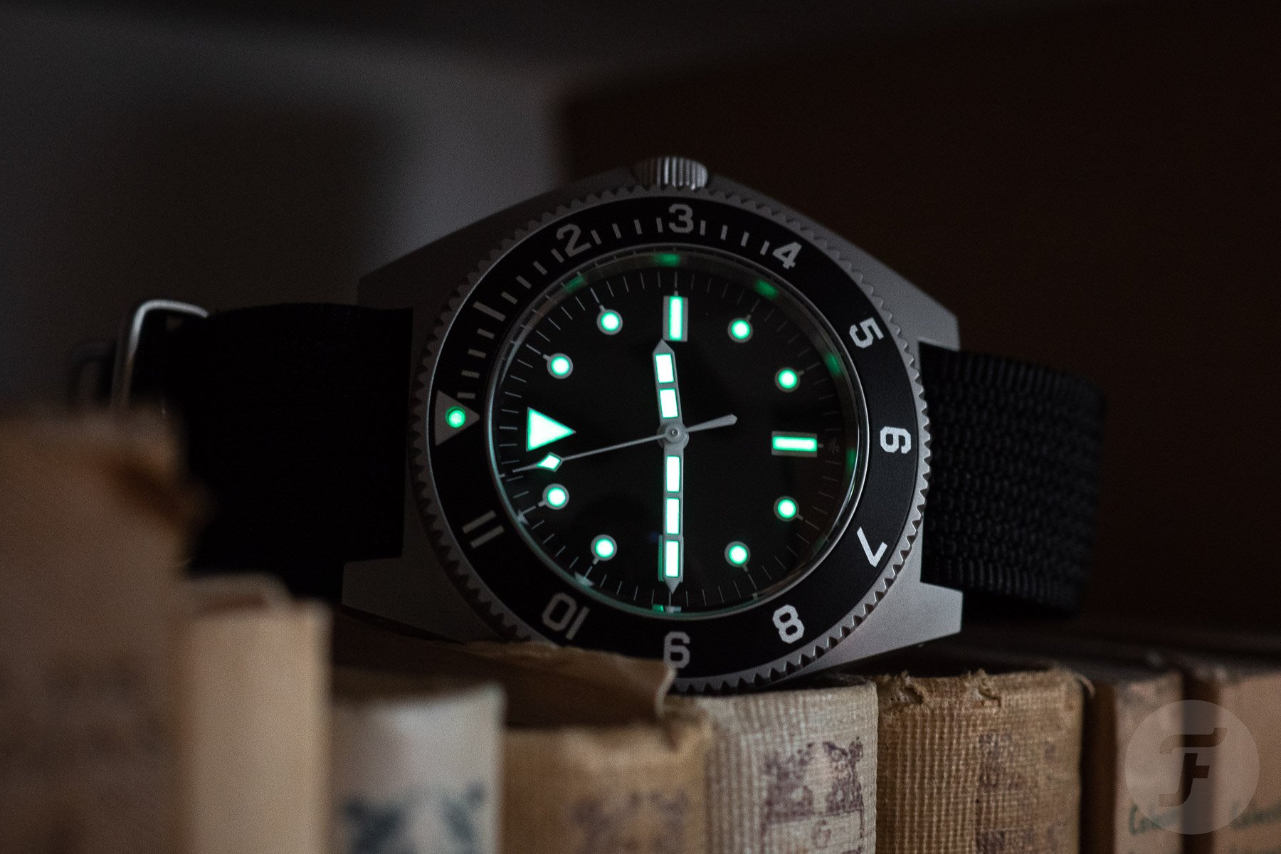
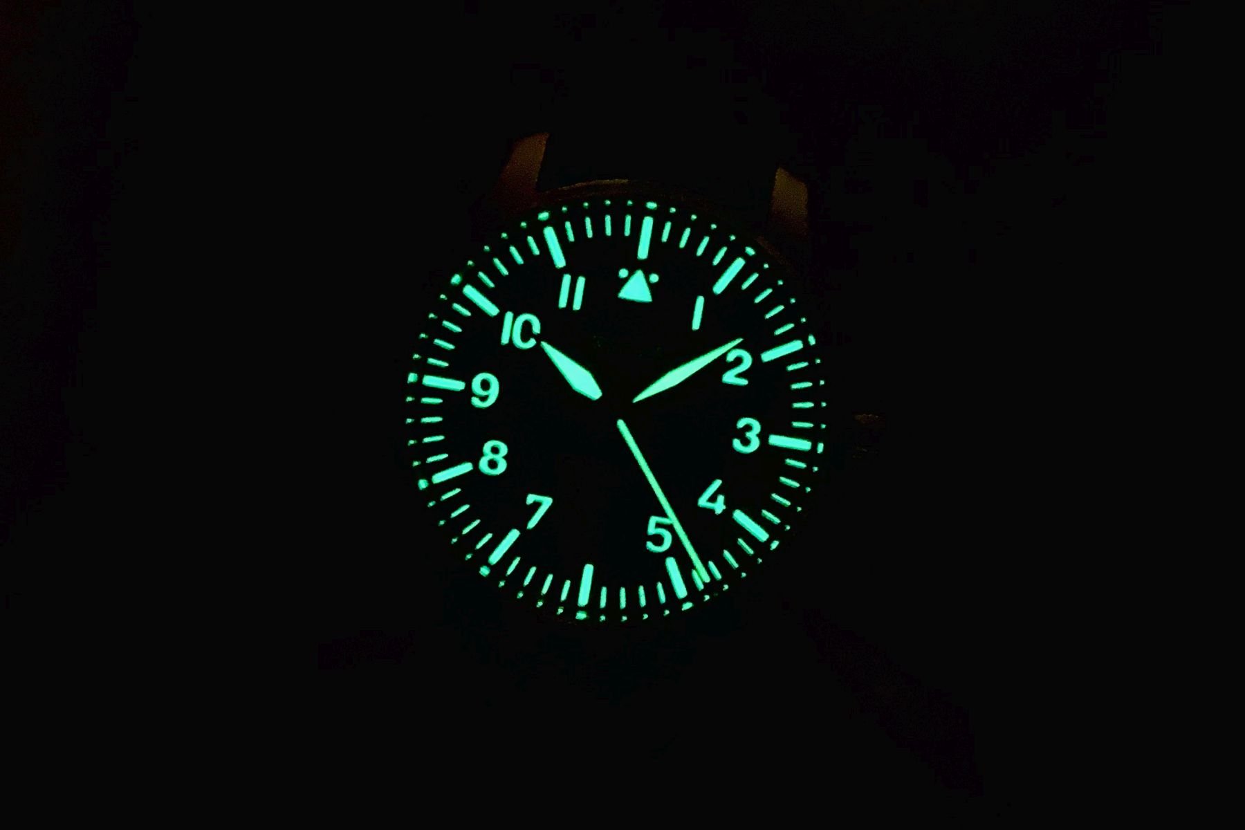
Textures are another way to create contrast, as are shapes. Think, for instance, of the archetypal dial layout of a dive watch with its dots, bars, and a single triangle. These contrasting shapes offer instant orientation in the cleanest way possible. The same goes for the hands. You can just use different sizes for the hours and the minutes, but if you also use contrasting shapes, legibility improves.
It is possible to clean up an otherwise cluttered dial through contrast. You could, for instance, use color coding. By executing the cluttering, advanced functions in one color and the basic time-telling features in another, you can achieve great legibility.
Different tools with a single goal
An experienced watch designer will likely have several more tools than the three primary ones described above. The key takeaway, however, is that there are several knobs one can turn to dial in the desired legibility.
Once you start looking at watches like this, you notice subtle differences and details. Some brands fall prey to the temptation of overcomplicating things — “Some decoration here, an extra color there, and let’s do a cool sunburst too.” Legibility is usually the first casualty. Others exercise great control and restraint, resulting in amazingly legible watches. This is often a matter of building the right visual hierarchy. The eye should go to the most important stuff first and only notice secondary functions and decorations afterward.
Sometimes legibility isn’t the prime concern
Of course, there are entire genres of watches in which legibility takes a backseat to aesthetics. But to me, a truly great watch is highly legible. If not, it is no longer a watch but an objet d’art.
Do you prioritize legibility when considering a watch? And what great and not-so-great examples spring to mind? Let us know in the comments below!