Watches Rooted In Important Design Movements — Examples From JLC, Richard Mille, Junghans, And More

As watch lovers, we tend to treat the watch world as a standalone universe. In reality, though, watch design lives within a much broader context. Trends in watch design come and go, fueled by the cultural context in which they exist. As a result, you can recognize design movements in certain watches. Today, I want to explore such watches and see what elements we can trace back to movements in art, architecture, and design.
I am sure you, Fratelli, can point out many more great examples. Please do so in the comments below!
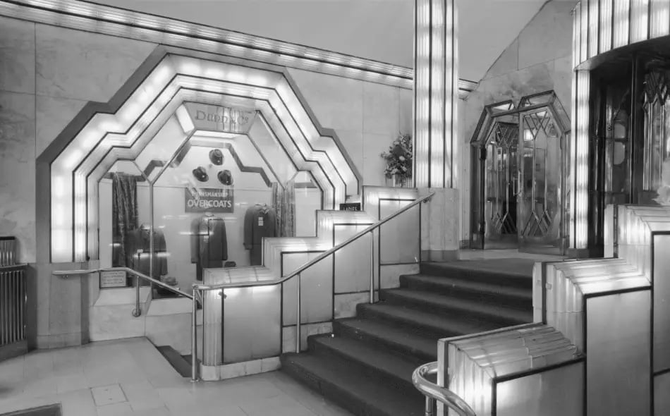
Art Deco design in the Strand Palace Hotel — Image: Historic England Archive
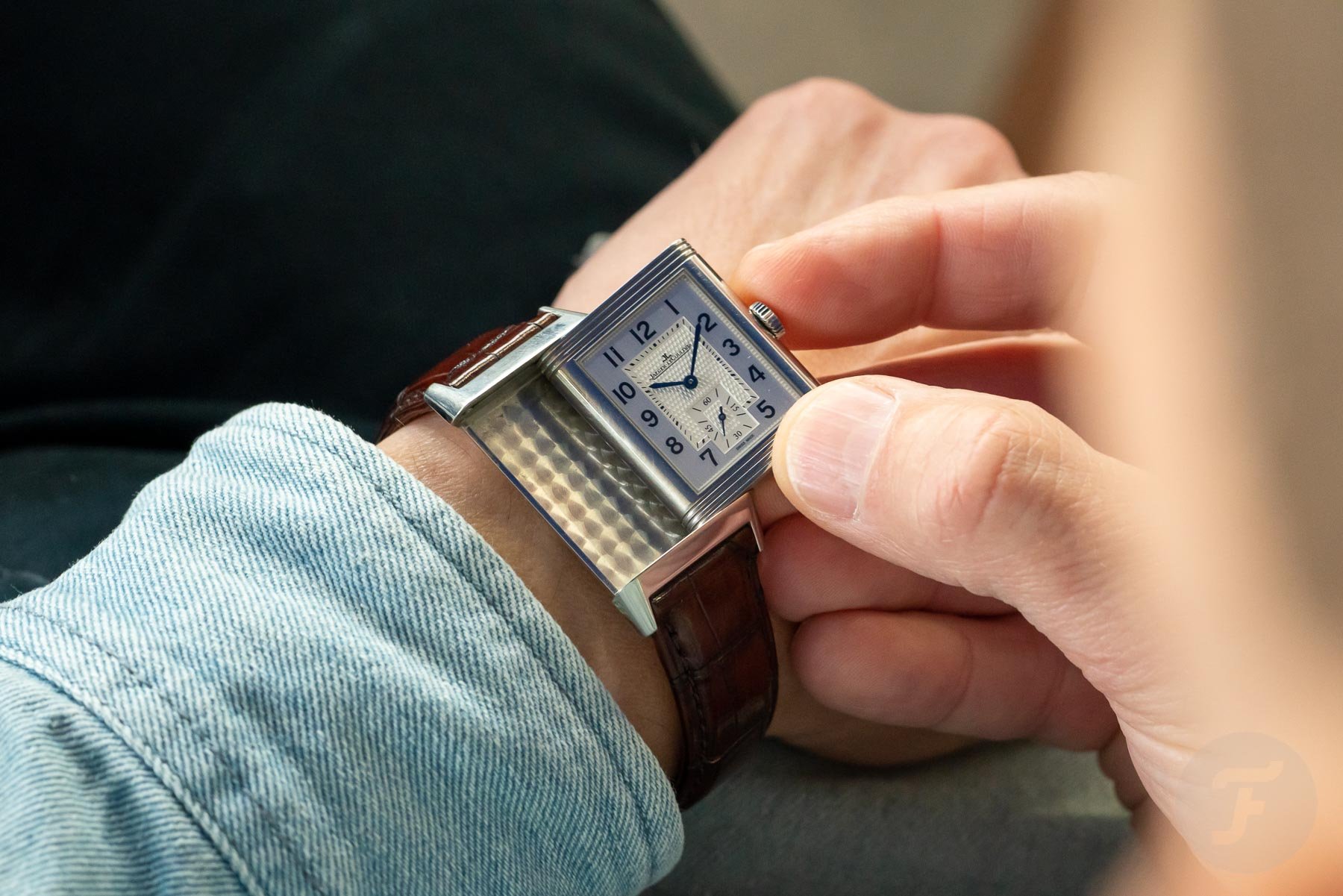
The Art Deco design movement: Jaeger-LeCoultre Reverso
Art Deco is, in many ways, an answer to the earlier Art Nouveau movement of design. Whereas Art Nouveau was rich in organic, asymmetrical shapes, Art Deco was characterized by geometric shapes and strong lines. The movement was influenced by the Industrial Revolution, as machine-made shapes gained popularity over handwork. This is in stark contrast to the earlier arts and crafts and Art Nouveau styles.
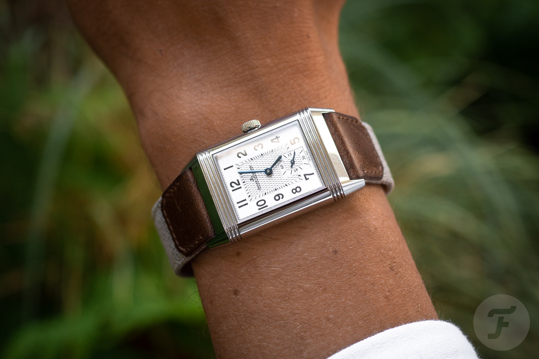
Art Deco was in its prime in the 1910s–1940s, with a particular peak in the interbellum. Right in the heart of the Art Deco era, in 1931, Jaeger-LeCoultre introduced the Reverso. Its proud, regal rectangular case oozes Art Deco style. Note how it is all straight lines when viewed from the front, with the characteristic sets of three horizontal bands above and below the dial. Viewed from an angle, the case has these cylindrical flanks that are very common in architecture of the times.
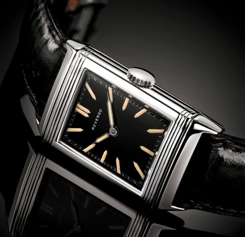
Image: Jaeger Le-Coultre
Even the typography on the dials of the early ones is indicative of the period. Typefaces got simpler, with the introduction of Paul Renner’s font Futura in 1927 as a highlight. The plain, sans-serif “Reverso” on the first models is perfectly in tune with that trend.
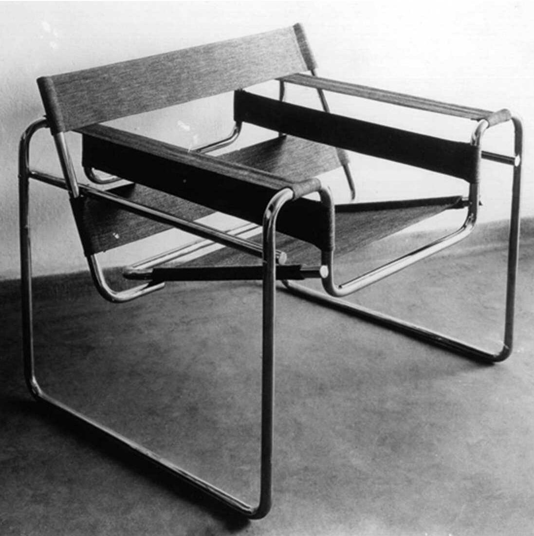
Wassily chair in Bauhaus style
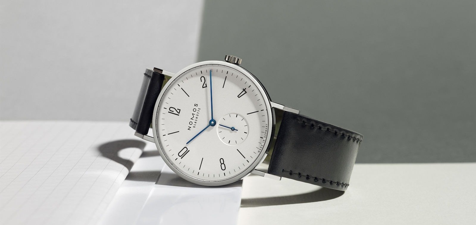
The Bauhaus design movement: Nomos Tangente and Junghans Max Bill
Bauhaus was a school that taught design, architecture, and art in Germany from 1919 until 1933. The keen observers among you may spot that this coincides with Art Deco. Stylistically, however, the two are worlds apart. Bauhaus taught an integrated philosophy of art and design, in which design was seen as a means of bettering society. If people lived in airy, light, and unembellished spaces, it would lead to greater solidarity and happiness. Simplicity and efficiency were key values, as opposed to Art Deco’s decorative richness. The school closed in 1933 as the pressure from the National Socialist Party to, among other things, remove Jewish teachers became too great.
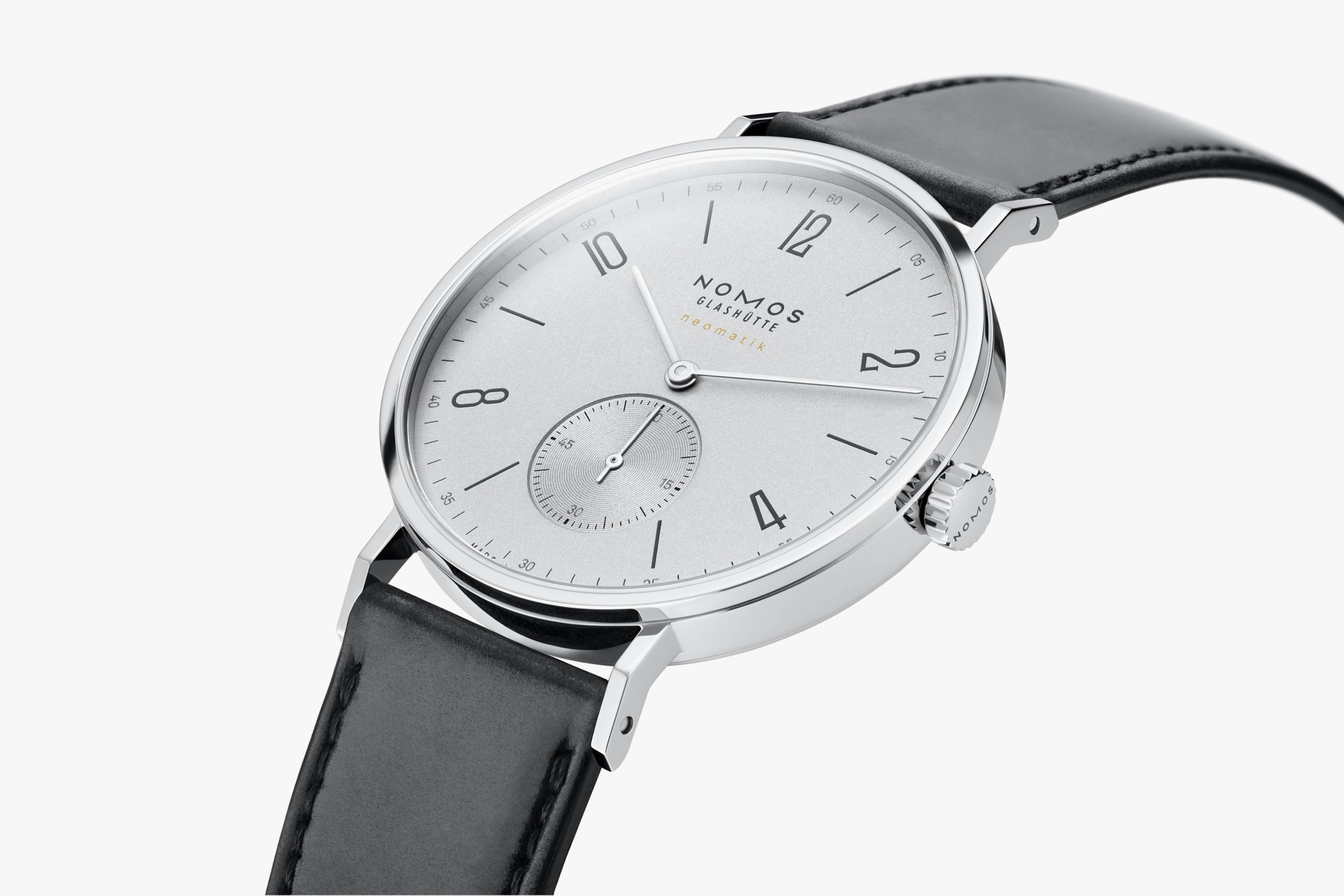
The Bauhaus influence became visible in watches in the 1920s when dial maker Weber & Baral supplied several German watch brands with Bauhaus-style dials. That minimalist design is still used today in, for instance, the Nomos Tangente. You can clearly see the clean, accessible design that is free of ornamentation. This is characteristic of the Bauhaus design movement.
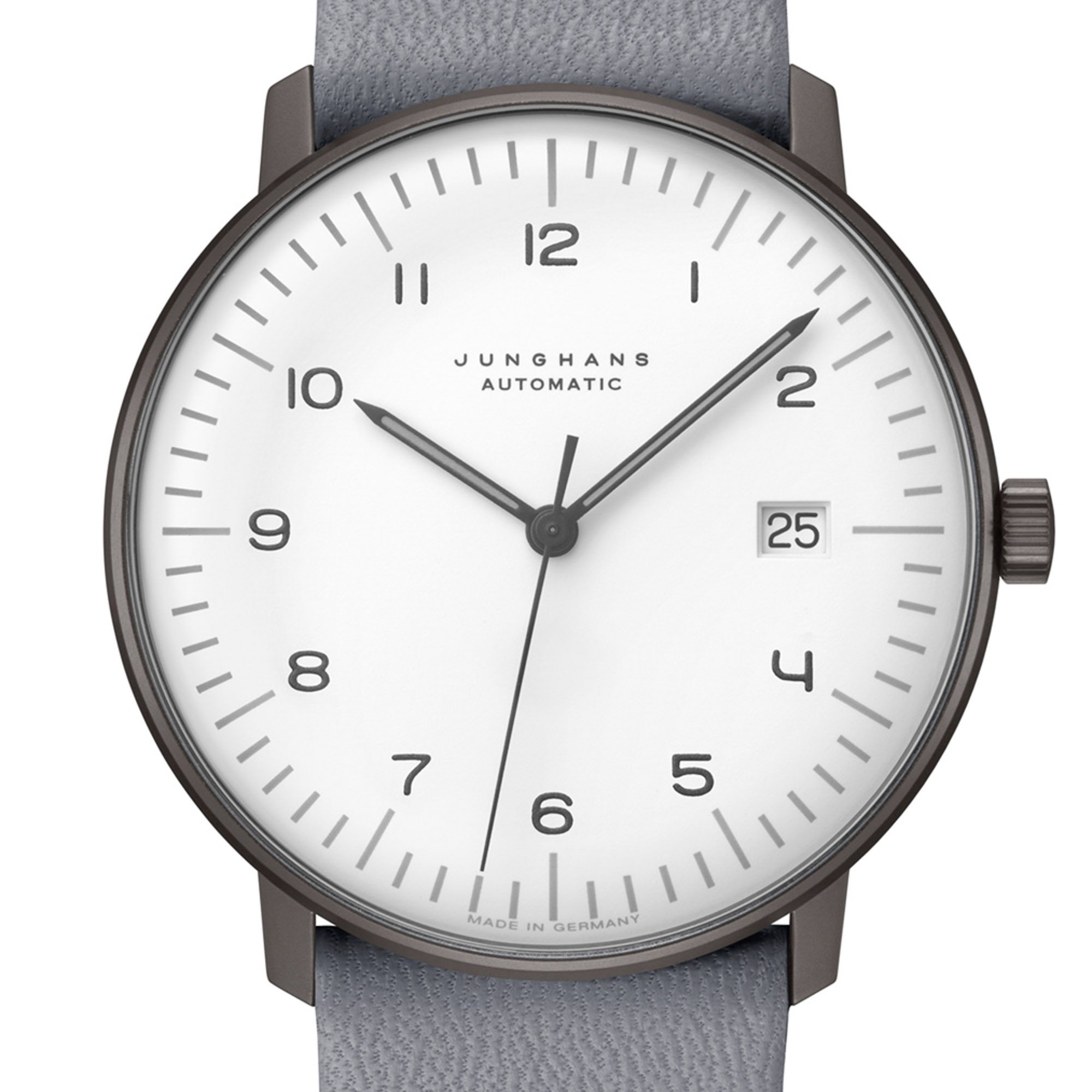
The school may have closed in 1933, but the design philosophy did not die. In the late 1950s, Bauhaus alum Max Bill joined forces with Junghans to design a kitchen wall clock. From the early ’60s on, he designed a series of watches for Junghans. Current Junghans Max Bill watches are still extremely faithful to that original, minimalist style.

Crying Girl (1963) — Image: Roy Lichtenstein Foundation
The Pop Art design movement: Swatch
Arguably the most instantly recognizable art movement of the 20th century was Pop Art. Primarily an art movement during the 1960s, Pop Art heavily influenced the design world as well. The core idea was that earlier movements had separated too far from real daily life. The movement’s adoption of commercial symbols such as products and celebrities was seen as anti-art. Stylistically, you see a lot of collage work, primary colors, and the aforementioned blurred lines with pop culture.
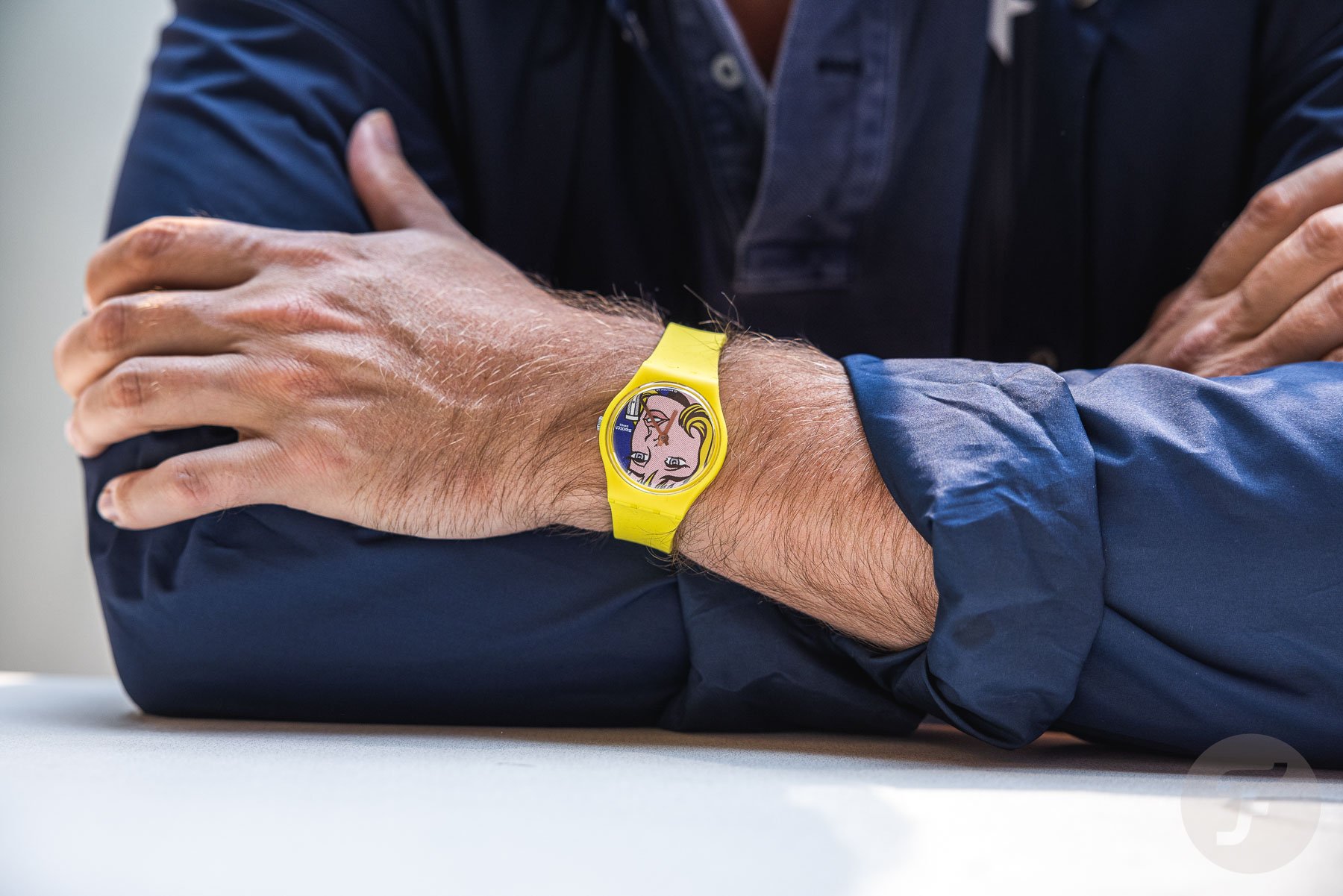
It would be tempting to point at Swatch collabs with Pop Artists. Legend has it, for instance, that Swatch reached out to Pop Art icon Andy Warhol, who was too busy to do a collab. Warhol apparently put forward his protege Keith Haring, who did numerous Swatch collaborations. More recently, the Swatch Art collection features a Roy Lichtenstein model, displaying the Pop Artist’s “Girl” lithograph.
I would argue, however, that the entire Swatch brand is influenced by Pop Art. The accessible, colorful plastic watch constantly crosses over into realms of pop culture. It uses the same iconic, colorful, and instantly recognizable aesthetic. Although Swatch didn’t emerge until 1983, after Pop Art’s heyday, I certainly see the design movement’s fingerprints all over it.
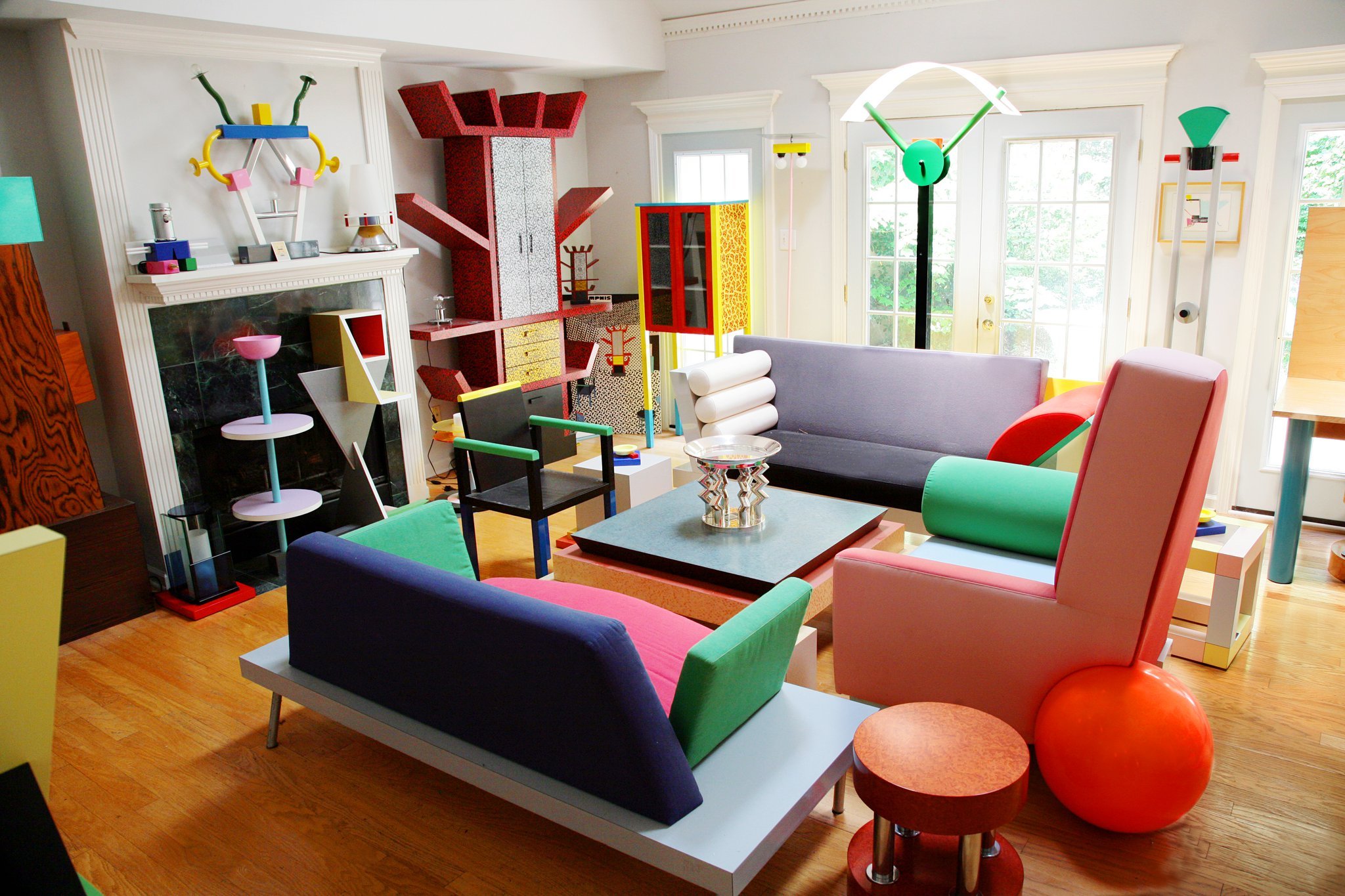
Memphis design — Image: Wikipedia/Zanone
The Memphis design movement: Richard Mille
The Memphis Group was a gathering of architects and designers founded by Ettore Sottsass. They gathered on December 11th, 1980, in a conscious effort to offer an answer to the modernist movement. Modernism had been about sleek, simple design without embellishment. The Memphis design movement would maintain the geometrical shapes but add asymmetry, color, and abstract decoration. The result was quite controversial and, beyond a shadow of a doubt “very ’80s” in style.
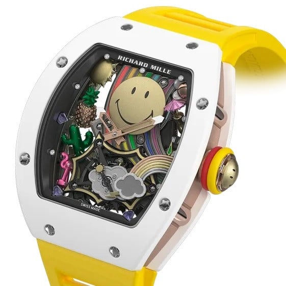
I tend to see some of this on Richard Mille’s dials. The colorful, bright, and sometimes seemingly randomly positioned elements often remind me of Memphis. And then, earlier this year, Richard Mille released the Memphis RM 07-01 collection, fully leaning into this notion. The watches feature the typical Memphis random geometric elements in bright colors.
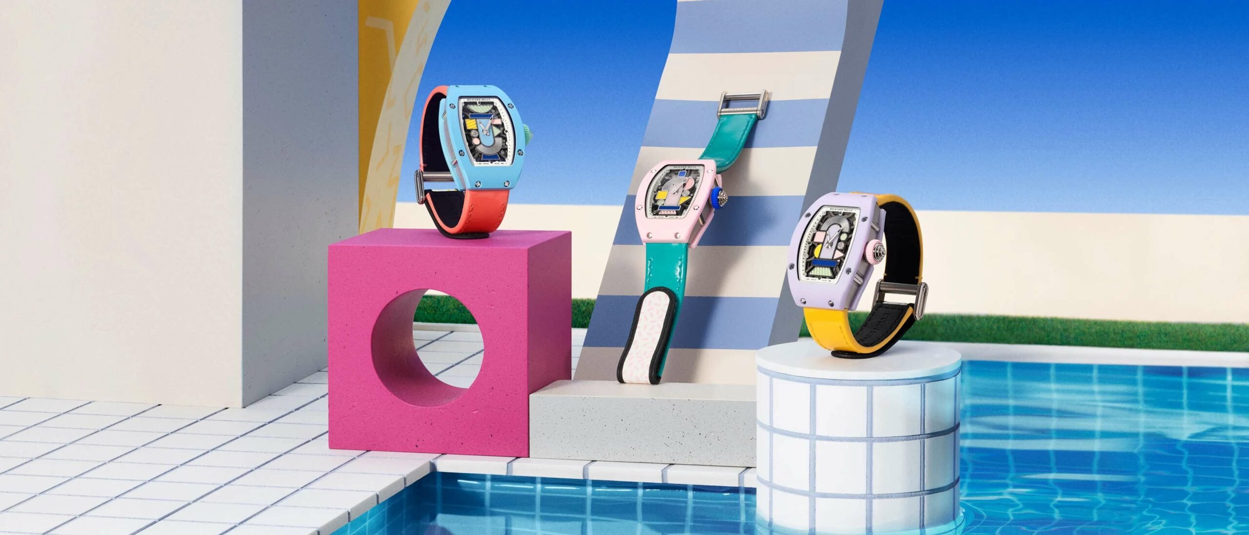
Admittedly, these are an overt, contemporary ode to a past design movement. In that sense, they very much stand outside of the movement looking in, unlike, for instance, the Reverso within Art Deco.

Deconstructivism by Frank Gehri — Image: Widewalls
Deconstructivism: Holthinrichs Deconstructed
The final example I would like to cover here is a fully contemporary design movement. Deconstructivism has been around since the late ’80s but continues in full stride today. This is a postmodern design movement, meaning it goes against the austerity of mid-century modernism. It shares that goal with Memphis, but it accomplishes it in a wholly different way. Deconstructivism is characterized by fragmentation and distortion. It is a technology-driven movement, as the aesthetic of a design no longer has to reflect its structure. Technology allows the designer to go beyond “form follows function.” A famous example of a deconstructivist architect is Frank Gehry.
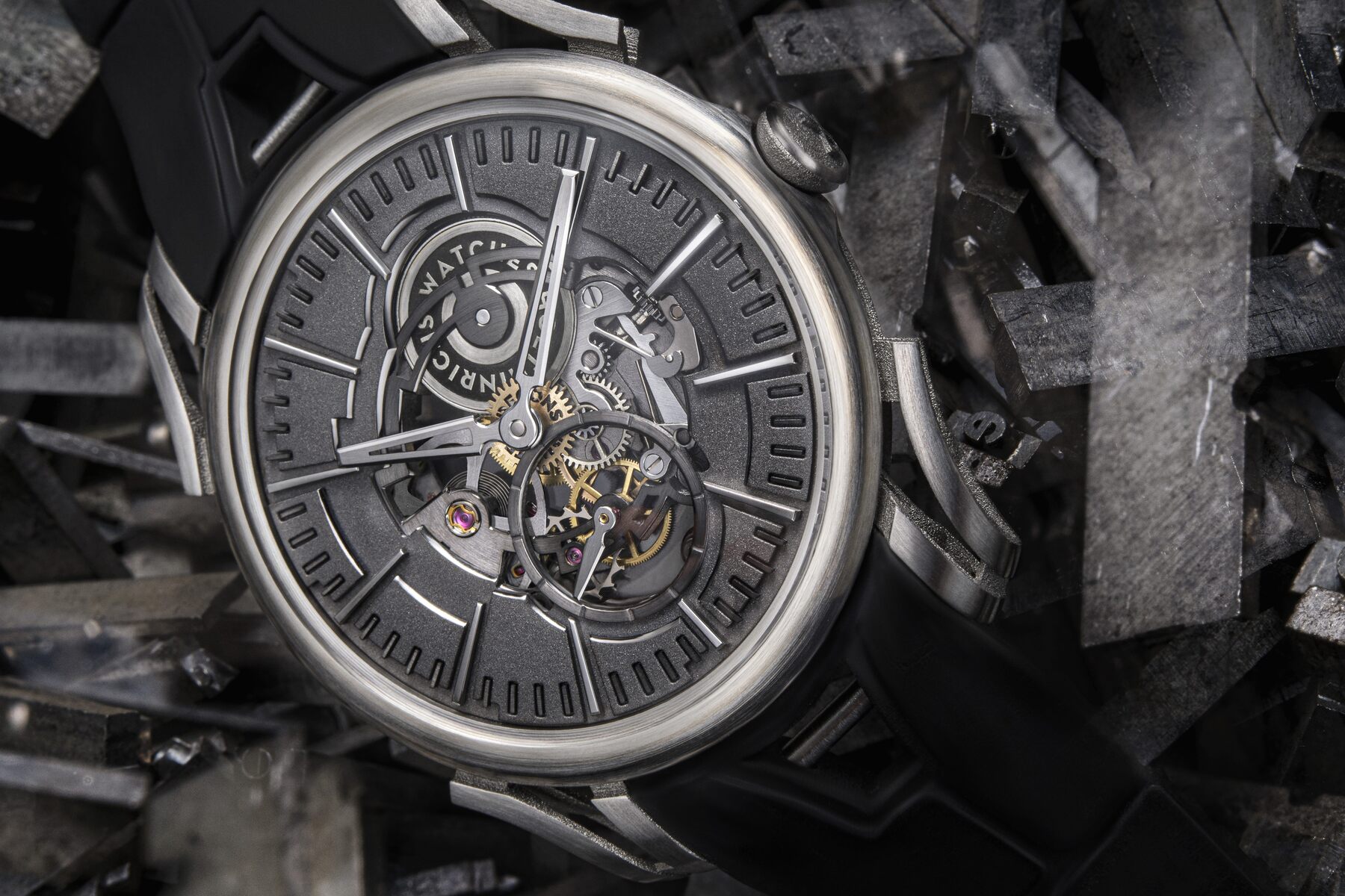
We find a prime example of this style in watches right here in the Netherlands. The aptly named Holthinrichs Deconstructed showcases the style in full glory. Holthinrichs carefully deconstructed the traditional elements of a mechanical watch and rearranged them in a way that, according to the brand, “questions their obviousness and structural integrity.”
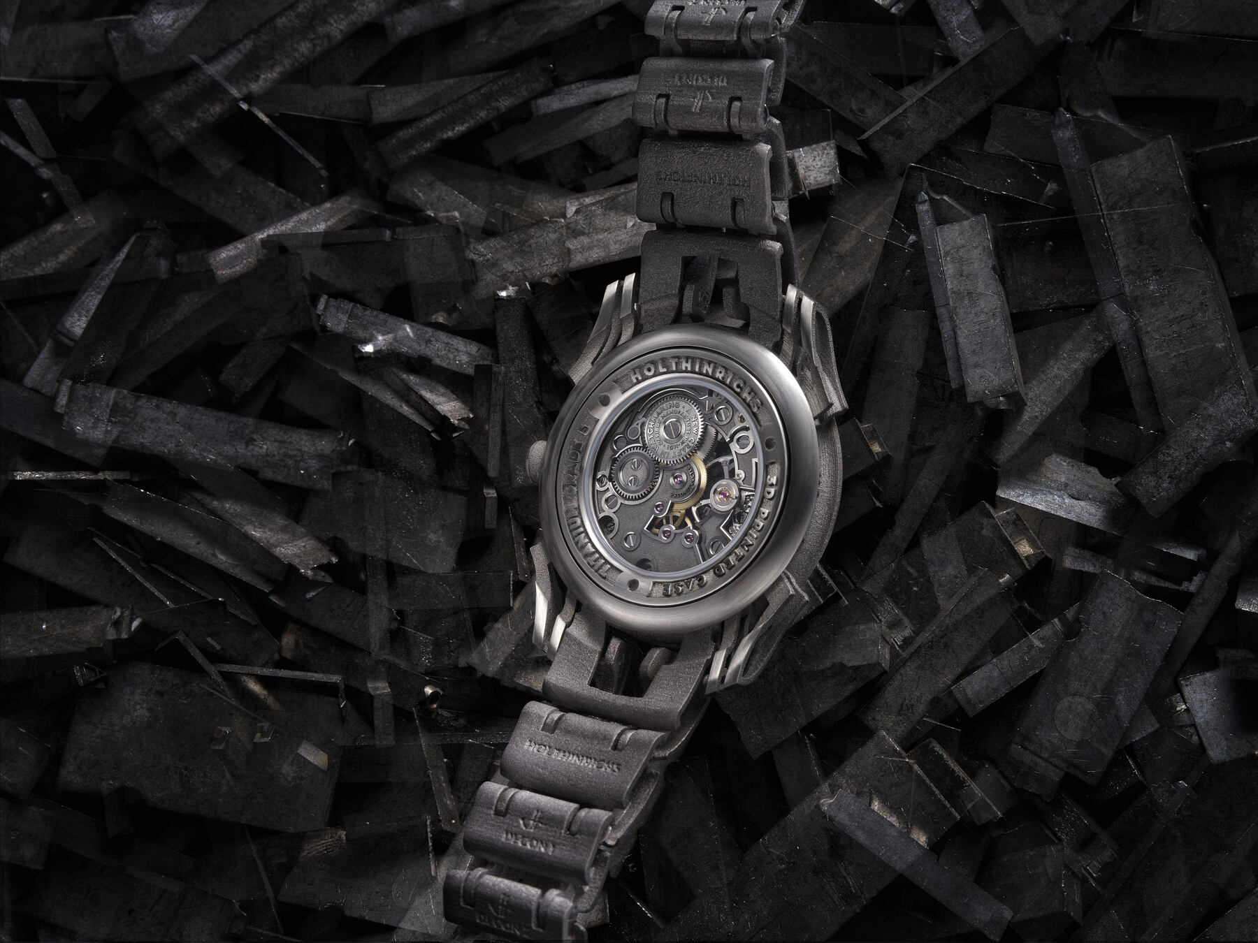
Holthinrichs uses 3D printing to make a watch that seemingly breaks apart before your eyes, including a fully fragmented bracelet. The result is extremely dynamic and striking. As the design movement prescribes, it challenges conservative form-follows-function watch design.
Closing thoughts on design movements in watchmaking
As you see, the five examples above are very clearly linked to broader movements in art and design. Without a doubt, though, this applies to almost all watches, albeit usually in a less obvious manner. Things get a little more complicated because designers tend to reach back and reuse elements from earlier movements too. The vintage trend of recent years is an example of a design movement in watchmaking that harks back to what was done before. This is what I mean when I question vintage-inspired design in my articles sometimes. The Reverso is a classic because it feels so authentic to its era. If it were designed today in Art Deco style, I feel it wouldn’t have quite the same weight and credibility.
I find it fascinating to regard watches within their stylistic context this way. For one, it provides a frame of reference to better understand what I am looking at. At the same time, it can give a watch significance beyond itself.
Can you think of any other watches that represent a broader design movement? Let us know in the comments below!