Dear Seiko, Bring Back The Motorist

When I set out on an hours-long drive, I always have a 12-hour chronograph on my wrist. If I had to make an exception, a wild card would go to the one and only Seiko Motorist. If there were one, that is…
A time-only watch doesn’t belong behind a steering wheel. When I read what I just wrote out loud, it sounds hard to believe, even to myself. Well, what I can do when I feel it that way? I don’t care what’s on my wrist when driving to the office. The drive is not the purpose, but rather, a necessary action to get to the office. When I set out on a three-to-five-hour trip, however, the time behind the wheel is a part of the experience.


Do I need a chrono when driving?
I know it’s irrational, but I need a chronograph for long drives. I always record the time that flies from the point of departure to the destination. To be able to freeze that duration afterward allows me to think about time as a physical quantity. I do not reset my chronograph immediately after I arrive at my destination. Instead, I look at my “frozen” chronograph for the next day or two, trying to feel the quantity of time that it took me to get where I am. I am not crazy, by the way.
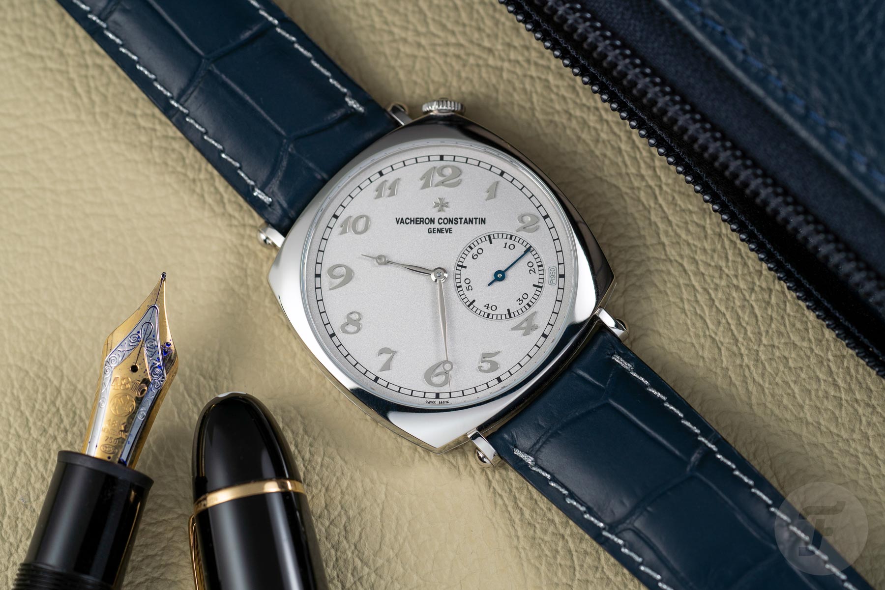
Vacheron Constantin Historiques American 1921 Platine
The sweet spot for the Seiko Motorist
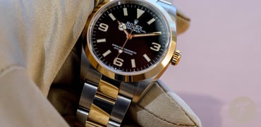
The idea behind the Motorist isn’t novel. If you have €30,000–40,000, you can get a Vacheron Constantin Historiques American 1921, the re-birth of a classic, iconic model. It has a dial slightly rotated to the right to provide a legible diagonal reading of the time without the need to turn the wrist. You just put your hands on the steering wheel, and off you go. The Vacheron may be closer to the original, but it’s also a bit boring… I mean way more boring than the Seiko Motorist from the 1960s.
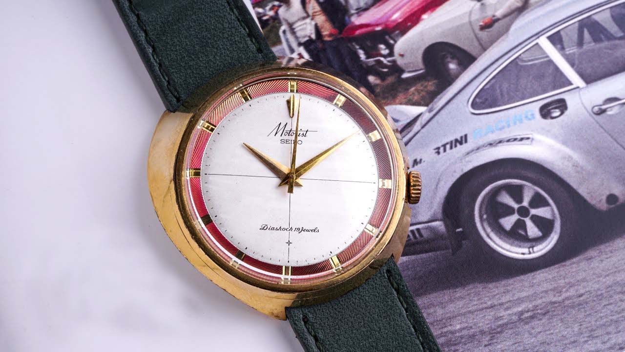
Image source: craftandtailored.com
Magnetic Motorist
I have never seen a Seiko Motorist in the flesh, but it’s so lively in pictures that I always think it jumps out of the screen. I don’t know where to start because every square millimeter is full of character, twists, and elegance. Ah yes, the case — that’s where we start. It’s asymmetrical, almost fluid. No matter what side you are looking at, it offers endless entertainment.
It’s sensual, funny, and classy at the same time. From the top, it’s so high that it looks like a tuna can. One would say it’s chunky and cumbersome from that particular angle. But let your eyes slide down the wave designed to copy your wrist, and you find yourself on the much smaller and steeply cut bottom end. The Historiques American 1921 is flat. The Seiko Motorist, however, angles the dial to make reading the time easier.
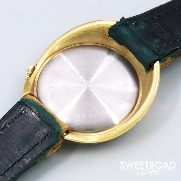
And take look at the picture above because I believe this view deserves its own paragraph. This angle confirms that the Seiko Motorist is neither thick nor chunky. When I look at it, I see a gold porcelain wall forming on a steel pottery wheel. The contrast of steel and the 20-micron-plated case makes me forget how I struggle to like bi-metallic watches. This particular watch still carries an original strap (or what’s left of it) which is, incidentally, green. You need to read what I have to say about green straps here.
Sector dial
The dial disarms me with its simplicity and light “jewelry” kiss that gives a watch elegant and believable beauty. Plain gold indexes are sunk into a colorfully decorated edge that can be either green or violet. The decoration is so contrasting that it almost makes the hour ring look like some inner bezel.
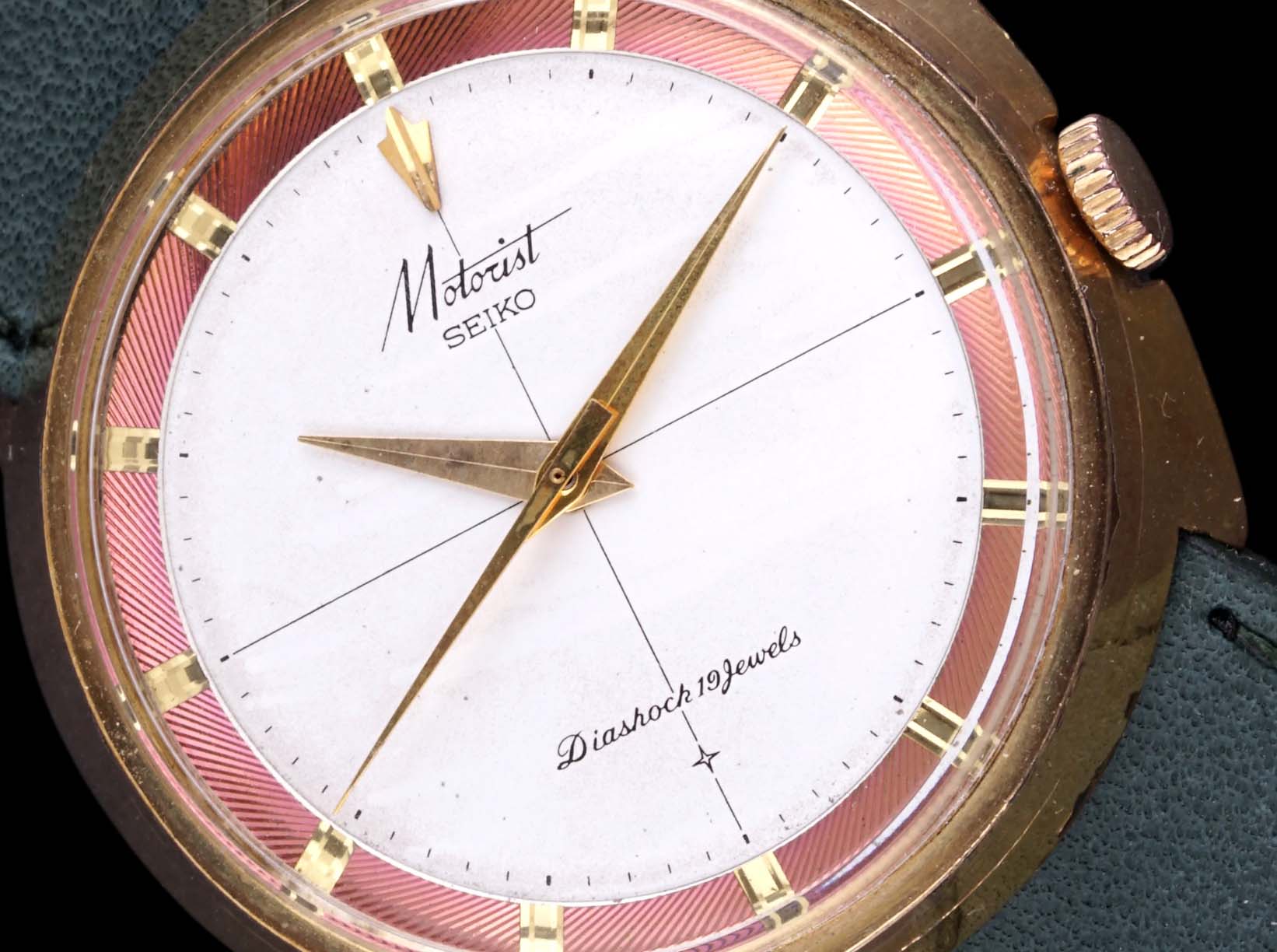
Image source: craftandtailored.com
I assume the plan was to create a great contrast with a perfectly (almost surgically) clean satin dial with a decent minute track and extra short indexes. I find the two sector lines splitting the dial into quarters a game-changer. We all know sector dials, but putting this style on a dial that’s rotated some 30 degrees is a surprising idea. It’s an idea that may bother you, but in reality, you find it satisfying.
Seiko Motorist logo
The hands have no lume, but they are sharper than your elementary school teacher, just to highlight how precise they are. There is no redundant detail on the dial. Oh, and look at the combination of the Seiko and Motorist logos. Every time I look at it, I see a huge neon sign for some restaurant on an American highway. Funnily enough, we are still looking at Japanese watches. If RJ made us all tattoo some watch logo on our chests, the Motorist logo would be a serious contender for me.


Last thoughts
I first bumped into the Seiko Motorist five or six years ago. I wanted it the second I saw it, but the €2,000 price tag gave me such a slap that it took me the next few years to look at one again. I have no idea what manual movement is inside, and it couldn’t be less important. You just need to know it was a good old manual winder. And it could also be manually wound if Seiko decided to re-interpret it in the years to come. After years of divers’-watch revivals, I dare say I am ready for something more individual. How do you feel about Seiko Motorist? Let me know in the comments.