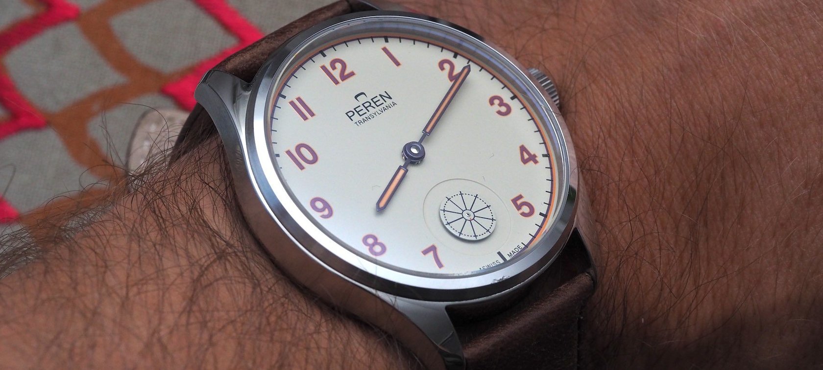
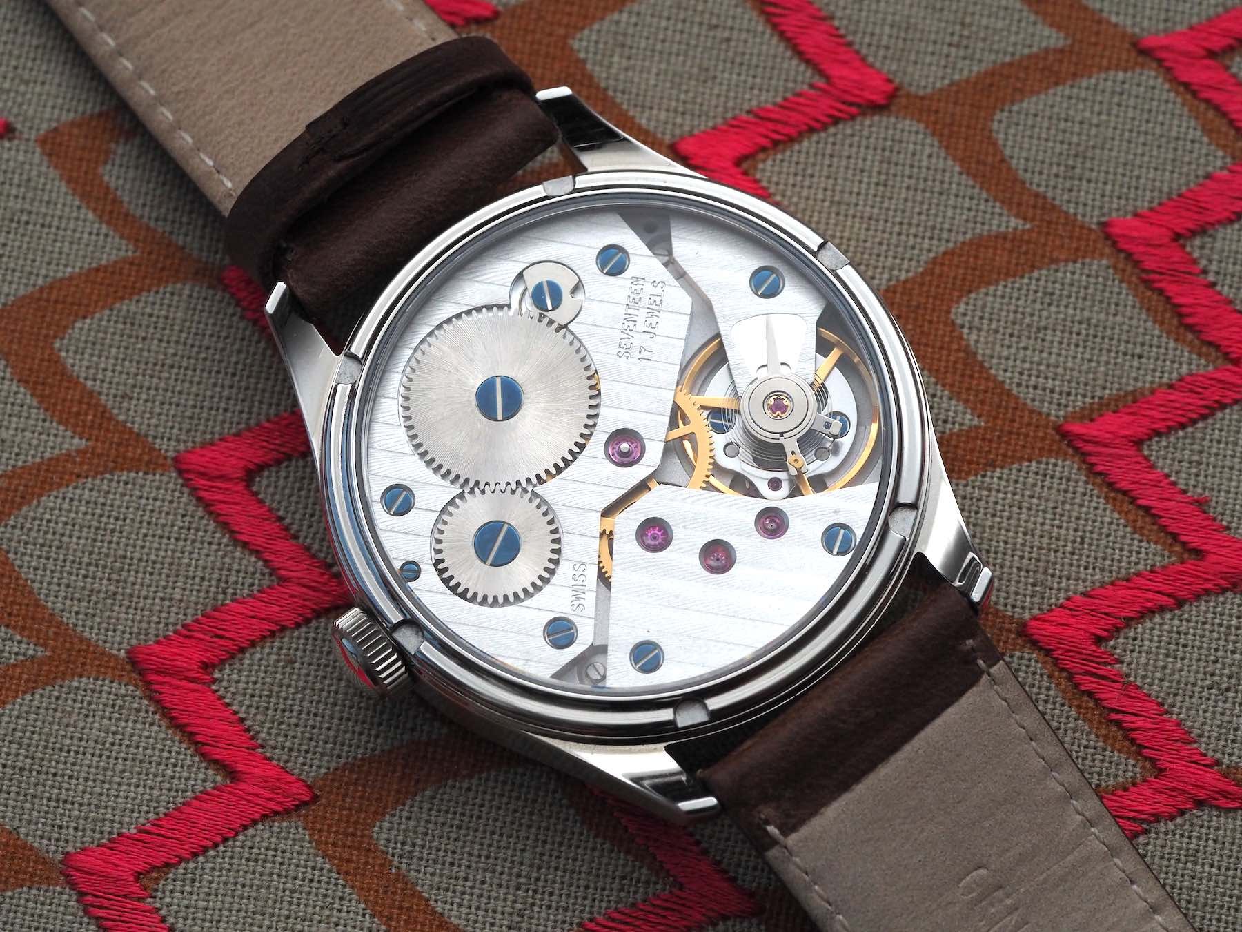
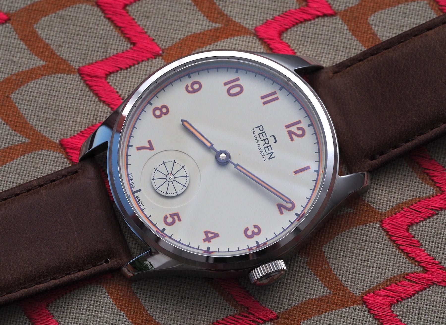
Giveaway Winner Announced: The Peren Hintz Wheels Its Way To A New Home

It’s been a long time coming, but now that the madness of Geneva Watch Days has died down and the Summer Splash competition approaches its close, it’s time to announce the winner of the Peren Hintz, generously donated to Fratello by brand founder Andy Bica.
The question we asked was inspired by the Hintz’s unusual color combination. I wanted to know which colors you’d like to see used together in watchmaking. The most creative answers really leaped off the page at me, so I thought, as usual, I would include the top four runners up alongside the winner, whose identity you will learn at the bottom of the page…
Let’s not end this discussion here. If you have some more thoughts on color combos that don’t get the love or exposure they deserve, hit us up in the comments below. We’ve seen before how these comments can influence brands, so why stop now?
5. Plecren
Great question and genuinely made me think.
Generally, I’m a fan of the good old-fashioned sweep hand but you have to be mesmerized by some of the tourbillons out there by brands such as Greubel Forsey, JLC, and Vacheron Constantin (love the Maltese cross) that indicate running seconds albeit not as their prime purpose!
A tourbillon cage seems a rather over-complicated and expensive way to do it using technology that might test the watchmaker’s art but not really offer much real-world benefit so I discounted those.
My favorite would have to be the rotating disc behind a window on the JLC master compressor divers. The chronograph has a cool little two-color wheel in a semi-circle but my real favorite is the GMT which has a letterbox aperture with a light blue and white disc rotating behind it that almost mimics the swell of the ocean. A new take on that perhaps with a wave-patterned aperture would be really cool?
![]()
As for colors, it is tough as over time they have pretty much come up with the best and most effective combinations already and there is a reason that others don’t work. This watch is a good example that contradicts that of course and I like the contrast between hands and numerals against the dial.
One of my favorite colors is purple but I have never seen a watch where this works well and many color combos leave me cold. I think blue watches with orange details and highlights work well but that has been done before. I am going to plump
for a seafoam light green dial with contrasting indices and hands in a violet/purple.
Enjoy the holiday!
![]()
4. Ron_W
Rob: the big boys came out to play in this one…
So you are putting your bum in Spanish sands while dumping this task on us? How very kind of you!
Intriguing question and I may well let it disturb my holiday preparations, planning for Hintergarten weather permitting, as this Peren watch begs for a few proposals in black and blood red to honor the Count as I believe he is from that region. But these would not stand a chance with Judge Rob ( turn and smear my friend ! ) as he is one not for the obvious.
So after some deliberation and soul searching I chose the long seconds hand as it is the most graceful version, instead of the little ones, annoying types these are…, which posses an almost Royal presence in presenting the passing time in a visually slower fashion than it`s smaller siblings. Hovering close to seven feet myself I am sure you can see why.
If done correctly with the right shape and counterweight ( Big Pilot 5002 example ) it is like a Japanese sword swiftly slicing through a slithering serpent, smooth as silk. Perfect! But there is more asked from us faithful readers as again Rob (hydrate Rob, have a sip) puts forward the pantonian question of what color combination would be preferred as most beautiful.
And this must of course also serve the purpose of legibility, so quit the challenge! But not for me as I am from Pantonia in my earlier life so I give you the iridescent blue dial of the Bethune DB25 ( 600 bhp that one ) with its delightful star-spangled skylight, and its floating silver seconds hand, long-legged like Nadja Auermann ( look her up !! ), sweeping away all day every day for your pleasure. Yummy!
Have a cool dip now Rob, radish red does not become you very well, and I think it is fair to say there is no need to read any further comments as this one is in the bag. Saved you a lot of time to …… well to do what it is people do on these holidays.
Cheers!
![]()
3. Warky
That’s a cool watch. I like the color scheme. As I am not trying to win this time I will keep my post brief…
Rob: even when he’s not trying he comes in third…
My current favorite method of “displaying” seconds is the Sign o Life on the Schofields. I think it is so clever to recognize that in the modern age the main purpose for most people of a going seconds is to let them know their timepiece is running. If you want to track seconds accurately you use a chronograph, not a three-hander.
My best idea as to an alternative way of doing it (and I don’t know if someone already has) is to take the date system from the new NOMOS Neomatics and use it to display seconds instead – so you have a pop of color moving around the periphery of the dial. I think that would look great with the right color scheme.
On the topic of colors (And NOMOS) I really like the “Seahawk” combination. I don’t recall seeing it on any other watches? It also happens to be the corporate colors of my firm’s branding. Maybe NOMOS would give me a bulk discount if I ordered one for each of my staff?!
![]()
2. Phobiaofwolves
I’m going to understand the word “displaying” loosely here and call for a seconds indicator on a LE Fratello dial/theme for the Apple Watch with Robert-Jan’s voice counting out each and every second of the day to the wearer. “…One. Two. Three. Four. Five…” Should you find yourself in a business meeting and need to toggle the voice feature off, his face then appears on the dial and soundlessly mouths the continued second count to you, so you can be sure to know exactly what time it is.
As for the second part, I would quite honestly like to see more watches that are primarily grey, but with pops of bright colors; along the lines of the Seiko Grey Dawn with that flash of orange on the bezel. I think that a medium to light grey dial with a lemon-colored seconds hand, or lime-green text, or arctic-blue lume plots could really draw a smile from the wearer.
1. (The Winner) DickMille
That Peren is a funky watch. I think they should have maxed out that second wheel a bit though. Seems a shame to do something cool and then make it so small. Saying that though, I know next to nothing about watchmaking so maybe there are weight concerns to be considered.
Anyway, best seconds indication?? For me, it has to be the Diarex Polaspot (Google it). Instead of a seconds hand, they used a disc made from polarizing film that covered the entire dial. Over the dial itself, they’d then place a second piece of polarizing film. For 40 seconds of every minute this would black out the dial image, however, when the seconds ‘hand’ polarizer lined up with the dial polarizer, light would be let through to reveal the hidden dial image (which was usually boobies). Obviously, non-erotic options were also available but who wants those?
Rob: I didn’t think that someone would crack out the boobies in an effort to win but here we are…
OLYMPUS DIGITAL CAMERA
Second place for seconds indication would probably go to the Piaget Altiplano Double Jeu hourglass. Bit of a cheat as it’s effectively just an hourglass bolted onto the front of a watch and has no connection to the movement itself but still a cool representation of the flow of time. Maybe some bonkers watchmaker could actually make some sort of functional hourglass running seconds complication….. certified sandometer. Tested in one position.
Rob: the boobies were good; the sandometer is better
Color combos? Pink and green. Pink dial. Green markers. Jobs a good-un. There has been a bit of a rash of pink dial watches recently, but sadly they’ve all been aimed at the smaller wrist. Revolution and Fratello (and others) are fighting the good fight with the Pink Dial project (Pink dial IWC Big Pilot 43… Yes please!) but as these are one-offs made for charity, they’ll sadly never be mine. Just put it into production IWC… You’ll sell tens… TENS I tell you!
Rob: can production handle that uptick in demand, though?
![]()
A worthy winner
Well done, Dick. Funny, informative, and genuine food for thought: the perfect combination. I’m reminded of Konstantin Chaykin’s Vanitas-inspired watch that featured a sand timer on the dial, but I think the general consensus was it didn’t offer much in the way of an accurate read-out and so didn’t really catch on (cool watch, though).
There will be another giveaway coming to the pages of Fratello soon. Fans of Pilot’s watches be on high alert: this next one is especially for you…
Till then, stay safe, and keep on ticking.