Hands-On Review Of The Bangalore Watch Company Mach 1A Automatic

I’ve had this watch in my possession for months longer than planned. We get sent a lot (and I really do mean a lot) of watches to assess, and sometimes it takes us a little bit of time to get to them. When it came to the Bangalore Watch Company Mach 1A, I was hit by alternating waves of enthusiasm and unenthusiasm, which made for a stunted reviewing experience. Eventually, however, I got it on my wrist and spent a few uninterrupted days putting it through its paces. Read on for my likes and dislikes of this, the flagship pilot’s watch from India’s most ambitious new brand.
Somewhere inside of me, there’s a guy that likes pilot’s watches. He doesn’t pop his head above the parapet very often, but he’s there. I think he’s squashed beneath the guy that likes dive watches and the other, kind of heavy-set guy that likes versatile steel sports watches. But underneath those chaps, he’s there, wriggling about, squealing, for what it’s worth, that brands should keep aviation-inspired dials clean. That’s it. That’s all he wants. And yet so few brands give it to him.
Truthfully, mastering “less is more” is an art.
Less is more. It’s an old adage that doesn’t always ring true, but so, so often does when it comes to watchmaking. Less doesn’t have to mean boring. Less doesn’t even have to mean little. It’s a relative thing. It’s about elements, not about size, or layout, or colorway. Truthfully, mastering “less is more” is an art. And art those hoping to design a successful pilot’s watch need to respect.
Nowhere to hide
What I like about pilot’s watches, in general, is that they leave their designer with nowhere to hide. At least, that is true of the good ones. Think Zenith. Think Laco. Maybe even think IWC if you sleep on a bed of solid gold. These brands make excellent pilot’s watches. They are, in my opinion, the best of the best. Trying to match these brands at their own game is tough. You have to be creative. With the design of the Mach 1A, Bangalore Watch Company has at least been creative. But has it been successful? Has it created something a fan of the above would lust after?
The opposite effect
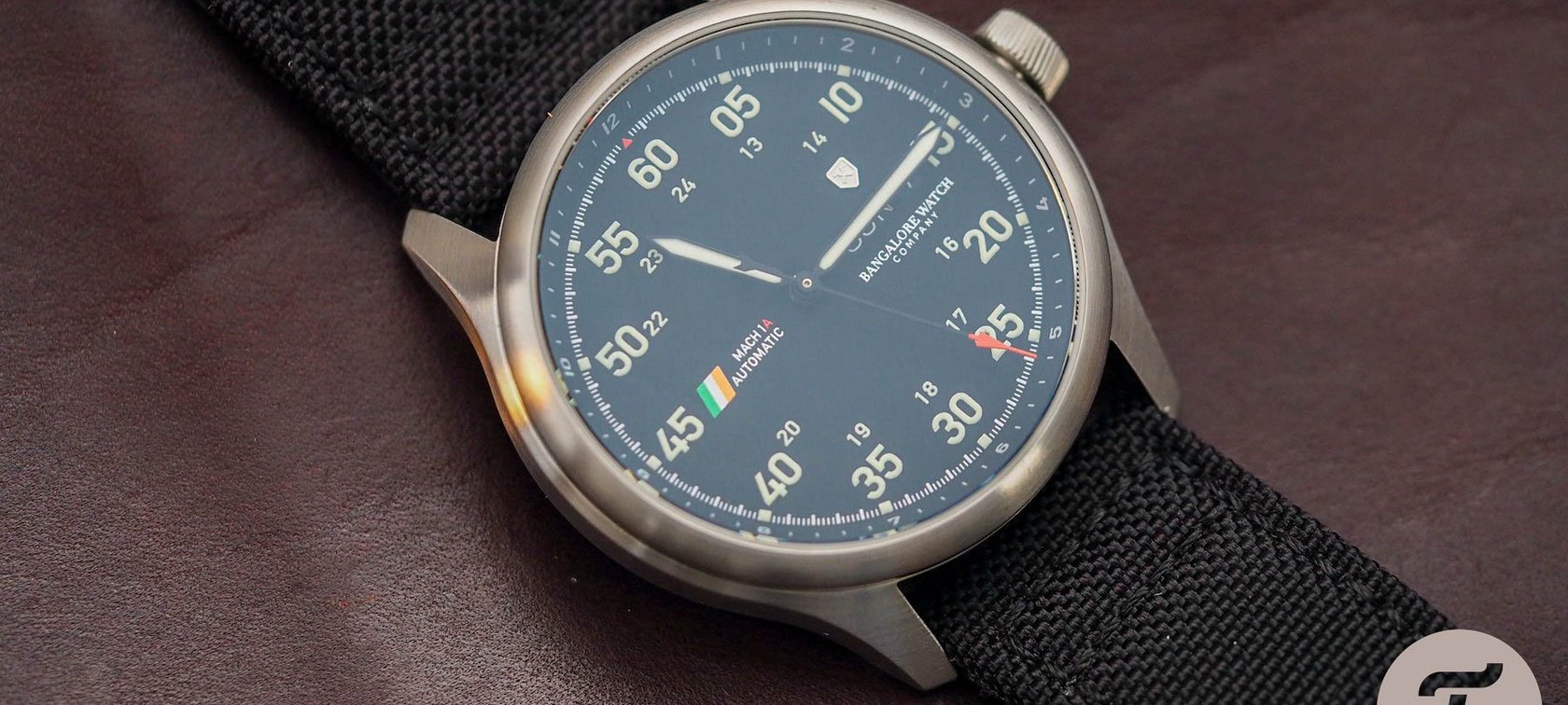
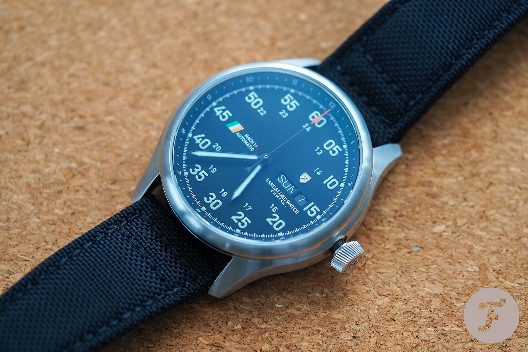
For me, the answer is no. Here’s why: when you look at a watch that professes to be a pilot’s watch like, say, the Zenith Pilot Type 20 it is two things; it is sparse and it is engaging. When I look at the Mach 1A, I see a dial that is too cluttered to be a true pilot’s watch (on account of its small size, spindly double numbers, applied logo, day/date complication, and the unnecessary vexillological embellishment).
And yet here’s the weird thing, the absence of the wordmark or any printing along the vertical axis of the dial does go some way towards compensating for the ubiquity of dial elements, and yet because of what our eyes expect to see when we look at at a watch, that unexpected space (which should register in our brains as nothing) actually registers as “something” and thus becomes oddly distracting in itself.
This isn’t a Goya, a Picasso, a Basquiat, or whatever you might expect to find hanging on an art gallery wall. This is a pilot’s watch.
When I really force myself to look at the dial for a long moment — for much longer than I would if I were just telling the time — the dial begins to sit more comfortably. When I have time to take in the elements, they bother me less. And I honestly think that is exactly how the designers ended up with this layout — they looked at it for too long. Because it doesn’t really matter if I “get” it after five minutes of analysis. This isn’t a Goya, a Picasso, a Basquiat, or whatever you might expect to find hanging on an art gallery wall. This is a pilot’s watch. Consequently, instant legibility is just about as important a characteristic of the genre as the hands themselves…
The good stuff
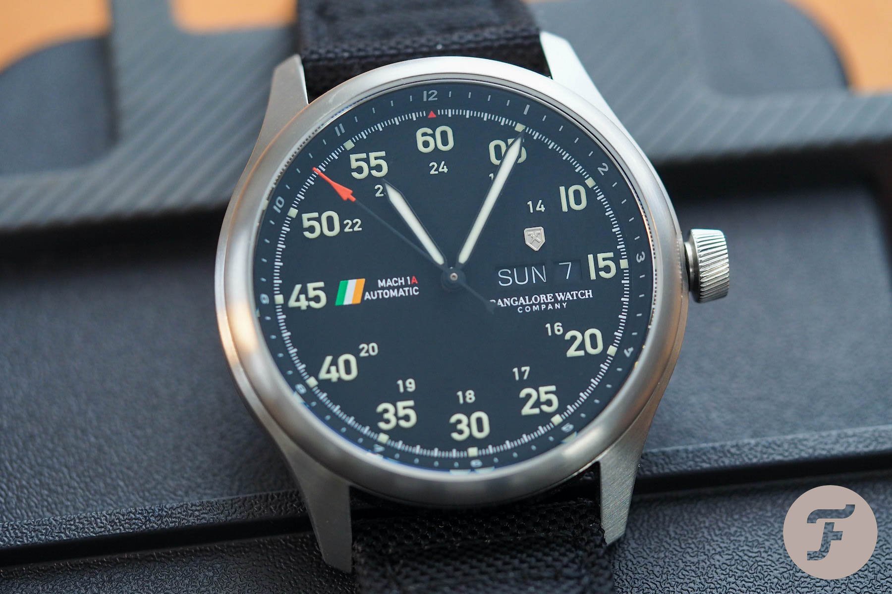
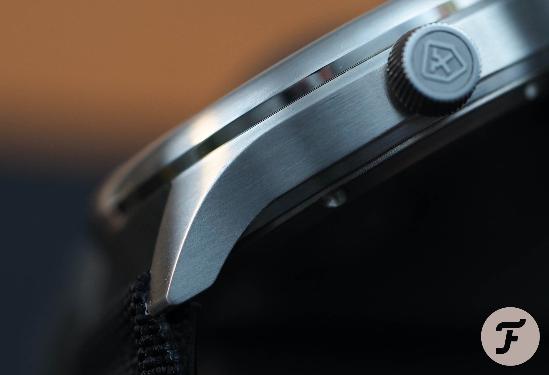
But it isn’t all bad. Would that it were. That would make my life a lot easier. No, there are some good bits worthy of praise. Firstly, the case, which is a bit vanilla but totally fine, is nicely made. The surface finishing has been well and patiently applied. You can tell this from the sharp edges of the lugs. The buttery edges of many micro/independent brands annoy me more than anything. I hate it when a watch looks like it’s been finished in a washing machine full of rocks. This one is pretty crisp and very decent for the money.
Glow bug
The lume is good. Here, Bangalore Watch Company does something a lot more brands should do, in my opinion, and uses 3D lume markers. The glow is immediate. The brightness of the hands and markers is relatively homogenous. It isn’t the longest-lasting lume in the world, but it does the job (with the hands lingering a while longer than the markers but still sufficiently visible for more than an hour in complete darkness.
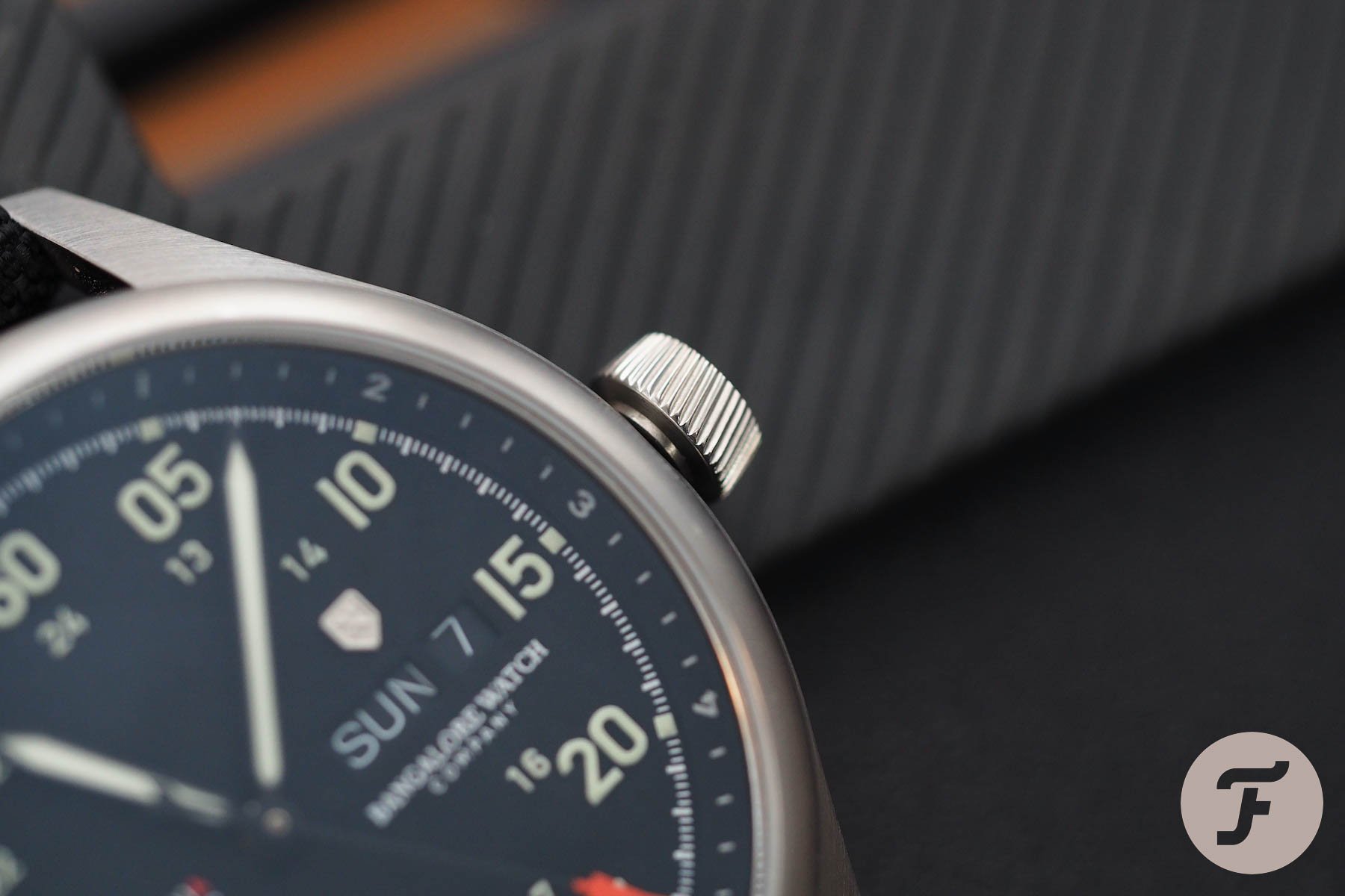
A right royal wind-up
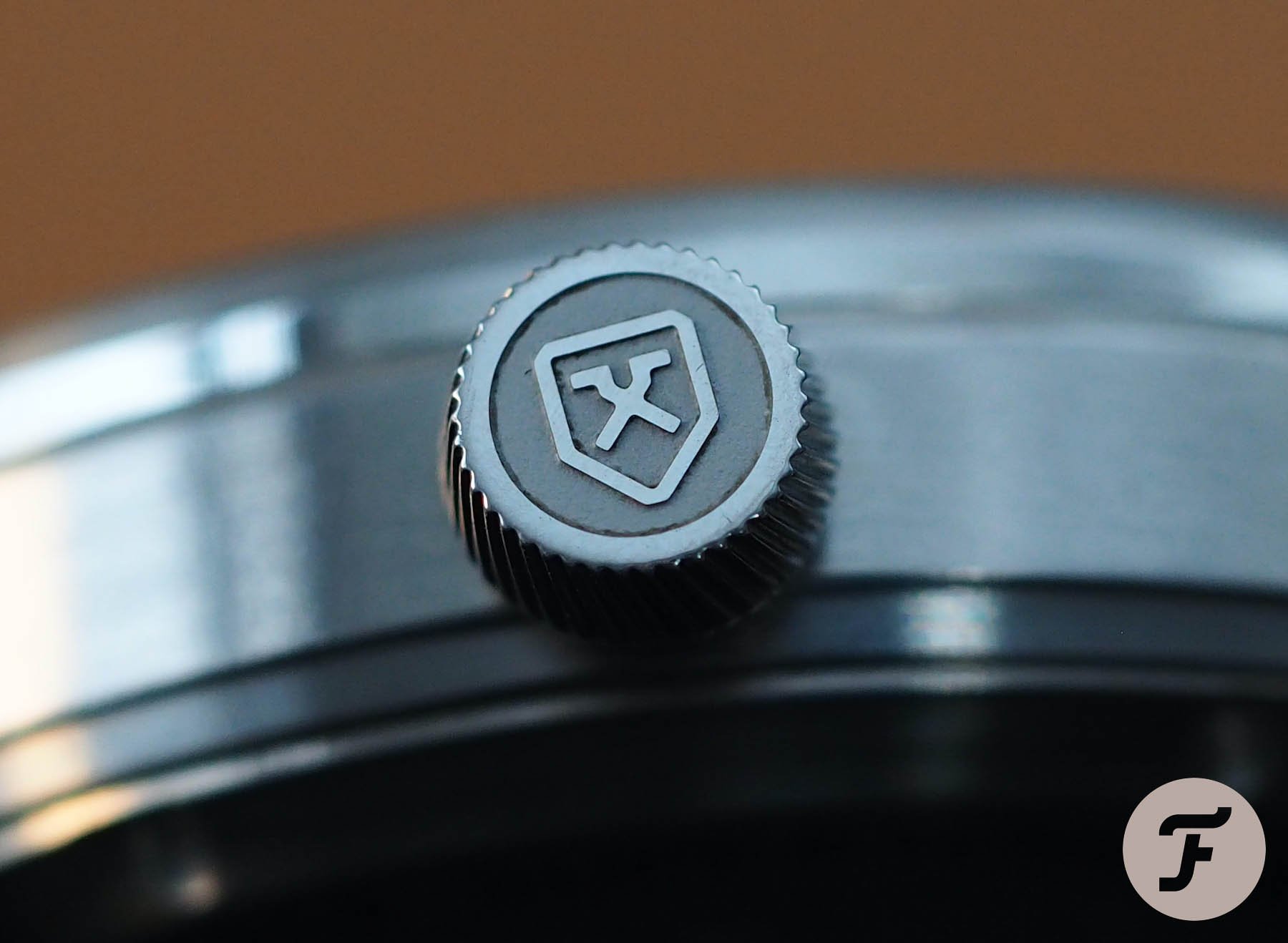
The crown design is actually pretty neat. I like it. It reminds me of a jet engine. I’ve seen this “twisted grooving” done before and I’ve seen it done far worse. Even the logo application on the crown is very nice. I could have done without that high-polished surface and would have accepted a laser-engraved recessed logo rather than a stamped proud logo if we could have got a bit more depth there. But truthfully, it is very good. The thread machining on the crown tube and on the inside of the crown is adequate: I’ve known better; I’ve known much, much worse. The winding stability could be a tad better if the crown pipe were a little thicker so there wasn’t so much side-to-side play between it and the interior of the crown tube itself. All in all, though, it’s pretty decent and way above its pay grade.
Buckle logo placement
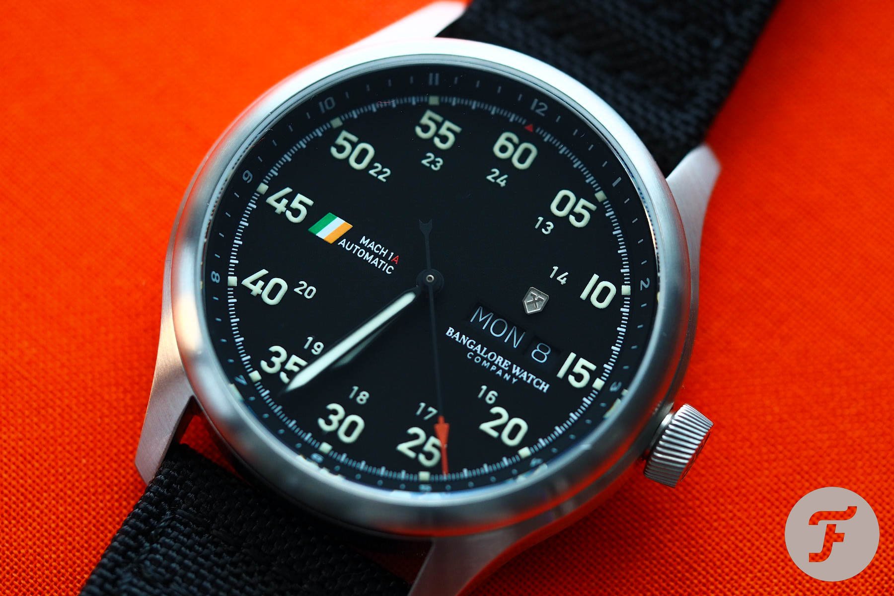
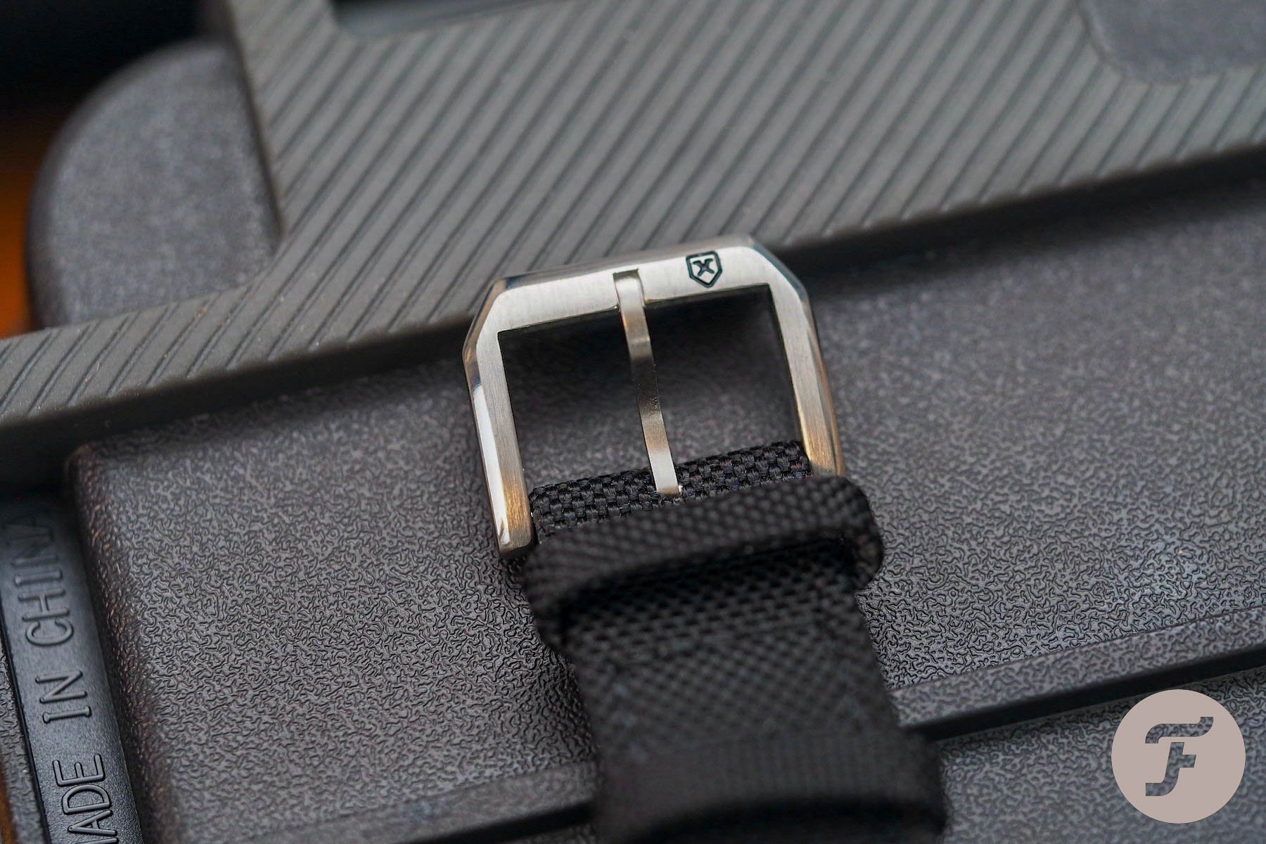
The strap of the Bangalore Watch Company Mach 1A is quite nice. It is a leather-backed sailcloth style of strap. These are not my favorite on any watch, but it looks smart and breaks in quite easily. The best bit about it, however, is the buckle. While this design is entirely unoriginal (I would go as far to say it is likely off the shelf), the placement of the logo is, blessedly, wise.
Too many brands try and fit their wordmark on the buckle with very little success. Cramming tiny, pathetically lasered characters onto a thin strip of poorly machined steel does no one any favors. Brands need to stop it. A good buckle can bring you a lot of love; a bad buckle can ruin your reputation. In the case of buckles, it is almost better to be lazy rather than dumb. Look at Casio G-Shock buckles, for example. For the most part, they are truly rubbish, but Casio doesn’t seem to care and, as such, we don’t either. When it’s clear someone has tried to do something and ended up doing it badly, it is far easier to criticize than someone clearly deeming something completely unnecessary.
Here, Bangalore Watch Company has smartly stuck with its graphical logo and placed it to the side. It is deeply engraved and filled with black enamel paint so it stands out against the brushed/polished surfaces of the buckle. Simple but sweet. I like it.
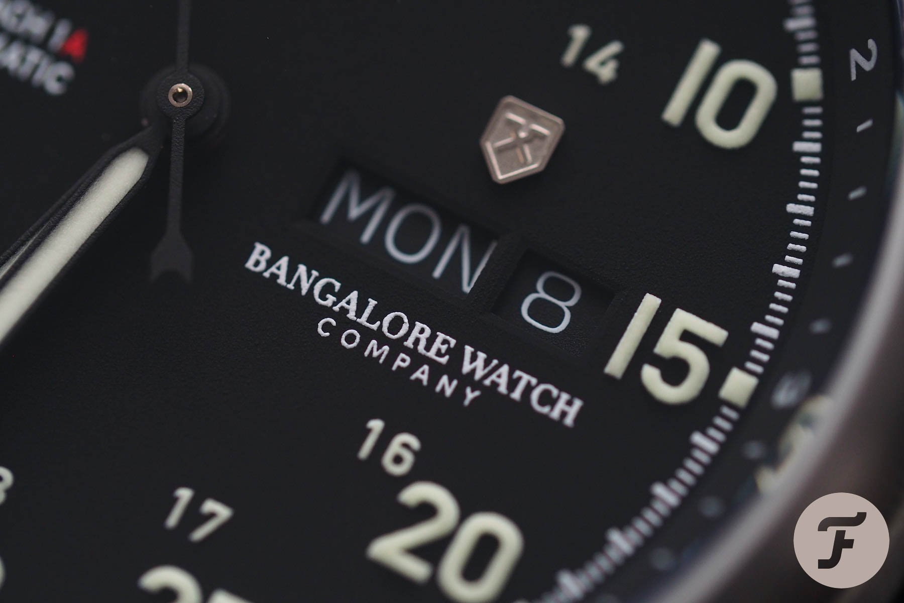
The library on the dial
There is an area on this dial, about 10mm by 16mm, that would rival any watch for the title of busiest dial per cubic millimeter. Between the 2 o’clock zone and the 4 o’clock zone, there is a lot going on. Here we have the rehaut numbers, the five-minute markers, the 24-hour scale, the day, the date, the company wordmark, and the company logo.
I don’t think I need to tell you, that’s a lot.
In total there are between 38 and 39 characters within this area including the logo and depending on whether we have a single or double-digit date. Also depending on that single or double-digit date is the number of font sizes. On a single-digit date, there are six; on a double-digit date, there are seven. I don’t think I need to tell you, that’s a lot.
The day/date complication in general
I’ve never been a huge fan of the day/date complication because of the way it does tend to busy-up a dial when placed in the 3 o’clock position. Worse still, day/dates are frequent QC fails. Oftentimes, the bar separating the windows is a bit off when it comes to cheaper watches (although it is actually pretty good on this sample), but the wheels themselves are also tricky to line up. They shouldn’t be. In fact, it should be impossible to mess it up. However, the reality is that minute difference in spring tension or component execution (for example, the flatness of the day wheel and the trueness of its connection to the spiked-cog beneath it that engages with the date-change mechanism) can play a part here.
But somewhere (perhaps on the kind of metaphysical level only Dr. Strange could access) there is a difference.
While Sellita clones are, for the most part, absolutely comparable to their ETA-made inspiration, this is one area in which the differences are apparent. The Sellita SW220 has had more updates to the date change hammer than I can count (by the time I left the bench in favor of the keyboard I remember it being quoted as more than 30). I’ve had the same hammer from an ETA 2836 on my desk, on top of, next to, under the microscope with the corollary of the SW220 and I’ll be damned if I could see a real difference. But somewhere (perhaps on the kind of metaphysical level only Dr. Strange could access) there is a difference. As such, the only SW220-powered watches I wear are ones I built myself after an incredibly long period of testing.
What to do about it?
I always talk about smart design decisions. Movement choice comes into this equation also. The crux of my argument comes down to one simple thing: do not do something unless you can do it well. My allergy to the SW220 is unique among Sellita calibers. I have faith in all others. I actively prefer the brand’s chronograph line and love the breadth of selection it offers consumers. But the 220, due to my personal experience with it, is a no-go.
Day/date complications can be cool. There is a way to implement them in a freeing, less burdonsome fashion. Look at the Rolex Day-Date, after all. It is close to perfection when it comes to a dial layout. But there are other options too…
I hate the vertical day/date at 6 o’clock, which sees the three-letter day codes arranged in a column. One word: yuck. But 6 o’clock day/dates can be cool when designers decouple themselves from the status quo. Smaller day windows; two letter day codes; color-coded day indicators… These are options too rarely explored. In some of Tomas’s #TBT articles we’ve seen some brilliantly creative and effortlessly cool executions of this concept, so why don’t we see more of it?
I would certainly have preferred that here. A day/date indicator isn’t necessary for me on a pilot’s watch. If you need to have it, because you’re convinced it adds value to the watch, then make it as obscure as possible.
Conclusion
The Bangalore Watch Company Mach 1A is, overall, a pretty well-built watch (good externals and reputable — even if personally unfavored — internals) that speaks of the brand’s ambition. For me, the dial design is a miss, but not by a long way. As stated earlier, it is really more of a layout problem in my eyes. But these are just my eyes, which happen to be attached to my biased brain. Perhaps you think I’m wrong (it wouldn’t be the first time). So let me have it in the comments section. Do you like this style of pilot’s watch? Do you think we need to see more of them? What would you change (if anything) about this design? Let us know below. As always, we appreciate the Fratelli’s input. Learn more about Bangalore Watch Company here.