Going Hands-On With The Tudor Black Bay GMT Opaline And The Tudor Black Bay Pro

It’s been almost a year since Tudor released the Black Bay GMT with the opaline white dial. Strangely enough, we never did a hands-on review of the watch. While it essentially was a line extension of the Black Bay GMT, the dial brings a certain praiseworthy attraction. The brand’s second GMT is the Black Bay Pro. It’s another popular model that seems to do well for Tudor. I had a chance to go hands-on with both shortly after another and compare them. It gave me the chance to find my favorite of the two. It was also good to see where Tudor could improve these popular models. It’s time to find out more.
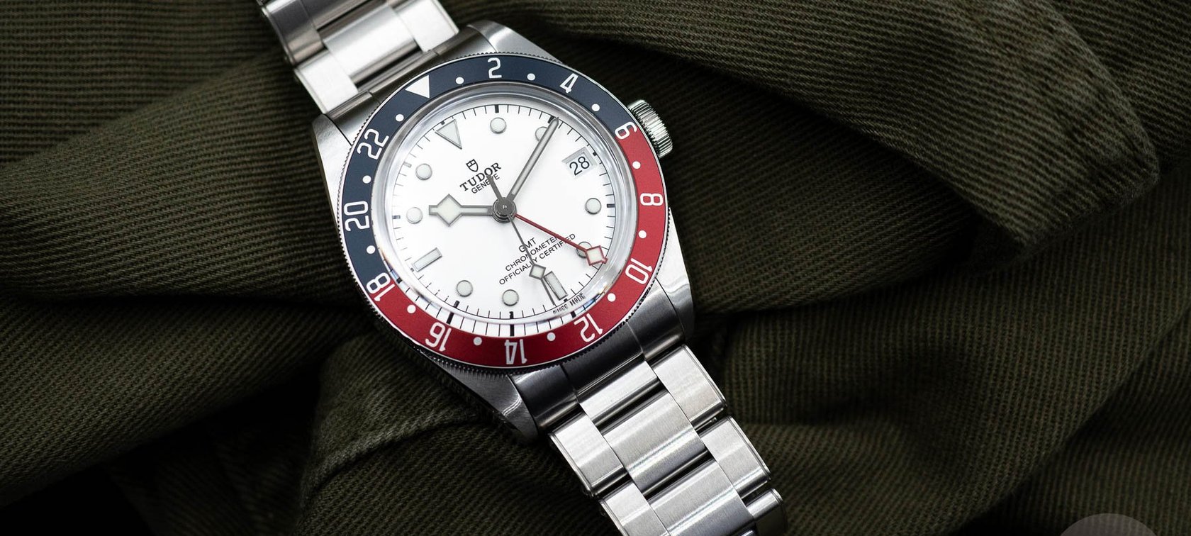
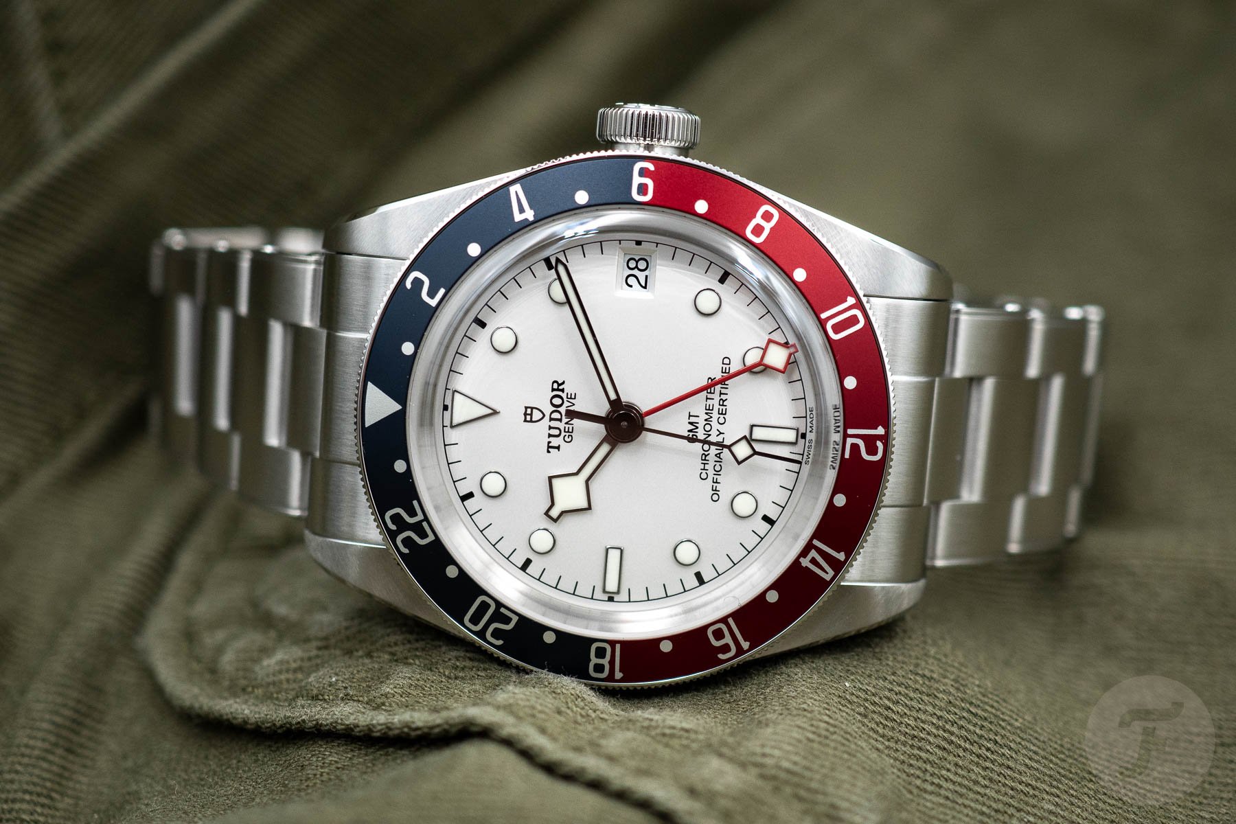
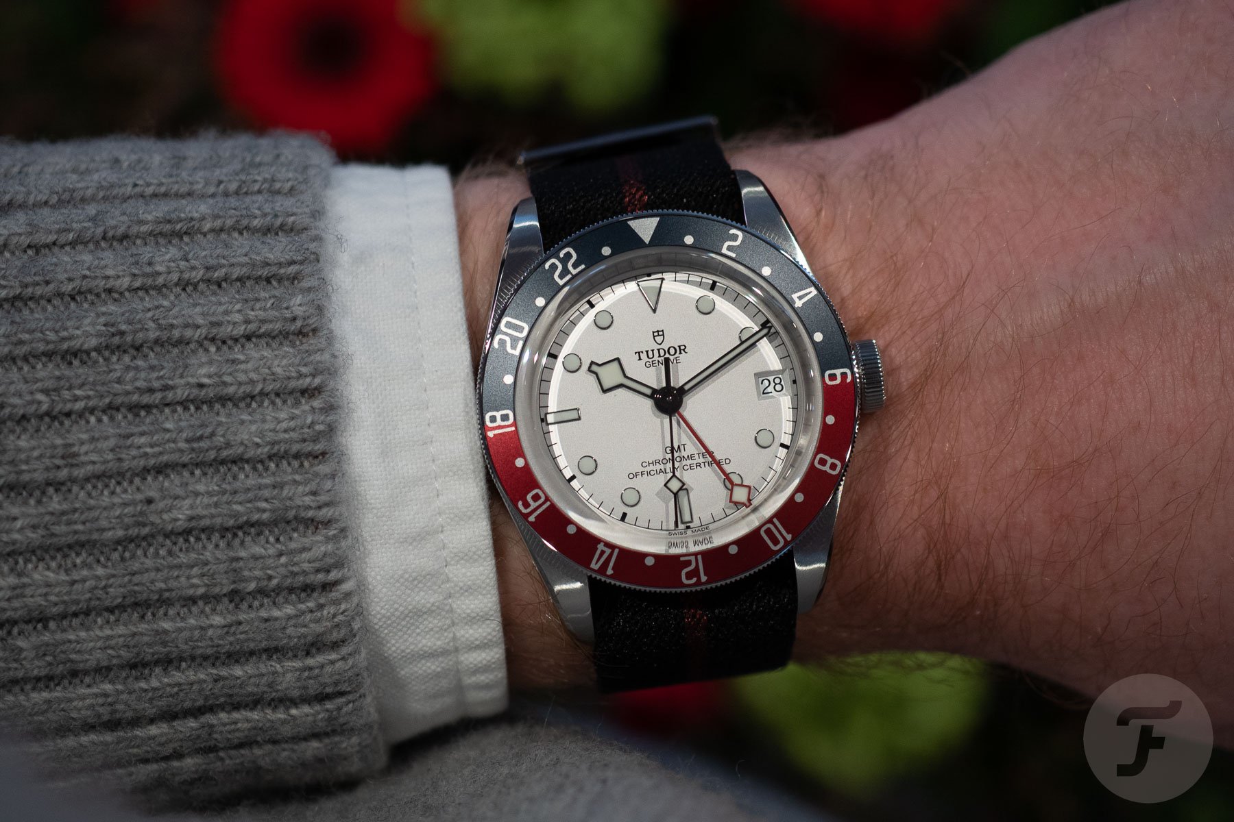
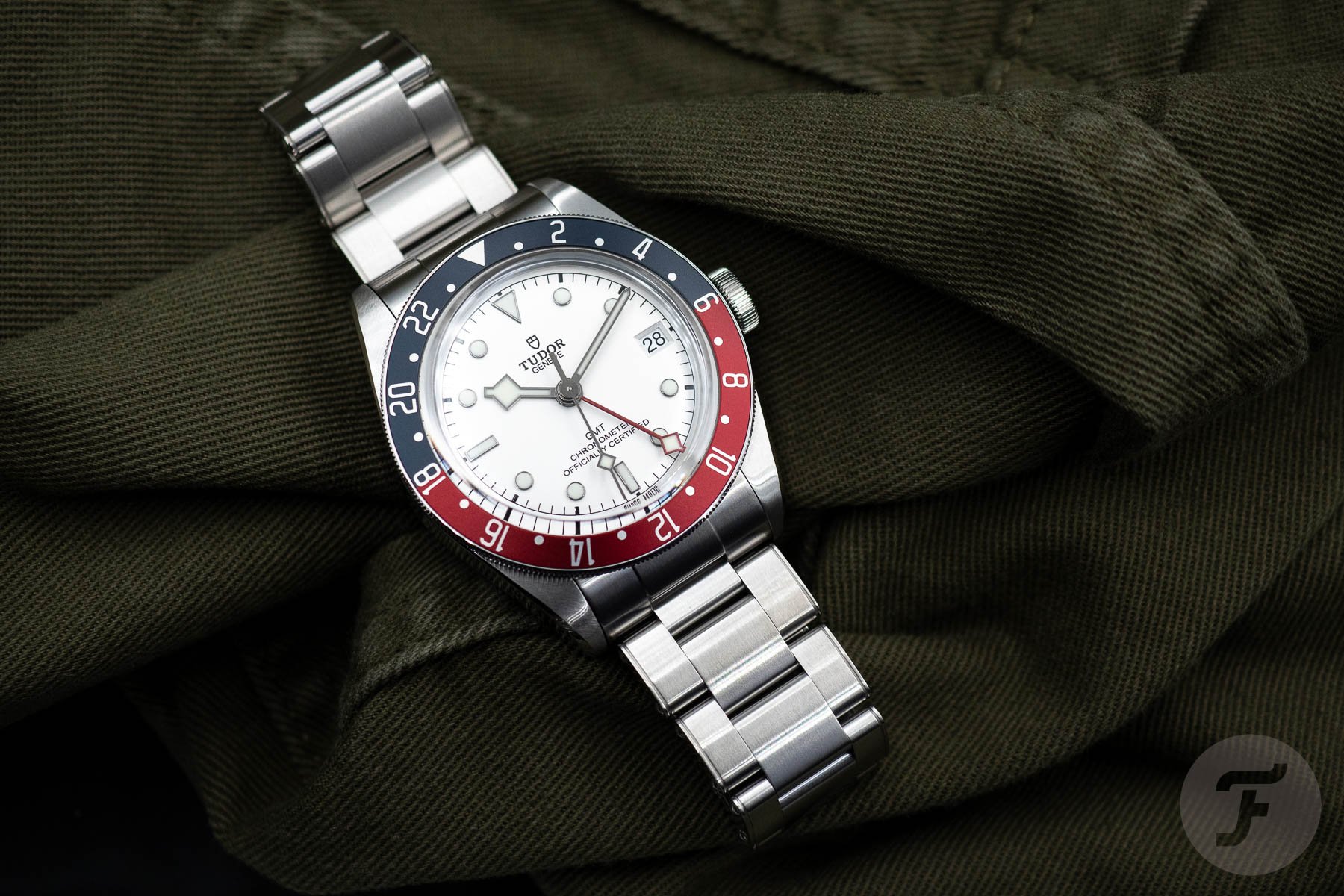
The white-dial Tudor Black Bay GMT did not impress me when it came out. It got a lot of favorable reviews, and some of my Fratello colleagues were impressed. But to me, it seemed like a less exciting option. It’s as simple as a general preference for black dials. The black-dial version was still my preferred pick after its white-dial brother debuted. But I was impressed once I had a chance to check out the white opaline dial up close. The dial is very nicely executed. On top of that, the watch shakes the inevitable Rolex comparisons to a certain degree. Sure, the GMT-Master “Albino” ref. 6542 was a thing, but The Crown never made a white-dial GMT-Master a regular option for the brand’s famous traveler’s watch.
Shaking a feeling that is impossible to lose with the Black Bay
The white-dial Black Bay GMT felt fresh straight out of the box. Something as simple as a different dial color greatly impacted the overall aesthetic. I appreciate the fact that it takes a step away from the GMT-Master (II). It brings something desirable that I would love to see from Tudor more often. We all know that Tudor walks a very fine line when balancing inspiration from its archives and inspiration from its bigger brother. The Black Bay GMT S&G and the Black Bay Pro were two examples that rubbed people the wrong way. These two Tudor watches pay obvious homage to two iconic Rolex models.
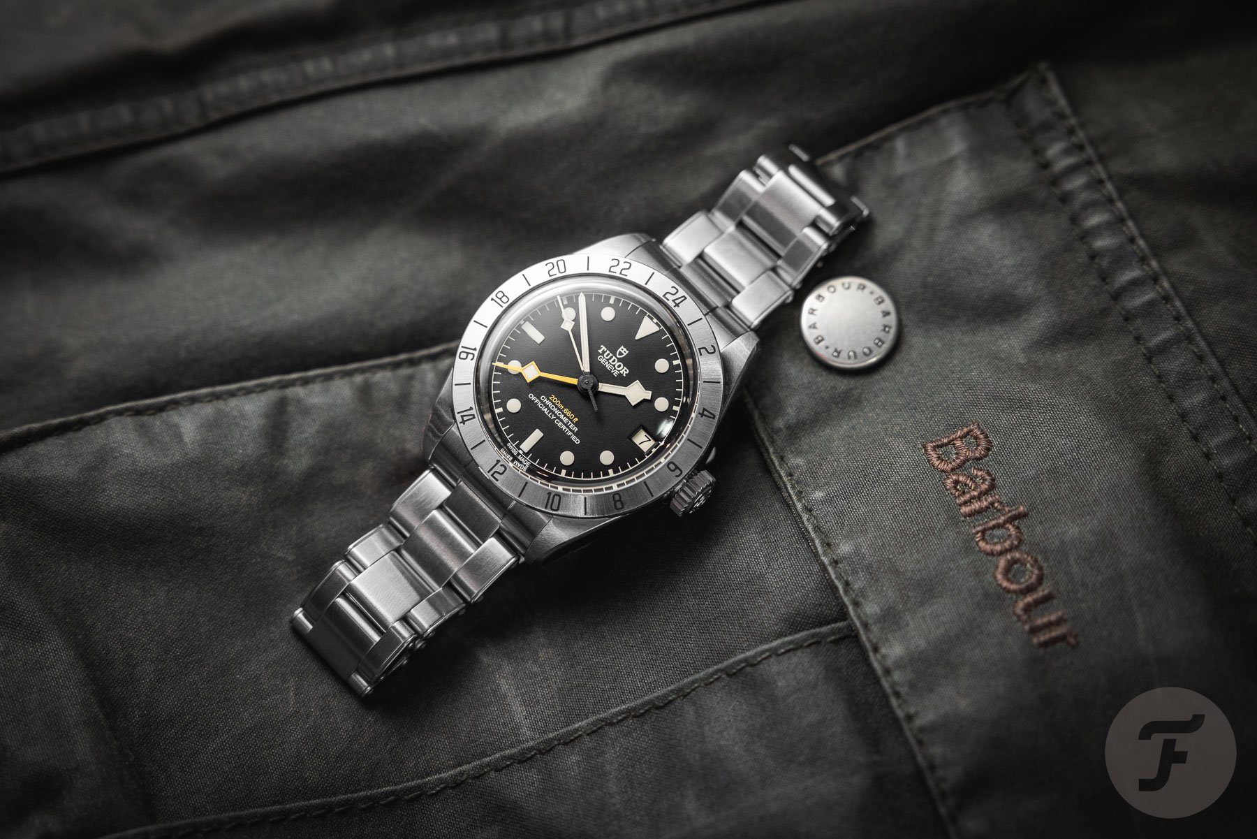
Longtime Fratello readers will remember the article Lex wrote about the design inspiration of the Black Bay Pro. The article created absolute mayhem as he dubbed the Black Bay Pro a “poor man’s Rolex Explorer II ref. 1655.” In all fairness, I completely agree with Lex. While it was always clear where Tudor got its inspiration, the brand had never blatantly found inspiration with two very specific Rolex models from the past. I thought it was a questionable design step for Tudor. But I was surprised by the actual watch once I had a chance to take the Black Bay Pro for a spin. It was far less of a copy of the original Rolex Explorer II 1655 “Freccione” than I expected.
The dial design of the Black Bay Pro makes it a Tudor
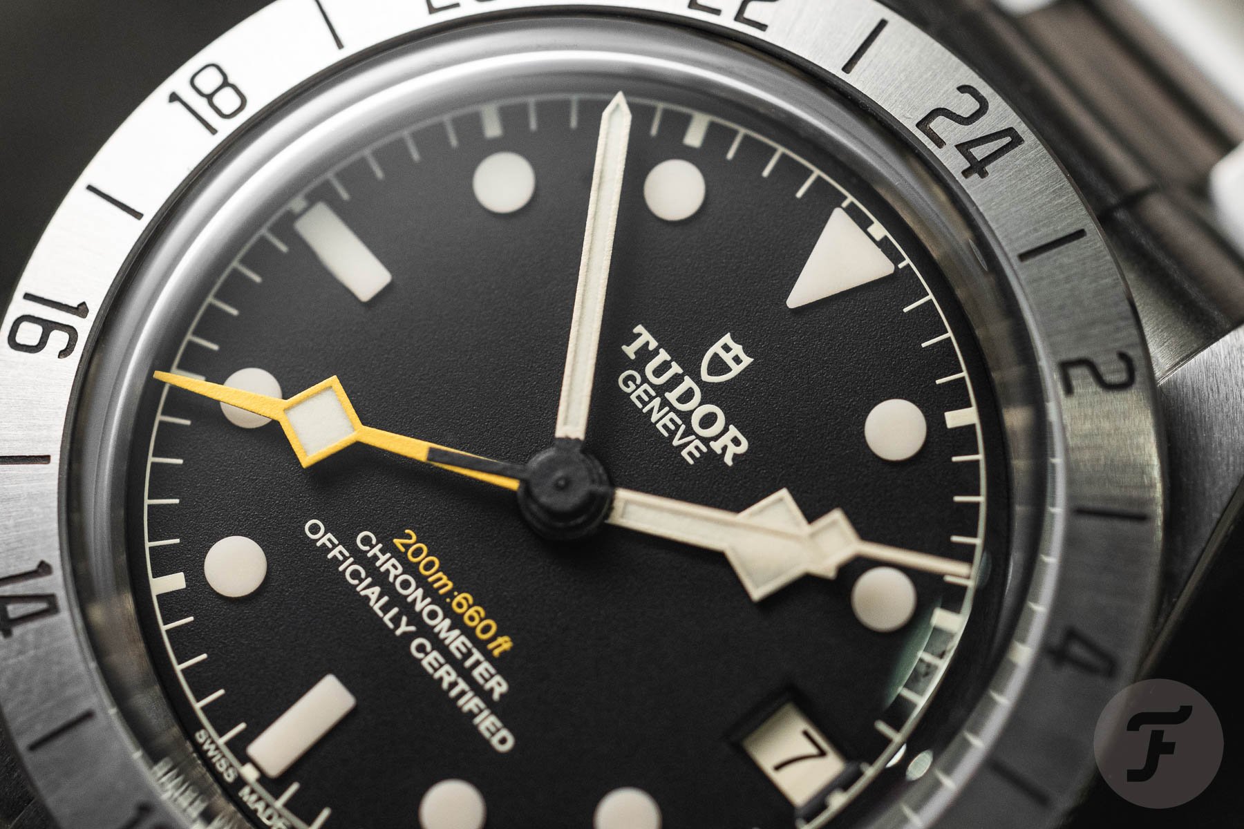
Sure, there is no denying where the Black Bay Pro gets its inspiration. As Lex explained, Tudor even confirmed it. But the designers did a great job Tudorifying the first-generation Explorer II. The dials and hands make it distinctly Tudor and less Rolex. Consequently, the Black Bay Pro took a step away from the “Freccione.” On top of that, it improved the impracticalities of the dial design of the Explorer II ref. 1655. In the process, the Tudor designers also swapped the orange GMT hand for a yellow one, which I strongly prefer in the overall picture. So, overall, I drastically changed my opinion of the Black Bay Pro. It went from an immediate “no” to the top of my list of wants.
That same thin line of giving a watch its Tudor-specific characteristics is also why I appreciate the white opaline dial in the Black Bay GMT. It is more obvious because it’s a color that Rolex never widely introduced for its GMT-Master. But that works well in combination with the Tudor handset. So both watches do a good job, in my opinion, of juggling the clear Rolex influences and adding the distinct Tudor flavor to the design. As I said, it is a very thin line, but these two walk it well. As a result, the white-dial Black Bay GMT became an immediate favorite over the black-dial variant.
Comparing the Black Bay GMT and the Black Bay Pro
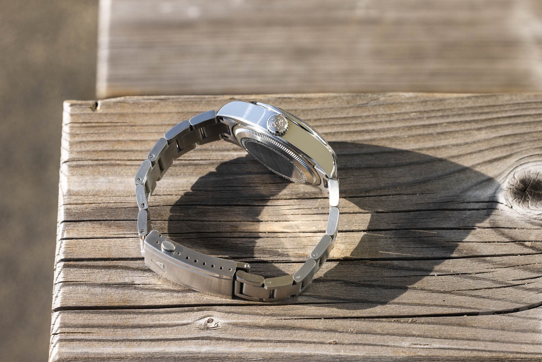
But which of the two models is the better watch? The answer will always be personal. But some things stood out when I had a chance to go hands-on with both. First, as we all know, these watches are both chunky. The Black Bay Pro measures 39mm wide, 14.6mm thick, 47mm long, and 20mm between the lugs. The Black Bay GMT has a 41mm case that is 14.7mm thick, 50mm long, and 22mm between the lugs.
The Black Bay GMT
I think it’s easy to agree on the wish to see slimmer GMTs from Tudor. The good thing is that the brand is working on creating slimmer Black Bay models, as we have seen with the METAS-certified Black Bay Burgundy. But we also know it will take time to see a slimmer Black Bay Pro or GMT. For that to happen, the brand must develop a slimmer movement to replace the 7.52mm-thick COSC-certified caliber MT5652. Because the white-dial Black Bay GMT was released not even a year ago, I wouldn’t be surprised if it took longer before we see a slimmer replacement.
The Black Bay Pro
Comparing the two designs of the Black Bay GMT and Black Bay Pro
Let’s hope that Tudor and Kenissi can shave off a significant bit of thickness from the current caliber because that will solve the main issue people have with both watches. For now, we have to deal with the current models. But how does it translate to the proportions of both watches? It’s easy to see that the Black Bay GMT has a more proportional case overall. With a larger diameter and longer lug-to-lug, the dramatic effect of the polished case sides is not as impactful as with the Black Bay Pro.
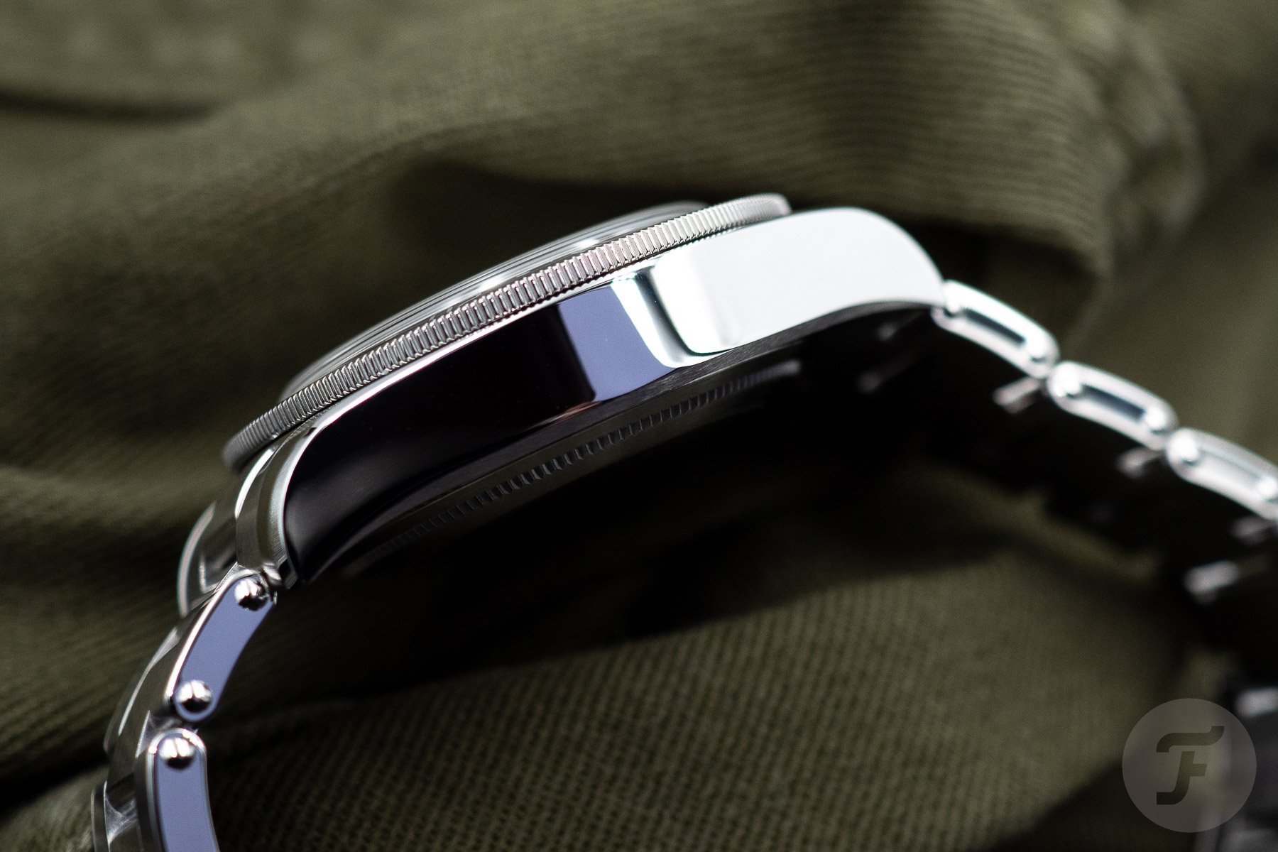
The Black Bay Pro is 2mm smaller in diameter and 3mm shorter from lug to lug. As a result, the watch looks like a chunky steel slab. The Black Bay GMT is not exactly slim, but the overall side profile is slightly more elegant. An easy first assumption is that the Black Bay Pro would be an immediate no-go. But the truth is not in seeing the watch but in wearing it.
Wearing the Black Bay GMT and Black Pro
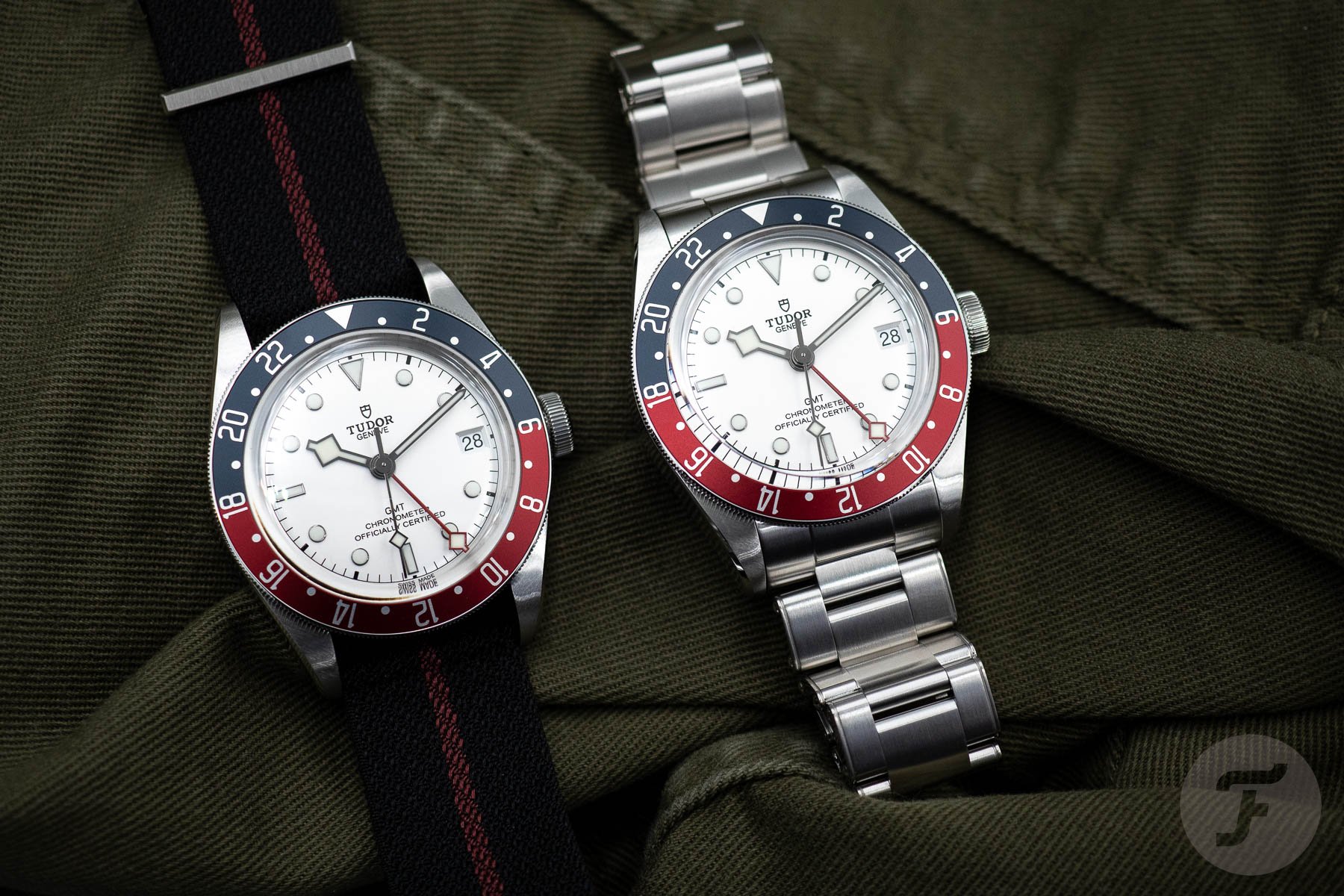
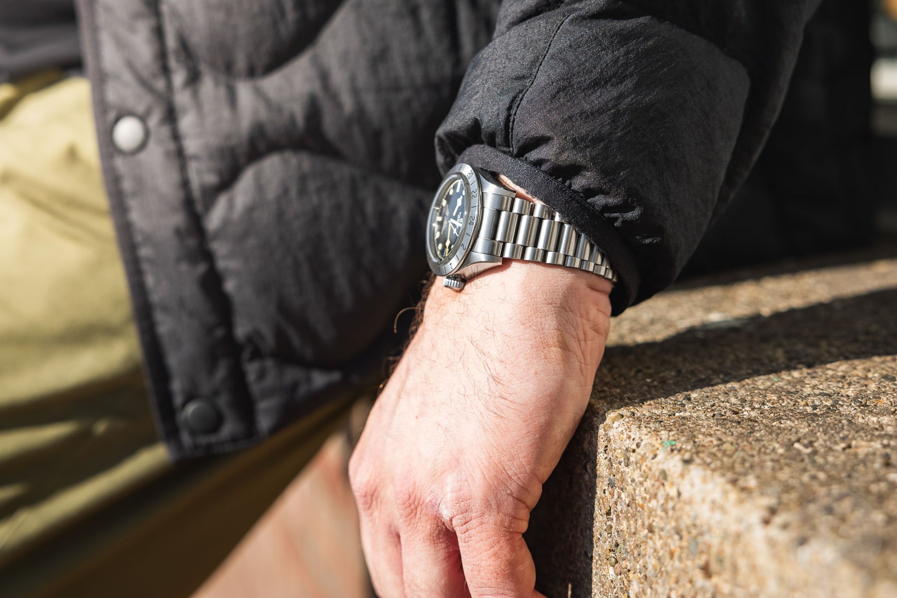
The truth is that both watches sit well on my 19cm wrist. I can easily handle a thicker watch, so they both balance nicely. Both watches are also available to buy on a strap, but if you ask me, the faux-rivet bracelet with the T-fit clasp is the only way to go. It’s a comfortable bracelet with a great clasp that perfectly balances both watches on the wrist.
I recently had a chance to wear the Black Bay Pro on three different Forstner bracelets, and that’s when I got more confirmation that the Black Bay Pro is my pick out of the two. While the Black Bay GMT’s proportions are visually better, I prefer the Black Bay Pro on the wrist. I want a smaller, chunky watch as it is easier to balance. On top of that, the combination of a 39mm case with a 20mm lug spacing hits the sweet spot for me visually and practically compared to the 41mm diameter and 22mm lug gap of the Black Bay GMT.
The look of the Black Bay GMT
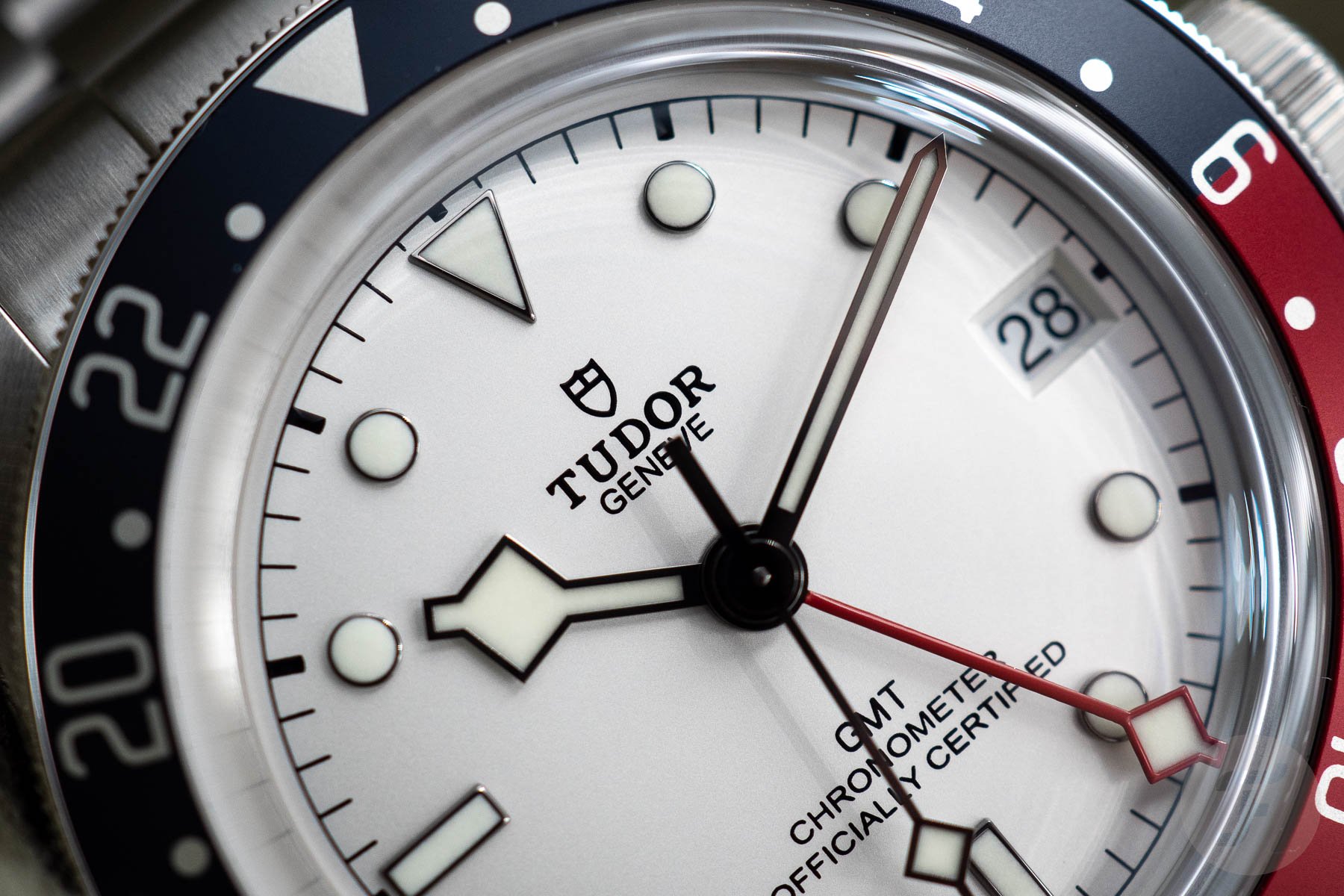
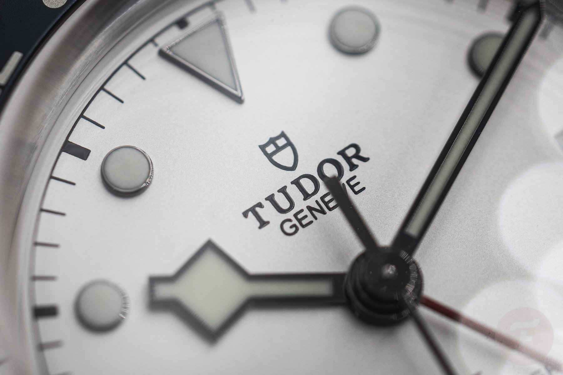
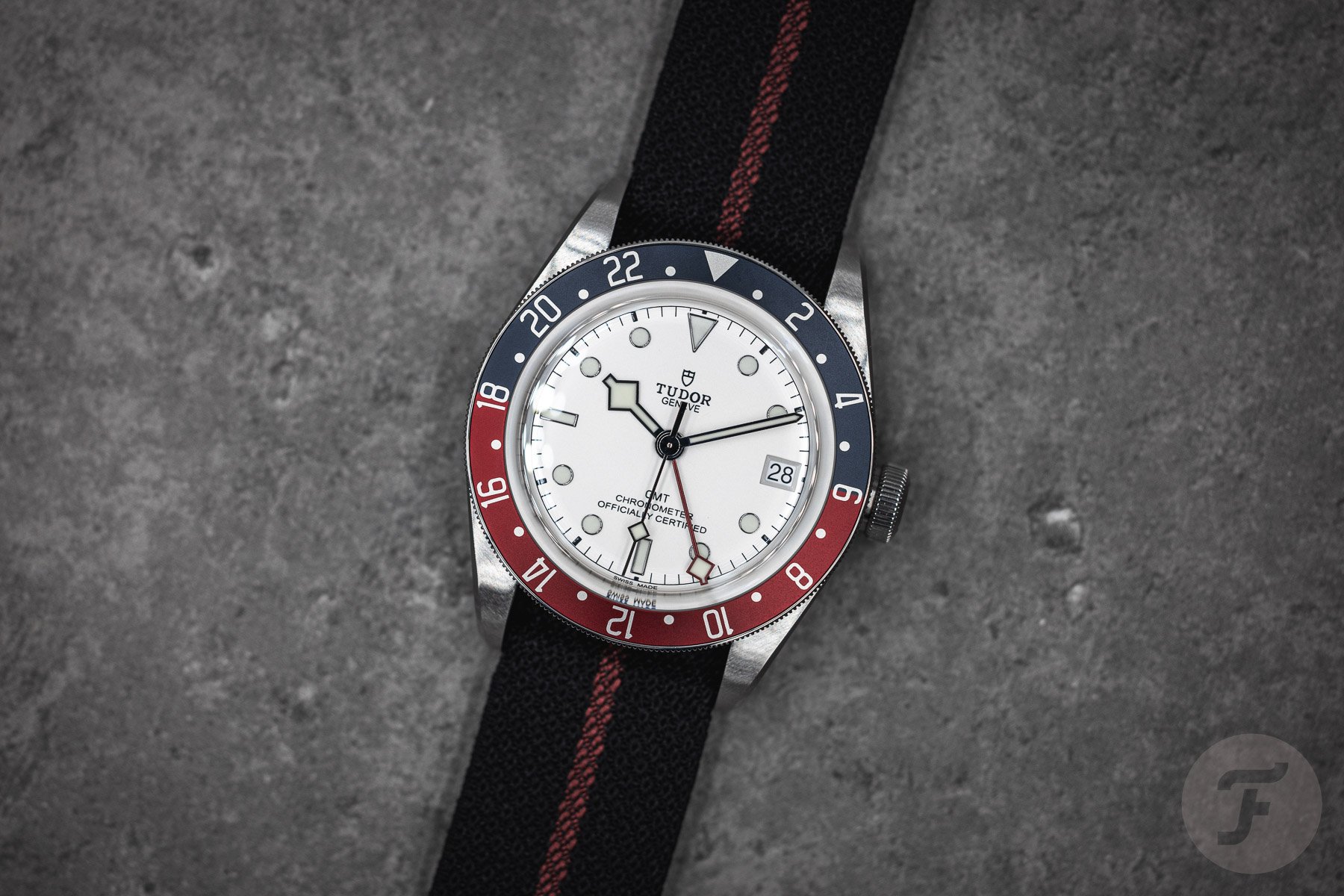
Once on the wrist, the aesthetic of both watches is completely different. What I immediately loved about the opaline white Black Bay GMT is that the indices are filled with white Super-LumiNova, corresponding to the dial color. This makes for a beautiful white-on-white experience that gives the dial a crisp feel. The white date disc with black printing fits in the overall picture nicely, and what you get is a nicely balanced white dial that offers great contrast from the red and black elements on and hovering over the dial. I like this classy presence a lot.
One of the details I have never been a fan of is the size of the hour markers. I know Tudor prefers to take a classic approach, but I like the markers slightly bigger. Rolex played with the size of the indices quite a bit in history, and I have always loved the dials of the ’70s ref. 1675 models with larger markers. It’s a fine balance between making something rather boring and exciting, although I understand this is a personal preference.
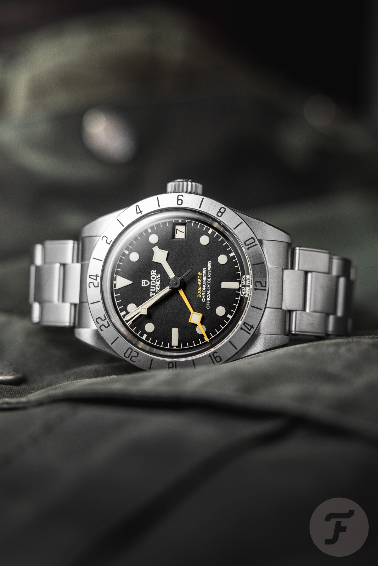
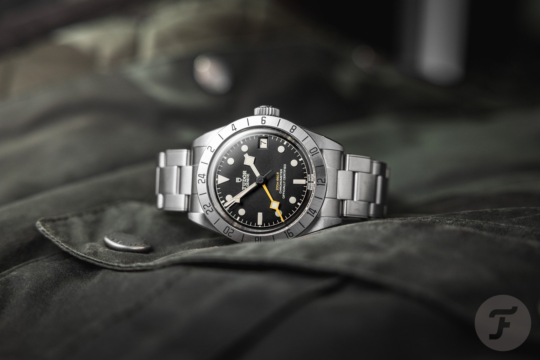
The look of the Black Bay Pro
When it comes to the Black Bay Pro, it feels more balanced. It has a smaller dial, and the full-lume blocks are exactly the right size, contrasting beautifully against the matte dial. The same goes for the balance of the handset and the dial; it feels spot-on. One thing that I would have preferred is a color-matched date disc in black with white printing. While the current solution makes sense as the date disc matches the indices, I love it when a date blends in more. The current design has never bothered me; it’s purely a matter of preference.

Another detail that stood out is that the font used for the bezel is the same on both watches. I prefer this font style combined with the Black Bay Pro’s stainless steel bezel. The blue and red bezel insert of the Black Bay GMT could use a more elegant and slightly thicker font. By the way, as you can see, the numerals on the bezel of the GMT are oriented correctly on the upper half of the bezel and upside down on the lower half. That is due to the rotating bezel. With its fixed bezel, the Black Bay Pro has all the numerals upright. I prefer the fixed bezel when putting the watches next to each other, but that is not why I would pick the Black Bay Pro.
Final thoughts on the Black Bay GMT comparison
The reason I prefer the Black Bay Pro is greater than its smaller size or dial design. What I particularly enjoy about the watch is that it takes the aesthetic of the “Freccione,” which I dearly love and will never own because of its high pre-owned prices, and makes it available to a wider audience for a more affordable price of €4,290 on the bracelet. It has also improved the balance and practicality of the dial design while giving it that typical Tudor look. The result is a watch that works stunningly well and is an improvement compared to the original Rolex model.
That’s not something I can say of the Black Bay GMT that goes for €4,450 on the bracelet. I do love the look of the watch with the white opaline dial. It is a nice step away from the standard GMT-Master realm. However, in the overall dial design, I love quite a few elements of vintage GMT-Masters. On top of that, a vintage GMT-Master is expensive but not yet unobtainable. I still haven’t let go of the idea of owning a GMT-Master ref. 1675, but I have said goodbye to owning an Explorer II. ref. 1655. It is easy to choose between the two. And getting back to Lex’s article and my initial reservations about copying the looks of the unique “Freccione,” as it turns out, it is a blessing rather than a curse.
For more information, visit the official Tudor website. Let us know which of these two models you prefer in the comments.