Is There Such A Thing As Objective Beauty In Watches?

Beauty is in the eye of the beholder. It is a statement often used to definitively end any debate about aesthetics. It seems we subconsciously agree that objective beauty does not exist. Broadly shared preferences for specific watches, in that spirit, are merely cultural constructs. You like a certain watch because you have been told to, time and again. And because you see it on people whom you consider connoisseurs or “of great taste.” Somehow, that idea doesn’t sit well with me. Is there perhaps such a thing as objective beauty in watches?
This idea took root in my mind during the design process of my own watch. My designer, Max Resnick, repeatedly and reliably predicted which of several options he presented would suit my preference. And more often than not, we would agree on what looked best. What was going on there?

Max working on my watch
Finding objective beauty together
Let me describe the process we went through to give you a better idea of what I am hinting at. The following occurred during the ideation stage, in which we generated many ideas and then went through a process of elimination and convergence. Max would work on specific parts of my upcoming watch, one at a time. After he generated several different ideas, he would present them to me. He often bundled several parts in one presentation. So he might start by showing me a bunch of possible end links and proceed with potential bracelet styles based on my requests next.
Not knowing what would be on the next slide, I would point at my preferred end link sketch. Max would proceed to say: “I knew that, so I took it as the basis for the following bracelet ideas.” He would show me the next slide, featuring bracelet ideas with my preferred end link. “I agree!” He would add. This happened time and time again on different parts of the design. And no, it was no clever trickery on his end. I had the same PDF files, and there were no backup slides, just in case I had picked another option.
So perhaps Max has an excellent grasp of my taste. But he agreed with most of my choices. He has been brutally honest with me elsewhere, so I don’t expect him to pretend to agree out of politeness. I checked our choices with numerous people whose opinions I value. Without knowing my choice prior, they would point at the same sketches. So either I have an overly homogenous peer group, or maybe some aesthetic design choices are just better than others. It got me thinking about objective beauty.
Objectively beautiful flowers but how about the watch?
David Deutsch on objective beauty
As it happens, I was reading David Deutsch’s book “The Beginning of Infinity” at the same time. It is a wide-ranging book on the nature of knowledge. I stumbled upon a chapter, “Why are flowers beautiful?” In it, Deutsch lays out why he believes that objective beauty is as real as objective truth. He describes that flowers evolved to be attractive to insects. And insects evolved to be attracted to flowers. The fact that humans find flowers attractive hints at the existence of some objective measure of beauty, so he claims.
He elaborates in an interview with Nature: “Beauty has both a subjective and objective part. Human aesthetic judgment is a complicated mixture of genetic, cultural, and objective factors.” Since the topic is poorly studied, it is impossible to untangle those factors.
The interview also touches upon cultural notions of beauty. Deutsch mentions how classical paintings depict different ideas of the ideal human body than we hold today. This proves that there is indeed a cultural perception of beauty. But the two can coexist, as it does not disprove the existence of objective beauty.
My personal (subjective) concept of beauty
Neuroscience on objective beauty
Studying the subject is notoriously hard. I came across several interesting studies, though. There was one in particular in which brain activity was measured while looking at images of Renaissance sculptures. Subjects were shown images of original sculptures by master sculptors and ones where the original proportions were tweaked. Brain activity was measured, and the subjects were asked to rate the art.
Interestingly, increased activity showed in the right insula, when looking at the original sculptures instead of the tweaked ones. Increased activity was present in the right amygdala when looking at the sculpture the subject reported as the preferred one. Now, if you agree (which admittedly is a leap) that the original sculpture was “more beautiful” than the tweaked ones, there seems to be some evidence here that objective beauty may be something distinctly different from subjective beauty on a neurological level.
Now, I would not quite go so far based on this publication. But the researchers at least conclude that there seem to be two discrete things going on. It is important to note that the subjects were not familiar with the art. So any differences in response could not have come from prior expectations. It does seem to rhyme with the fact that we can appreciate beauty in an object that isn’t to our personal taste.


Objective beauty in watches: the golden ratio
It is a bit of a cliché when discussing objective beauty, but I feel I must touch upon the golden ratio. Mathematically, two quantities are in golden ratio if their ratio is the same as the ratio of their sum to the largest of the two. Now, I will not go into the mathematical background as I flunked math in high school and steered clear since. But it comes down to the fact that this ratio is believed to be aesthetically pleasing. For this reason, artists like Leonardo da Vinci and Van Gogh famously used the resulting 1,618 ratio in their works.
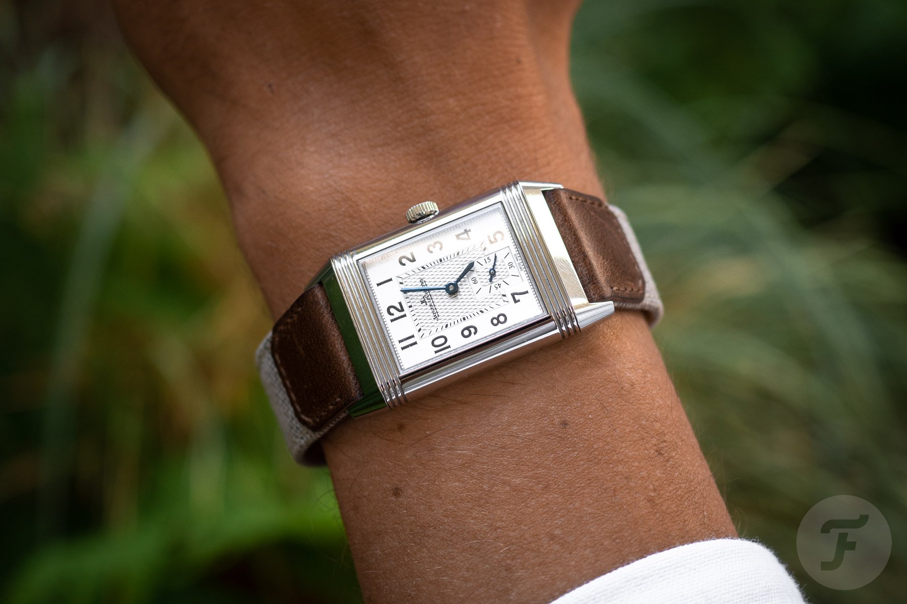
Jaeger-LeCoultre designed the Reverso case to this ratio, with a length that is 1,618 times the width of the case. A. Lange & Söhne also famously used it for the proportions of the large sub-dial within the overall dial of the Lange 1.
Whether the golden ratio sounds like mystical nonsense to you, or a fundamental truth about our universe is one thing. But the fact that visual elements arranged in this way are broadly perceived as pleasing is pretty well substantiated. Of course, using the golden ratio is by no means a guarantee that the resulting watch will be beautiful. But apparently, it does help. And apparently, that specific design trait constitutes some form of objective beauty.
Testing objective beauty on you, Fratelli
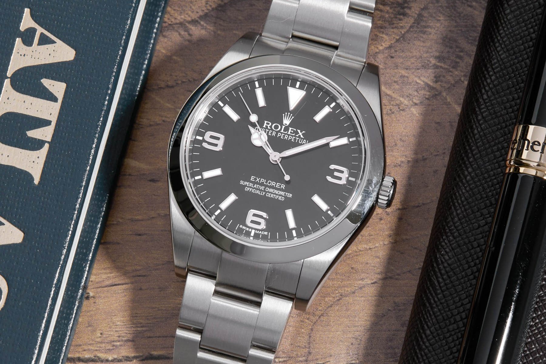
So, can we find examples of objective beauty and the absence of it in watches? One negative example that springs to mind is the first generation of the 39mm Rolex Explorer. I feel that most people either feel the handset is optically too short or do not have a strong opinion. I have never heard anyone say: “I wish they maintained the shorter handset; it looked so much better.” Could this be an example of an objectively inferior aesthetic trait? Let me know how you feel about it in the comments.


How about symmetry? I believe the vast majority of you prefer no date or a date at six over an asymmetrical position. We often see complaints in the comments about dates at three or four-thirty. Is that right? It would rhyme with many theories on how symmetry is broadly preferred over asymmetry. Let me know in the comments.
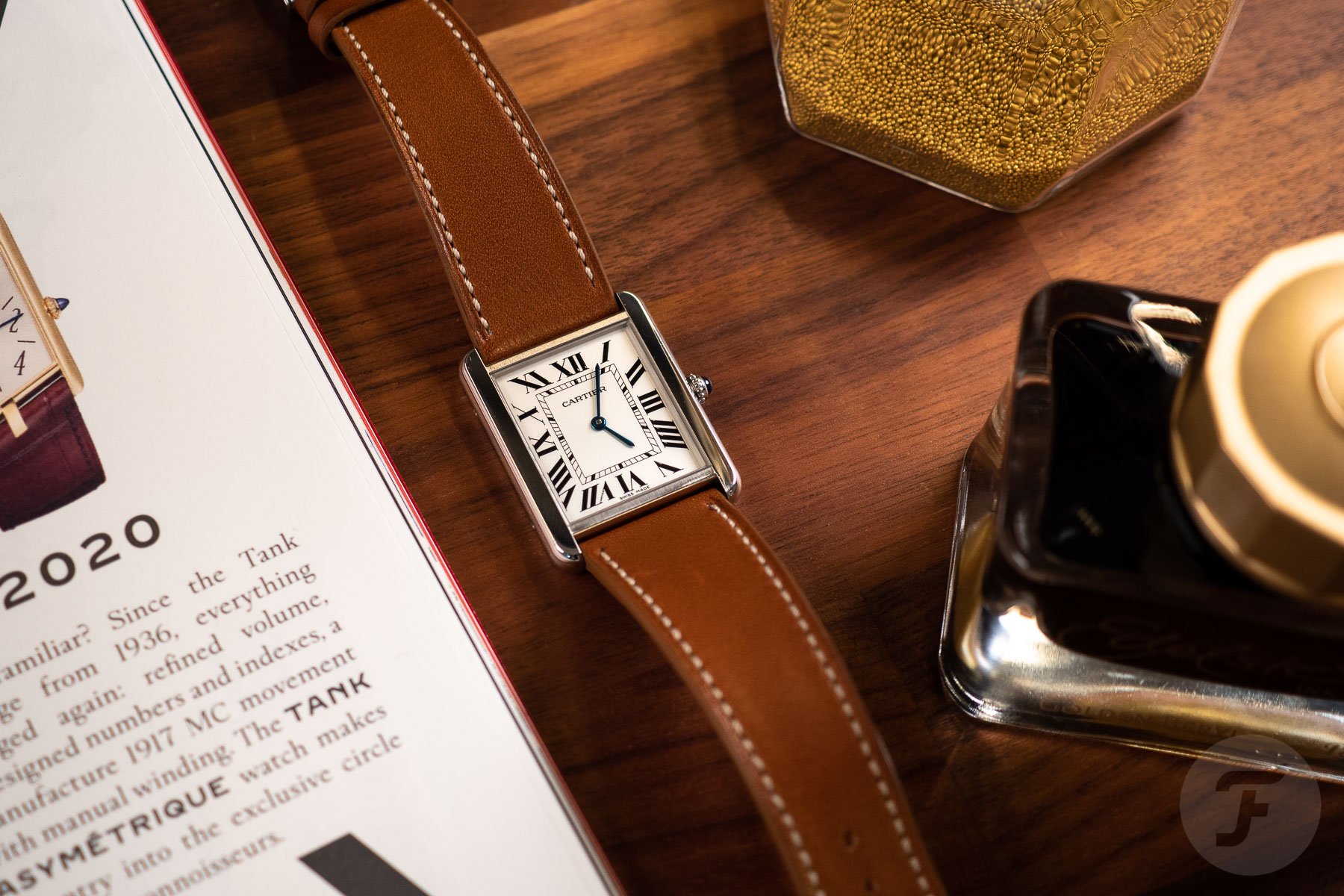
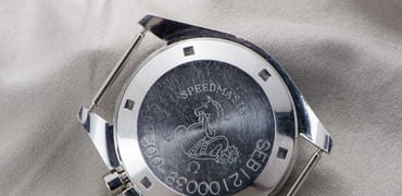
In general, how do you feel about this concept of objective beauty? Can you think of any watches you believe to be objectively beautiful, regardless of taste? I think the Cartier Tank may be a good example. I know many people for whom it doesn’t align with their taste. Many people dislike Roman numerals or prefer beefier watches. But I do not know of many people who would argue it is a poorly designed or objectively ugly watch. If you do feel that way, I would love to hear why in the comments below.
Closing thoughts on objective beauty
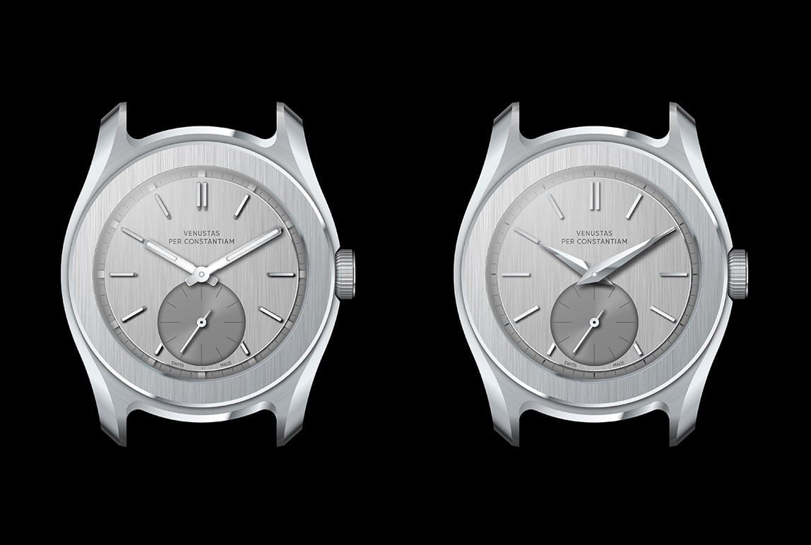
Above, you see an example of the process between Max and myself that I described earlier. These are two very early dial sketches of my watch. Our shared experience was that the handset and blocky lume pips on the left option were too modernist for this case. The one on the right was the one we preferred and chose to develop. This was an instinctive, gut reaction on my part.
I am tempted to believe the left sketch is for some reason, objectively less congruent than the right. The visual elements seem to fall apart rather than conspire to form a whole. Do you agree? Is this an example of objective aesthetic superiority for the version on the right?
What do you think about the concept of objective beauty in general? Is there such a thing? And where can it be found? I haven’t really found a clear and decisive answer in my search. But my hunch is that there is such a thing. Function-first design somehow often seems objectively more beautiful, for instance. And I agree with David Deutsch that it is only part of a larger equation. I think beauty is, in part, in the eye of the beholder.