Jorg’s Top-5 Minimalist Watches

What makes a great watch? I’ll leave that one up to you. But I think it comes down to balance (in the eye of the beholder). It is a combination of technique, design, and brand. For me, it’s always about design first and foremost. Design is what triggers me, it’s become the focus of my professional career, and I love nothing more than finding out about new watch designs. Especially when watches mess with the status quo. That’s exactly what inspired this Top-5 Minimalist Watches list.
The easiest way of compiling this list would be to pick five Bauhaus-inspired timepieces and run with it. As one of the world’s leading minimalist design movements, Bauhaus is definitely a huge inspiration for some watch brands, but that would be too simple. Minimalist doesn’t always mean that one specific style. In general, I would say it’s a lot more about the power of leaving elements out or simplifying them to create a new aesthetic. But for me, it’s also questioning whether adding elements takes a step away from being minimalist. I will try and explain what I mean by that in this list. So here goes, my Top-5 favorite minimalist watches.
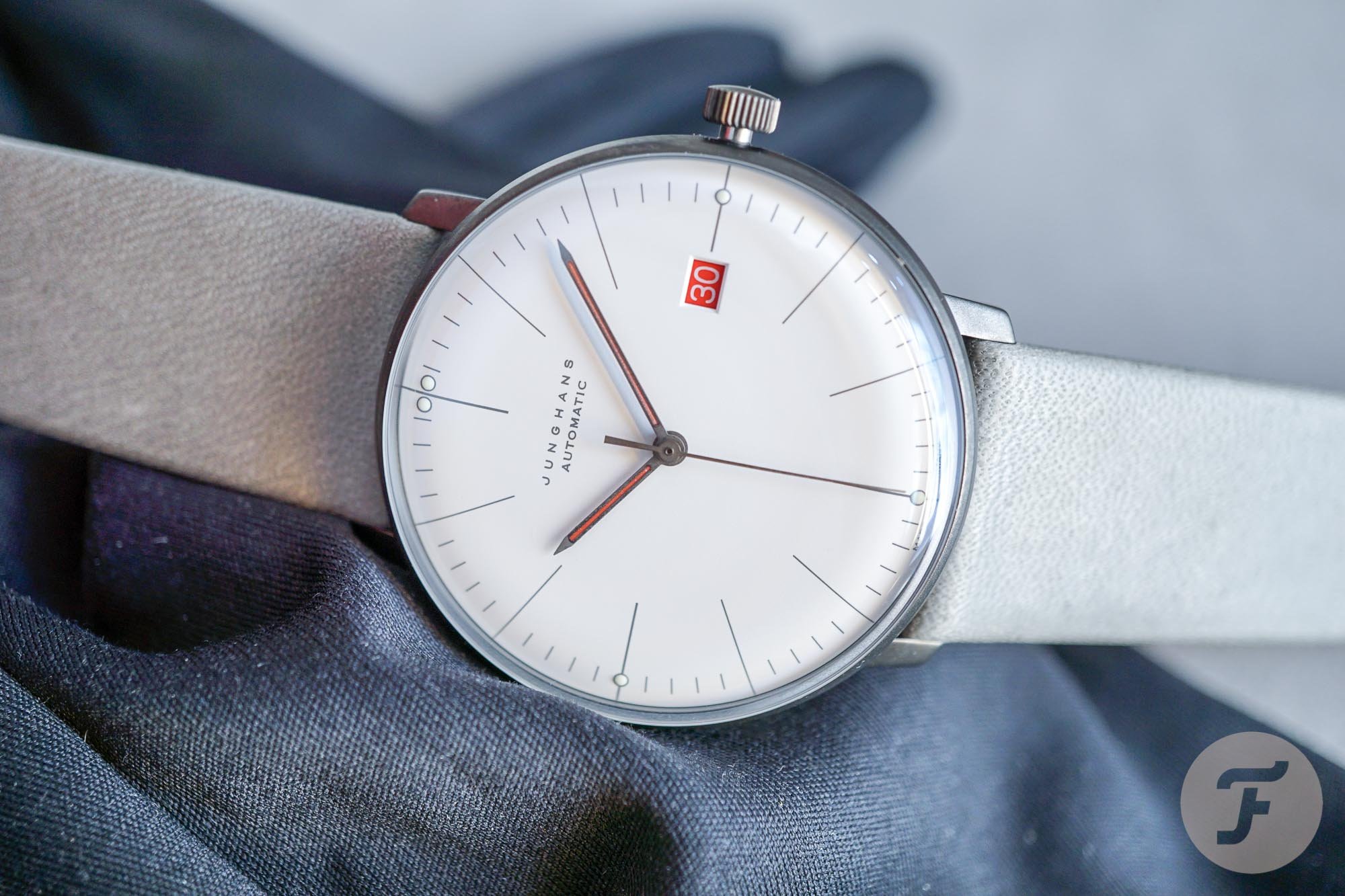
5. Junghans Max Bill Automatic 100 Jahre Bauhaus
The obvious choice? Yes and no. The fact that I chose a Junghans Max Bill for this list probably doesn’t come as a surprise. But I love the Automatic 100 Jahre Bauhaus edition that Junghans released in collaboration with the Bauhaus school specifically because it messes with your head by adding bright red elements. Everyone that knows the Max Bill Automatic, knows that it is all about black and white, right? No less, but certainly no more. So seeing the red date wheel and the red filled hands provoked a short, “what the hell?” as a first reaction.
But as soon as you start reading about the concept of the watch, it makes perfect sense. As Balazs explained in his review, the design is inspired by the Bauhaus school building in Dessau. The matt silver dial is a representation of the white walls of the building. The PVD coated anthracite case represents the facades while the grey strap symbolizes concrete as the one material Bauhaus often used. And the red elements? They are a nod to the bright red door the Bauhaus building has still to this day. It’s a brilliant concept where every detail has a function.
And if at any moment you forgot what the building looks like, turn the watch over. The case back features a brilliant depiction of the Bauhaus school building, where the windows are the cut-outs for the display back. Dressing up a minimalist watch doesn’t make it less minimal. It turns out to be the perfect representation of it.
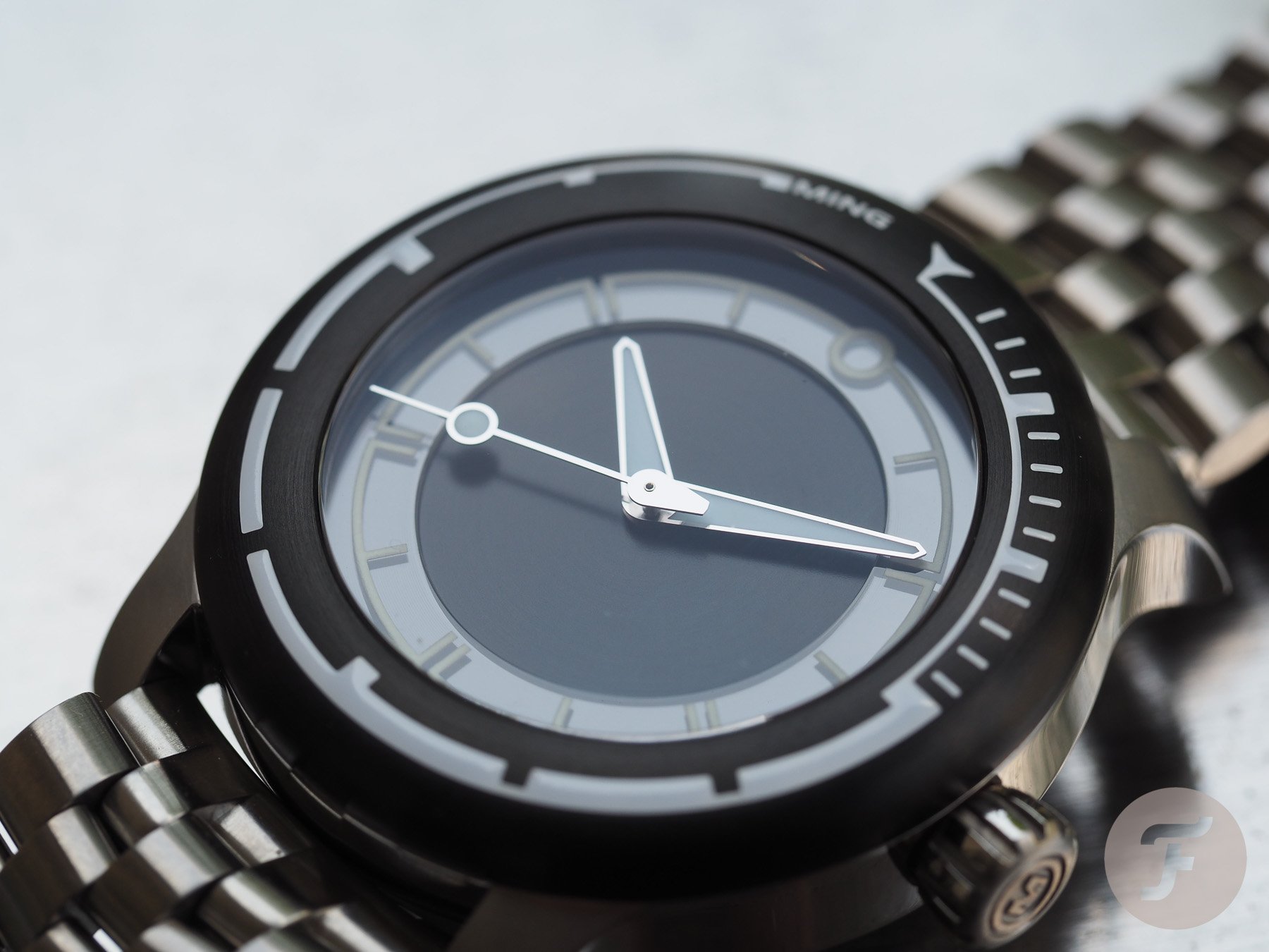
4. MING 18.01 H41 diver
The MING 18.01 H41 is, without a doubt, one of the most talked-about releases as of late. What I love about the watch is that the brand has pulled off a functional divers’ watch that fits its distinctive minimalist approach to design. And to do so, they had to develop a bezel that fits the brand’s typical style. The answer: leave out some of the information we’d normally expect to find on the diving scale.
It creates this very graphical and perfectly designed bezel that you can still use as a diving scale. Does it make life easier? Probably not. As Mike explained in his extensive review of the watch: “I’m no diver and, therefore, I don’t know what a dive watch bezel truly needs in order to satisfy underwater explorers”. But it was crucial in creating the great design of the MING 18.01 H41.
I love that there is no logo on the dial, the diving scale does not feature the usual numbers, and the hour markers are straightforward but stylish in execution. MING has created an innovative and minimalist approach to watch design that works perfectly, even for tool watches. The one element that could throw you off guard in making the watch being less minimal is its multi-link titanium bracelet. I agree, and to be honest, I am not a fan of the bracelet. I would prefer it on the rubber strap for maximum minimalist impact.
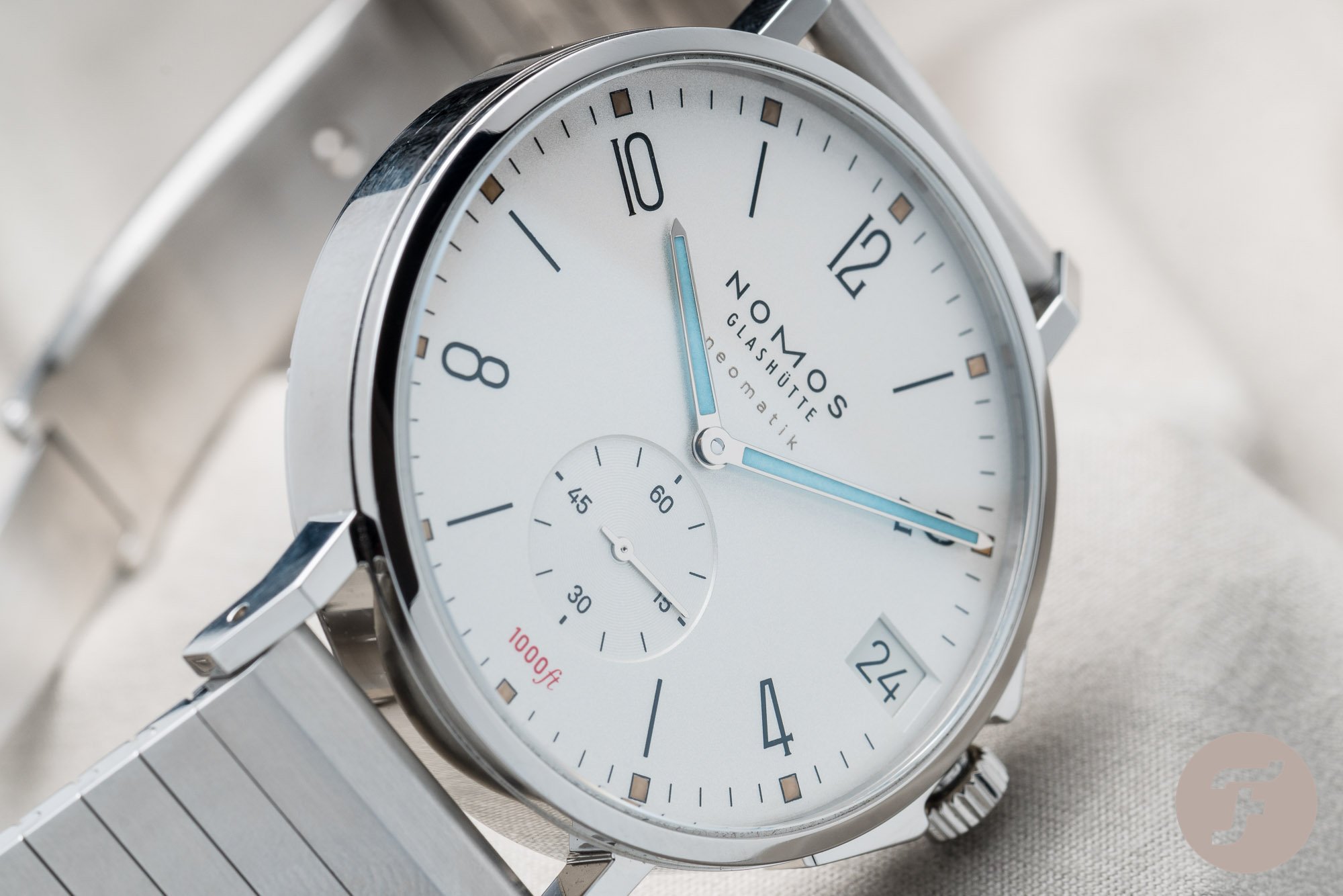
3. NOMOS Tangente Sport neomatik 42 Date
Another obvious choice for this list is NOMOS. The brand has embraced Bauhaus design as the design language for its collection of watches. What I especially love about Nomos, however, is that the brand from Glashütte will not let itself be restricted by its minimalist approach. If we went hardcore minimalist for this list, the regular black and white Tangente would be the way to go.
But it’s not the NOMOS I enjoy the most. Not overall and not when it comes to specific design elements. This Tangente Sport neomatik 42 Date is an exercise in carefully adding details to the minimalist foundation and making it work correctly, starting off with the case design. Do crown guards fit on a round case design that has become synonymous with NOMOS’ minimalist design? Honestly, I had to get used to the use of crown guards on the Tangente — or any NOMOS for that matter. But over time, they grew on me and proved a welcome change.
As is the stainless steel bracelet compared to the usual leather strap. Equally minimal in style and incredibly comfortable, it’s a great addition. What I also like about the Tangente Sport neomatik 42 Date is the use of color on the hands and dial. Never is it loud and exuberant, but it does add that little spark that makes the watch a joy to look at. The Tangente Sport neomatik 42 Date is the perfect example of NOMOS understanding its design DNA perfectly and adding elements to change it up without losing sight of what defined the brand in the first place. With a minimalist design that is an outstanding achievement.
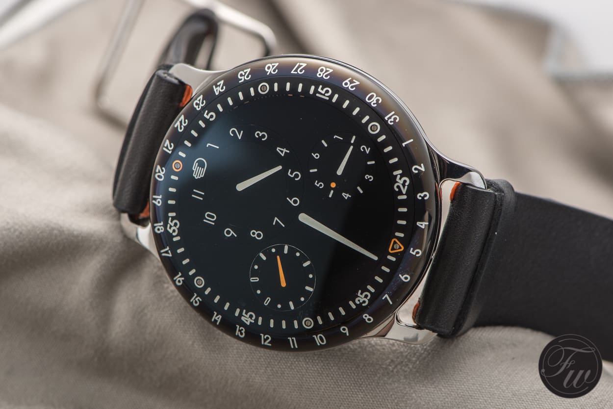
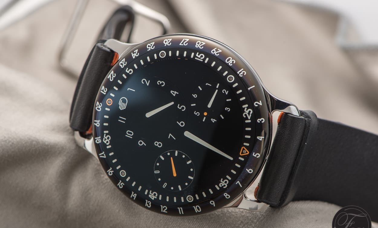
2. Ressence Type 3
Is the Ressence Type 3 a minimalist watch? From the sheer number of elements on the dial, you wouldn’t say so. But minimalism is neither a numbers game nor an exercise limited to the dial. The “Less Is More” design philosophy extolled by industrial designer Benoit Mintien is very much essential to the brand. Mintien chose to get rid of the traditional crown, and he reengineered the entire sapphire case-back to take its place. Another brilliant element is the absence of the traditional hands and replacing them with rotating discs to display the time.
I could have made my life a bit easier by choosing the Ressence Type 1 as it is more toned down in its appearance. But there is no way of not selecting the brilliance of the oil-filled Type 3. In his review of the Type 1 and Type 3, Bert explained in detail how both watches work. The reason for filling the space between the dial and the sapphire crystal with oil is to create perfect readability from many more angles. But it does not only create a functional benefit because that technical innovation adds to the emotional perception of time.
Overall, what I love — and many watch enthusiasts are with me here — is the utterly original way of creating a new watch design. No hands, no crown, an outstretched hand as the logo instead of the classic wordmark, the modern typography, the use of oil for improved legibility. And those are just a few of the elements. This is very much the epitome of minimalist watch design for me because, by thinking differently, a wholly new and innovative approach to watch design has been created.
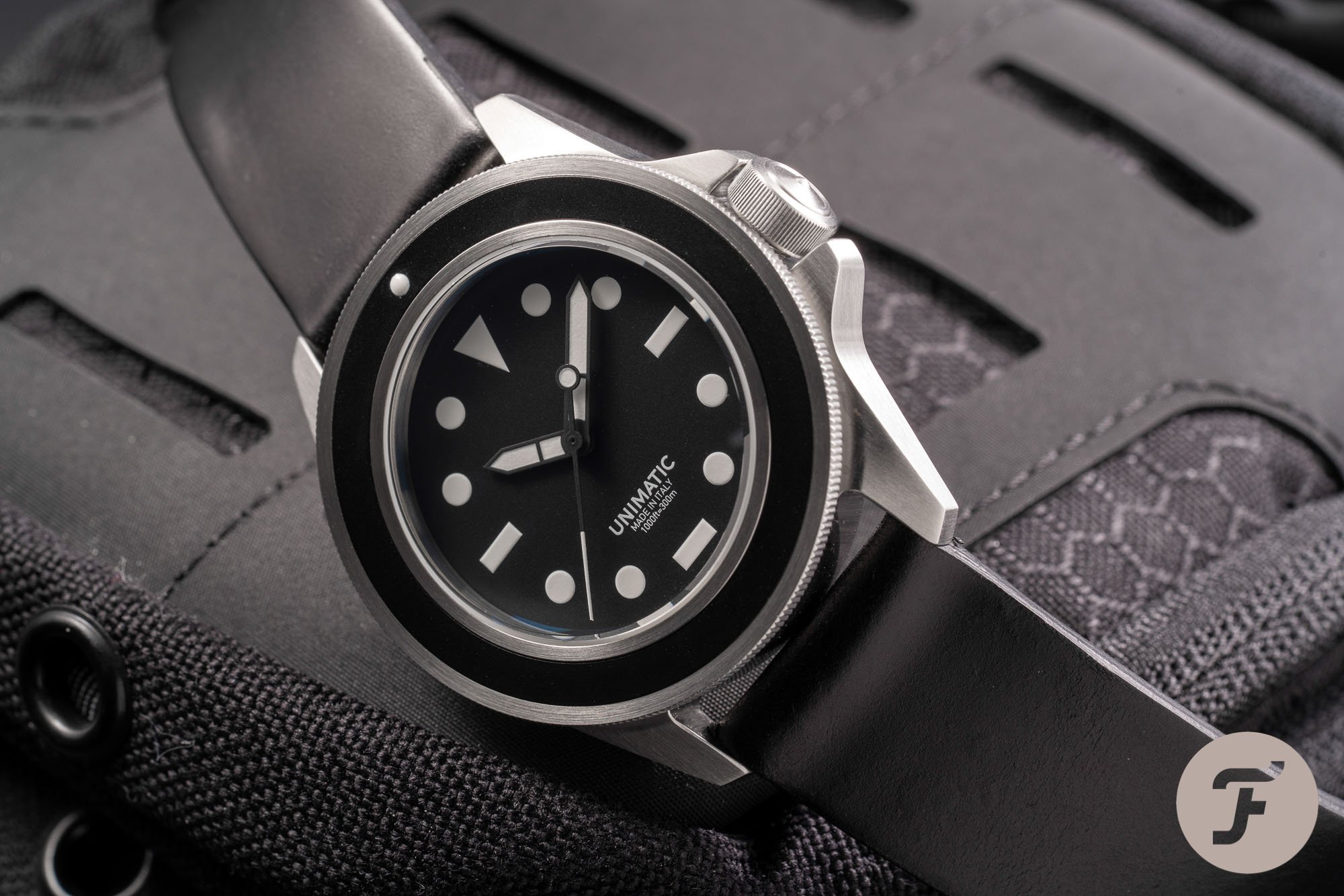
1. Unimatic Modello Uno U1-FM
Where Benoit Mintien from Ressence chose a blank canvas for his designs, Unimatic founders Simone Nunziato and Giovanni Moro decided to restructure a very familiar canvas. The Milan-based industrial designers chose to create their perfect divers’ watch based on several historical references, including the Rolex Submariner and the Blancpain Fifty Fathoms. But can you mess with what people have come to adore and respect over the decades? My first thought was, “no!” My current answer, however, is a wholehearted and definite, “yes!”
Unimatic has shown with its Modello Uno that there is a lot of room to play with elements that we have come to take for granted when it comes to diver’s watches. When I received the Modello Uno U1-F and U1-FM for review, I quickly found out that the minimalist U1-FM is where the magic is. The watch shows that by cleverly leaving out elements, a completely new aesthetic is created.
As I explained in my article about Unimatic, the minimalist approach of the U1-FM is where Unimatic has found a unique approach to watch design that makes the brand stand out. The minimalist bezel and stripped-down dial, the logo placed on the lower part of the dial, the straight angles of the case, and lugs, the U1-FM is a pretty powerful statement. A statement that doesn’t necessarily say it’s inspired by the past. Moreover, it is a way of showing the possibilities in the future. And that’s a pretty powerful statement.
The Unimatic closes out my Top-5 of minimalist watches. But there are plenty more options out there. Let us know in the comment section what your favorite minimalist watches are.