Sunday Morning Showdown: Battle Of The New Gold Integrated-Bracelet Juggernauts From Patek Philippe And Vacheron Constantin

We are taking things high-end for this week’s Sunday Morning Showdown! Welcome to the battle of the recently released integrated-bracelet powerhouses in full 18K pink gold. This is the Vacheron Constantin Overseas Chronograph versus the Patek Philippe Nautilus 5712/1R power reserve/moonphase. We are trying to save on groceries and the power bill, and we are fed up. Today, we’re splurging on precious metal and complications!
We find Daan representing Vacheron Constantin. Thomas is leading the lines for Patek Philippe today.
Yema versus Serica
But first things first. We were quite a lot more financially responsible last week, pitting two relatively affordable GMTs against each other. You, my dear Fratelli, had a pretty clear preference. It was an absolute landslide victory for the Serica. A whopping 79% of you voted for the Serica 8315. Both watches received plenty of criticism in the comments, but the Serica was obviously preferred in the end. It catches flack for some of its quirky design choices, but it shows that it is better to be something to a few than to be nothing to all. In the end, it seemed many of you can respect and appreciate that in a watch.
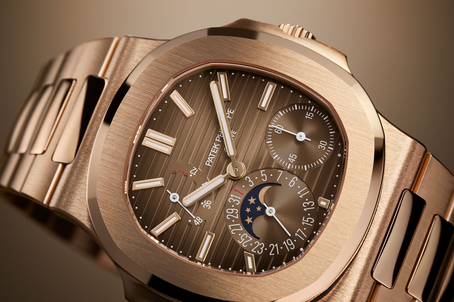
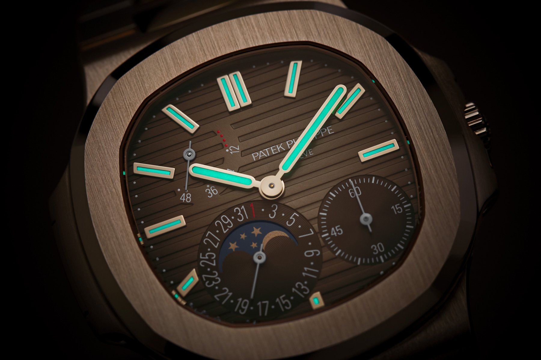
Thomas: Patek Philippe Nautilus 5712/1R
Honestly, both of these watches are a bit ridiculous to me. They are out of reach in several ways, and even if they weren’t, I wouldn’t have one. I have tried on a 40mm gold Nautilus before, and it is not a modest watch. “Duh!” you might say. But watches of this style make such an arrogant statement in real life that I’d be embarrassed to wear them outside of my living room. With the curtains closed.
But let’s imagine for a moment that I have overcome my shyness. I have around €/$80K burning a hole in my pocket, and I am very well connected in the brand-boutique universe. In short, I rule the world. What would I get? Well… the Nautilus, obviously.
It all boils down to looks
To me, the Nautilus is simply far better looking. All things equal, I would pick any Nautilus over any competing Overseas. Reducing it down to the bare essentials — Ref. 3700 — I just love everything about that watch. The case, the bracelet, the dial, the hands — I think it is an absolutely stunning watch to behold. A design masterstroke. It is one of my all-time favorite watch designs, actually.
I have to admit that any complication added to it or material choice other than steel ruins it for me. I would take my 80K and get a used Ref. 3800 in 37mm instead. But even in rose gold and with some oddly placed sub-dials, the Nautilus is the clear winner. The Overseas looks a bit too intricate to me. It’s like the designer spent too much time on it. The Nautilus just looks more natural.
I have to admit I liked the Overseas dial in the renders. The blue dial looked like a matte denim blue. Having seen actual photography now, it is actually a shiny, bright sunburst. I’ll take the fumé brown teak-deck dial of the Nautilus. Lastly, its 40 × 8.5mm dimensions also appeal to me more than the 42.5 × 13.7mm case of the Overseas.
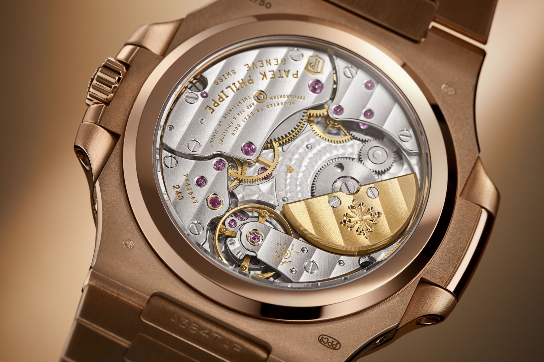
Caliber 240 PS IRM C LU
Catchy name, right? Well, it is catchy to look at. It is a micro-rotor automatic with a 22K gold rotor. It is often too bad that Haute Horlogerie calibers are obscured by rotors, as with the Overseas. The micro-rotor allows for an unobstructed view of the beautiful caliber.
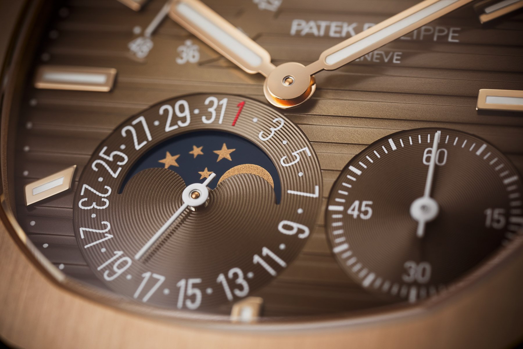
And beautiful it is. Everything is hand-finished to the highest standards, as you would expect. It features small seconds at four-thirty, and at seven, you find a pointer date and moonphase. Lastly, a power-reserve indication is located at ten-thirty. Granted, it is not the prettiest layout of all time, but it works.
Let me score one little point for Daan: the brand name is in a very odd spot on the dial. The weird layout does not leave Patek with many alternatives, but it does look a bit off. That being said, let’s hear why Daan thinks you should vote Overseas this fall.
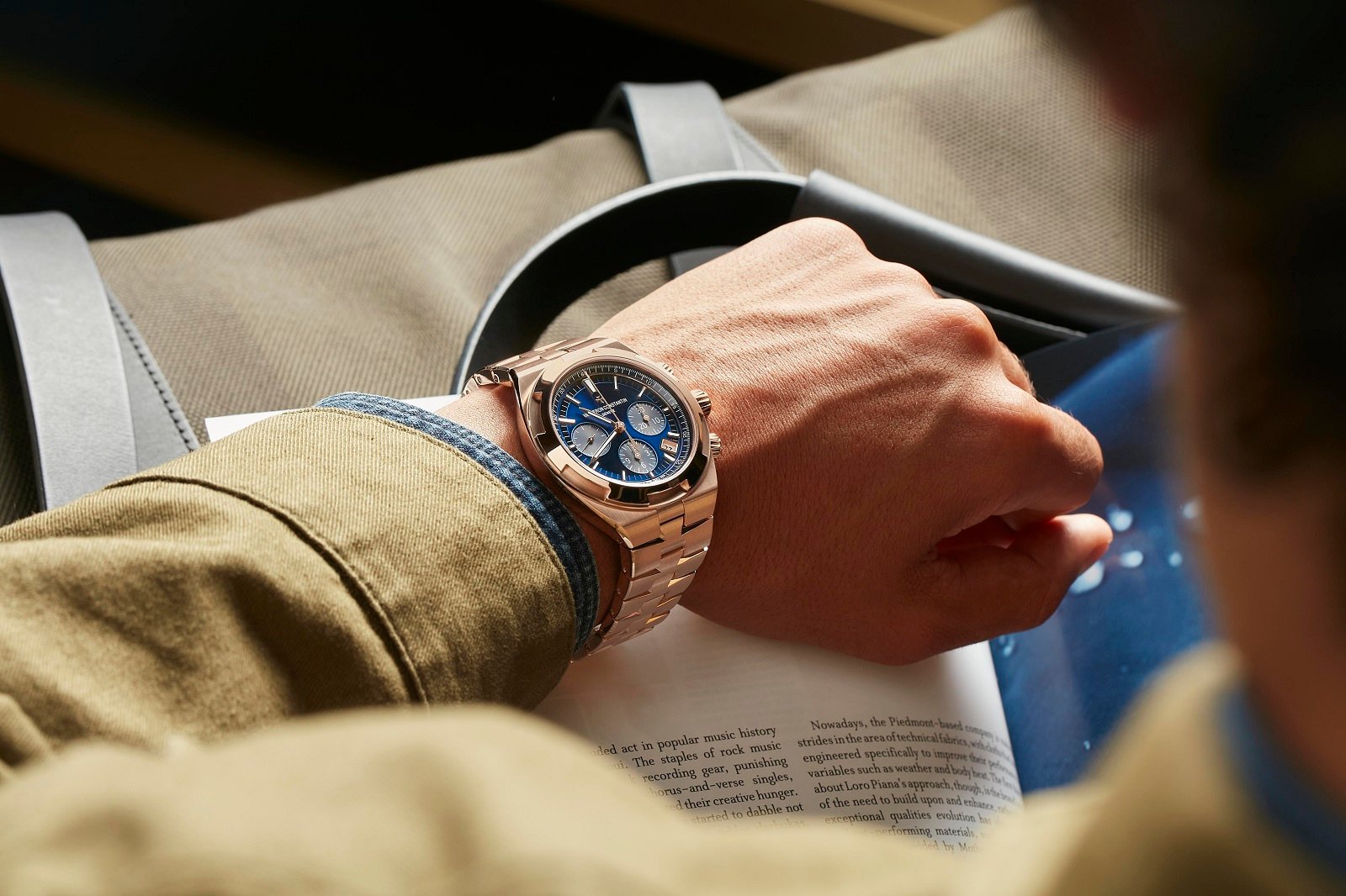
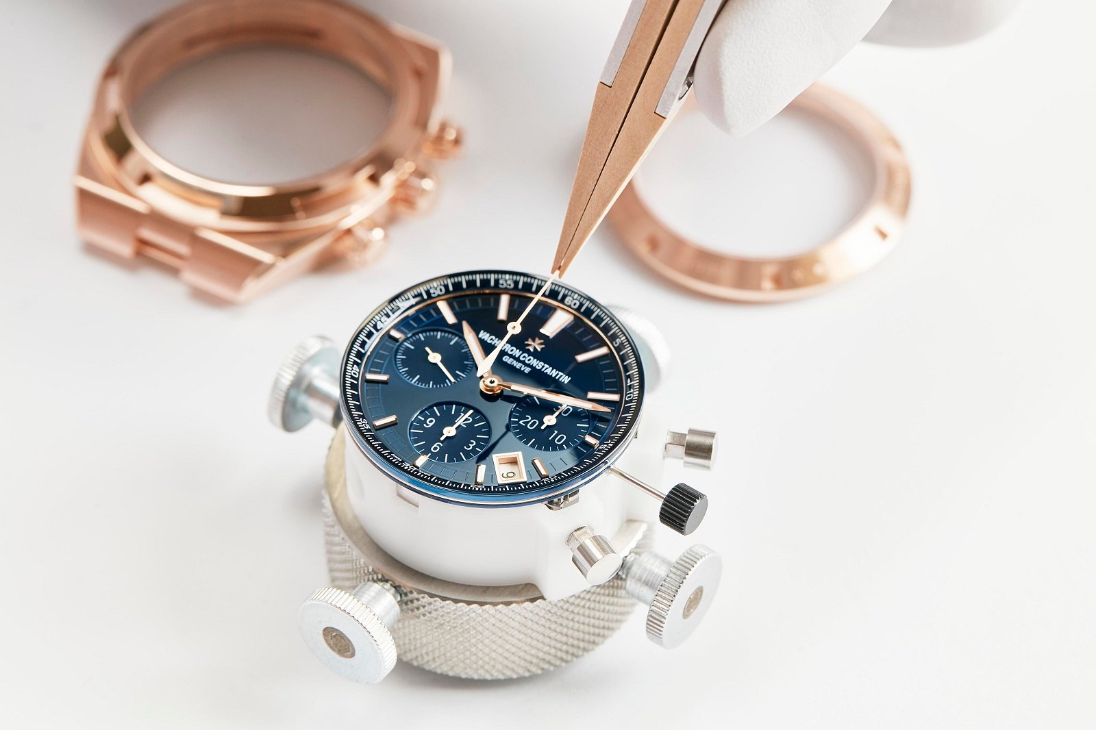
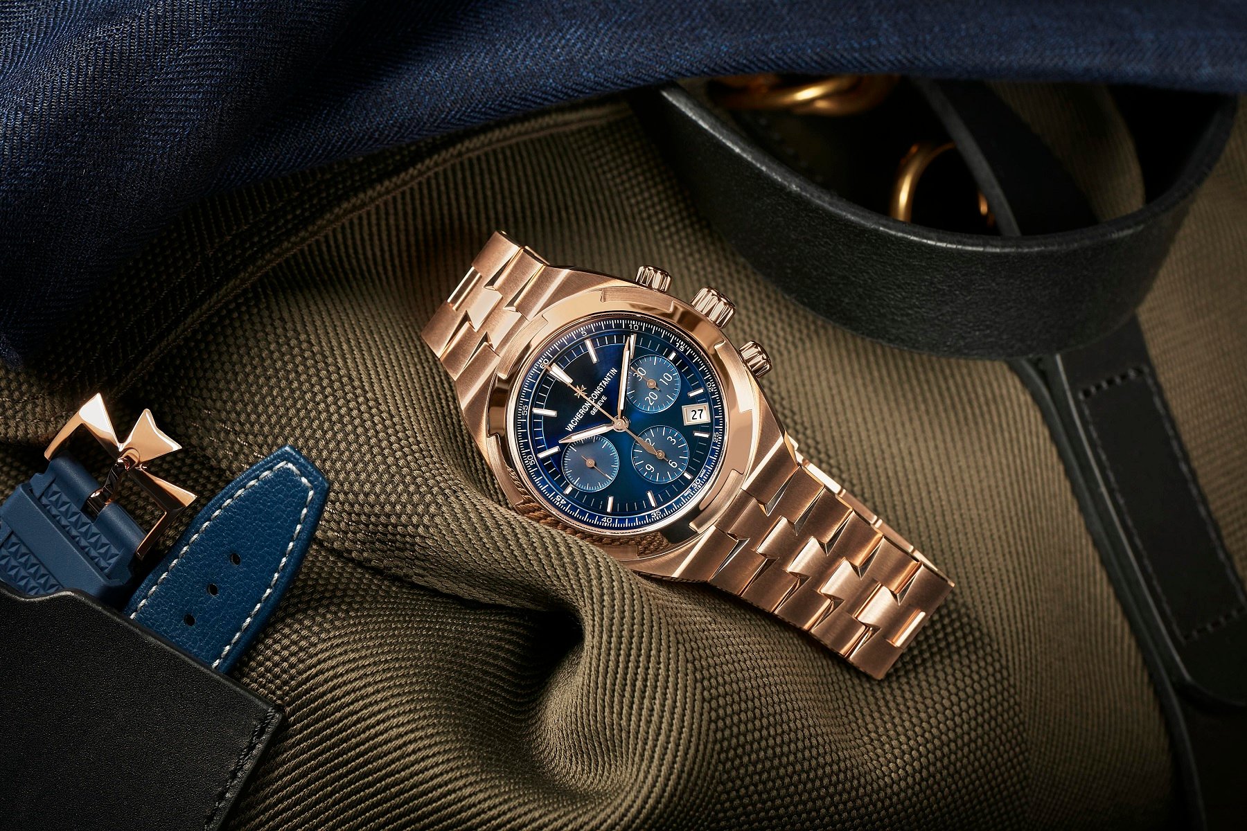
Daan: Vacheron Constantin Overseas Chronograph in 18K gold
First of all, I have to agree with you, Thomas. In terms of both style and budget, these two watches stand worlds apart from ones I’d consider adding to my own collection. Of course, these are both two beautifully made pieces, featuring only the best materials in the world and out-of-this-world finishing. But I guess they’re both just a bit much. I am, however, very glad that I’m here to defend the Overseas because, man, that Nautilus is one hot mess!
I’d rather walk around with an intricately designed Overseas than a cross-eyed Nautilus. Who on earth came up with all those randomly placed sub-dials? Just look at your own description here Thomas: “It features small seconds at four-thirty, and at seven, you find a pointer date and moonphase. Lastly, a power-reserve indication is located at ten-thirty.” I don’t even know how you were able to write that down so nonchalantly. Sometimes an unbalanced design works, but I’m sorry, this one just doesn’t.
Make some room, please!
The sub-dials also don’t really make sense to me. Why would you want a power-reserve indicator on an automatic watch? It’s totally unnecessary. That still leaves us with the small seconds and the moonphase, which could work together perfectly fine, but not in the way they’ve been presented here. But if we just took out that power-reserve indicator, there’d be more room available to shift those two around and make sure they’re placed in a more optically pleasing way. But to be honest, I think that wouldn’t solve the problem entirely.
Just as Thomas already said, the Nautilus is at its best without any extra complications. You can’t really add any because of the wide bezel and long hour markers. There’s simply not much space left. That logo placement reminds me of Christopher Ward (yes, I know the 5712 came out first in 2006, but still). And yes, the Nautilus might have the better size here, but if you need to add complications, I’d much rather have the Overseas’ bigger size and more consistent dial design.
Bigger and better!
And at this price point, it’s all about showing off, right? So besides the bigger watch, I also prefer the bigger rotor and bolder design language of the Vacheron Constantin. That bezel looks like it was taken directly off of a very good-looking rose gold vault, and that bracelet is really a piece of art. I love how the Maltese cross permeates the design yet doesn’t get annoying. And you can say all you want about that blue dial, but in combination with the rose gold, it looks so damn hot!
I haven’t seen this watch in person yet, but I’m sure that the satin finish on the dial is just as soft as the finish on the rose gold case. The color palette here just works so well! Much better than that brown lentil-soup dial on the Nautilus. I guess they couldn’t agree on a dial color there, so they just blended all possible options together until they got this brown gunk. It takes all the excitement out of the rose gold case and bracelet. The blue dial on the Overseas does the exact opposite. It makes it all look even more exciting and luxurious.
And don’t be fooled by those luxurious looks. The Overseas is still a very proper sports watch. In contrast to the mere 6 ATM water resistance of the Nautilus, the Overseas can handle pressure up to 15 ATM, so you don’t have to be afraid to wear this one at your next pool party!
Voting starts now!
Clearly, Thomas would go for the Patek, and Daan would definitely go for the Vacheron. But which one would you prefer if you had the chance to choose between these two rose gold heavy hitters? Please cast your votes now, and let us know in the comments why you’d choose one over the other. Of course, we’ll share the results of today’s battle in next week’s Sunday Morning Showdown.