#TBT The Timeless Lip Galaxie Ref. 43814

Thanks to a watch friend, I finally had a chance to put this watch on my wrist. The Lip Galaxie is stunningly clean and simple. In real life, it looks even better than it does in pictures. Here is my recap of the 24 hours I was granted with this distinctive French watch. But first, allow me to provide a bit of context…
In April 1973, Lip faced a crisis amid the Quartz Revolution, which led to the discovery of management’s plans to downsize, sparking worker outrage. Seizing three hostages, the employees barricaded the factory and faced a violent police intervention. They escalated their resistance by seizing 65,000 watches and factory plans and initiating a continuous occupation of the factory.
The strike
A national outcry ensued in the workers’ favor, which led to 12,000 people holding a demonstration in Besançon. This empowered the workers to push forward without management, resuming production and selling seized watches to raise funds. Attempts to restore order weren’t successful, which eventually led to the military forcing the workers out of the factory in September 1973. Even with a subsequent massive protest, the military occupation continued until the early months of 1974 when a new buyer for the company was found. CEH (Compagnie Européenne d’Horlogerie) took control of Lip and rehired 850 former workers, thus ending the strike.

The Lip Galaxie line
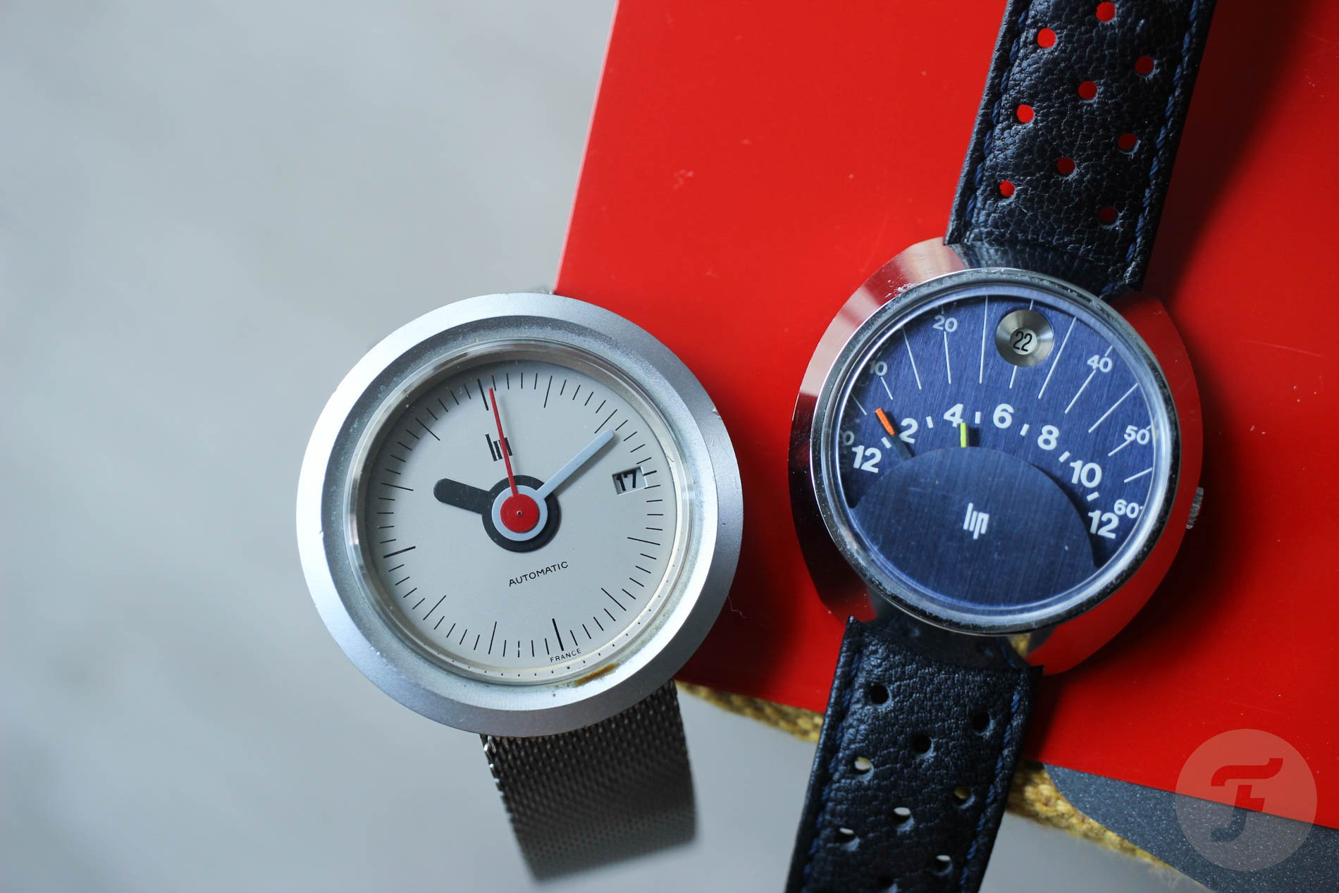
That’s when Rudi Meyer, who designed logos and corporate identities for many famous brands, including LVMH, came to the stage. In 1974, this Swiss lecturer on graphic design and typography designed the Lip Galaxie, which was available in about nine different variants. The circular case had two executions, but the dials and hands varied more interestingly. I like the models with 12 black balls on gray dials instead of typical hour markers. The model with circular holes to mark the hours is interesting too.

Image: The Watch Spot
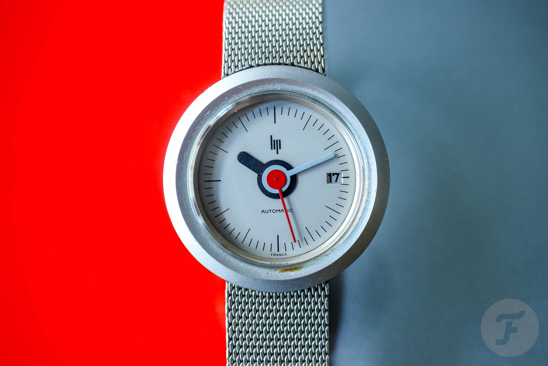
Lip Galaxie ref. 43814
But the one that speaks the loudest to me is the one that my watch friend Karrim picked up on eBay after a four-year hunt. “I saw it on Instagram the first time, and it was love at first sight,” says Karrim. “It is the sophistication of its simplicity that continues to grow on me all the time.” I couldn’t agree more.
Each time I look at the dial, I see a bit of that iconic Bauhaus style from the Junghans Max Bill. It’s unbelievably light and airy while still being perfectly legible. There is no special treatment for the date aperture. There’s no framing and no outlines, just a clear cut to provide a view of the date disc rotating underneath. The Lip logo formed from the “watchmaker’s four” (IIII) is another simple yet incredibly genuine graphic element. Applause!

The color and finishing
Join me if you struggle to believe that this watch was designed 50 years ago. I thought a lot about what makes this design so contemporary. If I had to narrow it down to one core attribute, I would say it’s the finishing. Unless you turn the watch around and spot raw material sticking out here and there, you don’t realize the watch has a chromium plating. When looking from the top, the structure of the case has a micro-grainy look. It almost feels like aluminum. Unusual finishing carries over to the dial, which has an uncommon gray color and cardboard-like texture.

Other details to love
The trio of magnificent hands doesn’t need any commentary, I guess. It perfectly balances on a thin edge of colorful flamboyance and childish playfulness. But it’s balanced so well that it draws you to it. When I asked Karrim when he usually wears his Lip Galaxie, he instantly said he reaches for it “on a sunny day, when my steps have an extra bounce.”

The movement and strap
Under the simple case back there is German Durowé 7525/2, which is a 25-jewel automatic caliber with 21,600vph frequency. As a fan of leather straps, I was surprised to see this watch on a mesh bracelet. “It came with a mesh, and albeit not my usual choice of strap, the mesh goes really well with the watch,” says Karrim. I concluded the same, especially after I saw how perfectly it integrated with the lugs.
Last thoughts
There is something wonderful about fluid, circular watch designs that are not “interrupted” by the crown or lugs sticking out from their typical positions. That’s why I like the Alpina La Ronde and other “UFO” or “Disco Volante” watches. If you are bored with the “Swiss” inscription on the dial of your watches, the French Lip Galaxie may be a great choice. The wild historical context and strong design individuality give this watch a pretty unique story. If you realize that the Galaxie had a very short production run of two years, you can’t be surprised that you won’t see one as often as a Cartier Tank. Happy hunting!
Thank you, Karrim, for letting me try and feature your watch on #TBT.