The Joy Of Six: Which Date Window Position Gets Your Vote?

Date windows inspire strong feelings. Whether they should exist at all is a serious question for some. Must they always be at three o’clock? There are those that say yes, those that hate the asymmetry of it, and those that love a nice, unobtrusive window at 4:30 to ensure the hour indices remain unruffled. But my choice? My choice is almost always for balance along the vertical axis. Give me the six o’clock date any day and I’ll be a happy man.
This is not just an opinion-based article (although I do have an opinion). What I’d like to do here is list the advantages and disadvantages, as well as the reasoning behind different date window positions. Then, at the bottom of this article, I’d like you to vote for your favorite (or register an abstention that I cordially invite you to explain in the comments section). Let’s get to it:
The 3 o’clock date
The 3 o’clock date is undoubtedly the most common date position in the history of date windows on dials. It was made popular by Rolex’s 1945 release of the Datejust, which boasted the first jumping date window on the dial. It has become a mainstay ever since. Commonly paired with a cyclops added to the design nine years after release in 1953 because, reputedly, Hans Wilsdorf’s wife couldn’t read the date without her glasses, its position is so intuitively accepted, it is rarely questioned or explained.
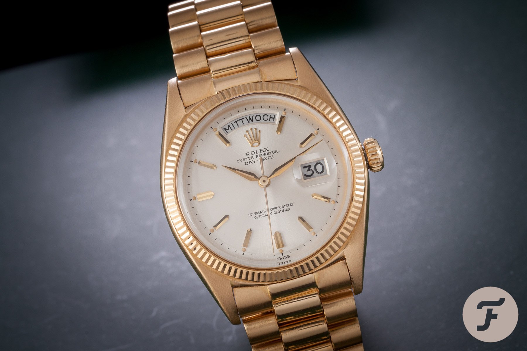
Why is the date at 3 o’clock? It isn’t the best position for font size (see below), so why is it so entrenched in the industry that the standard position is the first cardinal point beyond 12? I’ve heard quite a few people trying to make some link between its position and the crown, but anyone that knows anything about how a watch works and the underlying architecture of a watch movement will know this is poppycock. Simply put, a date window can be anywhere on around the edge of a dial — literally anywhere. The only thing you need to change is the printing on the wheel itself to ensure it aligns with whatever aperture you’ve chosen.
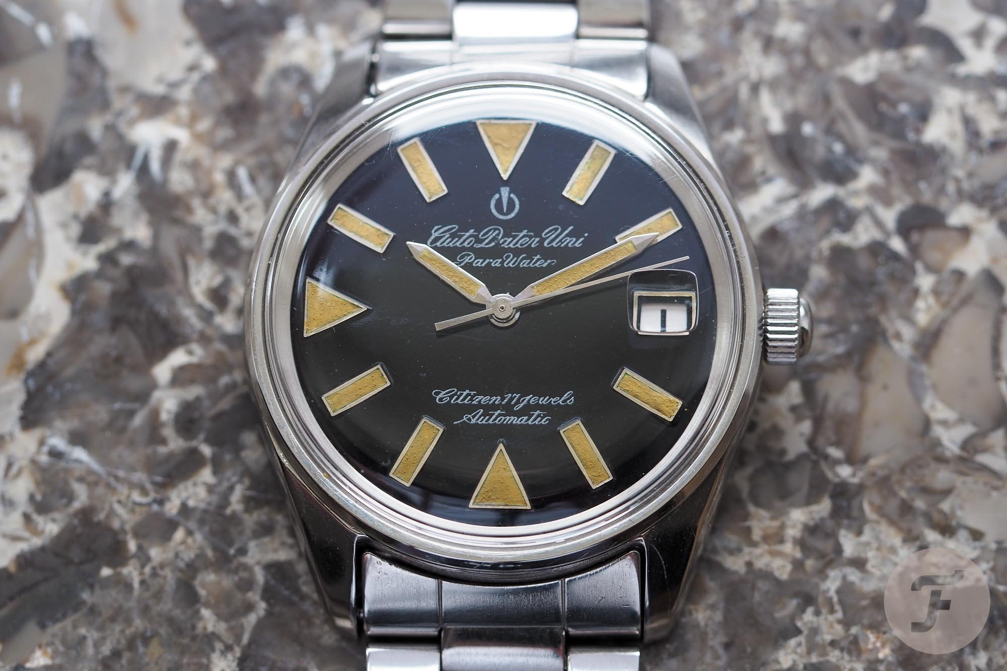
While 3 o’clock is perhaps not the most legible position from a font size perspective, it is the most immediately legible position for right-handed people. The 3 o’clock hour marker is the first part of the dial visible as it pokes out from beneath the cuff of a shirt. As such, it was chosen and has remained the default position of the date window.
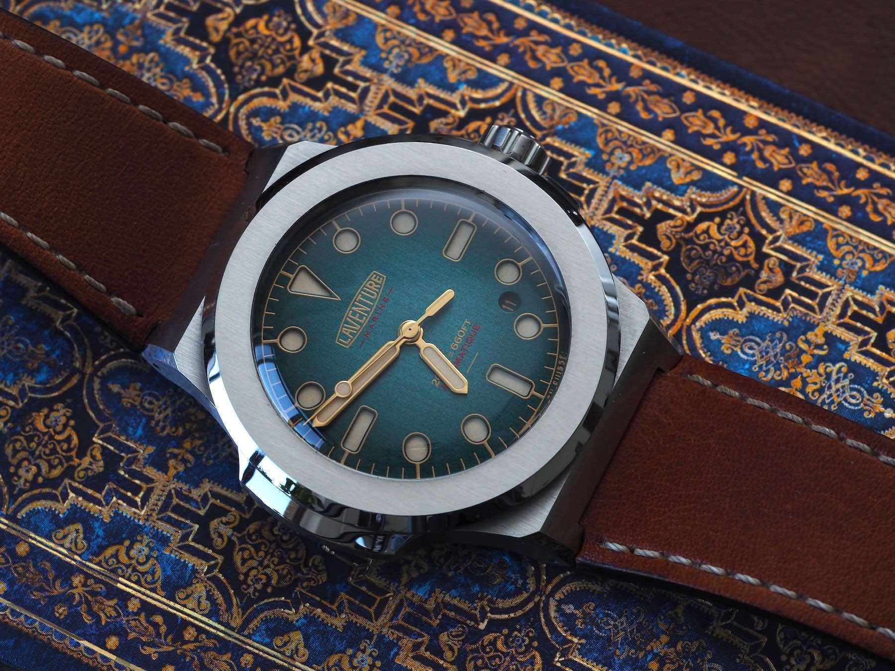
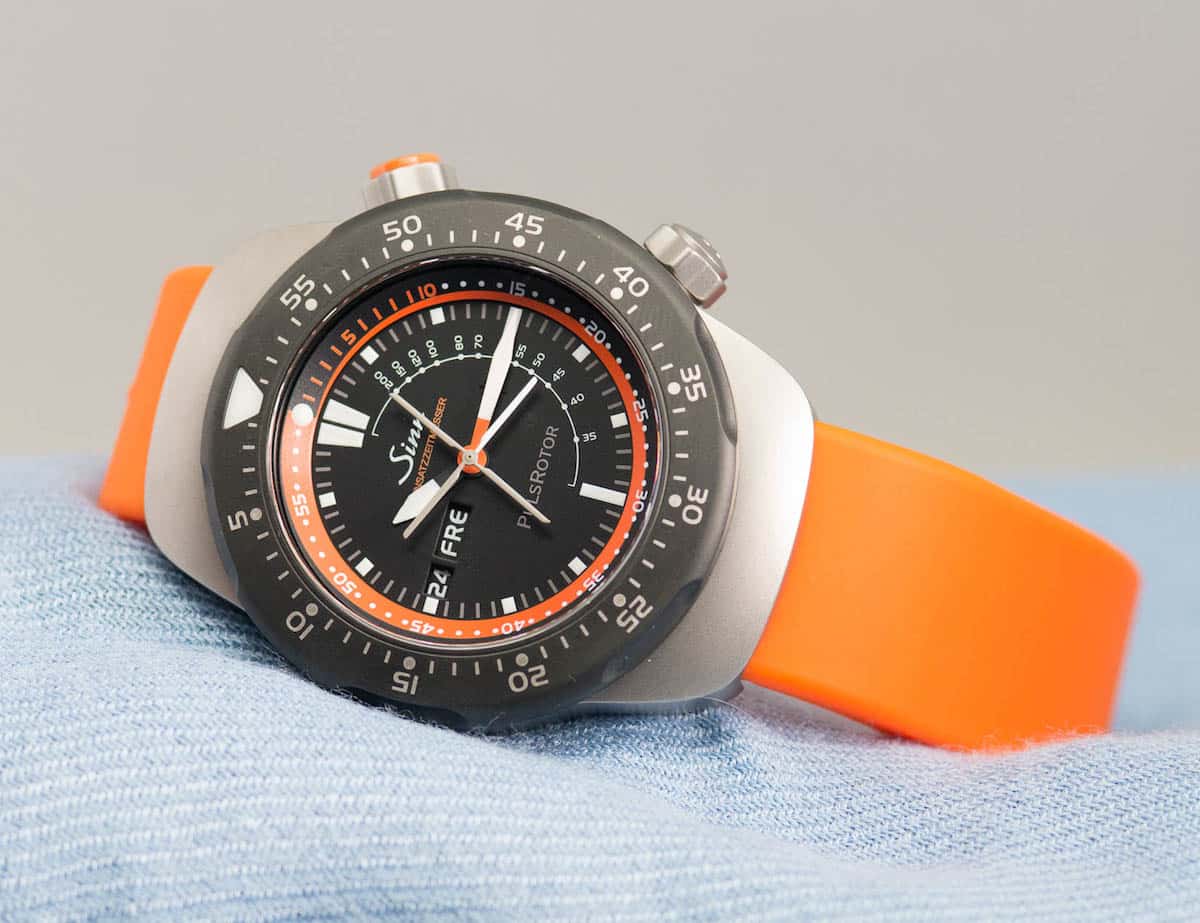
The 4:30 date window
Say hello to the unloved stepchild of date windows. The 4:30 date makes a whole load of sense when it comes to creating an uninterrupted dial view, especially on a watch that barely needs a date to fulfill its primary function. The downside? It looks like somebody dropped something on the dial and forgot to pick it up. Even though a date window neatly sandwiched between the 4 and 5 o’clock markers can be discreet (when a sympathetic and camouflaging colorway is chosen), it very often looks awkward, huddled, and embarrassed to be there.
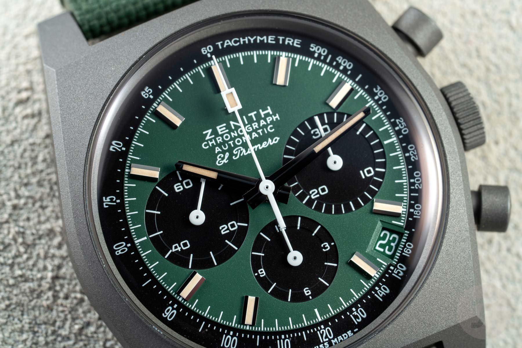
There are examples of this being down well (see the images I selected above — both the green-dialed Zenith and Laventure models integrate the date well by using color and smart, albeit different, positioning). However, for the most part, the ultra-sensible 4:30 date wheel comes off seeming nothing but weird. Life can be cruel sometimes.

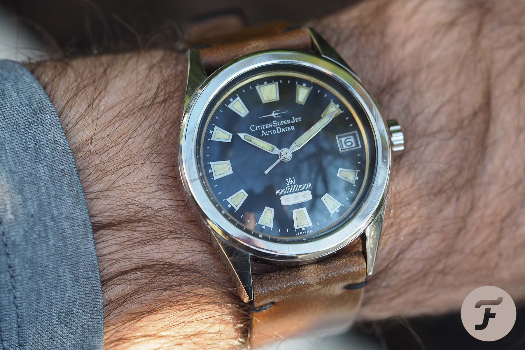
The joy of six
There are some distinct advantages to date windows at six o’clock. I will start with the obvious: symmetry. This is not only pleasing in the day, but it also works at night (or deep underwater when your lume is needed). Watches often use double or oversized markers at 12 o’clock for orientation. Enlarged hour markers at 3 and 9 are also common for visual balance and orientation once more. The absence (or vast reduction) of a luminous marker at 6 follows the above logic perfectly. Simply put, unlike 3 or 9 o’clock date dials that look broken in the dark, the 6 o’clock dial looks deliberate. This is a highly functional and justifiable lume layout and I love it.
Beyond the vertical symmetry, the 6 o’clock position (and theoretically the 12 o’clock position) affords the best legibility as numbers are taller than they are wide. That means that those single digits that look somewhat marooned at 3 o’clock are able to grow to their full potential at 6. This is something I personally enjoy about 6 o’clock dates, but I must admit I think I was biased by my time at NOMOS for the German brand’s reliance on the 6 o’clock date window to fill the arguably vast space between the bottom of the going seconds sub-dial and the edge of the case. Regardless of how I got here, however, I’m throwing my weight behind 6.
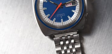
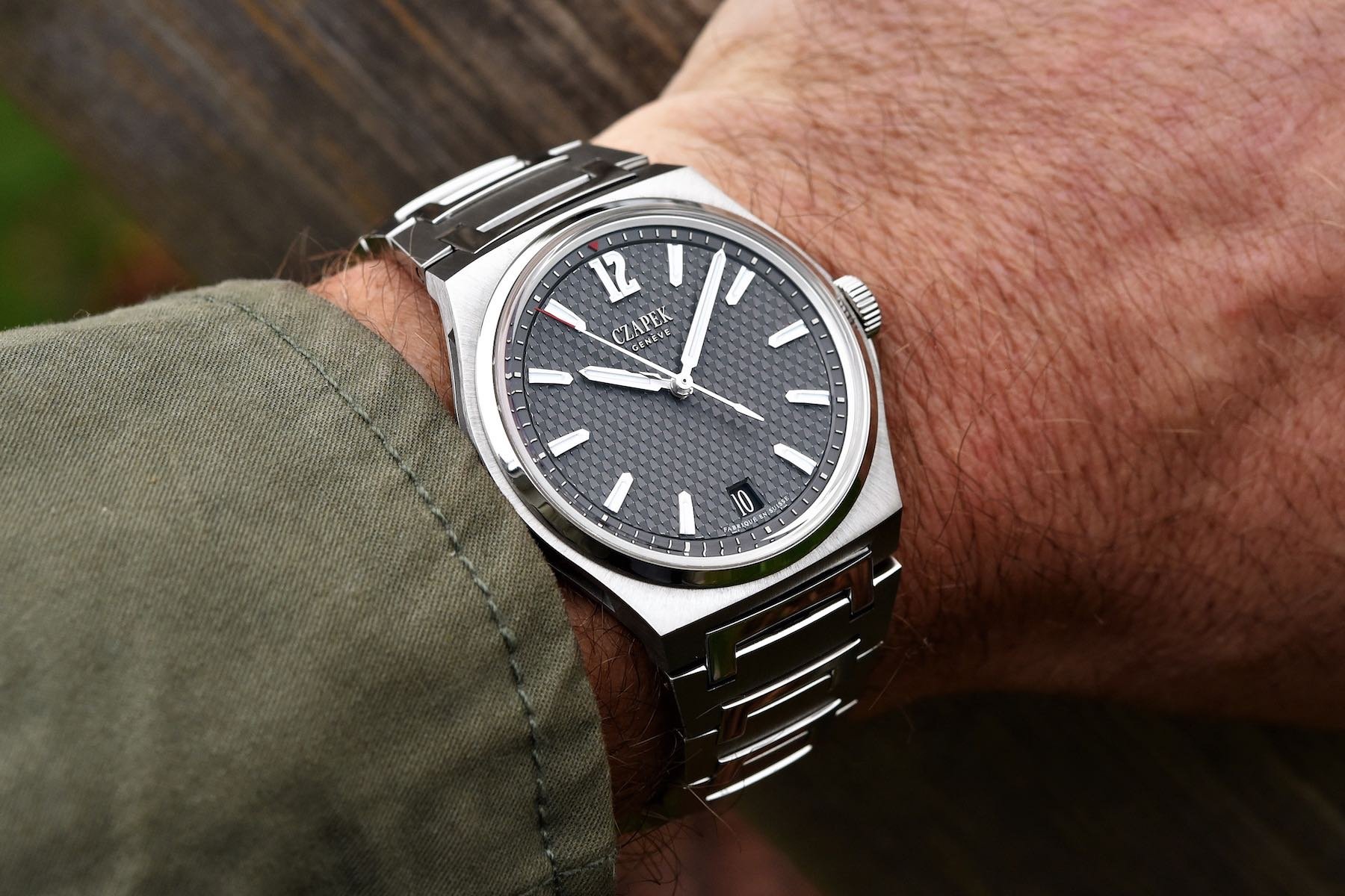
The 12 o’clock date
This is just rude. 12 o’clock dates have all of the proportional advantages of the six o’clock date, but it looks completely topsy-turvy and is totally nonsensical on tool watches that require a good nighttime appearance. I can think of one or two examples of this layout looking good (see above for my favorite), but by and large this is a disgraceful thing to do with a date and I’m not even sure I could sup a single pint with anyone responsible for placing a date at 12.
Nine o’clock and other stories…
I actually love flipping the expected position of dial elements along the horizontal axis. I’m a big fan of single sub-dial chronographs with big-eye subs on the 9 o’clock side but love them, even more, when the sub-register takes up the 3 o’clock position and the date shifts over to 9 (rare but not unheard of)).
There are two really solid justifications for the 9 o’clock date, however, beyond the cool factor. Firstly, most of us in the western world read from left to right. As such, although the 3 o’clock position is the most accessible if we’re wearing long sleeves, whenever we’re not, the 9 o’clock position is actually where our eyes fall first whenever we glance at a watch.
The second justification? What about left-handed watch lovers? We’re seeing the return of destro crowns as commercially viable products, so why not produce (and market) a destro date for a true lefty? I’ve seen plenty of 9 o’clock dates and even a few with Left-handed crowns and 9 o’clock dates, but I don’t recall seeing any watches called the “Destro Date” marketed in that way, so I’m going to leave you with the below poll while I toddle off and design one for your eyes and wallets to feast upon. You heard it here first…