The New Farer Moonphase Is A Triple Reinterpretation Of The Genre

The enigmatic moonphase complication goes in and out of fashion like watch sizes, and I have a personal penchant for the genre. With classic iterations from mid-range brands like Longines up to grail Pateks, the classicism still reigns supreme. For many of you, the very name conjures up images of small-cased watches with guilloché dials and blued hands. But chances are the new Farer Moonphase will change your perception.
With cool competition coming in from the likes of Linde Werdelin and small independents, perhaps it’s a lunar renaissance. It’s no secret that I consider myself half-British and love the quirkier offerings from the UK. The colorful brand Farer now joins the fray with a small-cased trio that is big on personality and puts the moon front and center. The latter quite literally, as I’ve seldom seen a larger piece of dial real estate devoted to the moon’s gleaming presence.
A charmingly indefinable case design
In this case (pun intended), Farer has evolved its accomplished 38.5mm cushion design. This was first seen in the Stanhope II, and it was a big reason for me to spend some hard-earned cash to get one. There’s a touch of Ferrier in the soft case, accentuated by the finely ridged crown. There is also a hint of the rare Rolex Viceroy from the ’40s, and on the wrist, it’s curvy comfort with a capital C. Sure, small cases aren’t for everyone, but my wrists are mid-sized, and I enjoy my shirts not snagging on a 44mm beast. The Farer Moonphase also comes with a new twist to the 43.8mm-long case — a gorgeous pebbled surface that Farer calls “grain twist.” Together with the inset brass logo in the crown, this once again makes Farer stand out for its belief in strong details. But the main player on this 38.5mm stage is the moon.
Three distinct personalities appear
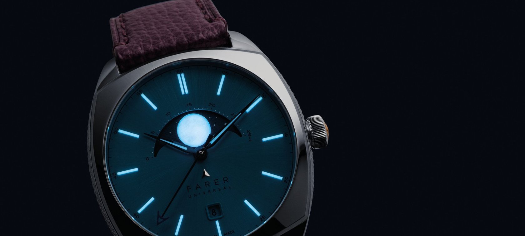
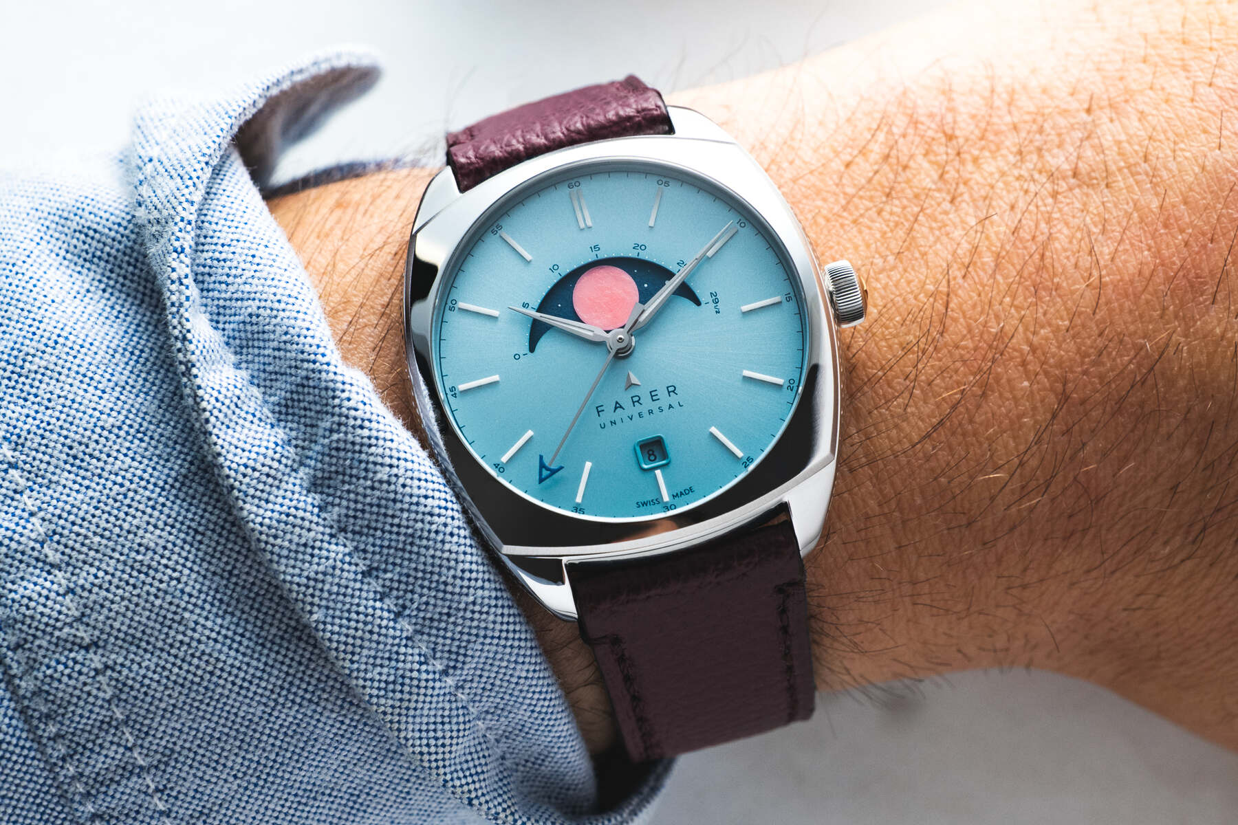
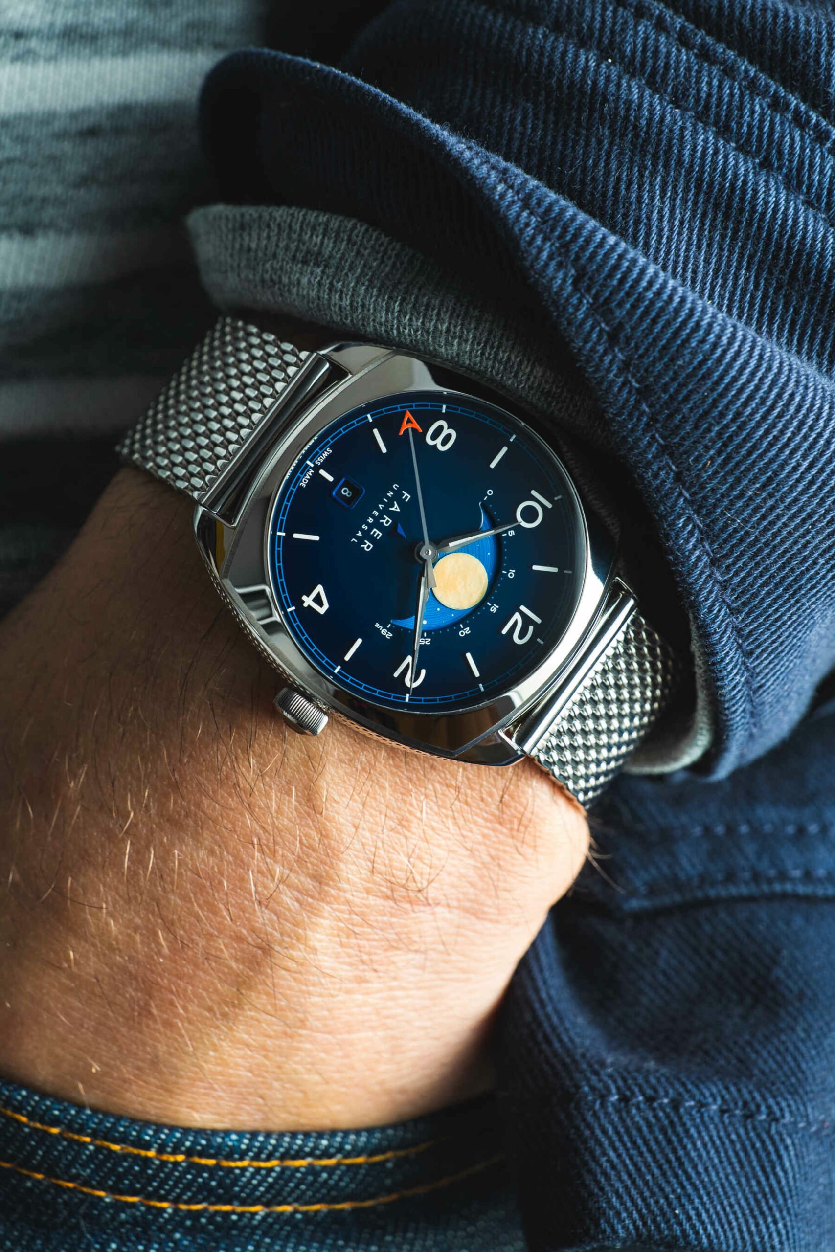
As with the latest Chrono-Classic and, in fact, most of Farer’s releases, there are three distinct personalities in the range. The smooth case with its side texture is a common thread. So is the proportionally huge moon, with each disc hand-painted in Geneva. The brightest pop comes from the Burbidge model’s bright blue sunburst dial. It has applied stick indices and a huge baby-pink moon inspired by Native American lore. In the glossy midnight dial of the more formal Halley, a yellow moon appears fresh against the space-like blue void. The lunar spectacle is also lumed for an extravagant night view that matches the bold numerals.
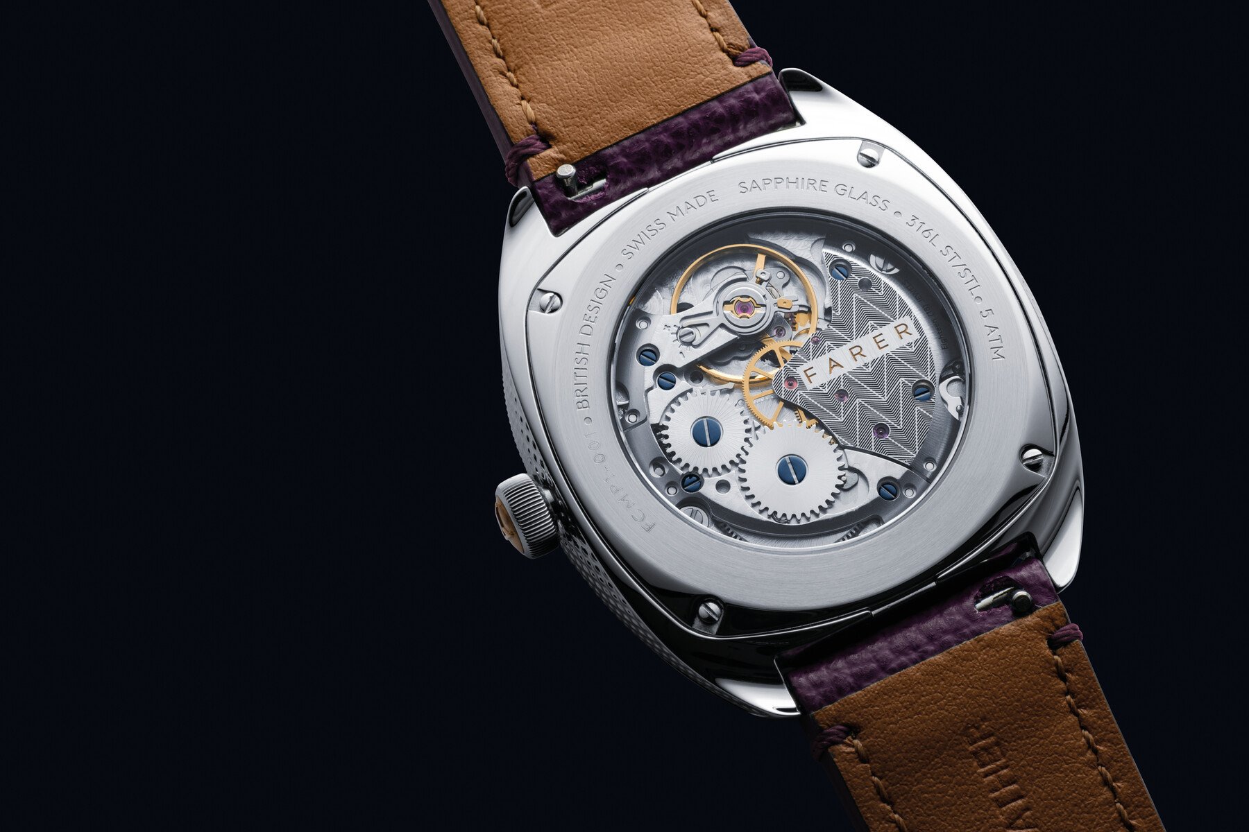
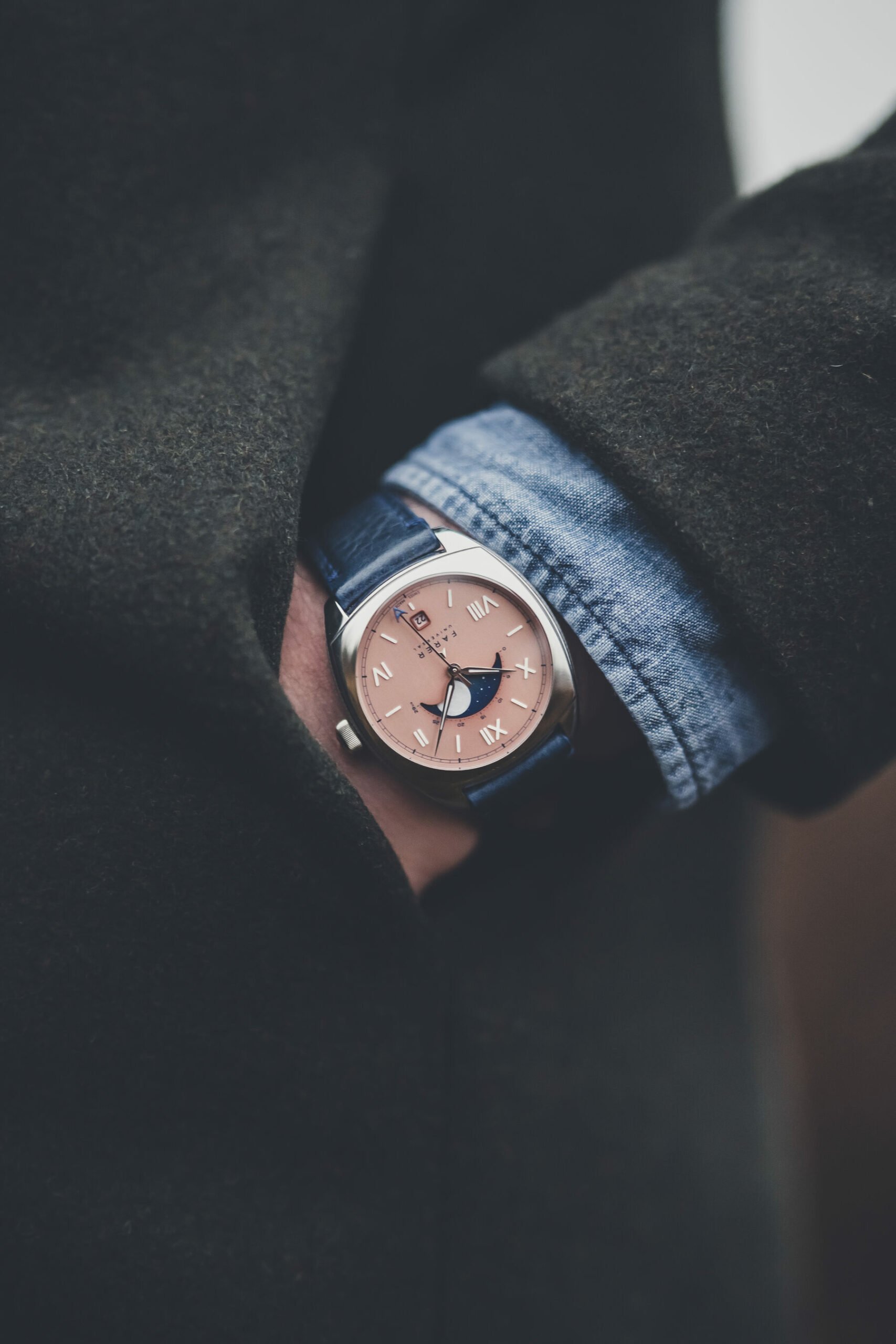
The movement is a Sellita SW288-1 Ma Elaboré Grade, with sharp details like blued screws and a bespoke Farer bridge. This also applies to the salmon-colored intriguing dial of the Eddington, named after the English astronomer. The moon here appears in its off-white natural state against a blue sky, also hand-painted with X1 Super-LumiNova. The classicism is underlined in the Roman numerals but with a twist. Yes, the indices are applied and made from solid X1 Super-LumiNova too. It’s a design that will imbue this with the best nighttime legibility of any sub-39mm dial with Roman numerals. The dial itself has got a soft, brushed surface and a dressy vibe that would work great with a dark suit.
A sweet-cased choice with a big presence
Any Farer watch will have a big wrist presence with discreetly sized ergonomics. From the brand’s smallest 36mm wrist-sweeties up to larger chronographs, they’re all imbued with a sense of occasion. I have the utmost respect for Farer not cutting any corners and purposely making production charmingly difficult. The brand’s cases have twists like the literal “grain twist” finish on the case sides of the Moonphase series. For many manufacturers, this would be enough, and your choice would be limited to two dial colors. Instead, each of these dramatic pieces of the moonphase renaissance has a distinct personality.
And to top it off, should you order a Farer Moonphase (£1,450), there are no less than 10 choices of straps, including Italian leather and steel mesh. I’ll let you do the math, but my conclusion is that personalization is a recipe for success. To me, the moon has never looked more appealing than in pink and charmingly hand-painted.
How about you Fratelli, are you entranced by this moon, or do these small-cased wonders leave you worried that the powerful lume will keep you up at night? Let us know in the comments, and for more info, head over to Farer’s website.
Find me and follow me: @thorsvaboe