A Week With The Farer Stanhope II — A Colorful British Watch With A Hint Of Ferrier

I know, comparing a €1,000 watch to a Laurent Ferrier might seem far-fetched. But after a week with the Farer Stanhope II, the first impression lingers. Within this very British cushion case are small touches of smooth joy that fit the bill, or am I fooling myself into a sense of grandeur? After all, I bought the Stanhope II with my own hard-earned cash.
I have my reasons for just spending a week with the Farer Stanhope II. The first is that my consolidation effort is not exactly going as planned (what a surprise…). Rather, I’ve decided to double down on my “Finding Joy In Variety” story, albeit in a controlled fashion. But don’t get me wrong, these are not opposing objectives, as long as I don’t buy watches on a whim. And this Farer was a long time coming indeed, as I love the brand’s use of colors with a vintage twist.
First impressions
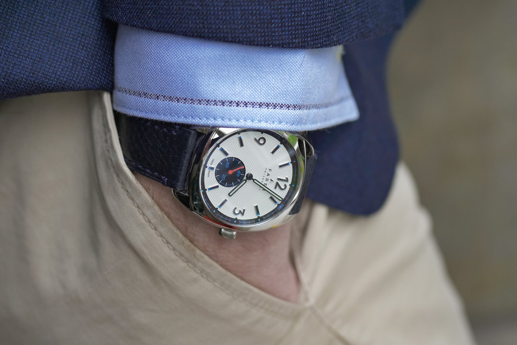
I am probably less surprised by the fit of a watch than Newbie Bob sticking his head down the watch-filled rabbit hole for the first time. But I’m still excited by a DHL package arriving, and I still savor the unboxing and save it for a calm moment in the day. The Farer Stanhope II came in a lovely fabric zipped case inside a logoed cardboard slipcase. The Stanhope II might never go back in its packaging, as I have a display cabinet for my pieces, but one thing is true: no matter what people say about sustainability and the luxury excess of packaging, it means a lot. Farer has this sussed out, with the watch fixed flat-lay style under two snap-buttoned holders. So far so good, and putting it on the wrist, the dainty watch properly surpassed my expectations of a delightful fit. But a hint of Laurent Ferrier, really?
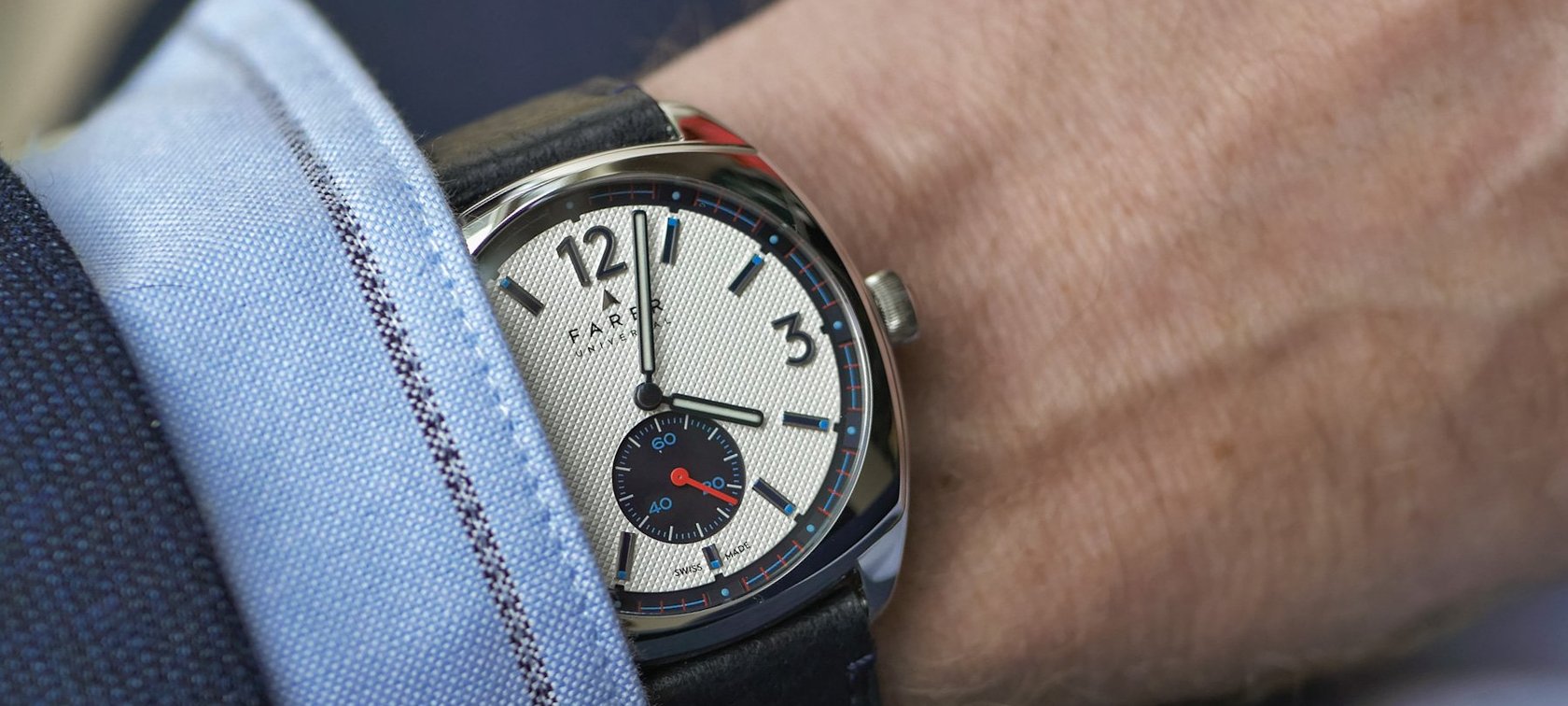
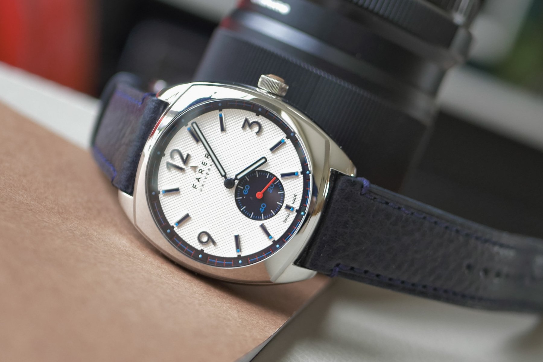
Less than 39mm makes a big difference
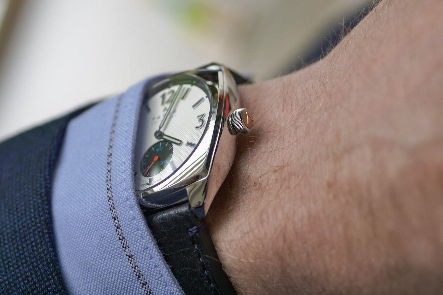
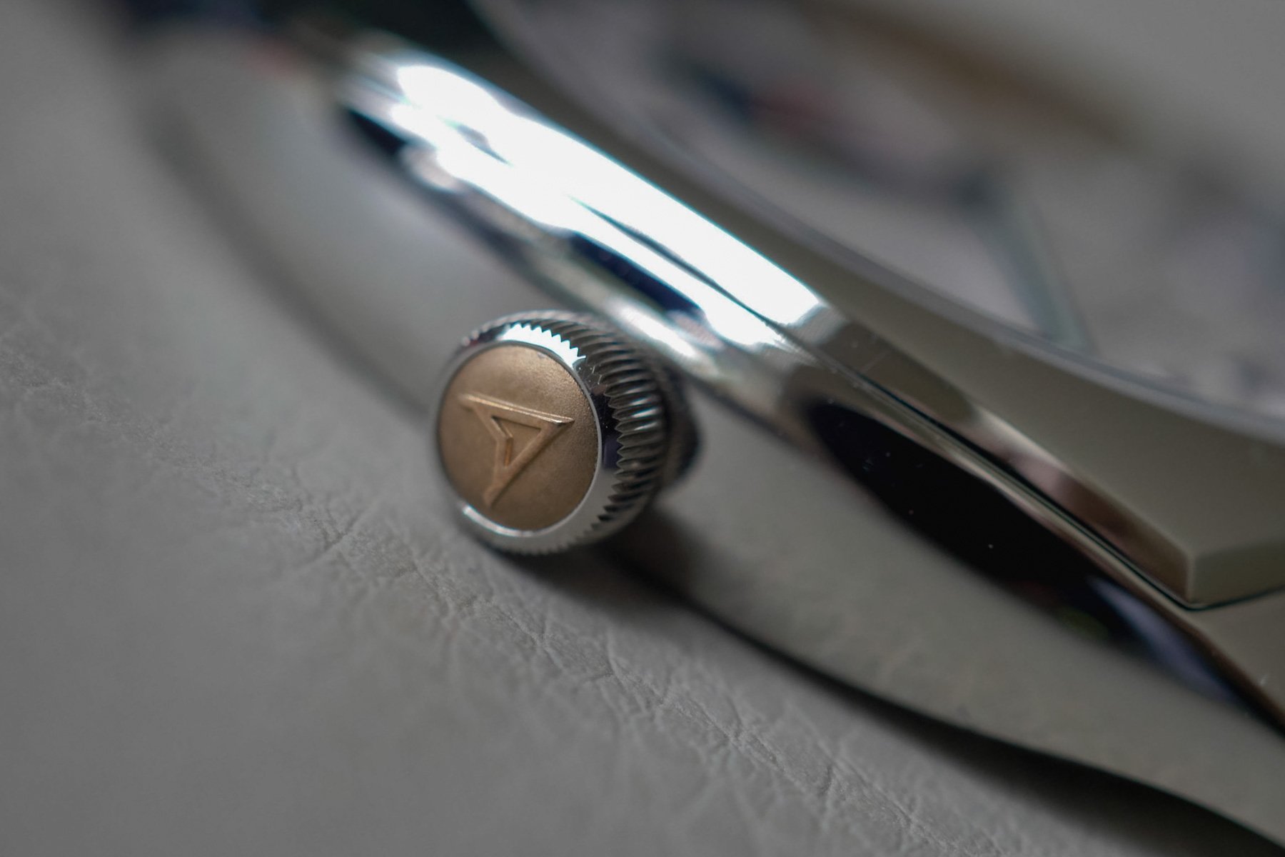
The first Stanhope was just 37mm. The Stanhope II here, however, has a brand-new case design. Someone reminded me of the Rolex Viceroy, as these Batman-eared lugs vaguely resemble that forgotten gem. Except for this, there are no clues of homage, simply a well-executed and accomplished piece of soft case design. The three-part case construction, however, does remind me of a Ferrier pebble, and that is a large compliment indeed. The soft case sides are “temptingly strokable,” let’s put it that way. The square-rounded beveled bezel has a rakish touch, and the large onion crown is a work of art. Its inset bronze cap with the Farer symbol makes for a pièce de résistance as it pops out from under the cuff, where it sits comfortably. The feeling of the hand-wound Sellita caliber is butter-smooth with just the right amount of resistance. The round crown also makes winding it a satisfying, zen-inducing exercise.
Strap goals
For my wrist, the 38.5mm case with a short 43.8mm lug stretch is perfection. I chose the St. Venere navy strap and was initially taken aback by its thickness in comparison to the 10.5mm slim case. But, despite trying on a more svelte leather strap, the thickness is actually a win. Between the lugs, the case is scalloped, so the soft leather nestles into the case ends, making it feel close to integrated. This makes what should be a too-fat strap fit like a dream. The slight texture and navy color are elegant with just the right touch of formality. Farer also easily trumps a few Swiss €2,000 watches with a well-fitted, brushed, and polished logo clasp.
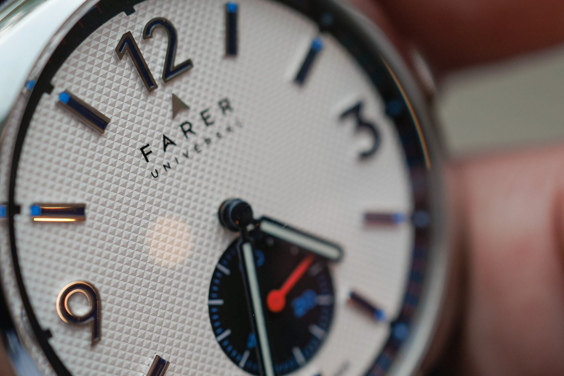
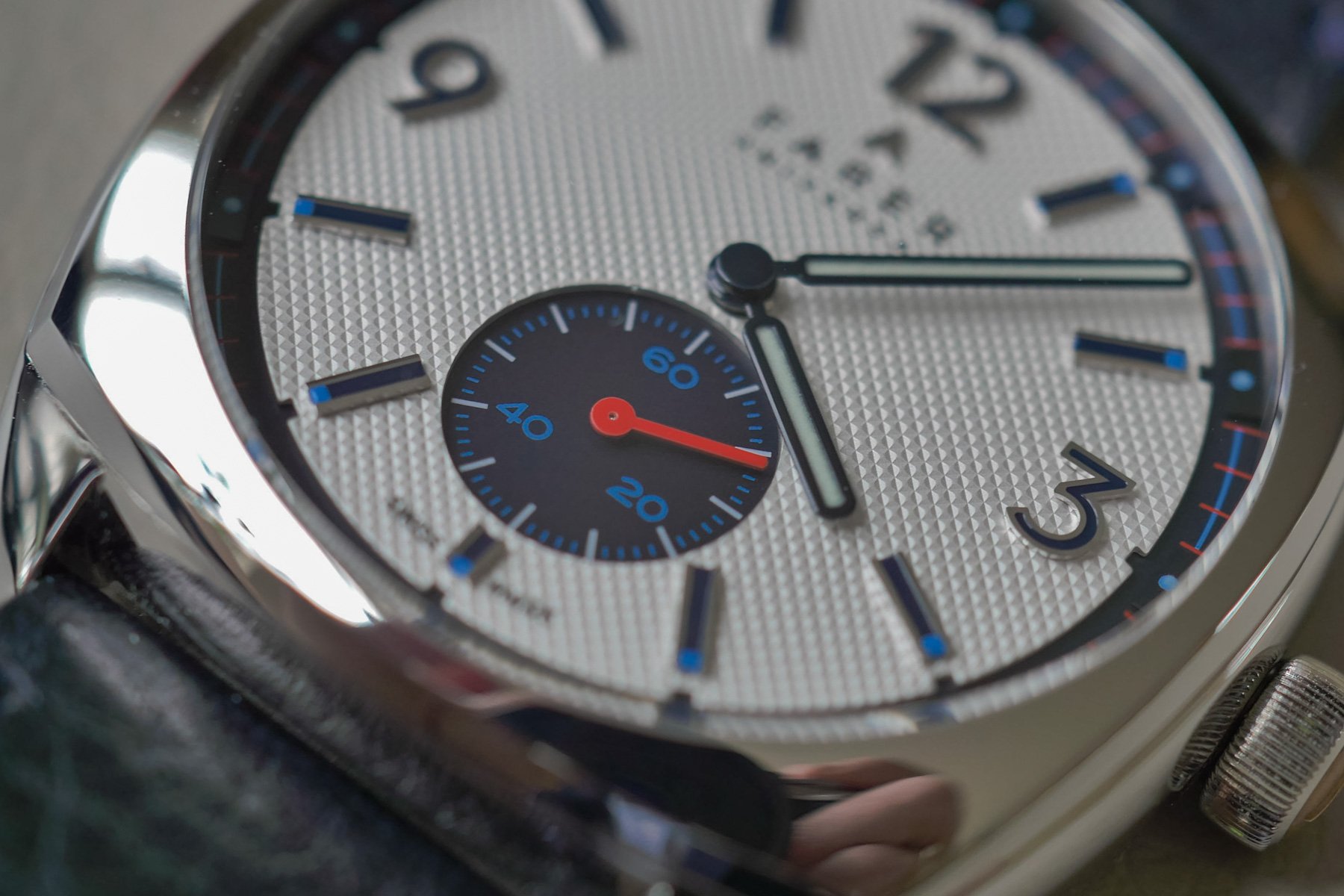
A piqué dial steals the show
It seems I’m one of the few people familiar with this term. Why? In Norway, a short-sleeved polo shirt is known as a “tennis shirt” or a “piqué shirt”. This is due to the textured, wicking fabric of a Lacoste polo, and while not looking like a soft T-shirt, I get the term. In reality, the Stanhope II has a sharp texture that I’d call miniature Clous de Paris, and the choice of silver is a studied one. The dial is a two-tiered design with the rehaut minute track and seconds register recessed in black, creating an elegant depth to the proceedings. Surrounding the piqué silver center, the rehaut has a delicate pattern of red minute markers crossing a blue line, the two accent colors of the Stanhope II. The myriad details place the dial firmly in the ’60s-’70s period and will surprise you at close range.
Pieces of a fresh-colored puzzle
I’m a detail fanatic. Take the indices and numbers, for example. They are filled with a deep navy blue in thickly applied relief to the light-catching surface, with pops of the light blue lume at the ends of each index. The coloring of the dial is actually quite reserved for Farer, a brand known for its vibrant wristwear. For me, this is perfect — it’s not monochrome, and it’s just colorful enough. The blued baton hands are glossy and well proportioned with solid lume application that lasts through the night. But my favorite detail is the small seconds at six o’clock. The idea of a small-seconds register at six is as old as pocket watches. For some reason, I enjoy watching the seconds hand run within its own circuit as if seconds were somehow a separate strain of time than hours and minutes.
Does the elaboré movement make the grade?
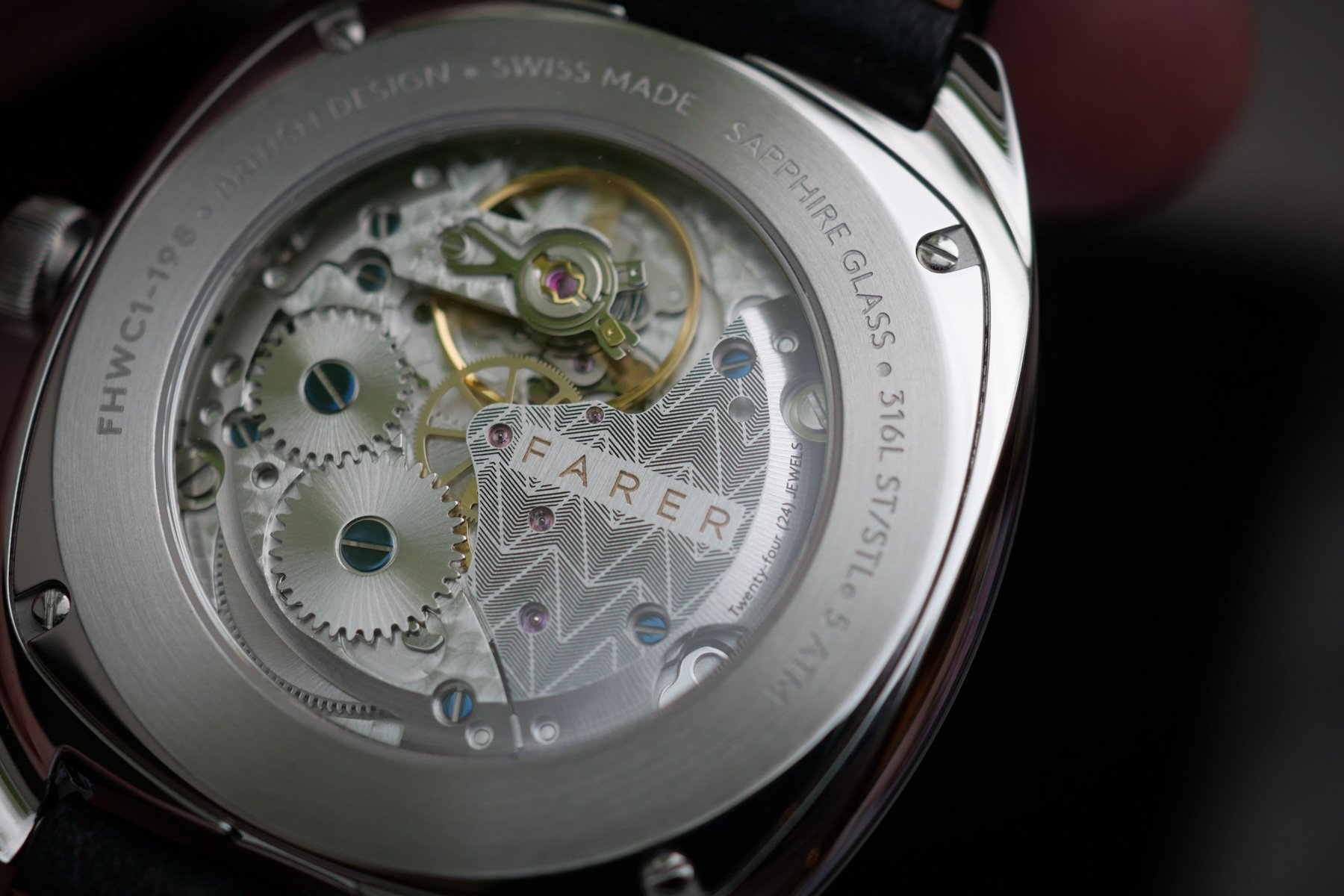
The Farer timepieces are proudly British in design and Swiss-made. I applaud the choice of the Sellita SW216-1, which has an enviable mix of slim build and smooth winding. The power reserve isn’t revolutionary at 45 hours, but who cares when the winding is so satisfying? Through one of the best-looking case backs for less than €1,000, the elaboré caliber has blued screws, perlage, and a perfectly placed balance wheel at 12. On the right, there’s a sharp-looking wedge-shaped bridge with the engraved Farer wordmark creating further visual interest. Underlining the eye-catching nature of the hand-wound movement, the sapphire is encircled by a brushed ring with all specs engraved, as well as the production number. Yes, the Stanhope II is limited this time to 200 pieces for €985, and mine is lucky number 198. That doesn’t mean, however, there are only two left. You actually get to choose an available number.
The details of a keeper
The Stanhope II has a studied blend of sharp detail, color, and ergonomics, easily making it a keeper for me. Farer has managed to make the dial fresh and contemporary. At the same time, it has an intrinsically mid-century design. And again, my favorite detail is the small seconds sub-dial that ties it all together. Its navy background complements the silver nicely, and its light blue markings and a bright red pointer give it some pop. Farer’s skillful design with a taste for colors might be an acquired taste for some. For me, the love for a watch often hinges on its dial catering to my love for depth, layers, colors, and applied details. The new Stanhope II ticks all my boxes, so consider it a winning part of my consolidation game.
So, over to you Fratelli — let us know what you think. Is the Farer Stanhope II the “Best Of The British”, or are you overpowered by the packed, colorful dial? Feel free to start a petition for more dial colors, as I might want another one.
Find me and follow me at @thorsvaboe