The New Naoya Hida & Co. Type 2C Is Haute Minimalisme At Its Japanese Best

If you read my series on The Allure Of Japanese Watchmaking before Christmas, you will remember my fondness for the bare-metal dial art of Naoya Hida. I still haven’t figured out the Japanese-language version of Haute Horlogerie, but the creations of Hida-san fit the bill to a tee. The NH Type 1-3 models are variations on a 37mm steel-cased theme of studied craftsmanship
Most Japanese top-tier dials are infused with centuries of Japanese culture, like a lacquered zen garden glassy to the touch. But there is more to Japanese horology than a multi-layered maki-e urushi lacquer dial. Here is proof that Japanese independent watchmaking is so much more than colored flash. Witness the intrinsic details of the new Naoya Hida & Co. Type 2C, proving my point with minimalist bare-metal dials.
Naoya Hida & Co.
Naoya Hida & Co. is a small atelier. Its eponymous founder has risen to niche fame thanks to Hodinkee Japan and doyens like the well-known watch collector Mark Cho. You might not think so if reading the text or a story without the close-up shots, but believe me. Your jaw might even drop at Hida’s engraved metal dials, set in a mid-century 37mm case. His workshop only completes around a dozen wristwatches per year, but you might well find it both worth the wait and the cost of pure craftsmanship. Naoya Hida makes magic happen through an understated eye for the smallest of detail and a vintage touch. His pieces speak with an elegant whisper rather than the dazzle of color, and the new Naoya Hida & Co. Type 2C is merely perfected.
The new NH Type 2C
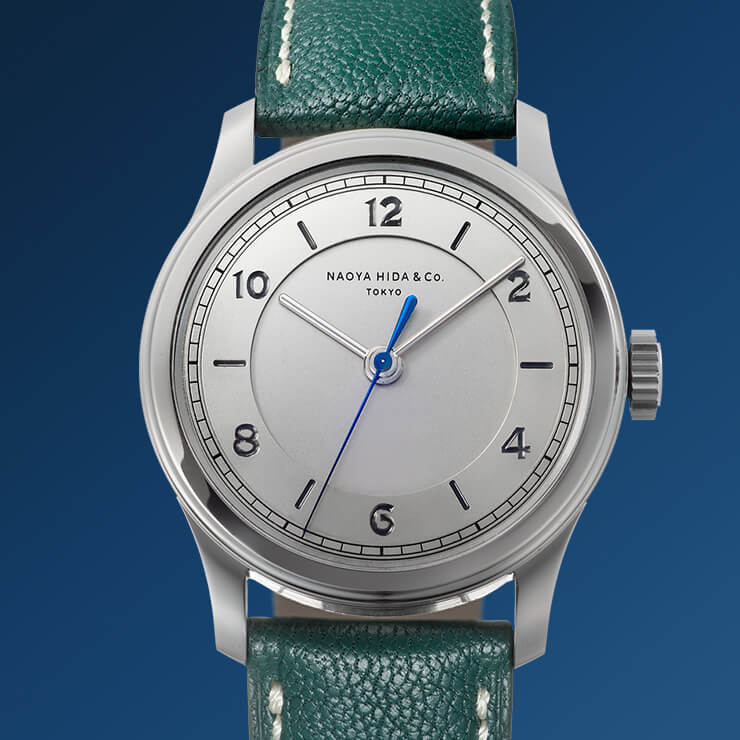
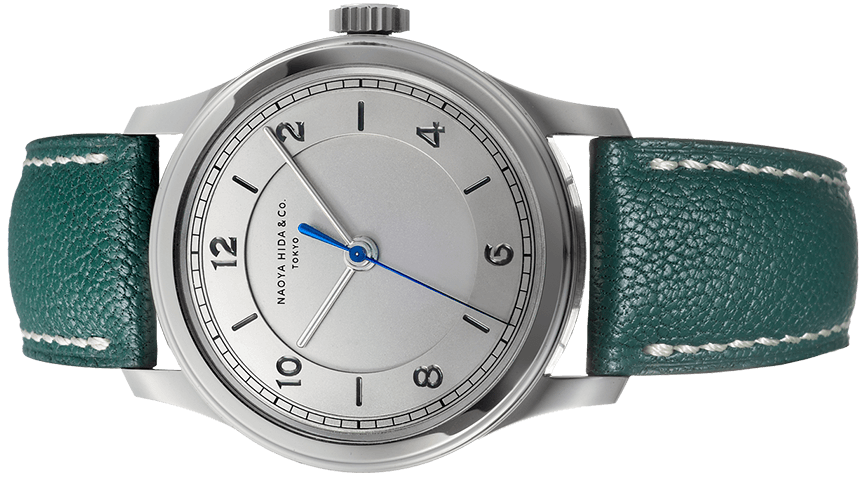
Naoya Hida uses the warmer 904L steel for his creations, a more refined alloy than the usual 316L, and one used by Rolex and Girard-Perregaux for a good reason. It might be slightly harder to machine, but polishing imbues it with a warmer glow than 316L, and it feels warmer on the wrist. Though polished detail is not found in abundance on a watch from Hida-san, it is judiciously placed for a refined glint of light. The 37mm case is only 10.2mm thick with a stepped ’40s design and a polished bezel and lug tops. Its 44mm lug-to-lug span is as damn close to perfection as you can get on my slim wrist. In this third-generation case, the lugs seem to have a more sweeping shape and are slimmer. The crown is almost field watch-like and quite broad for comfort in use, but the image is one of formal functionality.
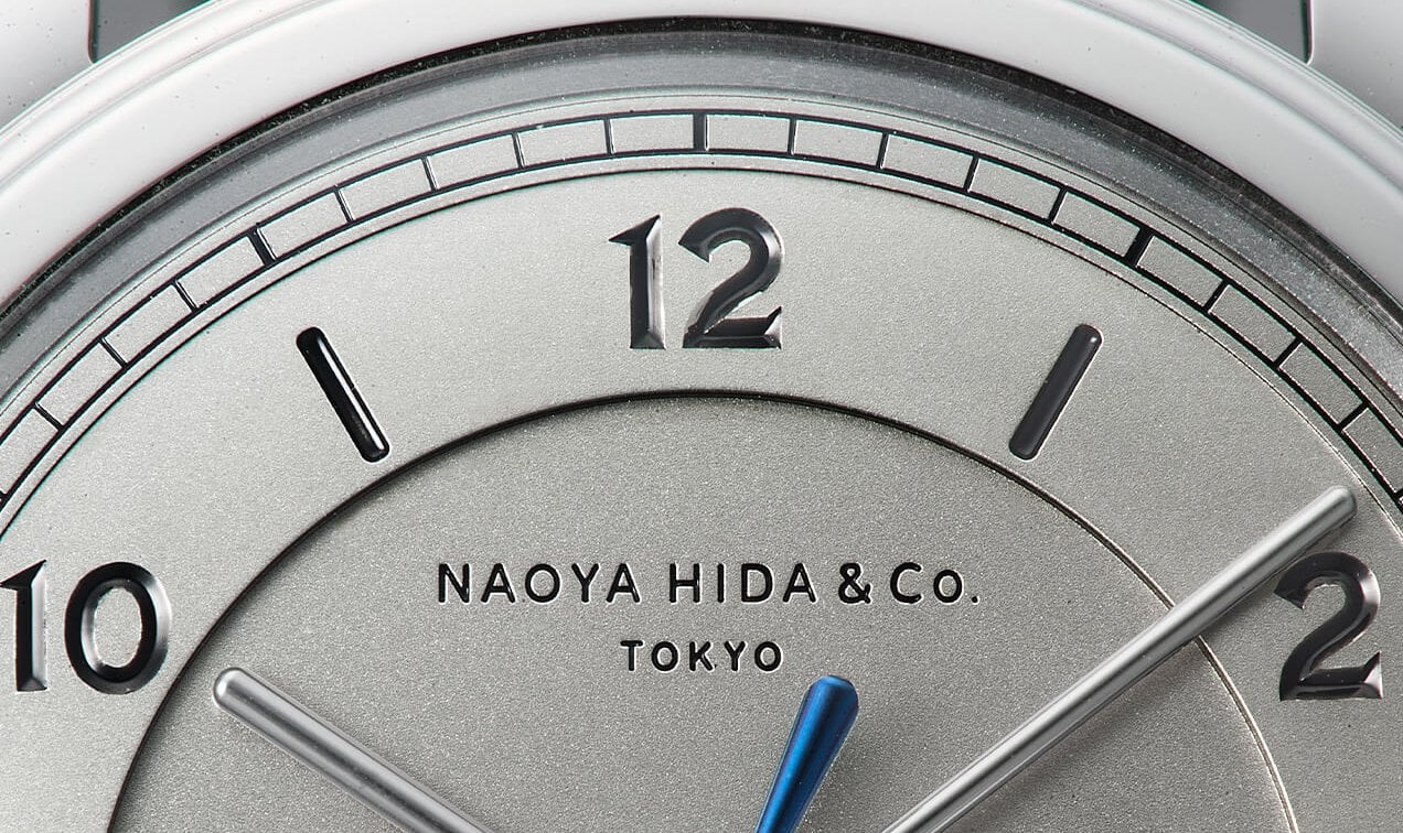
A textbook dial of German silver
Naoya Hida has a background in import and sales before creating his own brand. In many ways, Hida-san incited a Japanese embrace of brands like Philippe Dufour and F.P Journe, and it shows. First impressions are ones of serenity in the tonal greys of the bare German silver dial, with the surface variations and levels making a strong impression. But, it does take a trained eye to get the time and thought behind the quiet minimalism, and this is why it fascinates me Now, don’t get me wrong; I’m not making the Type 2C into a watch elitist’s daily wearer, but the appeal is not for everyone, and perhaps why I’m rather infatuated.
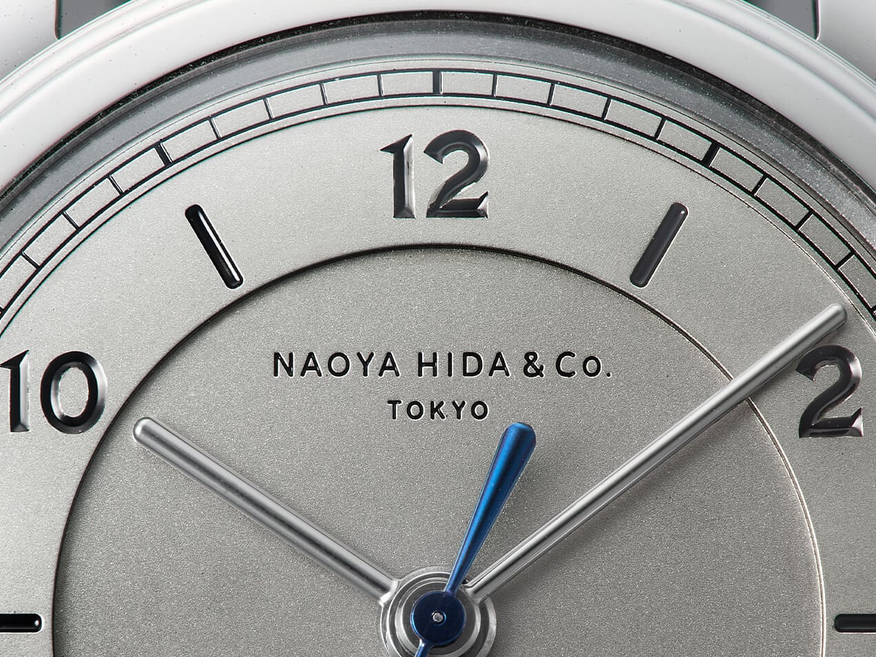
The stepped-dial details
Inside the rehaut, the chapter ring frames the matte-blasted German silver surface. This time we see a new lacquer-filled closed chemin de fer minute track sharpening the frame of the dial. One step down from this in separate parts lies a broad hour ring with deeply engraved even-number Arabic numerals and baton indices. The Type 2C might be a daytime-only piece due to its lack of lume, but its legibility is crisp. The engraved numerals are exquisite, with a hint of serifs and an open 6 spelling out a language balancing between Art Deco and utilitarian graphic design. In the center, the dial steps down to its final level with a modern logo below 12 almost shy in its size and airy spacing.
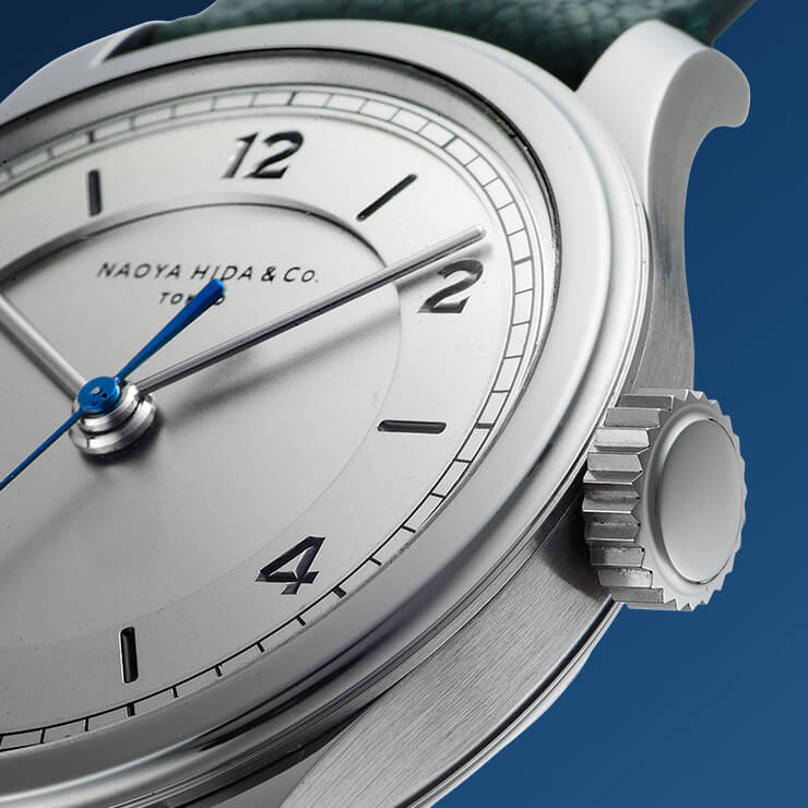
A lesson in hand design
Just like the design of the Type 2C itself, the hands are a thoughtful blend of minimalist refinement, and though seemingly simple at first, their design will surprise you. The baton hands are rounded in profile and hand-polished. What strikes you is the strong emphasis on size and balance, starting with the hour hand perfectly fenced in by the step in the inner dial, only just clearing the inner edge. The minute hand stops short of the outermost chapter ring, which is indicated by the center seconds hand. This is needle-thin at its end, hand-polished, and heat-blued with a downward sweep of its tip towards the brushed minute track.
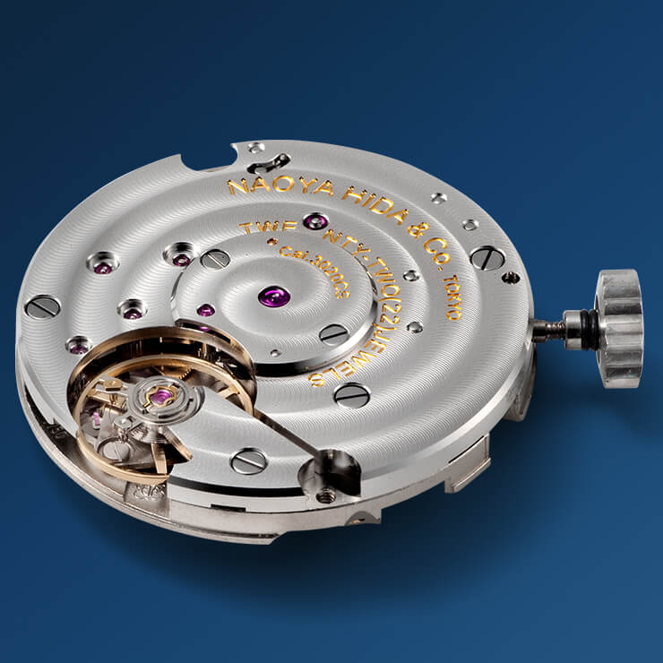
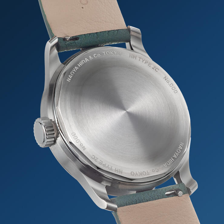
The hand-wound heart
Within the sleek 37mm case lies the Cal.3020CS. It has a 45-hour power reserve, a solid 28,800vph movement with exquisite finissage. Ironically, this is based on the storied Valjoux 7750 without the chronograph functionality — a studied choice. Unfortunately, it is not visible through the solid case back, changed to a micro-machined screw-in type for 2022. I will admit to enjoying the charm of merely knowing what resides within. The movement has a hypnotically concentric Côtes de Genève pattern on its backplate, while a large balance takes center stage. This has a large balance bridge with discreet language, and the ethos of Hida-san shines through the understatedly sharp execution. In another understated change to the movement from last year, this now incorporates a newly developed click mechanism. This is purely to increase the zen-vintage feel of winding the watch.
Understated eloquence
The closed nature of the caliber is almost liberating. After seeing one too many semi-open worked movements flaunting their wares through sapphire, here’s a lesson in restraint. This also pretty much sums up the beauty of the new NH Type 2C. The NH Type 2C comes on a sea-green 20mm Jean Rousseau textured leather strap. With a simple 16mm pin buckle in 904L steel, it’s a sweet match. The price for the Naoya Hida & Co. Type 2C is JPY 2.42 million and is available to order now through the brand’s website. But be quick. There are only 10 of these to be made in 2022.
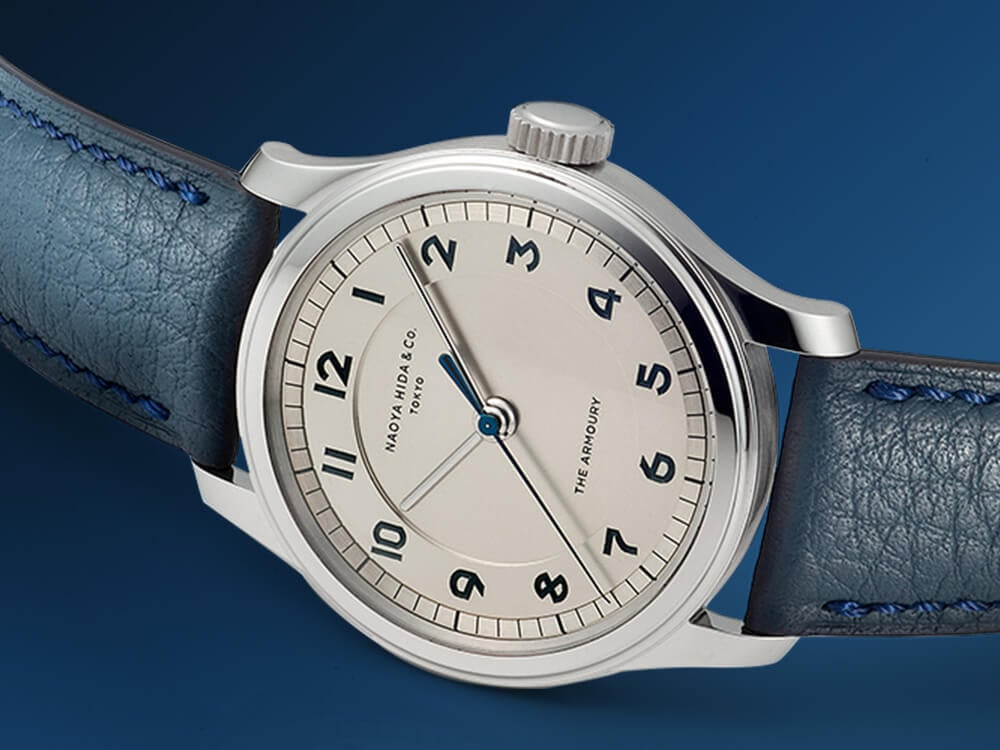
The limited-edition Type 2C-1 “Lettercutter” with Mark Cho
At a glance, it looks identical, but the dial is a masterpiece of graphic design with a flash of blue. The Armoury “Lettercutter” font has been used for the Arabic numerals. In its recognizably angular style, it brings an edgy blue contrast to the soft dial surface and classic case. Here, the Type 2C comes with a delightful variation, created together with The Armoury founder Mark Cho. At the risk of being blocked from his Instagram messages where we’ve been in touch before, I must admit that I pestered him. But Mark, the ever-friendly doyen of men’s style, managed to share some words with me while in the middle of the Japanese press day with Naoya Hida. Here is Mark’s story on the limited NH Type 2C-1.

Image courtesy of Robb Report
The difference a font can make
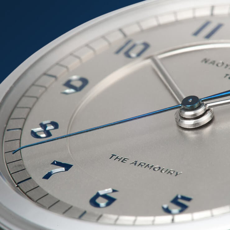
Would I choose the blues?
At around €18,800 and also limited to 10 pieces, I have a hard time choosing between the two. The angular “Lettercutter” font works exceedingly well in underlining the classic yet quirky nature of the NH Type 2C. So yes, this might just win it for me as a hypothetical buyer (my wife’s looking). Add the matching blue Jean Rousseau strap, and I’m won over. Have a good look at Hida-san’s website today. Type 1 and 3 have also been updated with similarly decisive tweaks. This makes the portfolio of Naoya Hida & Co. nothing if not very tempting indeed.
Find me and follow me: @thorsvaboe