Titoni Seascoper Reference 83600 S-BE-255 Dive Watch Review

The first time I encountered Titoni I was presented with a brand I had literally never heard of. And by the time I came face-to-face with these watches in the metal, I’d been working in the watch industry for almost 15 years. Had I been being completely pig-ignorant or was there something else at play here that might provide me some sort of excuse for having never heard of the brand before. I decided to find out what I’d been missing…
Titoni is a Swiss brand. Its prices run from around €450 for the ladies’ quartz entry point, right up to just over €2,000 for the master series collection on a bracelet. Despite it occupying an affordable price bracket and possessing looks akin to something like Longines, the brand is quite under-the-radar in Europe and the States.
In fact, when I first encountered Titoni, I was in a small shop on a Prague backstreet, surrounded by a swarm of Chinese tourists that had, moments after my entering the store, poured out of a tour bus and surrounded me and every product on display in a matter of seconds. The purchasing was rapid. It appeared indiscriminate. Thankfully, the clamoring for watches lasted only as long as the stock held out. Within an hour or so, the shelves were bare. 90% of the Longines had been sold. There were three Tissot models left in the case. All but one of the Titoni pieces was gone.
Popular around the world
I couldn’t believe my eyes. I asked the shop manager what on Earth had just happened. “Oh, those coach drivers keep us in business. They know we have the right stuff for their customers. Every day we get two, three, maybe four coach-loads of tourists come by. These brands we stock are very popular back home. They buy-up pretty much everything we have.”
“Even Titoni?” I asked, unsure of how to pronounce the brand name.
“Especially Titoni,” he smiled. I swear, he didn’t tap the side of his nose and shoot me a knowing wink, but he might as well have done. “Did you know there are two enormous banners outside Beijing airport this season? One of them is Rolex; the other is Titoni.”
“You’re kidding me… That must cost…”
“Yeah. A lot. but when you have the kind of widespread popularity Titoni does, anything is possible…”
I felt like I’d stumbled into bizarro land. Here was this guy, who I had reason to trust having just seen 100 tourists fill their shopping bags with his VAT-free wares, telling me a brand I’d never heard whispered in the halls of horology had widespread popularity.
Okay, it’s all a matter of perspective. Titoni does have widespread popularity. It’s just that it doesn’t often spread into the western world. However, that is starting to change. Again…
Money talks
Titoni wasn’t always an Asia-first brand. In fact, it was around on western shores for many decades before management decided to change the brand’s focus. Huge investments in the Asian market followed. Soon after, so too did success.
Anyone that’s worked in the Asian markets knows this: money talks. If you want to build a brand, be prepared to outspend your rivals when it comes to advertising. It is a terrifying thing to get into if you don’t have deep pockets, an iron will, and nerves of steel. Credit to Titoni; the brand cracked it. It helps that the cutesy logo is representative of a plum blossom — a flower found primarily in (you guessed it) China!
A change in the wind
Three years ago, when I first encountered Titoni, I walked away impressed with the business and underwhelmed by the watches. There was nothing there for me. Recently, however, that changed.
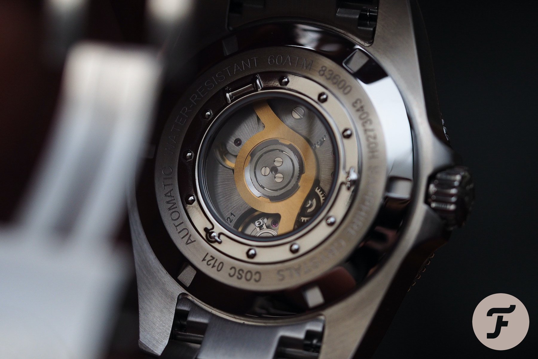
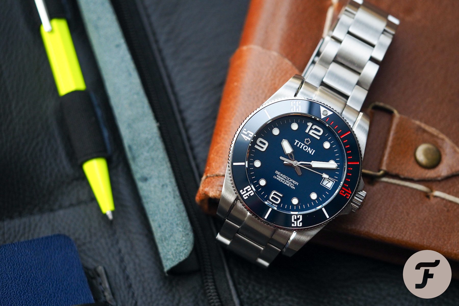
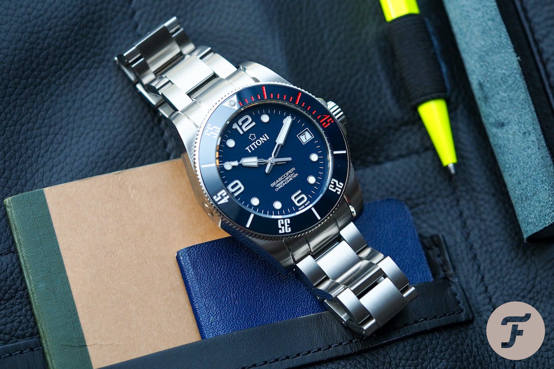
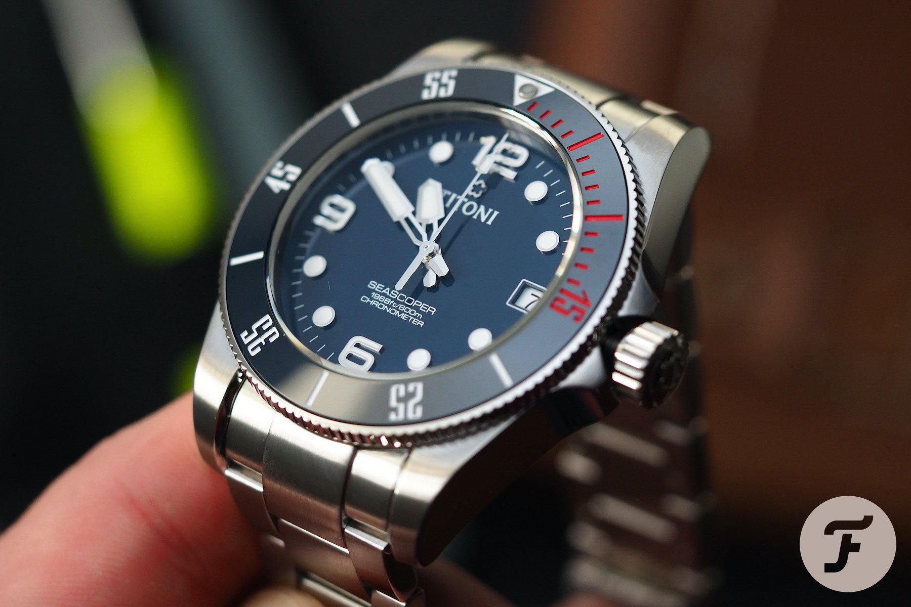
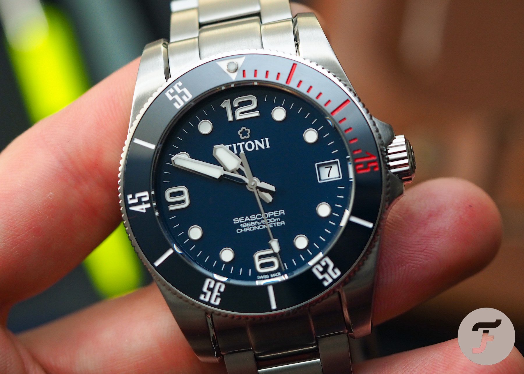
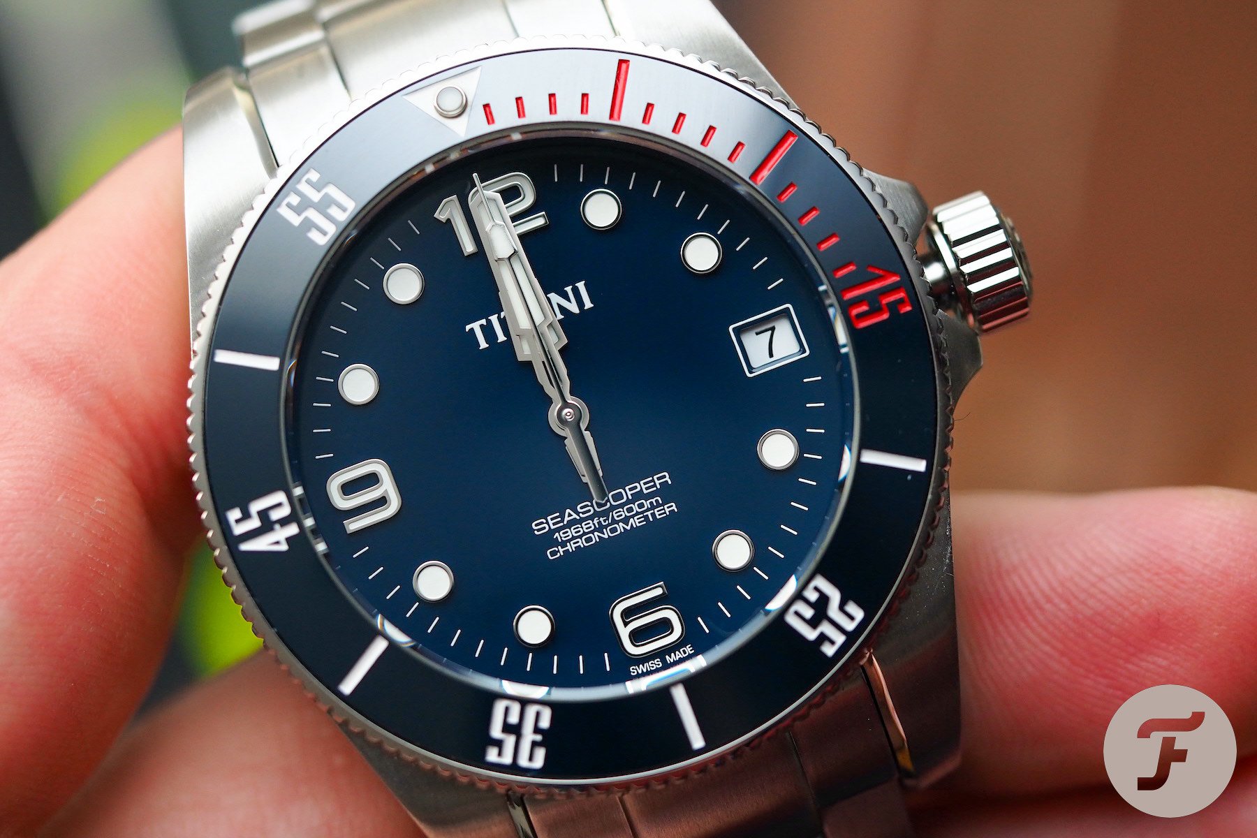
In 2019, the brand announced its in-house T-10 movement. Wider than most automatics in this price point, the T-10 measures 29.3mm edge-to-edge (compared to the 25.6mm measurement of the ETA 2824). It also boasts a pretty decent power reserve of up to three days (72 hours). The model I have in for review (Titoni Seascoper Reference 83600 S-BE-255) runs with chronometer-level accuracy for about 70 hours. I’ve read several reviews from owners and professionals that seem to quote a run-time of anything between 68 and 72 hours. At the very least, it’s fair to call this movement “weekend proof”.
So with a broad, powerful movement now enhancing the horological interest in this brand, what did I make of the Seascoper Reference 83600 S-BE-255 dive watch?
Let’s start at the top
First impressions do count. There are very few brands that could sell a watch based upon packaging alone (although one or two do exist, in my opinion), but it is nice when brands do not fluff their opening lines. Brands needn’t do much, but whatever they do they must do well. Titoni does an entirely passable job here, with a smart leatherette wallet containing the COSC certificate, warranty card, and (2-year) international guarantee booklet. It’s smart and unobtrusive, just how I like these effects to be presented.
The case in which I received this review piece was a travel-sized egg. I imagine it would come in a full-size box when bought over the counter or directly from the brand’s website, but I really like these little travel eggs. I find them far more useable than a presentation box (that I just store inside another, even bigger box of boxes). This travel pod has a button closure and a soft, velvety lining.
And next came the watch itself. My initial takeaways were surprisingly positive. This looked like the real deal right off the bat. Upon further analysis, there were things I really adored, and some I really wished had been done differently.
A similar character
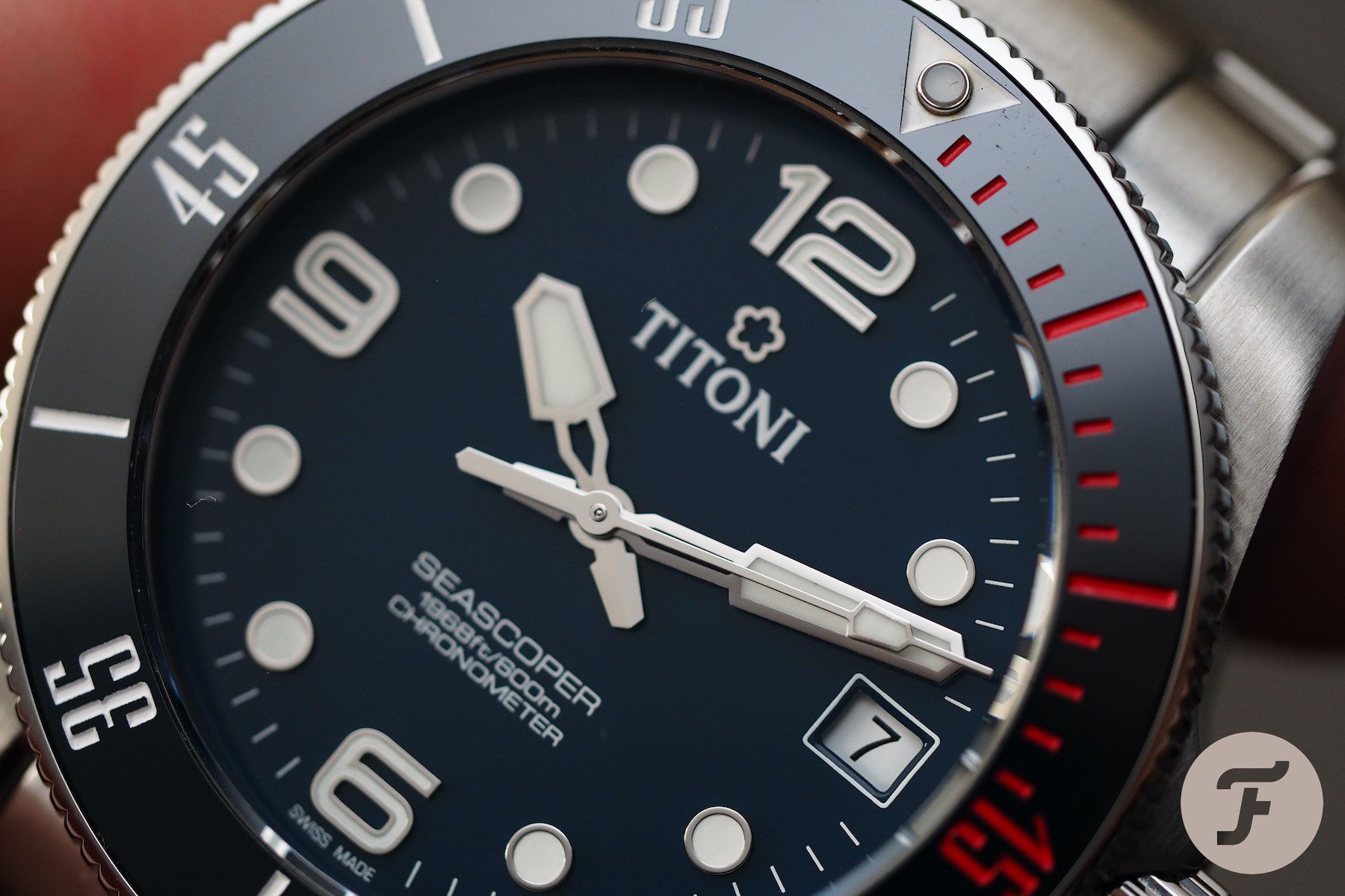
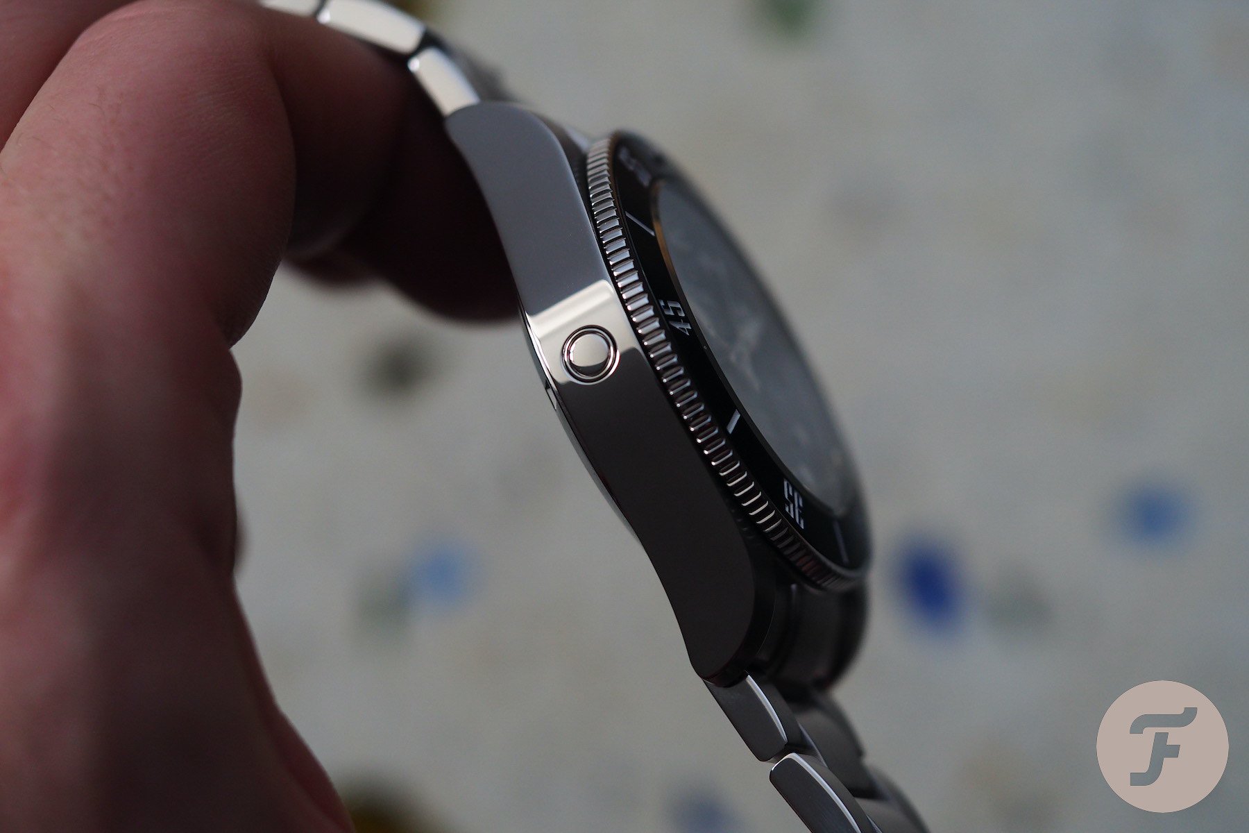
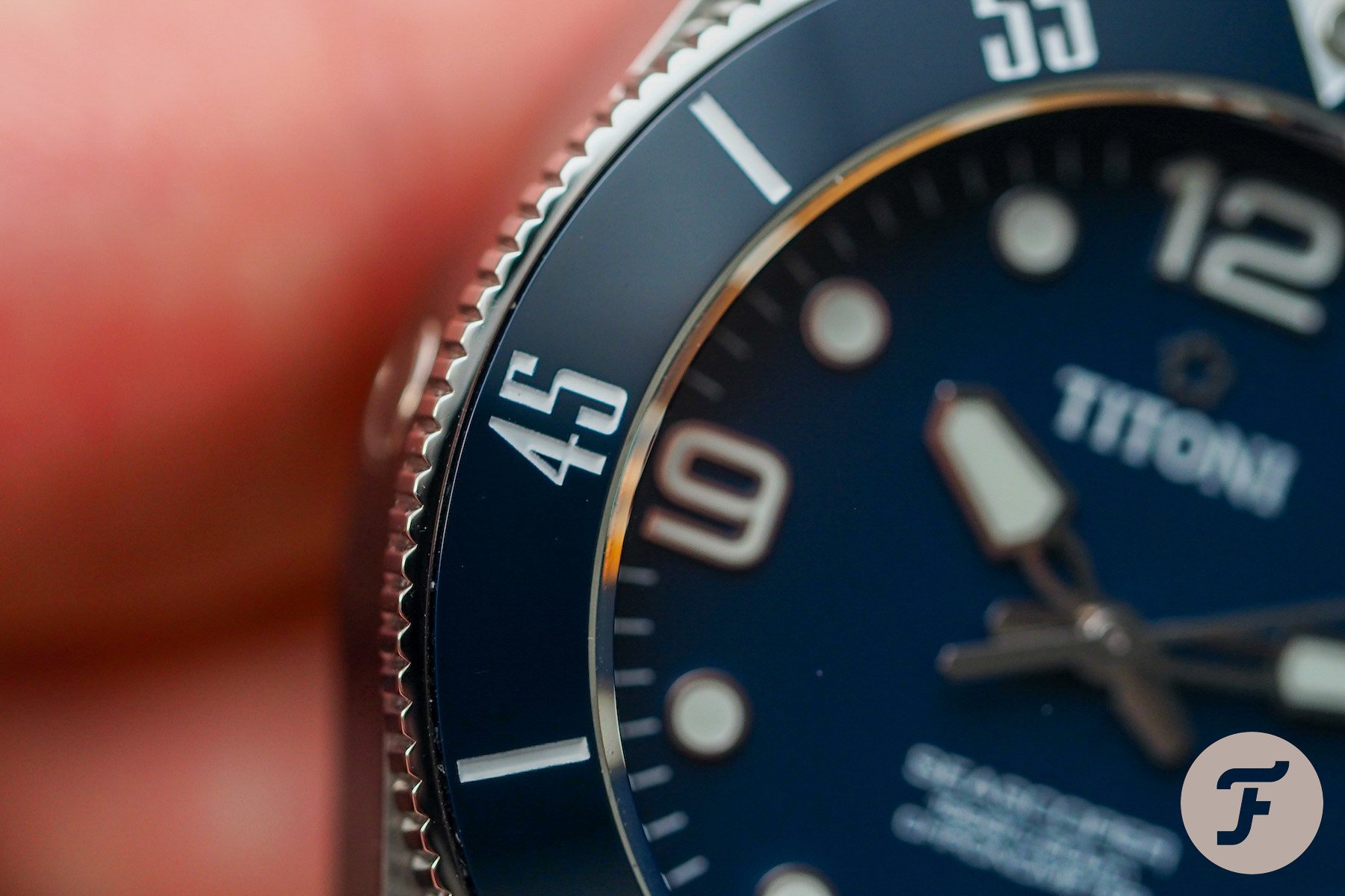
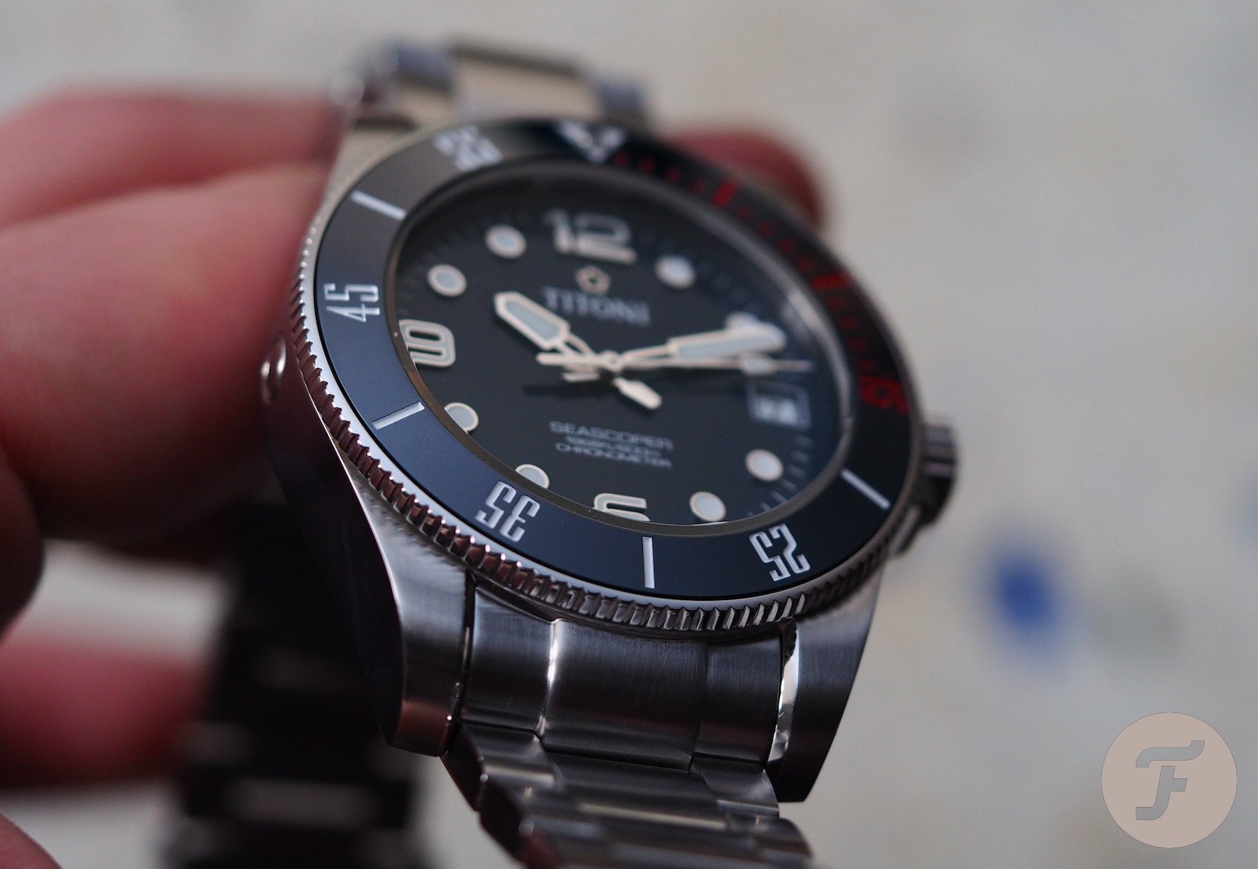
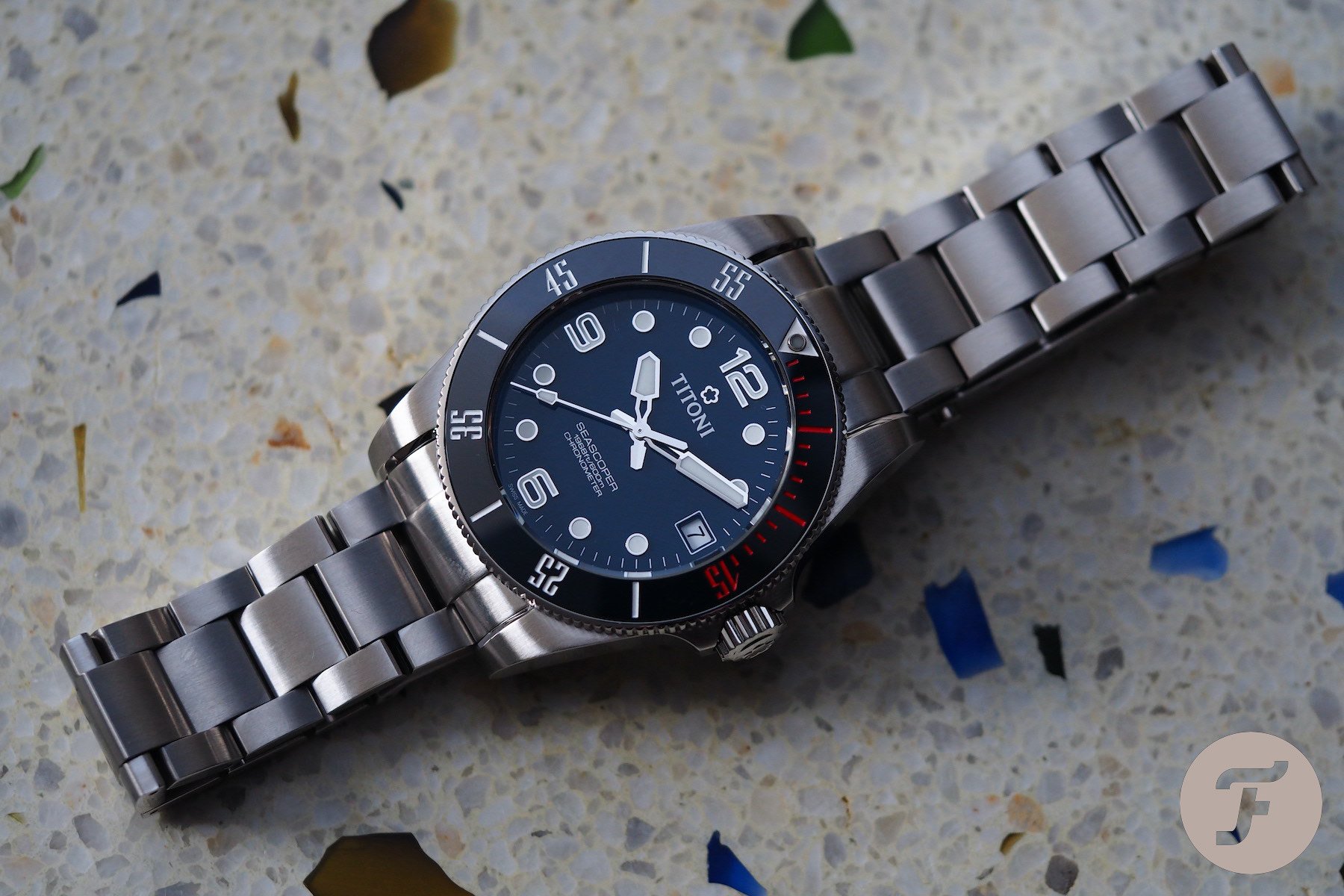
Sure, most dive watches look vaguely similar, but within this relatively similar silhouette, there are still discernable characters. Right off the bat, this watch reminded me of the Tudor Black bay. Overall it had a slightly “2D” appearance due to the flatter ceramic bezel, but it has a similar lug profile and those massive, slab-like sides that never fail to come up in Black Bay discussions.
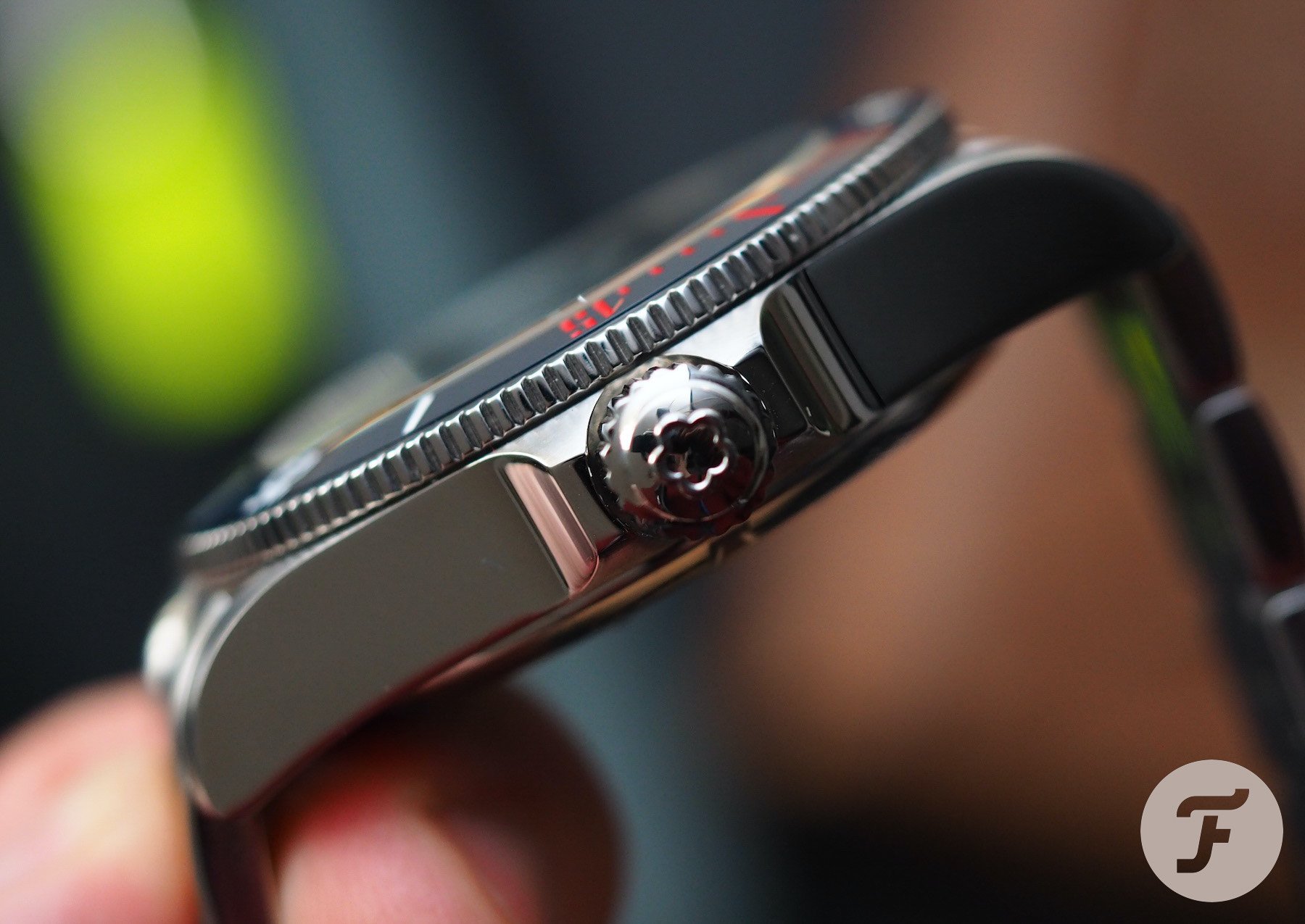
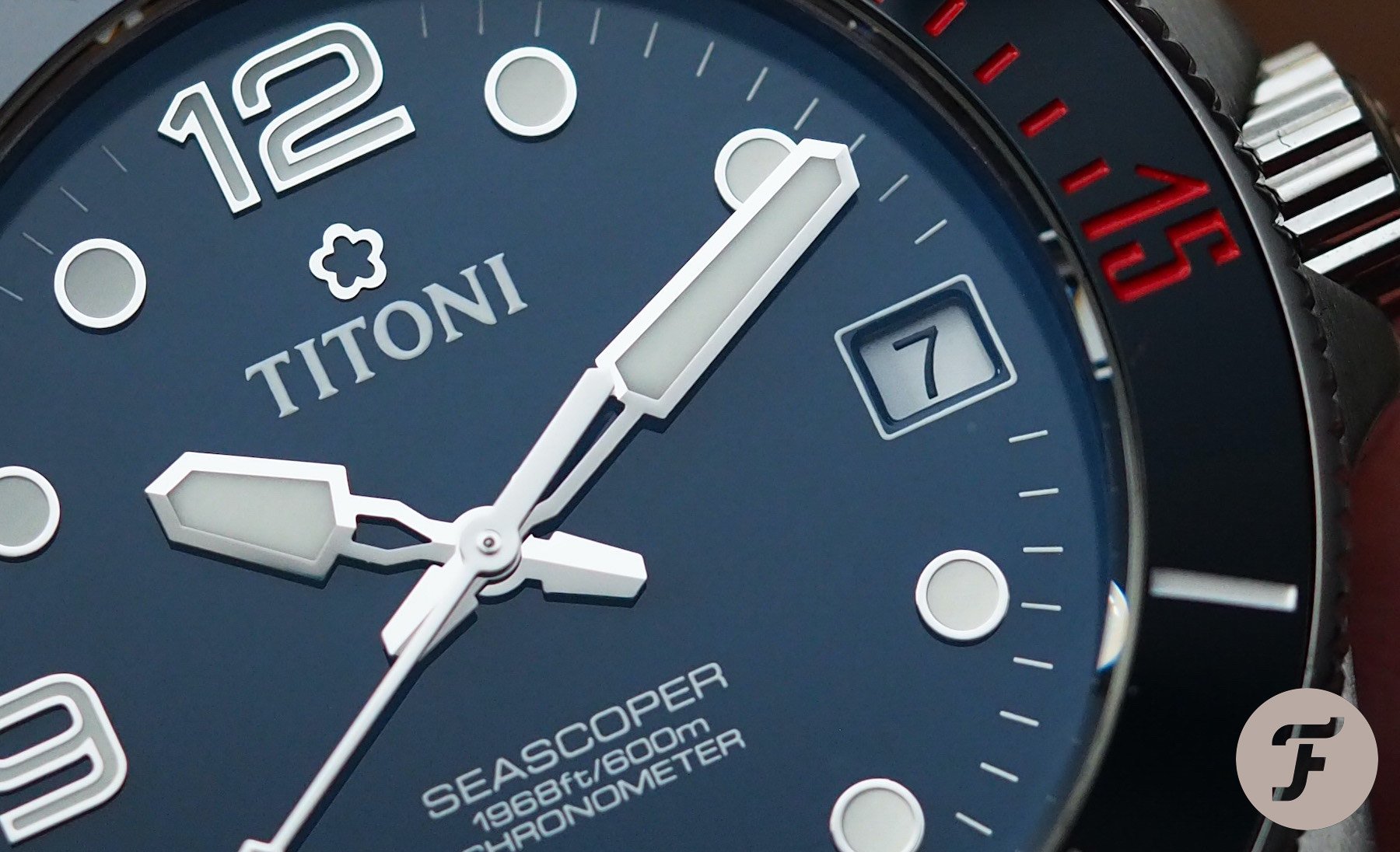
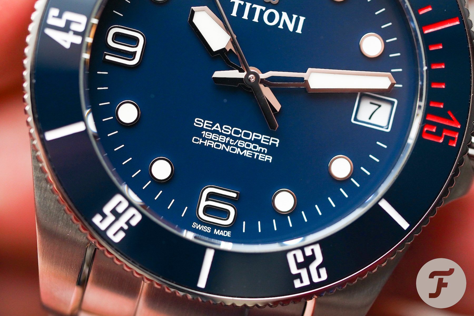
As with the Black Bay, that lefthand flank is broken up by nothing but a helium valve that few would ever use. The only kind of dive watch I like to see a date on is a saturation dive watch (otherwise I find dates fussy and functionally incongruous). Here we have a date window at three o’clock. It is a simple black-on-white date wheel with an incredibly dry font.
I’ll say this: it is legible and doesn’t jar too much against the dark blue dial and bezel insert, but it started me on a font journey around the dial that left me similarly satisfied and perplexed.
Just call me MS Word
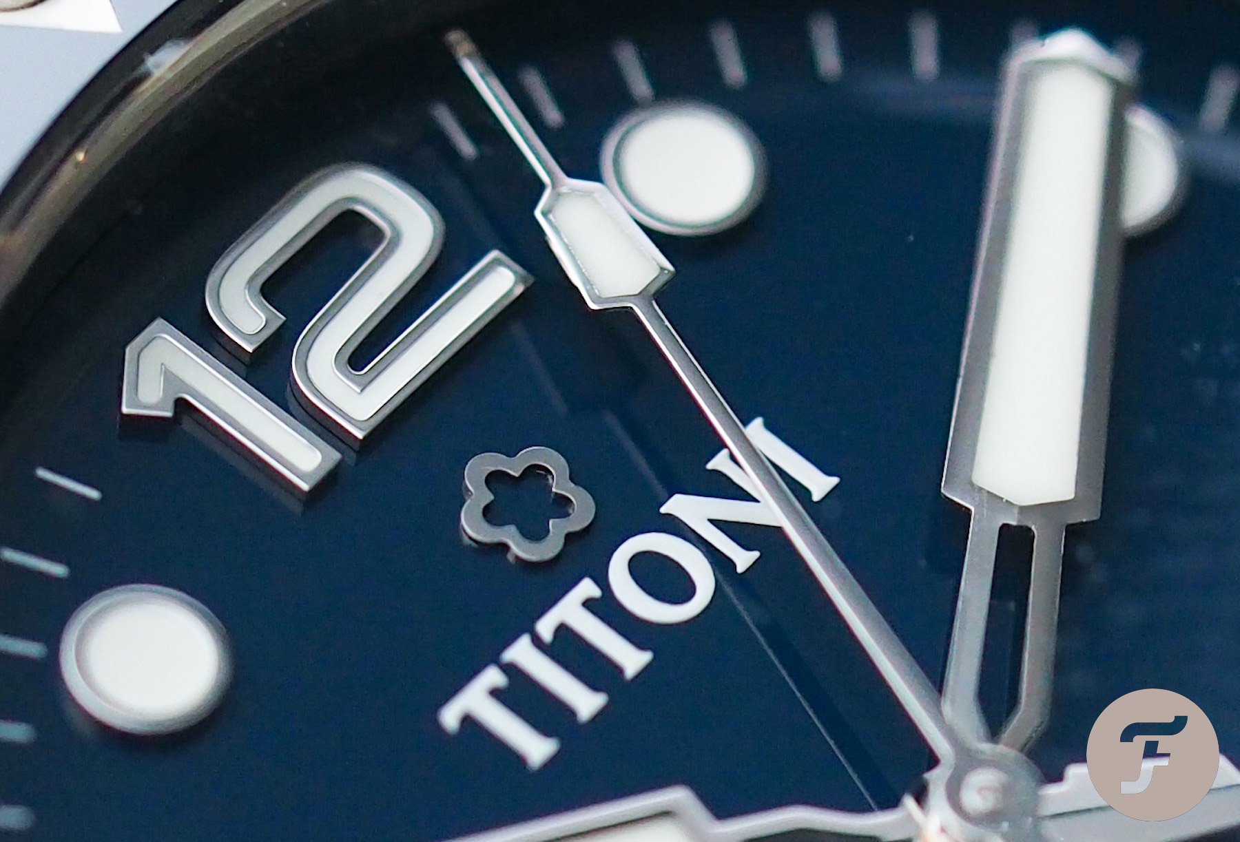
Okay, there are only six different typefaces on show here, so the Titoni Seascoper does lag behind MS Word for font choices, but it is quite a lot to deal with in such a short space. Let’s get half of those six out of the way quickly: the wordmark gets a pass, because it is, well, a wordmark; the date is uninspiring but totally functional and clear enough to deal with; the “Swiss Made” text at 6 o’clock rarely comes in for scrutiny but here it was more noticeable to me than usual. Still, I don’t mind that at all.
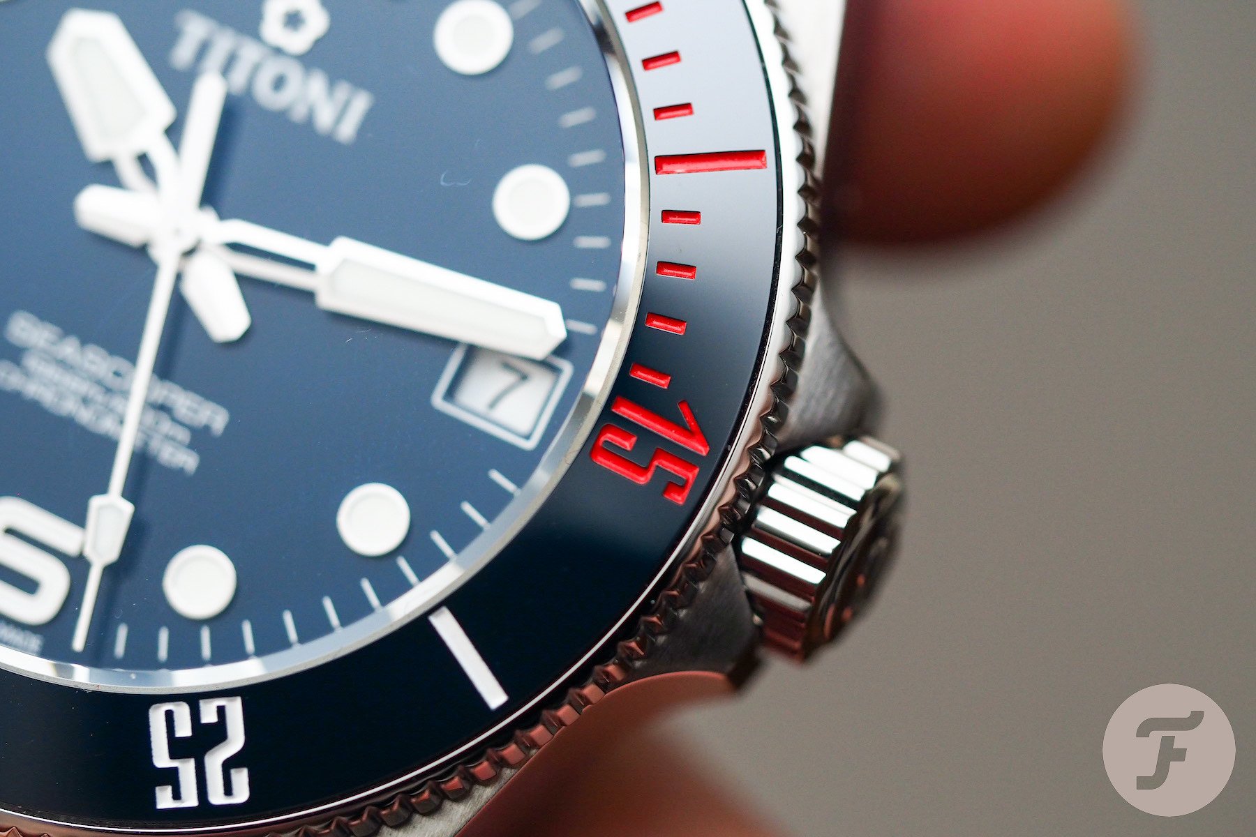
What I did mind, however, was the combination of the Seascoper text, the 12, 6, and 9 numerals, and the bezel-insert markings. The Seascoper font itself is very nice. It suits the watch and is pleasingly legible. However, each one of the (acceptable) three lines of text between 6 and center seems to be in a different size. It’s tough to see this upon first glance as the middle line (the depth rating) uses lower case letters, while the third line (CHRONOMETER) is all in capitals. I thought something looked a bit off, so I got the zeros and the capital”Os” under a loupe and compared them. Sure enough, they were different sizes…
In a font like this, one would imagine these characters to be identical. And, it seems, they are. As such, having the the “O” of Seascoper, the zeroes of “600m”, and the second “O” of chronometer so close together and in three different sizes is, in my opinion, a totally avoidable headache.
Stiletto sharp
I’m all for experimenting with fonts. My mother was a type-setter so I grew up around boxes and boxes of old lead type, which I would spend hours arranging in blocks whenever she would let me touch it. While such frequent exposure to lead might go some way towards explaining my odd personality, I like to think it also left me with a deep and intuitive appreciation of lettering and its forms. As such, fonts on watch dials are not just a necessary evil to me. They are pretty much the most important element. And while I appreciate novelty, it doesn’t get the thumbs up just for being new.
This bezel font is stiletto sharp. Tall and narrow, the numbers look stranded on that wide expanse of perfectly polished ceramic. This kind of style might actually have suited an anodized aluminum bezel better, where the texture of the material and the flat-integration of numbers and background might have softened the type a little bit. I’m not sure why Titoni didn’t just mirror the handsome 12, 6, 9 font (the sixth and final typeface on the front of this watch head). It is a nice one and would work just fine. Better still, do away with the bezel numbers entirely and lume the whole thing with a more technical pattern a la Ming. Now that would look cool…
Small triumphs
The details add up, however, to make this a very nice watch indeed. The dial is really well made and the lume homogeny between hands and dial markers is top-drawer. And when it comes to hands, I can barely shower enough praise on this edgy and unique handset. Thanks to the thoughtful skeletonization of the minute hand and the clearly calculated width of the hour hand, the minute hand never entirely obscures its bigger brother. That is, in my mind, an essential requirement of all dive watches.
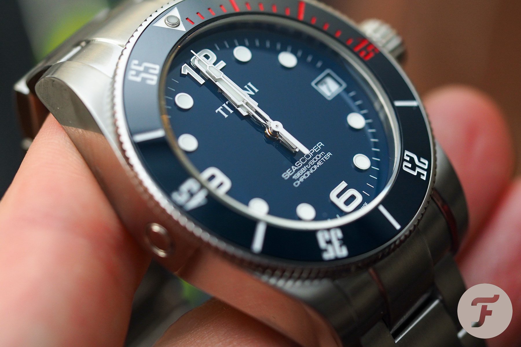
The tip of the seconds hand is an unusual shape that complements the hour and minute hands well. I like it very much and commend Titoni on a successful set of indicators from top to bottom.
Another thing to notice is how the hands stack. Check out the image above. That’s the kind of detail that can keep me grinning for days once I’ve noticed it. It’s super neat, super satisfying, and surprisingly original. Full marks again.
One of the best
Let’s talk about those lugs a little bit, because while they are reminiscent of the Tudor Black Bay, the internal chamfering marks them as distinct and, in my opinion, vastly superior. The way the lugs fold in on themselves towards the bracelet creates a very satisfying fusion of components. And while I am always unenthused about this kind of stock bracelet design, here the raised centerpiece of the end-link is nicely done and well-finished. The individual links are much better than average (in fact, they are really, really good), and the subtle taper enhancers wearing comfort drastically.
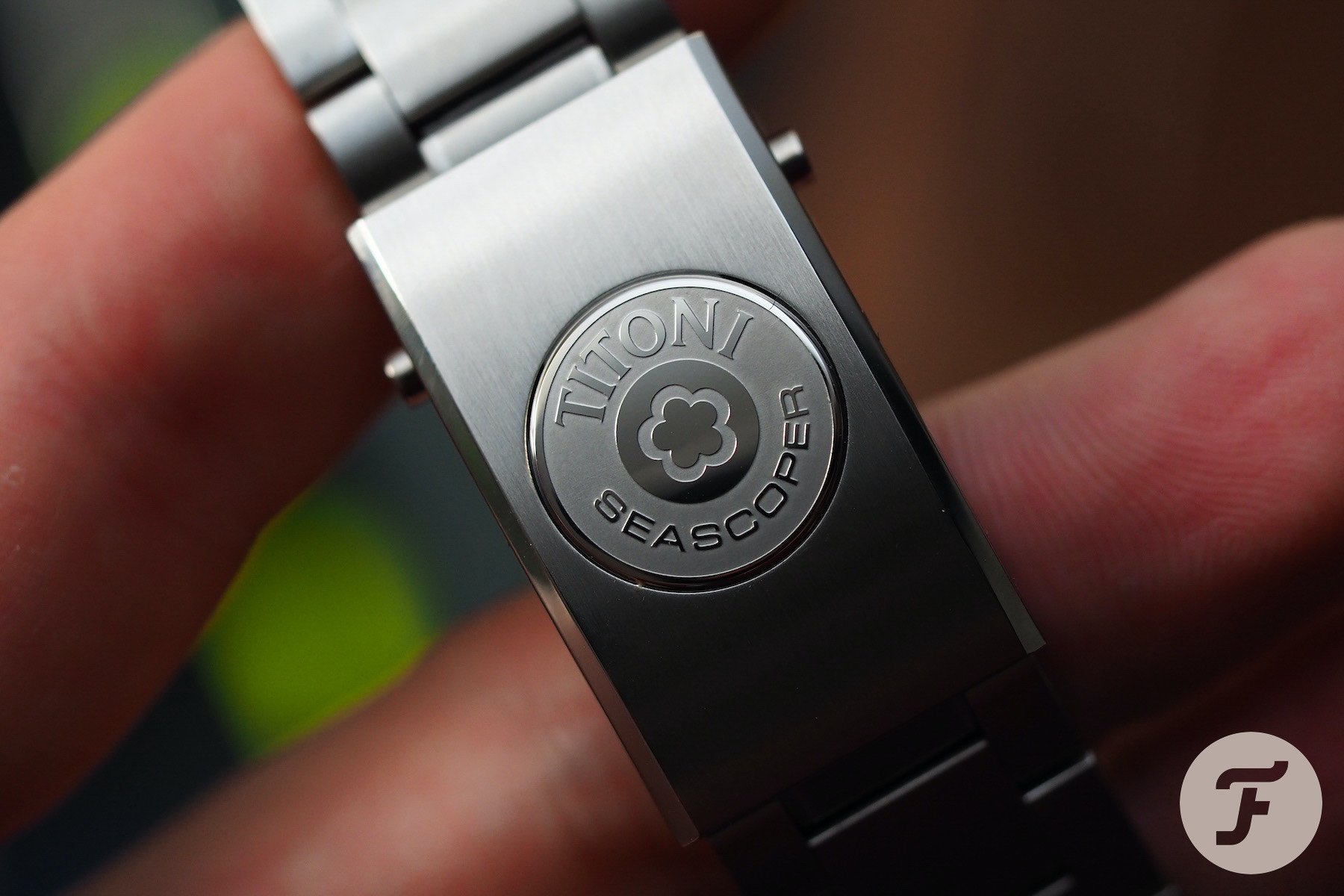
And by following those links all the way to the buckle, we reach the very best part of this entire watch. The micro-adjustment on the clasp is wonderful. It is released by depressing the large, beautifully realized Titoni Seascoper logo. It is solid, expertly machined, sympathetically integrated, and a shining example of branding. Seriously, I think it is the best buckle and micro-adjustment I’ve experienced outside of the Omega Ploprof and the Tudor Pelagos. In many ways, its overall design is even better because of its charming aesthetic.
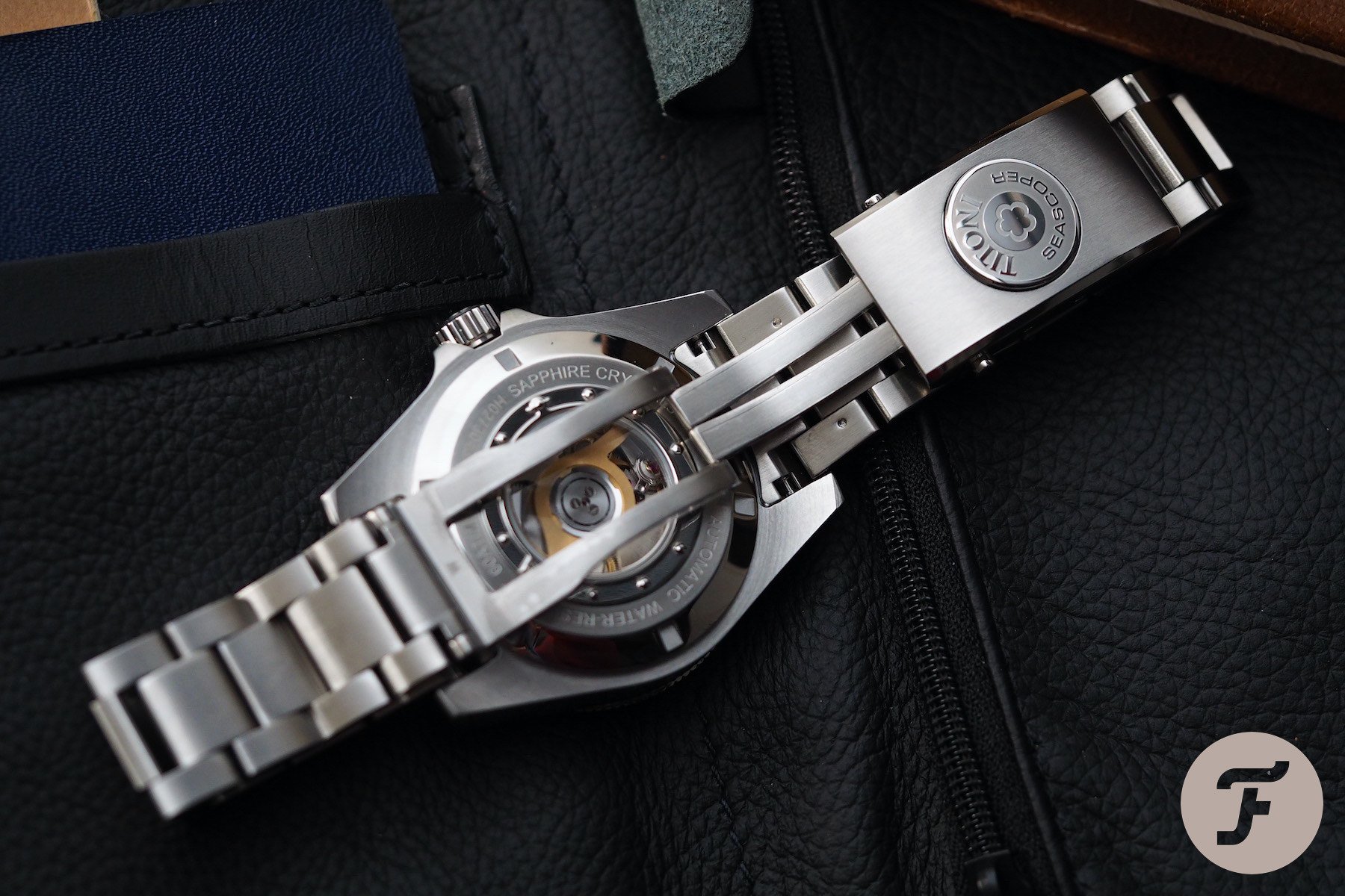
The case back and conclusion
My least favorite element of the Titoni Seascoper’s design is the case back. I suppose it is designed to resemble a porthole, which is kind of cute but a bit passé. I don’t like that cheap-looking molding. It’s never sat well with me. There’s simply no need for it. Especially not when you have something as visually interesting and distinct as the T-10 movement inside…
There is no way in 2020 with the level of CNC machining possible these days that this watch could not have had an edge-to-edge sapphire display back. Firstly, the 600m water resistance is way more than anyone could feasibly need, so why not drop it to 300 (if it were even necessary) and give us the view we all desire? We’ve seen how glorious the T-10 can look through a nice wide sapphire window because the brand gave us that on its 1919 line (also worth checking out).
…a lot of watch for the money.
Overall, I came away impressed. I was impressed by the level of quality Titoni is clearly able to reach. I don’t love all of the design decisions for the reasons listed above, but, in my opinion, Titoni has all of the necessary know-how to make a barnstorming competitor to the current dive watch leaders. And the price is just about right for this kind of product with this kind of movement. The Titoni Seascoper 83600 S-BE-255 comes in at €1,595 and is a lot of watch for the money. I guess it makes sense that the brand is able to offer that kind of value when you consider its under-the-radar success, but it still ended up surprising me (in a very good way). Learn more about Titoni here.