Tomas’s Top 7 Striking Vintage Dial Designs

Some watches are impossible to overlook due to their cult status. Others due to massive value appreciation achieved thanks to massive exposure and popularity among collectors. Let’s not forget the watches you might have only seen once before and are forever etched on your memory. Let’s take a look at some of the most striking vintage dial designs.
As the design is a matter of personal taste at the end of the day, we might be treading through dangerous territory today. Well, I‘ve decided to go for it anyway! It might sound unusual to try to separate the dial design from the case shape, the bezel, or the hand style, but I believe it is a worthwhile exercise. To narrow down the shortlist, I listed pieces where it’s the dial specifically that adds most to the experience. These dials may not have found their forever homes in the cases in which they were presented. Perhaps they could be reborn. Here’s hoping we see some of these awesome layouts pop-up in modern-day housings sometime soon.
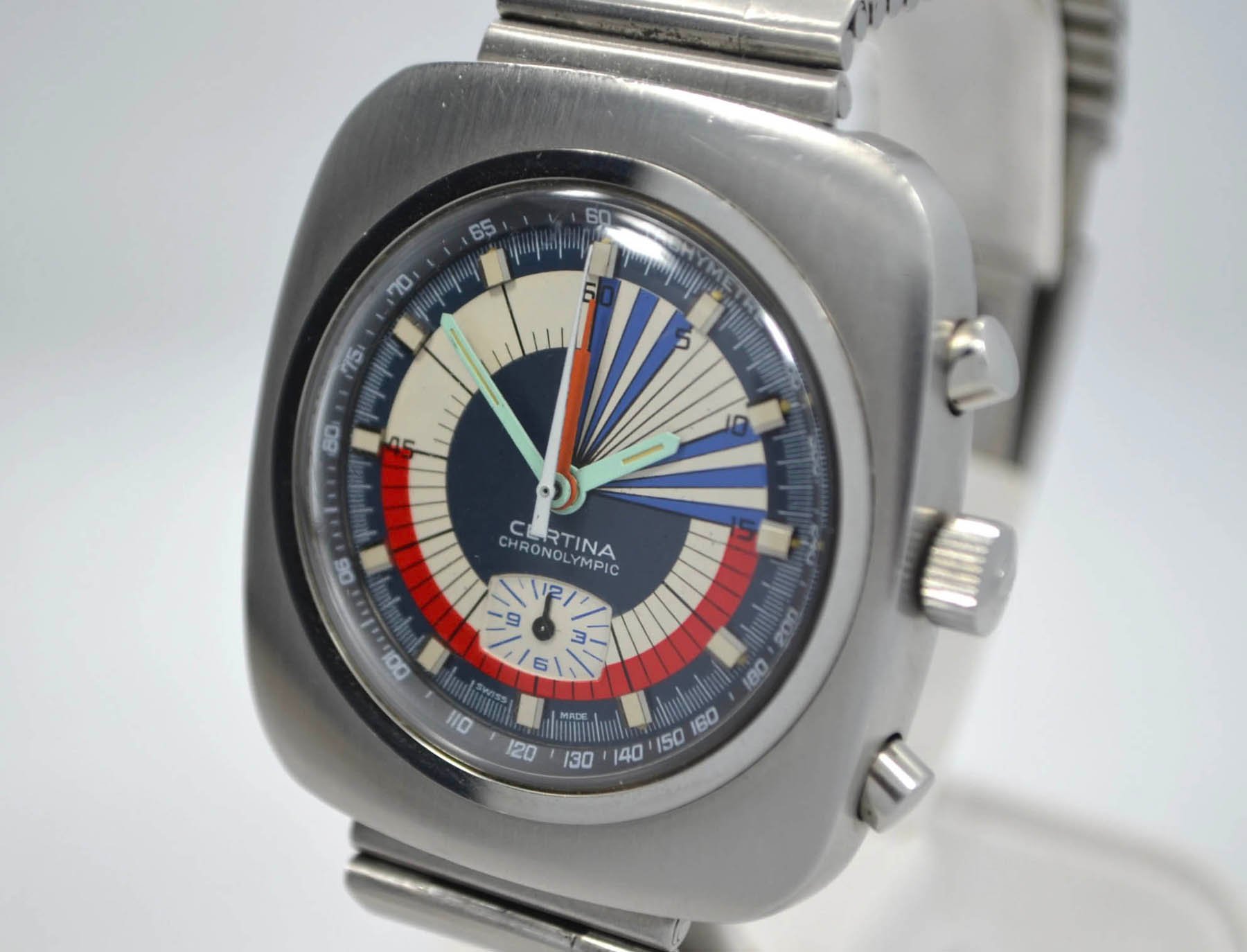
Image source: Hashtag Watch Company
Certina Chronolympic Regatta
This dial could sit in whatever case you choose. You would still find yourself staring at it for a while anyway. Struggling to find the hands? Well, you are not alone. But do you mind? I don’t know about you, but I don’t care. While typical Regatta chronographs played with circular subdials, Certina opted for concentric sandwich hands. Using a white central hand for counting seconds and a central orange hand for counting minutes created a bigger playground for the dial designer. And he went pretty loose. The set of thin and extra long contrasting triangles and the red 30-minute arc is epic. As circus-like as it looks, with a Valjoux 728 inside it, is a pretty serious, solid, and reliable tool.
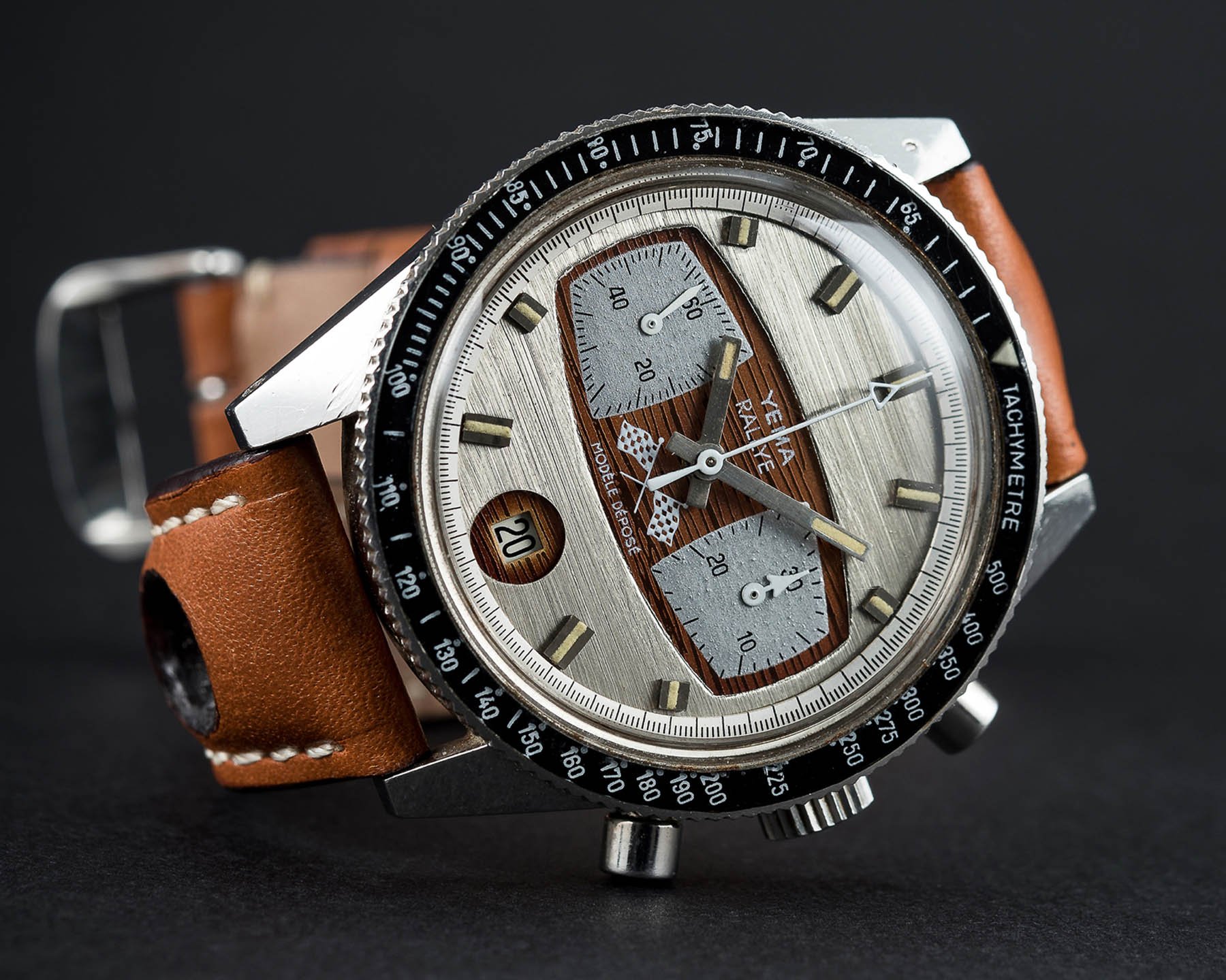
Image source: Watches of Knightsbridge Auctioneers
Striking Yema Rallygraf Super Formica
The Rallygraf Super Formica by French Yema is one hell of a chronograph. Not only did Yema change the shapes of the sub-registers, but the designers also connected them together into one consistent element that creates an original and visually separate layer. The combination of the bright horizontally brushed dial and the wooden background structure looking up from under the unusual cut-out shape is mesmerizing. It really feels like you are sitting in a classic car with a wooden instrument panel. These shapes are used too infrequently on modern watches and that’s a shame.
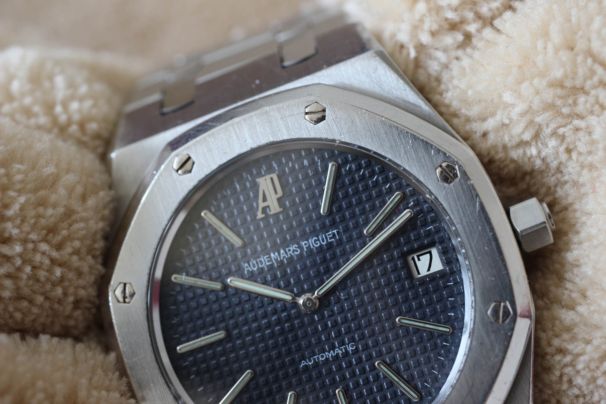
Audemars Piguet Royal Oak 5402
Due to the higher price tags, AP watches often stays off the radar. They are the victims of an, “I am not interested if I can’t afford it” attitude. Some say the Royal Oak is no big deal. Well, I bet they just ran through the pictures and never actually held the watch. I too was not particularly excited about AP until my friend’s vintage Royal Oak 5402 ended up in my hands. The “Tapisserie” dial in the picture and live are two different things. A picture degenerates it to look like a basic pattern, but the reality is it’s a few square centimeters of pure art and craftsmanship. Watch this video to get into the mood.
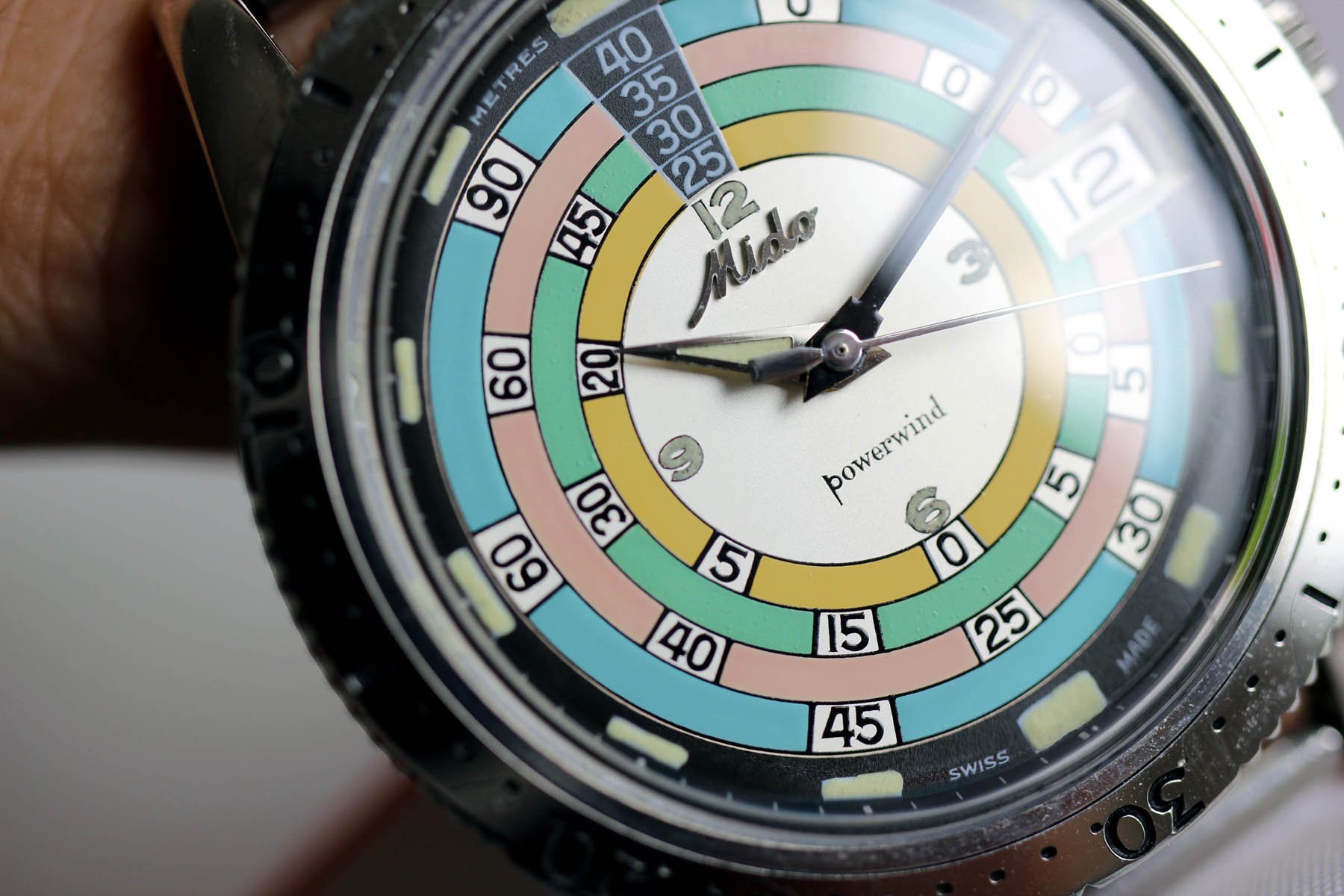
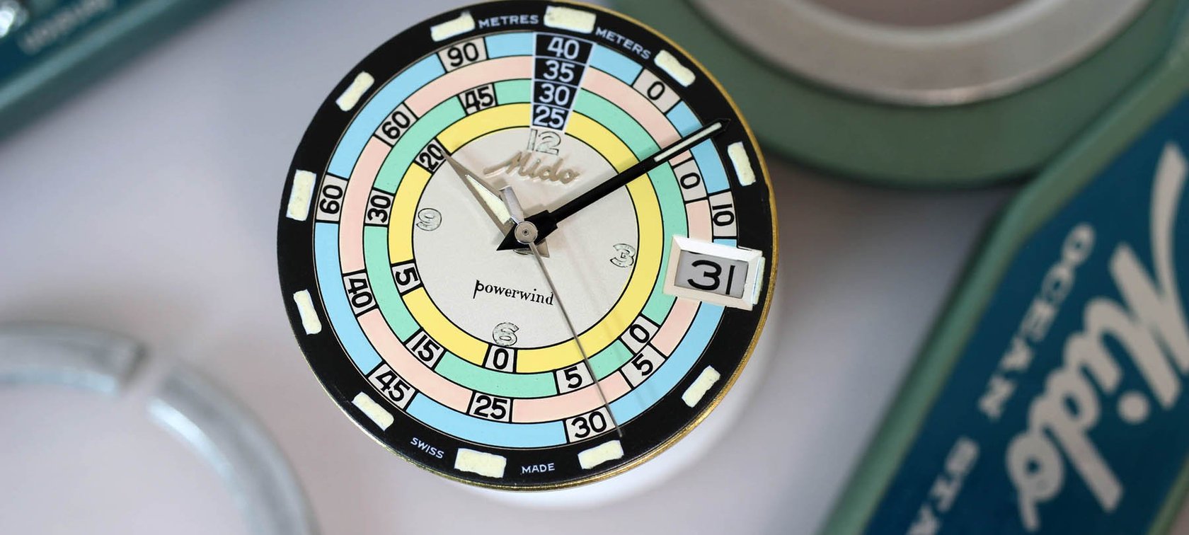
Mido “Rainbow” Dive Watch Ref. 5907
You have hundreds of all-black divers watches and then one colorful one to challenge them all. It was 1961 when Mido introduced the Ocean Star ref. 5907. When I reviewed it here, I wrote that “There is no adjective good enough to describe the beauty of the dial.” I stand behind that statement.
The novelty of the pastel colors, the oddity of the decompression scale, the elegant “powerwind” typeface, the robust date window — all these details should be in contrast with one another, but somehow together they form a delicate harmony cementing the “Rainbow” as an iconic piece.
Somehow, all of that fits in a pretty standard monocoque case. With multiple elements at play and thanks to the vivid colors, it is a dial that immediately showcases any imperfections, so getting your hands on a pristine piece is crucial. A rare feat, but definitely worth the hunt!
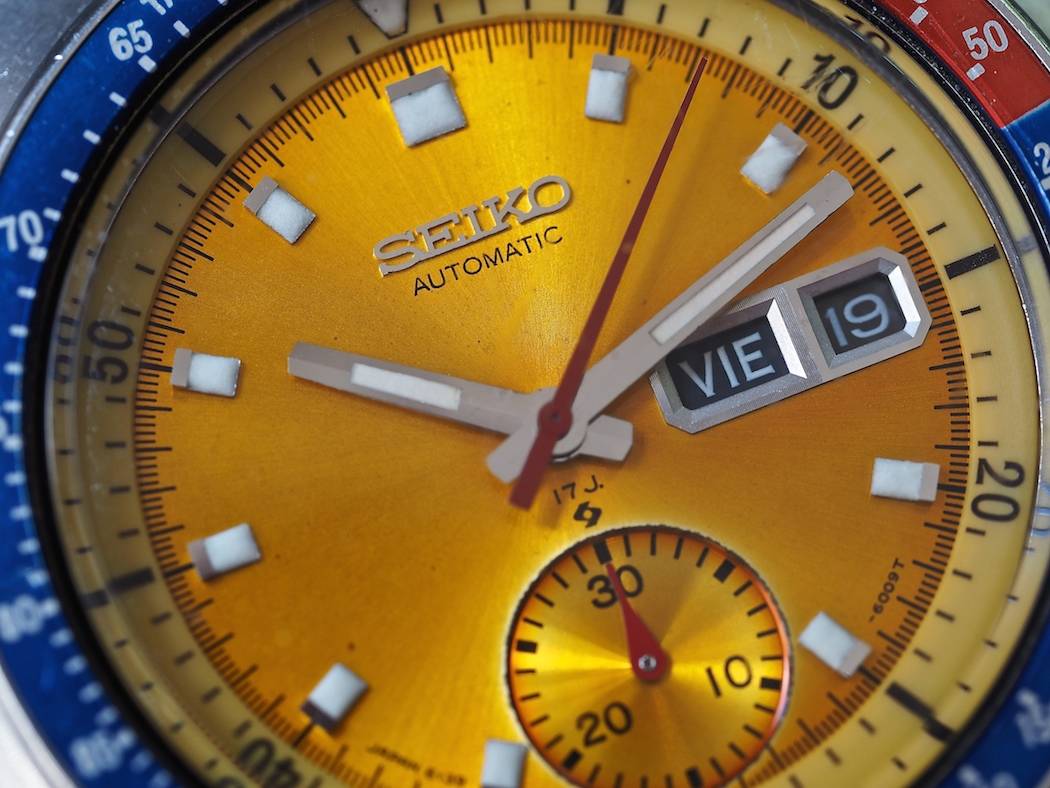
A look at the Seiko 6139 Pogue close up shows details such as the applied logo and the Suwa symbol
Striking Seiko 6139-6002 “Pogue” Chronograph
When looking at the dial of this chronograph, I am in no way surprised that Colonel William Pogue essentially smuggled it into space on his 1973 Skylab 4 mission. Few dials make one feel as if they are staring at a warm and caressing sun, but that is something the “Pogue” truly accomplishes. I can just see Pogue glancing down at his wrist as it catches a stray ray of light and pierces through the pitch black of space like a laser beam.
But let’s not get carried away. The shimmering dial is disrupted beautifully by the ceramic-like hour markers and the black and white date window. In any other colorway, the design would most likely come off as boring in its simplicity, but at the end of the day it is was foremostly a tool watch. Although many would argue that the watch doesn’t work to its iconic extent without the Pepsi bezel, I’d happily drop it. The golden dial is what does it for me.
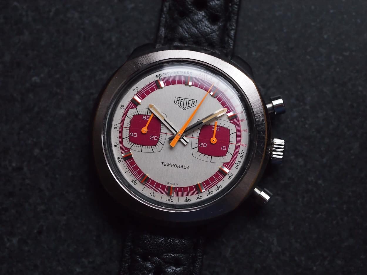
Heuer Temporada Chronograph
Although the dials came in various color combinations that weren’t always pleasing (to put it diplomatically), this red-orange-cream variation from Mike’s collection truly ticks all the striking boxes. The metallic lume hands match the applied and robust markers perfectly, giving the dial a robust edge. The red maroon and cream combination is both elegant and disturbing, a perfect embodiment of the racing spirit for me. It is very striking in comparison to the classic Heuer line-up. The neon orange chronograph hands seals the deal. A true ’70s design gem that does passionate justice to the Temporada Formula races held in Buenos Aires, Argentina during the late 1940s through the early 1950s.
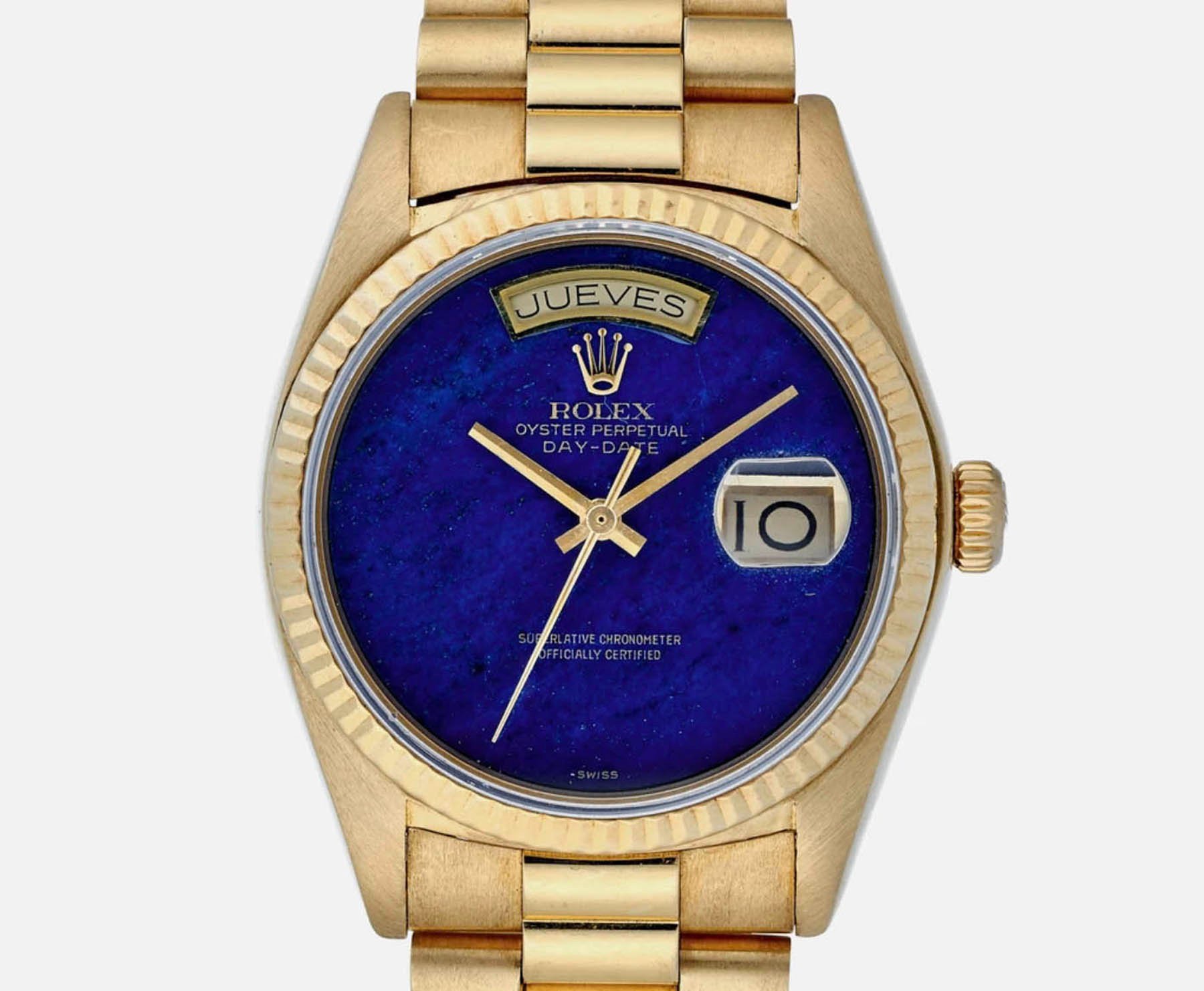
Image source: Hodinkee
Striking Rolex Day-Date 18030 With Lapis Lazuli Dial
With all the GMT masters and Submariners burnt into your eyes, this “no dial” (excuse my French) design really strikes above all other Rolex dials I know. No hour markers and a dial made of a rare semi-precious stone. While the Day-Date is one of Rolex’s staple collection models, this particular version that sheds almost all of the dial elements in favor of a deep ultramarine lapis lazuli stone is really something.
Leaving “only” the day window at 12, the Rolex brand inscription, and the date cyclops at there o’clock behind, the dial is more than enough to occupy the eye. It proves that sometimes less is more. Especially given the fact that the lapis lazuli stone is known to take on almost purple and golden hues when exposed to direct sunlight. Would I buy it? No, because I need hour indexes to feel good. Funnily enough, I consider this more striking than any number of jewels somebody puts on a Rolex watch.
Feel free to share your favorite striking vintage watch dials with us in the comments below.