Value In Vintage: A Longines Admiral Watch From The 1970s

Longines has produced a massive variety of designs over its illustrious history. Today, we’re looking at a vintage watch from the brand that reflects the bold designs of the 1970s.
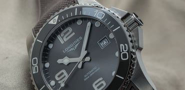
One of the standout features of this year’s Watches and Wonders was the fact that many companies sought to offer bold, stand-out designs. Yes, there was a clear trend of refinement on existing model lines (I’m looking at you, Tudor), but brands also committed to pushing the envelope on aesthetics.
A palette cleanser in an era of 1950s-esque designs
However, one need only look at the 1970s as a decade of watch design to see, perhaps, the greatest examples of existing designs being thrown out the window in favor of new approaches. The 1950s and 1960s saw watch brands attempt to push the technical limits of their craft to match the requirements and spirit of an age of technological advancement and scientific exploration. These decades were the era of space exploration kicking off, of deep-sea submarines, and the growing popularity of scuba diving.
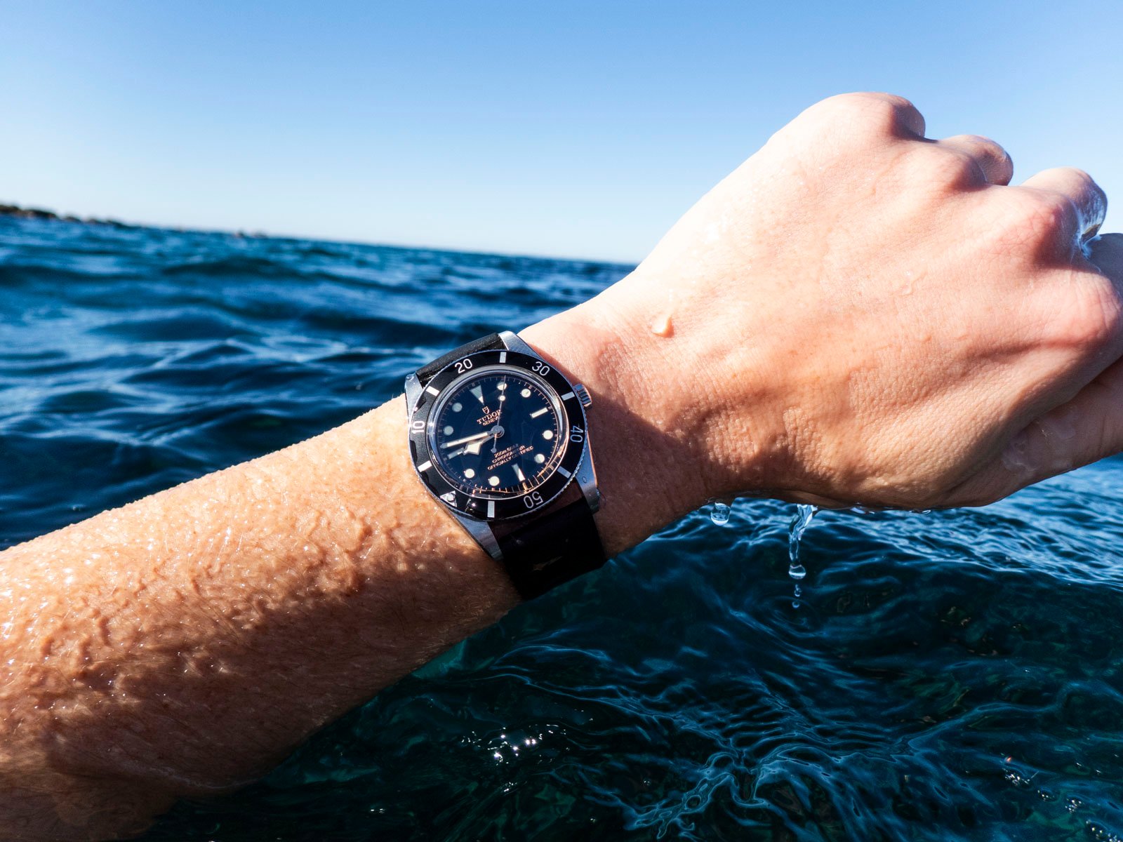
In those two decades, we saw many of what we could consider the ‘classic’ designs take hold. One of these includes the Rolex Submariner, arguably the most recognizable watch design ever. Then, in the mid-2010s, we saw brands double down on many of these mid-century classic design approaches. One of the most successful efforts in that direction was the Tudor Black Bay, which essentially single-handedly brought Tudor back into the mainstream. Now I am as much a fan of vintage aesthetics as anyone. But the emphasis on 1950s and 1960s design in brand reissues has been pretty heavy lately. This makes sense as there is something relatively ‘safe’ about brands releasing watches with these ‘classic’ design cues. However, when we look to the 1970s, some brands threw those classic design approaches out the window and went for something completely new and bold.
A quick caveat on what we mean when we say “1970s design”
This doesn’t fit neatly into 1970-1979; in fact, some brands were already experimenting with what I would call departure designs in the late 1960s, but for the sake of simplicity, I am calling this a 1970s design trend for the sake of this feature. I will note, however, that this design we are looking at today probably started in 1968-1969. With that caveat out of the way, let’s dive in.
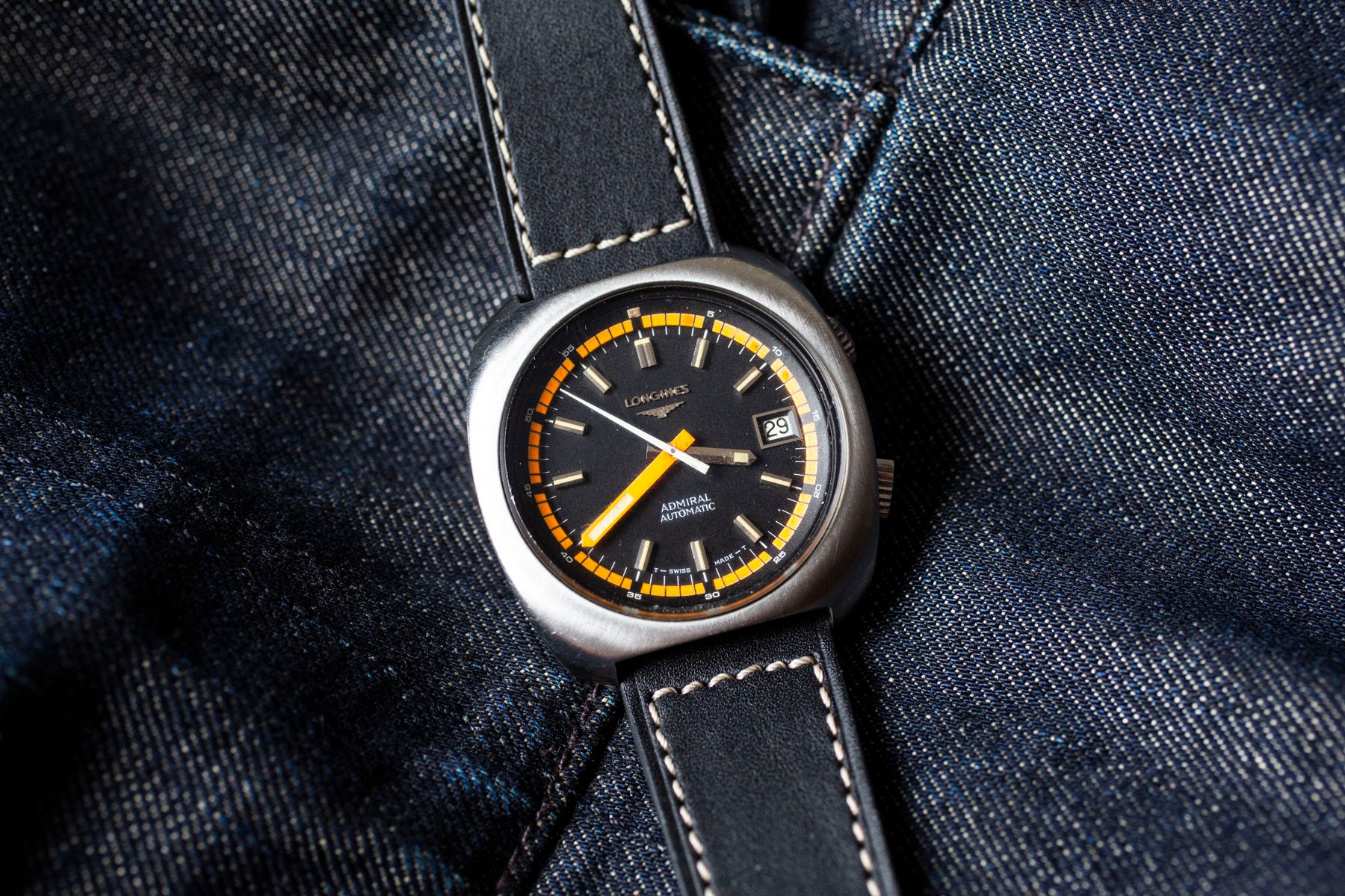
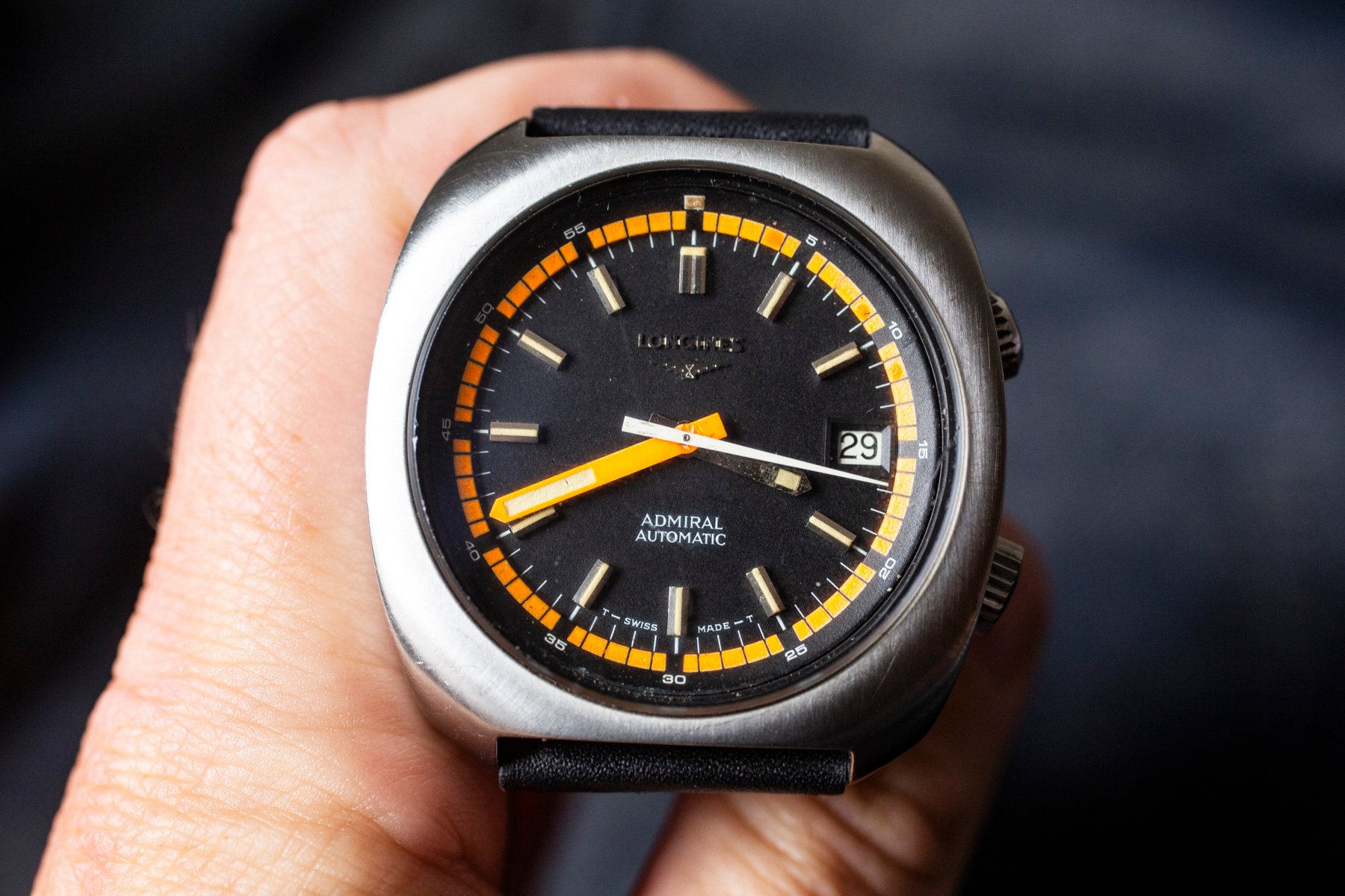
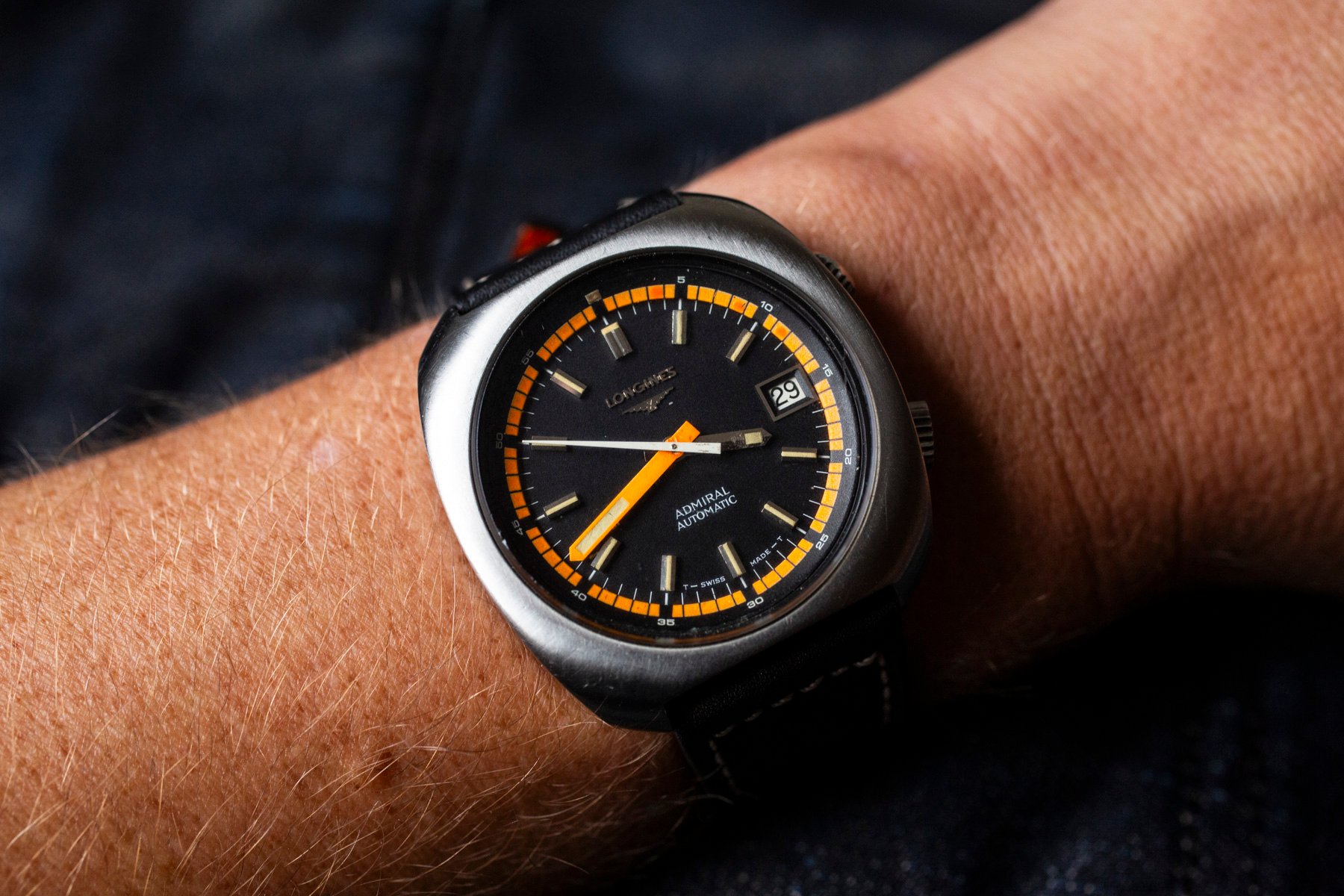
One brand that leaned into this original design trend was Longines. The watch we are looking at today comes from the Admiral product line. As my colleague Jorg noted in this feature, the Longines Admiral line of watches was introduced in the late 1950s and was in production until the 1970s. It mainly consisted of classically styled watches, but we saw a clear departure from the Calatrava-like designs when the 1970s hit. In the example we’re looking at today, we can see an almost-square case with a thick bezel. The dial almost peeks through from the middle of this bold case design. It reminds me of a ship’s porthole, with a subtle hint of brutalism.
Wonderful features set this Longines watch apart from the crowd
The watch has a twin-crown design, with one crown operating the inner rotating bezel, another acting as the time-setter, and the ability to manually wind the automatic caliber inside. Speaking of the caliber, we have a Longines caliber 6652, which means this watch likely dates from 1972 or 1973. It’s not one of the high-beat Longines calibers that were also featured in these super-compressor-style designs at the time. It features a date complication at 3 o’clock and beats at 28,800 bh/p.


There isn’t much information online about this particular watch, which seems to feature many of the design cues of a similarly styled Ultra-Chron. In fact, there are a couple of very similarly styled Ultra-Chrons on Longines’ website. The case is (an enormous one for the time) 43mm. The lug width is a modern 22mm. Unlike other examples online, it’s simple and plainly adorned. In this post online, we can see one that has been sold and features an image of the caliber inside, as well as an extract from Longines.
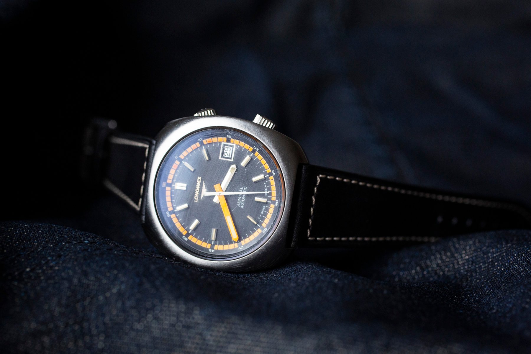
A handsome dial on this Longines watch
The brass dial features a beautiful bright orange minute hand, and a stark white seconds hand with a smaller brass hour hand. This design emphasizes legibility. An orange railroad minute track around the dial’s edge is another beautiful touch, and showcases the confident playfulness designers had in this era. This forms part of the internal rotating bezel, with a second railroad minute track in white markers on the inside of the dial. The luminescent material has aged to extinction, and a gorgeous tan color remains. The Longines branding has faded, but remains with the lovely hourglass logo beneath the 12 o’clock marker. Above the six o’clock marker, we see “Admiral” and “Automatic.” We can see some of these design cues in the modern re-issue of the Longines Ultra-Chron, pictured below.
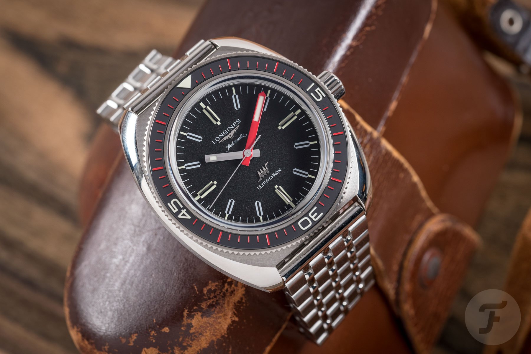
The dial is a masterclass in bold, creative, and playful design. Everything is appropriately sized and creates a wonderful symmetry. The use of orange enhances legibility while also being fun and handsome to look at. In the modern Ultra-Chron release by Longines, we see some similarities in case design. However, one of the best things about buying a vintage Longines watch is the abundance of relative bargains.
Concluding thoughts
This particular example I am showcasing today is my father’s watch. He has had this watch serviced and pressure tested, and taken it swimming in the ocean. Unlike modern watches with decent water-resistant ratings, I am usually pretty circumspect about taking a vintage watch in the sea. Like Jason Heaton, my father seems to have no qualms as long as it has passed a pressure test. More power to them! A quick search on platforms like Chrono24 reveals many interesting 1970s options from Longines. The brand was on fire before the quartz crisis really hit.
With this in mind, I might have to pick up my own quirky 1970s Longines. The only question is, what one? But what do you think, Fratelli, are there any designs from the 1970s that resonate with you? I look forward to reading your comments and suggestions.