Watch Pet Peeves: Brandon’s Top 3 Deal-Breaking Designs — Examples From Corum, Grand Seiko, And Rolex

Have you ever seen a watch online that you absolutely loved, only to then notice the “big mole” on its face? Or worse, have you ever bought one based on doctored photos, only to find it incredibly disappointing in real life? I’ve found myself in both situations, and man, what a letdown it can be! Especially when considering dropping significant cash on a watch, it’s best to anticipate and avoid these conundrums upfront. That’s why I’m here today to share with you, the Fratelli, my top three watch pet peeves of all time. These are the top three deal-breaking design elements for me. And no, not even the venerable Grand Seiko gets a pass!
In my opinion, these design choices are flaws, but they have helped me trust my gut and ultimately saved me money. While these pet peeves are highly personal, I hope they illustrate the importance of being honest with yourself about deal-breaking designs. I also hope that this article encourages you to get out there and try before you buy, as Photoshop and stock renderings are not always your friends! So, without further ado, let’s address my pet peeves and the top three offenders from Corum, Grand Seiko, and Rolex!
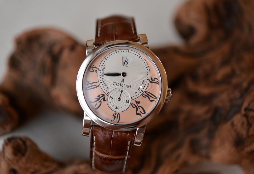
Image source: Collection Shiba
Watch pet peeves: Pointless jumping-hour displays
I’ll start off with a bit of a peculiar one that speaks to my love of complications. For years now, I have wanted a jumping-hour watch. I find such a geeky charm in seeing the digital hour disc click over! It’s as satisfying as seeing a Rolex date change precisely at midnight, but I can actually be awake to watch it happen every hour. And while I now have my sights on a retrograde-minutes/jumping-hour combo, this Corum Classic Jumping Hour Limited Edition crossed my path years ago. At first, I loved pretty much everything about it from the two-tone dial and crazy numerals to the gimmicky swiveling lugs. I even considered buying it as my one jumping-hour watch until I realized that doing so would defeat the purpose altogether. I wouldn’t even be able to see the jumping hour jump!
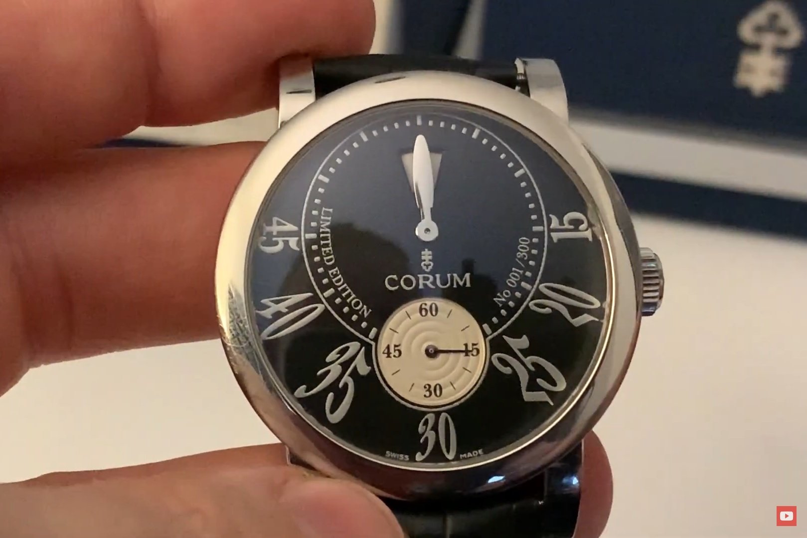
Image source: Click Spring
The position of the hour window combined with the fat minute hand completely obscures the jumping action from view. To me, this is an utter waste of such a charming complication. I find absolutely no joy in a jumping-hour watch executed like this. Unlike a date window, which serves a mostly practical function, I dare to say that the jumping hour serves more of a decorative one. Yes, it allows you to read the hour at a glance, but shouldn’t you also be able to enjoy the action that gives the complication life? I have talked to folks who find this Corum jumping-hour display charming. Unlike me, they seem to like the sense of “mystery” behind it. But like all of these pet peeves, this one reflects my personal taste, and thankfully, there are watch designers out there who agree with me.

A jumping-hour watch done right
In this video, Karl-Friedrich Scheufele, co-president of Chopard, elaborates on the design of the Chopard L.U.C Quattro Spirit 25:
“One detail I need to mention also is the position of the window because at first, the team showed me the position at 12. I said, ‘Look, the hand inevitably hides the perfect moment because the hand would be at 12, and the hour would jump and you wouldn’t even see it!’ So, I sent them back to the drawing board and said, ‘We need to have this window at 6 o’clock.”
I can’t applaud this decision enough, and it’s one of the many reasons that I love Chopard. If I’m ever able to afford the flippin’-awesome Quattro Spirit 25, I’d have no qualms about adding it to my collection. But this watch and examples from Gérald Genta, Chronoswiss, and DeWitt, among others, help hammer my point home. There are plenty of ways to make a legible jumping-hour display. If you’re going to do it, do it right, or don’t do it at all.
Watch pet peeves: “Sunburst” dials that don’t burst in the sun
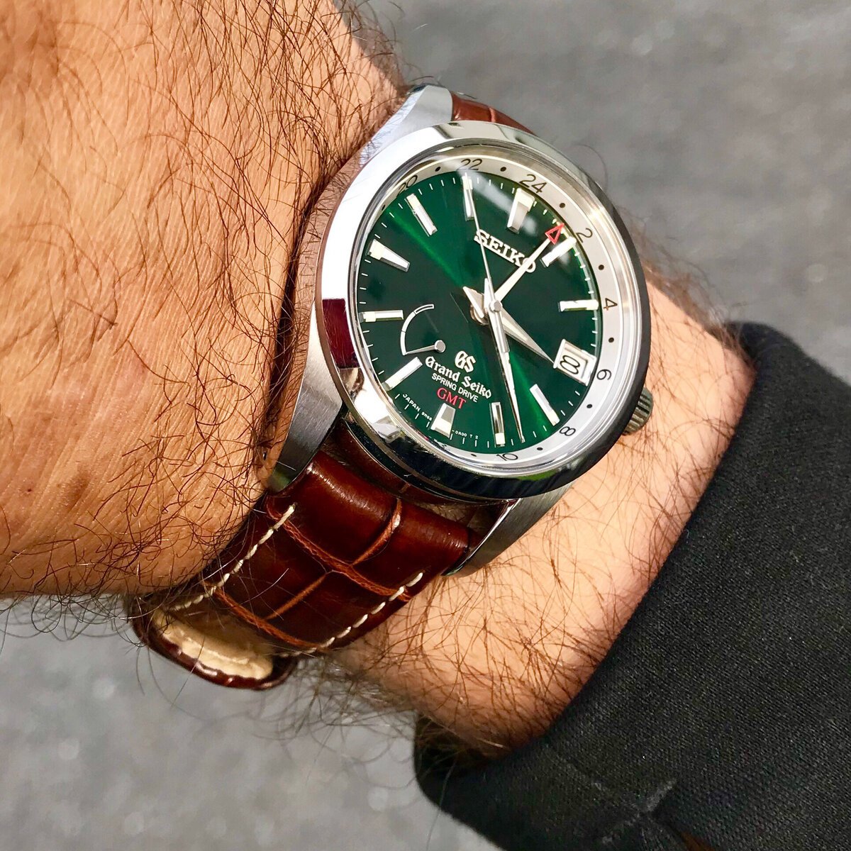
The above photo is a lie. I know because I took it. I took it of my own watch and then doctored it to death. Or should that be “life”? Do you see the “sunburst” green dial of this Grand Seiko SBGE033? Yeah… it hardly ever really looked like that. I just wanted it to look that way so badly that I amped up the color, saturation, and contrast until I couldn’t anymore. You see, I spent over two years tracking down this watch merely based on pictures that I had found on the internet. Many of the photos showed the dial in a similar way with a beautiful, verdant forest green popping through. I’m a huge fan of green and in-your-face dials, so I thought this watch could be the perfect keeper for me. Oh, how wrong, how dreadfully wrong I was.
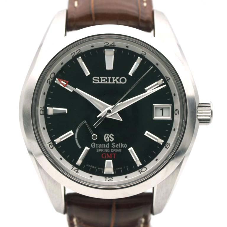
Image source: Rakuten/Rich Time
This is what the watch actually looked like. And yes, I know because I bought this very example. I was convinced that the photos in the listing were just bad. There was no way that a dial by Grand Seiko could look this bland… right? Wrong. The dial of my SBGE033 looked as dark as my soul in nearly all lighting conditions, even out in the sun! You call this “sunburst”? More like “0.672%-of-indoor-fluorescent-lighting-burst”. But that doesn’t sound as good.
Learning a valuable lesson
To be honest, this watch disappointed me only a few days into the honeymoon period. Nevertheless, I spent over three years trying to love it anyway. I don’t have any original undoctored photos of it because I was too busy lying to myself (and my Instagram followers) to save them. Eventually, I sold this piece and learned an important lesson about my tastes and pet peeves.
I should never merely trust photos of watches online. Chances are, they’ve been edited to make the watch look better (my photos are guilty as charged). If possible, I should try to check the watch out for myself, and if I can’t, I should ask for the opinions of people who’ve seen it. If anyone says a sunburst dial “looks almost black” in whatever lighting, run away, Brandon. Run away fast! Some of you may like the subtlety that a dial like this provides. I don’t. Bring the color full force, or my money stays mine.
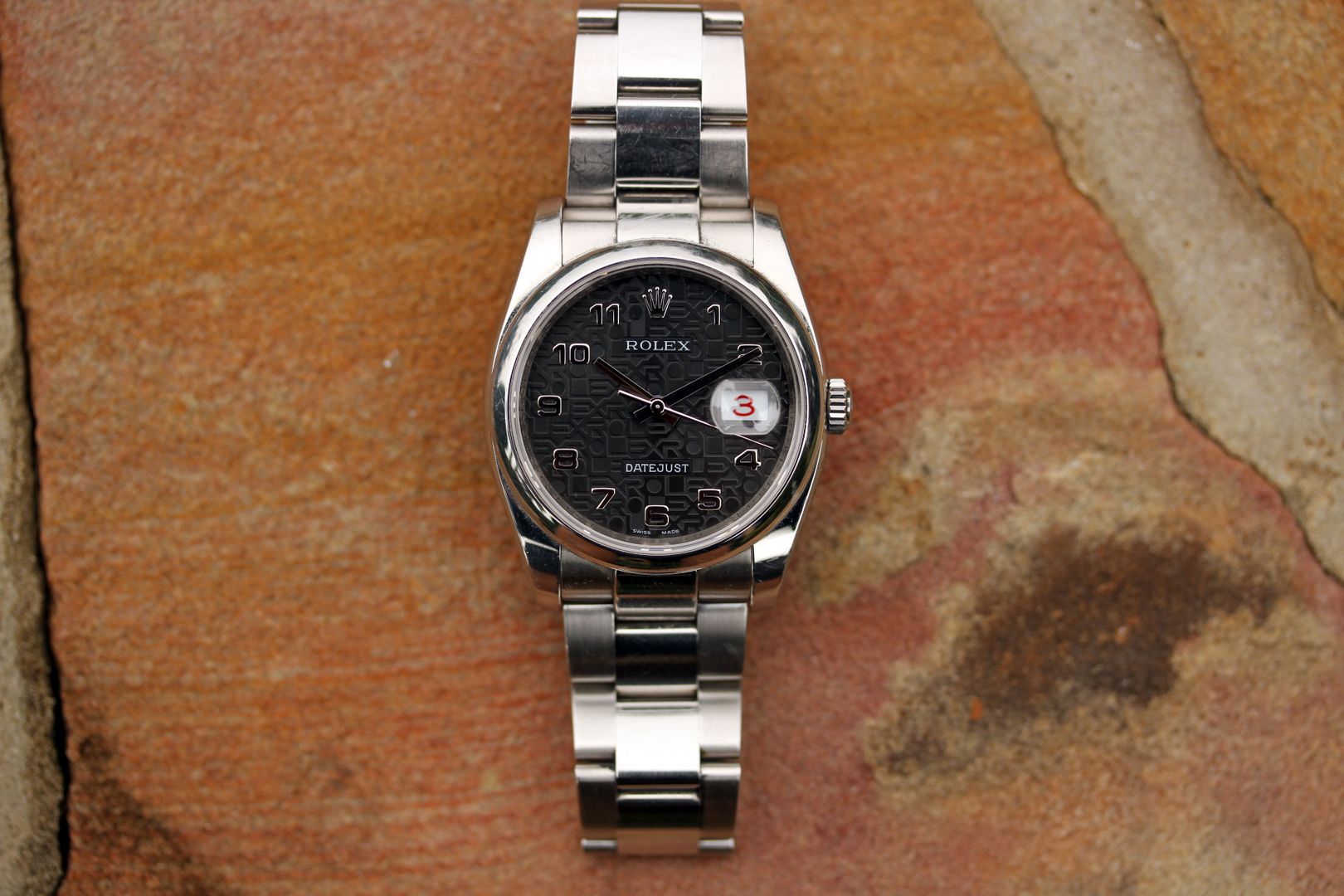
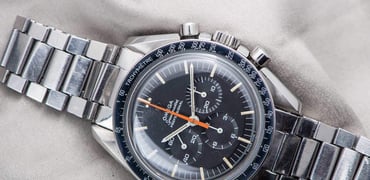
Image source: Watch Charts/Rolex Forums
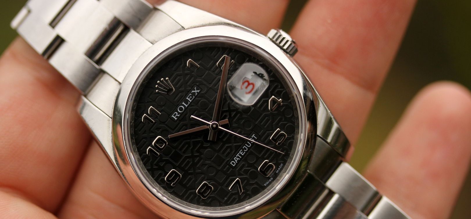
Watch pet peeves: Unlumed, polished hands and indices on dark dials
I will hand it to Grand Seiko for something else, though — excellent contrast between dials, indices, and hands. For Rolex, unfortunately, I can’t always say the same. Probably my number-one watch pet peeve of all time is when hands and indices disappear like Houdini. This often happens when the dial is a dark color (like black) and the hands and indices are polished with little or no lume. The Datejust above is a prime example. Unless you tilt it to reflect the light just so, the numerals, in essence, get completely blacked out. The hands are faceted, yes. But even as such, only one edge of them is visible in low light if you’re lucky. I can’t imagine the nincompoops who thought this was a good idea. “Let’s destroy legibility!” “Sure, I’m all for it!”
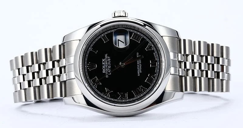
Image source: Bob’s Watches
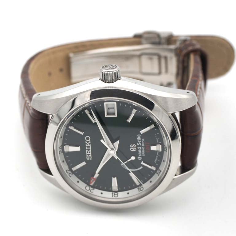
And this Datejust is even worse (sorry, Bob). When I visited the Seiko Museum in Tokyo, I read a placard that described the Grand Seiko design philosophy. It detailed how the brand never pairs black or dark dials with polished hands because doing so severely hinders readability. And if you scroll back up to the underwhelming listing photos of my SBGE033, you’ll notice that its brushed hands are at least perfectly legible. Since I discovered that aspect of Grand Seiko’s design language, I must say that it has ruined a lot of watches for me.
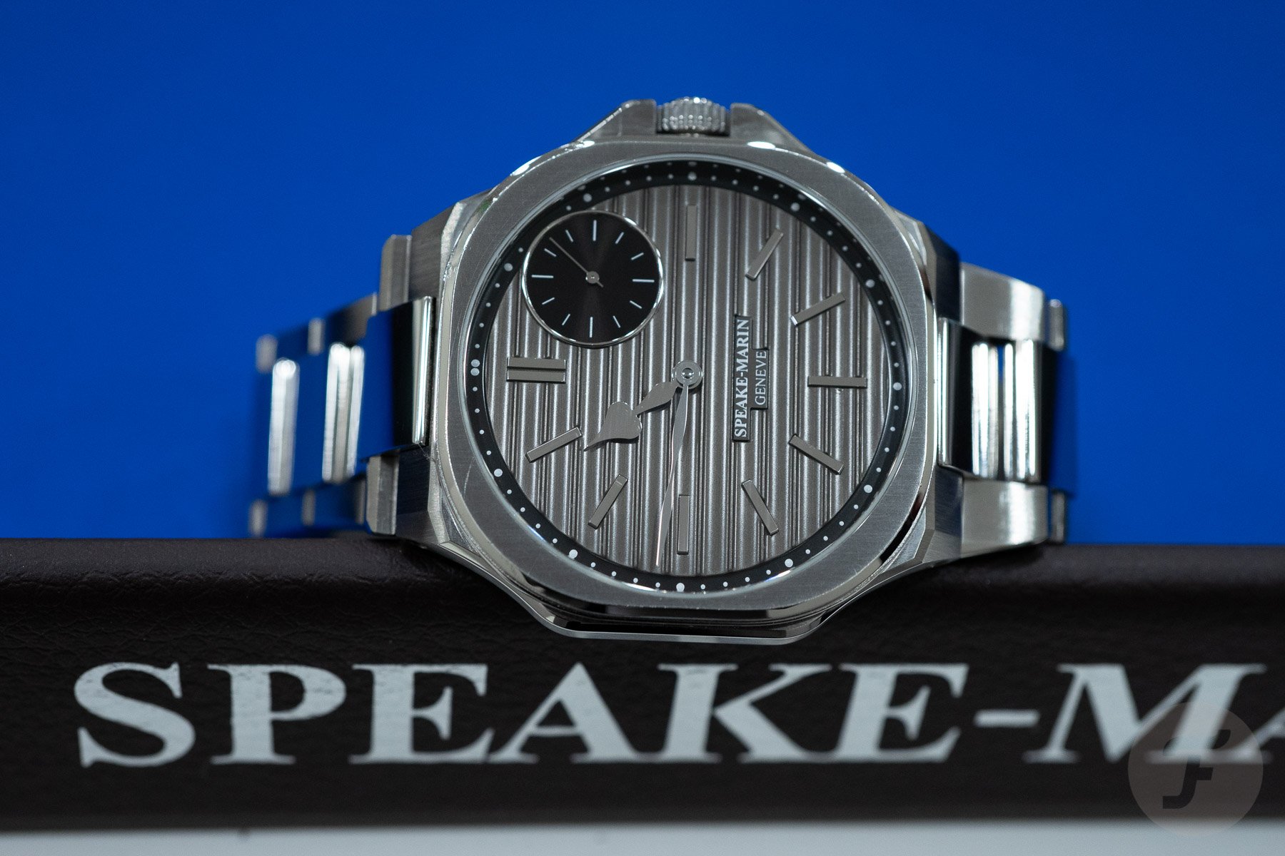
Alas, Rolex is not the only brand to make decisions like this. In fact, our own Ben Hodges sold his Omega Speedmaster First Omega In Space in part because its polished hands weren’t legible in low light. The Speake-Marin Ripples is another offender, and as Lex said, “the rhodium-plated, polished, heart-shaped ‘Big Ben’ hands more or less blend into the background of the dial.” Sorry (not sorry), but that just doesn’t fly.
Trust your tastes
I like complications to be enjoyable, sunburst colors to burst, and hands and indices to contrast well with the dial. Is that too much to ask? No, I don’t think so. And while my pet peeves may not be deal-breakers for you, I’m sure that you must have a few of your own.
In the end, it’s important that we be honest with ourselves about what we like in watches and what we despise. When online photos of a particular watch tempt you, look for any aspects of the design that you might not enjoy. If you find some and have a chance to see the watch in person, I always recommend doing so before pulling the trigger. In the end, you may find that it’s not so bad after all, or you may discover that your gut feeling was right all along. And as I mentioned earlier, if you can’t go hands-on, at least try to find honest feedback from people who have. Hopefully, you’ll be a happier camper in the end.
What are your watch pet peeves? What design elements get your goat? Do let me know in the comments below! And if you’re interested in hearing our other editors call foul on watch designs, chime in about that too while you’re at it!
Featured image source: Watch Charts/Rolex Forums