Sunday Morning Showdown: Lorier Neptune Vs. Baltic Aquascaphe MK2
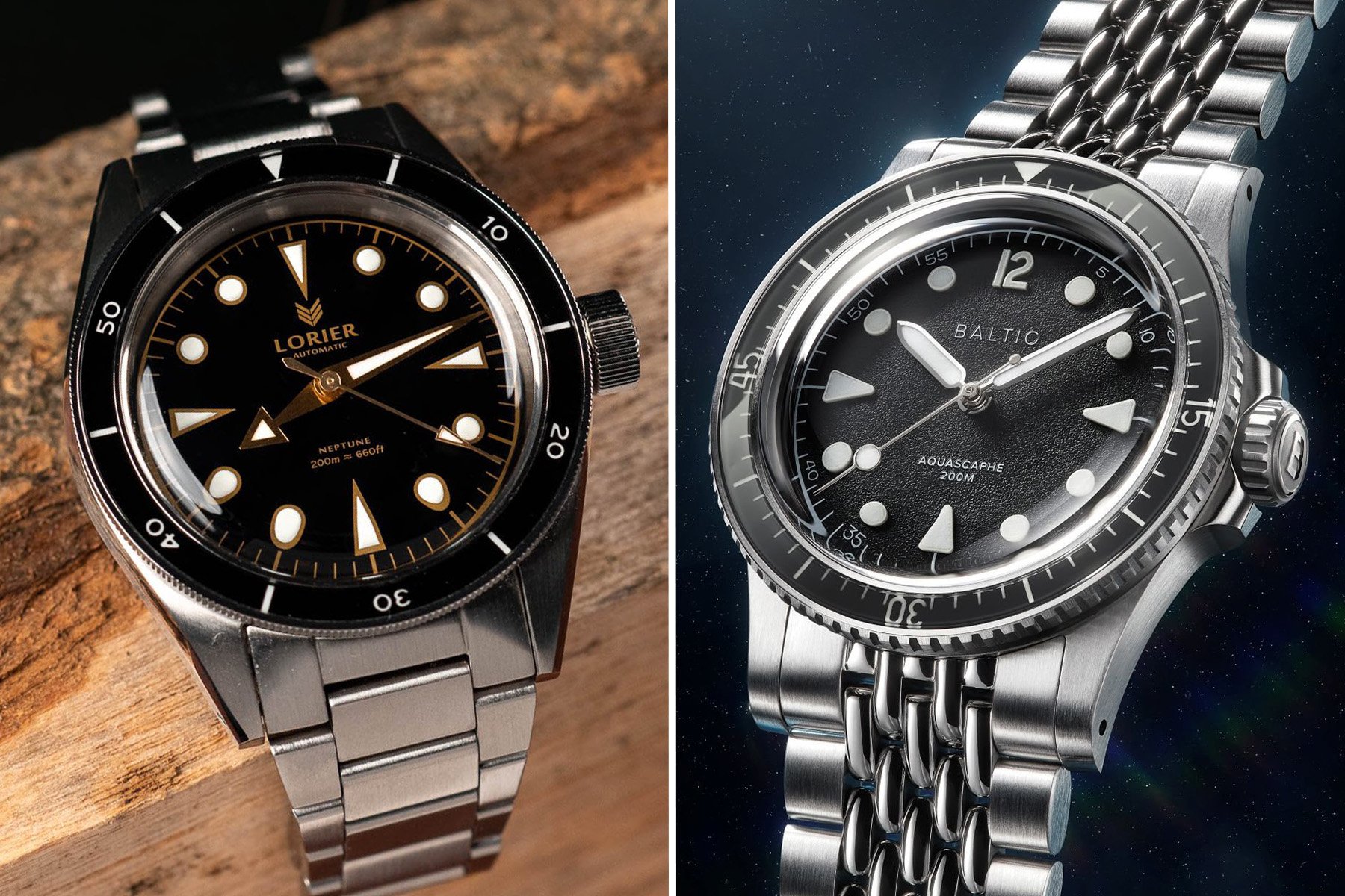
Welcome to another Sunday Morning Showdown! Daan and Thomas face off with two affordable vintage-inspired dive watches this time. Thomas defends the Lorier Neptune, while Daan represents the new Baltic Aquascaphe MK2.
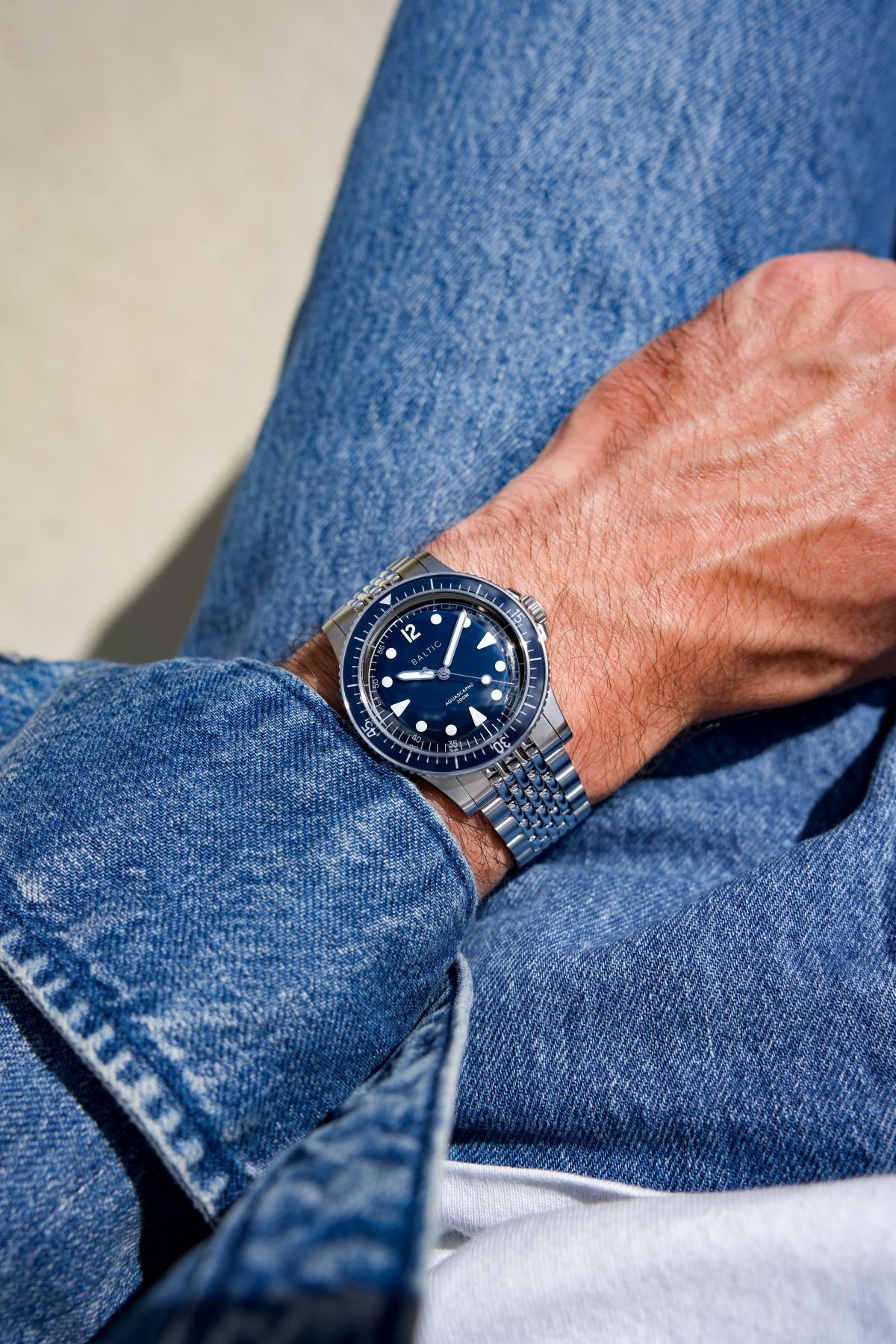
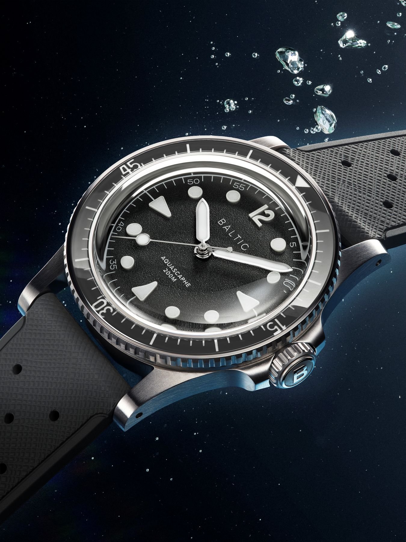
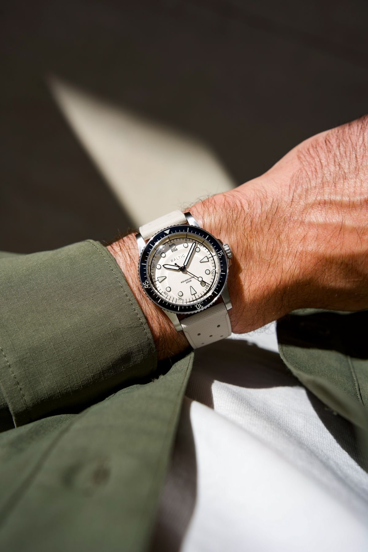
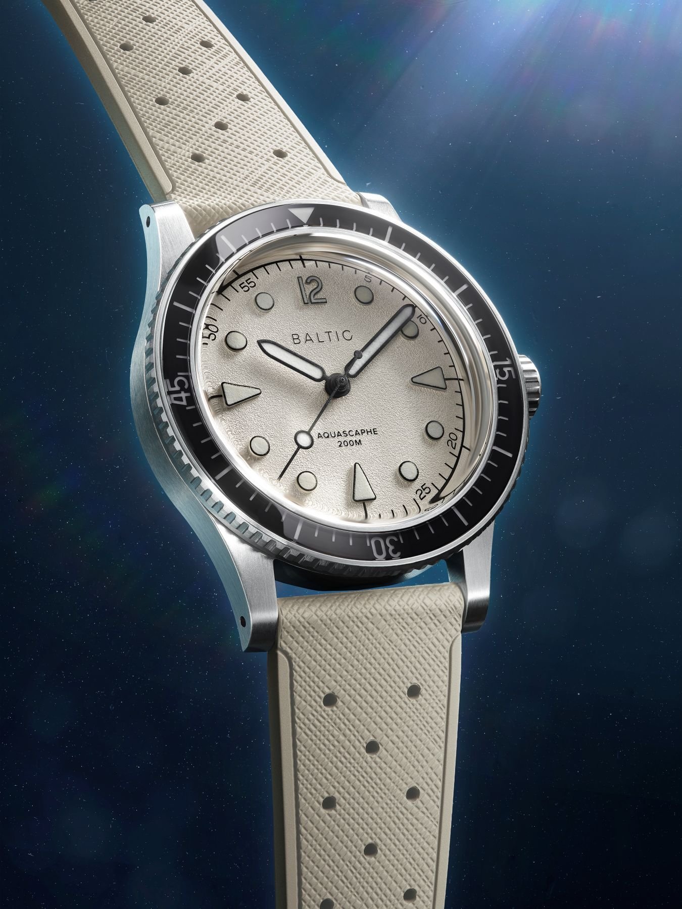
These contenders have the aesthetic of ’50s and ’60s dive watches and house modern Miyota movements in 39(.5)mm cases. The Lorier costs US$599, while the Baltic costs €840.95 on a steel bracelet. Let’s see how they stack up!
But first, last week’s showdown
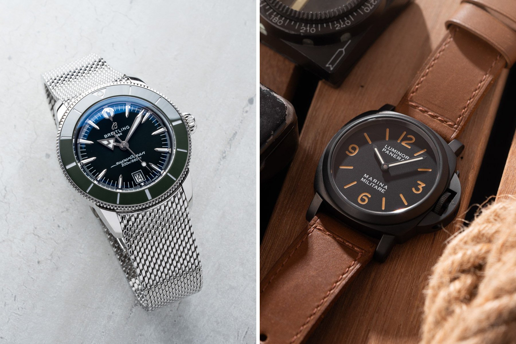
Before we let the boys loose, let’s take a quick look at last week’s results. Jorg and Mike pitted the Breitling Superocean Heritage B31 Automatic 42 against the Panerai Luminor Marina Militare PAM05218. Again, these were two retro divers but in a wholly different price segment than today’s combatants.
As it turns out, these two split the Fratello reader base right down the middle. At the time of writing, the scoreboard shows 50% of the votes for each.
The comments showed an appreciation and strong criticism for both watches. The Panerai was lauded for its simplicity and cleanliness but criticized for its mismatched lume. The Breitling got credit for its new caliber and caught flak for its generic aesthetic. It only goes to show that there are different strokes for different folks! Let’s see if today’s pairing results in a clear winner!
Thomas: Lorier Neptune
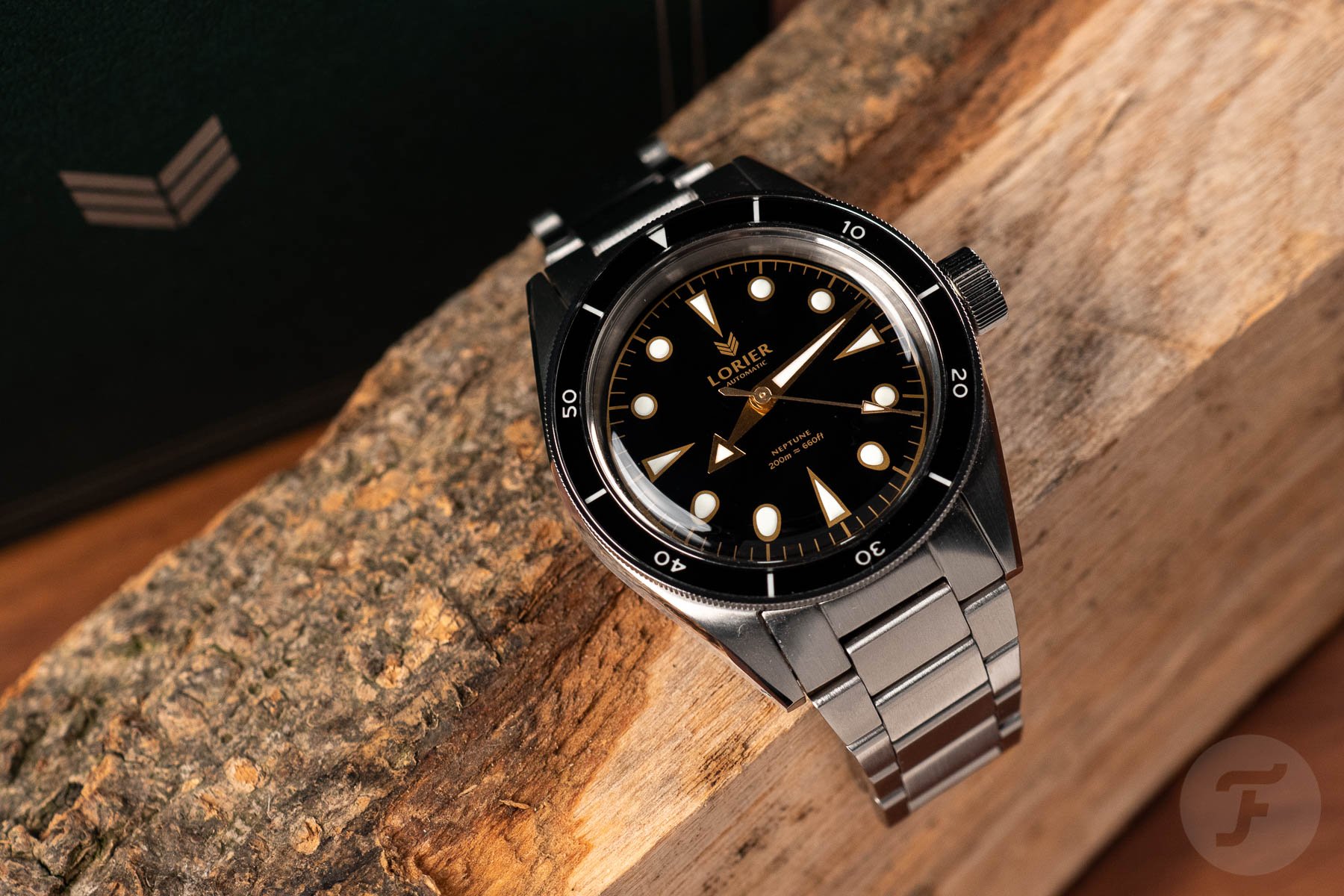
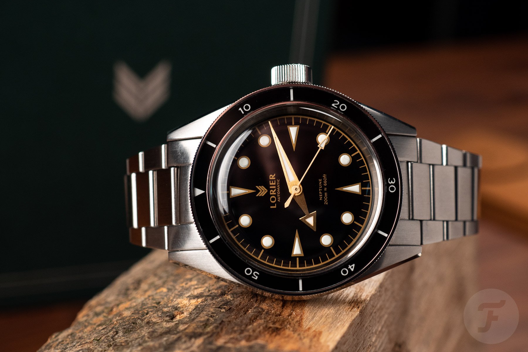
Good morning, Daan! And good morning, Fratelli! I hope you have a good cup of coffee and a croissant within reach. I am delighted that I have the chance to bring the Lorier Neptune to your attention once more and to defend it against its French counterpart. I have reviewed the Neptune before, and came away deeply charmed. I happen to know how hard it is to build a small watch brand, so I am happy to give one a little push today.
This is my first argument for the Lorier Neptune straight away. Both Lorier and Baltic started relatively recently as pure microbrands. Baltic, in the meantime, grew to become a significant player in its segment. While I applaud and admire the brand’s success, I cannot help but feel more strongly about Lorier. Lovely husband-and-wife team Lauren and Lorenzo’s business still feels like a more personal, passion-driven project.
Again, I am not hating on Baltic for breaking out of the micro scale. Still, I know where I would prefer to spend my hard-earned money, all other things equal. Speaking of money, the Lorier is notably cheaper for a technically nearly identical watch.
Lorier Neptune over Baltic Aquascaphe MK2
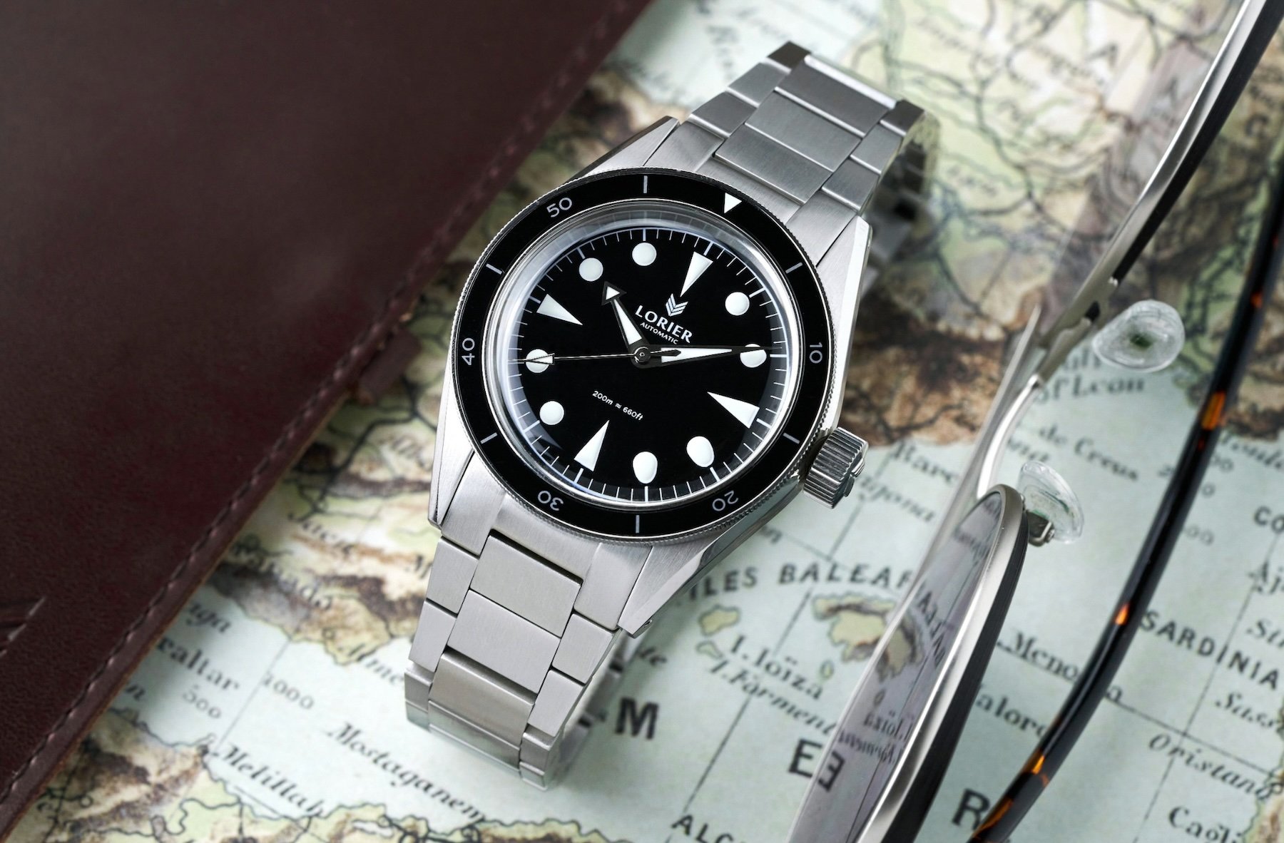
As it happens, all other things aren’t equal. The differences mainly reside in the design, as the specs of these watches are within spitting distance of each other. The similarities are striking; you can even get both on flat-link bracelets. Bonus points to Lorier for using a fully brushed one, if you ask me. The shiny outer links on the Baltic look a bit lost and overly blingy.
The most divisive specification is probably the crystals. The Baltic comes with a sapphire crystal. The Lorier Neptune, meanwhile, doubles down on the vintage vibes with a proper acrylic crystal. I know many of you will automatically prefer sapphire, but I think the acrylic should take the win. Why? It’s because these watches aim to offer the experience of a vintage dive watch on a budget that would hardly suffice to service a proper vintage one. If you want that vibe, go all the way! Get the acrylic.
The Neptune is prettier
Okay, I will probably catch some flak for stating my opinion as fact, but I believe the Lorier Neptune is objectively better looking. Hear me out. I think the Baltic Aquascaphe MK2 veered off track from the original. While the first one had a clear design based on 1950s divers, the MK2 added some anachronistic and clashing design elements. It somehow doesn’t really come together anymore, if I put it harshly.
The Lorier Neptune is the opposite. Yes, it clearly references original models by other manufacturers. It does so, however, with a very keen eye for detail as well as an overview of the whole. Lauren and Lorenzo also make no secret of their sources of inspiration, openly showcasing them on the product pages.
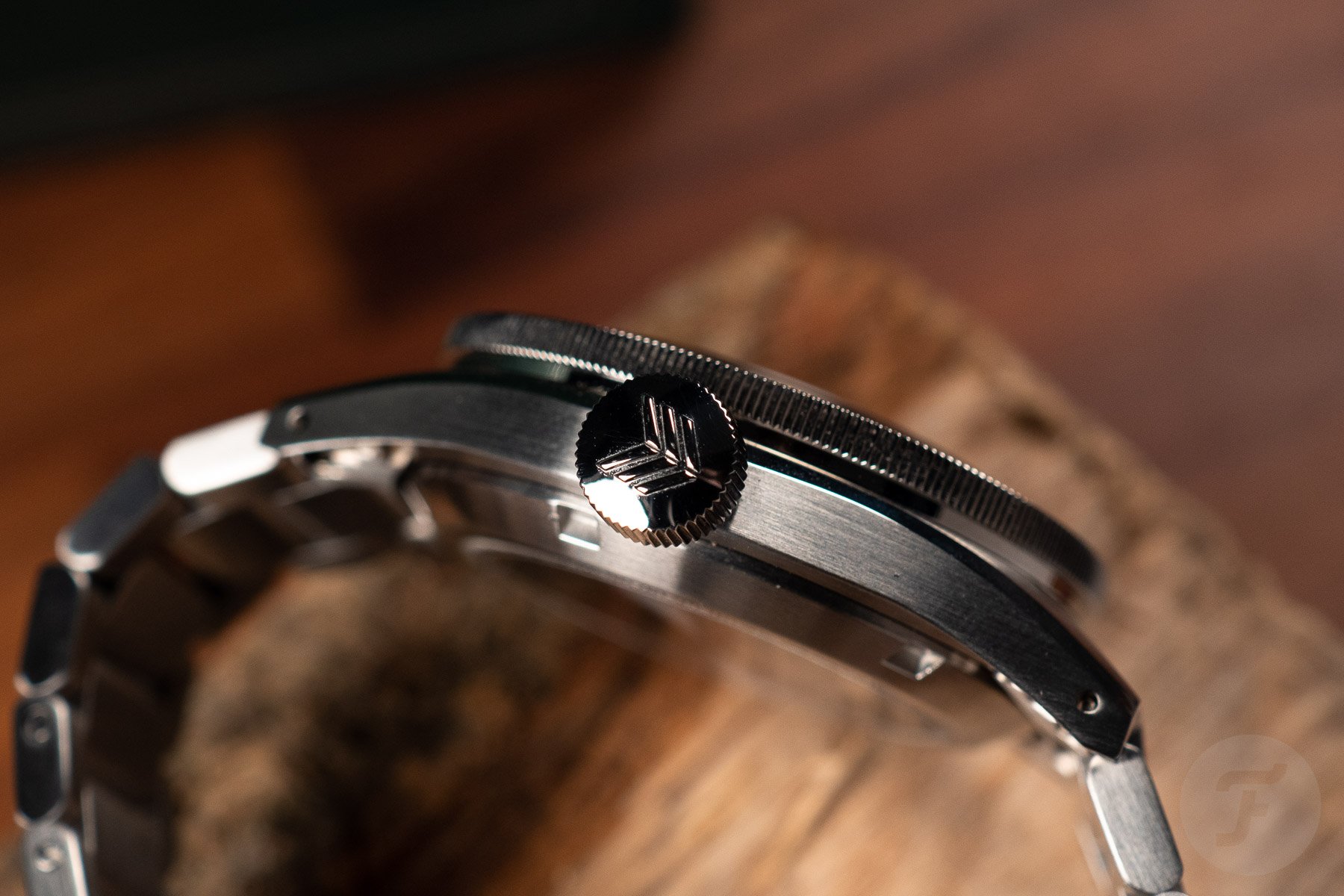
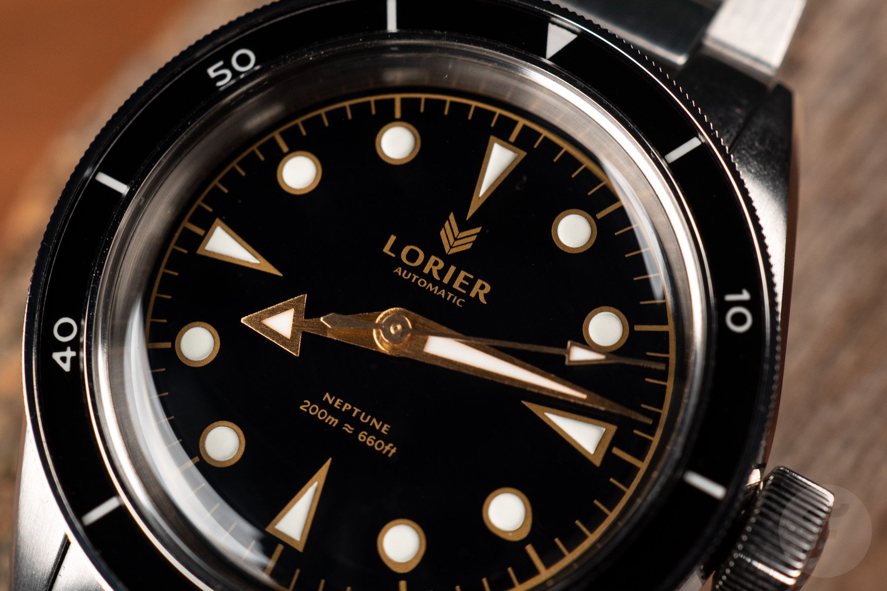
The Neptune feels more balanced. The narrow bezel looks right in place with the glossy dial, reminiscent of early gilt dials. Lorier fine-tuned the design over time, landing in a real sweet spot now. The slim mid-case, oversized crown, finely knurled bezel, and traditional dial layout really sing together. Even the flat-link bracelet looks more at home here than on the Baltic. Okay, let me leave it at that. Tell the good people why I am wrong, Daan!
Daan: Baltic Aquascaphe MkII
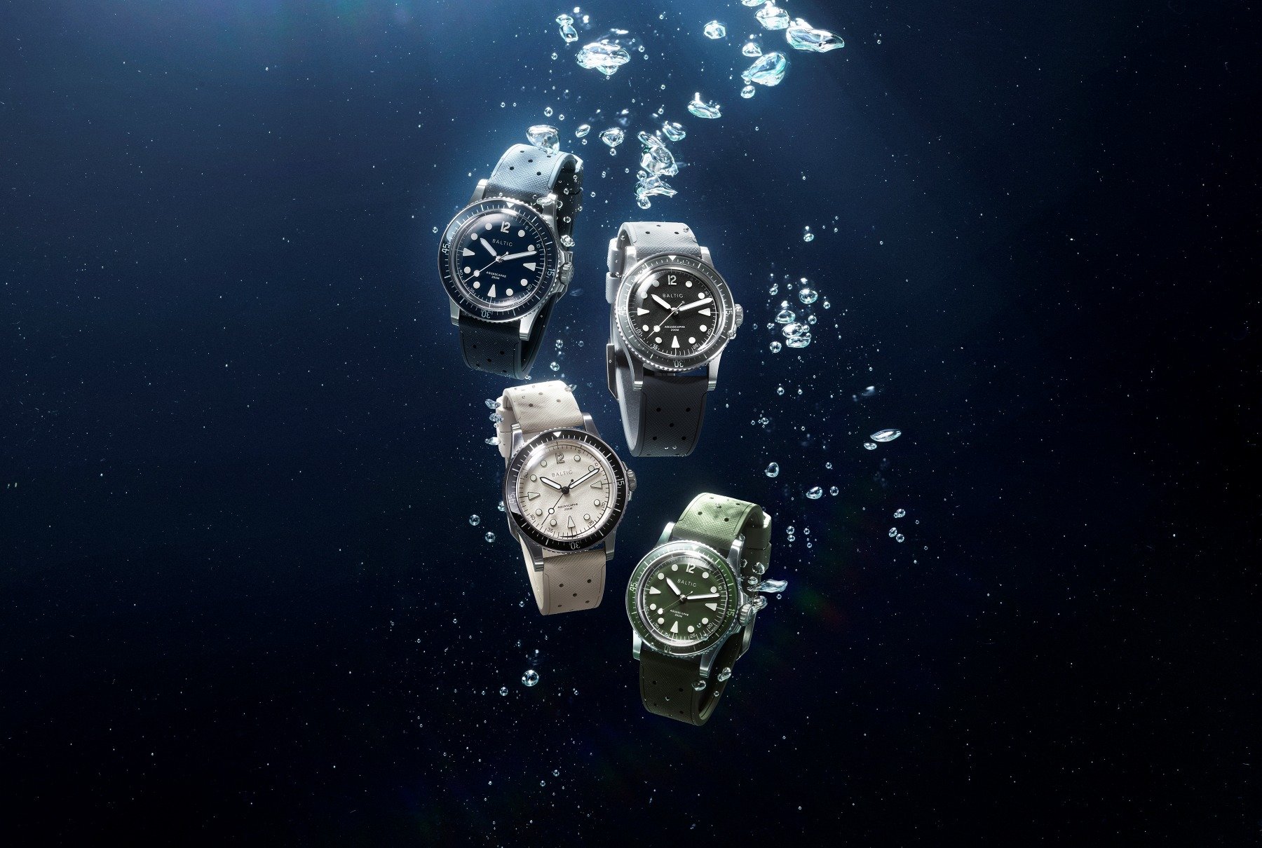
Oh, I will, Thomas, thanks. Baltic has a special place in my heart. When I seriously got into watches, the Parisian brand was there to tempt me with its reasonably priced and great-looking vintage-inspired offerings. Since then, co-founder Etienne Malec has continued along those lines, but he has also created a style of his own. His designs are rooted in the mid-1900s, but they also feel updated to today’s standards. The Aquascaphe MK2 is the perfect next step in that journey.
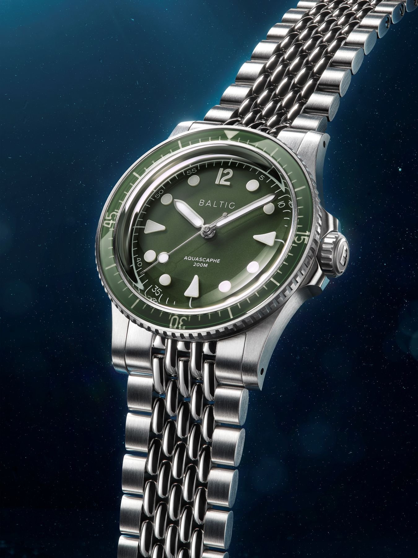
Gone are the gold-tone details and sandwich dials. Get ready for the MK2, which has a choice of blue, green, gray, or warm silver dials. The white or black printing contrasts nicely against the background, and the fully lumed and applied markers come at you proudly and brightly. Everything is perfectly proportioned, either in a 37mm or 39.5mm case. The new crown guards add some muscle, and the Saffiano-textured rubber straps bring elegance to the sporty combo. You’re not a huge fan of Baltic’s flat-link bracelet, Thomas, but I’d go for the OG beads-of-rice bracelet anyway.
Well worth the higher price
The Baltic might be a bit more expensive, but it also looks like a higher-value watch. The Lorier gives me a more fragile impression with its skinny, triangular indexes and Broad Arrow hands. I also think the crown is too big next to the skinny mid-case. Furthermore, it’s quite thick and simply not as nicely proportioned as the crown on the Baltic. The Neptune looks more modest to me, while the Aquascaphe is there to take on any job you throw at it.
Baltic has more daring designs overall, I feel. When you look at Lorier’s overview of watches, they all have very similar cases, and not one truly stands out among the rest. It’s true that Baltic also uses fairly similar case designs across its collections, apart from the new Prismic range. However, looking at all the brand’s watches side by side, they look very different. The great use of color, different fonts, and various materials mainly provides that.
Bigger and better
This variety is also why Baltic was able to grow into the bigger watch brand that it now is. Of course, the founders also aspired to this, but it’s certainly also thanks to their playful and consistent designs. By the way, I don’t feel the brand is any less sympathetic than it was when it just started. Lorier might not want to become much bigger than it is right now. But with the less daring lineup of watches the brand currently offers, I also feel there’s less room to grow.
Specs-wise, these watches are very similar. It really comes down to whether you like one or the other better. As opposed to what you just said, Thomas, I think personal taste still plays a big role here. So, no, the Lorier Neptune doesn’t look objectively better. I much prefer the Baltic Aquascaphe’s bolder and more daring looks.
Cast your vote
What do you think? Are you on the more classic side of the Lorier Neptune, or are you into the Baltic Aquascaphe MK2’s updated and more daring looks? Please cast your vote now, and let us know why you voted the way you did in the comments below.

