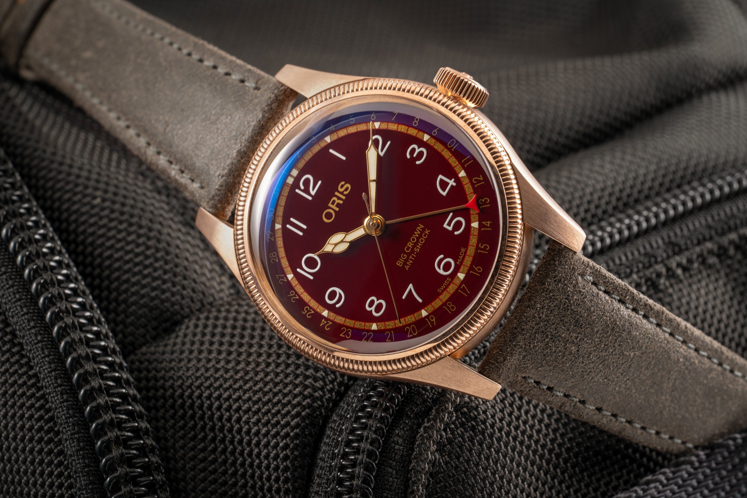
An Ode To The Empty Dial: When The Fewest Words Tell The Greatest Story — Examples From Rolex, Grand Seiko, Cartier, And More

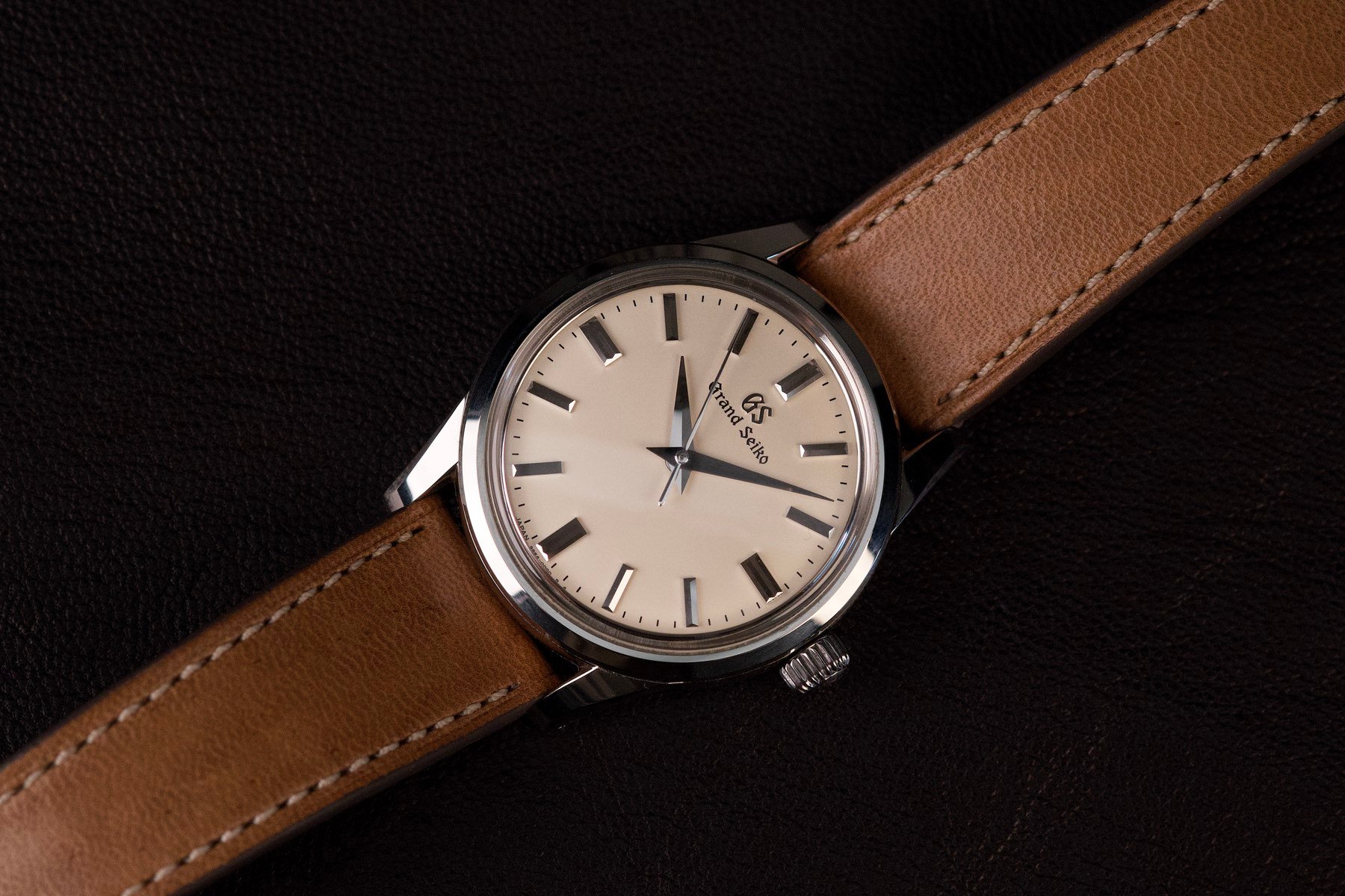
An “empty dial” can be a sight for sore eyes. When I first went to the Grand Seiko dealer to have a look at the SBGW231 that I would later buy, it was the empty dial that jumped out at me. Just an applied “GS” and printed “Grand Seiko” at 12 o’clock, nothing more. It provided a visual calm and balance that I find utterly beautiful. It got me wondering, what is up with all this printing on other watches? Are dial printers getting paid by the letter? Do watch lovers want something to read on their daily commute?
Could it be that we have just become desensitized to a lot of text on watch dials through mere exposure? Could it be that we unconsciously accept unneeded ugliness? Or does dial text offer much-needed visual balance? Let’s find out! Just so we are on the same page, I am not talking about sterile dials, which feature no manufacturer logos. I am specifically taking aim at the text we usually find between the hand stack and the six-o’clock marker.
-

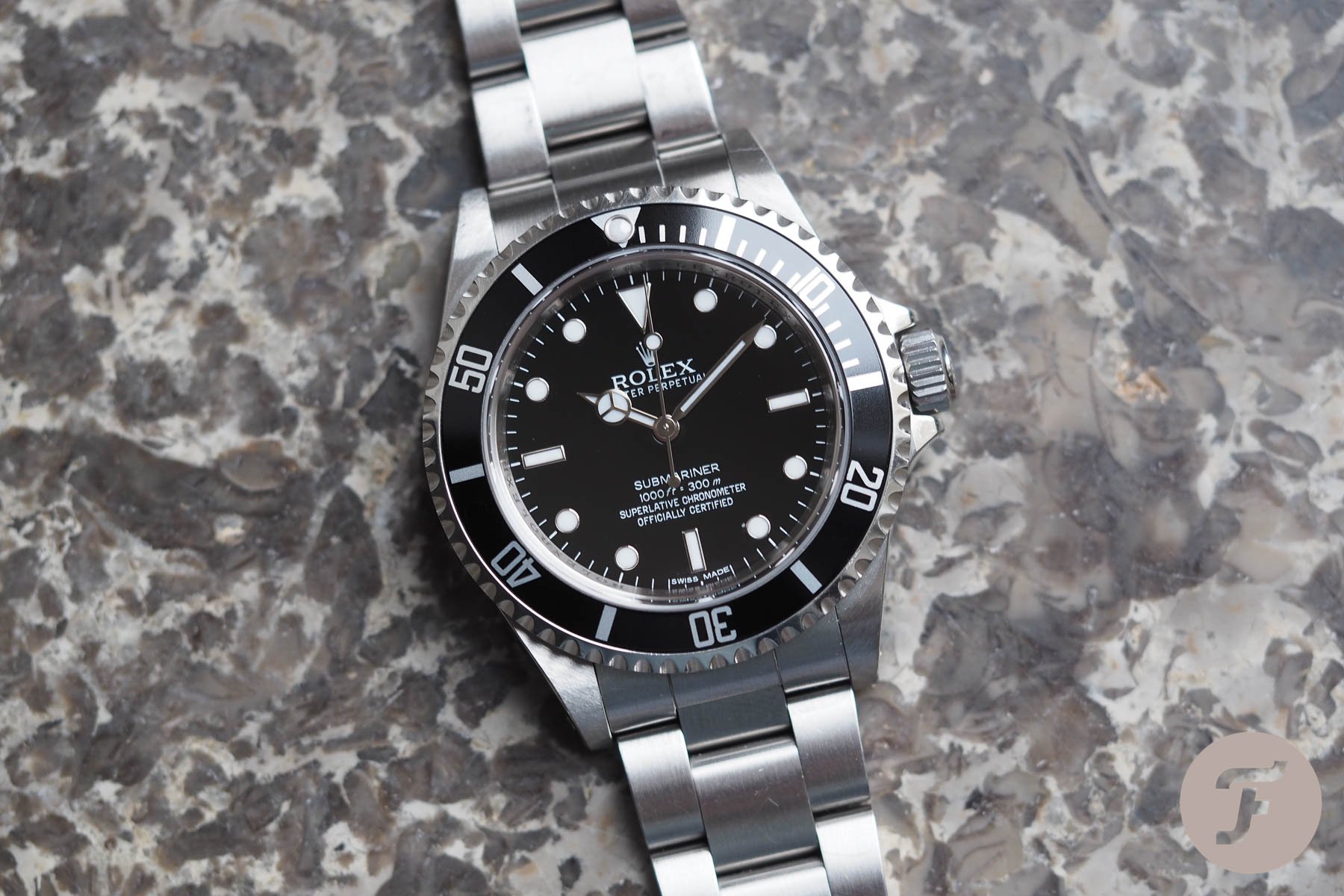
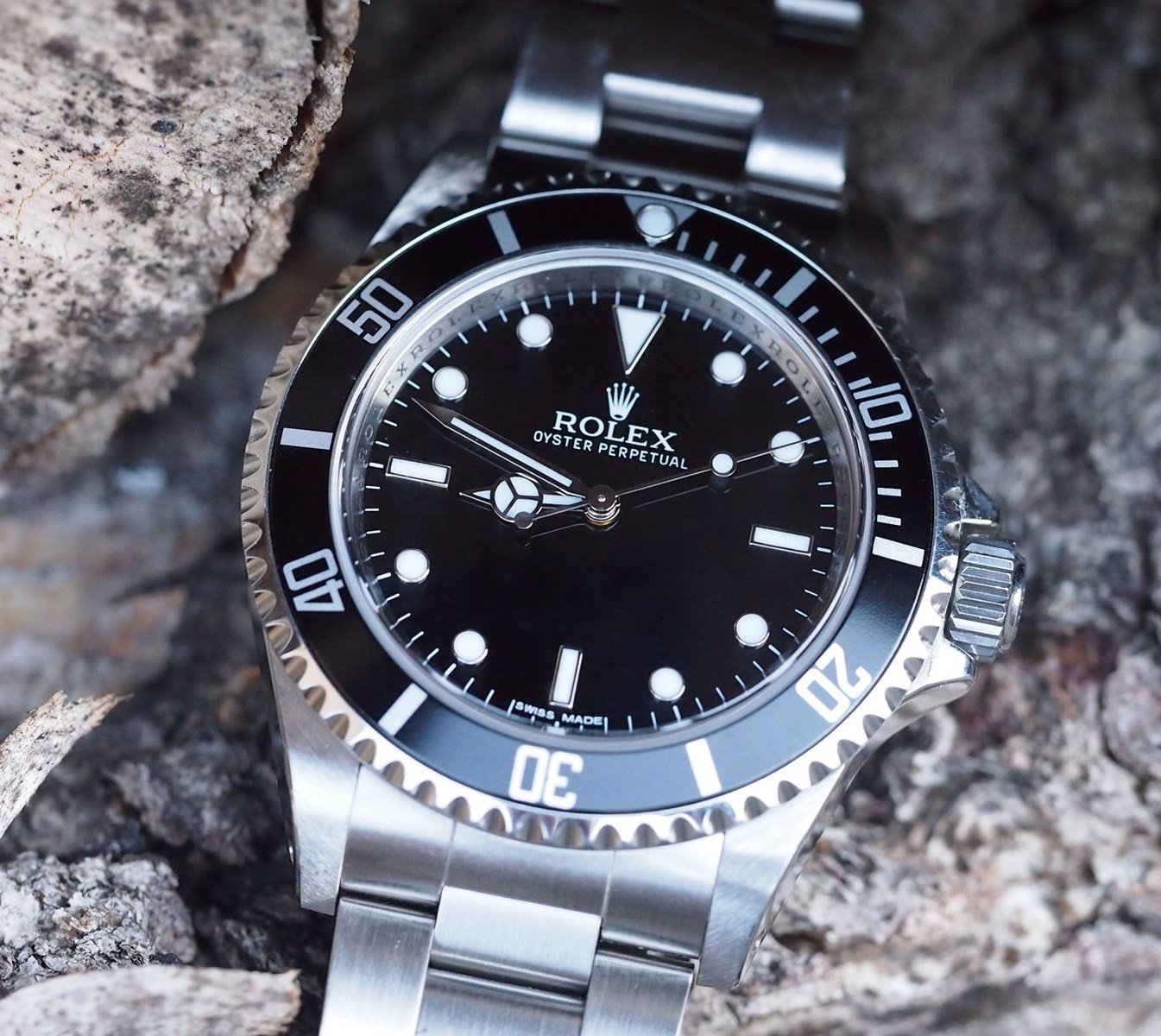
- Four-liner Submariner
-
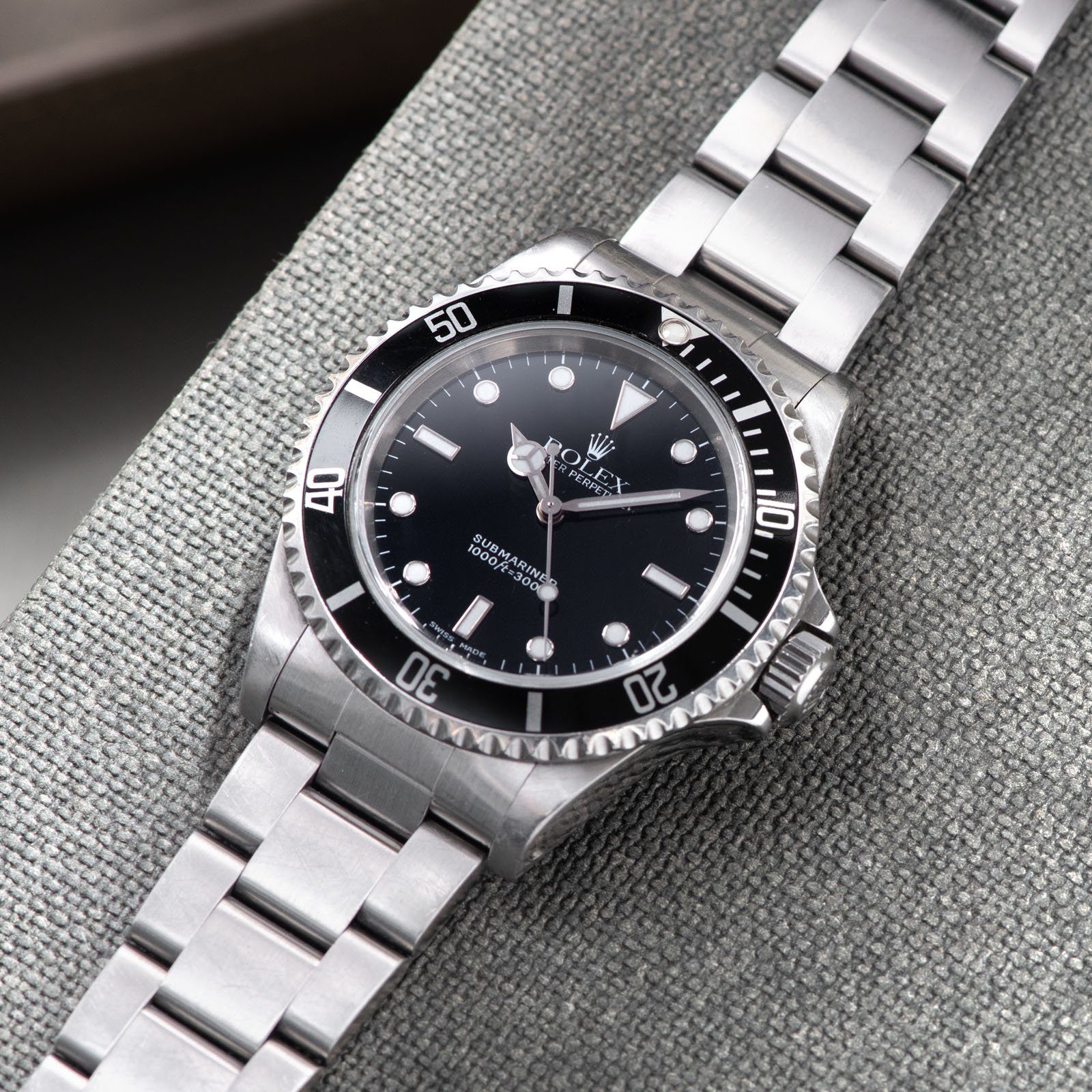
- Two-liner Submariner — Image credit: Bulang and Sons
-
- Photoshopped no-liner Submariner
Two-liners and four-liners
I started to think about this article, expecting watch lovers to agree that less is more. I thought I would always prefer less dial printing. I was sure cleaner dials would certainly also get your vote, dear Fratelli.
But then I pitched the idea to RJ, and he immediately brought up the Rolex Submariner ref. 14060M. This no-date Sub exists in an early non-chronometer version as well as a later chronometer variant (as a quick side note, those extra lines came a little later than the addition of “M” and caliber 3130). RJ immediately said that he prefers the so-called four-liner chronometer over the earlier two-liner. He felt the dial needs that little extra weight at the bottom.
I just love it when that happens. Just when I think I know it all, RJ puts a bomb under my presumptions. I strongly prefer the two-liner. I think it looks more classical and balanced. Above, you can see them side by side. I have added a third alternative with all the text removed. I am curious to hear which you prefer. Let me know in the comments. Note that we are talking purely about aesthetics here. For argument’s sake, let’s pretend they’re all chronometers — or they all aren’t, whichever floats your boat.
The watch that made me fall in love with empty dials
An empty dial or a spec list
I have ranted about how we attribute too much value to watch specs before. The empty dial seems to be an endangered species, in part, thanks to our obsession with specs. For some reason, it has become customary to describe the watch on its dial. Jewel count, type of winding, chronometer spec, depth rating… It is all crammed above the six-o’clock marker.
-
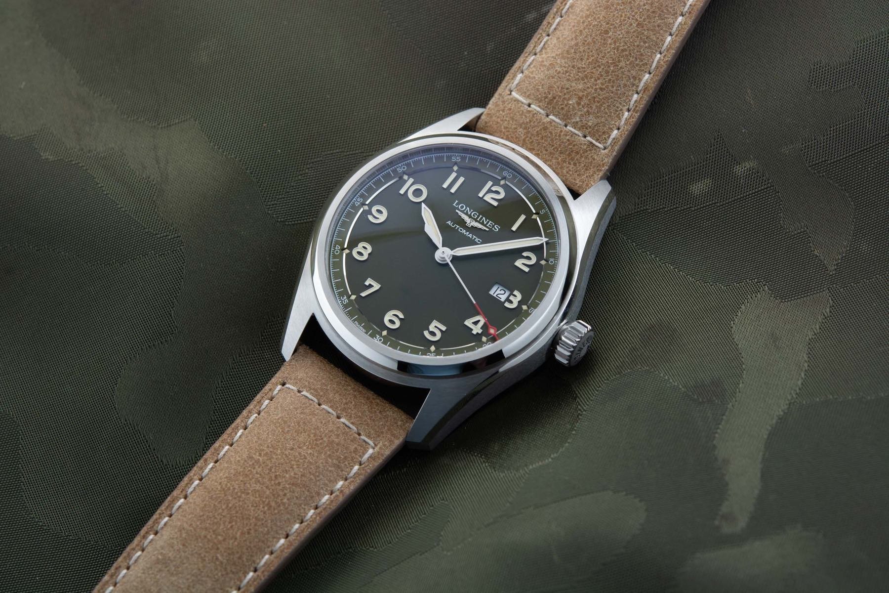
- The Longines Spirit is already quite clean

-
- But how about this virtual no-liner?
The obvious question is, why? “I wonder if my watch is manual-winding or automatic… I will check my dial!” said no one ever. A depth rating might be useful to some on very specific occasions. But then why not just engrave that on the case back? Guess what: on many watches, it is on the case back as well. Information overload.
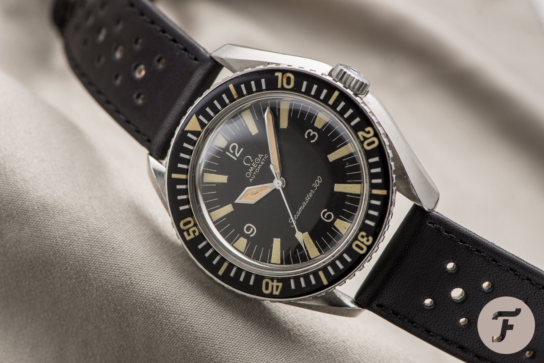
One line on a vintage Seamaster 300
Sadly, it is getting worse. If you look at watches from the 1930s–1970s, there was a maximum of two lines of text on most. None or just one line was even more common. Then look at modern watches. We get entire paragraphs printed on our dials now. The empty dial is disappearing. At the same time, we are depending on our watches as tools less and less, so the specs are actually less relevant than they were back in the day. It must be, then, that it is done for aesthetic reasons. Modern watch designers prefer more text — or think that you do.
-
- Would you rather have this?
-
- Or this Photoshopped no-liner?
An ode to the empty dial
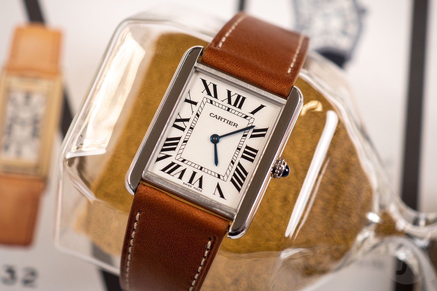
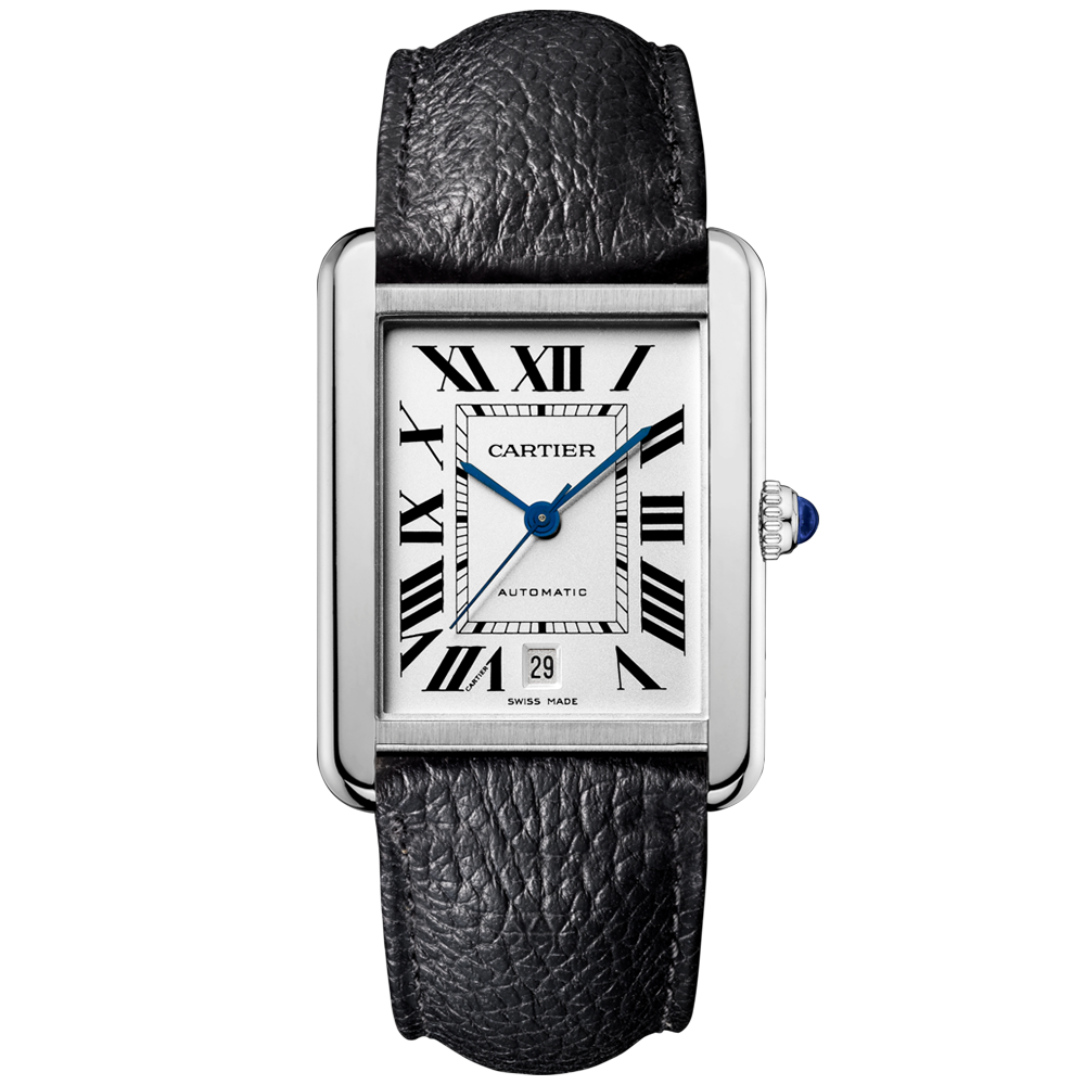
Luckily, there are still empty dial watches out there. I recently tried Nacho’s Cartier Tank Solo for a week. It has a busy dial, for sure, but at least there is no additional text below the hand stack. Had it been an automatic version, there would have been. Especially on this style of watch, I think that looks completely out of place. What do you think?
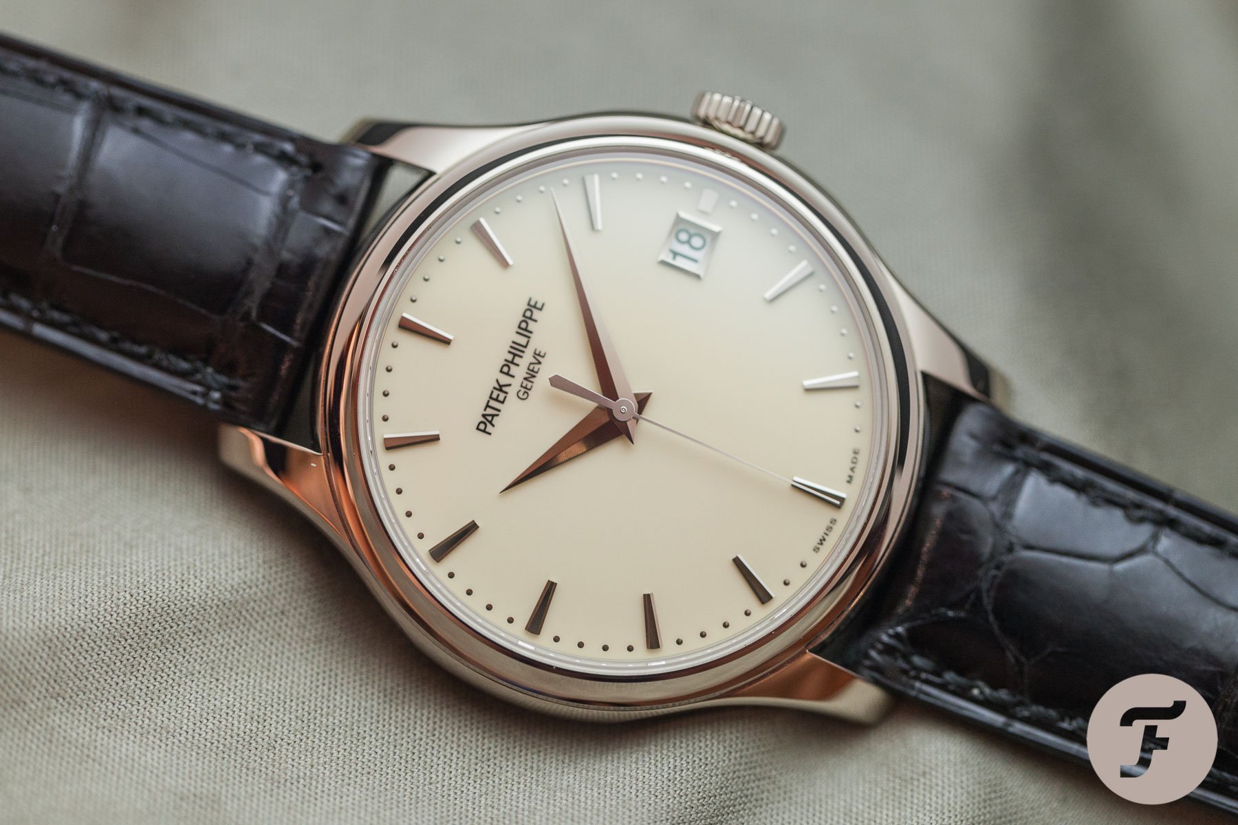
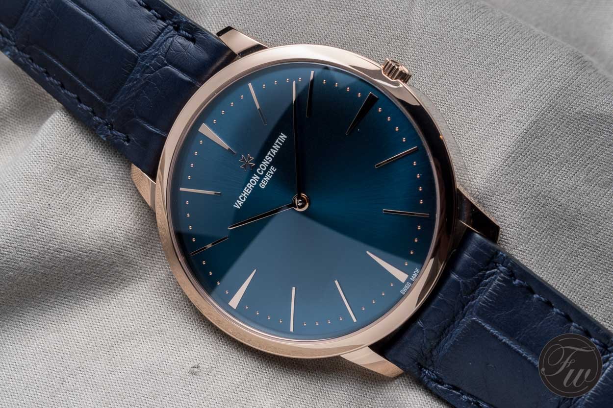
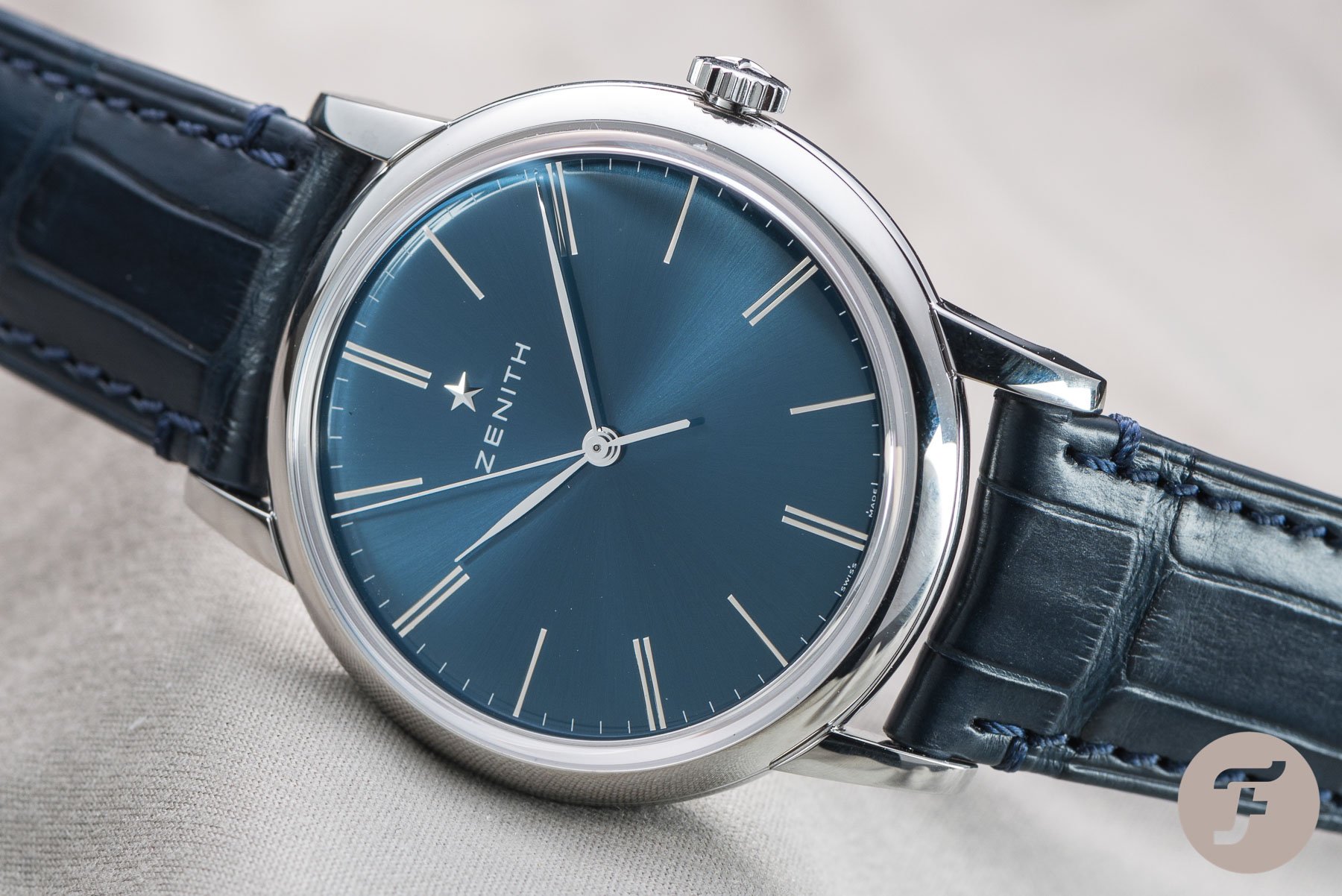
The empty dial is actually still quite common in formal watches. Have a look at some of the examples below from Patek Philippe, Vacheron Constantin, and Zenith. My mind slows down just looking at them. I know some of you have very stressful jobs. I recommend five minutes of wrist-gazing at an empty dial a day.
The thing is, it is actually hard to design an empty dial. Keeping it simple is always harder. In a sense, it exposes your design. Intricacies can mask a poor basis. I suspect dial text is sometimes used to balance out a poor dial design.
But actually, an empty dial might not always be better
Preparing this article has actually changed my opinion. As I described earlier, I thought that an empty dial would always be better, and I thought that most people would agree with me. But now looking at some of the photo-edited dials I made, I am not so sure.
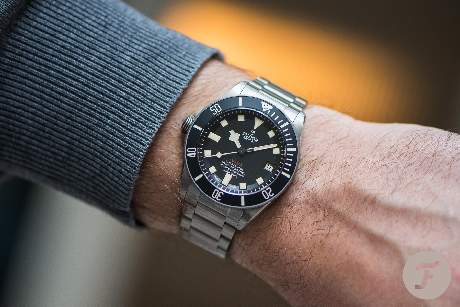
I think I might prefer the two-liner Sub over the four-liner and the empty dial. However, if I look at the five lines on the Tudor Pelagos, I cannot help but feel that they ruin the dial. Still, I think we have to differentiate between tool watches and dress watches.
-
- Do you prefer this?
-
- Or this Photoshopped no-liner?
I guess my personal take is that one or two lines of text work on tool watches. Empty dials are awesome for dress watches. Full paragraphs are best on Fratello rather than any watch dial. And, obviously, it all depends on the specific design. You cannot really generalize as I am doing here. Still, it has been a fun little experiment. I am curious to hear your thoughts. I am sure we will see some contrasting opinions in the comments…
You can also find and follow me on Instagram: @time_travelers_journal