Are Rolex Fans Blind To Design Flaws? Have Your Say!

Today, I’m taking a closer look at the current Rolex line-up and picking out what I consider design flaws. My selection is subjective, but I cannot be the only one who has looked at a modern Rolex and thought, “It would be better if…”. I am not attempting to be an armchair designer and fully appreciate I am not the only customer base. However, sometimes, a particularly Rolex model is showered with praise, yet I cannot shake the sense of “Emperor’s new clothes” syndrome. There is even a chance to vote and share your voice in the comments section below, so let’s get the debate going.
Firstly, you might be wondering why I am deciding to kick-off the New Year in a slightly negative connotation. “Hasn’t there been enough negativity in the preceding 12 months, Ben?” Of course, I am generally easy-going when it comes to my hobbies, especially with wristwatches that I enjoy immensely. Seeking the positives can alleviate any price or availability discrepancies that sometimes lumber articles with unnecessary doom and gloom. Add in a competitive element, and that can change quite quickly, as you may have seen from our many Sunday Morning Showdowns. I’m not sure why, but the evil within me bubbles to the surface without the need for an opponent.
Turning a blind eye
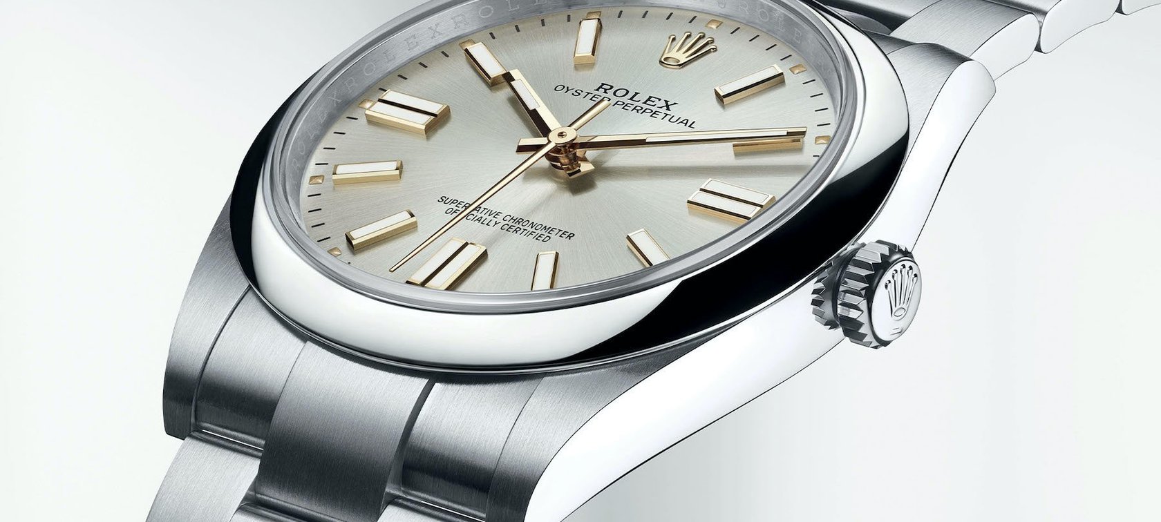
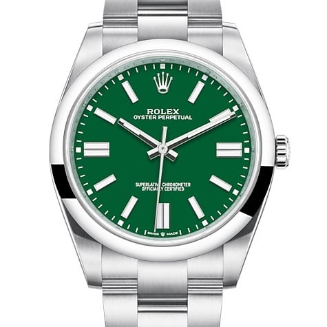
What actually triggered this internal question, “are Rolex fans blind to design flaws?” were the annual round-ups of the preceding year’s best watches, not necessarily from other watch publications but definitely from figureheads within the industry. Specifically, it was the new Rolex Oyster Perpetual ref. 124300. The latest Rolex OP iteration has an increased 41mm case in an array of colors and buttoned-up silver or black dials. We covered the announcement here, and I agreed it was an effective update for Rolex’s base sports watch.
As the year rolled off, the increasing attention the Rolex OP was gaining was extraordinary. It seemed to top many lists as the year’s best watch. Really? Last year was an odd one, yet we were treated to a pantheon of genre-bending timepieces with technical innovations. Somehow, the OP kept cropping up as the finest on offer — it just did not sit right.
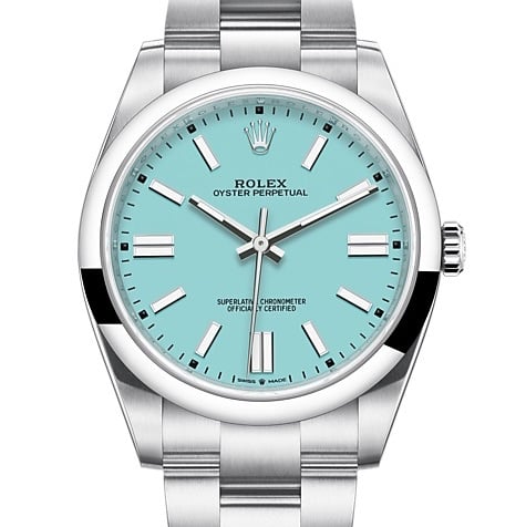
The pastel dials were refreshing from Rolex.
Perhaps the typically inoffensive OP shook the trees with vibrant and pastel dials that seemed uncharacteristic and refreshing by Rolex. Or that Rolex studies the market intuitively, assessing that colorful dials in gentlemanly dimensions are what will lure today’s consumers toward the coronet. It must have been a successful study, as waitlists are now stacking up, and the pre-owned market is already listing the OP at double the price brand new.
Wrist time with the Oyster Perpetual
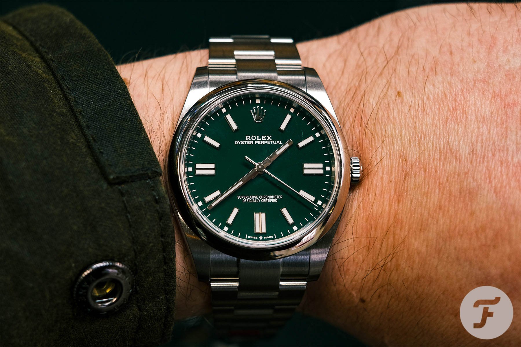
When I went hands-on, I was left with a different impression. I tried the forest green dial Oyster Perpetual reference 124300. Of the seven available dials and four funky new colors, the green was my preference. It glows with glory in direct sunlight and sinks into inky black in low-light — a chameleon of a dial that equally charms and chills. Nevertheless, something felt off, and I had a hard time pinpointing the source of imbalance.
The new 41mm Oyster Perpetual reference 124300 has more dial space than the outgoing 39mm reference 114300.
It is a larger diameter than the outgoing jumbo Oyster Perpetual that had a 39mm case. Naturally then, this leads to a greater expanse of dial space that feels empty. That quickly dissipated when I tried it on, and the proportions were exquisite. Rolex certainly knows how to make a great-looking watch off the wrist without sacrificing the wearing comfort when on the wrist.
Finding the cause of my frustration
Further investigation led to the culprit. Take a look at the spacing of the coronet logo and the Rolex text below it. Maybe take it a step further and observe the distance to the description of a 360° self-winding rotor and water-resistant case, aka “Oyster Perpetual.” Notice how the coronet seems to be in no man’s land compared to the rest of the text. I suppose the logo takes the place of the 12 o’clock marker, as seen on many other models in Rolex history, so it locks in this position. But when coupled with the relatively minimal text of the OP dial, the distance intensifies.
The Superlative printing above the 6 o’clock marker goes some way to explain the Rolex name’s position. And both sets of dial scripting, above and below the center pinion, balance each other in terms of typeface weight and position. Yet, it results in an awkward gap, that to me, is rather glaring.
Outgoing 39mm Rolex Oyster Perpetual 114300
39mm Oyster Perpetual Dial
Other Rolex collections, like the Datejust, have an additional line for the model name that forces the Rolex text further up the dial towards the logo. Some even have an equal spacing, such as the Day-Date and Daytona, due to the day and chronograph complications, respectively. For the new OP, I feel Rolex have snookered themselves when positioning the dial script. It got me thinking of the outgoing OP reference 114300. I mentioned before that the 2018 OP was available in a smaller 39mm case, which already tightens the text spread. Now, I notice how the more significant printing of “Rolex” reduces the distance to the crown logo.
I am fully aware that I am going beyond picking nits here. Most of these complaints will fall on deaf ears, especially from lucky owners of the watch. But when it comes to awarding accolades for particular watch models that showcase the best of what the year had to offer, I feel quirks like this tend to be eschewed in favor of acknowledging the Rolex brand. It made me think that the coronet has a spell that pulls the wool over eyes to ignore odd design choices. Other brands have their fair share of ill-advised options but are more likely to receive the ire of demanding fans. Rolex gets a pass too often. Following my assessment of the new Rolex Oyster Perpetual, it’s time for me to unplug from the Matrix and look at the broader collection with a fresh perspective.
Slipping through quality control
There are individual factory hiccups that plague a minute percentage of the Rolex output. Those are the unfortunate anomalies, such as duplicate numerals in the wrong position or misaligned dial printing. Even with Rolex’s intense scrutiny, these specific flaws slip through quality control and end up in showroom windows. Weirdly, they are often met with the glee of keen buyers, eager to bag a one-off factory Rolex.
When your production is more than 800,000, it’s rare but still possible for errors like this to occur. If errors occur regularly at a much lower output, I would perhaps recommend to scale back production to ensure tighter quality assurance at high-end prices. Either way, my focus is on intentional design decisions that, to me, do not reflect the high esteem of Rolex. Some even go beyond design and focus on practicality.
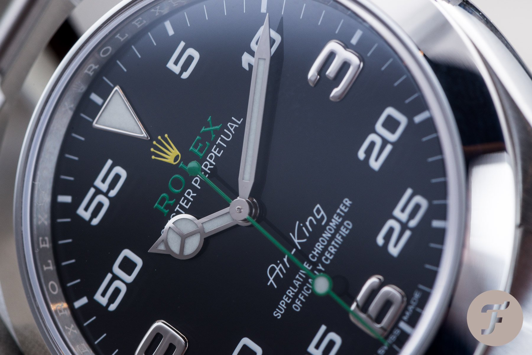
Rolex Air-King Ref. 116900
The latest Air-King, in all honesty, does receive flack for the inclusion of the numerals in increasing five-minute intervals. The excess of the number “5” on the dial is well-documented, as highlighted in this Sunday Morning Showdown. Basing the design on the dashboard instruments from the long-in-the-tooth Bloodhound LSR (formally Bloodhound SSC) project does provide a reason for this layout.
So, I’m not here to shame the concept — more so the execution. At 11 o’clock and 1 o’clock are the numerals to indicate 55 minutes and 5 minutes. My view is that the asymmetry between double digits and the single-digit is off-kilter. A suggestion would be to include the 0 before the 5 to equalize the uniformity of the dial.
Rolex “Cyclops” — multiple references
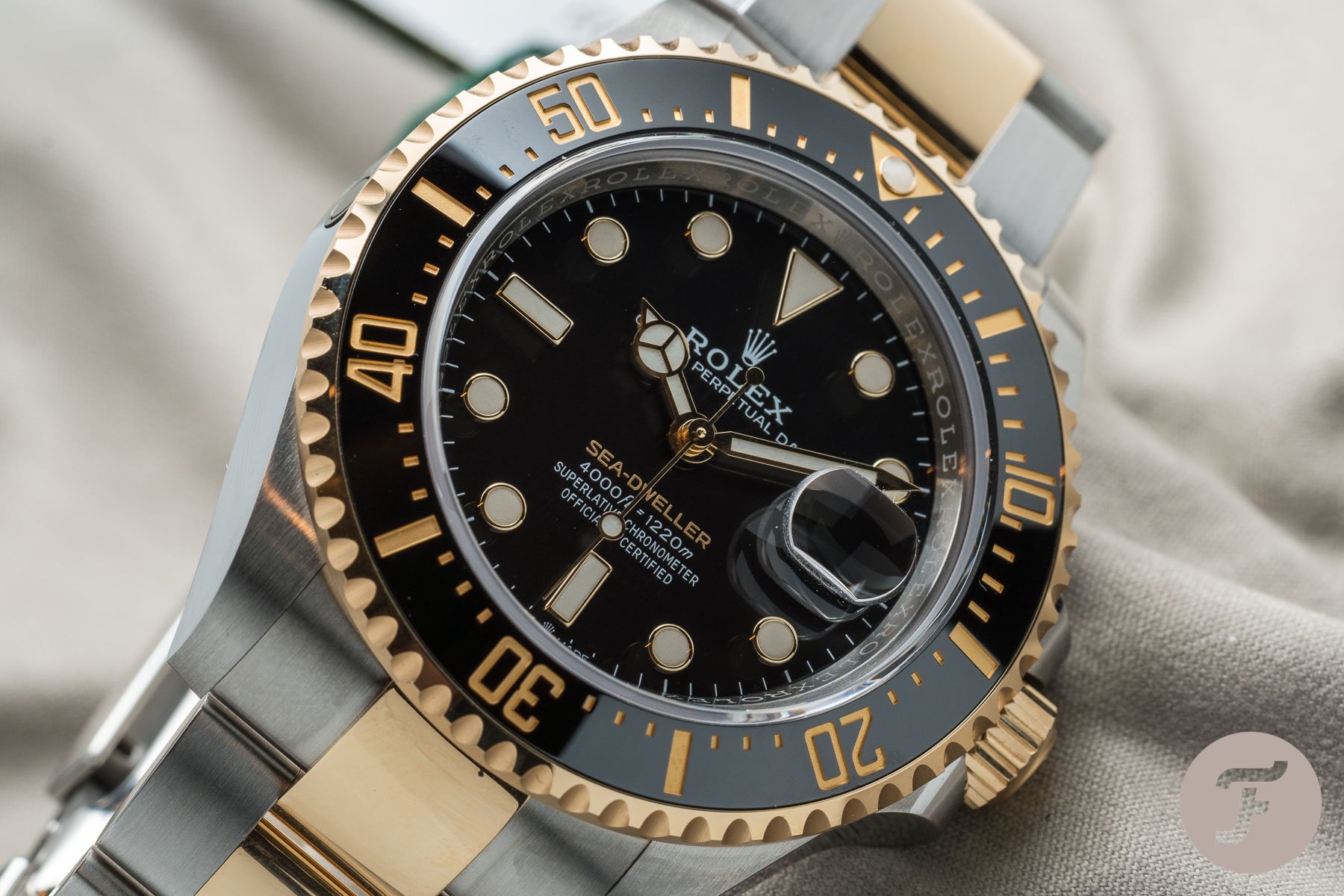
Next on my list is the date magnification, colloquially known as the “Cyclops.” Again, the idea for the cyclops is not what irks me. It’s a practical way to magnify the date aperture while minimizing the mechanism wheel size. Rolex tends to commercialize this for mountain climbers checking the date from a distance with one hand above them dangling from a rock.
The application is probably more for short-sighted golfers to check the date to mark down on their scorecard. Even so, Rolex takes pride in applying anti-reflective coating on the cyclops and fully transparent glue. Rolex goes as far as to claim these technological advancements allow the Sea-Dweller to reach depths of 1,220 meters, with the cyclops sticking in place. But why does it still need to be glued on?
Could Rolex apply the magnifier on the underside of the crystal?
Undoubtedly, the ultimate advancement would be to mold the date magnification within the entire sapphire. Or apply the magnifier on the underside of the crystal. This would alleviate a problem I face with the separate sapphire element. When a Rolex delivers a watch with date cyclops fresh from the factory, it looks clean and clear. After a while, and the watch is put through its paces, dust and lint accumulate around the cyclops. This opaques the area over the dial, making it a challenge to polish regularly. There is a trickle-down effect from Rolex to other brands where innovations see imitation. Yet, the cyclops is not as commonly employed by other brands. Certainly not when compared to other Rolex mainstays such as the screw-down crown or unidirectional bezel.
Share your opinion and make it count
There are many more examples throughout the years, and it’s evident that Rolex pays attention to these qualms. For instance, the 39mm Rolex Explorer saw a quiet “mark II” update in 2016 to rectify the “small hands” problem. When Rolex originally grew reference 214270 up from 36mm, it seemingly forgot to apply the same scale to the hour and minute hands. More recently, the square lugs of the outgoing Submariner made way for a svelter case.
One person’s flaw is indeed another person’s flair. But it’s a useful exercise to lend a discerning eye to the most prominent brand in the luxury watch segment. So try to avoid being blinded by the brilliance of the brand and be more critical. In the end, it leads to continuous improvements and better watches.