The Best Watch Dial Textures Available In 2021: Featuring Grand Seiko, AnOrdain, Straum, Czapek, And… NOMOS?

If you’ve read my recent article, you may well have noticed me banging on about dial textures and why they’re so important. The dial is probably the first thing we see when looking at a watch for the first time. They say first impressions are the key to success, so the dial is quite an important element in this regard. It’s not just color that can make a dial truly eye-catching, texture can and does play a key role when it comes to this. I decided to go back and take a look at some of the best dial textures out there today, as well as the brands responsible.
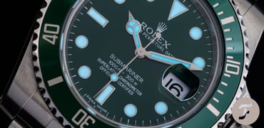
As a forewarning and a caveat, I’ve purposely tried to steer clear of guilloché dials for this article. Guilloché is an art form of its own and will one day require its own dedicated article. So, please, please don’t crucify me in the comments for not including George Daniels or Breguet (and many more), on the list. It was 100% intentional.
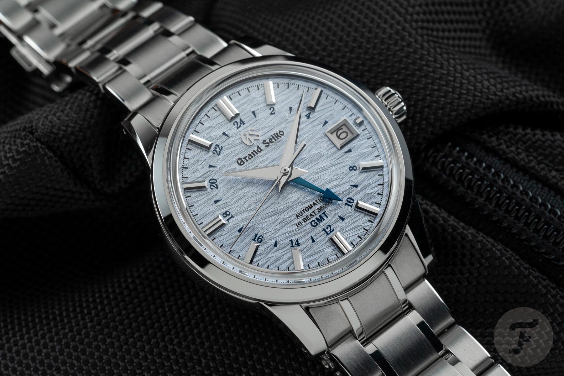
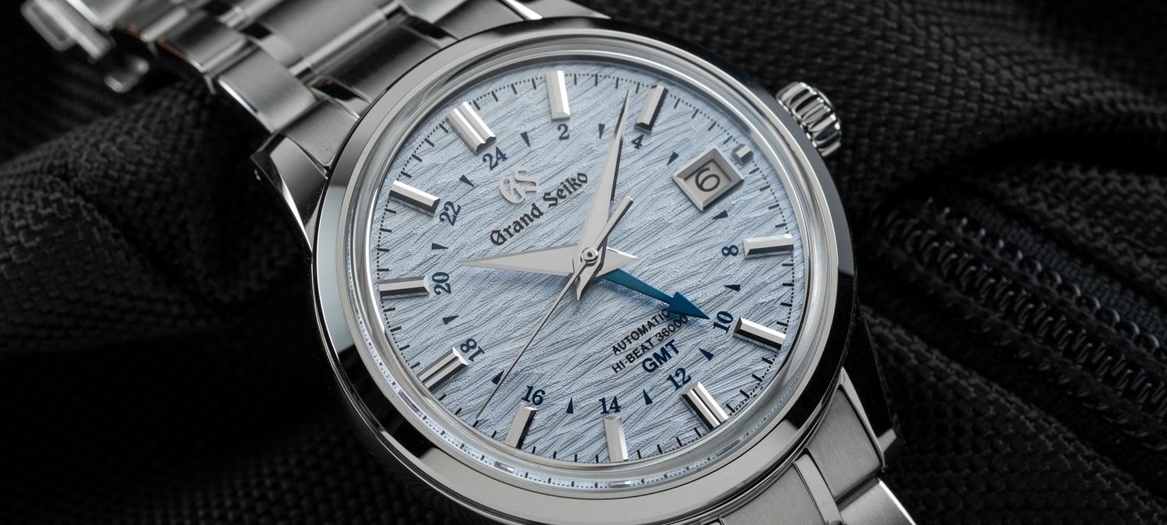
Grand Seiko Shōsho
If we’re talking about dial textures, we have to start with Grand Seiko. In my opinion, the Japanese brand started the recent dial texture revival trend. Grand Seiko began strongly with examples like the Snowflake and the Skyflake and set the bar high for all other brands looking to throw their hats into the ring. Today, I’m going to talk about my second-favorite Grand Seiko watch, the Grand Seiko SBGJ249 Shōsho.
Despite my evident love for the Skyflake, this is not the first time I’ve picked the SBGJ249 in one of my lists. Due to its GMT function, I chose it as one of the watches in my top four travel watches. Since the day that Grand Seiko first released the SBGJ249, I’ve been in love. Why? Well, we’ve come back round to the matter at hand here — the dial texture.
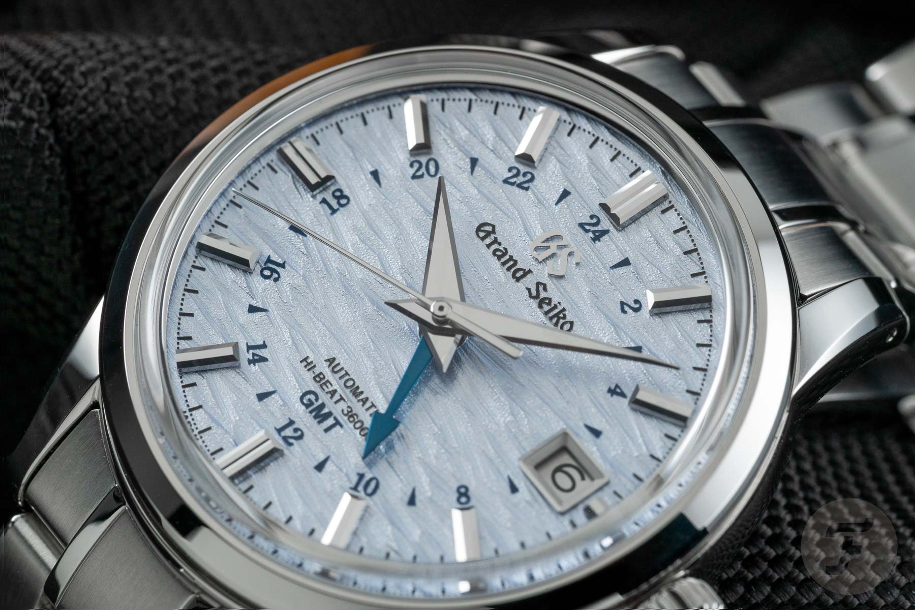
The texture trendsetters
It’s not the first time Grand Seiko has broken out the texture pattern. If it seems familiar, that’s because if you rotate it 90 degrees, you basically have the SLGH005 Silver Birch. That’s an attractive watch, but I don’t feel like the color of the dial best played to the texture’s potential. The SBGJ249, however, adds a swathe of beautiful blue color which takes it to the next level. The finished result is very reminiscent of moving ripples across the surface of the water. It’s a calming and serene visual effect and a home run from Grand Seiko. Isn’t it funny how essentially the same dial texture can change so drastically with a couple of minor tweaks?
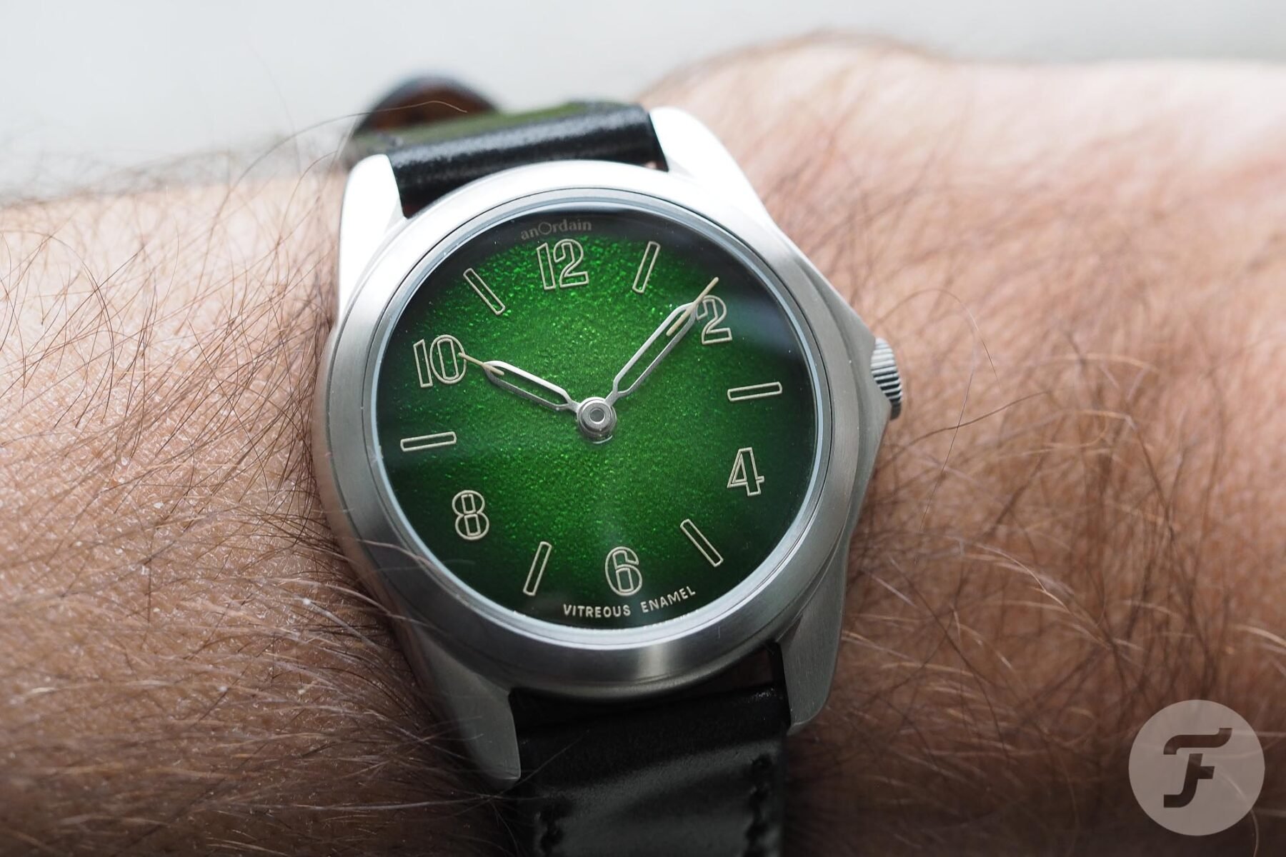
AnOrdain Model 2 fumé
We couldn’t NOT talk about anOrdain and dial textures, now, could we? AnOrdain built itself a fearsome reputation and loyal fanbase thanks to its mastery of grand feu enamel dials. A part of the mastery involved developing a gorgeous fumé color-enameled finish over a beautiful ripple-like texture. I still find it quite fascinating that these dials are the result of a happy accident. While experimenting with enamel on a silver blank, the enamellers found the metal tended to warp and dome. This fault would typically render the dial useless, if not for the fact that when sanded flat, the enamel’s interplay with the metal formed an attractive gradient. This led the brand’s in-house team of enamellers to experiment to control and recreate the effect consistently.

Smooooookin’!
The combination of the colored fumé enamel over the Model 2’s stamped silver dial base is beautiful. Every single color that the Scottish brand has tried so far seems to somehow magically work. Color and texture, it’s the future, I’m telling you! Now, sadly, anOrdain closed out the Model 2 series with a brown, whisky-inspired shade, but I don’t for a second think that this is the last we’ve seen of these gorgeous textured dials. Watch this space!
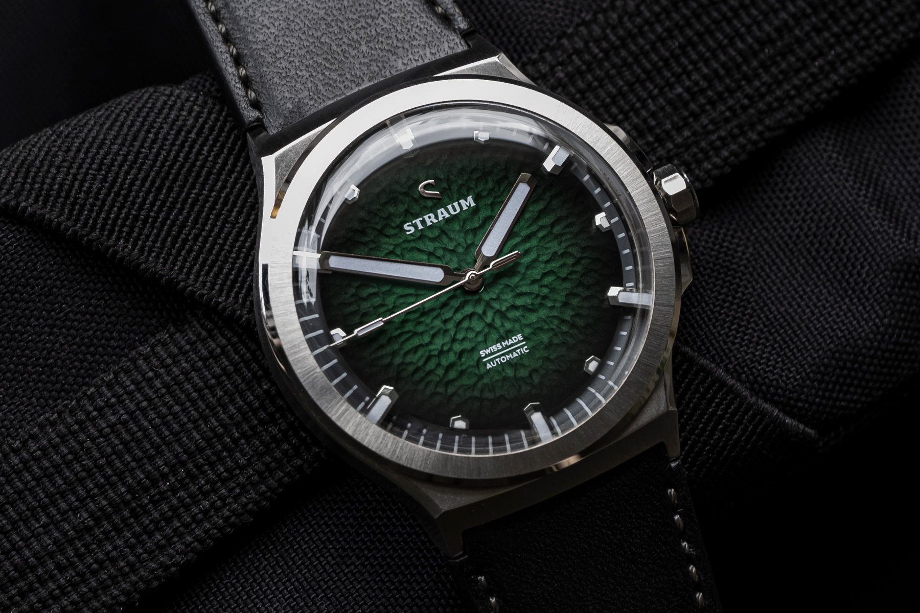
Straum Opphav
Straum is probably the one brand on here that you may not have heard of. Well, now you have, and you can thank me later. We have actually mentioned the Norwegian brand a few times lately on the pages on Fratello Watches. Rob recently did a podcast with the lovely blokes from Straum, which is worth a listen here. One cursory glance at the brand’s watches will tell you exactly why they’ve earned their position on this list.
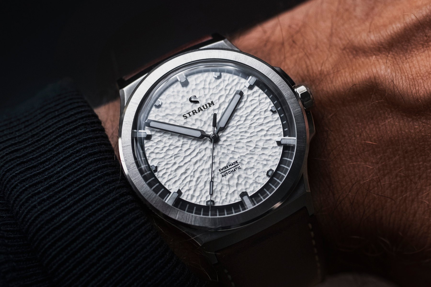
Nordic textural beauty
The name Straum comes from an Old Norse word, “straumr”, meaning “a steady movement of material”, such as water. The dial of the brand’s debut release, the Opphav, shows that the brand name is well represented in the watch’s design. Norway is well known for its beautiful mountain glaciers and fjords, to which the dial textures pay beautiful homage. The steel dial blank is stamped and then treated with multiple layers of paints and lacquers to get the final effect.
Depending on the dial color you choose, the dial takes on an entirely different character. The white dial is like the crisp and newly-fallen mountain snow. Ripples on the lake echo through the blue dial, and the leafy canopies of lush Norwegian forests come to mind with the green dial. Straum has also made great efforts to highlight the dial texture and allow it to take pride of place by moving the chapter ring below the dial. The dial is then elevated and held in place by the six extended hour indices. This is a very accomplished design, and I can’t wait to see one of these beauties in hand one day!
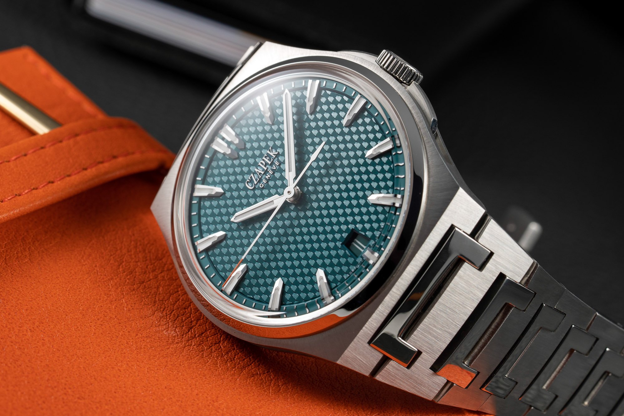
Czapek Antarctique
You probably saw this one coming from a mile off, didn’t you? OK, there was a clue in the title which gave it away, but Czapek was always going to be in a list of top dial textures. The question is, which model do I focus on? Well, I love the Faubourg De Cracovie dials, but sadly it’s disqualified from today’s article because I stated guilloché deserves a whole article on its own. So, we’re probably looking at the Antarctique, right? You know, the current darling of the stainless steel sports watch sector. Two models immediately come to mind: the Terra Adelié and the Passage de Drake. Call me biased or nepotistic, but, for me, the Passage De Drake takes the win by a hair.
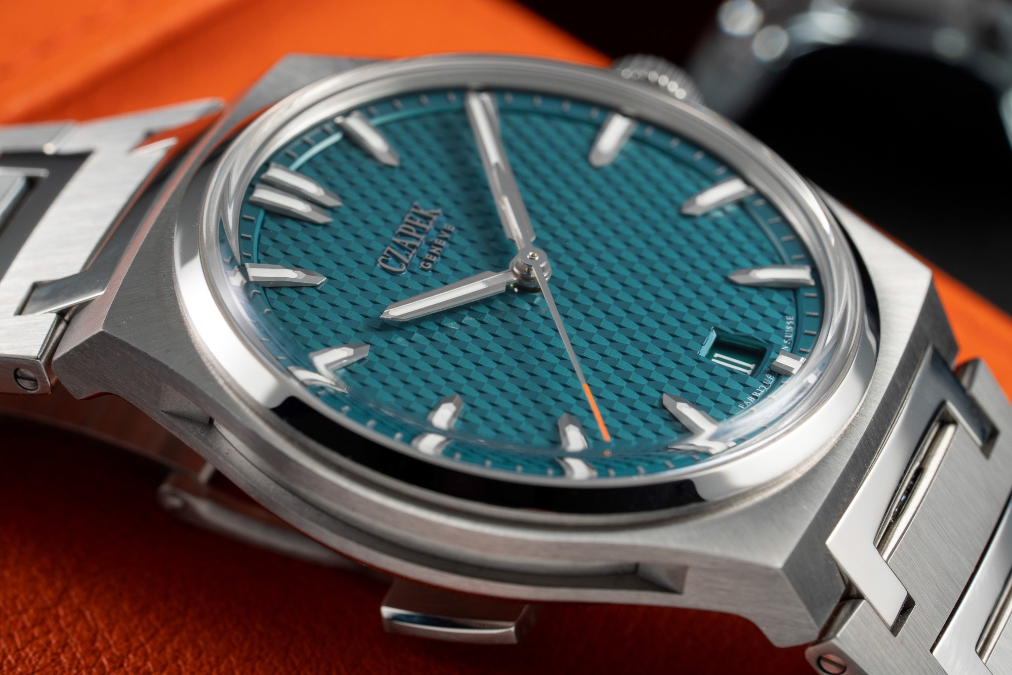
The stairway to textural eternity!
You will likely recall this pattern as the same dial texture we used for the Fratello Viridian Green edition. It is formed of an atypical trapezoid dial motif whose three-dimensional stamped flinqué pattern creates a play of shadows across the dial. Czapek nicknamed it the “Stairway to Eternity”. An apt name for the finished result. The lovely thing about this dial is that it can appear very differently depending on the angle you look at it from. If you ever get the chance to see a Czapek Passage de Drake in real life, take that opportunity to admire its gorgeous dial texture. It is quite unlike anything I’ve come across before.
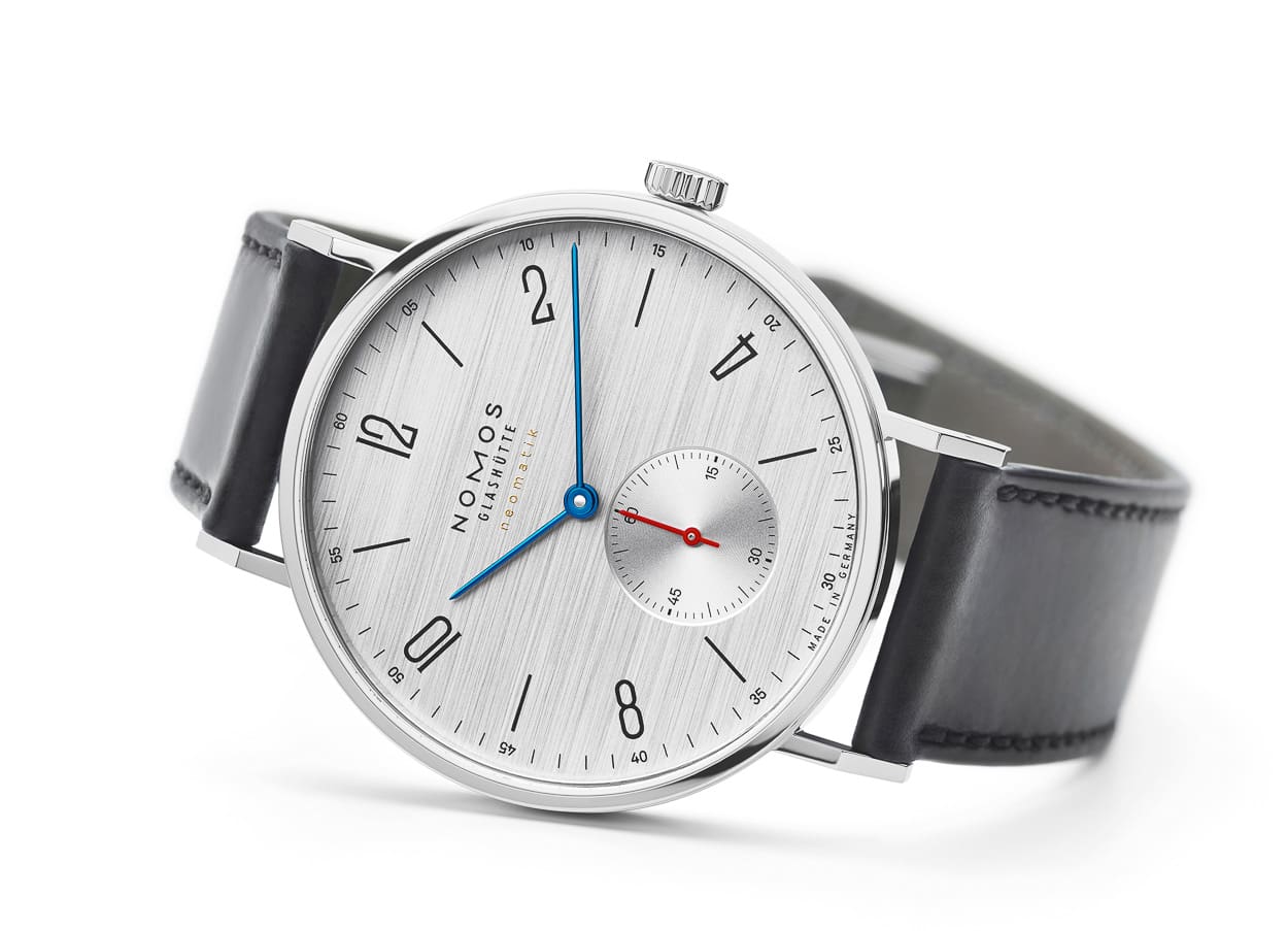
NOMOS Glashütte Silvercut dials
Wait, what? NOMOS on a list of best dial textures? You know it! Although, had I been asked this question a couple of months ago, NOMOS likely wouldn’t have made the cut. I was fortunate enough to have had the opportunity to visit the NOMOS Glasshütte manufacture back in August. After a fascinating day learning about the inner workings of the German brand’s production, I was browsing the brand’s small boutique along the main street in Glasshütte. Among the usual suspects, I spotted a watch I’d never seen before. Well, the model was a Tangente with which I was familiar with, but the dial…the dial was something totally new to me. It featured the traditional Tangente layout, but the dial was a beautiful silver color with a horizontally brushed finish.
What was this magic texture?
Thankfully our resident NOMOS expert, Rob Nudds, was on hand to explain to me what this beautiful artifact in front of me was. He explained to me that this was the NOMOS “silvercut” dial. I was in awe. NOMOS had always been a very hit-or-miss brand for me. I like the Weltzeit and the club models, but the others never entirely spoke to me. That included the Tangente, but the addition of the silvercut dial elevated the Tangente design to a whole new plane. It’s funny how a simple tweak to a dial finish/texture can make a huge difference, as everything else about the watch was core Tangente. I’ve been long-wanting to add a NOMOS Club model to my collection, but I know I won’t be happy unless it’s a Club with a silvercut dial. Currently, there is no such model in the NOMOS catalog so, hopefully, someone from the NOMOS design team is reading this and nodding their head in agreement! Let’s make it happen!
What’s on your texture list?
So here’s my take on some of my favorite dial textures from some of my favorite brands. I hope you’ll agree with at least some of the mentions on my list, but I’m keen to hear your thoughts. Are there any I’ve missed off? Remember no guilloché please! Let me know in the comment below.
Follow me on Instagram: @davesergeant