Building A Watch Brand Episode 2: Revealing The Name And Brand Concept

Let me start by thanking you for the reception of the first episode of Building A Watch Brand. It has been heartwarming to receive your messages of encouragement and support! In this second installment, I will share some more details about the brand. I have a name and an idea of what the brand should be. As promised, I will share the journey even though it is all still in development.
Perhaps needless to say, everything I show you here is still very much in the works. Some things might evolve along the way, while other aspects might stick around. But I promised to share an unfiltered journey, and this is what I am working on at the moment.
So the name is…
Okay, exciting moment. Drum roll, please! My upcoming brand is called… VPC. There. It’s out! VPC is short for Venustas Per Constantiam, which is Latin for “beauty through restraint.” I have decided to put a key brand ambition right there in the name. You may know that I have a taste for simpler, cleaner designs, so this name is a preview of sorts of what is to come. My intention is to primarily use the acronym VPC, only using the full name in the logo.
I have registered the domain vpcwatch.com and the Instagram handle @vpc_watch. I have set up a temporary landing page where people can register their interest until a full website is up. As you surely understand, it is crucial not to lose interested people along the way, so setting up a mailing list was a priority, even if the site looks a bit naked now.
A reversed approach to building a watch brand
During my pre-switch career, I was involved in many corporate branding projects. Through the years, things got increasingly strategic and theoretical. Not a week goes by without some “guru” releasing another book on branding strategy. Most of them are poorly substantiated, and many are even debunked. I do not want to sound cynical, but it seems to line the pockets of fancy consulting firms more than anything else.
And then I met with the manager of a Dutch fashion brand who was refreshingly different. “Our brand strategy? We put out what we think is cool. Whoever shares our taste is our target audience.” Now, that might sound a bit simplistic, but it is really all there is to it. If you just allow your unique character to shine through consistently, you automatically and effortlessly build a congruent brand. Most importantly, you build one that is authentic and not some construct made to engage an imaginary target audience.
In a broad sense, this is how I plan to run VPC, from the aesthetics of the brand to the way I treat customers and partners. The looks will be as I like to see them, and communication will, quite simply, be my tone of voice. That might not win any branding awards, but I am confident it will lead to happy customers. It is in line with the “1,000 true fans” philosophy that I mentioned in the first episode of this series.
So what does that mean?
As the name suggests, I want to keep things simple. Not in a Bauhaus/minimalist kind of way, but rather in the way I described in this earlier article. I have a preference for slightly more modest, under-the-radar watches. I love it when a watch is a slow-release charmer, revealing its subtle, beautiful details over time. The design should not jump at you from across the room. Rather, it should provide a private little affair between you and the watch on your wrist. This is the kind of restraint I refer to in “Constantiam.”
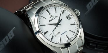
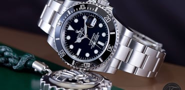
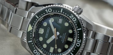
Naturally, as a vintage guy, my watch brand will lean on the vintage world. The aim is, however, to use vintage-inspired design language without going for direct reissue vibes. That means no faux patina, for instance. The challenge is to find the right balance between historical design elements and their contemporary use. If done right, the result should be almost free of a temporal context. What I mean by that is that it will look at home regardless of the era in which you view it. I think the best watches have this quality. They looked fresh in 1960, and they still do today. It is an ambitious goal but one worth pursuing.
It is tempting to go for a straight vintage-style watch and brand. I am afraid that such designs will not age too well, though. I am unsure whether a 2020s interpretation of a 1960s style will still work in the 2040s. And I want my customers or their children to still enjoy their VPC watch by then. So the aim is to bring vintage design language into a less era-specific application.
Printing on a 1957 dial
Getting obsessive
I have a rather obsessive nature. When something fascinates me, I can bite down and lose myself. This project is no different. I have, for instance, obsessed over fonts for months now. If you have read my book, you know that I get bogged down in these sorts of details. I could devote an entire episode of Building A Watch Brand to fonts alone.
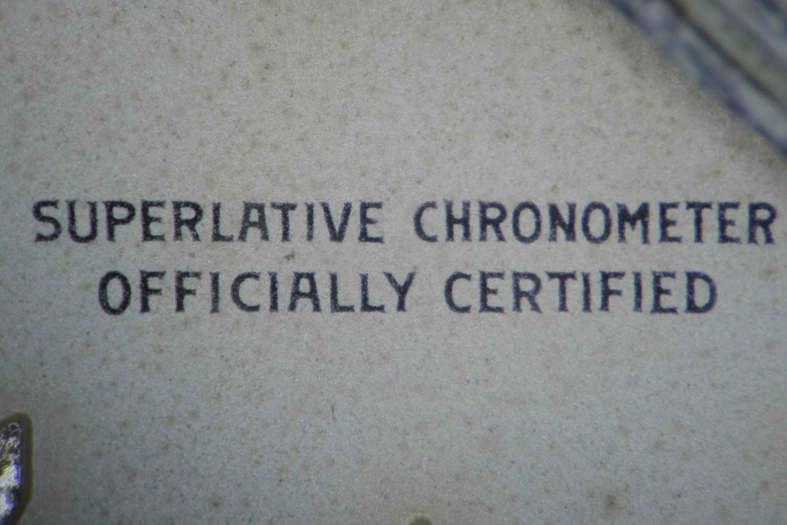
I will stick to a short version here. Back in the day, the dials for most watch brands were produced by a handful of dial makers. They developed fonts that would remain legible when printed extremely small, as on a watch dial. These fonts were also specially optimized for pad printing to prevent ink buildup, pull-up, and smearing. The resulting typefaces had a specific style of serif as well as some oddities like flat-topped As and 4s. These are unique to vintage watches and have largely disappeared in the following decades.
There is an episode of Abstract on Netflix dedicated to Hoeffler & Co. recreating that sort of font. Unfortunately, they opted to make it more modern and widely usable. In that process, they omitted the characteristic pointy serifs. I have spent months tracking down a font closer to the overall feel of those original vintage watches. I have found one. It will be used in the VPC logo as an ode to watches from what I consider the golden era of watch design, the 1930s–1970s. This is the type of obsession over details that I absolutely love to lose myself in. I guess I have now created my own playground in that sense.
VPC preliminary logos
So the typeface is a nod to the past, and the general layout of the logo will be as well. It is an ode to the history of our shared passion. I say “logo,” but technically, it will just be a signature. Early watchmakers used to sign dials with their (brand) name. This would generally be done either in one or two straight lines or curved along the dial. This is why so many watch-brand logos are so similar. The fonts were technically optimized, almost leaving just the choice of a straight or curved signature. I want to echo that style because I love the simplicity and historical value. Also, I feel an overly modern logo on a vintage-inspired watch can cheapen the look.
I have made some preliminary mockups of both using my precious typeface. While interviewing potential watch designers for VPC, one had an important bit of advice. He told me to ensure that any logo — not just the font — would work on a very small scale. I will create two versions of the logo, one for general use and one for small use (on the dial). The regular one is designed to look good on-screen and on any branded materials. The other is a slightly thinner version with greater kerning (spacing between the characters). That might look less attractive at a large scale, but it remains much more legible when printed small. If executed properly, they will appear the same unless you know what to look for.
![]()
I have to see these mockups on the actual watch design before making a choice of which to pursue. I love the charming vibe of a curved logo. However, as I explained above, I want to prevent the watch from becoming too much of a throwback retro piece. Whether the curved logo works or I need a more contemporary straight-line alternative, we’ll see later on. There are plenty of great examples of both styles, but we’ll have to see which fits best. Of course, the chosen style will then be fine-tuned by my graphic designer, which I clearly am not.
A word on design choices
This is only the second episode of Building A Watch Brand, and I am already throwing sketches into the ether. Admittedly, none are of the watch just yet, but still. Perhaps, then, this is an excellent time to address what that means. Most brands do not disclose anything until it is fully developed and matured, so this is a bit different.
For one, I have to rely on your mental flexibility as things evolve. Compare it to a concept car at a fair. It might look spectacular, but the designer did not take road safety and fuel economy into account. The final version will look radically different. Compromises will have to be made. The same applies here. “Kill your darlings” is hard in any case. You will witness me killing my darlings. I can fully imagine that might be frustrating (or hilarious) for you at times.
Furthermore, I love that I get to read your feedback. It is extremely valuable to me. At the same time, I am not going for a crowd-sourced design, so there will be times when I ignore great input for the sake of staying true to my own compass. That is a bit scary, actually. I might share a sketch that you absolutely love but that I want to change radically. Or I might be in love with a feature that you, the Fratelli, tear apart in the comments section. It is, however, exciting to see how this all works out.
Next steps in building a watch brand
When the next episode of Building A Watch Brand comes out, I will likely have a watch designer on board. He or she will creatively and technically develop my concept. More on that later. I will also be a bit further along in terms of finances and a business model. As I become better informed, the truly daunting scale of the project presents itself. When I started musing about the idea that a watch might be a cool next step after the book, I was comfortably naive as to what it entailed. However, the investment required upfront is of a completely different magnitude.
So my lighthearted approach to building a watch brand becomes a little more serious. I have to be able to find a number of aficionados who share my particular taste, and they have to be willing to part with their money to get a VPC watch. If I fail, I — and, more importantly, my family — will suffer a very serious financial blow. So all fun and games aside, I have to devise a solid plan. I have to do some risk management.
I promised to share the whole journey, so I will share that part of it too. Though I prefer to write about typefaces and dial layouts, the financial aspect is of equal importance. It is no reason to get discouraged, but it has to be managed well.
What do you think of where VPC is heading so far? Let me know in the comments section below.
You can also find and follow me on Instagram: @time_travelers_journal