Building A Watch Brand Episode 5: The First Design Ideation Sketches

Today, I am proud to share the design ideation stage of VPC’s debut watch. I have been postponing this one so that I could share a big chunk of progress in one go. And a big chunk it is! Finally, I have something visual to show you. Max Resnick and I started with my original concept and generated several different possible design paths from it. We then took the elements that spoke to me to come up with the preferred path. Today, you will see that journey from many rough ideas (divergent thinking) to that one path (convergent thinking) for the case and bracelet.
I will show you some of these different paths and how we went through a process of elimination. I am proud to share this with you because it is highly uncommon. If you ever see preliminary sketches of watches, they always seem to lead cleanly and directly to the final product. Often, the highly polished sketches that you might see are produced for marketing purposes after a watch has been fully designed. But that does not reflect what the design process looks like behind the curtains. You try stuff. You go down a path only to conclude that it is not where you intended to be. And you stumble upon things that work unexpectedly well. So, at the risk of showing you discarded material that you like more than the chosen route — which is why sensible people never share this stuff — here we go.
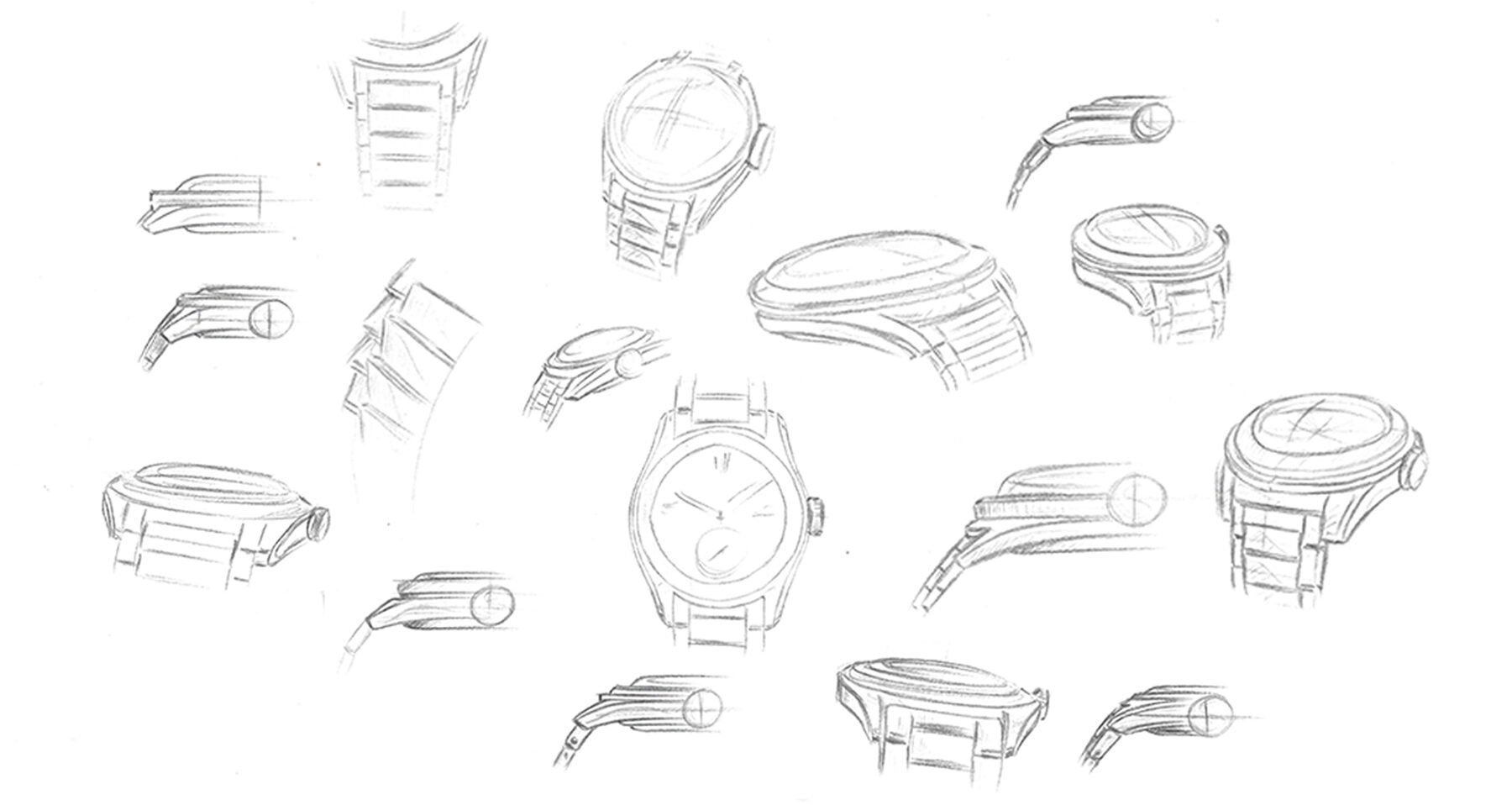
The first round of exploratory sketches
Initial exploratory design sketches
Above, you see some of Max Resnick’s first pencil sketches based on my original design brief and our moodboarding efforts. You can clearly see him play with different ways of piecing together the features of my original concept, as summarized in Episode 4, and exploring how the different elements might work together. This stage is about finding a general form and direction. It is also about getting a feel for what the watch sets out to be.
You may notice that the watches drawn are still quite generic at this point. One of Max’s most important design tasks is finding a language that is instantly recognizable and unique to VPC. As explained before, we are looking for a contemporary translation of a vintage design language. The sketches above show some very interesting and potentially attractive watches but nothing truly distinguishing just yet. This, then, is very much a warm-up routine — getting to grips with the brief, throwing stuff at the wall to see what sticks. At this stage, finding what doesn’t work or reflect VPC is equally important to us as discovering what does.
It is also a test of my concept. Do the features and components that I have conceptualized come together in any sort of promising way? Is there any music in it? We concluded that there is and that it allows enough freedom to be bold in how we approach the design. Therefore, the next step is to get more creative with it and explore different directions in which to take it.
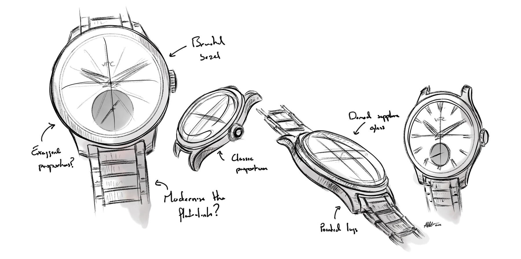
A “road not taken” in a more formal translation of the brief
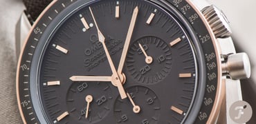
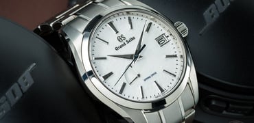
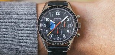
The dressy–sporty spectrum of do-it-all watches
A do-it-all watch is intended to be at home on formal as well as casual occasions. You can lean either way when coming up with such a design, and there’s a fine balance to find between a dress and a sports watch. In my eyes, the Rolex Explorer and Omega Aqua Terra are on the sportier side of that spectrum, for instance. The Rolex Datejust is more on the formal side of center if you ask me. As you will see, it is rather subtle details that will determine a watch’s position on that continuum.
A slightly sportier angle but still not quite where we want to be
Above, you see two potential paths leaning towards the more formal side. Do not get too attached, my fellow watch lovers; these are paths that we chose to abandon early on. I enjoyed seeing how details such as a narrower bezel and simpler lugs led to this more formal aesthetic. These tests highlight the influence that differing proportions between the dial opening and flat bezel will have on the overall feel of this watch. Our early tests on the more formal side did, however, encourage us to maintain a visually slim design.
I wanted something a little more aggressive, though, and we wanted to find a design route with a stronger personality. There is potential here for a future VPC dress watch, but these sketches do not represent what I am looking for in my debut watch.
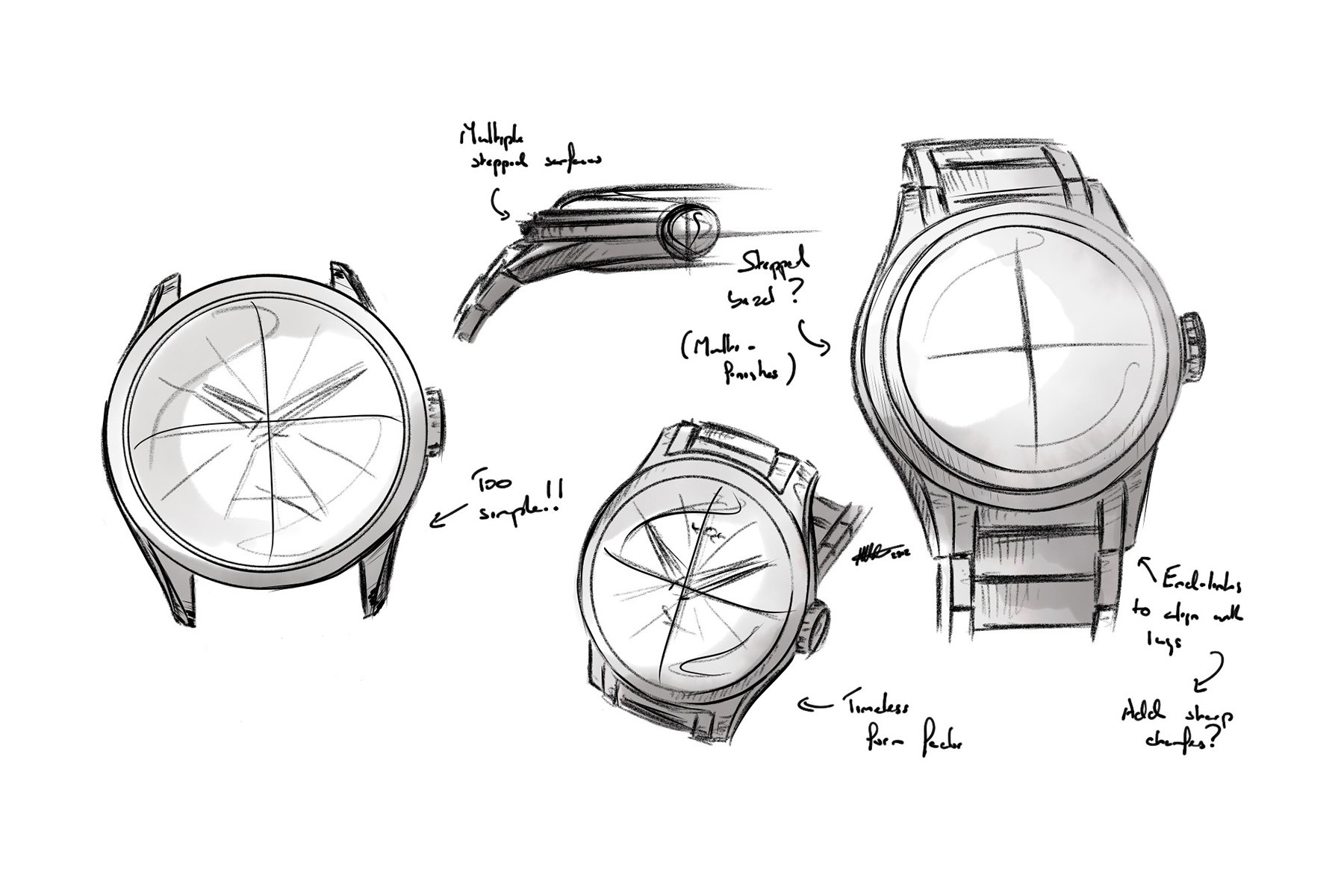
Sketch of a more daring approach
A sportier design with a unique twist that will stay
Above, you see sketches with a more muscular, forceful case shape. This vibe is created by pairing a smaller dial with a broader bezel and meatier lugs. The case instantly looks more solid and aggressive. The overall form and details also start to create something more distinctive — a watch with a unique identity. Counterbalancing the subtle 37mm diameter, the signature style will provide the strong wrist presence that I am after. Max felt it was important that these early sketches sparked excitement because it’s here where we start to discover a design language for VPC. It needs to act as a statement of intent in our first watch, with translatable attributes to future VPC watches as a cohesive collection. Max labeled our style “retro-futurist,” which I feel hits the nail on the head. This path, then, is the one that I asked Max to pursue.
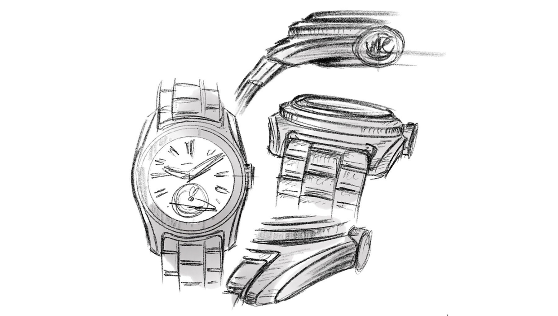
Driven by my hard demand for a beautiful end link or case/bracelet marriage, Max came up with something brilliant — at least I certainly think so. My concept featured a narrow, flat ledge surrounding (and echoing) a vertically brushed, flat bezel. This puts some space between the bezel and the bracelet. It also gives the effect of a larger perceived case size than the ~37mm diameter might initially suggest.
Max decided to turn that into a key design feature. As you see, he elegantly curved the inner corners of the lugs and added a downward-sloping facet. This will form a small ledge that the bracelet runs beneath rather than up against. It is a discrete detail, yet it adds layers to the watch’s overall form. It is a subtle, modernized version of the classical hooded lugs, and it should pair equally well with a strap.
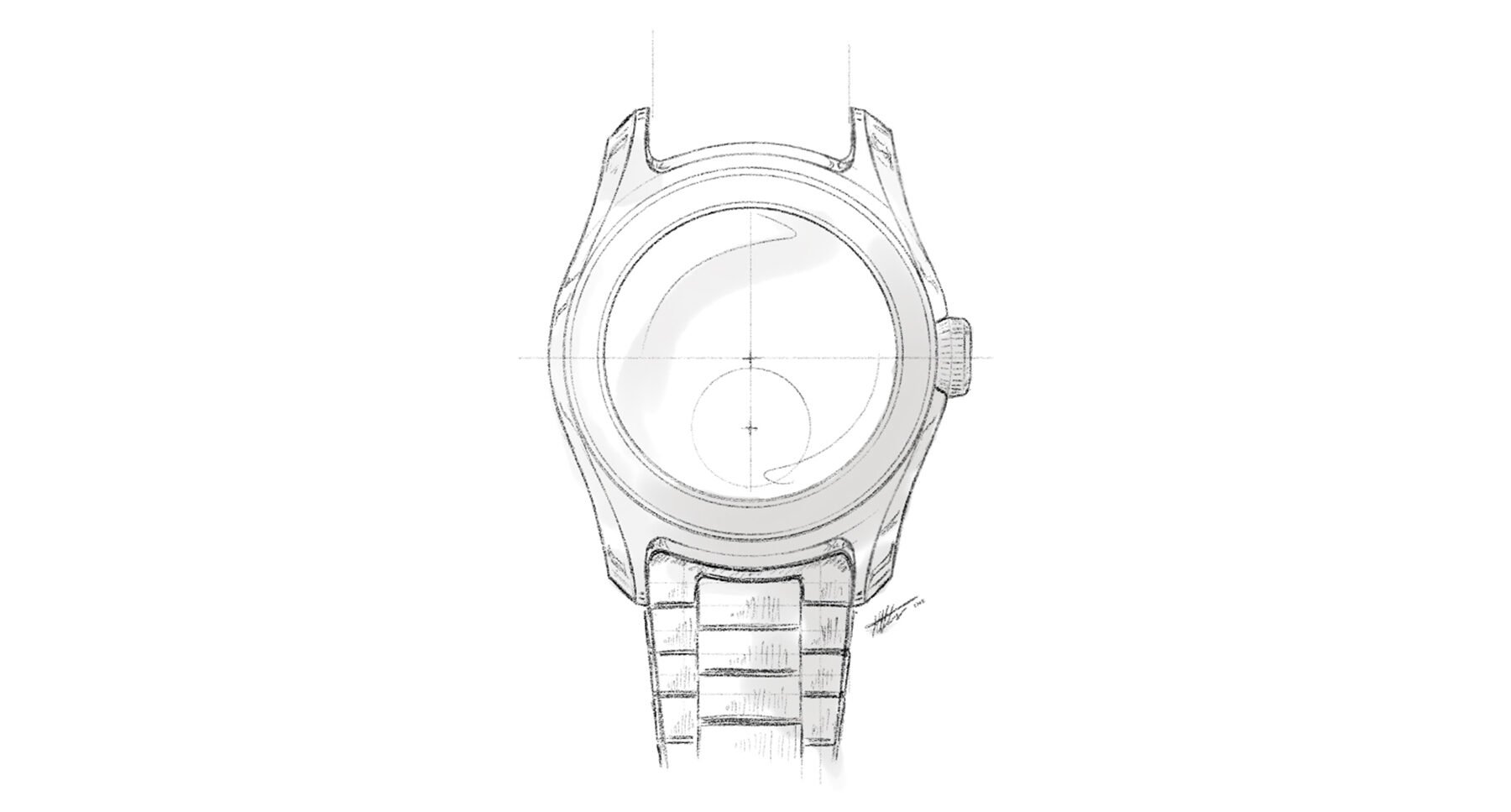
Refinement of my preferred design path
Going down the chosen design path
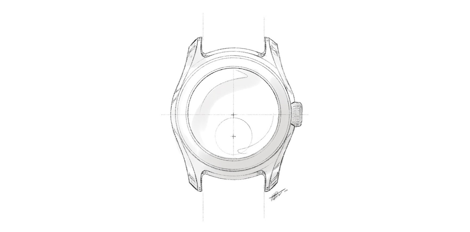
The more I looked at the sketch, the more I fell in love with it. Max had succeeded in doing something unique without making it feel forced in any way. Remember, I am simply aiming to satisfy my taste here; you may very well disagree, which is perfectly fine and only natural. Next, he took that sketch and took it through a round of refinement and development, resulting in the sketch above. We will go through many more rounds of iteration and refinement, but this sketch reflects our intent and is realistic in its proportions and overall form. Even at this early stage, we are mindful of the movement that we intend to use as well as a range of technical performance targets.
If you aim for a round case, the ledges result in broader flanks too. Otherwise, you would end up with a stretched or oval design. This extra steel allows for the implementation of crown guards and extended chamfers, which further enhances the visual strength of the case. Bringing the crown slightly within the overall form of the watch increases comfort and wearability. The entire case is brushed, except for the chamfers on its flanks, on the ledges, and around the bezel.
Upon seeing this drawing, I got seriously excited. Beauty is in the eye of the beholder, of course, but I think this case design is masterful. I love how Max managed to make it feel familiar and original at the same time.
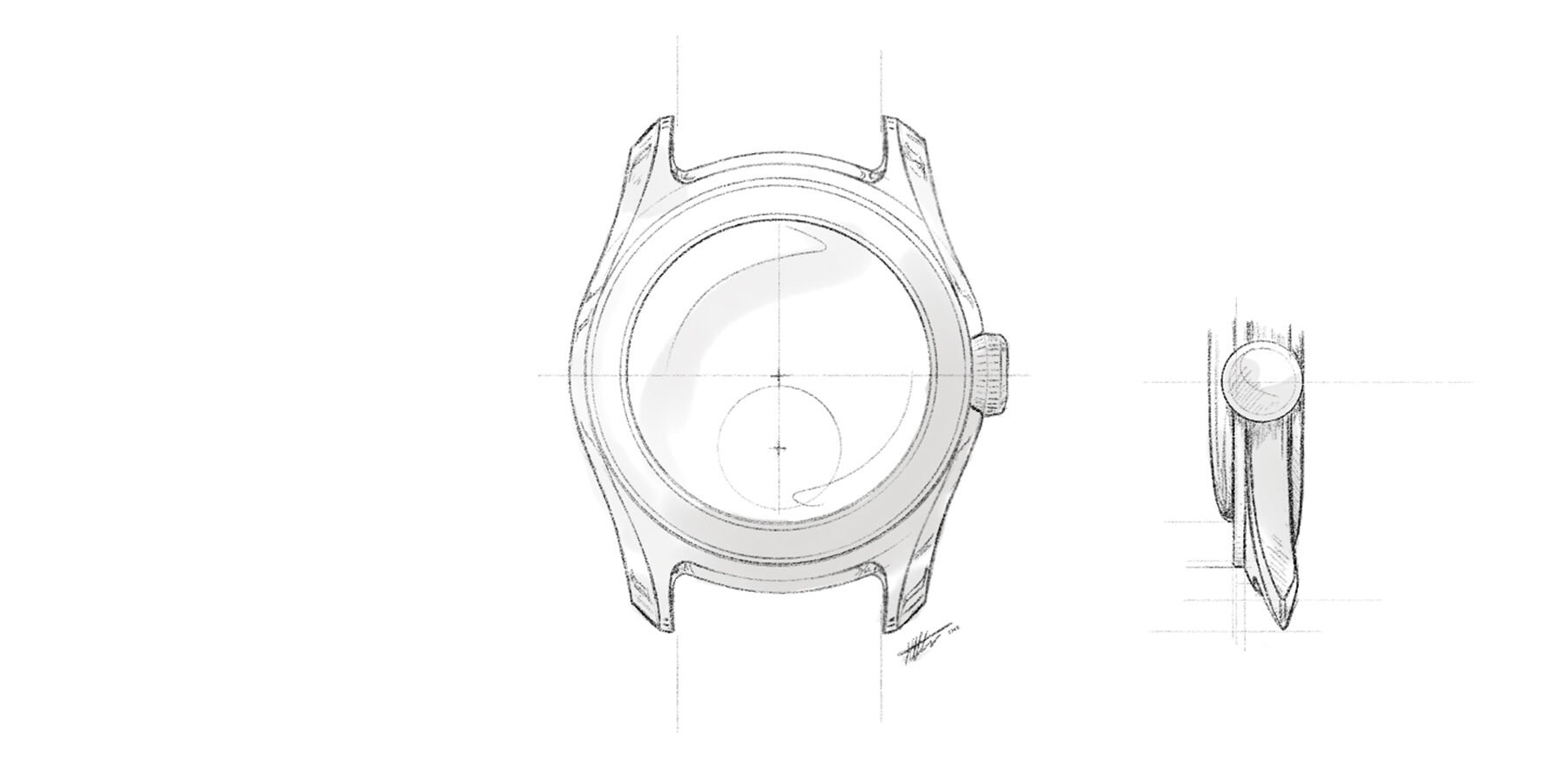
End link and bracelet sketch
Bracelet design and integration
My concept described a flat-link-style bracelet. Max went to work on ways to make it rhyme with our brand-new case design. We will give the original style a slight upgrade with some subtle, narrow chamfering. Otherwise, the entire bracelet will be brushed. I prefer fully brushed bracelets for their more subtle appearance and propensity not to show fingerprints and smudging. The bracelet will be 20mm wide and taper to ~16mm at the clasp.
The end link is where things get a little different. Our case solves one of the significant issues that most end links face — bridging the gap in thickness between the case and bracelet. Typically, you may have to jump from, for instance, a 2mm-thick bracelet to a 6mm-high lug opening. That often puts the end link at an angle that does not flow with how the bracelet drapes. Our ledge significantly shrinks this jump. To further improve the bracelet-to-case transition, we will give the first center link an articulating design, meaning that the bracelet can immediately drape from the tip of the lugs and sit closer to the wrist.
The end link will follow the curved contour of the inside of the lugs, with the central piece enabling the transition to the more angular bracelet. We needed that contrast. A more rounded bracelet design makes the entire watch too bulbous and gimmicky. The combination of round and angular shapes provides balance, at least in my humble opinion. It is all a matter of taste, of course.
A rough first exploration of a possible case profile
Moving the design forward
It is important to remember that this is still only the ideation stage. We will get into problem-solving later on. That first articulating link, for instance, should not end up sticking its two rounded top corners up in the air when on the wrist. But such issues are for the next phase. As always, then, everything is still up for change and revision.
This process has, however, put us on the desired path. I think Max succeeded in finding a unique visual identity for VPC’s debut watch. He managed to do something more radical than I conceptualized but still perfectly in line with my preferences. Max insisted that we push the design a little further than I initially briefed him to do. I think he was right as this is more of a statement of intent for VPC now.
The next crucial step is adding realism to the design to make it come alive. This will give us much more of a feel for what the watch would end up looking like. Of course, the dial is another key defining element that we will work on next. You can already see a vague outline of my desired small seconds sub-dial. Now is the time to make that one-eyed panda come to life.
Just when you thought there would be no more blurred pictures!
Closing thoughts
I am so happy to finally be able to share these first visuals with you. I love them more than I had dared to hope or could envision. Honestly, it feels like Max reached into a part of my brain that I did not have access to and pulled out this watch. “Here, Thomas, this is that dream watch of yours. Enjoy!”
A note from Max: “This ideation phase has given me time to really understand Thomas’s intent for VPC, going beyond the concept he shared in Episode 4. I’ve had the opportunity to push Thomas a little outside his comfort zone as we’ve explored different directions and interpretations of a do-it-all watch. Now we have found a design identity that we can build on.”
Next time, I will hopefully be able to share ideation stage sketches of the dial. That will surely put some soul into the design. I cannot express how excited I am about the entire project. I am starting to believe more and more that there is potential in this concept. It is equally exciting that I get to share the journey with you. I sincerely hope you enjoy seeing the process as much as I enjoy driving it.