Dear Jaeger-LeCoultre, Bring Back The Reverso

As a vintage-watch nerd, I don’t need any new modern watches. Well, actually, I do need one. You see, my wife would like to have a new Reverso. The problem is that there is nothing in the current JLC portfolio that would bring us into a boutique.
Every couple or work team has inside jokes that don’t make sense to anyone but a few people involved. One or two words are usually enough to get provoke those knowing snickers. These moments come up irregularly and spontaneously. Usually, they occur when someone is picking on another or in situations that recall an impactful moment from the past. Whatever that was, a few “trigger” words bring up that special moment of understanding, shared experience, and eternal bonding. My wife and I have one of those too. All it takes is for her to say, “Push present?!”
A Reverso as a well-deserved gift
I believe I do not need to elaborate much, and you get the idea of what’s it all about. The fact is that my wife’s wrist still hasn’t seen a Jaeger-LeCoultre Reverso. I could say she refused multiple offers to go to the boutique, but that’s exactly what makes the inside joke a good joke. Anytime she pulls a “Push present?!” move, I look funny. I made a promise that hasn’t been fulfilled. And honestly, today, it’s completely irrelevant why I haven’t delivered. I even don’t feel the urge to defend myself. I just smile with satisfaction. We both love our “push present” joke that, over the years, grew into something bigger.
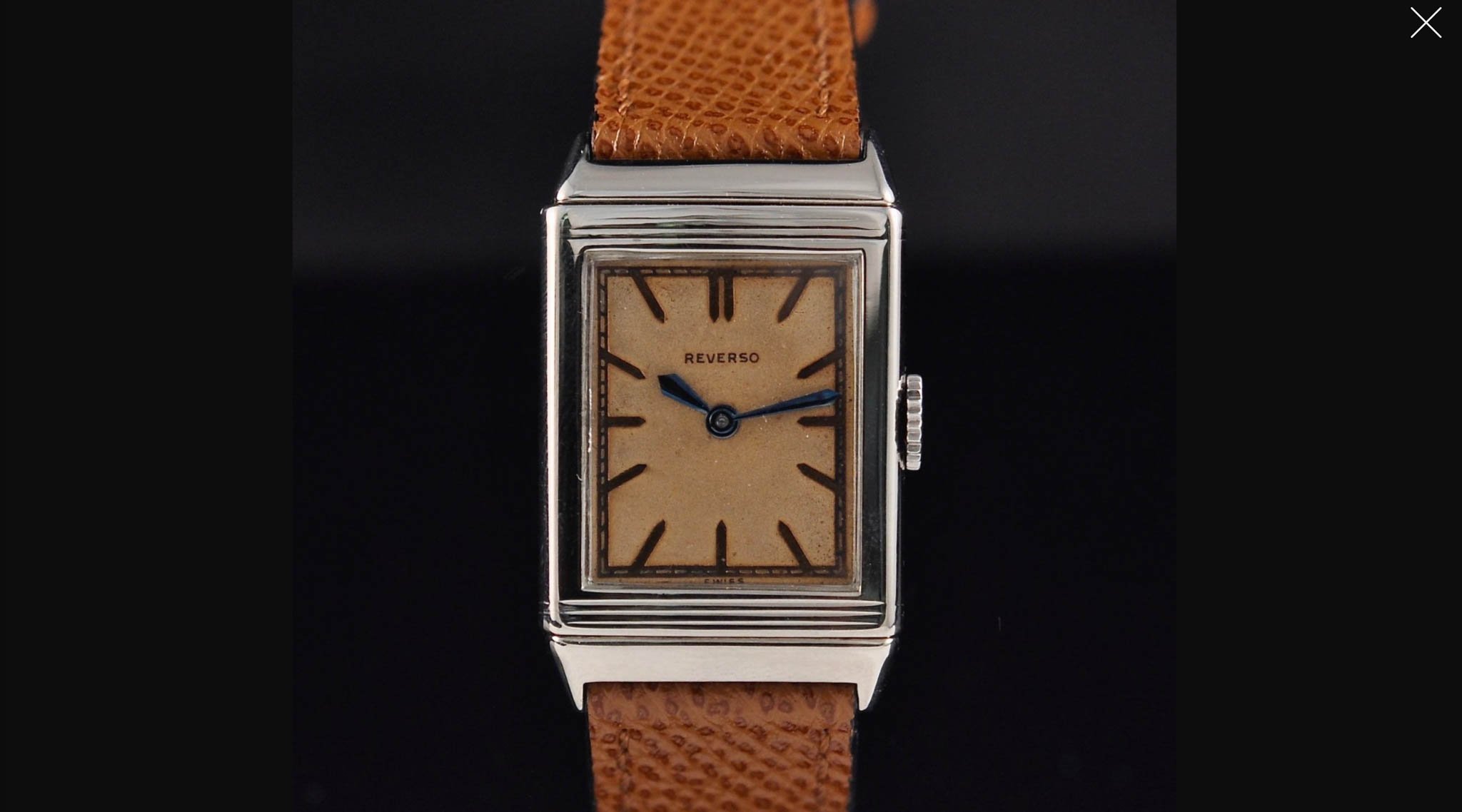
Image source: Romain Rea
What’s the problem?
We both know my wife will get her JLC Reverso. And once she gets it, it will be big! Well, not big in terms of dimensions because that’s one of the problems we have with the current Tribute collection. When I say “big,” I mean that my wife will be overwhelmed with the design… which she is not today. For both of us vintage lovers, the Reverso One and Reverso Classic are way too far from what we consider the real essence of the Reverso. I guess that’s why JLC keeps the Tribute line in its collection. But again, it’s not even close to our taste. Those models are too shiny, the hands are too chubby, and the watches are missing a bit of lightness.
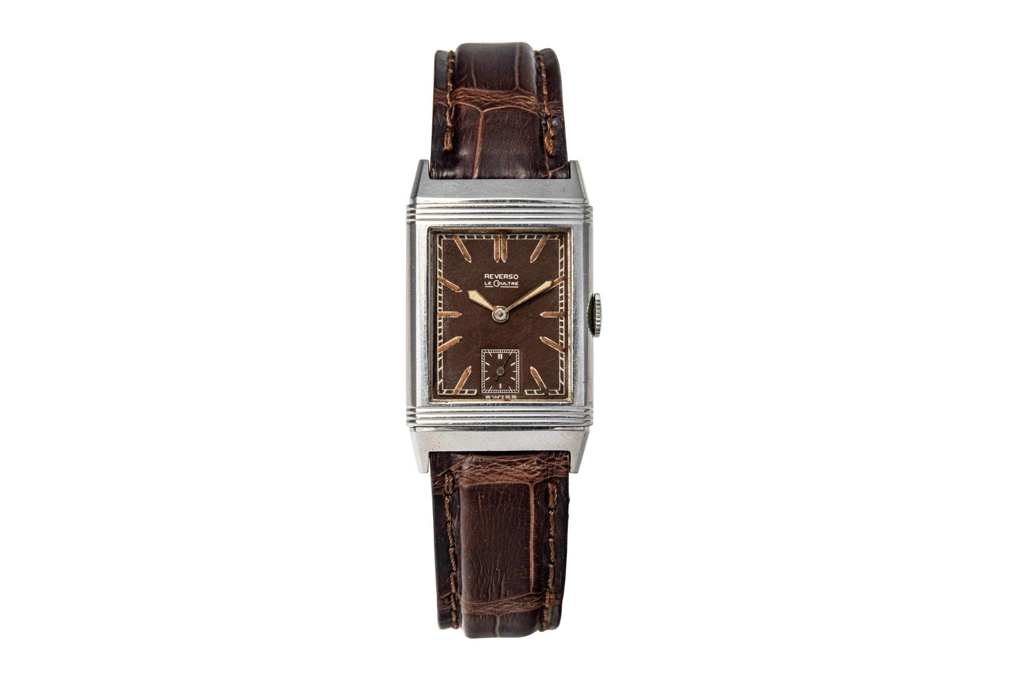
Image source: Antiquorum
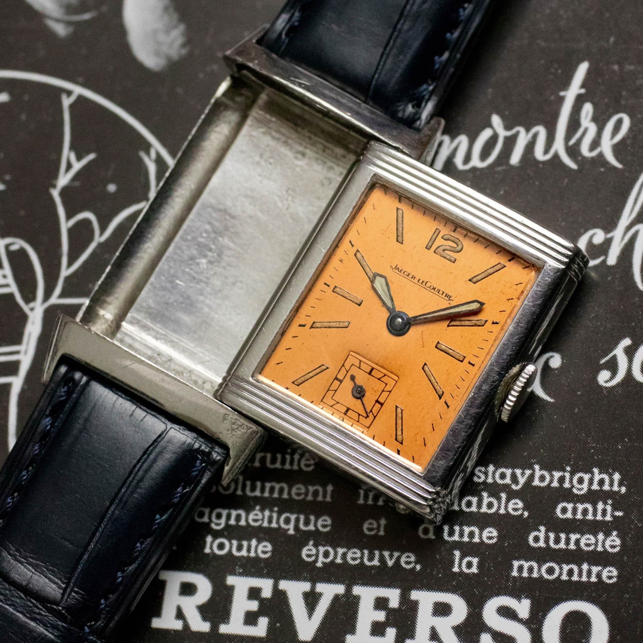
What kind of Reverso do we want?
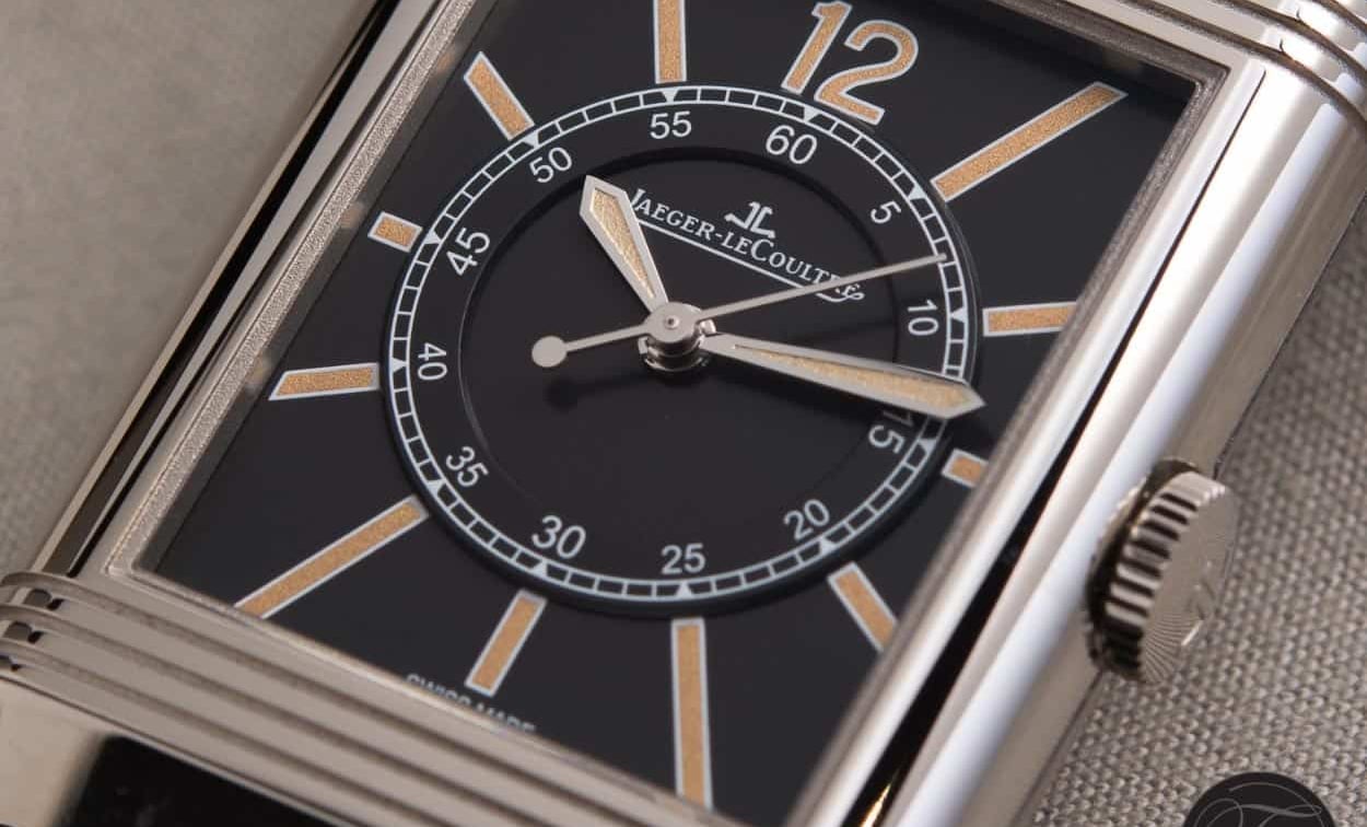
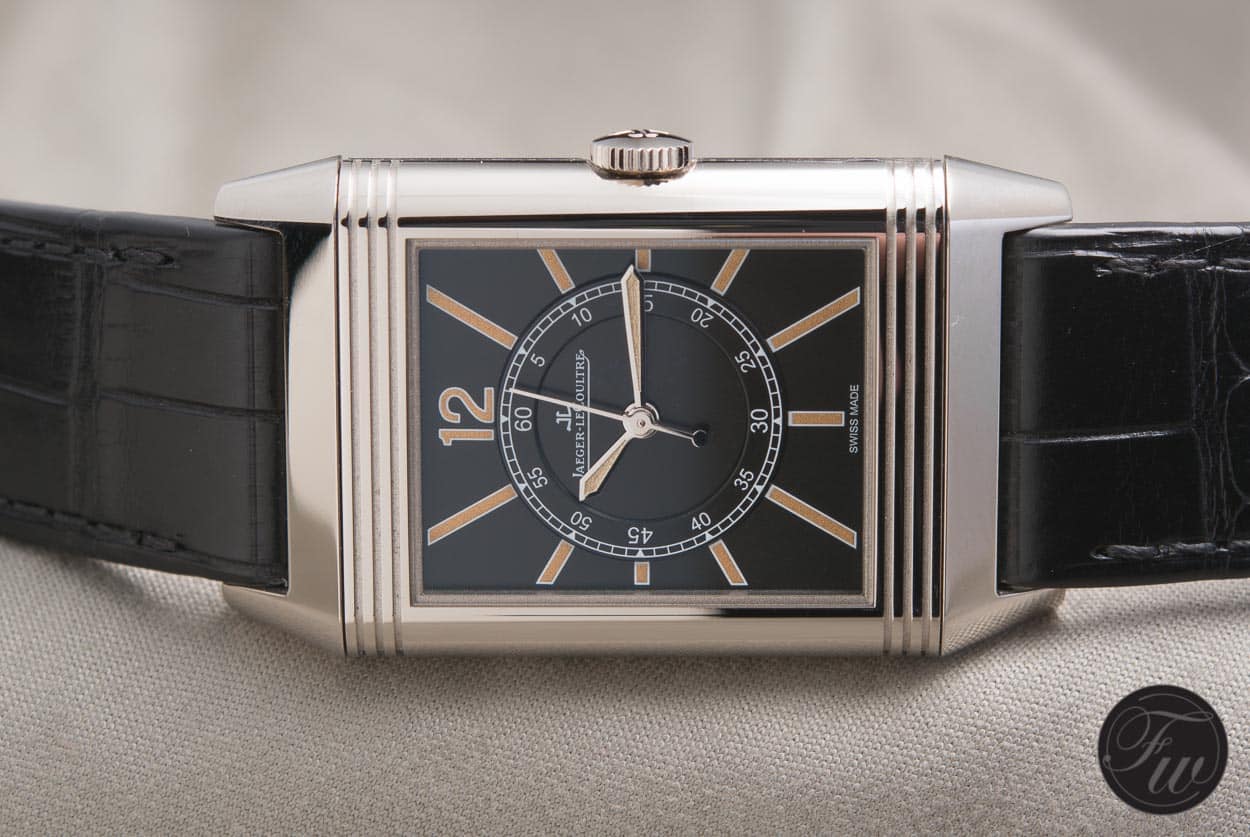
The closest to what we see as my wife’s first JLC Reverso is the Jaeger-LeCoultre US Limited Edition Reverso Tribute to 1931. The prices for these got crazy in the last few years, and now, they are trading for up to $20,000. With the minimalistic logo, iconic indexes, best Reverso hands ever, and lume, no wonder we see maybe one piece resurface online per year. And no matter the price tag, it usually disappears within hours.
For the record, I have no specific model in mind. I don’t necessarily need to see another 1:1 re-edition. I just decided to point out a few models that popped into my online search and highlight a few elements that represent an iconic model for me. Honestly, I want to see new watches, and I want to be surprised. I believe JLC and the Reverso have great source material for a modern reinterpretation that will keep the vintage nostalgia and add some edginess that the future demands.
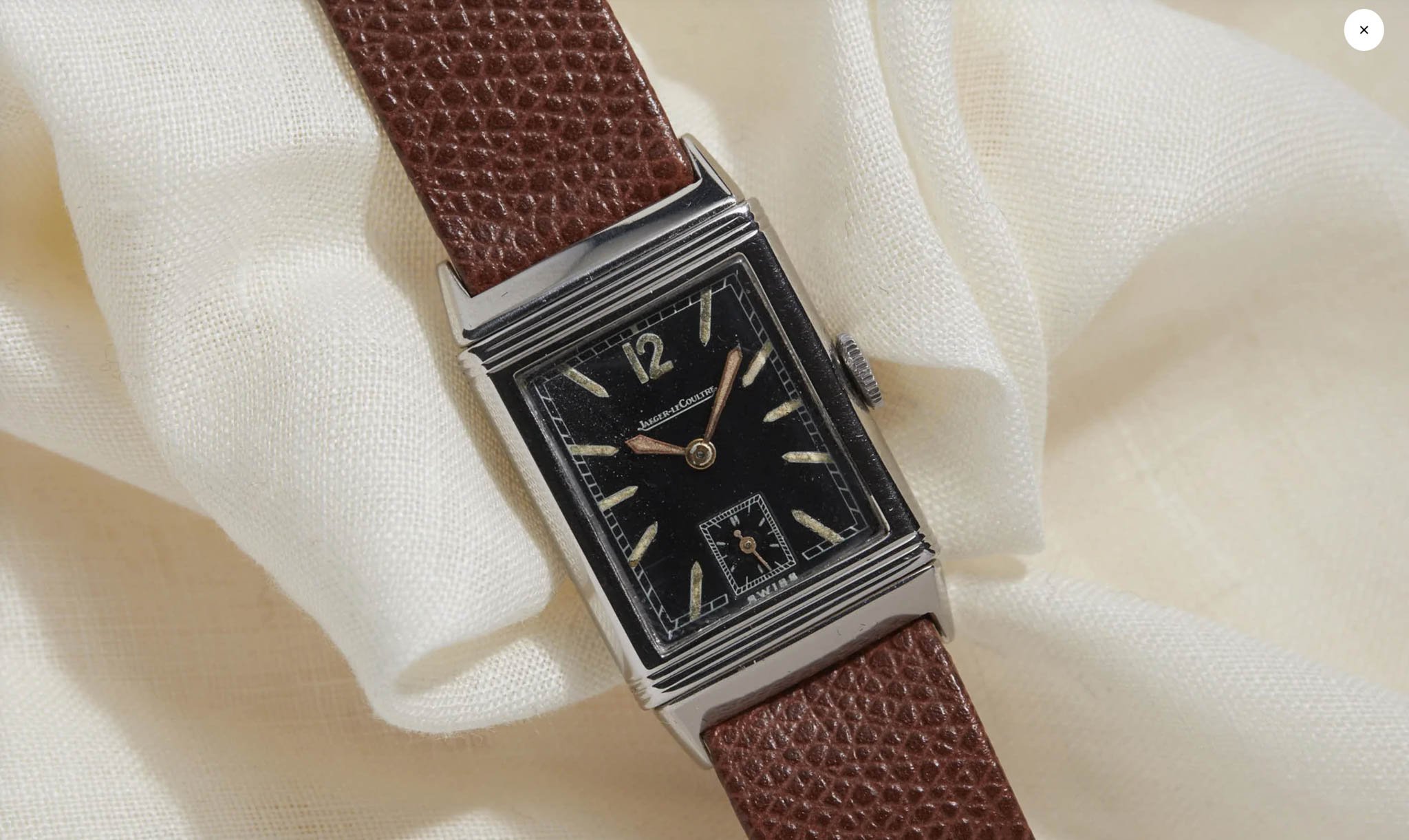
Image source: Analog/Shift
Sword hands
Many brands used this specific hand style, including Gallet, Tissot, and Omega. But once you say “sword hands,” there is only one watch I see. I guess it’s all about proportions — the width of the tip, the angling of the sides, and yes, the length. The concept works on a 38mm watch too, but it’s hardly the visual experience you get from short Reverso hands. Those are the iconic sword hands. Once the dial exceeds a certain diameter and you know the original Reverso, the hands look like they were tailor-made for Karl Malone. I would like to see Reverso sword hands come back.
Numbers and fonts
If there is something that makes my eyes itch, that would be the font styles on the Reverso dials. One looks like a boring default Arial that no one bothered to change on the forms at city hall. The other looks like it was cut out from a teenage-love-story movie poster. I don’t know. I suppose I can understand why it is what it is; it’s just not my taste. There were some epic fonts over the decades that could be nicely reinterpreted by a great typographer, I think. Let’s hope we will see some of that happening in years to come.
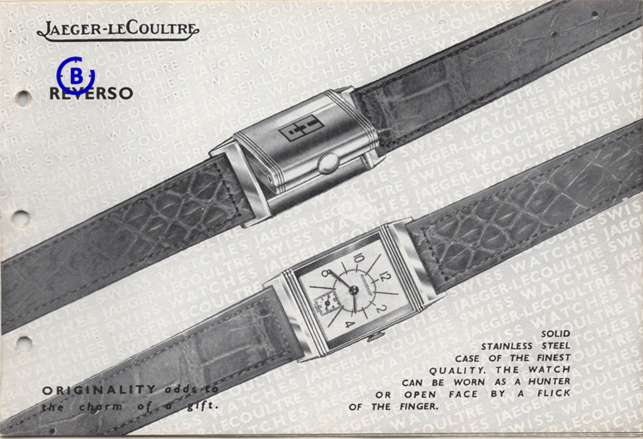
Image source: Blomman Watch Report
Long lines and round tracks
Dials from the 1950s had a lot of charisma. When I look at the current JLC Reverso lineup, though, it makes me feel like looking at some car manufacturer’s portfolio. You need to read the caption to realize it’s a different model. Seventy years ago, dials were richer in detail. Just look at this shot from a JLC catalog from the ’50s. I feel that the designers used the dial space much more playfully. There were different lengths, widths, and proportions of the indexes. The fonts were fresh and creative, and so were the minute tracks designed in different styles.
I don’t know if it has aged naturally or if someone helped it a bit, but this particular image made me realistically imagine that there is even more room to experiment with vintage-inspired dial designs and colors. If I were to encapsulate what I miss, I would say: make it a bit out of touch with everyday, ordinary life. I don’t want JLC’s quality to suffer, and I certainly don’t expect a Reverso to be my favorite sports watch. I just believe that there is room to cut back a bit on the elegance and make the Reverso slightly less formal.
Last thoughts
Buying my wife a vintage JLC Reverso would be the fastest and easiest way to deal with our “Push present?!” challenge. But I am just not sure how long-lasting that would be, as vintage Reverso examples seem pretty fragile. After all, we have two small kids aged one and three, and you know, even watches can fly if they are in the right hands. I guess we won’t push it. It’s kind of nice to wait and see what JLC will bring for the next-gen Reverso. What would you like to see more of? Let me know in the comments.