Hands-On With The New Blancpain × Swatch Bioceramic Scuba Fifty Fathoms Ocean Of Storms

When it became clear that Swatch would release a new Bioceramic Scuba Fifty Fathoms yesterday, I wasn’t sure how people would react. The initial release in September of last year didn’t replicate the hype and success of the MoonSwatch. Some people weren’t that convinced about the more expensive, non-serviceable Scuba Fifty Fathoms. Of course, those doubts were still there for yesterday’s release. Overall, though, I have to say that reactions have been quite positive. It shows that the all-black Ocean of Storms edition is a welcome addition to the Blancpain × Swatch Bioceramic Scuba Fifty Fathoms collection.
On Wednesday, a day before the release, our photographer Morgan and I had an appointment at the Swatch boutique in Amsterdam. There, they took one of the new watches out of the store’s safe and allowed us to go hands-on with it and take some proper pictures. This article is the result of that fun and quick session backstage at the Swatch boutique.
First impressions
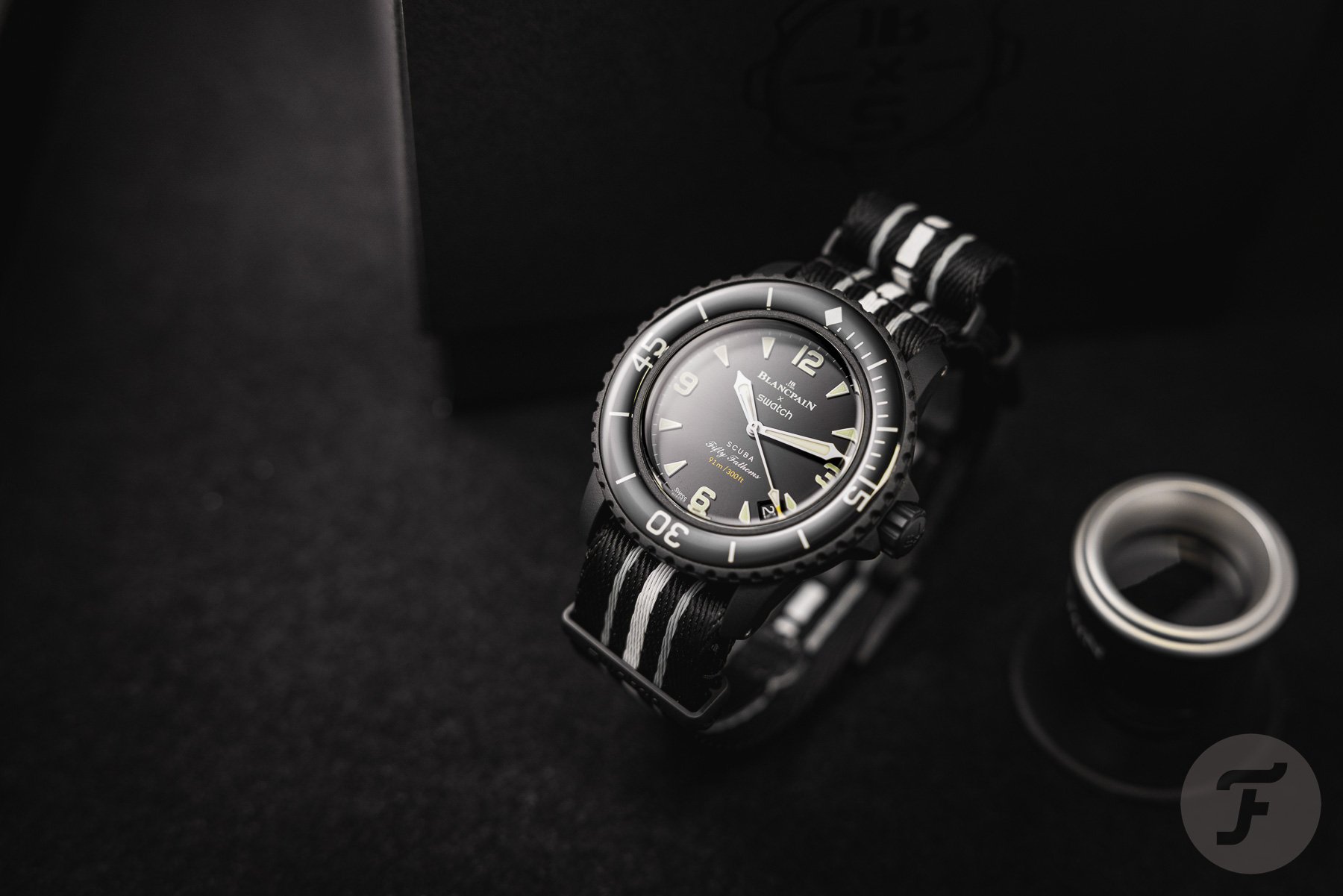
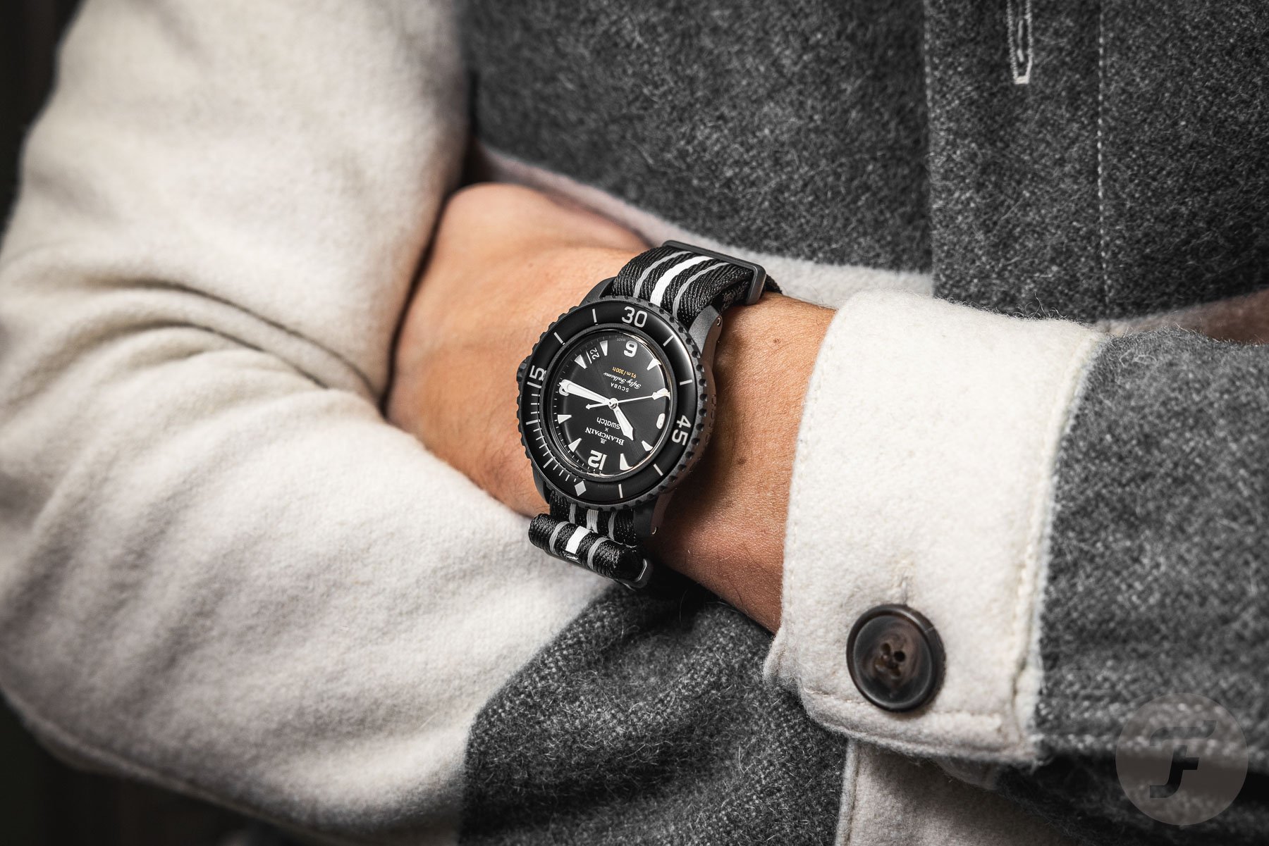
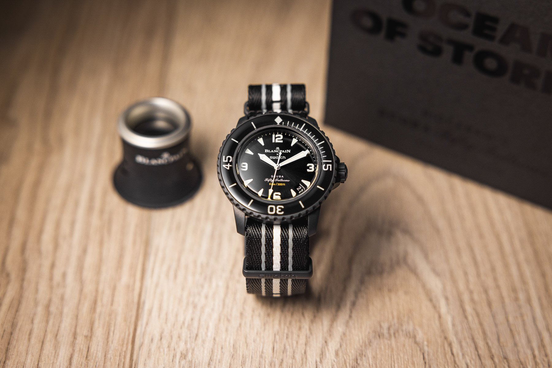
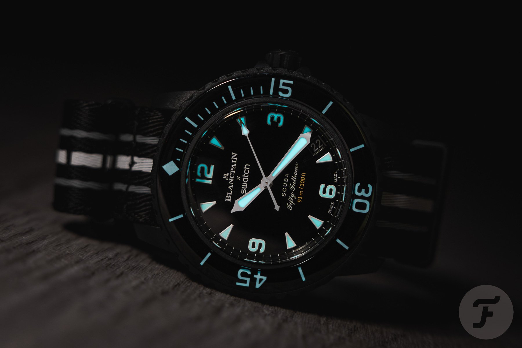
Right out of the box, the Ocean of Storms edition feels like the most serious one of the bunch. Its black sunburst dial and black bezel insert also make it the one that looks most similar to a regular Blancpain Fifty Fathoms in stainless steel. However, with the striped NATO strap and its light construction, it’s still a fun watch to wear. As I mentioned in the introduction article, most of its features are similar to the previously available versions. The real standout feature here is the subtle sunburst texture on the dial.
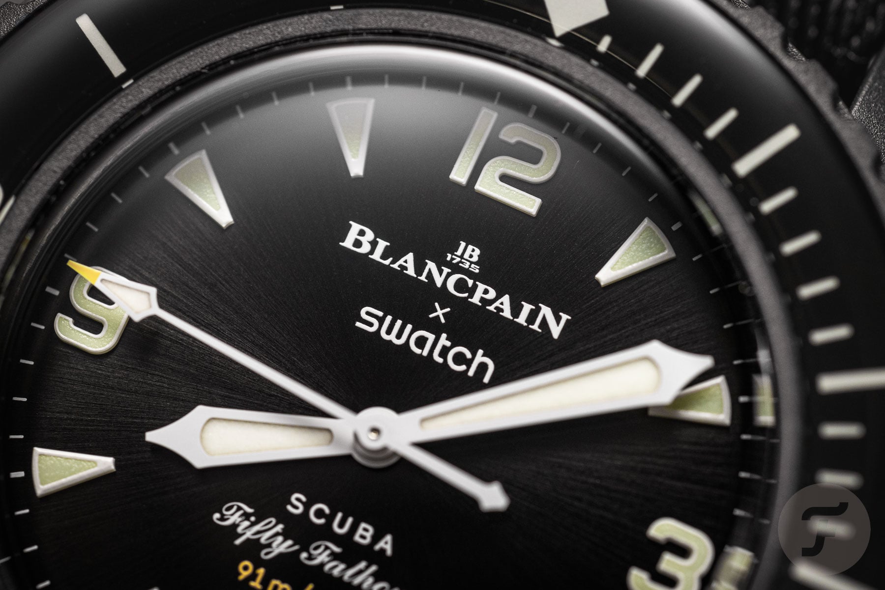
The fumé finishing on the dials of the other versions matches well with their more colorful and contrasting themes. But this evenly black satin-soft sunburst texture adds a more sophisticated touch to the overall aesthetics of the Scuba Fifty Fathoms Ocean of Storms. As you can see in the pictures, it’s not something you’ll notice every time you look at the watch. However, when you see it, it is something you’ll enjoy. It’s almost as if you’re examining how the Sun’s rays hit the water’s surface at sea.
Well-executed and cool details
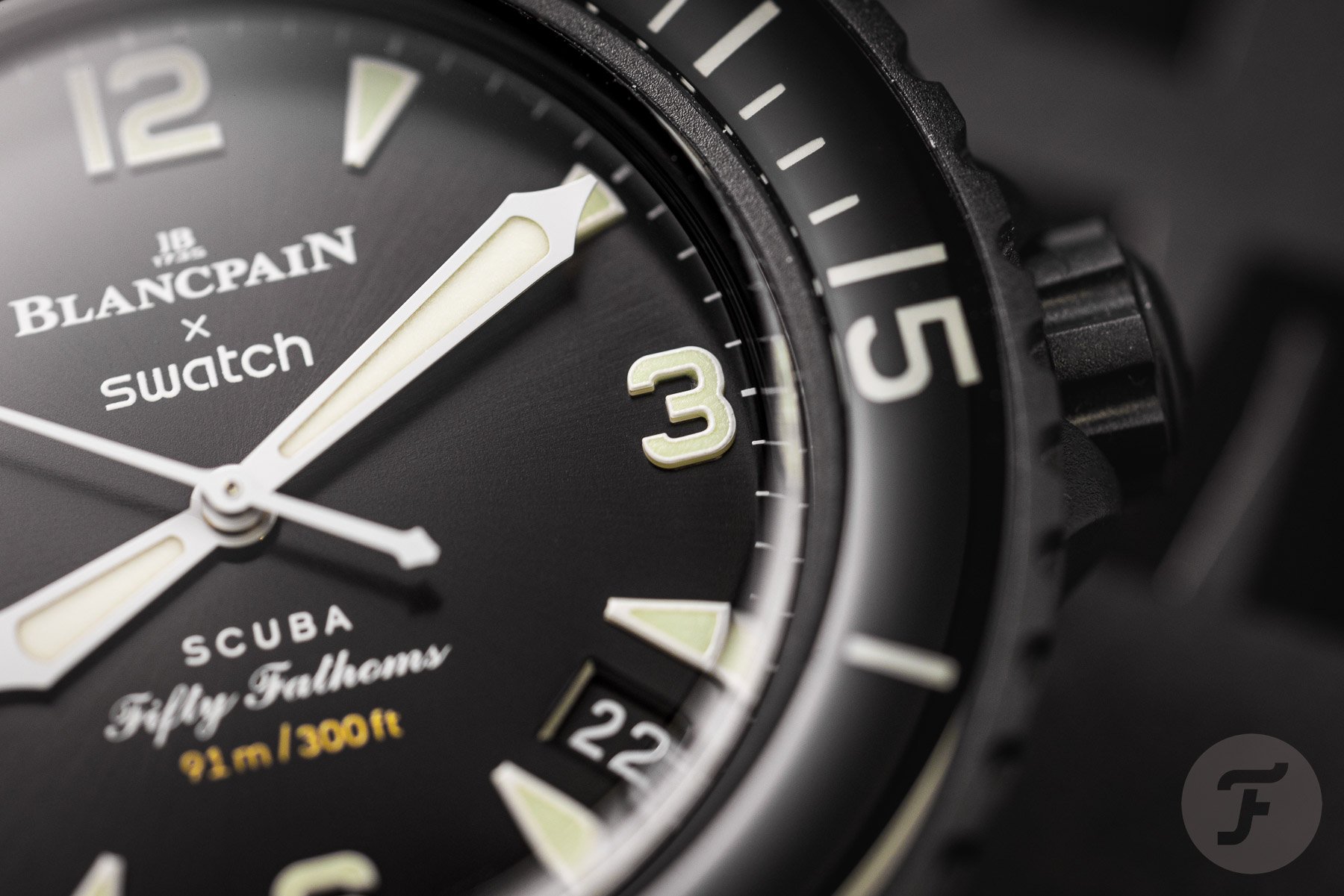
This was also the first time that I spent a little longer with a version with the 12-3-6-9 dial. I was already impressed with the execution of the indices on my Arctic Ocean version. But on the Ocean of Storms, it might even be more impressive. Like on all other versions, the markers consist of six layers of Super-LumiNova with their edges painted white. The precise execution of the indices, especially on those bold numerals, is a joy to behold.


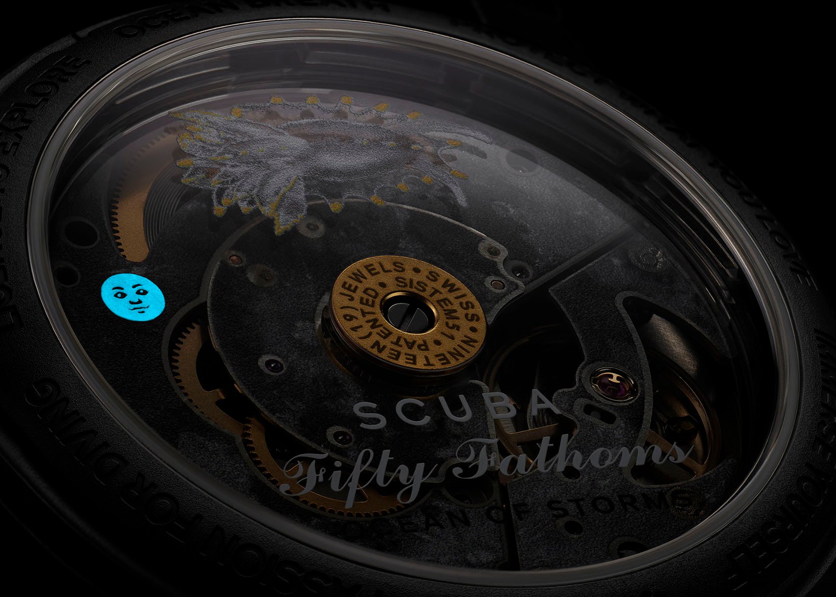
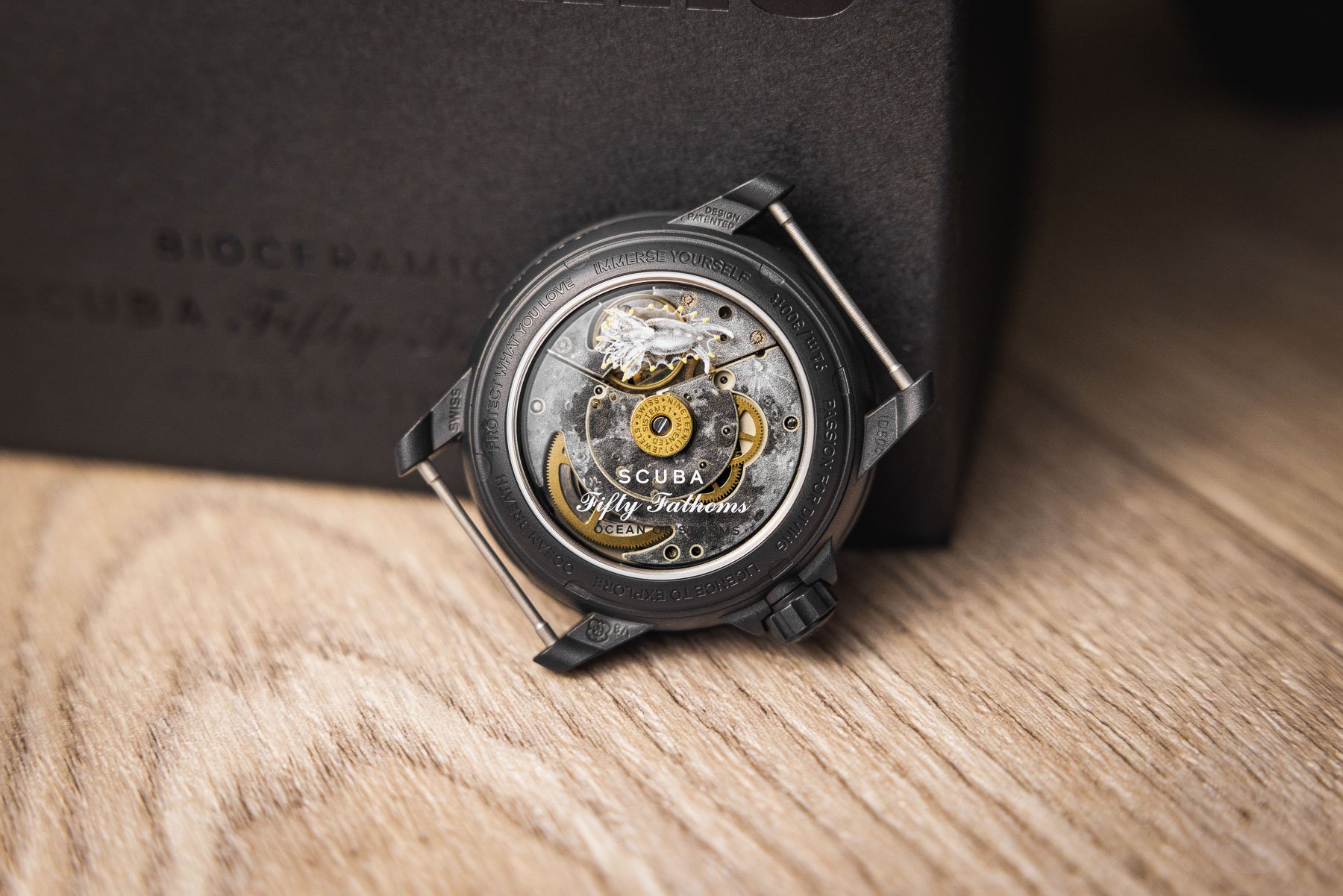
A fun luminescent detail on the movement. Image: Swatch
Another detail that I greatly enjoy is that deep yellow dot on the tip of the seconds hand. It matches perfectly with the yellow text on the dial, which indicates the very appropriate water resistance rating of fifty fathoms. But what I didn’t realize at first is that the nudibranch on the back, the Okenia luna, is also mainly white and has the same dots of yellow on the tips of its feelers. It’s small details like these that make this fun watch just that little more interesting to look at and wear.
On the wrist
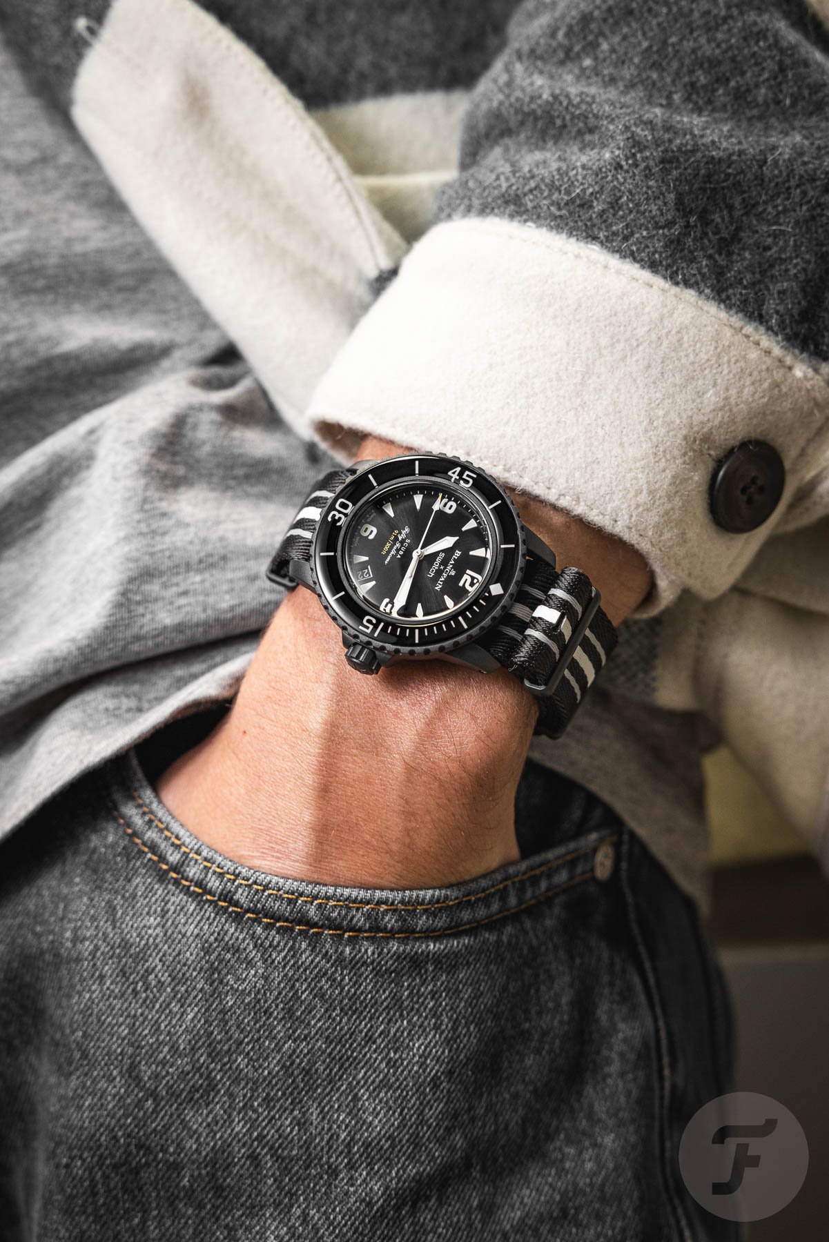
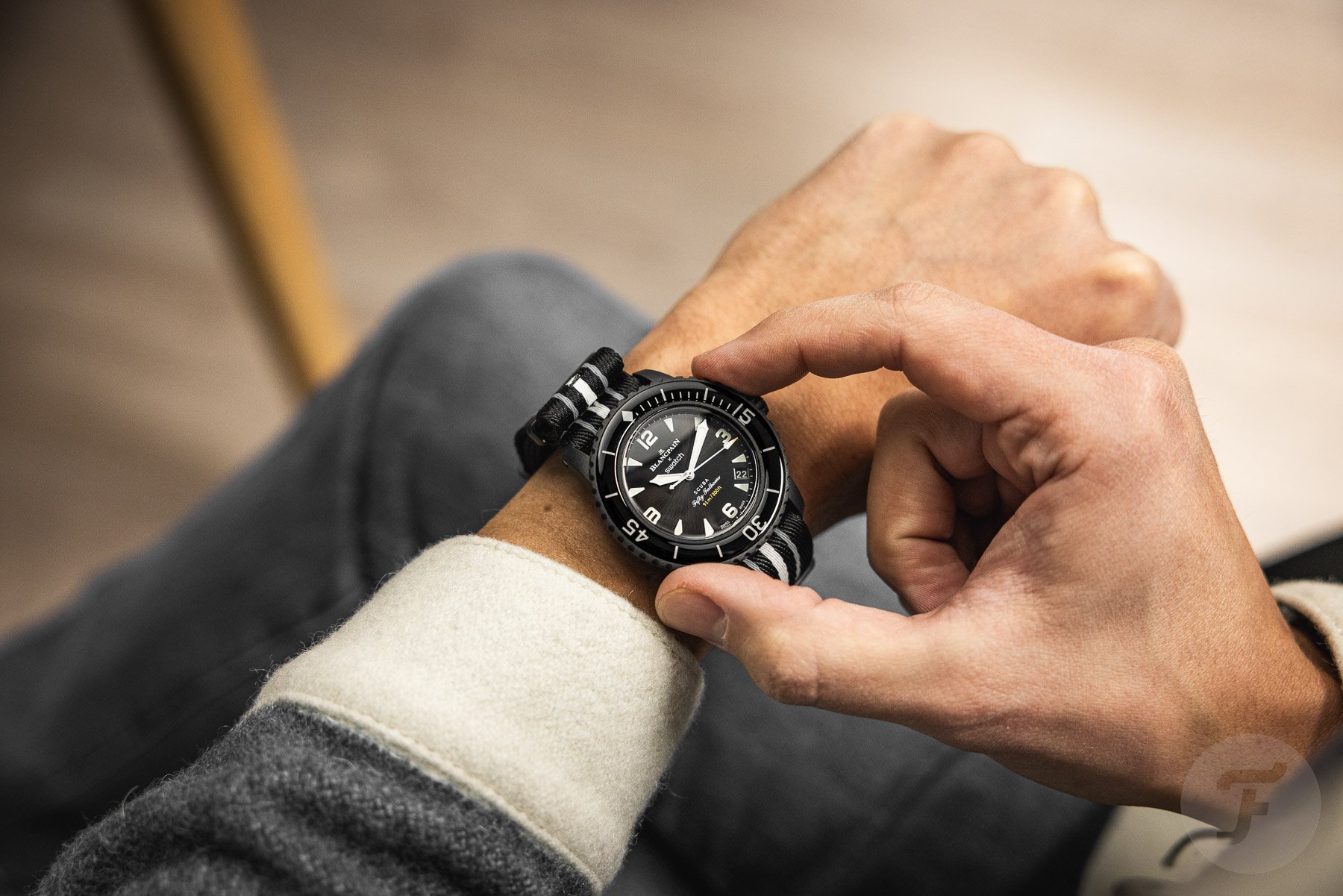
One of the biggest complaints about the Blancpain × Swatch Scuba Fifty Fathoms is its size (or bulkiness). Just like the previous versions, the Ocean of Storms is almost identical in size to the stainless steel Blancpain Fifty Fathoms 70th Aniversary Series I, so not much is going to change here. Especially in combination with the double-layer NATO strap that goes underneath, it does have quite a significant physical presence on the wrist. On the other hand, the lightweight Bioceramic case does make it a bit easier to cope with the bulk. I certainly don’t mind it on my 17cm wrist.


In addition, the fact that the Ocean of Storms has a black case, bezel, and dial does make it look a bit less in-your-face than the other versions. Now, I don’t know why exactly, but I’m not usually a fan of all-black watches. I also rarely wear black clothes, other than maybe during training sessions and tuxedo dinners. However, there are many of you out there who do wear a lot more black and who like a more monochrome watch. For those people, I do think the Scuba Fifty Fathoms Ocean of Storms is the most wearable version of them all.
A new crowd favorite?
And that brings me back to those first reactions we got underneath the introduction article and a wrist shot I posted on my Instagram. As I said above, many people feel this is the version closest to the original Blancpain Fifty Fathoms. It’s also the least colorful variant in the Bioceramic Scuba Fifty Fathoms lineup. I think those two facts together make a lot of people say that this is by far their favorite version of the collection.
In addition, I also got reactions from people who weren’t that convinced about those first five editions. They are now more inclined to get one because of the more modest look. This black Ocean of Storms version is a welcome addition to the lineup. It almost looks like people were waiting for it, and Swatch knew precisely how to fill that gap.
There are, of course, also still quite a few people who aren’t convinced by this new version. The fact that it can’t be serviced turns it into a disposable watch in their eyes. The bulk is also still a source of annoyance. I do, however, think a different strap can do wonders there. I know Monstraps has some fitted rubber straps for it, and Artem is also working on matching rubber/sailcloth straps. Of course, there are also many other non-branded (read: cheaper and of lesser quality) options out there.
Final words
The Blancpain × Swatch Bioceramic Scuba Fifty Fathoms Ocean of Storms is the most serious and maybe most grown-up version in the collection. That’s why it’s appealing to a new group of people, even the ones who weren’t fans at first. The subtle sunburst on the evenly black dial is a very nice and distinguishing feature. It matches well with the rest of its design, which is thoughtful and executed well.
As I hinted at, this one is certainly not my favorite. But clearly, a black version of the Blancpain × Swatch Bioceramic Scuba Fifty Fathoms was missing from the collection. The Ocean of Storms now fills that gap. It is a watch with a design inspired by the Moon’s most expansive sea. In that sense, you could even argue that this is actually another MoonSwatch release, as one of our commentators rightfully noted.
What do you think of the Blancpain × Swatch Bioceramic Scuba Fifty Fathoms Ocean of Storms? Let me know in the comments below.