These Three New Seiko Sumo Models Are The Best Ones Yet — Or Are They?

The Seiko “Sumo”, a crowd favorite, cult classic, and underrated value proposition since its 2007 debut is back, upgraded to meet modern standards. Fans of the Sumo — and there are many out there — will be happy to see Seiko give the watch some well-deserved attention. And though the changes made are subtle enough to demand a second look, I feel they certainly do the watch justice. The new SPB321J1, SPB323J1, and SPB325J1 are ready to make a splash and take over where the former generation left off. These subtle changes not only bring the Sumo up to current-day standards but also transform the watch significantly. So, let’s take a closer look and see what the new Seiko Sumo dive watches offer.
Now, hold on just one minute! Yes, you! Before you scroll down and comment that the Sumo is “too big to wear,” let me come out and say it: the Sumo is an unapologetically chunky watch, and that’s how we like it! Also, if you haven’t had the chance to put one on your wrist, you should immediately head to the nearest Seiko boutique/AD and try it on. I think you’ll find that for its dimensions, it actually wears rather nicely. I got to spend some time with Jorg’s when shooting it for his Strap Check article, and I couldn’t help but enjoy wearing it more than I ever expected to. Plus, there’s something fun about wearing a piece that makes you step a little bit out of your comfort zone. And there are worse ways to do that than with a Seiko Sumo on your wrist!
Trimming down the Sumo
Looking at the new Seiko Sumo models, you might spot some aesthetic changes. Personally, I’d say there’s a lot of good that’s been done to these watches. On the other hand, all that glitters ain’t gold. Unfortunately, these upgrades have stripped some of the charm of the original Sumo away. And yes, I still call the changes “upgrades” as they ultimately improve the watch overall. The main “issue” for me is something that Sumo connoisseurs will be familiar with. Looking at the SBDC001 below, you’ll notice its chunky hands, lack of Prospex logo, and big, bold bezel font. This watch, to me, is the pinnacle of Seiko Sumo cool. Since then, the design has been refined, compressed, and trimmed down to a sleeker, more elegant, and somewhat boring look.
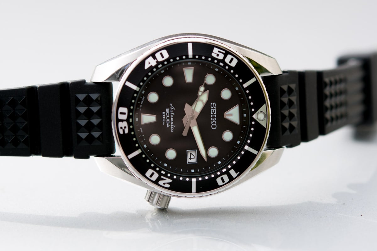
Image courtesy of Dreamchrono
I must give the Seiko SBDC027 “Sumo” 50th Anniversary an honorable mention. This rather odd model foreshadowed some of the upgrades that have come to the new models, namely the bezel’s slimmer markings and shiny appearance. Luckily, though, the three new Sumos have maintained the handset found in the models of the previous generation. However, the days of ceramic have caught up with them. Whereas the 50th Anniversary model’s bezel was just shiny in appearance, the three new models are equipped with ceramic bezels. Like that model, these watches have also been given a special hard coating to prevent scratches and dings. But, what else is new?
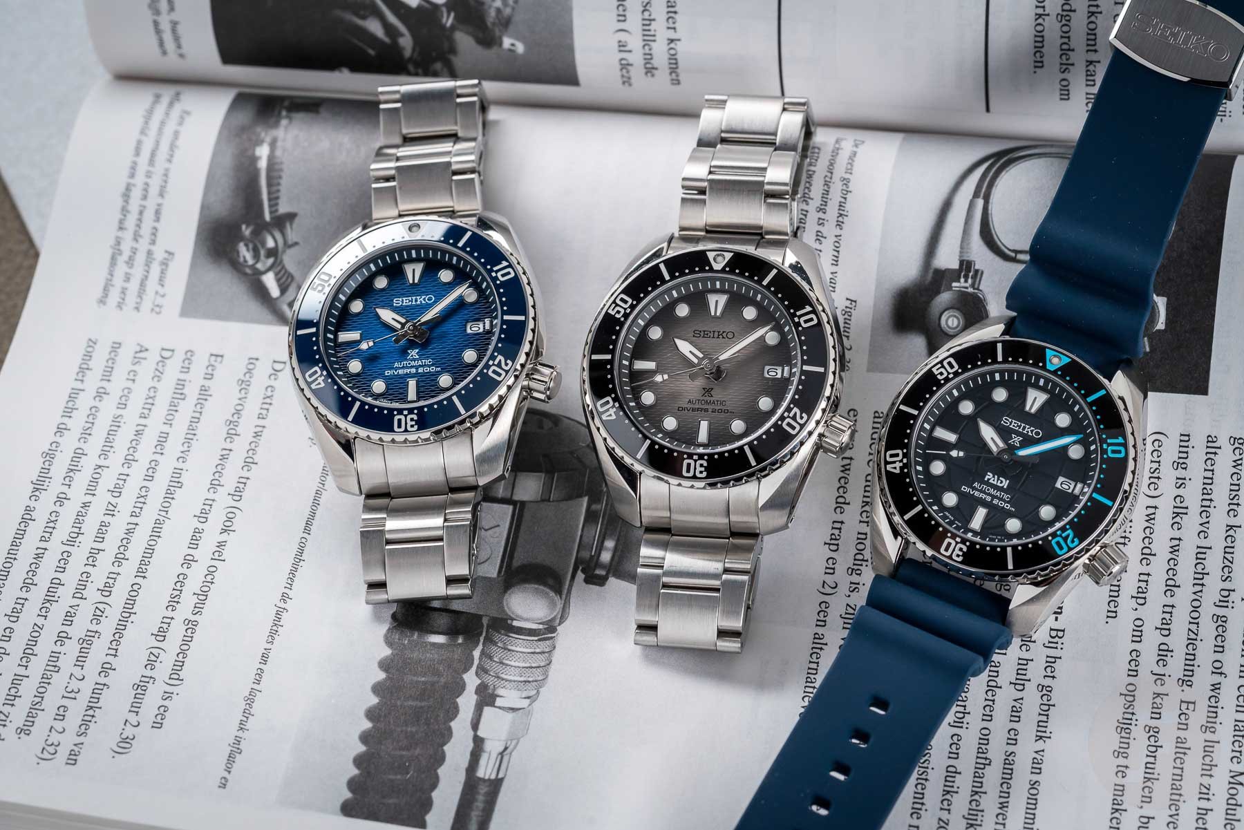
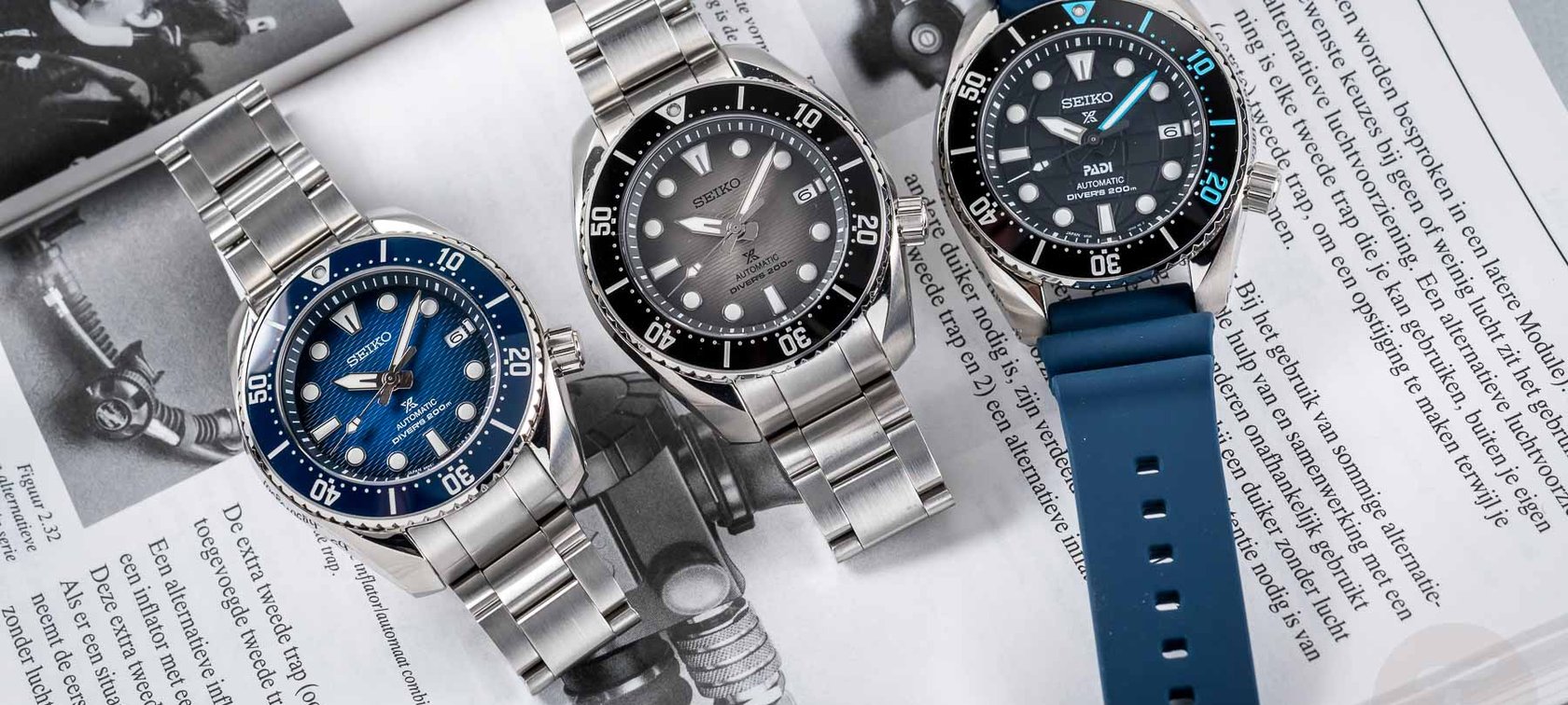
The new Seiko Sumo SPB321J1, SPB323J1, and SPB325J1
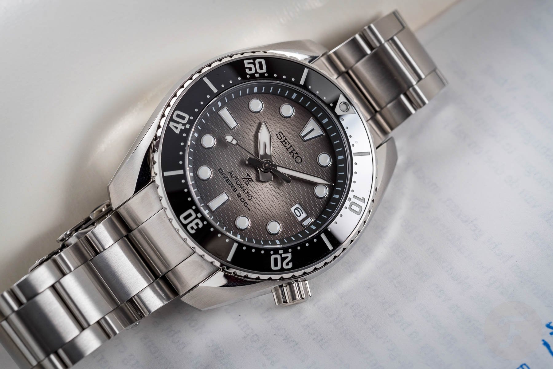
So, besides a new ceramic bezel and a super-hard coating applied to the case and bracelet, the main differences come in the shape of a new dial and a new bracelet. The bracelet has been toned down and now has a more classical three-link design. It resembles the more traditional Oyster-style bracelet and does away with the central ridges found in previous generations of Sumo bracelets. Personally, this change is not one I’m too keen on. Combined with the more plain bezel text, I feel that this change removes some of the Sumo’s original charm. However, the wave-textured vignette dial looks fantastic, especially that of the SPB323J1. It plays with the light and has a glossy look comparable to but not the same as that of the Omega Seamaster Professional 300M.


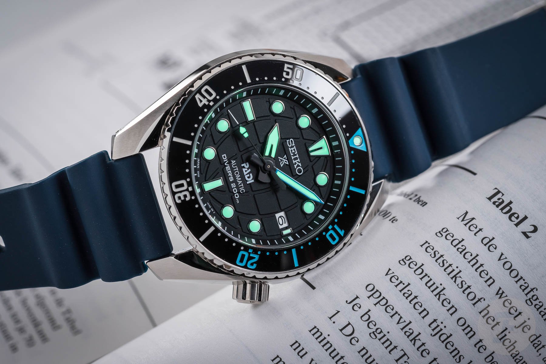
The SPB321J1 has a blue bezel that matches its blue vignette dial, whereas the SPB323J1 has a black bezel. This offers a nice bit of contrast from the light gray vignette dial. Finally, the SPB325J1 is part of Seiko’s PADI line. And just like the other recent PADI releases, the blue-and-red colorway makes way for black and light blue. The dial is also different from the other two. Instead of waves, we see the globe texture of the PADI logo executed with a matte black finish. This matte black color also carries over to the seconds hand and base of the minute and hour hands. The Prospex logo finds a new home under the Seiko logo at 12 o’clock. The “PADI” text is squeezed in under the cannon pinion over the rest of the dial text at 6 o’clock. All three watches maintain the Sumo’s screw-down crown at 4 o’clock and have 200 meters of water resistance. The case remains nice and chunky at 45mm.
Final thoughts
Not one, not two, but three new Sumos! These three new models will be made available online and at Seiko retailers and boutiques shortly. The non-PADI versions will retail on the steel bracelet for €1,250, whereas the PADI model will set you back €1,100 on a blue version of the classic Seiko vented rubber strap. Inside these Sumos, you’ll find Seiko’s workhorse 6R35 movement. With its 70-hour power reserve, hacking, and hand-winding, it’s the same excellent movement found in the SPB143J1 and the SPB317J1. In terms of performance, you will likely not be disappointed, but don’t expect chronometer-like results, especially if you wear the watch as it’s intended to be worn. For more information, check the official Seiko website.


What do you make of these three new Seiko Sumo dive watches? Are you keen on the upgrades? Or do you find that the time of the 45mm Sumo has long passed? Let me know your thoughts in the comments below.