Who Wore It Better? Seiko Astron SSH077J1 Vs. Prospex SPB187J1 Dive Watch — The Battle Of The Blues

Blue dials have been incredibly popular in our industry since mechanical watchmaking burst into life once more in the late ’80s and early ’90s. Today, we take a closer, side-by-side look at two blue dialed variants of watches we’ve covered separately earlier this year in their more muted skins. And I need your help deciding which one wears it better. Allow me to welcome to the stage, the Seiko Astron SSH077J1 and the Seiko Prospex SPB187J1 dive watch.
Here on Fratello, we love Seiko. And if you’re looking for an article that sums-up why, this may well be it. Here we have two completely different 2020 releases. Both of these watches are well made. Both are reasonably priced. But perhaps best of all, both have a character that is simultaneously distinct and yet entirely Seiko. How does a brand have so much scope for experimentation under one umbrella? It shouldn’t really be possible, but after many decades of trial and error, Seiko seems to have mastered this skill.
And while the hyper-modern, super-functional abilities of the GPS-outfitted Seiko Astron SSH077J1 are as impressive as the robustness and reliability of the SPB187J1, these two branches of the Seiko catalog are not alone! The Presage line adds a third string to the brand’s bow. We have dressy pieces. We have techy pieces. And for often-bearded northerners like me (those of us that are perennially drenched in rain and covered in mud up to our knees whatever the weather), we’ve got dive watches that blend aesthetics and action like few others.
The battle of the blues
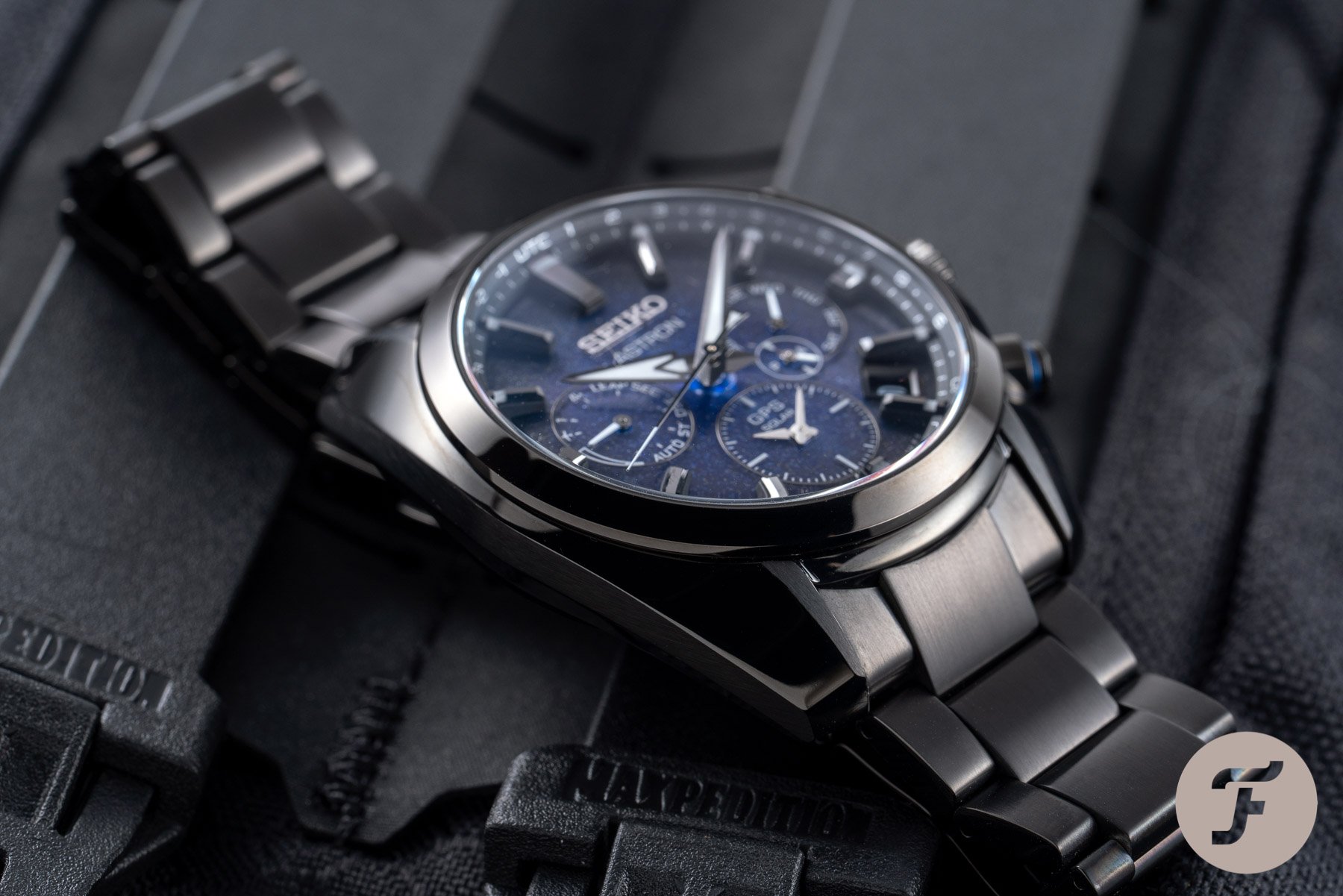
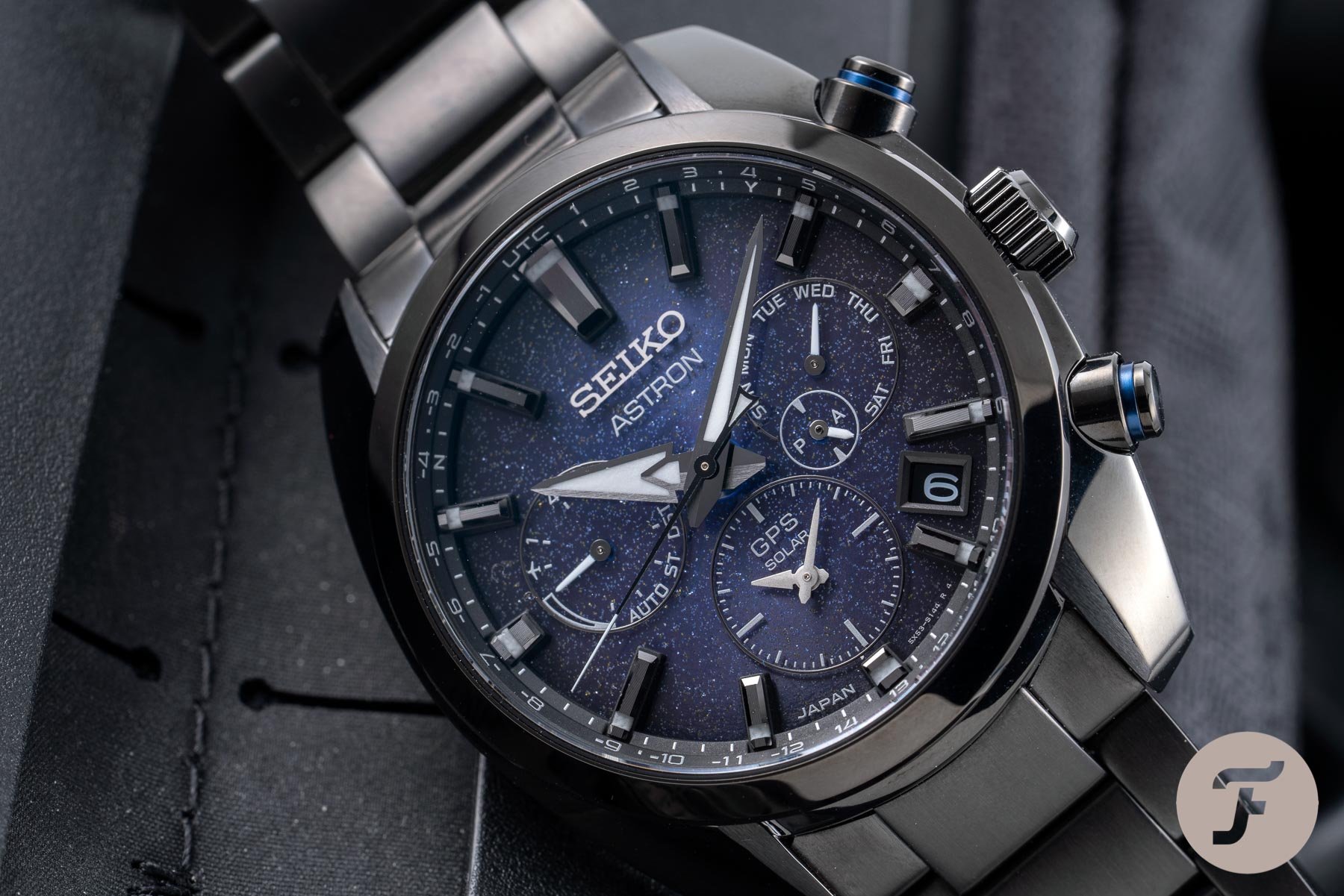
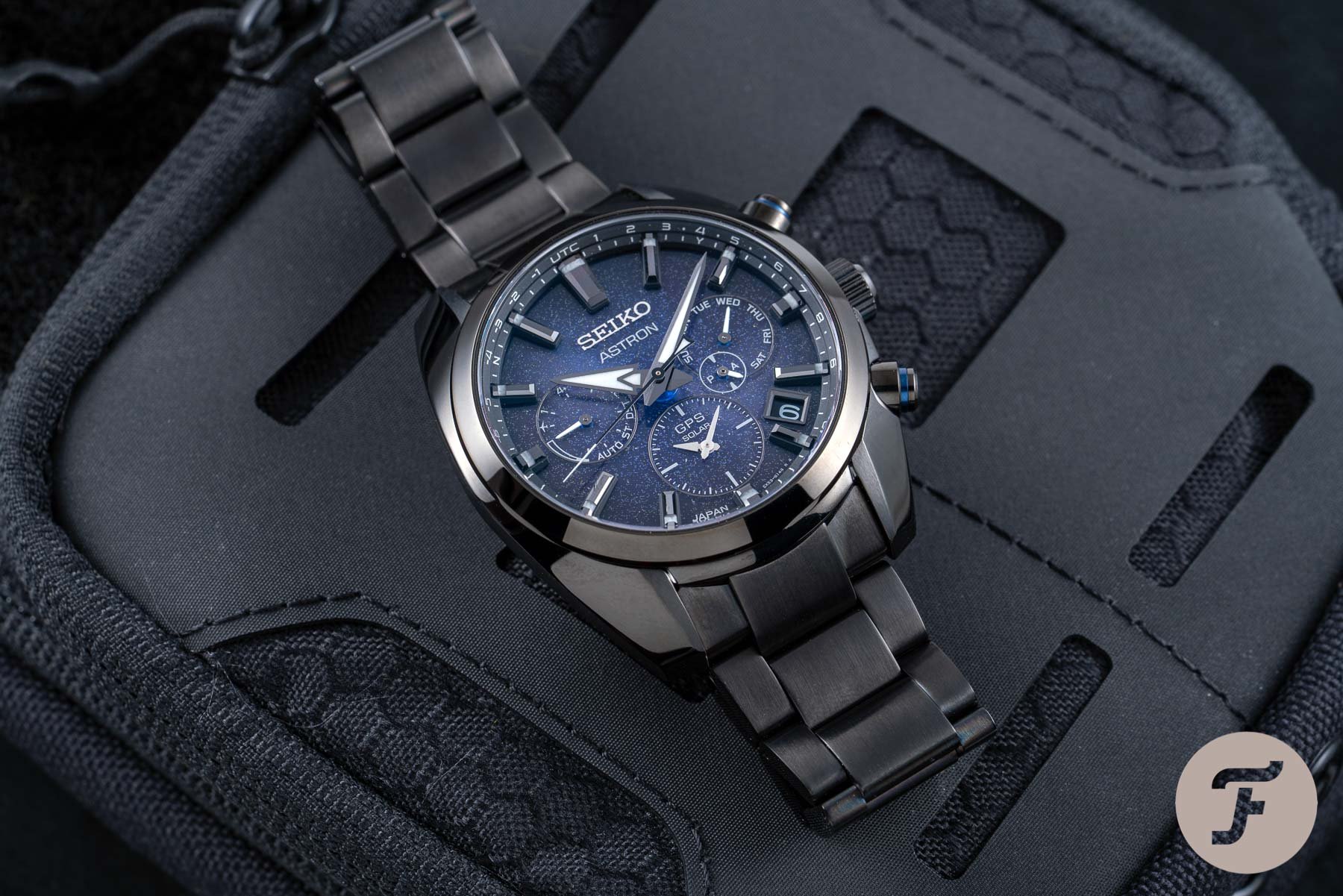
We reviewed the latest Seiko Astron in-depth here. It is truly a stunner. It looks fantastic and it does everything you could imagine it to and more. If ever you wondered whether a quartz watch could look as luxurious as a mechanical alternative, you simply have to try one of these on the wrist. The glassy, solar dial is something else. It is an extremely satisfying example of form following function and outshining it in the process.
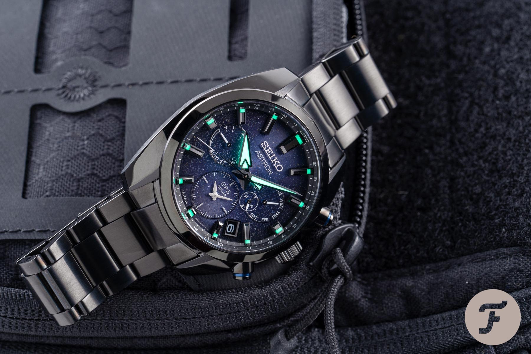
The blue dial, however, brings a different character to the fore. Here is an altogether moodier piece. It is perhaps more subtle than the white dial version, more versatile than the green, and more interesting than the black. For me, it is between this dial and the crisp, glacial white dial. But that’s not the question we’re trying to answer today, oh no…
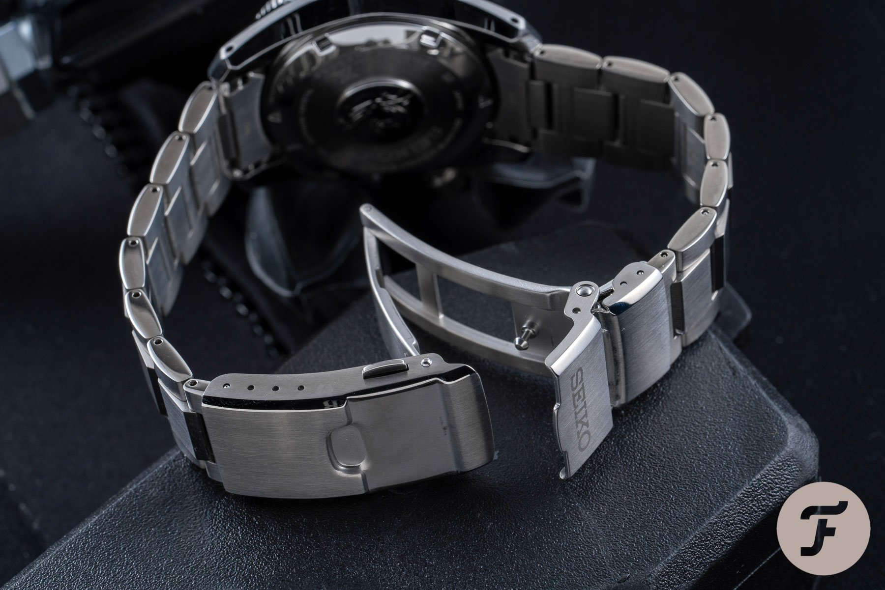
Today, I want you to comb through these mico-galleries with which I’ve laced this text. I want you to observe the SSH077J1 next to the SPB187J1 and tell me which one of these two watches wore it better. Is blue forever tied to the briny deep the SPB187J1 calls home? Or is blue, the color of luxury, more at home on the dial of a watch that can claim to be one of the world’s most prestigious examples of quartz technology (I’m serious about that, by the way). And how about that black case on the SHH077J1? Are you a fan or not? Let us know in the comments below.
The importance of color
Color in watchmaking cannot be overlooked. Recently, I’ve taken part in a few podcasts during which I’ve been asked to predict the “color of 2021”. My answer has been teal — a mid-blue/green color that would once have seemed frivolous in watchmaking but is now approaching an industry far more conscious of the role color can play within it. The SSH077J1 and the SPB187J1 both illustrate this.
Beyond the color teal, though, what I really expect to see more of in 2021, is texture. Dial textures are ever more important. A well-done sun-ray, a geometrically satisfying tapisserie pattern, a granulated surface, brushing vertically, horizontally, and radially… You name it. Through texture, novelty can be presented in a far more timeless fashion than through color.
And while blue is about as safe a non-white/black color as the industry has in its quiver, both the SSH077J1 and the SPB187J1 have interesting dial textures that mark them as distinct from their more mainstream range-mates.
Comparisons with the core models
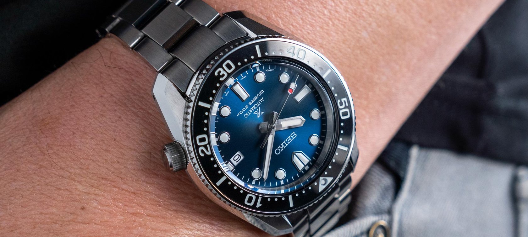
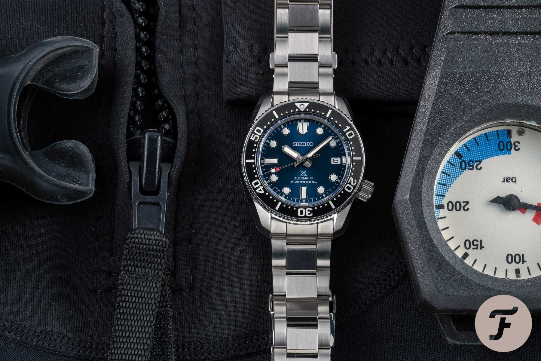
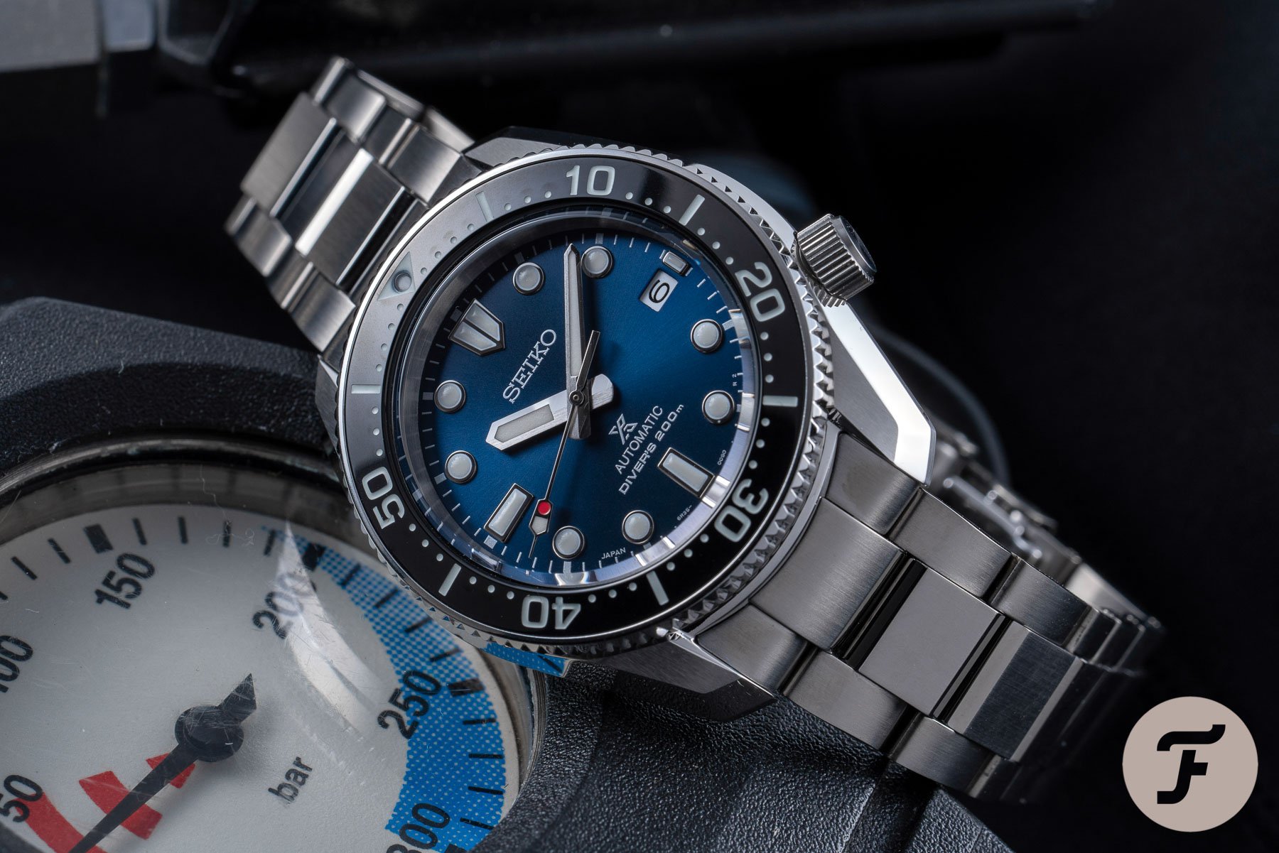
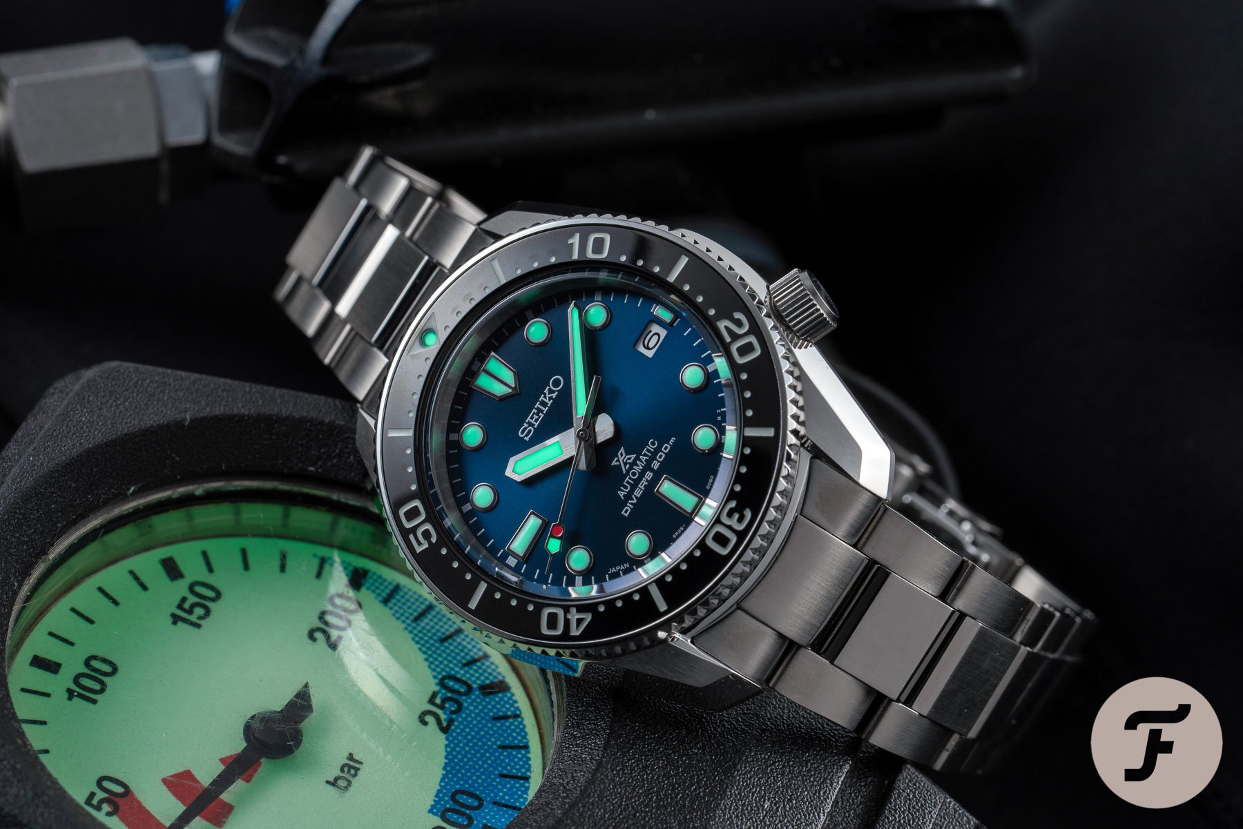
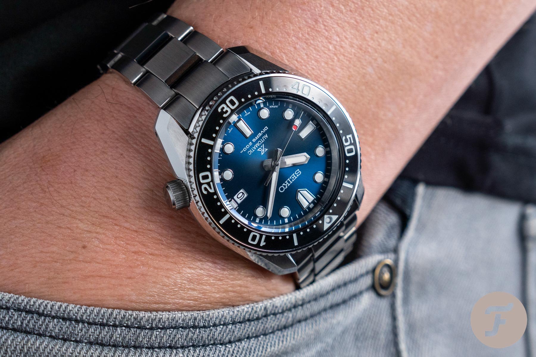
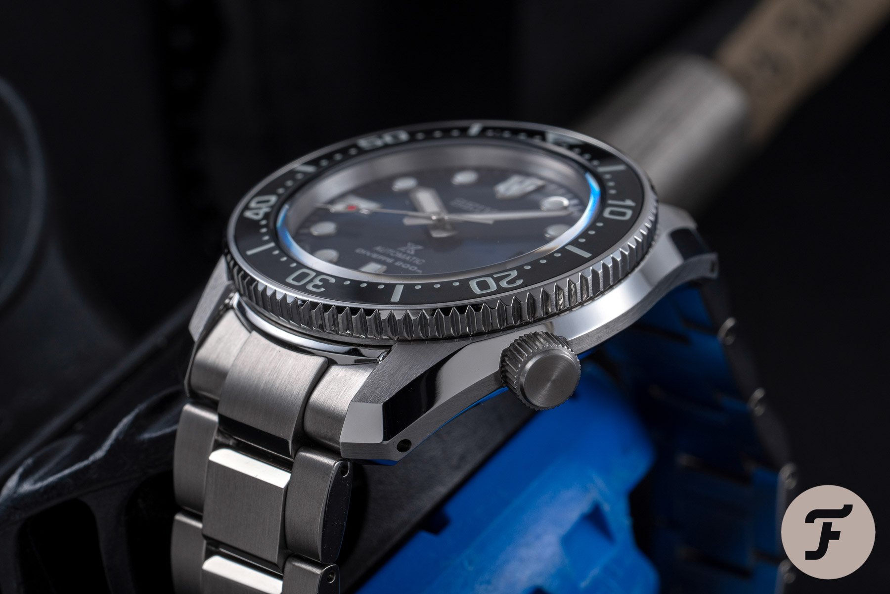
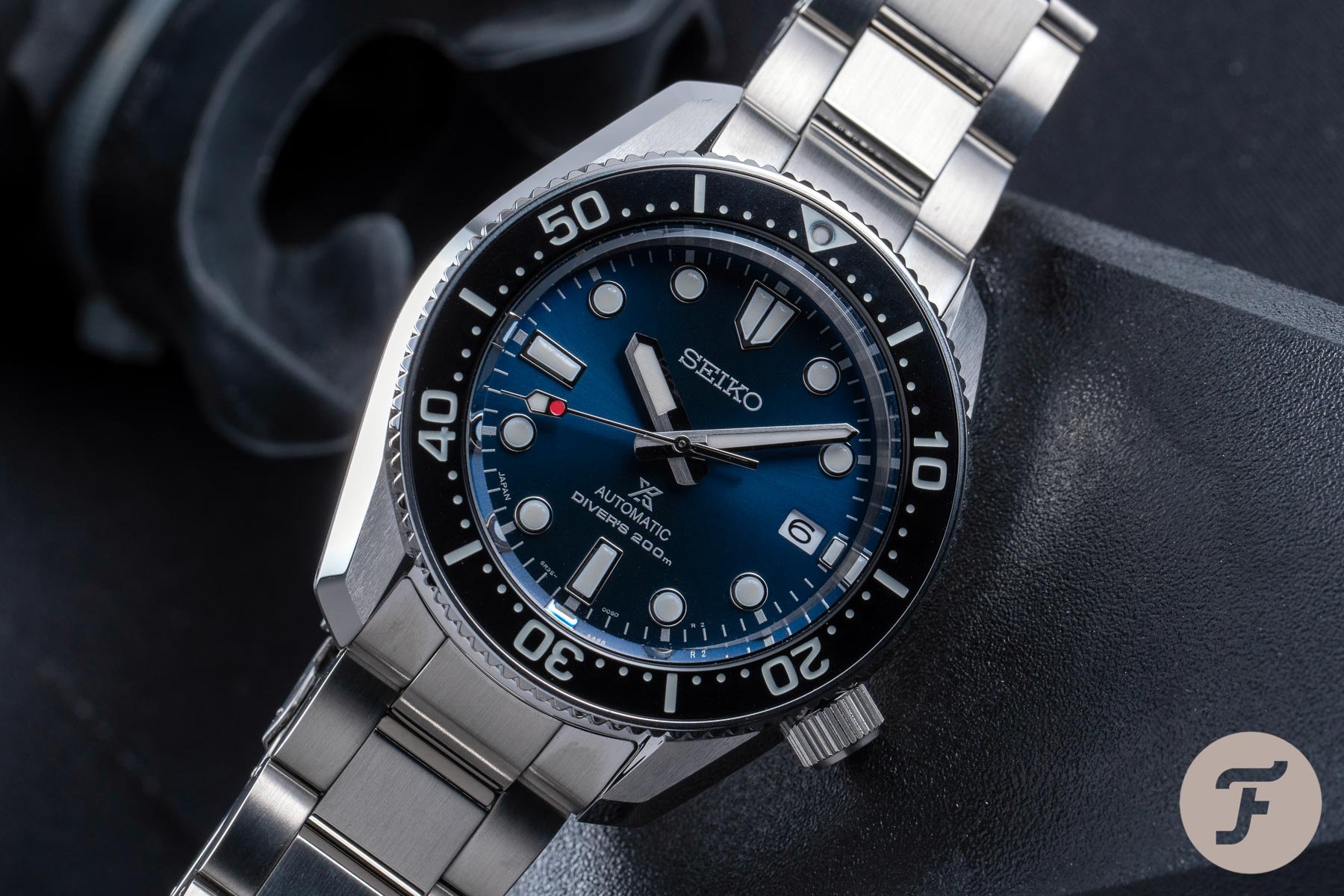
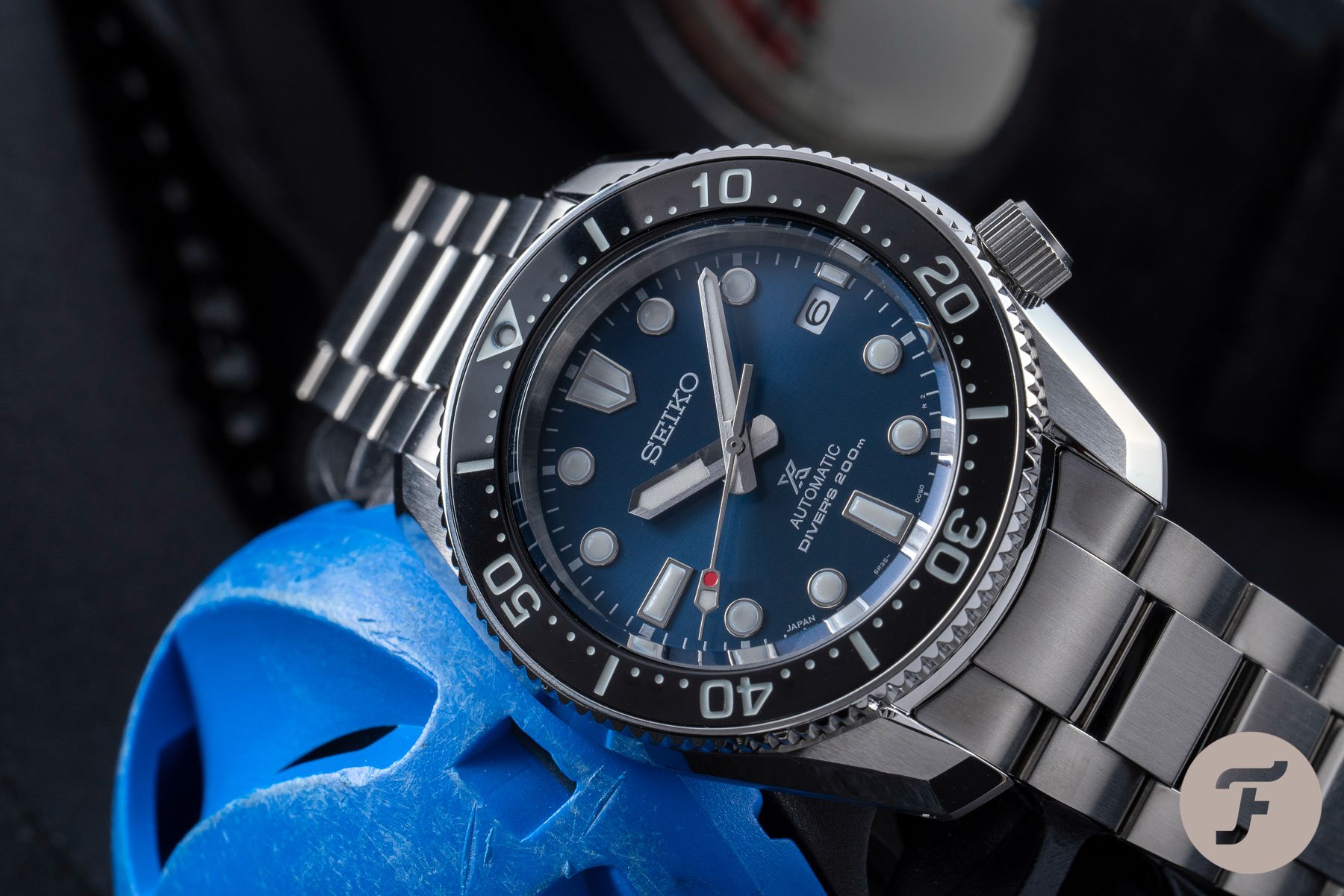
The SPB185J1 was perhaps my favorite/second favorite Seiko release (it is neck-and-neck with the SRPE33, which I purchased). The SPB187J1 is exactly the same watch but for the swirling blue dial. It changes the appearance entirely. For blue-dial lovers, this one is a must-try. I, on the other hand, prefer the flat black and steel bezel of the SPB185J1. Perhaps if Seiko wants to flip things around and give me a black dial with gilt printing/gold hands and a navy blue bezel then we can talk black and blue. Now that would be something I’d like to see…
-

- The SPB187
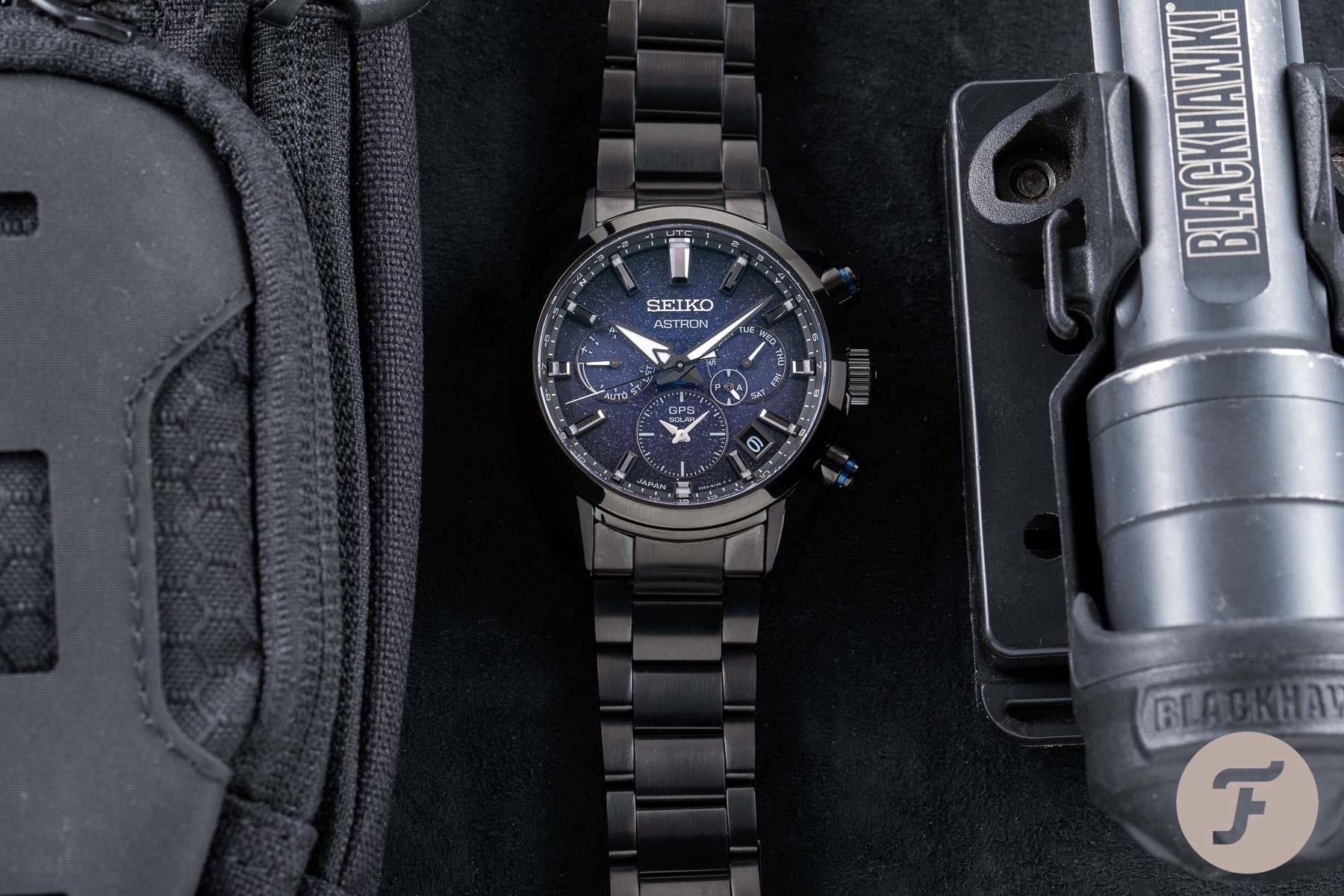
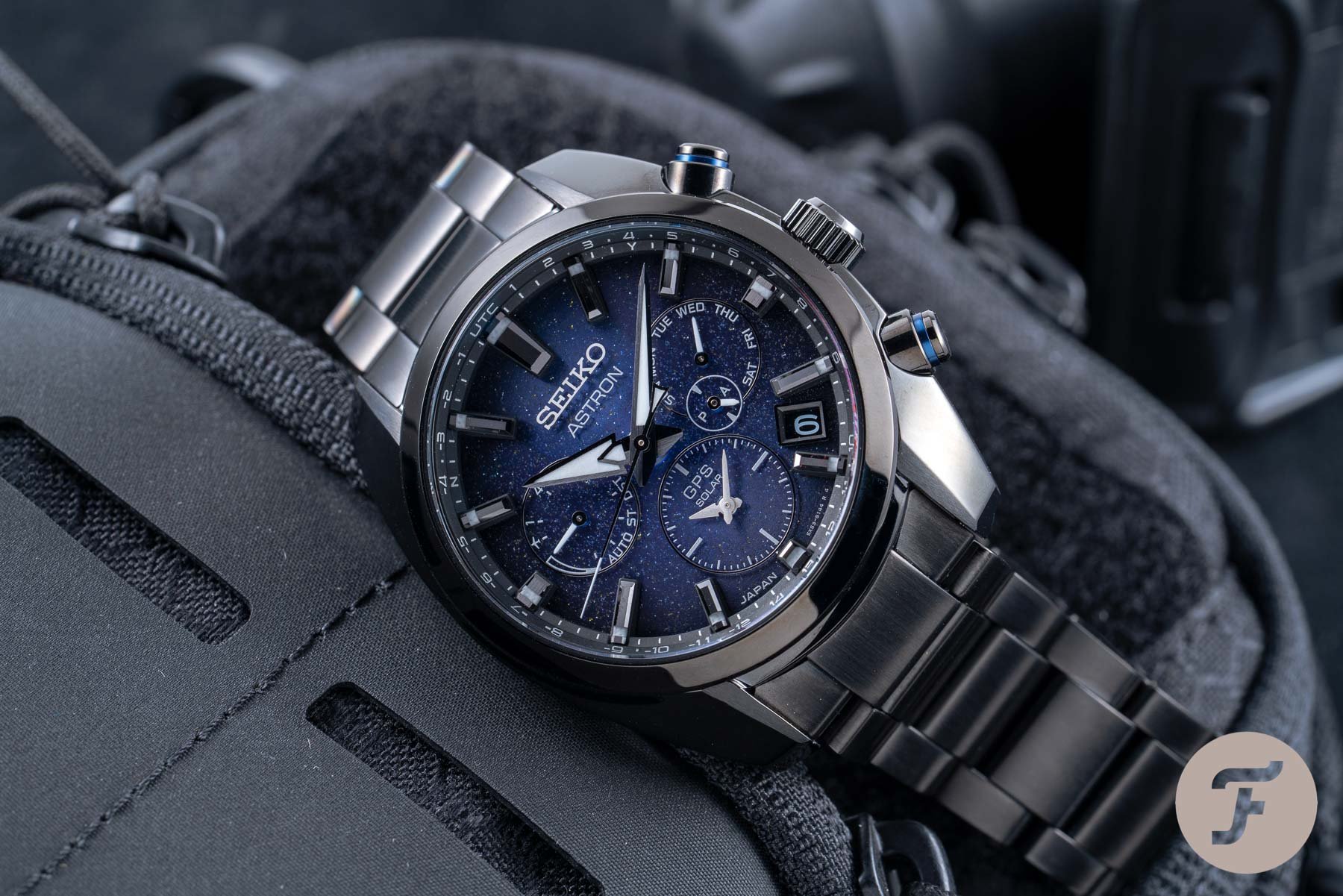
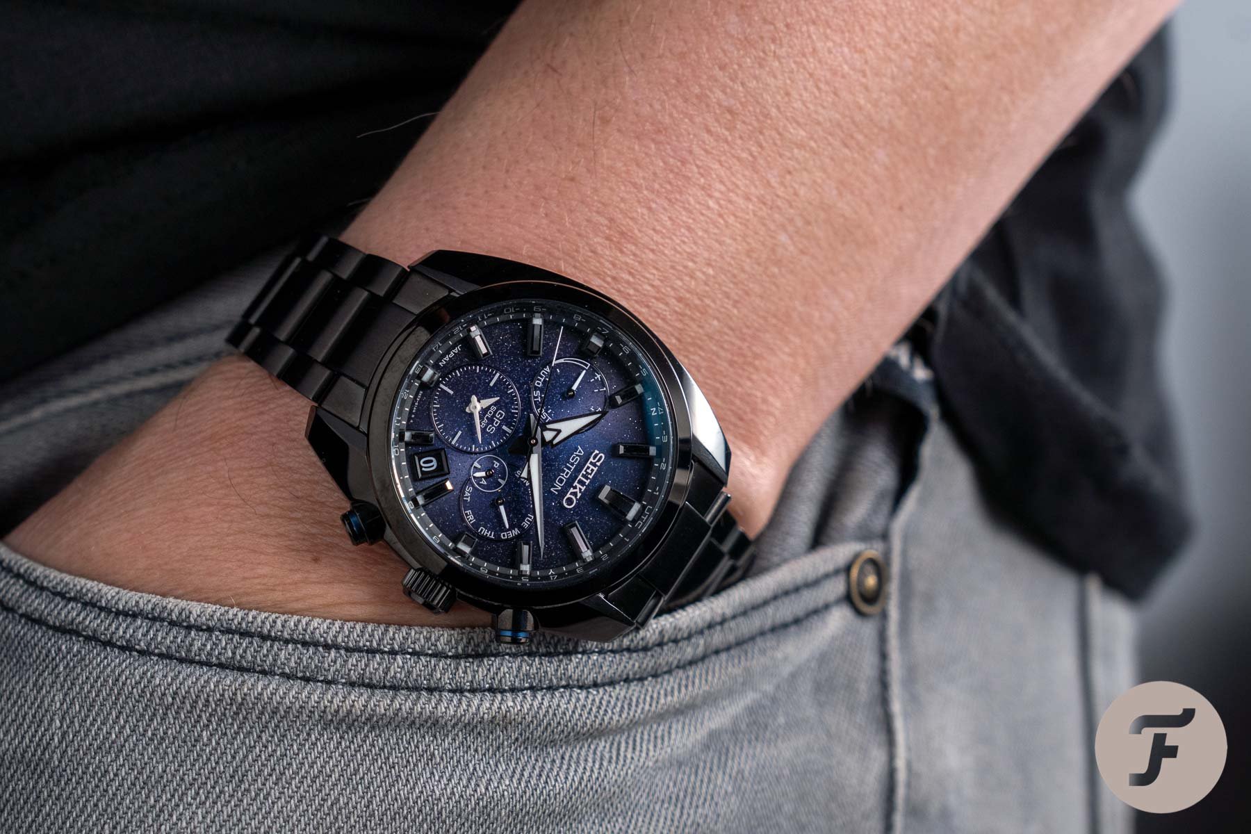
Meanwhile, the SSH077 is, to my eyes, a huge step up from the classic white dial of this year’s Astron (and I really loved that piece also). Here, the deep-Space blue (my words, not Seiko’s) gives the impression of a far-flung and limitless future. It suits the watch to a T. But these are only my personal opinions on two amazing watches with approachable retail prices. The limited-edition SSH077 comes in at €2,300 and the SPB187J1 demands €1,250.
But now I need your help settling this once and for all: in the Battle of the Blues, who wore is better?