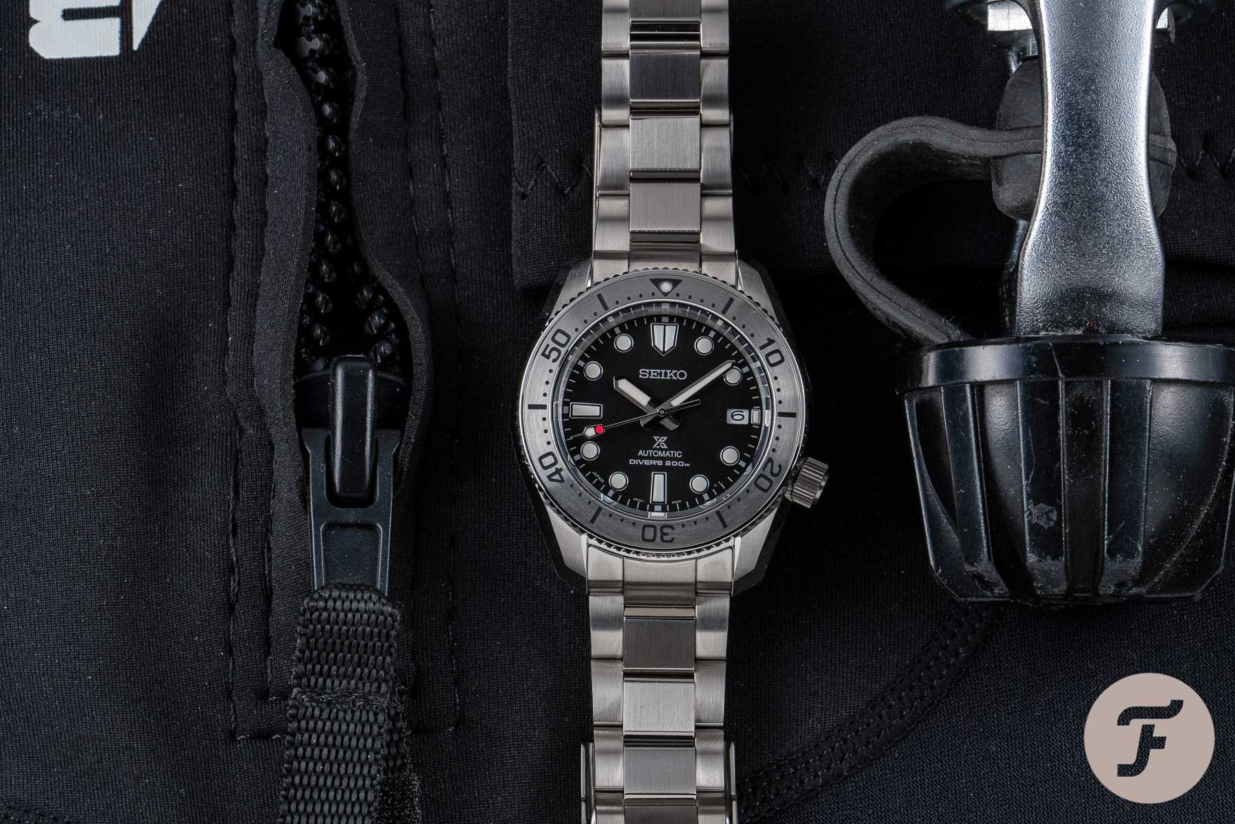
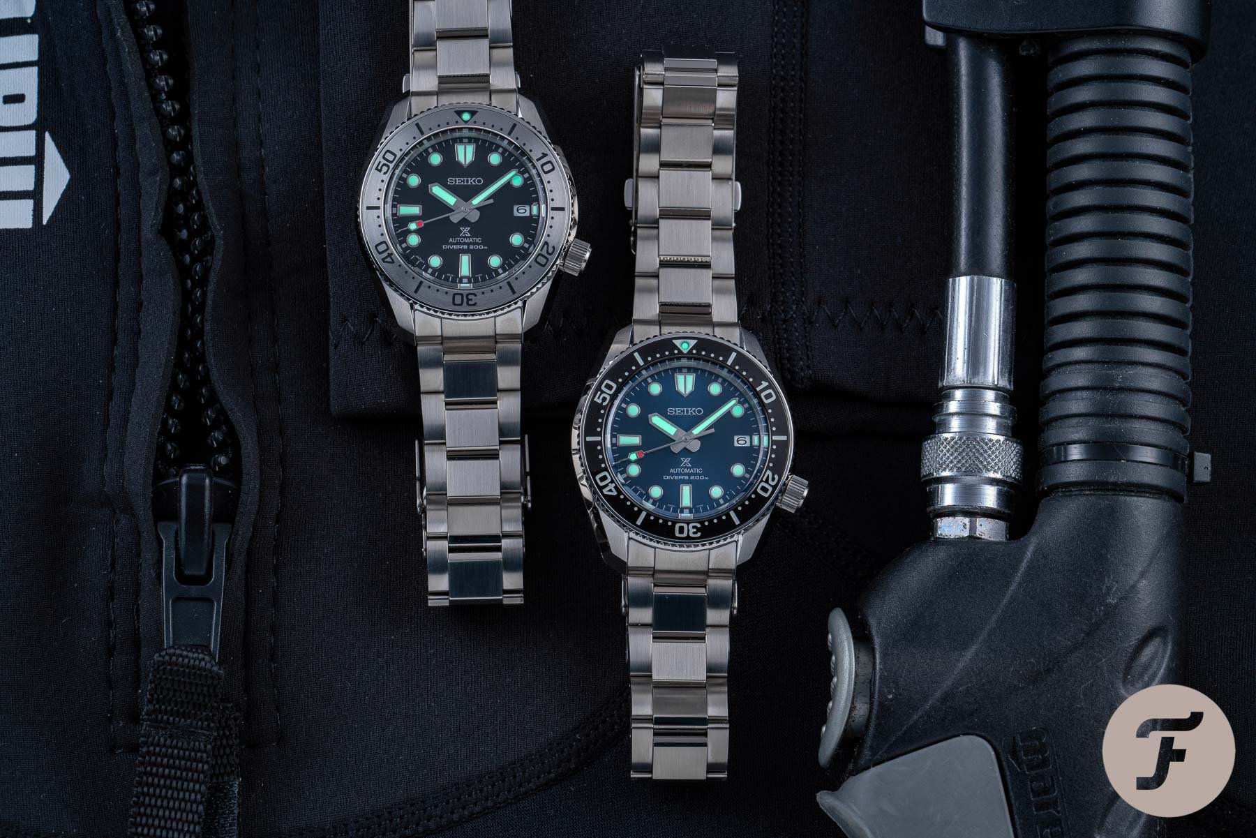
Seiko SPB185 Dive Watch With A Smart “Shovel” Seconds Hand

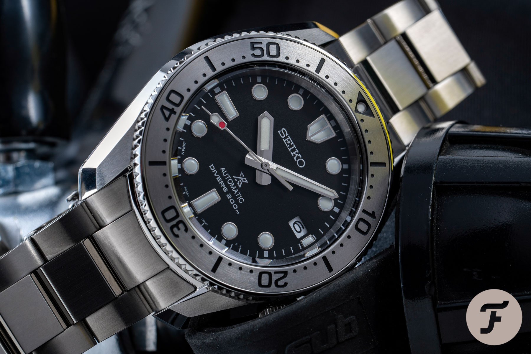
Often, it is the little things that make all the difference in life. In watchmaking, that is almost always the case. Sure, these ticking marvels are tiny to begin with, but upon these minute canvases, the minutest flourish or novelty can transform a watch’s overall character. When it comes to the SPB185, that is certainly true. What is otherwise a very solid, fairly-priced, handsomely designed dive watch, is vaulted to the next level by a flash of red upon the “shovel-style” seconds hand. Inconsequential or invaluable? Take a look at the photos and you tell me…
There’s a lot of good news coming out of Seiko right now. We’ve waxed lyrical ad nauseam about the stellar year this Japanese powerhouse is enjoying. And just when I thought it was time to settle down by the fire with a nice cup of cocoa and well-earned break, the SPB185 kicked-in my door and demanded a bit of attention.
A potential classic
And thanks to that seconds hand, and its simple splodge of red, it was afforded its demand. Sometimes, it can be hard to explain how such an over-the-top reaction can come from such an apparently minor point, but here we are. The SPB185 is a great looking watch without its seconds hand. But it would be fair to say that it could very easily float under-the-radar without it. When you take the time to study all elements of the design (which I will do), you start to realize this is a really great, potentially classic dive watch. But the cold hard truth is this: were it not for that seconds hand having caught my eye, I wouldn’t have given this watch the consideration it deserves.
…the little things are really the big things when it comes to design…
On the one hand that made me feel very good about the fact that I was lucky enough to have noticed exactly how much this package has to offer. On the other, I felt a little sad. I was suddenly aware of how many wonderful watches might have passed me by because they lacked that little spark of separation. But then, that’s life. That’s why the little things are really the big things when it comes to design…
More than one element
There is more than one element that makes this watch great. In fact, I’m not dissatisfied with any of them. Bizarrely, for a watch that was not in my sights at all until this review landed on my desk, I am struggling to find any fault with it at all. I think perhaps my biggest “complaint” begins and ends with the uncreative bracelet.
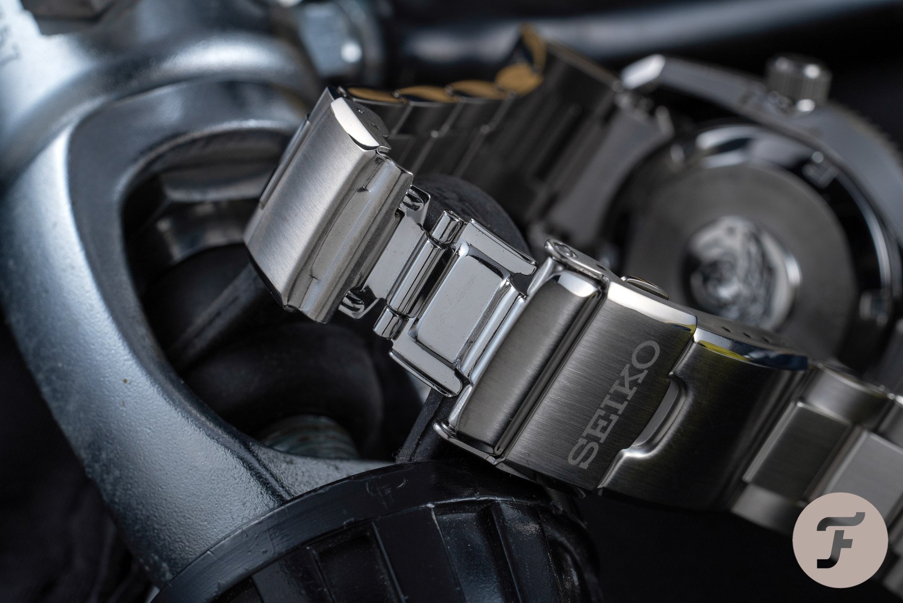
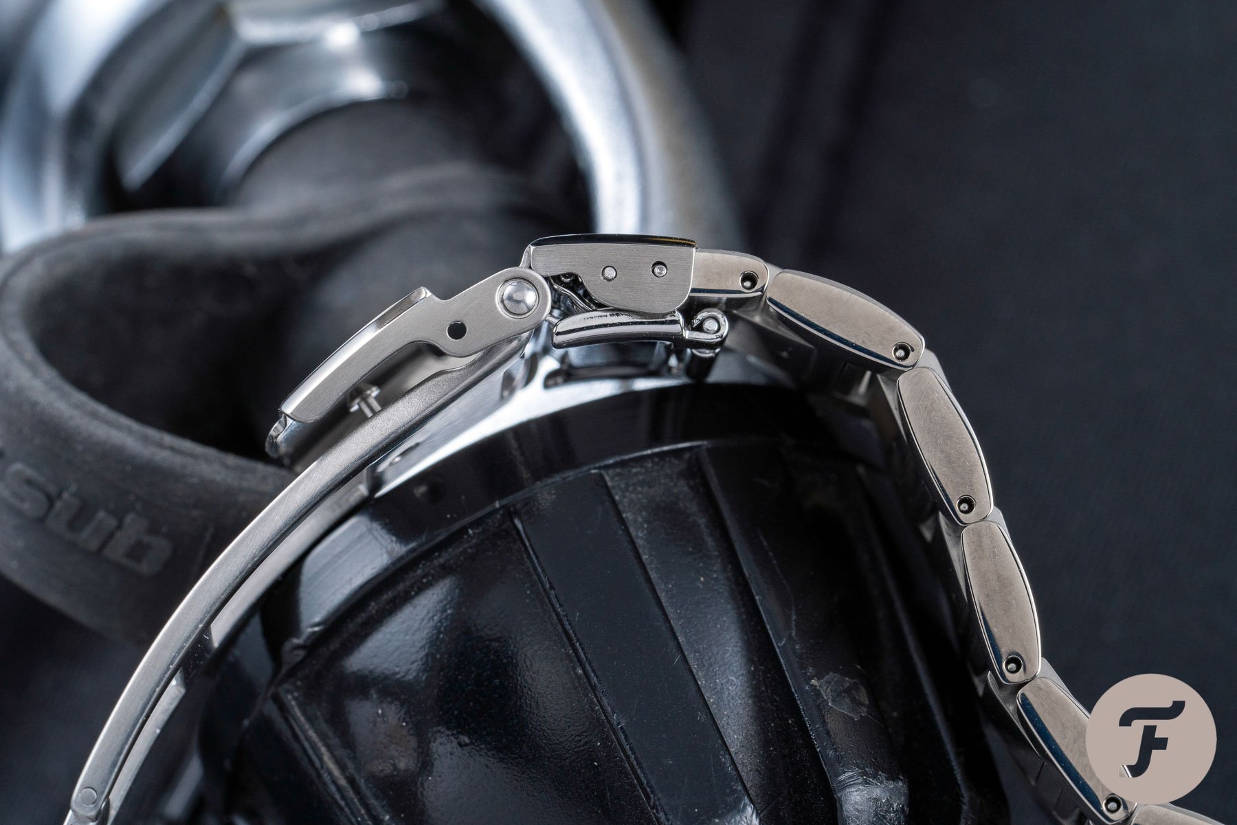
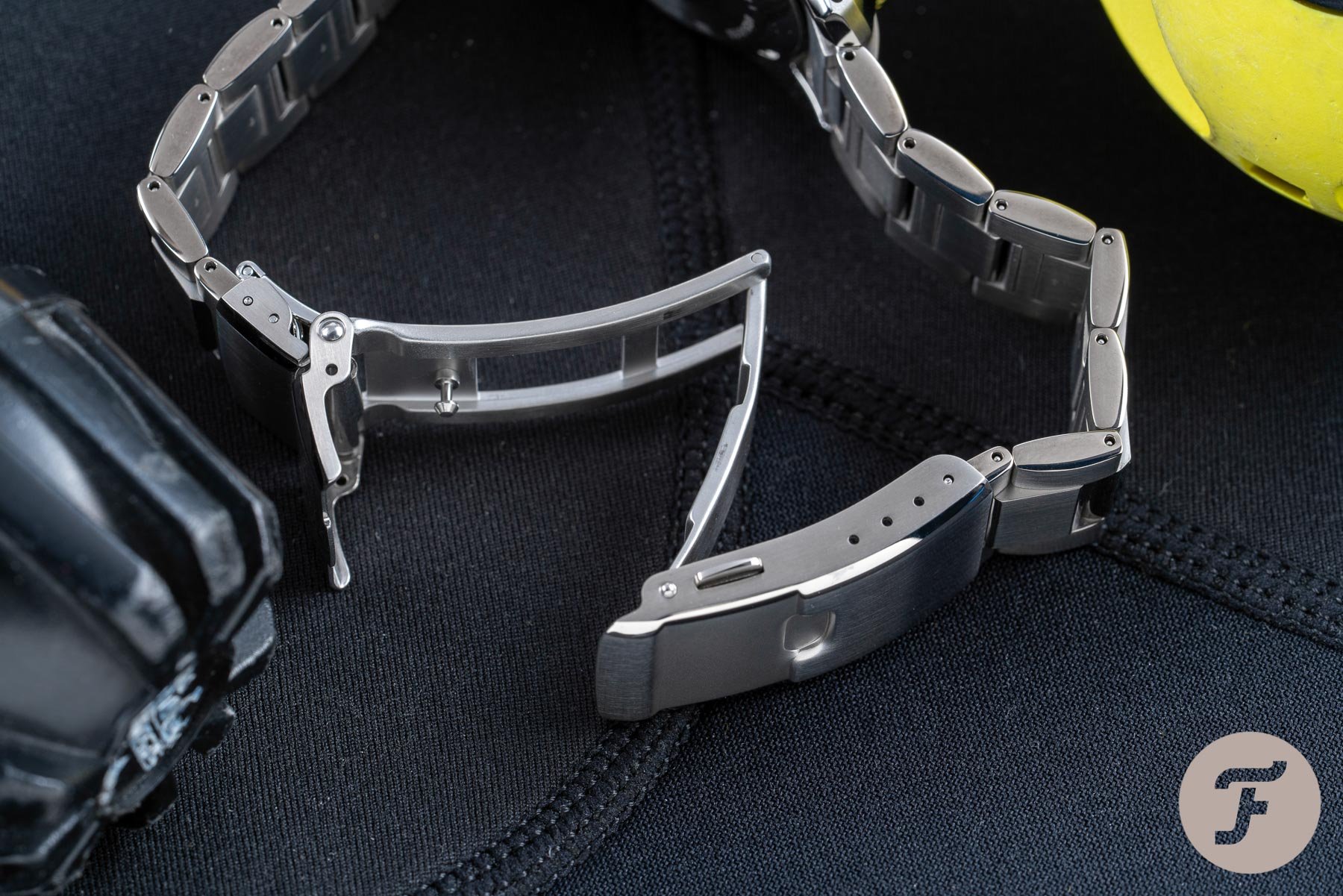
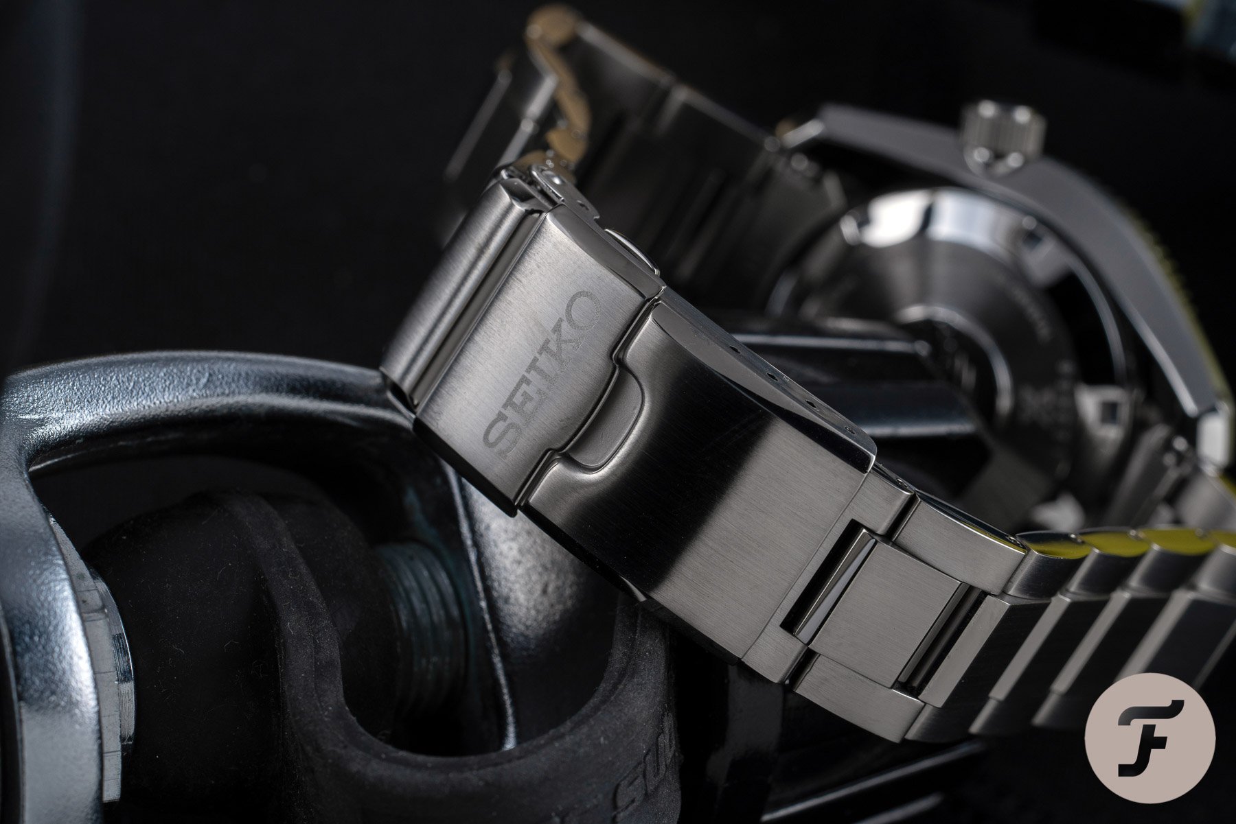
I hate to criticize blindly without any solutions offered. That, to me, isn’t helpful for anyone. It doesn’t help a would-be purchaser ascertain why a certain element dissatisfied and it doesn’t help a brand improve. I will say this for Seiko’s bracelets in this price bracket: they are reliable and robust and about as good as one could reasonably expect in terms of finishing and build quality. I do find the designs a bit vanilla on occasion, however, and this “professional” style is “fine” but it doesn’t blow my socks off.
Anyone that reads my columns will know I am a bit of a bracelet-hater by and large. Normally, I switch my watches onto leather or rubber as soon as they hit my hands. But this watch needs a bracelet. It demands one. Even I would rock this bracelet on this watch head were I to buy it, but I would have loved it to be a little more elegant. I think what would have changed things for me would have been some polished beveled edges to recall those massive polished chamfers on the watch head. Is it a big deal? No. With a 16.5cm wrist, there’s barely any bracelet left to gripe about once I’ve resized it. Is it something I would address if I wanted to make this watch perfect for me? Yes. Yes, it is.
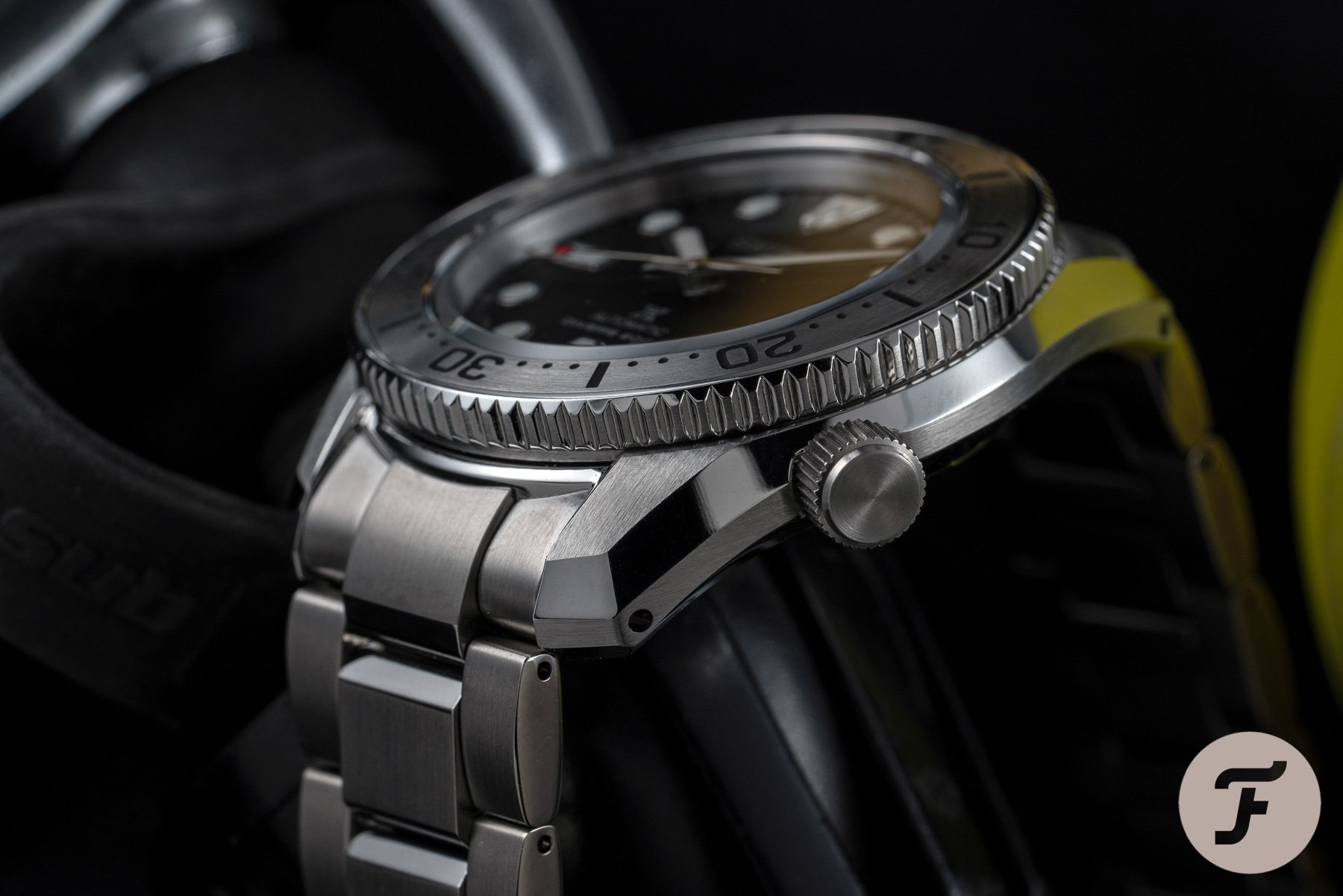
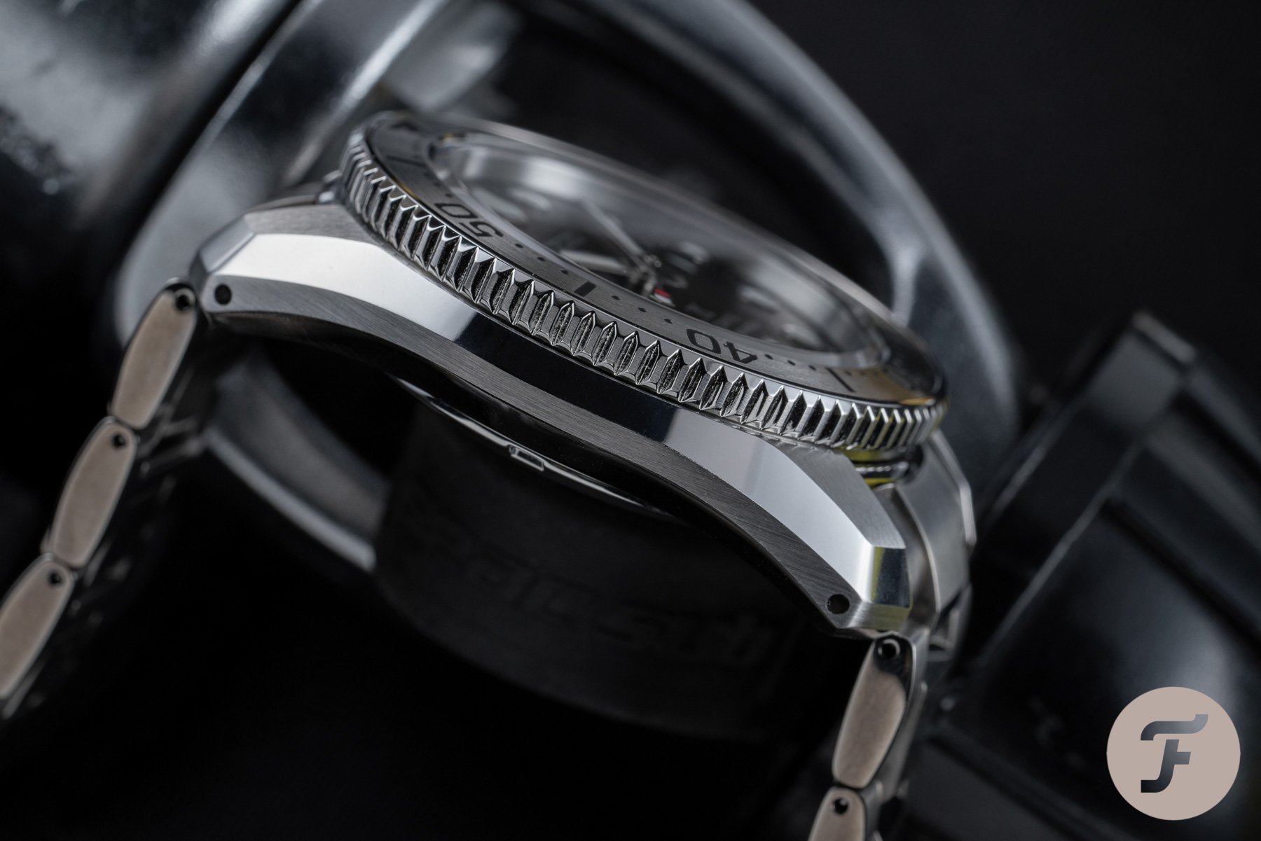
The lugs
I mean, just look at them! This is a textbook example of how to make presence look elegant. I’m not saying those massive polished chamfers won’t pick up their fair share of scratches (they surely will the second you take this thing out into the wild), but out of the box, this thing is gleaming. It’s funny to see this kind of design in the metal. I’ve drawn something similar on paper many times, but I’m never quite sure if it is guaranteed to work in real life.
…my personal preference is to balance the essence of a design with real-world wearability.
I tend to start with an “ideal” silhouette (based on whatever my idea of the ideal is on that given day), and then I add broad chamfers. I do this to retain the outline but reduce the presence of a watch. While blockish cases and similarly blockish lugs can be used to create the opposite effect (with a great result), my personal preference is to balance the essence of a design with real-world wearability.
The bezel and dial combination
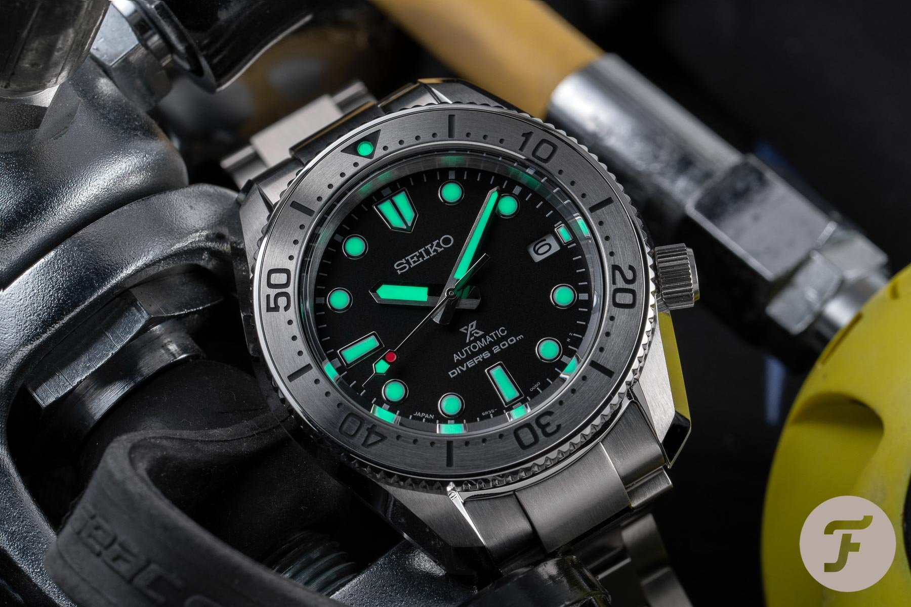
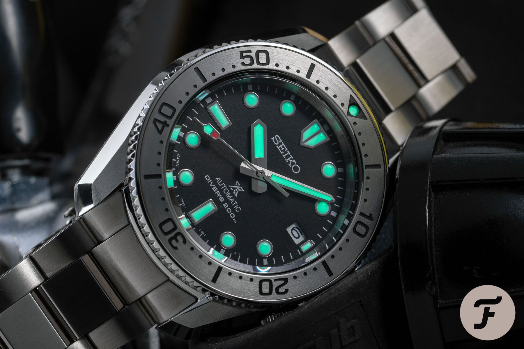
Seiko’s LumiBrite is frequently praised. Having spent the majority of the last month wearing my SRPE33 in all manner of conditions I can say it deserves the accolades. It really is an excellent quality lume for this (or, in fact, any) price point. It is well-applied to this dial (and bezel pip). The glow homogeny between hands and hour markers is typically solid, and the SPB185 dial layout benefits from the smart spacing of elements. While the Prospex logo might make the dial but fussy for some, I think it is very well balanced. The lume plots and 12 o’clock marker especially are slightly smaller than some of the more cartoonish diver markers we’ve seen from Seiko.
I won’t get tired of that in a hurry…
This adds up to a more refined look. Perhaps, even, a more professional look. The hands are broad, no-nonsense indicators that are a brilliant length and not so extravagantly styled so as to steal the show by night. By day, of course, that little flash of red on the seconds hand is where my love affair with the SPB185 began. I won’t get tired of that in a hurry and it may well result in this watch ending up in my collection. The color-matched engraved bezel adds a touch of class because of its chromatic humility as well as a less boisterous typeface for the numbers. It’s all business here and I like it.
A worthy successor
Whenever I talk about potential classics in the dive watch sphere, my mind always skips to Rolex. I see the Submariners and Sea-Dwellers of old float past my mind’s eye. Forget this modern stuff. That’s not what I’m talking about. I’m talking about the reference 6205 Submariner with pencil hands, the 6538 Sub (two- or four-line — take your pick), or things like the reference 1665 “double red” Sea-Dweller. These are real classics — real archetypes. They are frequently referenced, rarely matched, and almost never bettered.
…a characterful and cheerful companion…
And I’m not asking you to elevate the humble Seiko SPB185 to that level at all, but I am compelling you to look at it with those models in mind. To say it doesn’t satisfy some of the same aesthetic desires would be harsh. To me, it is a really sterling modern interpretation of that kind of dive watch. A crisp, legible, functional timepiece first and foremost, yes. But a characterful and cheerful companion for days beyond the waves. To me, that’s a pretty powerful proposition.
Pricing and availability
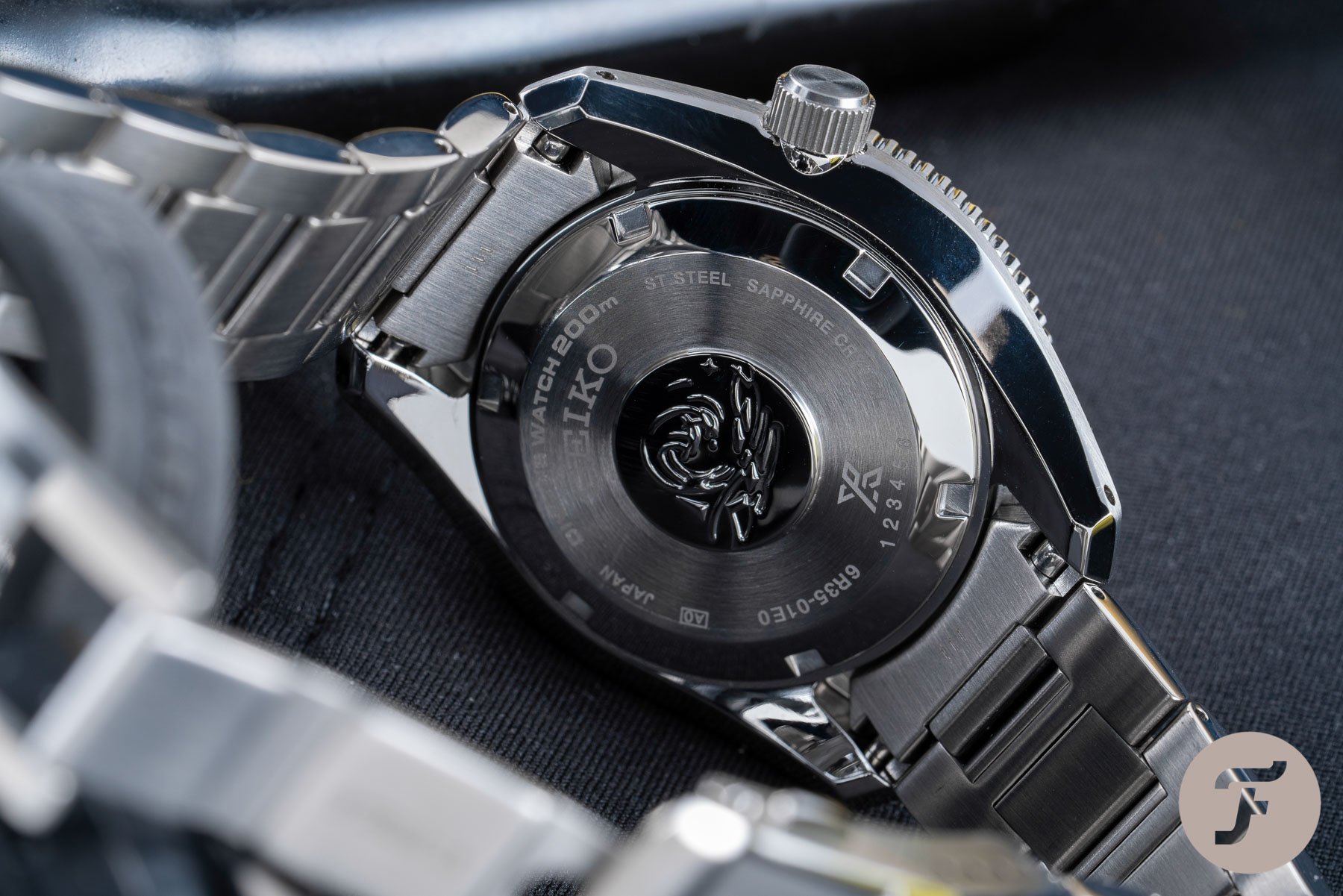
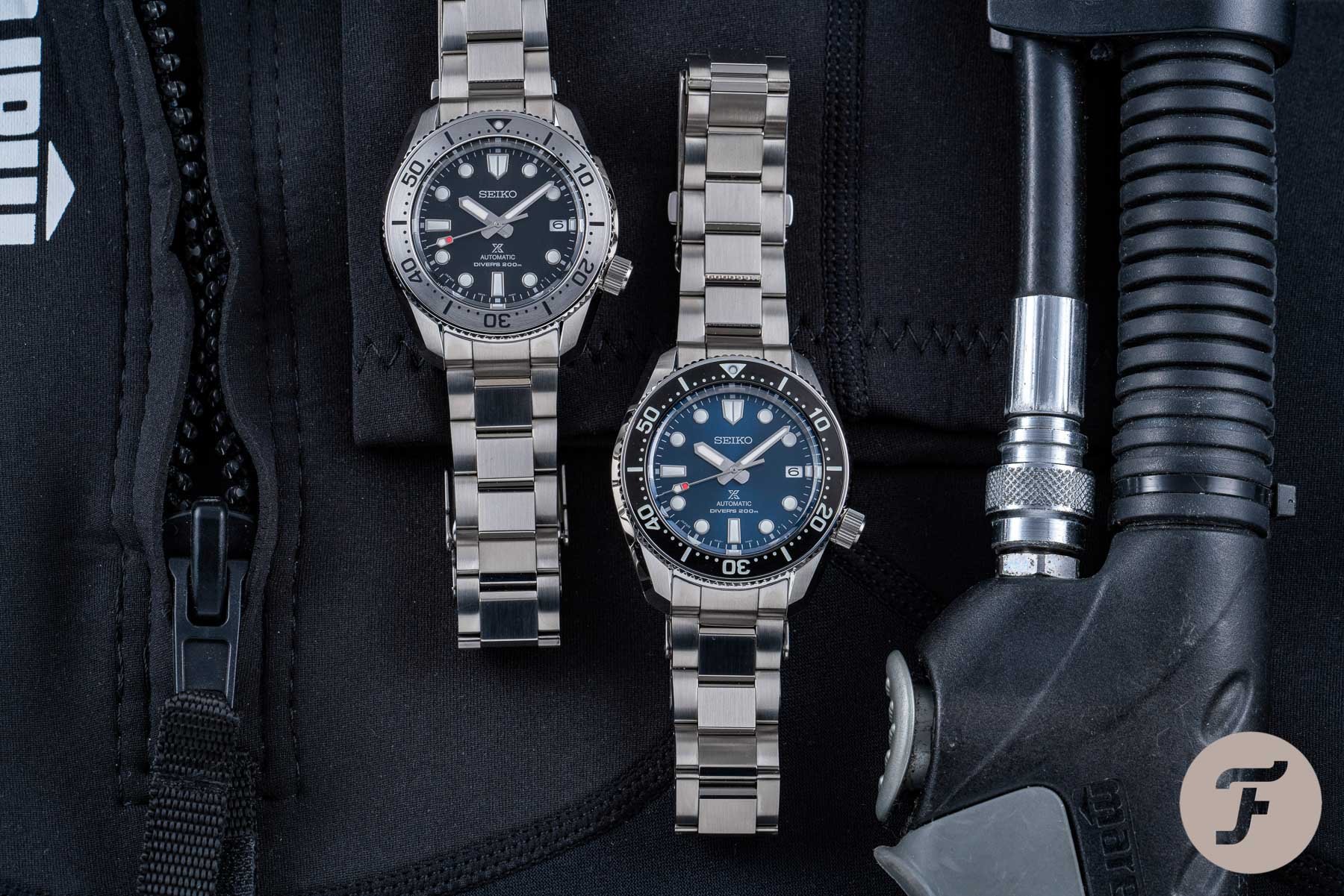
The SPB185 hit the shelves today (that’s the 11th of November for anyone removed from their calendar). It should be available from your local boutique whenever you have a chance to stop by. In my opinion, this release is a massive boost for the SPB reference line. Previous models in this collection (like the SPB101 or SPB103) had a completely different lug profile (this model is more like the SLA039, to be honest). Those models suffered from being somewhere between the delicious curviness of a Turtle and the striking angularity of the Samurai. Furthermore, they were 45mm wide. This model is a much more forgiving 42mm in diameter.
…really tempting prospect.
The simplification of the lume plots at 6 and 9 and the refinement of the plot at 12 are all steps in the right direction. In fact, as far as upgrades go, this one is about as positively comprehensive as I’ve seen this year. It’s a winner in my book, and at €1,250 the SPB185 is a really tempting prospect. It may be a fair bit more than the forerunning SPB models, but it strikes me as worth every extra penny. Learn more about Seiko here.