Seiko Turtle SRPA21K1 PADI Edition — 52Mondayz, week #14-2020

Would you ever turn to a Pepsi dial besides for a Rolex GMT-Master? Before I bought the Seiko Prospex SRPA21K1 PADI Edition, that thought had never even crossed my mind. Wearing my PADI Edition diver for this installment of 52Mondayz is a good reminder of why blue and red is a great color combination for watches in general and why the “Turtle” is such an impressive watch.
We have featured quite a few Seiko watches in 52Mondayz and there have been a number of articles on Seiko’s retro-styled ‘Turtle” diver. But the Turtle was never featured in our 52Mondayz articles. That’s why it seemed appropriate to wear my Turtle PADI Edition for a week and collect my thoughts on it after having owned it for almost four years.
After four years it’s time to look back at why I bought the watch, how it has grown on me and why it has become one of my most worn watches in my collection. So I’ll focus more on the emotional connection rather than discussing all the technical info. The current Turtle was introduced back in 2015 and covered in multiple articles on Fratello you can find here and here. I want to focus more on the power the Turtle has to win you over, even if you are not a fan at first.
The Turtle just wasn’t for me
In the almost four years that I have owned the Seiko SRPA21K1, I have fallen in love with its looks. But it definitely wasn’t “love at first sight.” Back in 2016 when the PADI collaboration was first announced, I didn’t really pay attention to it all that much. Unlike many, I wasn’t a big fan of the retro looks of the new Turtle. The case shape felt a bit too retro for me — a bit too defined by the time it was referring back to. Sure, it was based on the legendary Seiko 6309 “Turtle” Diver that Michael wrote a great article about. But a great story is not always enough and the looks were not an immediate “go” for me.
In my opinion, a GMT-Master just needs to be blue and red as it was created that way.
I also had my doubts about the color combination. The blue and red color combination refers to the blue and red PADI logo, so it makes sense to use it. But it’s something that has always worked best for me on a Rolex GMT-Master because of historical significance, not because I love the “Pepsi” colors per se. In my opinion, a GMT-Master just needs to be blue and red as it was created that way. How about that for a purist position? I have never considered myself a purist at all when it comes to watches but this is one of those rare occasions.
The design of the PADI Edition
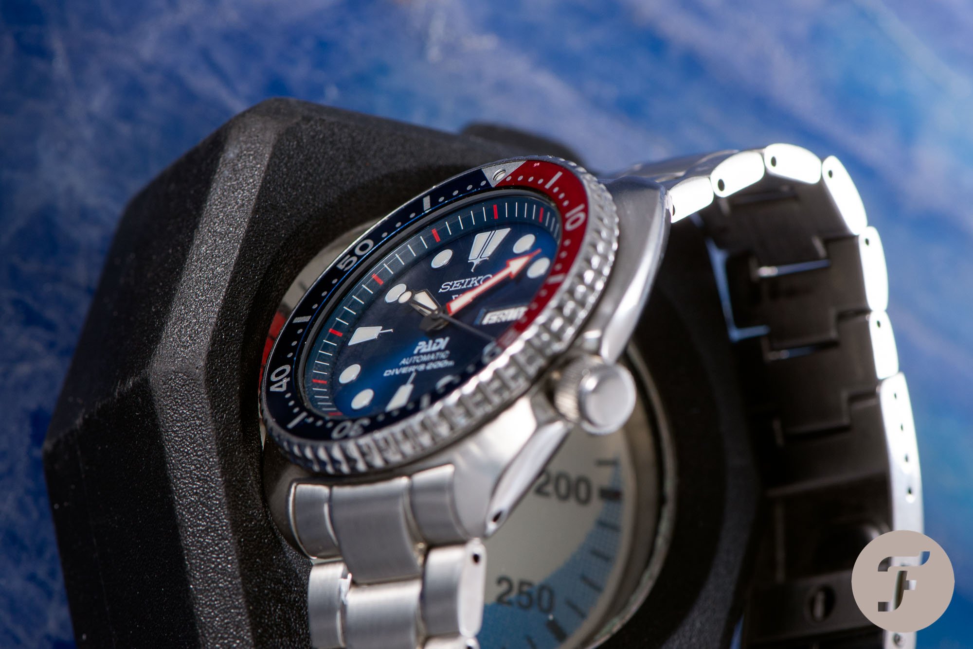
As mentioned before I wasn’t sold on the case shape, the colors, and, on top of that, I also wasn’t a big fan of the multiple logos on the dial. To start off with the case. Yes, it’s a perfect representation of Seventies design and it stands out amongst today’s watch designs. But it’s not a design I was a fan of particularly. The downward-facing, wide case shape didn’t feel crisp. As if there was a lot of excess baggage making the watch feel lazy and sluggish. Especially compared to the Seiko SBDC031 “Sumo” I already owned, the Turtle just didn’t feel as compelling.
There is nothing wrong with a busy dial.
Which brings me to the dial of the SRPA21K1. One of the most heard critiques over the years is the, let’s say, “unusual” design of the Prospex logo. And I agree with that. It is something that often gets in the way of a clean-looking Seiko dial. It has the same effect on me as the weird-looking Officine Panerai logo. Don’t get me wrong, there is nothing wrong with a busy dial. As long as it doesn’t feel cluttered and there are no dissonances. And that’s exactly how the Prospex logo can feel. For this special collaboration piece, the PADI logo was also added to the dial. Another extra element and another typeface to make the dial even less harmonious.
And lastly, as you have already read, the blue and red color combo just is something I’m not drawn to immediately. I can hear you think, “Why the hell did you even buy the watch?” And you’re right, there were a lot of reasons not to buy the watch.
Changing from black to blue
That was until I witnessed both the Kinetic GMT Diver (SUN065) and the Turtle Diver (SRPA21K1) in the metal. It’s the first time I started believing my personal world of watches was not just painted black. You have to understand that navigating towards anything black is a Pavlovian reaction for me. Whether it be black clothes, black shoes, or black-dialed watches, finding the black option just comes naturally to me. And it’s not like black is the only option for me, but it’s the first option and often the preferred one. I only make exceptions on a tennis court, where all colors are an option from the get-go. Yes, even neon. I’m not kidding.
I still had my doubts whether I would actually wear the watch…
Both of the Seiko PADI Editions showed, however, that the deep blue color used for both watches really is a winner. And the blue and red color combination of the Turtle is even better. After trying both watches on, I knew the Turtle was the one to go for. But I still had my doubts whether I would actually wear the watch instead of putting it in a drawer, forgetting it ever existed. Thanks to the incredible €430 price tag back in 2016, that would have never been a costly mistake so I decided to go for it.
Wearing the SRPA21K1 daily
Once I received the watch, it didn’t immediately grow on me. The scenario I had predicted basically played itself out. In the beginning, I wore the SRPA21K1 only a couple of times before I put it back in its box. As predicted it was fighting with my love for the Sumo, the other Seiko in my collection. The ultimate remedy, however, was easy — just wear it for a longer period of time. The first time I wore the PADI Edition for a couple of days, it turned into almost two weeks non-stop. Suddenly it clicked and wearing it felt natural. So natural, in fact, that there are hardly any watches that have had the same effect on me.
The watch is incredibly comfortable on the wrist…
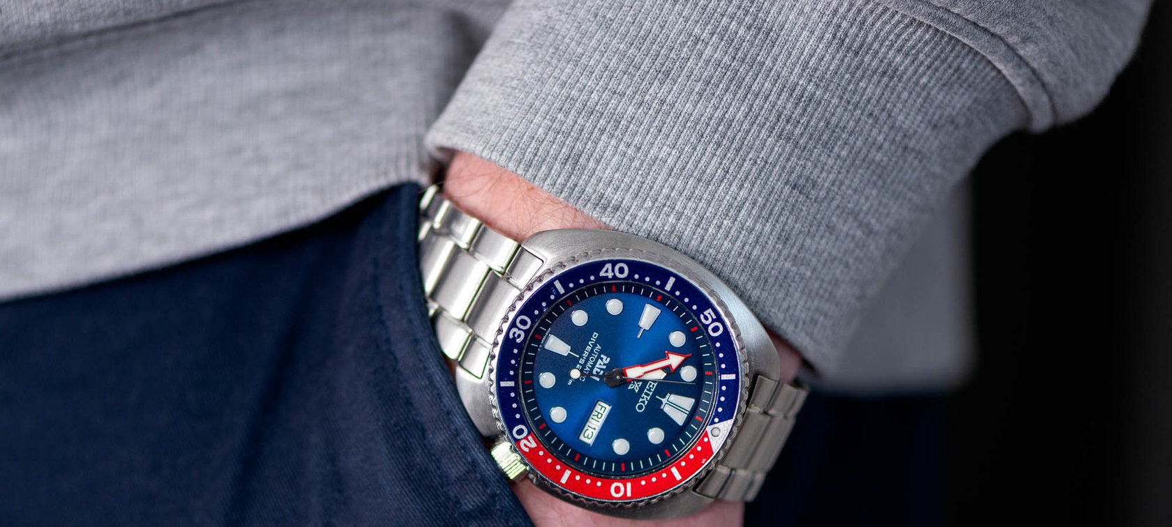
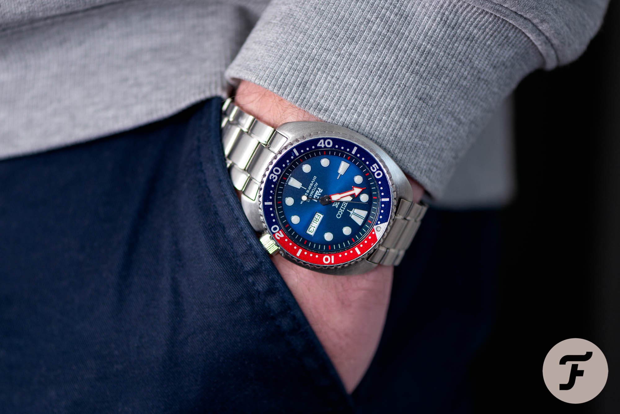
The shape of the case and its 45mm size turned out to be perfect. The watch is incredibly comfortable on the wrist and it certainly doesn’t wear like a big watch although it does have a great amount of wrist presence. When you wear the Turtle, you are also aware you’re wearing a watch because of its weight. I wouldn’t call it heavy lifting but the weight is quite substantial. For me, that turned out to be a trigger to make me look at it even more.
Decoding the pieces of the puzzle
As far as getting used to the shape, it’s best to compare it to the Pepsi color configuration of the original Rolex GMT-Master. It’s simply supposed to be like this and that’s its charm. You get used to it, even when it doesn’t immediately bowl you over. Is it my favorite watch case ever? No, but I do love it a lot. It is unique and it’s what defines the Seiko Turtle. It’s how it should be.
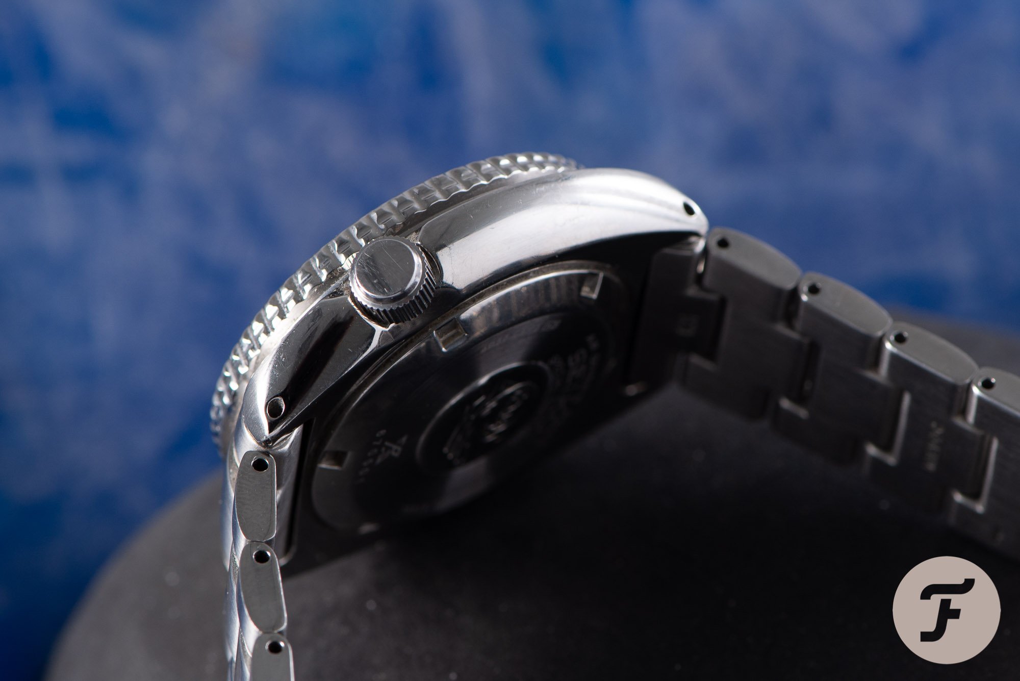
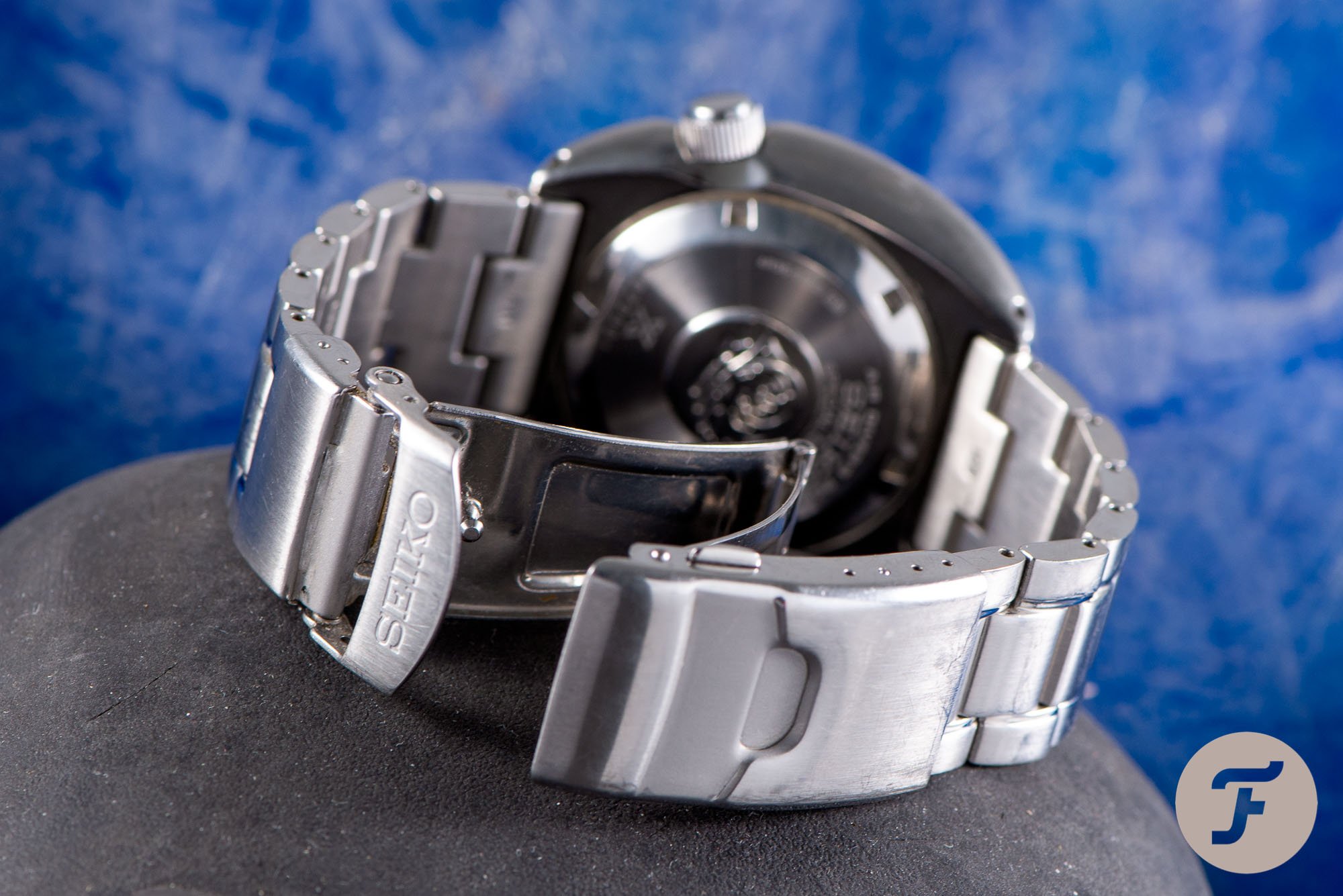
The next thing to discuss is the stainless steel bracelet. It’s been a topic of debate over the years with Seiko fans and I understand that. The build quality is certainly is not up to the level of some of the luxury watch brands that people like to compare it to. And I do think Seiko can take steps to improve the quality of the bracelet.
I like to think that Seiko is over-delivering with a lot of their divers’ watches…
Over the almost four years that I have had the SRPA21K1, it has never bothered me for one second though. For a watch that does not even cost €500, the bracelet for me is absolutely on par with what you can expect for that price. I like to think that Seiko is over-delivering with a lot of their divers’ watches considering their prices. So it’s hard to grill them for a bracelet that is definitely on par with its price point.

Clever design or a coincidence?
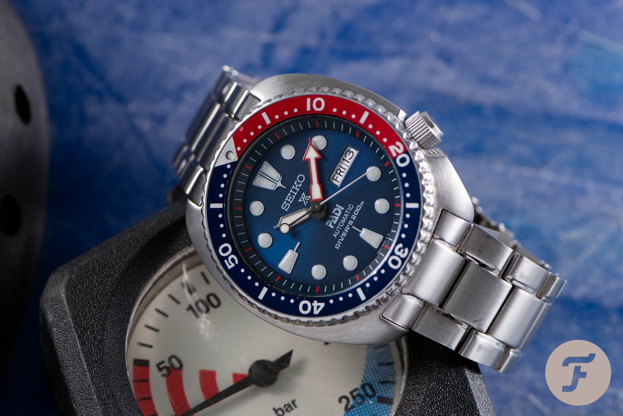
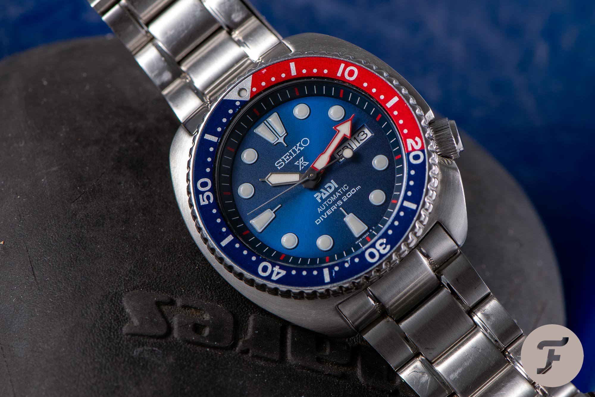
Which brings me to the dial and the Pepsi color combination. The colors have grown on me mainly because of the incredible blue color of the dial with the sunray pattern. It is exactly the right shade of blue and makes a great combination with the bright red. And if you move the watch in the daylight, the sunray pattern will change the blue color from lighter to darker shades of blue. It’s an incredible depth compared to the matte black dial of the regular Turtle.
The thing that maybe surprised me most over time is the design of the dial. Not once has the presence of two logos bothered me. And a big part of that has to do with the fact that at least half of the time, both logos are covered by the broad hands of the Turtle.
…the dial is, in my opinion, perfectly balanced…
And when the logos are visible, they don’t attract a lot of attention. The colors, the hands, the day/date display, and the luminous hour markers catch my eyes a lot quicker than the Prospex and PADI logos. And that’s how it should be because most of these elements are part of the functional reading of time. So despite having my doubts, the dial is, in my opinion, perfectly balanced and a joy to observe despite having two logos that at first bothered me.
My thoughts after four years
After that moment where the SRPA21K1 and I clicked, I started wearing the Seiko Turtle PADI Edition more and more. And often for a couple of days in a row. Over the almost four years I had the SRPA21K1, it has become one of the favorite watches I own. And a big part of that is due to the fact that I was so skeptical at first and how the Turtle PADI has surprised me and was able to completely win me over. There aren’t many watches that can do that.
Next to that, the self-winding Seiko caliber 4R36 that powers the Turtle, does a great job in both precision and reliability. And that’s what you want from a daily beater. Pick it up after some time of not wearing it and it starts running. Setting the day, date, and time is incredibly simple. And after that, you’re good to go.
But the main thing that I like about the Seiko Prospex SRPA21K1 PADI Edition is its wrist presence. I have grown to love the design of the case, the dial and especially the colors. It’s the sum of these parts that makes it a great watch to wear. And when you wear this Seiko Turtle PADI Edition or any Seiko Turtle for that matter, you have the feeling that you are wearing a very serious watch. For its current price of €460, that’s a special feeling.
And, so I will be the first to tell you to buy the Seiko Prospex SRPA21K1 PADI Edition. It is a great addition to your collection and one of the best choices if you are looking for one very affordable watch you can wear every day and enjoy every single time you wear it. Learn more about Seiko here.