Studio Underd0g Watermel0n, Desert Sky, and Go0fy Panda Mechanical Chronograph Watches
I don’t know if you’ve noticed, but there’s been a bit of a tug of war going on in the watch industry for some time. There is a constant struggle between the traditionalists and the revolutionaries. This struggle can take many forms. It is a war fought on many battlefields. No part of the watch world or the watch itself is safe. One week it will be a fight over brand transparency. The next week someone will be touting the merits of silicon hairsprings. Every so often, a new brand comes along determined to have some fun with the stuffy old institution we call sanctuary. The results can be challenging for both supporters and detractors. But, whatever you make of brands like Studio Underd0g, it is my belief they add to the conversation. As such, we’ve decided to feature its novelties here, on the pages of Fratello.
Loving something is easy; hating something can be healthy. Strong reactions are everything. I’m going to go way out on a limb here and guess that you are in one of those two camps. That’s not to say that loving these watches guarantees you’re going to rush out and buy one (actually, you don’t have to go anywhere; they are live on Kickstarter right now), but I mean that your instinctive reaction is positive rather than one of overwhelming disgust.
That might sound like a strong reaction, but it’s fair to mention it as I have literally seen it with my own eyes. Within our team, I’m in the minority. I think that these watches are fun, fairly priced, mechanically interesting chronographs. They won’t upend the industry even if that’s the brand’s surreptitious hope, but they did (and do) bring a smile to my face and who am I to ignore that?
Why so serious?
Studio Underd0g sets its stall out right from the off. Don’t for a second think these watches are glib or thoughtless products — far from it. But they are irreverent, clearly self-aware side-steps off the beaten path. They are, as it clearly references in the press release, a physical manifestation of the incredulity half our industry expressed at the furor surrounding Rolex increasing its Submariner case by 1mm last year.
Here’s the funny thing about that struggle I mentioned in the opening paragraph: both sides are right. Truthfully, for collectors and admirers of Rolex and the indisputable classic that is the Submariner, the 1mm size difference and the new profile of the lugs were a huge deal.
Similarly, it is kind of ridiculous from a layman’s perspective that something like that could matter so much to so many people. Studio Underd0g isn’t going to instigate industry-wide epiphanies with this release; it is more likely to annoy the old guard and titillate the upstarts. And, to be frank, I think the brand is totally fine with that outcome.
What the heck are we looking at here?
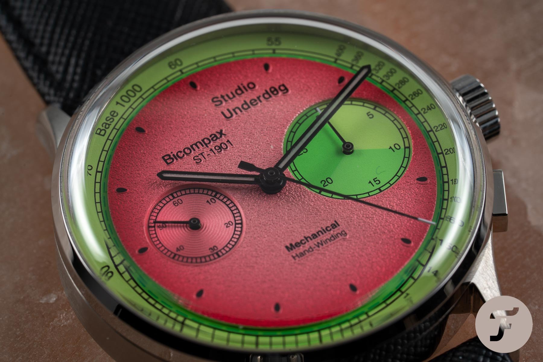
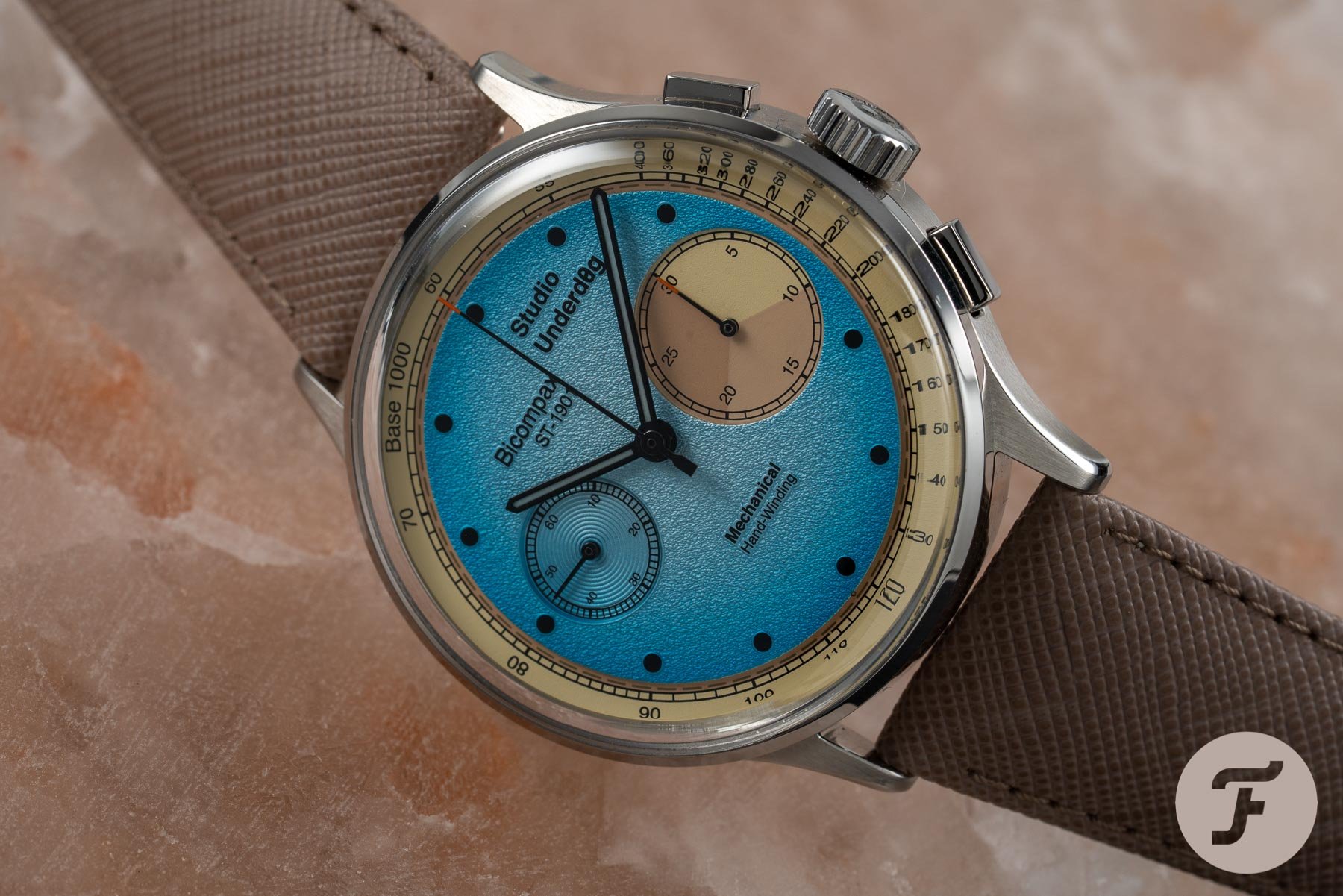
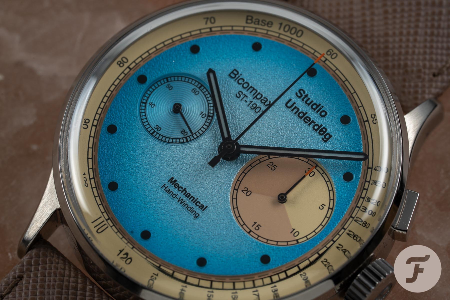
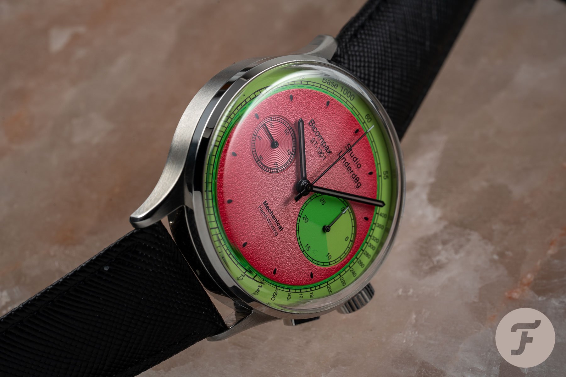
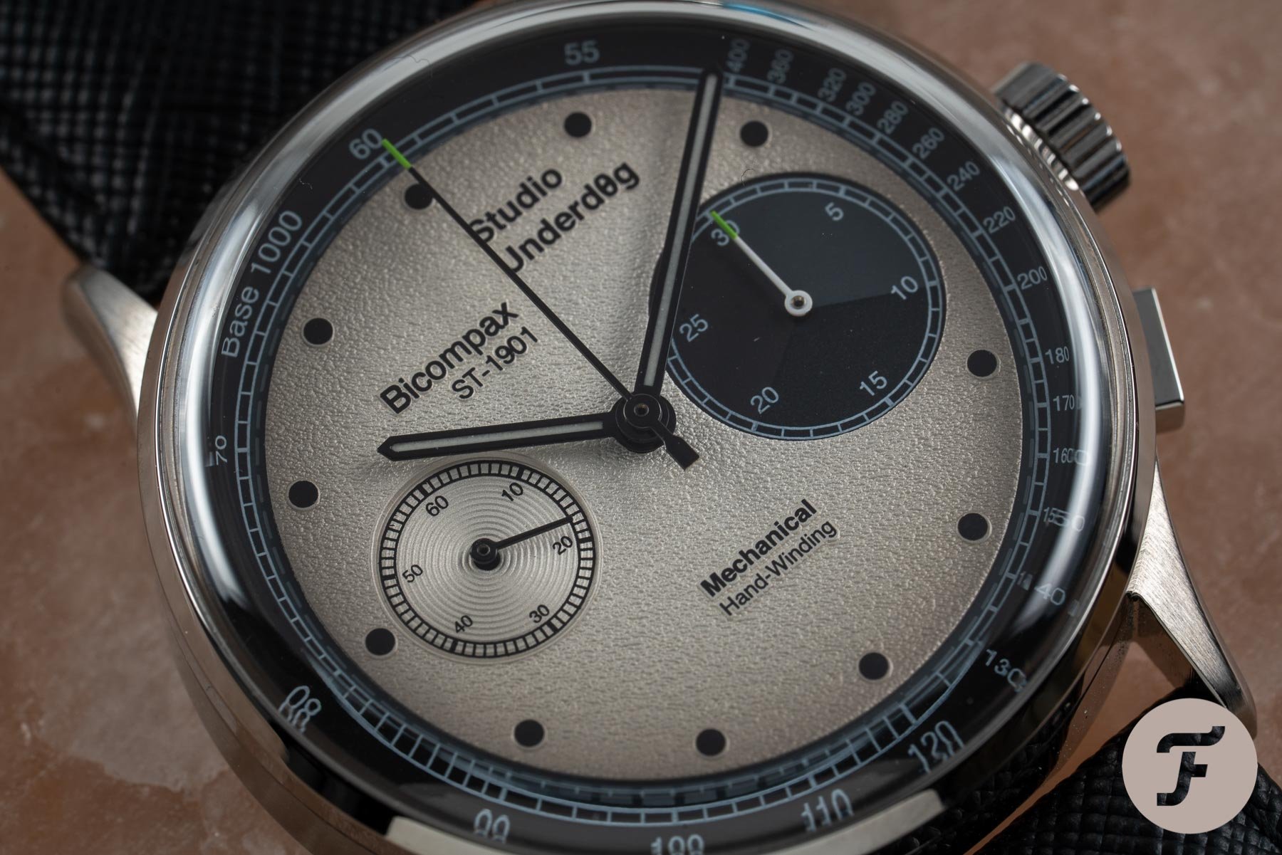
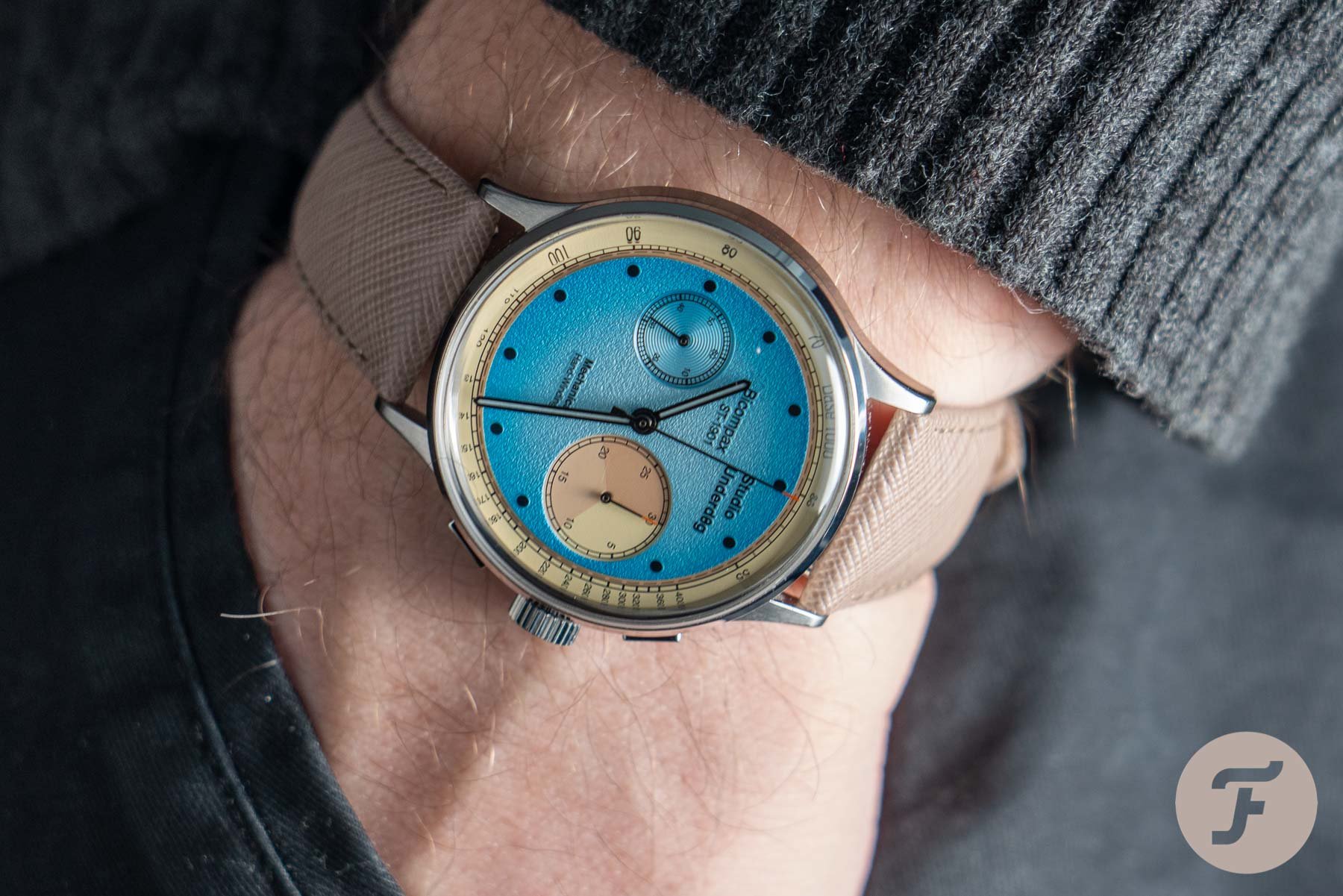
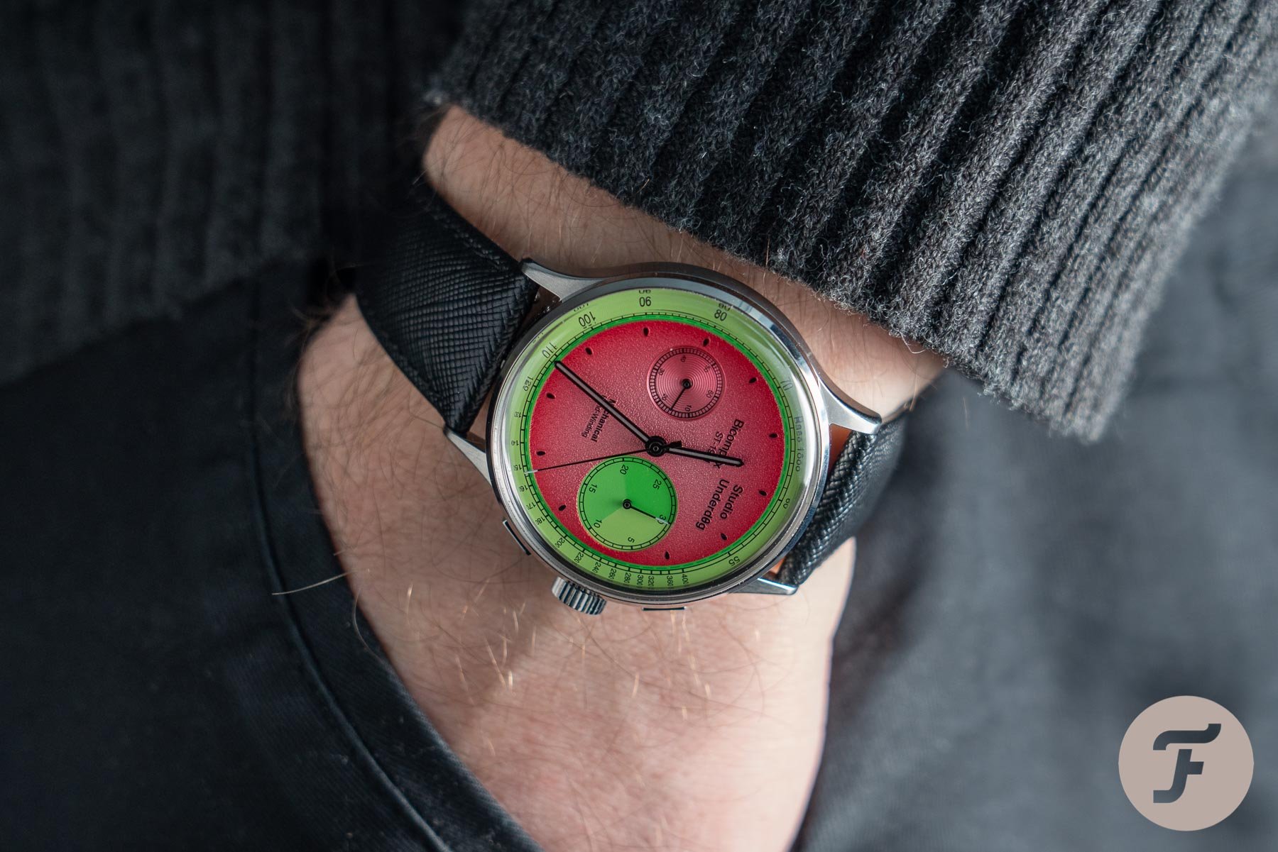
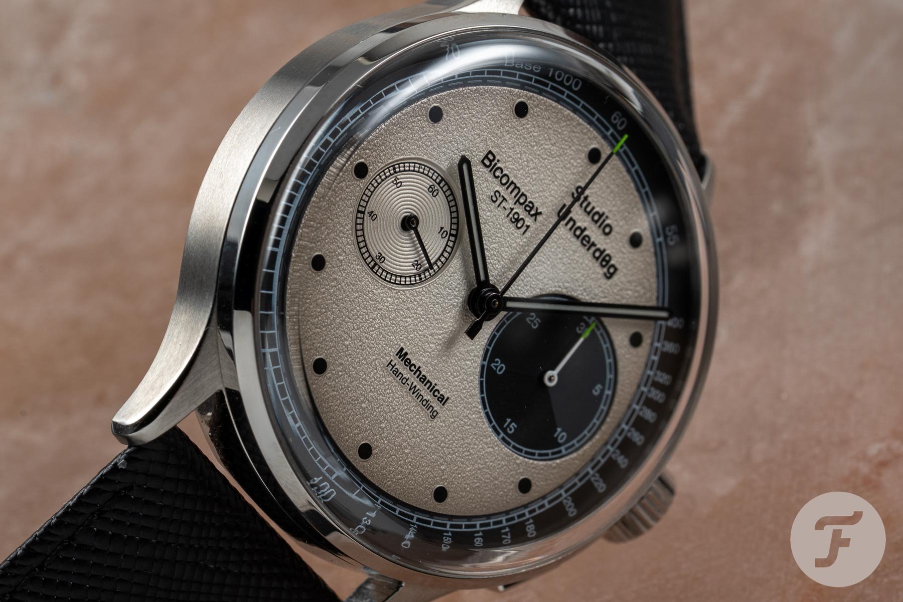
According to the admittedly amusing press release, the design of these watches can be summed up as “where Bauhaus meets Bugs Bunny.” Yeah. Whatever they’re drinking in Studio U, I want some. The colors — or flavors, perhaps — are so vivid and so in-your-face they hardly need explaining. They have the tendency to overawe you at first sight, so I’d encourage you to forget about the watermelon pink and the baby blue for a second and focus on the below Panda to get a clearer idea of the design itself:
Colorways
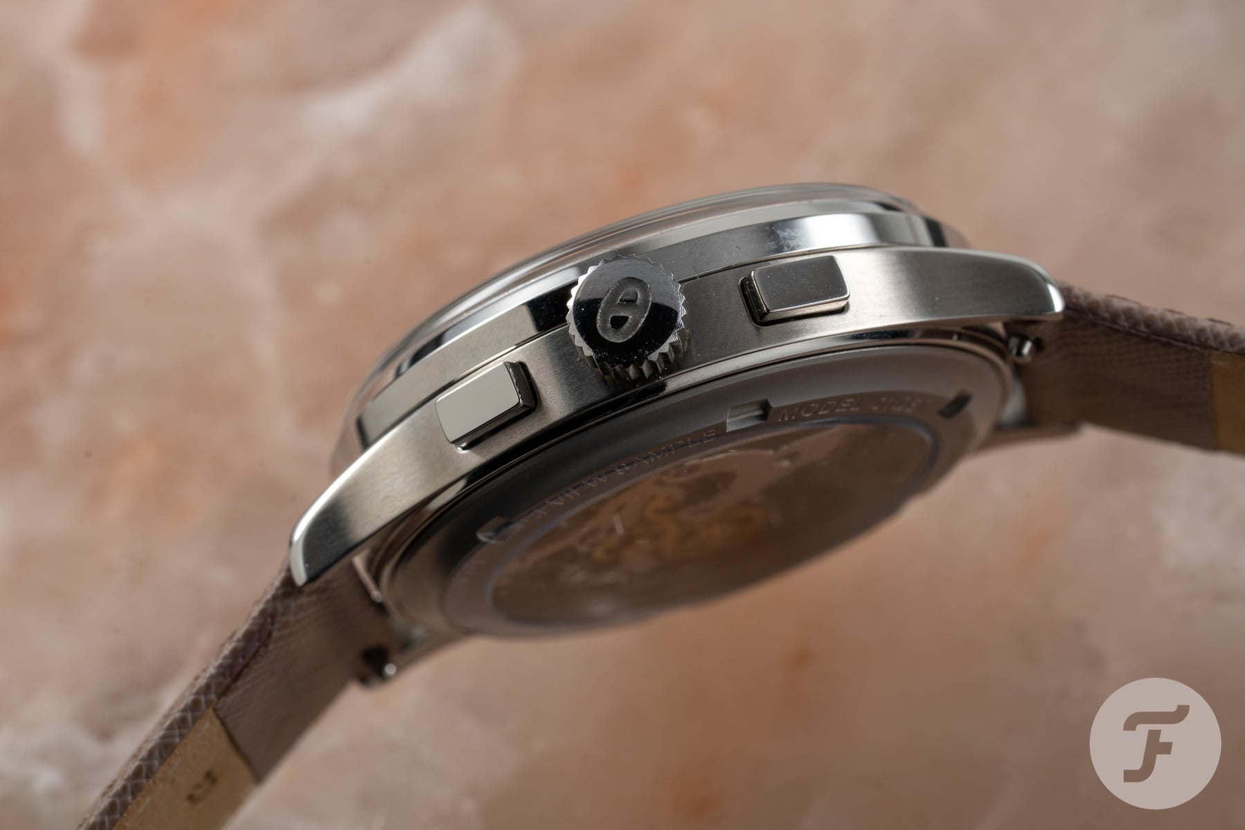
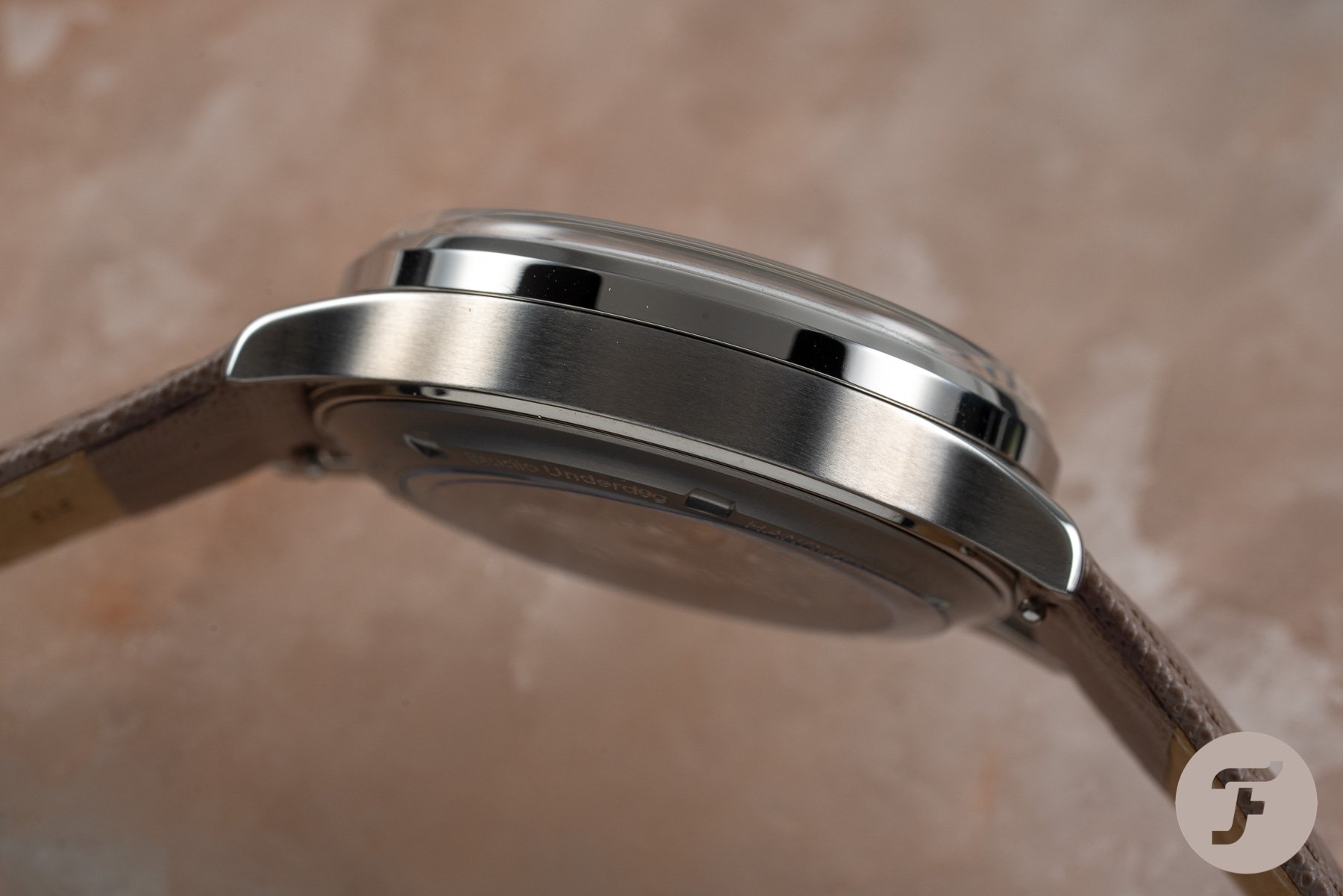
Now, in this more muted colorway (save the vibrant flashes of green on the tips of the chronograph seconds hand and the minute counter hand) we can see that “squinting” sub-dials are part of a relatively sensible (and rather attractive) layout. The edge-to-edge crystal and the vintage-style case silhouette hark back to the seventies. Both elements are cool and look to be pretty well executed for the price point. But don’t expect to find big brand finishing on models like this — it’s an unrealistic expectation and impossible for something retailing for as low as $400 (super-early-bird prices, which will rise to $500 following successful completion of the campaign).
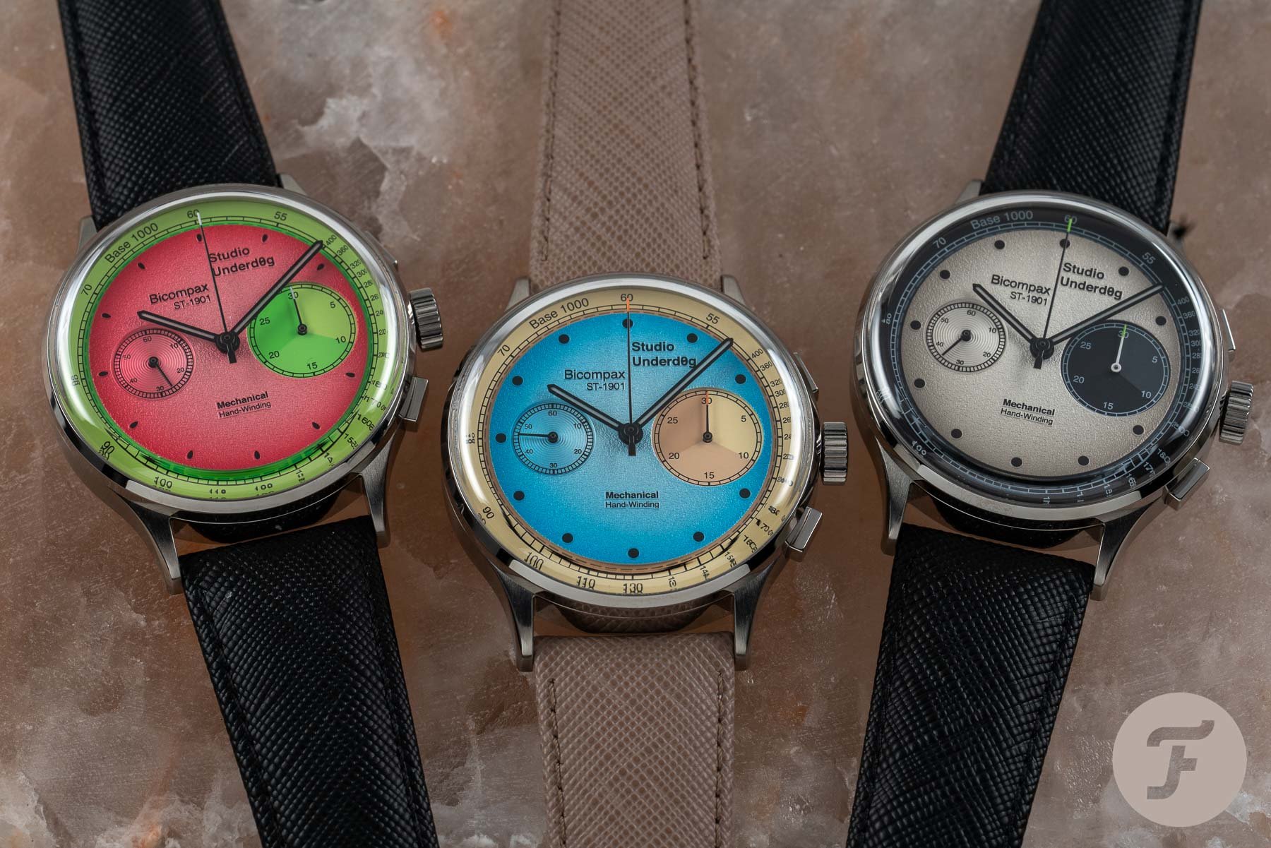
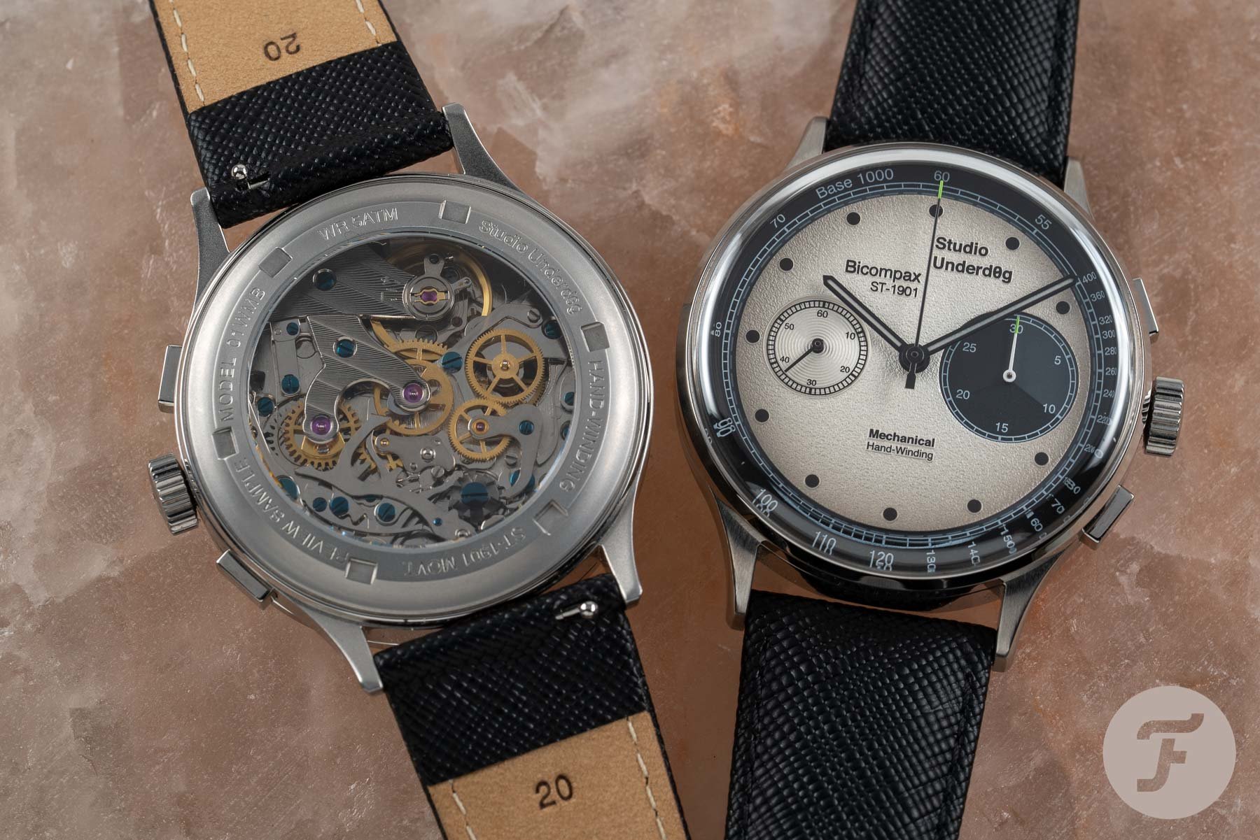
So, we have three models available. You can choose between the Watermel0n (01WMB), the Desert Sky (01DST), and the Go0fy Panda (01GPB), otherwise known as pink, blue, and white. The case is 38.5mm wide, 13.6mm thick, 44.5mm lug-to-lug, and has a 20mm lug width. This 316L stainless steel case is water-resistant to 50 meters and has a screw-down crown. Front and back sapphire crystals reveal textured degradé dials surrounded by tachymeter scales on the front, and the 3Hz Seagull Manual Winding ST-1901 chronograph movement through the back. Yeah, that’s right: this bonkers little project is mechanical, not quartz. This particular movement runs for 45 hours on a full wind.
My main gripe
So this is a somewhat contentious issue, but the dial layout here, which is commonly referred to these days as bicompax, used to be known as a “compur” layout or a “uni-compax”. The term compax was used to express complications on the dial (of which the going seconds does not count). I would have loved Studio Underd0g, which has otherwise produced a thoroughly modern watch, to have used the old-school (and, in my opinion, correct) terminology just for added laughs. It would have provided a weirdly anachronistic counterpoint to the shocking watermelon colorway (which is my favorite, by the way).
Then again, I’m not sure anyone that would buy this watch would ever care to be so pedantic. People have been calling a compur/uni-compax layout a bicompax for so long it has become widely accepted as the term, and, I must say, it looks kind of cool on the dial, especially given the weird, off-center (and yet perfectly balanced) text arrangement. Is this nuts? Yep. Do I think it will make it through the Kickstarter gauntlet? I reckon it will fly. Which begs one question: where does Studio Underd0g go from here? Check out the Kickstarter project here.

