Building A Watch Brand Episode 6: Caliber, Pouch, Logo, Bracelet, And Case Refinements

It has been a while since Episode 5 of Building A Watch Brand. I thought I’d let the dust settle after Watches and Wonders before sharing another update on the progress of VPC. That does not mean that nothing happened in the meantime. In fact, I have been quite busy on many fronts. So in today’s update, I will share several things I worked on rather than go deep into specific design choices. Still, there are plenty of those to share as well.
Today’s update includes news on the design front — a new bracelet and more realistic renders. I have settled on a caliber that I can now share, and there is a fun little peek into typeface design that I found particularly interesting. Finally, there is a potential bit of packaging in the form of a pouch. We have a lot to cover, so let’s get into it!
From sketch to concept design
As explained in Episode 5 of Building A Watch Brand, we had settled on a case design direction early on. Designer Max Resnick then went to work making a more realistic concept design. At this stage, the proportions are finetuned, and we get to see some surface textures. This gives a much better feel for what the end product might actually look like. I can only speak for myself, but I absolutely love this case!
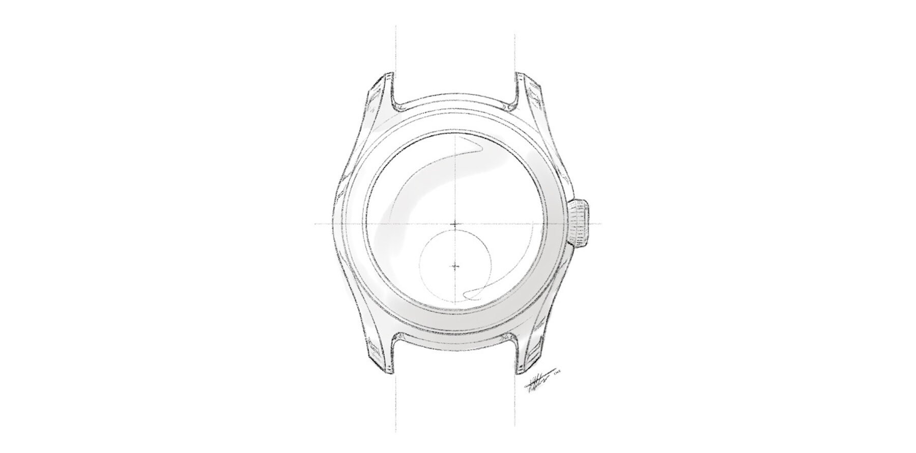
The sketch we continued to develop
This is still the concept stage of the entire design process. Max is mindful of technical feasibility, but it is not the main area of focus just yet. This is still all about finding the desired aesthetics and feature set. Once all of that is to our complete satisfaction, we will start looking at the functional aspects. That includes, for instance, making physical prototype cases to explore the fit on the wrist. We might, for example, curve the lugs a little more or less as a result, or we may tweak the proportions for a perfect fit.
Only after that will the design enter the technical development phase. At this stage, we will explore how to match our desired design to our desired specs. Expect challenges such as: “You can have this chamfer, but not within the proposed budget” or “For 200m water resistance, we need x additional height, or we need to agree on 150 or 100 meters.” At this stage, we also look at technical solutions for combining a hand-wound caliber with a screw-down crown. As you can see, there is a huge amount of problem-solving to do while trying to stay as faithful as possible to the concept design. In fact, part of the selection procedure for potential manufacturers is to analyze how close they can stay to our concept design.
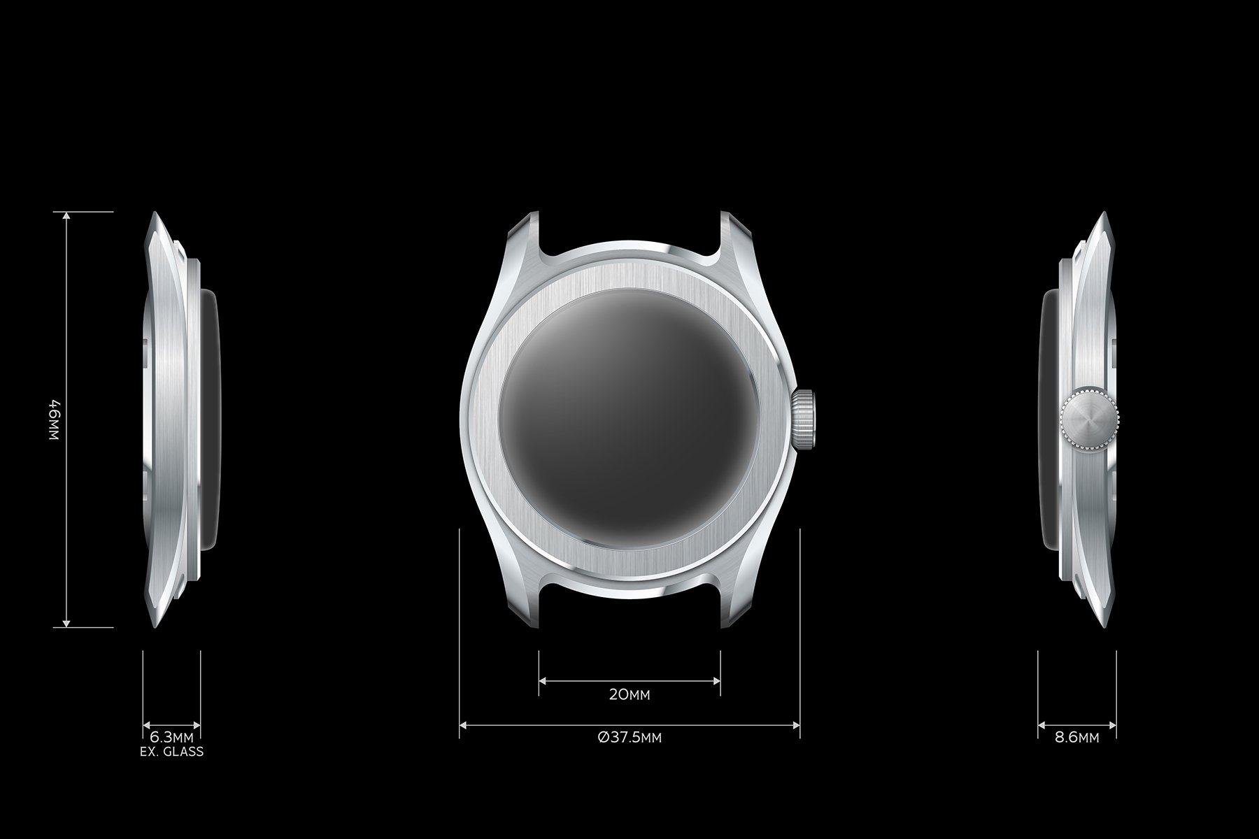
Preliminary dimensions. A monogram for the crown is still under development
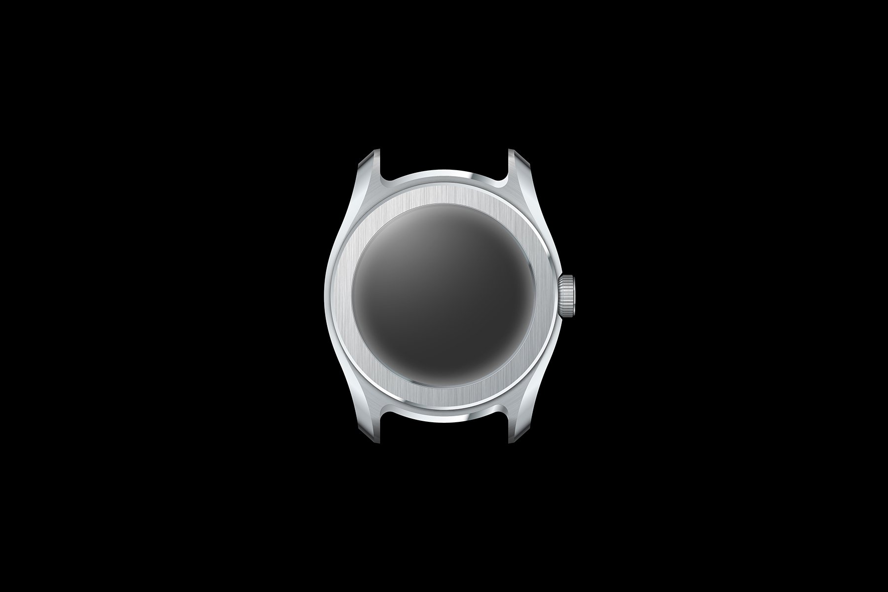
A caliber conundrum
As shared in Episode 4 of Building A Watch Brand, I wanted a hand-wound caliber with sub-seconds at six. I had my eye on two primary candidates — the La Joux-Perret D100 and the Sellita SW216-1. Quality and price-wise, the two are very similar, but there were some tough decisions to make nonetheless.
The D100 is one of the slimmest options on the market at just 2.5mm thick. Unfortunately, it cannot be finely regulated due to the low inertia of the balance wheel. Another big drawback was the lead time, which turned out prohibitive from a logistical perspective at this point.
The top-spec Sellita, on the other hand, can be regulated to COSC specifications. This opens up the possibility of making VPC’s debut watch a chronometer, which was the ambition early on. It has a significantly shorter lead time, reducing my overall timeline by half a year compared to the LJP. It was now up to Max to hide the 1.85mm difference in height. As you can see in the profiles above, he more than succeeded in keeping the watch perfectly slender nonetheless. So the choice has been made: VPC’s debut watch will be powered by a top-grade Sellita SW216-1, probably COSC certified.
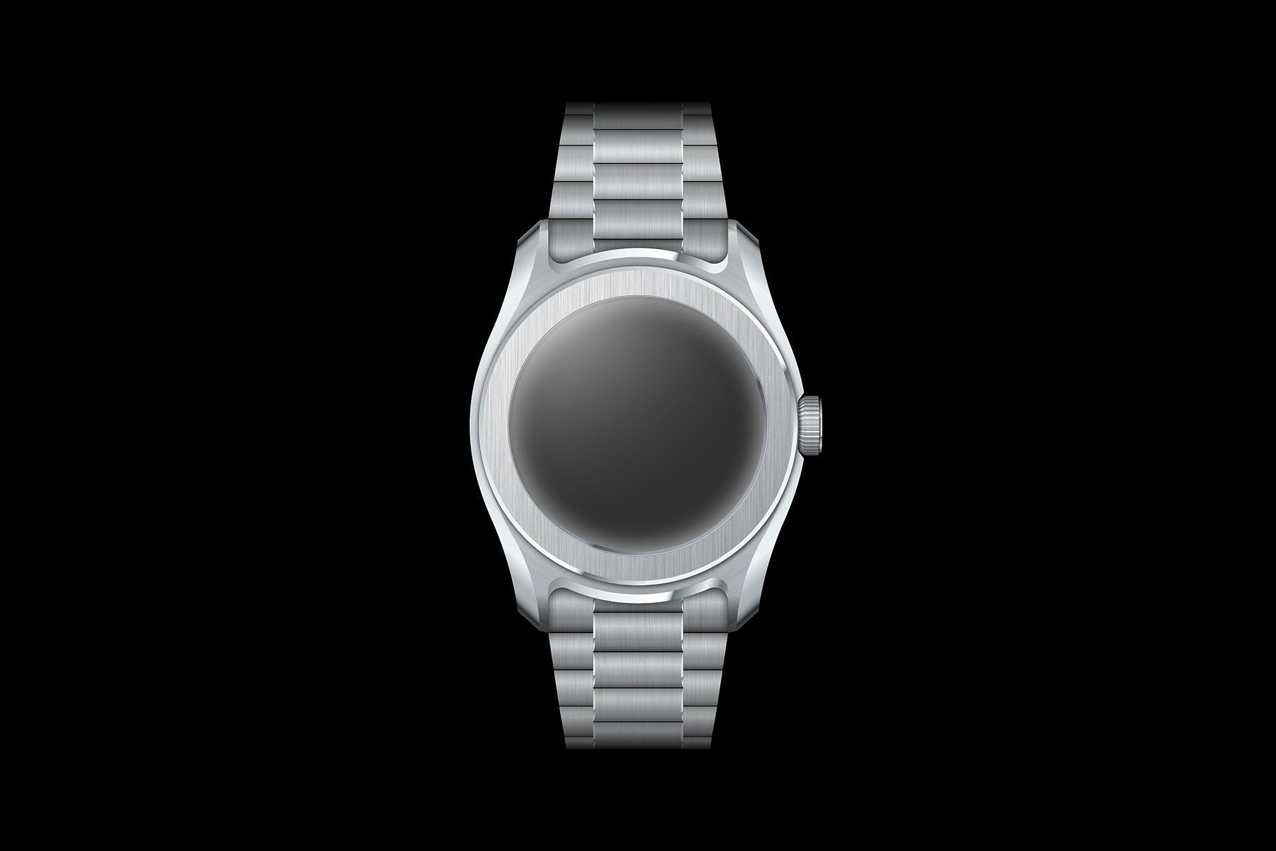
Our new bracelet concept
A brand-new bracelet design
Episode 5 of Building A Watch Brand featured a sketch of a flat-link-style bracelet, as you see below. Max had designed an end link that echoed the characteristic ledge and married it to a more angular bracelet. Interestingly, as time progressed, both Max and I lost our love for that design. When I proposed that we backtrack a bit and try again, he wholeheartedly agreed.
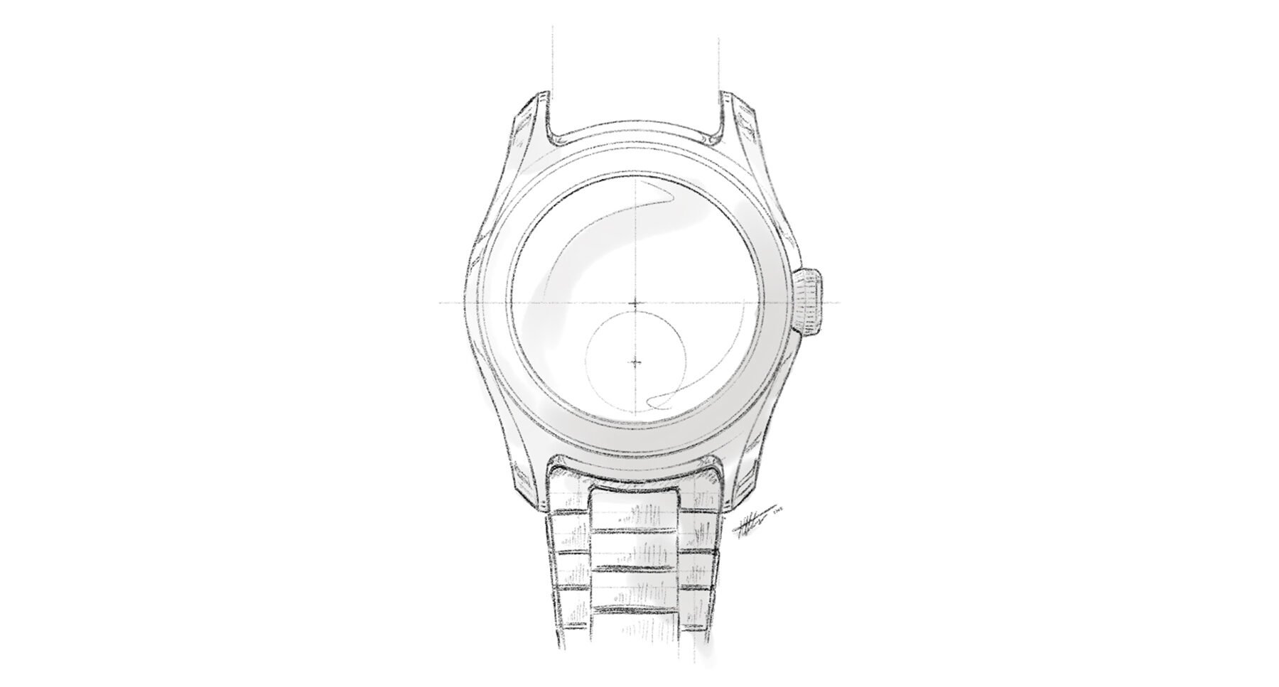
The flat-link bracelet with a distinct end-link design that we decided to abandon
The problem was that it did not optimally capitalize on the ledge design. The ledge offers the unique opportunity to make it look like the bracelet runs straight through the case, uninterrupted. If, however, we did that with a relatively traditional flat-link bracelet, a style breach emerged with the case. This is why we initially needed an end link to marry those styles. It was back to the drawing board for something better.
We decided to echo the softer, rounder shapes of the case by un-flattening the flat-link design. It is almost as if a flat-link had a baby with a President-style bracelet. A subtle chamfer on the center links further marries the bracelet to the case. The bracelet will taper from 20mm down to 16mm. We are also aiming for a three-piece end link. Thanks to the ledge, it can remain as thin as the rest of the bracelet. This means it will provide the illusion of the bracelet running straight through the case. If we can make it work as intended, it will be as if there is no end link at all. This is still merely my humble opinion, but I think Max worked miracles here once more.
A closer look at typography
As I mentioned in Episode 2 of Building A Watch Brand, I have been obsessing over typography. I settled on a font that has roughly the right feel. My early logo sketches, however, looked off somehow, so I hired typography specialist Samuel Baker to help me out.
Samuel explained that most fonts use a standard template for kerning — the space between characters. Only in more high-end typography do designers compensate for specificities that emerge while designing a unique typeface. So my logo sketch looked odd because of odd kerning. Some letters bundled together (for instance, the “NS” of Constantiam), while others seemed to break off (the “AS” of Venustas, for example). Samuel corrected the kerning. As you can see in the comparison above, the result is much more cohesive and easy on the eye. It goes to show that if you are a generalist like me, you need the right specialists by your side.
With the watch taking on a slightly more modern aesthetic than I initially envisioned, I discarded the curved logo. It felt overly vintage. However, this is not to say that the above is the final logo. Samuel and I may have a pretty cool trick up our sleeves still, but it is too early to discuss that just yet. All I can say is, do not get overly attached to these logos for now.
Packaging ideas
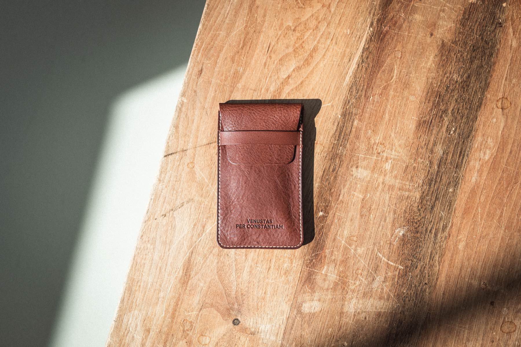
If you are a watch collector, you probably have a big pile of massive boxes stacked in the back of a closet. Costly, overly luxurious boxes, I might add. This is not what I want for VPC. I want to include packaging that is functional and useful, so I have decided to include a really good pouch and keep the box relatively sober, compact, and simple.
I try to work by the creed that anything you buy from VPC should last a lifetime or longer. Consequently, some affordable pouches that I had made earlier did not make the cut. They were pretty, but I knew that they would not survive a year of daily use, let alone a lifetime.


Instead, I had a sample made by Wesley Pijnenburg from Watchpouch, and boy, he delivered. It is thick, supple leather with a great smell, sewn together in a way that will last. I am putting it through the wringer now to see how it holds up and what kind of patina it develops. It is a serious contender to become part of the final packaging for VPC.
What is next in my process of building a watch brand?
One thing is still pretty glaringly missing from the design — a dial! Or, more accurately, dials. Just as the eyes put the soul into a portrait painting, so does the dial blow life into a case. And this is precisely why we saved it for last. You know you have a great case and bracelet if you can make them sing without a dial. If we had done it the other way around, our case and bracelet would surely have been less special.
Max is already hard at work on dial concepts, which will follow largely the same development route as the case. We will likely make a small number of color and texture variants of the central theme of the one-eyed panda.
Once we have the dial concepts finished, we will move on to 3D modeling. Freely moving around the design will surely unleash new inspiration and reveal potential issues. We are slowly but surely getting closer to an actual watch, my dear Fratelli, and I cannot tell you how excited I am. Building a watch brand so far has been a massive challenge and a huge source of joy. I am looking forward to showing you more as we proceed. As I have expressed before, I sincerely hope this series is informative and entertaining regardless of whether you like the watch. The two are meant to stand alone. As always, thank you so much for coming along!
Can’t get enough?
- VPC website and newsletter opt-in
- VPC on Instagram
- Building A Watch Brand Episode 1 — Introduction
- Building A Watch Brand Episode 2 — Brand and name
- Building A Watch Brand Episode 3 — Finances, risk mitigation, and a designer
- Building A Watch Brand Episode 4 — Unveiling the watch concept
- Building A Watch Brand Episode 5 — The first design ideation sketches