Hands-On With The Chris Ward C65 Chronograph

If the 1970s Rolex Daytona took the 1970s Heuer Skipper on a romantic trip to a desert island, the latest Christopher Ward’s C65 Chronograph is probably what they would bring back as a memory of their passionate encounter…
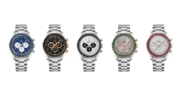
Christopher Ward (the brand, not the man) fought COVID last year with a bold diver release that introduced a thick transparent sapphire dial. At the end of last summer, CW revived the legendary EPSA cases with inner rotating inserts operated by an extra crown. Today’s C65 Chronograph is the most recent Christopher Ward release that caught my attention. Do they succeed in getting yours?
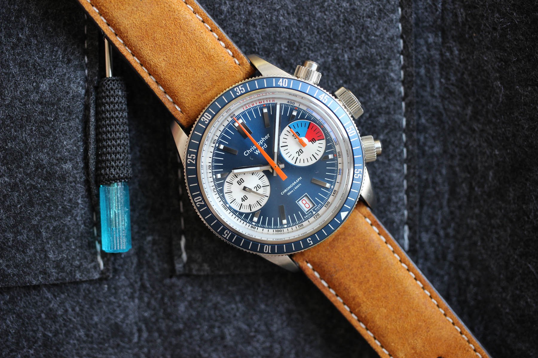
The C65 Chronograph. Original or not?
To be honest, I was instantly intrigued when information on the new C65 hit my email box. At the same time, I was a bit hesitant, as a few unpleasant ideas started swirling in my mind. The inspiration CW took was more than apparent and I was not sure what to think. I felt guilty, so I asked for a piece to sort out my dilemma.
The same base
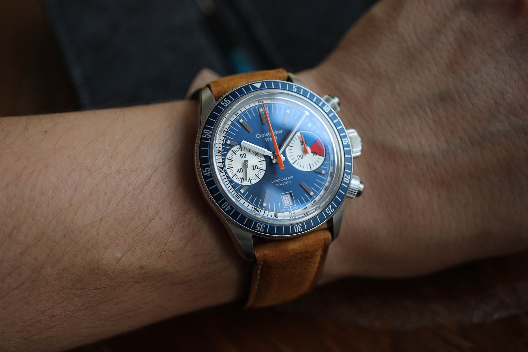
The case is very on-brand, you can’t argue that. It’s actually maybe too CW and even as a brand enthusiast I would welcome some novelty in that regard. That’s all the more imperative now, given the frequency of the brand’s releases. The good news is that the horizontally cut case is so good and so versatile that it looks like it was designed for this particular chronograph design. The angling of the case’s underside makes it look and feel really light and sleek.
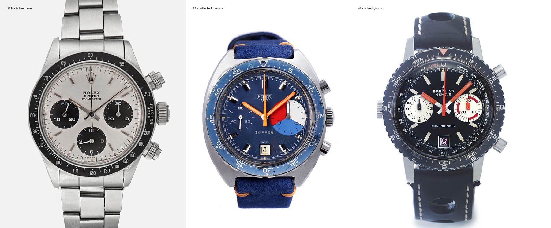
The first automatic chronograph
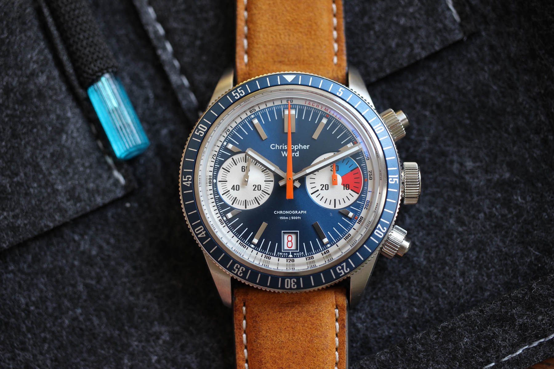
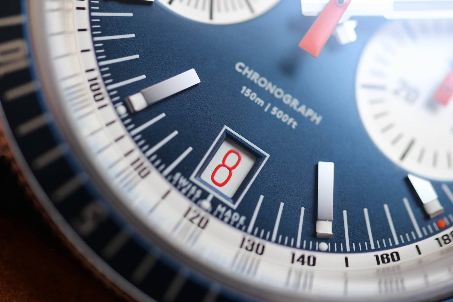
The more I wore the new C65 Chronograph, the more I found other design legacies hidden within its design. I am surprised that the following one didn’t come up immediately. The sub-dial alignment with a boxed date window at six o’clock strongly resembles the first automatic chronographs with a cal. 11.
I have one in particular in my mind: the Breitling Chrono-Matic ref. 2110. That’s my favorite from the entire fleet. If you look closer at the sub-dial hands, you will see what I referred to as one of the nicest details found in the Breitling ref. 2110.
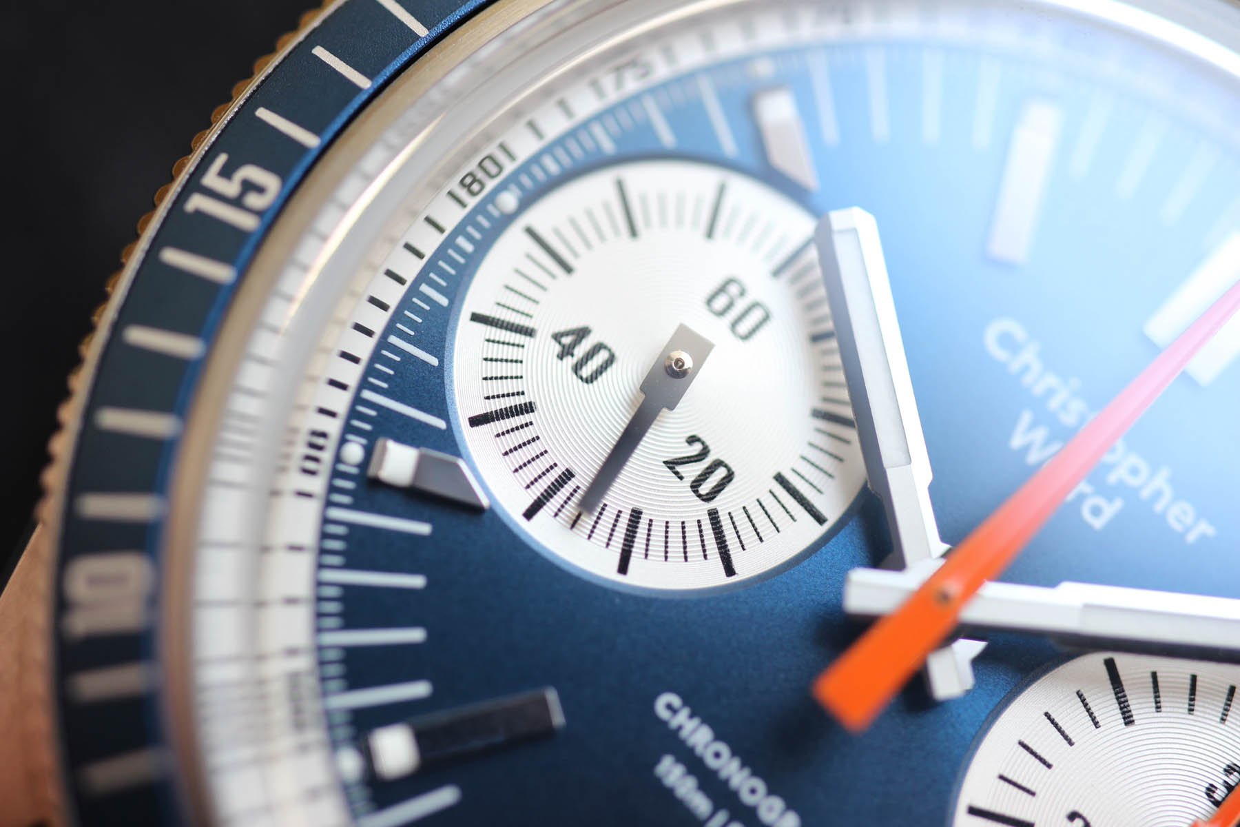
The tank-style hands have a bit broader square base that the mentioned Breitling reference, but the basic shape is undoubtedly there. The date number typography is classic 1970s too and I don‘t mind it at all. The positioning and the size is perfect and even date haters have to admit it’s one of the better date integration into the chronograph. You don’t need to break your neck to read it, just like you don’t need a loupe to read it as you do with watches that come with such small date windows that they try to pretend it‘s not even there.
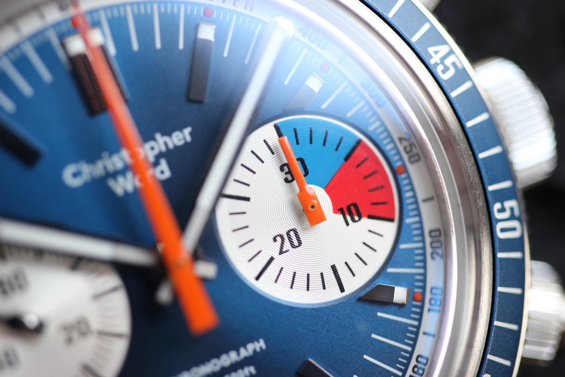
C65 color scheme
To give you a real example of how tricky colors can be, I will just tell you that I see the Slovak flag on the sub-dial. That is the country I was born and where I live. I see also the Czech flag and a few other Slavic countries that bear the blue, red and white tricolor. I would be curious to see if it makes for an easier sale in those markets.
However, vexillological musings aside, it is actually vintage regatta timers that inspired this handsome 3 o’clock counter. From quite a long list of reference models, a Heuer Skipper is the role model popping up most vigorously in my mind’s eye.
Sailing basics
As the number of seas in my country equals zero, my sailing experience is pretty limited. I have never been on a sailboat before and all I know about regatta racing is that there exists a 5–10-minute interval that you need to get ready before the race starts. According to Google, “The most important part of a yacht race unfolds in the 10 minutes before it begins when sailors need to wangle their vessels into the best start position without barging the line (facing steep penalties) or hitting another boat before the final gun.”
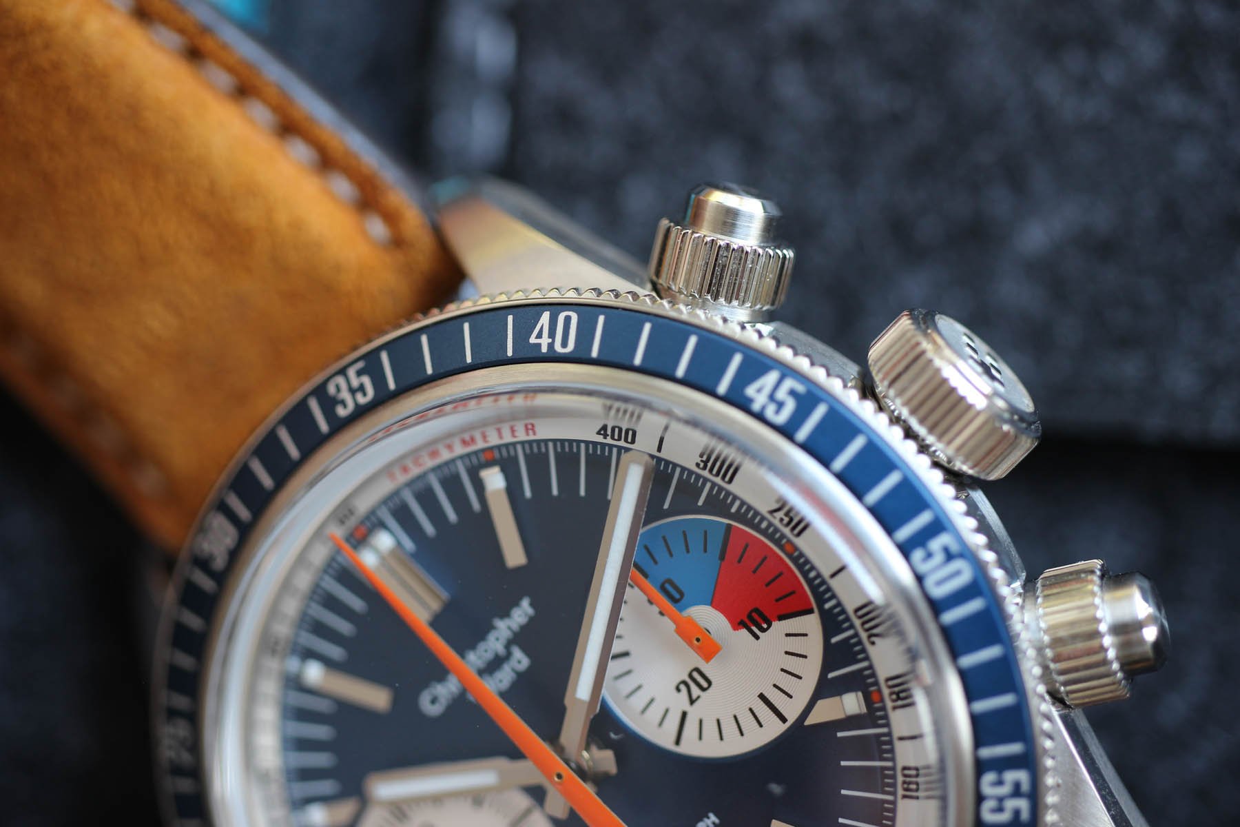
The orange central second is another reminder of my favorite Breitling Chrono-Matic. Even the shape is almost identical. So is the red typo on the date disc, that is balanced with a TACHYMETER sign on the top of the dial. If there is any detail that really bothers me, it’s linked to the tachymeter track. Design-wise, it’s really decent and I am happy it’s there as it complements the uni-directional rotating bezel. Just the edge of the crystal reaches it a bit from the top. It’s no big tragedy, but it could have been pure perfection.
Patented blue
If you showed me five dials with no branding, I guess I would instantly recognize the “Christopher Ward blue” you can see on the bezel. I believe it’s that steel-cold tone that makes it icy-cool. On the contrary, the blue on the dial is a bit brighter and warmer. When the sun hits it full-on, that’s a real joy.
By the way, shooting the C65 Chronograph was fun and no extra effort was needed to get nice pictures. What was a bit unexpected, was to see the pure white lume on hands and indexes. There is no sandy yellow or creamy fauxtina to mimic vintage models here. It looks like a minor detail, but I believe the pure snow-white lume helps to establish a modern look.
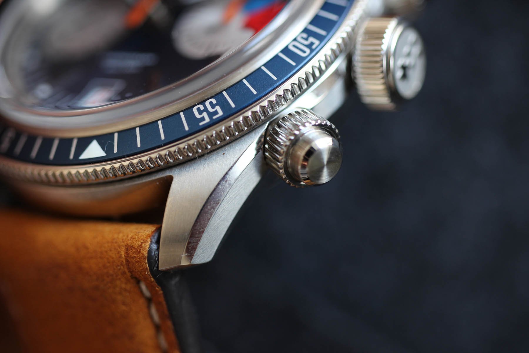
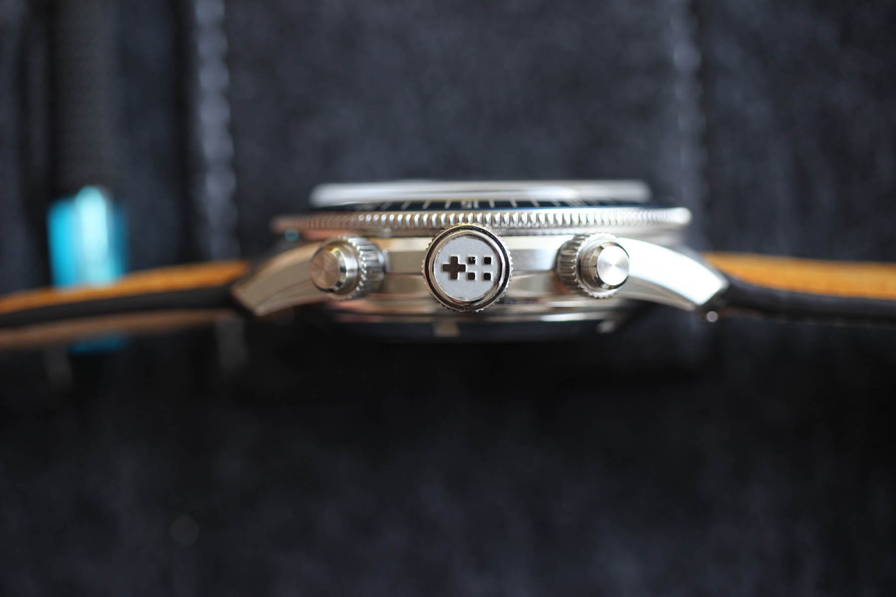
Pushers on C65
What do you think about the screw-down pushers? Let us know in the comments below! Technically they are very solid and they unscrew easily and precisely. Christopher Ward promises they provide an extra layer of water-resistance (guaranteed to 150m).
Regarding the pusher, I find myself on the fence. Honestly, I love the look of them, but I hated unscrewing them each time I wanted to use them. I don’t race and if I want to time something, I usually need to do it RIGHT away. So the unscrewing only frustrates me, but as a part of a relaxing exercise, they are perfect. If you are a heavy stopwatch user, I recommend trying it first.
Shotgun notes
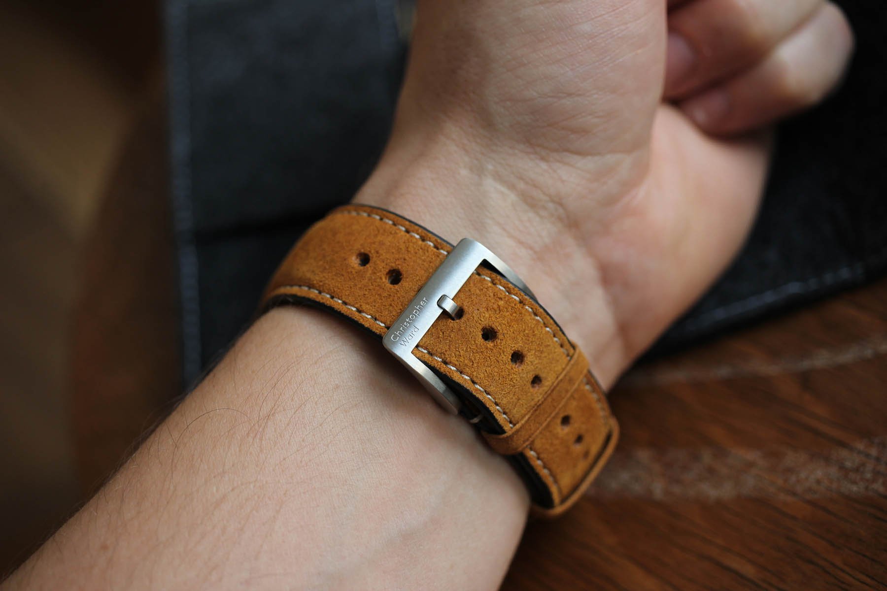
Vintage or modern, I recently found myself very fond of oversized flat crowns. This one is a screw-down type and is superb to use. You can feel it under your fingertips. The 41mm diameter fits today’s standard well. My personal feeling was that it looks smaller, but wears bigger. The brushed leather strap is very pleasant, so if you want to multiply the vintage vibes, opt for it. You might consider dropping the blue tropic in as well, as it changes the overall look and feels big time.
Last thoughts
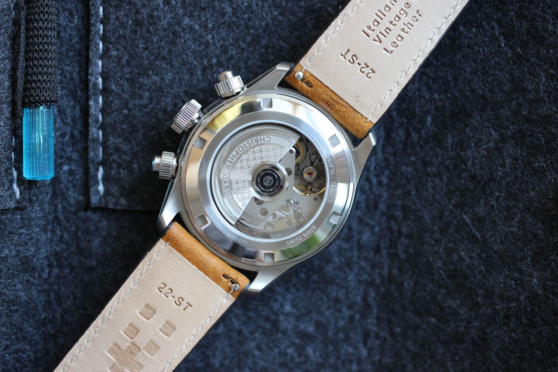
No matter how many famous vintage references you recognize in the C65 Chronograph dial, the case and bezel indisputably give it a Christopher Ward feel. If an in-house movement is not your priority, the Sellita SW510 should be reliable enough. I am the kind of guy who prefers dreaming about a vintage Heuer Skipper or Rolex Daytona. But we know, we would never take them for a swim. The C65 Chronograph on the other hand, that we could.