Luxury Brand Logos Losing Their Charm — From A Unique Look To A Standard Combination Of Letters

Perhaps you have noticed that some of the most famous luxury fashion brands have a very sleek and almost minimalist logo nowadays. You might also know what the classic Yves Saint Laurent logo looks like. There was the vertical monogram of Y, S, and L designed by Cassandre, one of the most influential poster artists of the 20th century, in 1961. There was also the horizontal logo with the prominent italic Y, S, and L in slightly larger capitals without spacing. The current logo used by the Kering-owned brand is completely different. It’s very sleek, yes, but also very vanilla. Founder Yves is absent, and all that remains is Saint Laurent in Helvetica Neue Bold — that’s a font you will find in Word. Why is it happening, and will the watch industry follow if it hasn’t already?
There’s nothing wrong with the Helvetica font. On the contrary, it’s probably the most famous font in the world, and rightly so. It was originally called Neue Haas Grotesk and was designed in 1957 by typeface designer Max Miedinger with Eduard Hoffmann, the president of the Haas’sche Schriftgiesserei in Basel, Switzerland.
The objective of both designers was to create a neutral typeface. According to Wikipedia, it was to be one “that had great clarity, no intrinsic meaning in its form, and that could be used on a wide variety of signage.” When Linotype got the license for the font in 1960, the name changed to a play on “Helvetia,” the Latin word for Switzerland. Helvetica expresses the great qualities of Switzerland in the field of design. Most of all, though, it symbolized Switzerland’s neutral status. Is a neutral font really the kind you want to use when you’re a fashion brand like Saint Laurent, one driven by creativity, artistry, and passion?
Luxury brand logos losing their charm — how about watch brand logos?
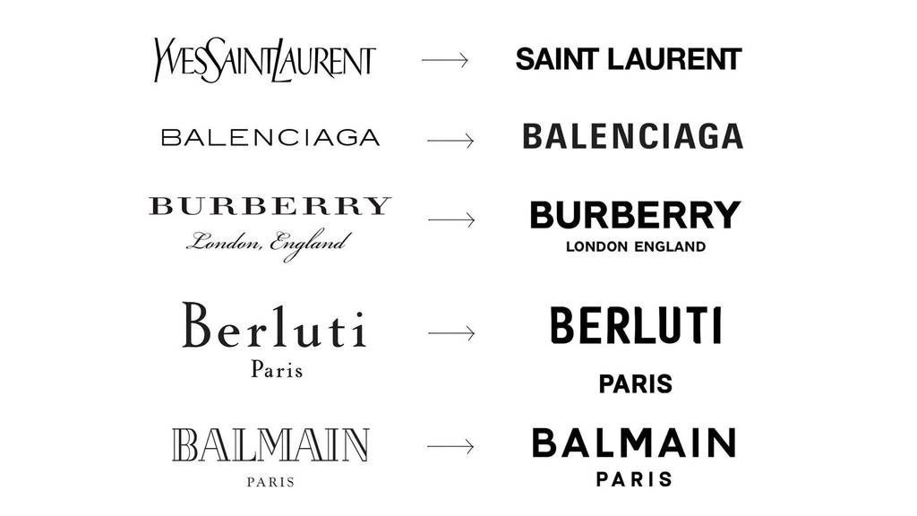
Saint Laurent uses Helvetica, and Louis Vuitton chose Futura, a font that IKEA, Volkswagen, and Shell also used in the past. Does using these neutral fonts diminish the emotion people feel when seeing the brands’ names written in them? It seems that luxury fashion brands, by exchanging their idiosyncratic logos for standard typefaces, take the risk of becoming a homogeneous mass. To put it bluntly, they now all look more or less the same. Look at Burberry and Balenciaga, two very different brands that now use sans-serif typefaces that look “eerily” similar. The brands are, of course, fully aware of this, so the question remains: what’s the reason to look just like the competition?
The internet is to blame, really. And your smartphone. Logos like the Yves Saint Laurent monogram or fantasy fonts don’t work and/or don’t look good in tiny spaces. And since the future isn’t print — the original natural habitat for the creative logo with its lavish embellishments — but the digital space, logos were stripped of all frivolities. It’s undeniable that sans-serif fonts offer easy, clean, instrumental legibility, especially online. But there’s more to it than readability. A nondescript logo is like an empty vessel that can be filled with every kind of message the brand wants to communicate.
Money over matter
With rapidly changing trends, a brand logo that goes with everything from urban to classic looks is way more convenient than a logo that creates an emotion and an image by itself. Is this opportunistic or very smart? Do brands want to trade in their image for commercial reasons? Do they want to give up the carefully created image based on values like creativity, quality, artistry, durability, and so on, that brought them fame and fortune? The bland logos do suggest that creativity is officially dead. Is it the pursuit of shareholder value that kills the identities of creative fashion brands? Shareholders are short-term thinkers, not long-term visionaries who encourage taking the unbeaten path. In other words, they tend not to want to make room for experimental expressions of creativity.
Also, shareholders are most often not experts in the field of the company they have shares in. They’re not capable of distinguishing between good and bad creative strategies and will always play it safe.
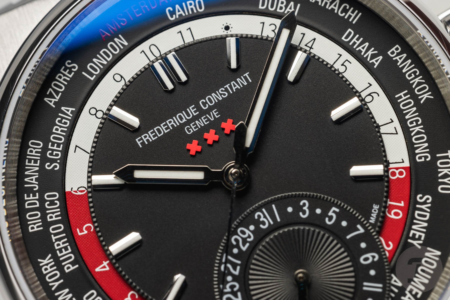
By the way, the simplification of logos doesn’t stop with the fonts used. It also affects individual letters with an accent. So the former “é” in Céline lost its accent mark. That same letter now brings us to Frederique Constant and into the world of luxury watches — yes, finally. The original (fantasy) name of the brand with Dutch origins was Frédérique Constant. In the case of both Céline and Frédérique Constant, the reason for losing the accent was user-friendliness. Without the accent, bloggers, influencers, and (lazy) journalists didn’t have to make an “effort” to get the accent over the “e” any longer. A lot of them never even bothered to do so in the first place.
Patek Philippe and the Arial typeface
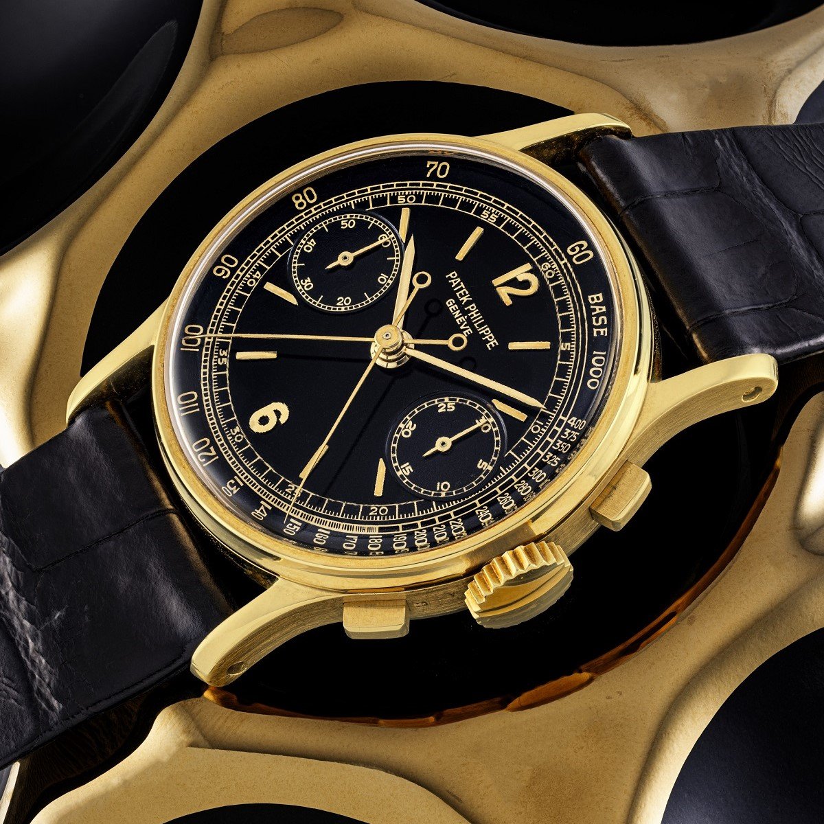
Now that we’re in the realm of luxury watch brands, let’s take a look at the logos and typefaces they use. Surprisingly, a lot of standard or slightly altered standard typefaces were commonly used. Patek Philippe, for example, used ITC American Typewriter and Arial on various watches in the past. Now, the original Patek Philippe logo from 1887 definitely wasn’t. It was the Calatrava Cross that was chosen because it represented the Order of Calatrava in Spain centuries ago. The knights of Calatrava cherished the same values as the Geneva-based watch brand, such as independence, chivalry, and courage. The present logo uses Monotype Grotesque Regular, a grotesque sans-serif font designed by Frank Hinman Pierpont.
![]()
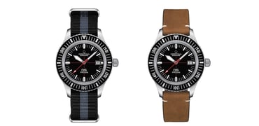
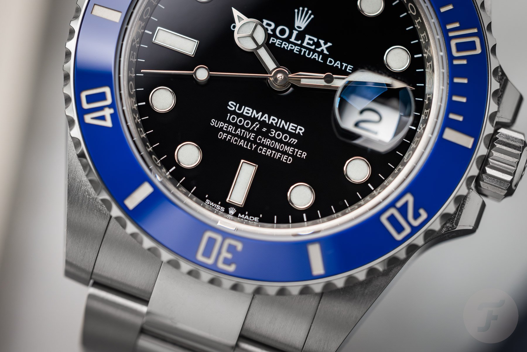
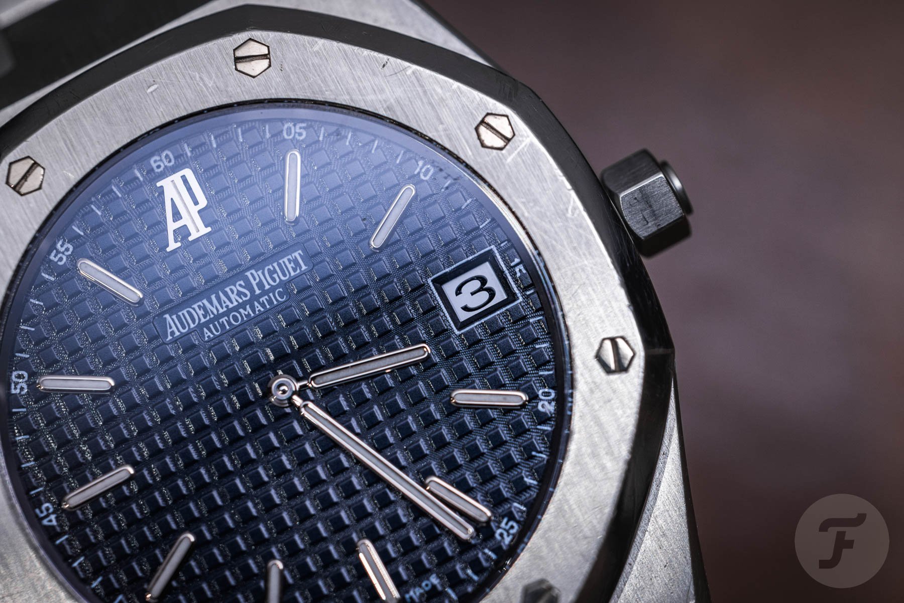
Patek Philippe is not the only watch brand to use existing or slightly modified fonts. Rolex uses an ever-so-slightly modified version of Garamond, a typeface widely used for printing body text and books. Audemars Piguet also used custom lettering on its watches in the past but decided that an elongated version of Times Roman looked better.
The dial vs. the smartphone screen
Using easy-to-read typefaces on watch dials has nothing to do with the increasingly online nature of luxury shopping. Watch brands have been using minimalist fonts long before the invention of the internet. Just like a smartphone, the watch dial offers very limited space, so clarity is paramount. For once, the conservative watch industry was way ahead of the fashion industry — not intentionally, of course, but due to pragmatism.
Watches are now emotional products, but in the past, they were practical instruments first and foremost. Fonts were chosen based on readability but weren’t the result of long studies and debates by the design and marketing teams. The good thing for the aforementioned brands (and quite a few others) is that they don’t have to change their logos en masse to be visible in the digital space. That also probably means that the standard fonts on watch dials never really attracted too much attention.
Great exceptions from Chanel and Hermès
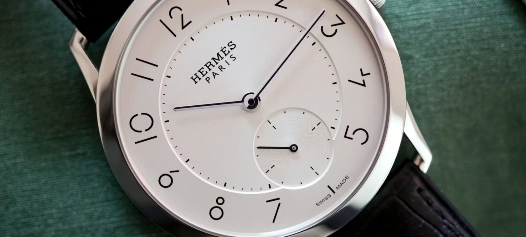
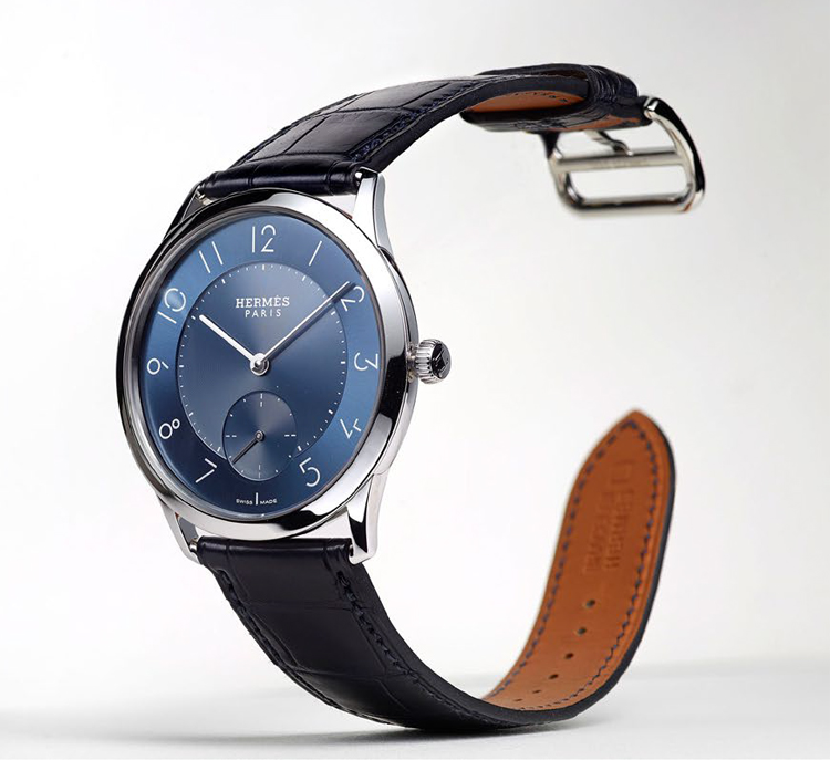
Take a look at the Slim d’ Hermès, a watch from the hand of Philippe Delhotal, Creative Director of La Montre Hermès. The timepiece debuted during Baselworld 2015. Yes, the brand name in the logo is in Memphis Bold, a font by Rudolf Wolf and published by Linotype, but the numerals are not off-the-shelf. Au contraire, Hermès asked graphic designer Philippe Apeloig to come up with an original font. It looks fresh, functional, and original. It also works contrastingly well with the traditional logo.


The Chanel logo was designed by Coco Chanel in 1925, and it shows two bold interlaced Cs that mirror each other. It’s a simple yet strong logo that evokes the authoritative elegance of simplicity, following Mademoiselle Chanel’s fundamental philosophy of “less is more.” The fully written Chanel name is done in Couture, a clean sans-serif font designed by Chase Babb using Coco’s handwriting. It was made especially for Chanel but, curiously enough, is not exclusive to the brand. And that’s because of Babb’s modus operandi: “No, I won’t design something just for you. If I make it, it has to be publicly available.”
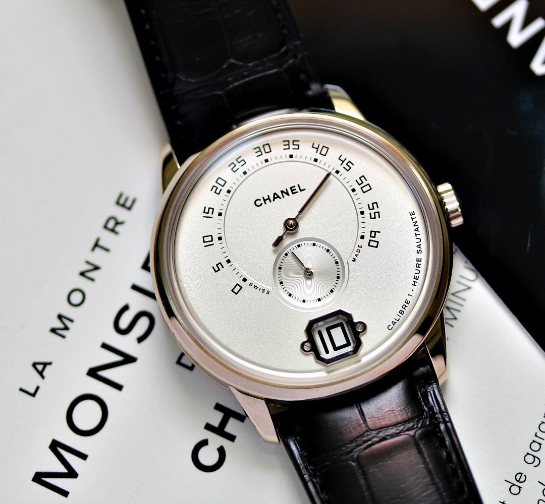
The Monsieur — a watch with jumping hours, retrograde minutes, and the three-day-power-reserve Calibre 1 developed with Romain Gauthier — shows a very special and exclusive font. The numerals are in a font specifically designed for this watch. Yes, it’s a fashionable sans-serif one, but it’s also distinctly angular. And although the numerals are completely new and unique, they do have that certain Chanel je ne sais quoi.
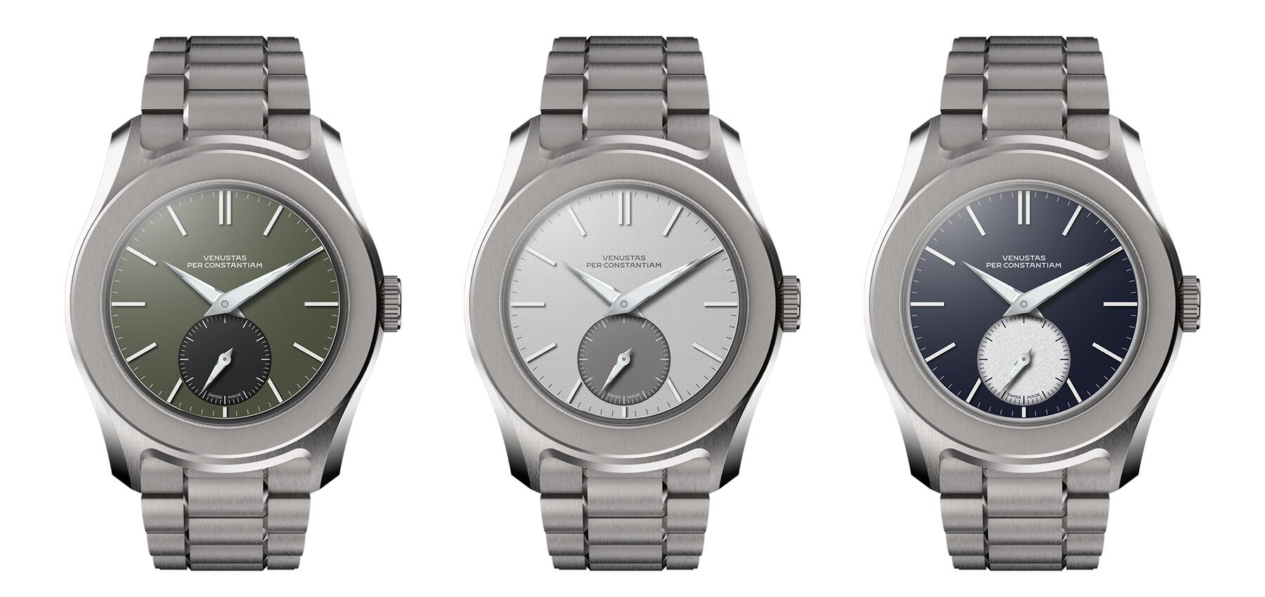
And VPC does it as well
You don’t have to travel to Paris to find a unique font. Fratello’s very own Thomas van Straaten is in the process of creating his very own watch brand, VPC. And he was adamant about having a unique typeface based on vintage ones. He came across designer Samuel Baker, who came up with a complete typeface with a vintage touch. The typeface is a classic serif one, so it goes against the current trend. And it also shows charming quirks with a fair bit of flair. The artistic freedom and a touch of frivolity really show in the C, N, and V. Take a look at the typography and read about Thomas’s search right here.
What struck me most while writing this article was that Thomas has quite a bit in common with Coco Chanel. He might not know it, but I’m sure he can get behind one of Coco Chanel’s many inspirational quotes. She once said that “in order to be irreplaceable, one must always be different.” Did Thomas think about how his custom font would work on a smartphone? I’ll ask him, but I guess he didn’t and also doesn’t care.