Building A Watch Brand Episode 8: Geeking Out On Typography

Welcome to the wondrous world of dial typography! Much of the design language of the wristwatches we know and love today was set in the 1930s–1970s. That includes typography. And if you look closely at watches from that era, you soon discover some really quirky features. These features give away how these dials were actually designed and manufactured. Unfortunately, most of these quirks have been lost due to technical advancements, and some of the unique charm of these watches was lost in the process. So I decided to pursue the revival of such typography for VPC. I found a like-minded designer in Samuel Baker, who has performed some true wizardry for me, as you will soon find out.
I have alluded to dial typography a couple of times before. It is a subject that most watch aficionados appreciate as important, but it is also poorly understood. In fact, I have even erroneously stated that clichés for pad printing were cut by hand. We will learn otherwise today. Most articles on the topic only go skin-deep. If you are up for it, join me in a complete geek-out on dial typography. As it turns out, my typographer Samuel is a bit of a nerd in that field. I have to give him full credit for the technical information in this article. Although this is an installment of Building A Watch Brand, I am sure there is plenty of fun stuff for those who aren’t interested in my watch. So let’s dive in!
Drawn by hand
To understand why text and numerals on vintage dials look the way they do, we must understand how they were made. There were different ways in which it was done, but the following is a common method. A so-called draftsman or draftswoman used specialist drawing tools to design a dial on a larger-than-actual scale. These people were trained to do technical drawings by hand. This is a crucial thing to realize: you are looking at an individual’s handwork.
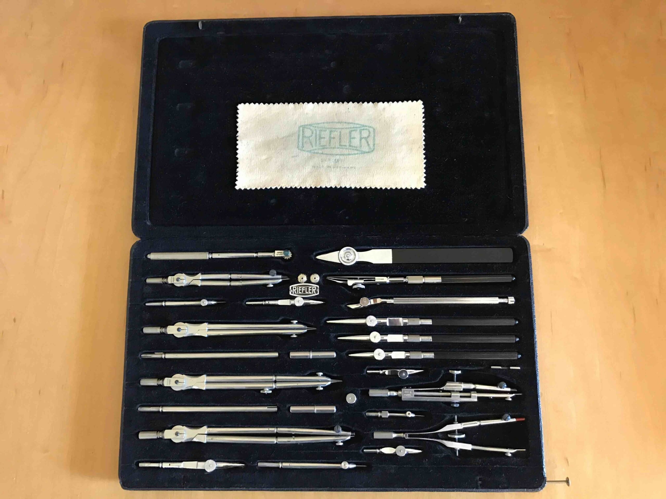
A vintage Riefler set. The technical pens are fourth, fifth, and sixth from the top right — Image: Reddit user KEHAFF
The designers used so-called technical pens for lettering, such as those from Gaphos, Shaeffer, and Rotring. These pens, intended for engineers, designers, and architects, had the unique characteristic of consistent line width. They were refillable like fountain pens, but their nibs featured a flow control wire, resulting in consistent line weight regardless of applied pressure. In that sense, they are the polar opposite of fountain pens.
This means that line weight — or “color,” as it is referred to — can be controlled very precisely. It can be used as a design theme. Imagine if a designer drew two lines of text in the same style but different sizes. By using the same nib, those lines would have the same weight, which is also referred to as “monoline.” Now imagine setting your modern-day computer font to size 12 for one line and then size 8 for the next. Those two lines are of different weights, breaking their visual relation. This is one of several reasons why those old dials look so extremely pleasing to the eye. The inconsistency of the human touch is another. It puts life into something that becomes sterile when too perfect.

Etching, silkscreen printing, and tampography
Next, the dial design is photographed and scaled down to the actual dial size. It is then projected onto a fine silk screen that is stretched on a frame or onto a photo-sensitive etching compound on a metal plate. For the former method, the silk is coated in a photo-reactive substance that solidifies when exposed to light. After cleaning, that leaves only a fine open mesh where there was ink on the original drawing.
This silkscreen is placed on a clean, flat surface, often glass. Ink is then applied and wiped off. When the silk screen is removed, a perfect dial print is left on the glass. For the alternative and probably more common method, the etched metal plate is the cliché that gets filled with ink. Either way, the wet ink is picked up by a soft pad and pressed onto the blank dial. This process, known as tampography, enables the printing of a flat image onto a three-dimensional surface.
Naturally, the etching, the silkscreen, and the pad affect the resulting print. The silk, although very fine, has a pixelating effect. The viscosity of the ink and the pressing of the pad results in a slight softening and mild distortion of the print. The same method is still used today, although advances in technology have minimized the aesthetic side effects. By the way, it is important to realize that only a handful of dial makers supplied the entire industry. This is why there is so much similarity between brands.
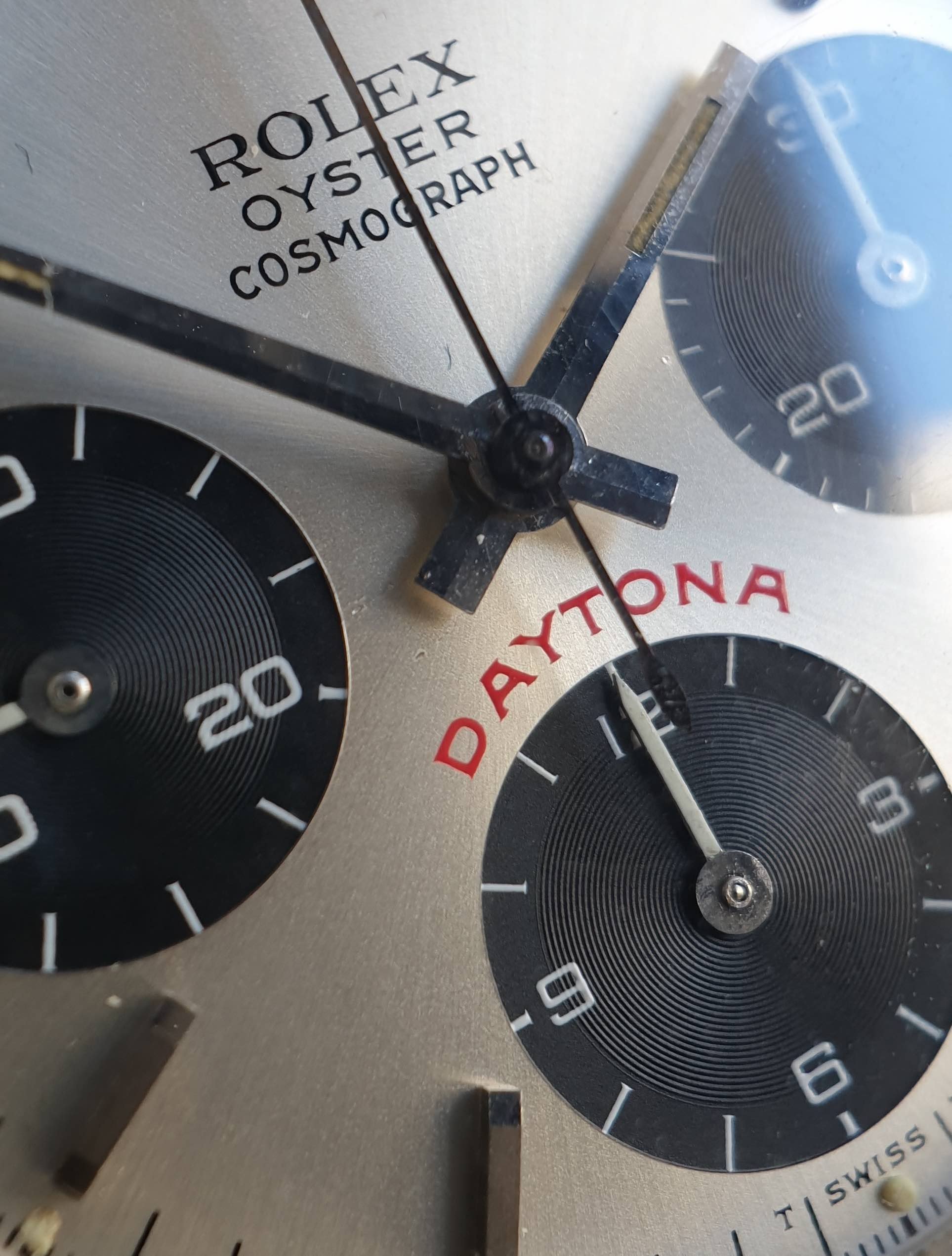
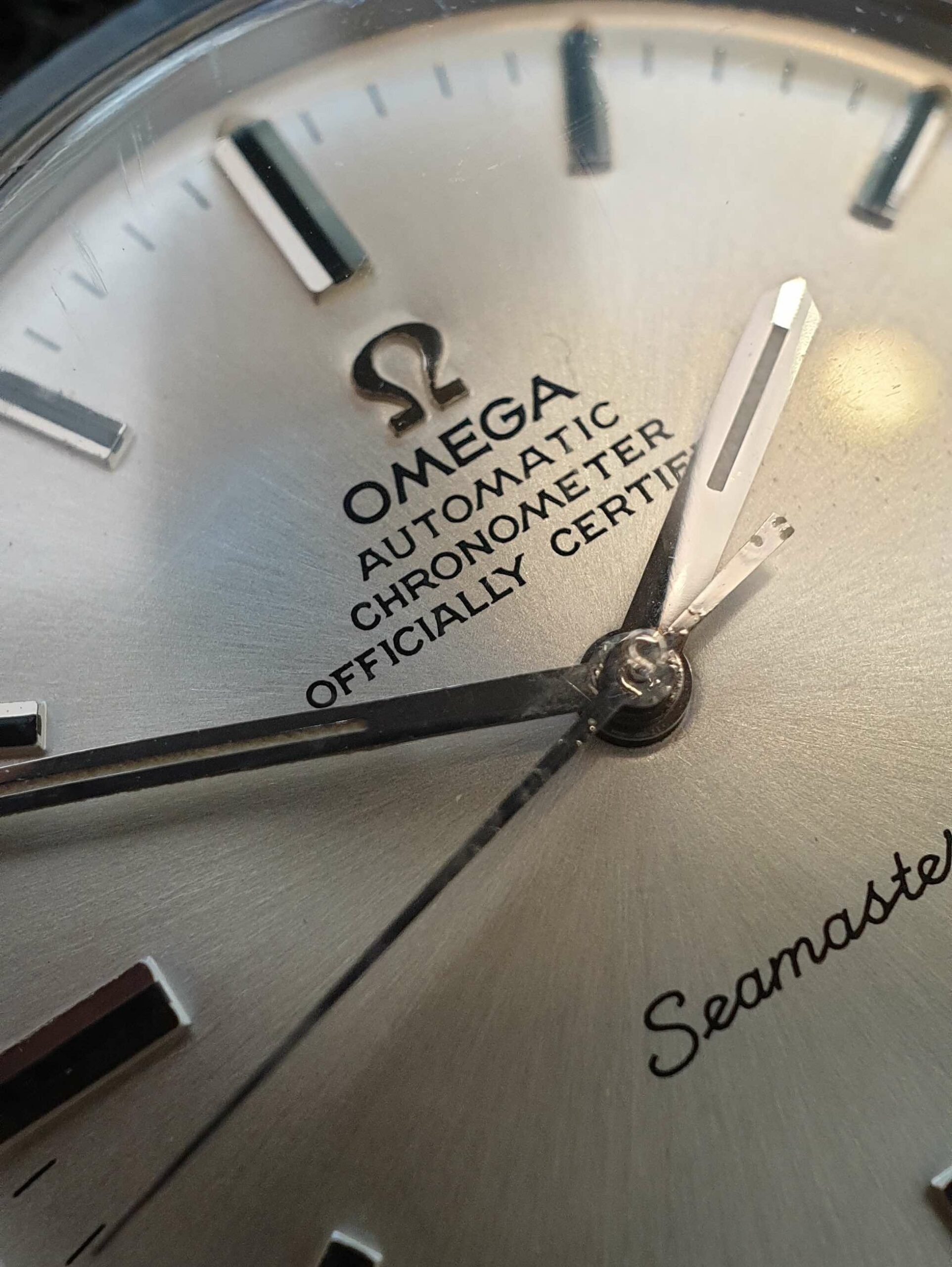
Note the consistent line weight of “Oyster” and “Cosmograph,” even though their font sizes differ significantly
How did this affect typography?
The designer had to account for this delicate printing process, especially at this tiny scale. Legibility at this small scale was another challenge. Ink buildup, smearing, and pull-up can ruin a dial, so the typography had to prevent that from happening. How? By keeping the lines as widely separated as possible.
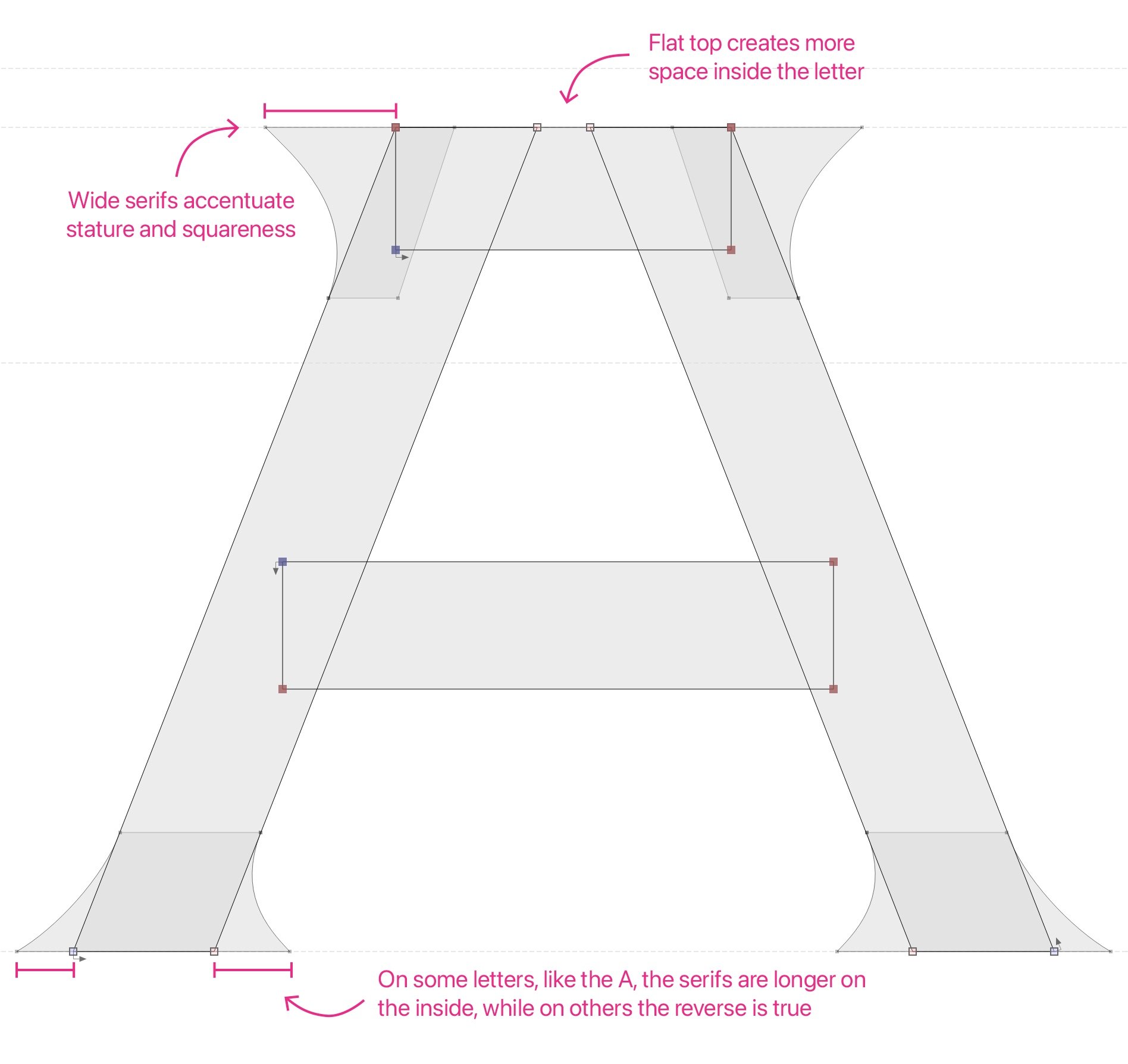
This is where the most characteristic features of vintage watch dials originate — the flat-topped A and 4. The triangle in the numeral 4 can quickly fill out or become hard to read when printed very small, so the designers made a great effort to maximize the aperture. They made the leg as short as possible and flattened the top. The resulting trapezoid is much larger than the typical triangle you see in typefaces intended for printing on paper or digital use. The same method was applied to the letter A. The R is similarly quirky, with a bowl as big as the Ps and a tiny leg. Again, this is to maintain a wide aperture, even at the expense of some imbalance in its stance.
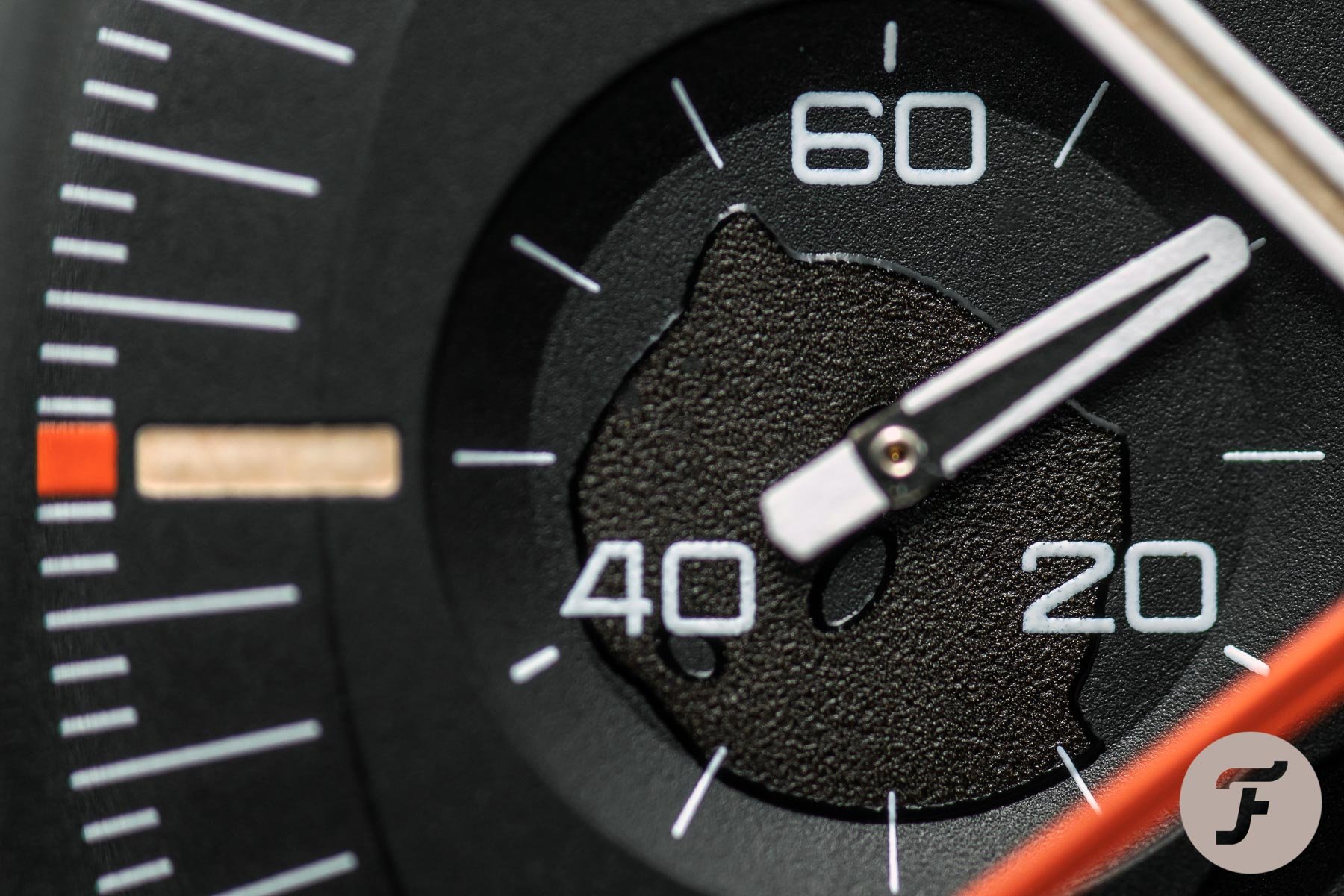
Note the flat-topped and short-legged 4
The S was “unfolded” a bit to widen the apertures. There was also a degree of monospacing (all letters the same width) going on to fill out day and date windows, regardless of which letters or numbers were displayed. Lastly, sharp serifs were used to prevent ink pull-up from corners. Once dial designers had taken these characteristics into account, they would do the rest of the lettering in the same style. A vernacular emerged, guiding further stylistic choices, so not everything you see is functional. Much of it is simply the consistent implementation of an emerging design language.
The new VPC typeface
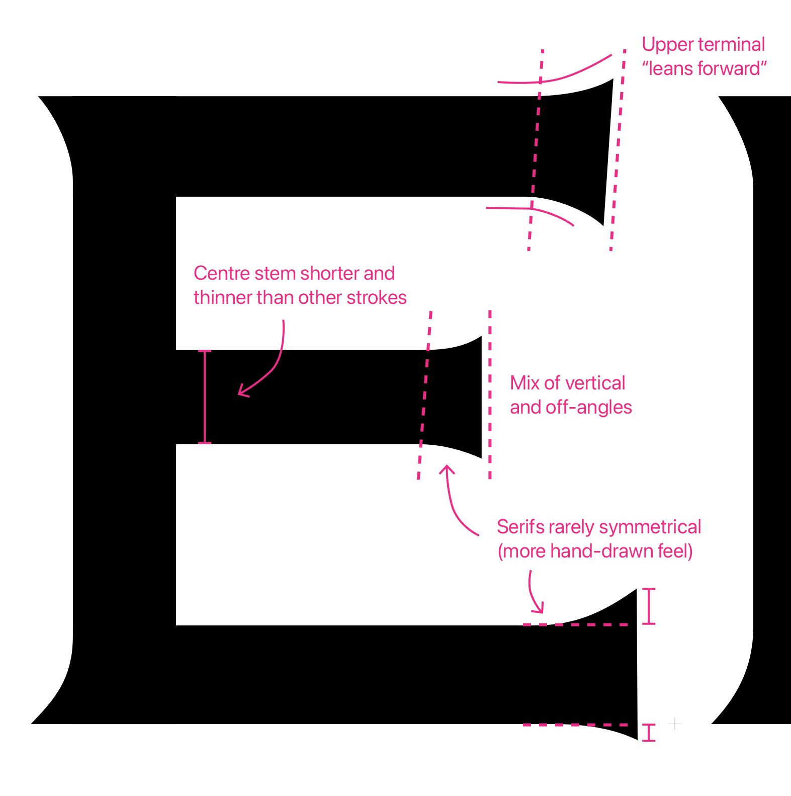
Okay, now onto our new rendition of all of the above. Rather than making a straight copy of these old fonts, Samuel just played by the same rules. He took the same input and limitations but designed a completely new typeface with them. This means we have many of those charming quirks mentioned above but also some differences. The C, N, and V, for instance, are where he took some liberties and put in some flair of his own.
Usually, when designing a modern serif typeface, you would make the serifs perfectly even. Samuel has intentionally made them very inconsistent to simulate the hand-drawn lettering of yesteryear. Have a close look at the foot of the V and the top of the A. You would expect them to be mirror images of each other, but they are far from being so. The V has narrower, more vertical serifs and a rounded vertex. The A has broader, more curved serifs and a broader top. Even within any single letter, all serifs are slightly different.
These aren’t things you will notice explicitly, but they do all add up to provide that intangible playfulness and imperfection that is so characteristic of vintage dials. I think it adds great value for aficionados who can appreciate the little details. It is also yet another way to make VPC stand out as it is a typeface unique to my brand. Note that we have not featured this typeface on any of the previous watch designs and renders I shared just yet. That was a ready-made font that has a similar feel but lacks these truly defining characteristics.
Adaptations of the typography
Now, Samuel is a bit of a purist. If you thought we would just hit “Save as .OTF” and be done with it, you would be wrong. Our rendition of “Swiss Made” in the sub-dial, for instance, is curved. He insisted that he wanted to put the letters on that curve manually and make the required adjustments. Why? Because the result will look better. I love working with people who are as obsessed as I am. Left (below) is the old version, and right is the new one.


Then there is the case back, which will feature some specs and numbers. Historically, these would often feature sans-serif fonts, although exceptions exist. We have not come around to it yet, but rest assured it will be done letter by letter to get a perfectly balanced result. We may use the VPC font shown here. But if it turns out we need to develop some adaptation, we will.
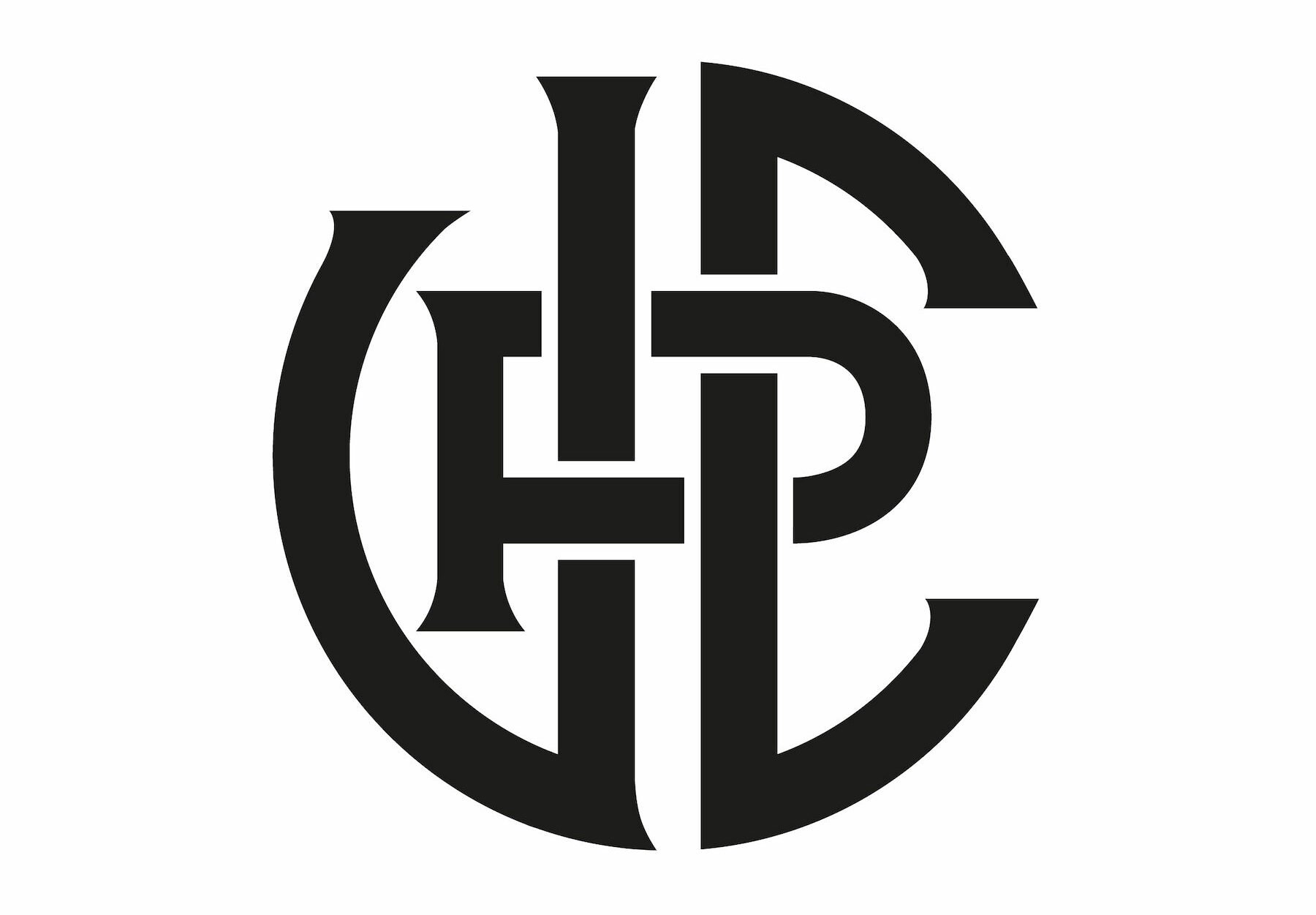
Lastly, we are working on a monogram to go with the wordmark. The monogram will be widely used as a logo, for instance, on the crown and case back. As you can see below, its letters are derived from the VPC typeface and stylized to form an emblem. I know some people don’t like the brand name (no need to tell me again), so let me address this before you hit the comment section: no, the monogram will not replace the name on the dial. The full wordmark will sit proudly below 12 o’clock. It is the more traditional and timeless approach, and it is why we go to such lengths to create the perfect font. I am happy to report that I receive many compliments about it as well, so it goes to show that I cannot possibly please everybody, which is okay.
Closing thoughts on typography
Typography is often underestimated. As technology advanced and lettering, as described above, became obsolete, an art form was lost. Today, even some of the biggest names in watchmaking put bland Arial text on their dials. Sure, it is much sharper and flawless compared to back in the day. But I cannot help but feel some of the charm was lost in the process. The brands that genuinely value typography and make an effort to get it right are few and far between. Hoefler&Co. did a vintage-watch-inspired typeface some years ago. Netflix featured it in the series Abstract, but Hoefler modernized it quite a bit more than we wanted to.
For me, it makes perfect sense to obsess over typography for VPC. I am not developing a watch for the masses who could not care less about these details. I am making a watch for a tiny group of aficionados who love and appreciate the effort that goes into this sort of stuff. If VPC has a right to exist, I firmly believe it is in being non-compromising — a labor of love.
Whether the result suits your taste or not is beside the point. But there is no denying that Samuel Baker is putting all he has into this kind of work. And I like to think it shows, even if you don’t know the nitty-gritty of it. I believe people will look at the result and feel, “Yes, that is just done right!” regardless of personal taste. The love and attention are apparent. That is why I try to put as much of that into my watch as I possibly can. Having people like Samuel and Max Resnick on my team helps — a lot, actually.
The VPC Type 37HW concept design (still with the old type)
Can’t get enough?
- VPC website and newsletter opt-in
- VPC on Instagram < If you want more detailed updates between BAWB articles
- Building A Watch Brand Episode 1 — Introduction
- Building A Watch Brand Episode 2 — Brand and name
- Building A Watch Brand Episode 3 — Finances, risk mitigation, and a designer
- Building A Watch Brand Episode 4 — Unveiling the watch concept
- Building A Watch Brand Episode 5 — The first design ideation sketches
- Building A Watch Brand Episode 6 — Caliber, pouch, case and bracelet updates, typography
- Building A Watch Brand Episode 7 — Dial design