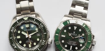
Building A Watch Brand Episode 7: Dial Design

Finally, we get to talk about dial design! Once we finished the case and bracelet, we used our momentum to continue with the dials. As with the case, the desired design direction revealed itself quite quickly. We then took our sweet time to iterate on it and fine-tune it until it felt just right. In this installment of Building A Watch Brand, I am happy to share some of the decision-making involved in dial design. My original dial input has largely survived the scrutiny of my designer, Max Resnick. He did, as I’ve come to expect, lift it several levels higher, so I can unashamedly say I love the result. I hope you do too! Let’s get into it.
The watch has also received a reference — Type 37HW. Naturally, this refers to the case size and the hand-wound caliber. That means, from now on, I can refer to an actual designation rather than “my upcoming watch.” As always, I am sharing both the road taken as well as several roads not taken. Again, that is at the risk of you, my dear Fratelli, preferring a road not taken. But hey, I promised to share the whole journey, so I will.
The dial design
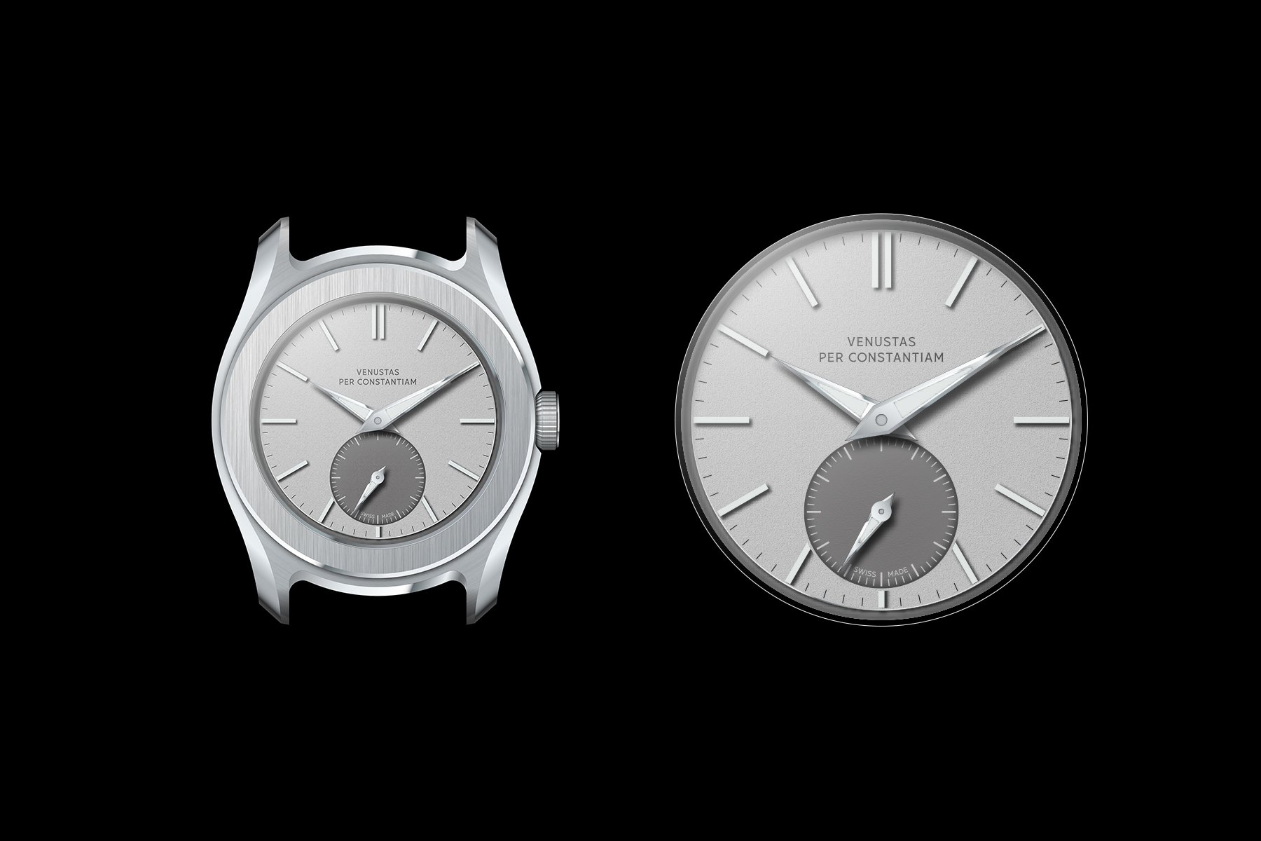
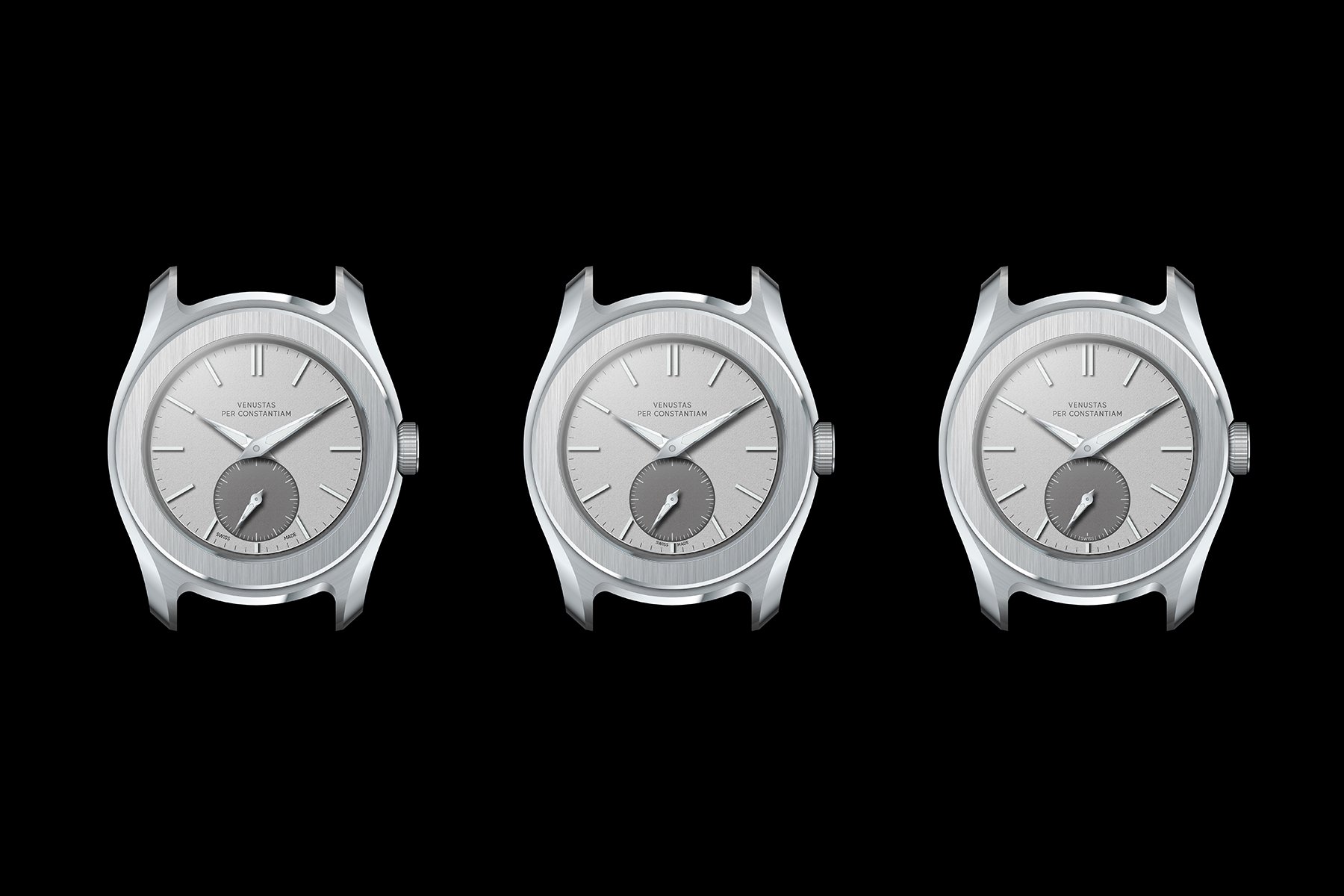
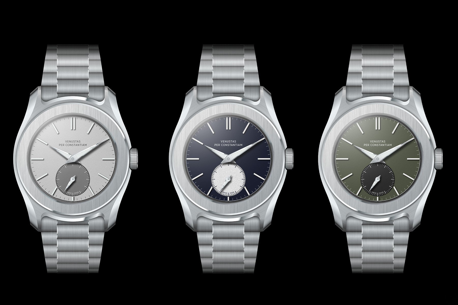
My initial design brief featured silver, mocha, green, and blue dials. Max started with silver since it exposes the bare design best. It is much easier to add color later than it is to start with a color. My mocha idea, by the way, got binned. It looked like a dirty Band-Aid, which is not quite the look I was striving for. You can’t win ‘em all, can you?
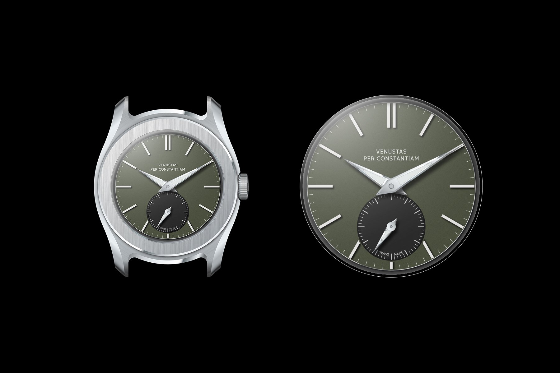
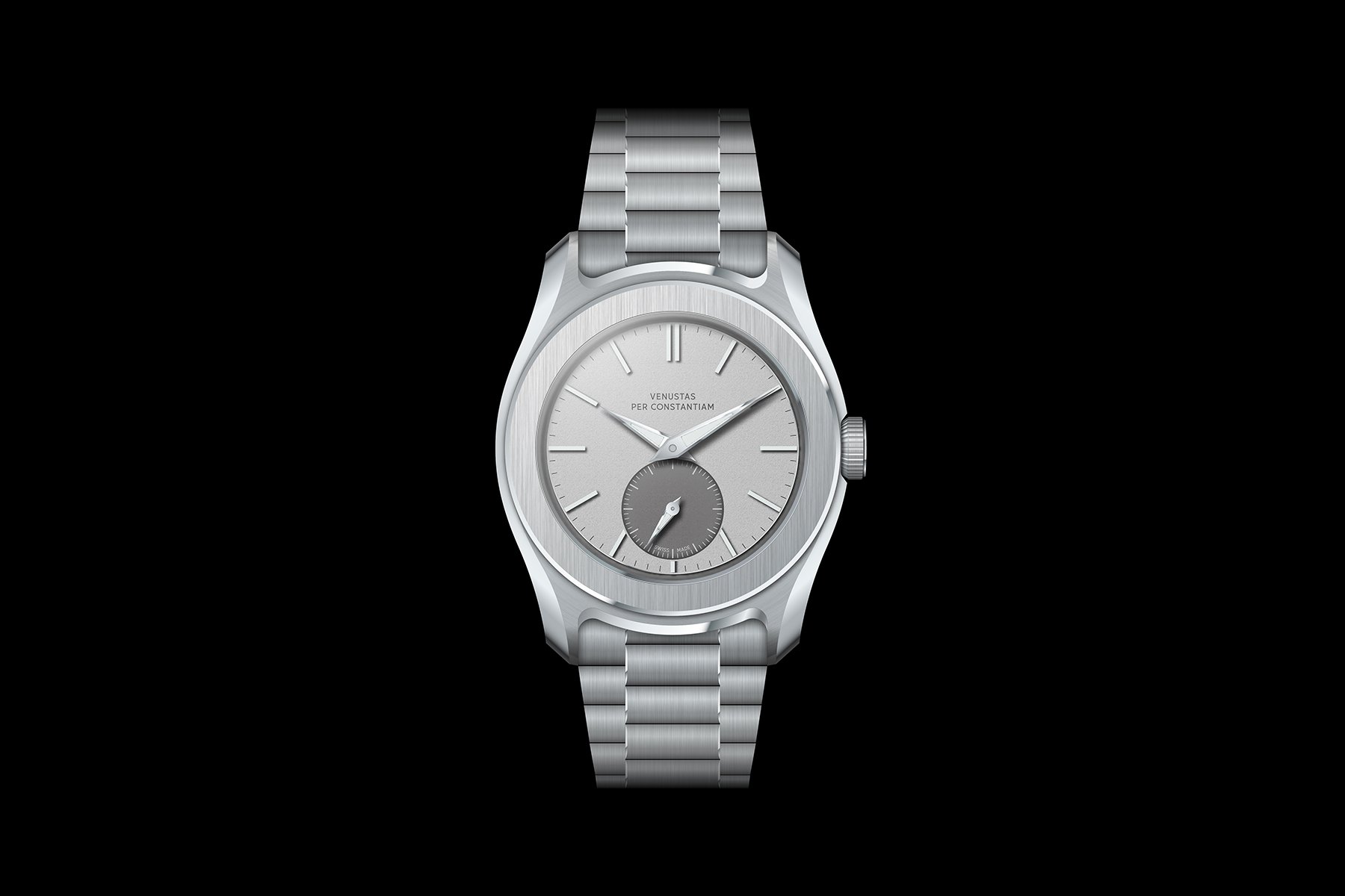
The dial design we ended up with features a matte, frosted texture inspired by the movement plates in old pocket watches. The same texture is used on the sunken sub-dial, which is executed in a contrasting color. I was adamant about not using a typical sunburst finish since I feel it is a bit tired and overly shiny. The contrasting color is echoed on the dial perimeter, which is stepped, inspired by old pie-pan dials. We experimented with different step widths and found that a super narrow edge worked best with the case. Otherwise, paired with the broad bezel, the dial would optically become too small, as you can see in some of the concepts further down in this article.
Roads not taken: different “Swiss Made” placements
The aim was to keep the dial as clean as possible. That meant only the brand name in the traditional position and “Swiss Made” hidden in the sub-dial. Otherwise, we decided to put no additional text on the dial. We played around with eight different places for the Swiss Made signature, determined not to let it break up the minute or seconds tracks. After all, a chronometer with a sharp handset should not only be accurate, but it should also aesthetically imply accuracy. Breaking up the minute or seconds track makes no sense in that respect. I found this position above the seconds track to be least intrusive on the overall cleanliness of the dial.
Lume
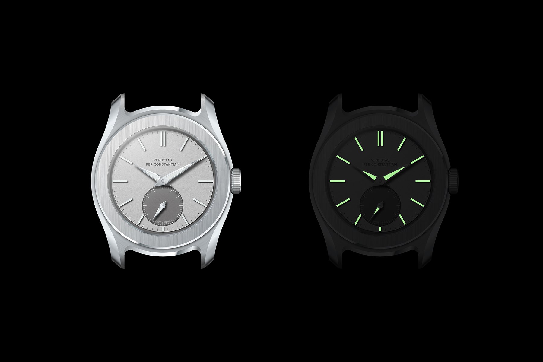
I was determined to have proper lume on the VPC Type 37HW. I think it is a valuable feature in a do-it-all watch if done right. And by “done right,” I mean that it should complement the design while also being bright enough to serve its luminescent purpose. It can be tempting to use tiny amounts not to break up your design. But then the function gets lost in the process. So, as with several features, the brief was to get it right or not do it at all. Max offered different dial concepts with and without lume for me to evaluate.
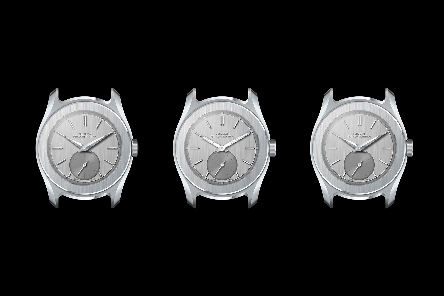
Roads not taken: two no-lume dial concepts flanking a more sporty, modern alternative. Note how the wider-stepped dial doesn’t really work with the case, resulting in a cramped dial design.
The no-lume versions you see here looked too classical to me. Especially when paired with sunburst sub-dials, they leaned a little too much toward classical dress watches. I think they are very good designs, but they are not where I intended them to be. Additionally, the more modern-looking design in the center looked overly sporty to me, so that was not the ticket either.
The route we decided to pursue was one with applied solid lume blocks for indices. These are known from Tudor’s Black Bay Pro and Vertex watches. This allows us to keep the indices super slender since they are pure lume. The handset is fitted with trapezoid lume basins. You will see some different shapes across the different renders, but I found the trapezoid the most contemporary and fresh-looking, so that was our pick. The sub-seconds hand is also lumed. This will likely be a little dimmer due to the small lume basin. However, it is a valuable addition I wanted to have to ensure you can see that your watch is running when you check the time in the dark.


Testing colors with the dial design
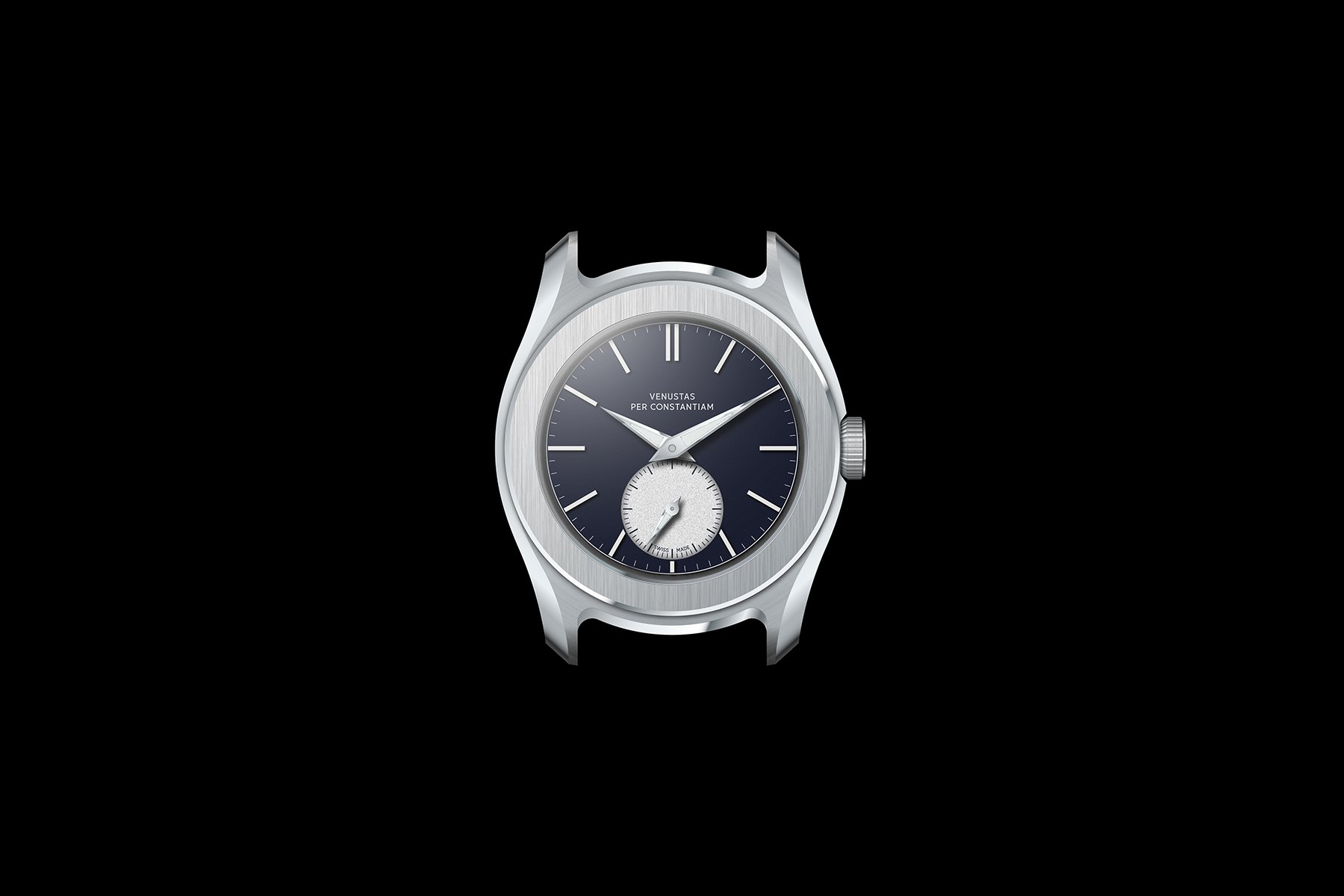
Once we had landed on the desired dial design in silver, we started testing colors. I am quite particular about blue dials. In fact, I dislike most of them. I often find them a little too blue to actually be versatile. And since the VPC Type 37HW is an everyday watch, you want versatility. I proposed the deep, inky blue used in traditional Dutch Delft blue pottery paired with a white sub-dial. This tone of blue did precisely what I wanted it to, but the white was too harsh of a contrast. A silver sub-dial cured that issue, resulting in the blue watch you see here.
For the green dial, I wanted a slightly grayed-out tone of green. For all you color theoreticians, I know, a tone of a color is always a mixture of that color with gray. If you aren’t into your color theory, a tint is mixed with white, and a shade is mixed with black. We landed on this rich, dark sage green. It is paired with an anthracite sub-dial and dial perimeter. The resulting dial is rather subdued, leading to greater versatility than a brighter green would. Still, it has a warmth that is quite distinct from the cooler silver and blue dials.
All three dials feature the same matte, finely frosted texture on the main surface, the sub-dial, and the pie-pan edge. Note that the blue dial in the renders does not feature its silver pie pan step just yet, but it will. The silver and green dials will feature green-glowing lume, and the blue dial will glow blue-ish. Before you ask, we have yet to make technical decisions about lume compounds together with the dial maker. At the moment, I suspect we will end up with BGW9 and C3 Super-LumiNova.
It all comes together
The dials were the final component in the concept design stage. That means we now have our finished concept designs! You can regard this as the target appearance of the watch. Next, we go into 3D modeling, technical design, and, later, prototyping. As you can imagine, a lot can still change. And quite seriously so. Features may not be technically feasible or make the entire watch too expensive.
This, then, is very much like a concept car you see at a fair. Max has certainly taken technical and financial feasibility into account, but it has not been the primary focus. There are several aspects of this design that are more challenging than with typical watches. Think of the combo of the screw-down crown and hand-wound caliber or the aspirations for water resistance paired with the thinness. The super-narrow lume blocks and the flat three-piece end links are rather challenging too.
While I cannot speak for anyone else, I am delighted with how the concept design turned out. Max took my ideas and lifted them far beyond what I dared to hope for. Hiring a top designer is a decision that I haven’t regretted for an instant. Now it is time to ensure that the prospected manufacturers live up to that same level. Seeing the final concept designs fills me with hope, though. This might just work…
Can’t get enough?
- VPC website and newsletter opt-in
- VPC on Instagram
- Building A Watch Brand Episode 1 — Introduction
- Building A Watch Brand Episode 2 — Brand and name
- Building A Watch Brand Episode 3 — Finances, risk mitigation, and a designer
- Building A Watch Brand Episode 4 — Unveiling the watch concept
- Building A Watch Brand Episode 5 — The first design ideation sketches
- Building A Watch Brand Episode 6 — Caliber, pouch, case and bracelet updates, typography